84
Opinion
TRENDS in Neurosciences Vol.25 No.2 February 2002
69 Balkowiec, A. and Katz, D.M. (2000) Activitydependent release of endogenous brain-derived neurotrophic factor from primary sensory neurons detected by ELISA in situ. J. Neurosci 20, 7417–7423 70 Seo, H. et al. Cortico–hippocampal APP and NGF levels are dynamically altered by cholinergic muscarinic antagonist of M1 agonist treatment in normal mice. Eur. J. Neurosci. (in press) 71 Granholm, A-C. (2000) Estrogen and nerve growth factor – neuroprotection and repair in Alzheimer’s disease. Expert Opin. Invest. Drugs 9, 685–694
72 Nitsch, R.M. et al. (1992) Release of Alzheimer amyloid precursor derivatives stimulated by activation of muscarinic acetylcholine receptors. Science 258, 304–310 73 Buxbaum, J.D. et al. (1993) Protein phosphorylation inhibits production of Alzheimer amyloid β/A4 peptide. Proc. Natl. Acad. Sci. U. S. A. 90, 9195–9198 74 Hung, A.Y. et al. (1993) Activation of protein kinase C inhibits cellular production of the amyloid β-protein. J. Biol. Chem. 268, 22959–22962 75 Slack, B.E. et al. (1993) Regulation by phorbol esters of amyloid precursor protein release
A rationale for the structure of color space R. Beau Lotto and Dale Purves The colors perceived by humans in response to light stimuli are generally described in terms of four color categories (reds, greens, blues and yellows), the members of which are systematically arrayed around gray. This broadly accepted description of color sensation differs fundamentally from the light that induces it, which is neither ‘circular’ nor categorical. What, then, accounts for these discrepancies between the structure of color experience and the physical reality that underlies it? We suggest that these differences are based on two related requirements for successful color vision: (1) that spectra be ordered according to their physical similarities and differences; and (2) that this ordering be constrained by the four-color map problem.
R. Beau Lotto* Institute of Ophthalmology, University College London, 11–43 Bath Street, London, UK EC1V 9EL. *e-mail:
[email protected] Dale Purves Dept of Neurobiology, Duke University Medical Center, Durham, NC 27710, USA.
The goal of any visual system is presumably to distinguish physically different objects and the conditions under which they are witnessed, thus enabling successful visually guided behavior. All visual animals achieve this end by detecting differences in the quantity of the LIGHT (see Glossary) reflected by objects or otherwise returned to the eye, which are perceived in humans as LIGHTNESS and/or BRIGHTNESS. Many animals also distinguish objects according to differences in the quality of the light they reflect (i.e. the distributions of the spectral power in the stimulus), which are perceived in humans as different COLORS. Although descriptions of the organization of human color sensations differ in detail [1–4], they share several key features. Thus, at any given level of light intensity, color experience can be portrayed as a plane in which movements around the perimeter correspond to changes in hue and movements along its radial axis correspond to changes in saturation (i.e. changes in the relative grayness of the color) (Fig. 1). In contrast to the continuously variable spectral distributions that generate sensations of color, all colors are experienced as belonging to one of http://tins.trends.com
from Swiss 3T3 fibroblasts overexpressing protein kinase Cα. J. Biol. Chem. 268, 21097–21101 76 Nitsch, R.M. and Growdon, J.H. (1994) Role of neurotransmission in the regulation of amyloid beta-protein precursor processing. Biochem. Pharmacol. 47, 1275–1284 77 Caputi, A. et al. (1997) Increased secretion of the amino-terminal fragment of amyloid precursor protein in brains of rats with a constitutive upregulation of protein kinase C. J. Neurochem. 68, 2523–2529
four perceptual categories (reds, greens, blues and yellows), or combinations thereof. Thus, although the relationships between other visual sensations and the physical world that gives rise to them (e.g. sensations of shape, depth and motion) appear straightforward (i.e. the structure of physical space is roughly similar to the overall structure of the perceptual space it generates), color sensations are different: there is no obvious basis in the physical characteristics of light for either the circular ordering of colors in a plane, or their parcellation into four perceptual categories. Why, then, is perceptual color space structured in this way, and does this structure have deeper implications for understanding the nature of vision generally? To the extent that contemporary theories of color vision have addressed these questions, the subjective structure of color experience is considered an inevitable consequence of TRICHROMACY and OPPONENCY ([5–9], but see Ref. [10]). Thus, most modern work has understandably focused on determining the cellular bases of these two physiological pillars of color sensation. As a result, the rationale for the structure of color experience is, in this view, secondary to the evolutionary value of trichromacy and opponency as such. Some of the advantages that have been suggested are: (1) optimally satisfying the constraints of information theory [11–13]; (2) promoting the perception of ‘color constancy’ [14–16]; and (3) helping our frugivore ancestors detect ripe fruit [17,18]. We take the opposite approach to understanding color experience. Rather than rationalizing the structure of color sensations in terms of trichromacy and opponency, we consider the structure of color space itself, asking whether color space (and thus the physiology that generates it) might represent the solution to the two fundamental problems in topology with which the evolution of color sensations must ultimately contend. Distinguishing territories by spectral information
In examining the proposition that the structure of color experience, as such, should be a better guide to understanding color vision, a good place to start is to consider why color sensations have evolved in the first place. Many animals do not have a significant degree of color vision, and even those that do are for the most part more limited in color perception than are
0166-2236/02/$ – see front matter © 2002 Elsevier Science Ltd. All rights reserved. PII: S0166-2236(02)02059-2
Opinion
TRENDS in Neurosciences Vol.25 No.2 February 2002
Fig. 1. Human color experience. (a) The subjective sensations called color are generally portrayed as a series of planes organized according to hue, saturation and brightness: hue is the quality of a color (i.e. its relative redness, greenness, blueness or yellowness); saturation is the degree to which the color differs from neutral gray; and brightness (or lightness) is the perceived intensity of the color. (b) Any one of these planes comprises four primary color categories (red, green, blue and yellow), each of which is characterized by a unique color percept (the approximate position of which is indicated by dots), that is, a color experience that cannot be seen or imagined as a mixture of any other colors. Although the illustration is only a didactic approximation, the unique colors are, as shown, not symmetrically disposed around the color circle. Secondary color groupings, such as purples, oranges, cyans and yellow–greens are seen as mixtures of the four primary hues, and can always be perceptually reduced to the relative contributions of these four possible components.
Intensity
0.5 0.0
350 450 550 650 750 Wavelength
0.0
0.8
0.5 0.0
350 450 550 650 750 Wavelength
0.0
1.0
1.6
0.5
0.8
0.0
350 450 550 650 750 Wavelength
0.0
Normalized intensity
0.8
1.6 1.0
Normalized intensity
1.0
Intensity
1.6
Normalized intensity
(a)
Intensity
humans [19–24]. Indeed, trichromatic color vision occurs only in humans and Old World monkeys; most other primates, and the majority of other color-seeing mammals, are DICHROMATS.
40 0
350 450 550 650 750 Wavelength
80
Cumulative sum spectrum
80
Cumulative sum spectrum
Cumulative sum spectrum
(b) 40 0
350 450 550 650 750 Wavelength
80 40 0
350 450 550 650 750 Wavelength
TRENDS in Neurosciences
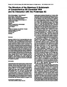
Fig. 2. Evaluating the physical similarities and differences between spectra. (a) The spectra (black in each panel) are representative examples from a larger computer-generated set (1024 spectra) that was created by continuously varying all combinations of five equally spaced wavelengths at four different intensities; the intervening wavelengths were filled in at 2.5 nm intervals using a simple sigmoid function. Although this database is arbitrary in that it does not represent natural spectra or their distribution (about which there is little information [38–40]), it provides a uniform, if limited, sample of all possible light spectra. The colored spectra in each panel show the distribution of wavelengths after normalization. (b) Transformation of the normalized spectra in (a) into cumulative spectra by the progressive addition of power at 2.5 nm intervals. Converting the spectra into cumulative sums allows a comparison of spectral similarities and differences (Fig. 3); without this procedure, two non-overlapping spectra composed of neighboring wavelength distributions would be deemed as different from each other as two other non-overlapping spectral distributions composed of more distant wavelengths.
http://tins.trends.com
85
What benefit, then, does color vision add to seeing scenes in shades of gray, which seem otherwise adequate (watching a black and white movie is presumably a good indication of the experience of animals that lack color vision)? Although all sighted mammals can distinguish surfaces according to differences in reflected light intensity, only animals with color vision can distinguish a further set of surfaces according to differences in the wavelength composition of light reaching the eye. Therefore a visual system that can identify surfaces derived from this additional information conveyed by light (which leads to perceptions of color) will be more effective in distinguishing objects – and therefore in generating successful behavior – than a visual system that cannot [17,18]. The importance of preserving spectral similarities and differences
Given this broad rationale for color vision (i.e. to discriminate between spectra that arise from differently reflective surfaces), the multitude of spectral returns from objects must be distinguished in a way that accords with the similarities and differences between surfaces. To appreciate this point, consider the way we perceive spatial attributes. In this case, the need to generate sensations that accord with the arrangement of objects in space rather than their absolute position is obvious. If spatial relationships were not preserved in this way, there would be no basis for grouping the elements of a scene according to their relative positions and distances, and thus no basis for generating appropriate behavioral responses to this aspect of visual stimuli. In a similar way, the perception of spectral differences, to be useful, must be ordered in perception according to the physical similarities and differences of spectra. If this goal were not met, then the visual system could not effectively group the similar but different elements of a scene into object surfaces according to their spectral qualities. In fact, the planar organization of color experience does preserve the physical similarities and differences among spectral distributions, as initially
TRENDS in Neurosciences Vol.25 No.2 February 2002
(a)
(b)
Spectral comparisons
Difference matrix
Glossary
Cumulative sum spectrum
80
40
0
Area of non-overlap
350
450 550 650 Wavelength
750
80 Cumulative sum spectrum
Fig. 3. Comparison of light spectra by multidimensional scaling. (a) Comparison of the similarities (color areas) and differences (black) between the three sample spectra illustrated in Fig. 2. (b) Difference matrix of the spectral comparisons in (a). (c) Multidimensional scaling map of the matrix ‘distances’ in the example in (b); the distances between spectra in the map correspond to the relative differences between them.
Opinion
Area of 40 non-overlap
0
350
450 550 650 Wavelength
(c) 750
MDS of difference matrix 2
10.6
1
80 Cumulative sum spectrum
86
16.2 Area of 40 non-overlap
15.4
3 0
350
450 550 650 Wavelength
750
TRENDS in Neurosciences
pointed out by Roger Shepard and J. Douglas Carroll in a paper on the analysis on non-linear data structures [25]. Perhaps the simplest – though not necessarily the most complete – way to compare spectra is in terms of their overall form. Consider, for example, spectral comparisons according to the total area of their overlap, a method much like that devised by D’Arcy Thompson [26] to assess the physical relationships between animal forms (Fig. 2). The greater the total area of overlap between two forms (or spectra), the greater their similarity, and vice versa. Thus, two identical spectra overlap completely, whereas two very different spectra have little or no overlap. How various shapes or spectra are physically
Fig. 4. Multidimensional scaling (MDS) maps of the complete (1024 × 1024) matrix of spectral comparisons. (a) MDS map showing the relative similarities and differences between spectra; examples that occupy the indicated points around the perimeter of the map are illustrated. Notice that the locations of these spectra define the outer boundary of a disk-like plane with a central axis (C); ‘circular’ movements around this axis identify spectra that would elicit progressive differences in hue (compare with Fig. 1). (b) The same map, but now indicating a series of spectra that define movement across the space from one spectrum to its physical opposite (corresponding to the movements between opponent color sensations in perceptual space). Movements in this dimension correspond to spectral differences that would elicit different sensations of saturation, the central axis (C) being the most uniform spectrum. The non-uniform distribution of the points in the map arises from the limited number and arbitrary configuration of the spectra in the database; the ‘scalloping’ of the perimeter, for example, is owing to the absence in the database of the spectra that would otherwise occupy these regions.
http://tins.trends.com
Brightness: the subjective sense of the intensity of light, technically from a light emitting source (see lightness). Colors: the subjective sensations elicited in humans (and presumably many other animals) by different spectral distributions of light. Dichromat: a person (or the majority of mammals) whose color vision depends on only two cone types. Light: the wavelength range within the electromagnetic spectrum that elicits visual sensations (about 390–740 nm). Lightness: the subjective sense of the intensity of light reflected from a surface. Opponency (adjective, opponent): refers to the fact that the receptive field centers and surrounds of many visual neurons in primates (and many other animals) respond oppositely to spectra that elicit sensations that lie across the color circle from one another (see Fig. 1 in main text). Spectrum: for present purposes, the power distribution of a given light stimulus. Trichromacy (adjective, trichromatic): refers to the fact that humans and other primates have three different cone photopigments, each with a different absorption spectrum, that are segregated in different receptor types. The three types are referred to as long, medium and short wavelength.
related can then be determined by, for example, multi-dimensional scaling (MDS), a technique that orders items such that their relative positions on a map represent the relative similarities and differences between them (in much the same way that the relative relationships of the cities in a country are represented on a geographical map) (Fig. 3) [27–30]. Whereas such scaling has often been used to determine the similarities and differences between perceived colors [31], the map in Fig. 3c represents the physical similarities and differences between spectra, quite apart from any consideration of the colors the spectra generate. A MDS map that efficiently represents the physical relationships among a uniform sampling of over 1000 artificially generated five-point spectra is shown in Fig. 4. Ordering the spectra in this way results in a roughly ‘circular’ plane, in which location represents the relationship of a particular SPECTRUM to all the other spectra in the database. To travel incrementally from one point to another in this space by progressively changing the shape of a spectral distribution without changing its variance or ‘flatness’ entails moving around the perimeter of the map (note that changing the shape of the distribution is not equivalent to simply shifting the dominant wavelength of the spectrum, as some distributions are multi-modal). Thus, any such movement around the perimeter of the space mapping spectral similarities and differences will eventually return to the same spectrum (Fig. 4a), as do incremental changes of hue in perceptual color space. Conversely, to move between spectra that differ progressively by virtue of the variance (or flatness) of spectral distribution entails ordinal movements towards the center of the map (Fig. 4b), as do changes in saturation in perceptual color space. Finally, the center of the plane is occupied by a spectrum of approximately equal
Opinion
Fig. 5. The four-color-map problem. (a) An arbitrarily complex collection of surfaces in a 2D array. (b) The four-color-map problem (or more properly its solution) alludes to the fact that four differentiating categories are necessary and sufficient to distinguish unambiguously any such collection of surfaces. (c) If fewer than four categories of comparison are available, some surfaces would necessarily be conflated. The biological solution of this topological problem could explain why humans experience color in terms of four categories, each defined by a unique hue.
TRENDS in Neurosciences Vol.25 No.2 February 2002
intensity at all wavelengths; this spectrum bears a uniform relationship to all the other spectra in the plane, much as the sensory relationship of gray to other color sensations at the same level of intensity. In summary, the general structure of the space generated by ordering spectra according to the full range of their physical similarities and differences has the same fundamental characteristics as perceptual color space (compare Fig. 1 with Fig. 4). This similarity suggests that the link between the physical qualities of light and the way they are perceived is predicated on maintaining in perception spectral relationships, rather than any absolute metric. Accordingly, colors represent not the physical attributes of spectra per se, but the similarities and differences between them. A further topological dilemma: four-color map problem
Although providing a rationale for the both the meaning and overall organization of hue and saturation in human perception, ordering spectra according to their physical similarities and differences provides no indication of why color sensations should be grouped into four perceptual categories. Whereas normal trichromats can differentiate thousands of colors, any particular color percept is experienced as a mixture of red, green, blue and yellow (Fig. 1) [32–34]. As there is no physical basis for this perceptual categorization (which is conventionally attributed to higher-order processing), this aspect of color vision is puzzling, particularly as creating a veridical representation of the physical world is taken by many as the ultimate goal of vision. Is there, then, some other requirement in distinguishing surfaces according to spectral information that could account for this peculiar feature of color sensations? If, as we have argued, the fundamental purpose of color vision is to distinguish objects according to their spectral similarities and differences, then the visual system would have to achieve this goal while ensuring that no two areas separated by a common boundary in a 2D array (the retinal image in this case) appear the same if they are in fact different [35]. This fundamental problem in topology – generally referred to as the ‘four-color map problem’ – was recognized long ago in cartography, and solved empirically by using a minimum of four colors (using only three colors inevitably conflates some boundaries) (Fig. 5). The issue of why a minimum of four colors are needed to disambiguate the territories in a topological array was posed as a logical challenge in the 19th century [36], and was formally solved ~100 years later [37]. Given the fundamental nature http://tins.trends.com
87
Fig. 6. The importance of maintaining the physical similarities and differences between light spectra while simultaneously solving the fourcolor-map problem. (a) A theoretical scene in which three objects are presented against a background (which can be considered a fourth object). Imagine that each object in this scene is composed of multiple patches, as are most objects in nature. Although the spectral reflectance of each of these patches is different, the reflectance of the surfaces that make up any one of the four ‘objects’ is more similar to each other it is to that of the surfaces of the other objects. Unlike most natural scenes, however, each patch here has been constructed such that it reflects the same quantity of light to the eye. (b) Given the equiluminance of the returns from all the patches in the scene, neither the objects, their backgrounds nor their constituent surfaces can be distinguished in the absence of color vision. (c) An animal with color vision could, however, distinguish each tile from its neighbors by using four colors. Note, however, that resolving the individual surfaces of the objects with only four colors does not preserve the similarities and differences between the surfaces, and thus prevents the objects from becoming visible. (d) When, however, the same surfaces are distinguished by four color categories that maintain the similarities and differences between spectral distributions, the objects and their constituent surfaces are apparent. Thus, although the distinction of the individual surfaces according to four colors in (c) precludes the conflation of any adjacent territories, it does not allow the grouping that leads to an appreciation of the object relationships shown in (d).
of this issue in topology, it seems inevitable that the evolving visual systems would ultimately wish to solve the four-color-map problem for the biological advantage that would presumably follow. If this conclusion has merit, then the physiology of successful color vision, whatever its particulars, would need to compare the similarities and differences between spectra in at least four different directions [35]. If the directions for comparison are fewer than four, then, as indicated in Fig. 5, some abutting territories would necessarily be conflated. It is attractive to suppose, therefore, that the four color categories humans experience – redness, greenness, blueness and yellowness – represent the four different directions of spectral comparison required by the logical constraints of the four-color-map problem. We emphasize directions to indicate that reducing perception to any four colors would not, in itself, be sufficient to meet this challenge; employing four
88
Opinion
TRENDS in Neurosciences Vol.25 No.2 February 2002
different categories and categorical comparisons is the only way to maintain the appropriate relationships between spectra while simultaneously resolving the four-color-map problem, as shown in Fig. 6. Some problems
Acknowledgments We are grateful to David Brainard, Surajit Nundy, Tom Polger, Jim Schirillo, Amita Shimpi and Jim Voyvodic for useful advice and/or criticism. This work was supported by NIH grant NS#29187.
Not surprisingly, there are some weaknesses in this argument, or at least in the simple methods of spectral comparison employed here to make the case. Perhaps the most salient of these problems is the fact of metameric stimuli, that is, stimuli that generate similar sensations of color but comprise different distributions of wavelengths (this phenomenology occurs because different spectra can activate the three human cones types in exactly the same way, thus giving rise to the same subjective experience). With respect to the ideas proposed here, the problem raised is which spectra in the maps shown in Fig. 4 are metameric and what the locations of these spectra might mean for perception. These interesting issues are beyond the scope of this article and the analysis we have used here. One possibility, however, is that metameric stimuli are spectra that, in the same way as those that elicit neutral color sensations (i.e. grays), have the same physical relationship to all the other spectra experienced by human observers.
References 1 Munsell Book of Color (1929) Munsell Color Company 2 Nickerson, D. (1976) History of the Munsell color system, Company, and Foundation: Parts I, II and III. Color Res. Application 1, 7–10 and 69–77 3 Fairchild, M.D. (1998) Color Appearance Models, Addison-Wesley 4 Palmer, S.E. (1999) Vision Science: Photons to Phenomenology, MIT Press 5 Lennie, P. and D’Zmura, M. (1988) Mechanisms of color vision. Neurobiology 3, 333–400 6 De Valois, R.L. and De Valois, K.K. (1993) A multistage color model. Vision Res. 33, 1053–1065 7 Kaiser, P. and Boynton, R. (1996) Human Color Vision (2nd edn), pp. 250, 287, 353, 500 and 507, Optical Society of America 8 Komatsu, H. (1998) Mechanisms of central color vision. Curr. Opin. Neurobiol. 8, 503–508 9 Chichilnisky, E.J. and Wandell, B.A. (1999) Trichromatic opponent color classification. Vision Res. 39, 3444–3458 10 Jameson, K. and D’Andrade, R.G. (1997) It’s not really red, green, yellow, blue: an inquiry into perceptual color space. In Color Categories in Thought and Language (Hardin, C.L. et al., eds), pp. 295–319, Cambridge University Press 11 Gottschalk, A. and Buchsbaum, G. (1983) Information theoretic aspects of color signal processing in the visual system. IEEE Trans. Systems Man Cyber. 13, 864–873 12 Buchsbaum, G. and Gottschalk, A. (1983) Trichromacy, opponent colours coding and optimum colour information transmission in the retina. Proc. R. Soc. London 220, 89–113 13 Ruderman, D.L. et. al. (1998) Statistics of cone responses to natural images: implications for visual coding. J. Opt. Soc. A – Optics Image Sci. Vision 15, 2036–2045 14 D’Zmura, M. and Lennie, P. (1986) Mechanisms of color constancy. J. Opt. Soc. Am. 3, 1662–1672
http://tins.trends.com
Concluding remarks
We have outlined a general rationale for the organization of subjective color experience based on the need of the visual system to solve two topological problems simultaneously. The arrangement of the colors in a plane around a central locus perceived as color neutral arises from the need to generate a variety of color percepts that adequately represents the breadth of information conveyed by naturally occurring spectra, maintaining in this process perceptual distances appropriate to the physical differences and similarities that exist between them. The solution of the four-color-map problem is, in this conceptual framework, the reason for the arrangement of the colors into four perceptual categories, which we take to be the directions of this quartet of comparisons. Although this explanation of human color experience does not address the teleology of trichromacy and opponency as such (which are considered elsewhere [11–18]), it does imply that the nature of perceptual color space, far from being an incidental consequence of trichromatic or opponent physiology, represents first and foremost a solution to the basic problems in topology that color vision (and its underlying physiological mechanisms) evolved to solve.
15 Maloney, L.T. and Wandell, B.A. (1986) Color constancy: a method for recovering surface spectral reflectance. J. Opt. Soc. Am. 3, 29–33 16 Shepard, R.N. (1992) The perceptual organization of colors: an adaptation to regularities of the terrestrial world? In The Adapted Mind: Evolutionary Psychology and the Generation of Culture (Barkow, J. et al., eds), pp. 495–532, Oxford University Press 17 Mollon, J.D. and Regan, B.C. (1999) The spectral distribution of primate cones and of the macular pigment: matched to properties of the world? J. Opt. Technol. 66, 847–851 18 Sumner, P. and Mollon, J.D. (2000) Chromaticity as a signal of ripeness in fruits taken by primates. J. Exp. Biol. 203, 1987–2000 19 Bowmaker, J.K. (1984) Microspectrophotometry of vertebrate photoreceptors. Vision Res. 24, 1641–1650 20 Bowmaker, J.K. (1998) The evolution of color vision in vertebrates. Eye 12, 541–547 21 Neumeyer, C. (1991) Evolution of color vision. In Evolution of the Eye and Visual System: Vision and Visual Dysfunction (Vol. 2) (Cronly-Dillon, J.R. and Gregory, R.L., eds), pp. 284–305, CRC Press 22 Jacobs, G.H. (1993) The distribution and nature of colour vision among the mammals. Biol. Rev. 68, 413–471 23 Jacobs, G.H. et al. (1996) Trichromatic colour vision in New World monkeys. Nature 382, 156–158 24 Nathans, J. et al. (1986) Molecular genetics of inherited variation in human color vision. Science 232, 203–210 25 Shepard, R.N. and Carroll, J.D. (1966) Parametric representation of non-linear data structures. In International Symposium on Multivariate Analysis (Krishnaiah, P.R., ed.), pp. 568–570, Academic Press
26 Thompson, D.W. (1917) On Growth and Form, Cambridge University Press 27 Torgerson, W.S. (1952) Multidimensional scaling: I. Theory and method. Psychometrika 17, 401–419 28 Shepard, R.N. (1962) The analysis of proximities: multidimensional scaling with an unknown distance function. I and II. Psychometrika 27, 125–140; 27, 219–246 29 Kruskal, J.B. (1964) Nonmetric multidimensional scaling: a numerical method. Psychometrika 29, 1–27; 27, 115–129 30 Kruskal, J.B. and Wish, M. (1977) Multidimensional Scaling, Sage Publications 31 Indow, T. and Ohsumi, K. (1972) Multidimensional mapping of sixty Munsell colors by nonmetric procedure. In Color Metrics (Vox, J.J. et al., eds), pp. 124–133, AIC 32 Hering E. (1964) Outlines of a Theory of the Light Sense [translated by Hurvich, L.M. and Jameson, D.), Harvard University Press 33 Evans, R.M. (1948) An Introduction to Color, John Wiley and Sons 34 Hurvich L. (1981) Color Vision, pp. 180–194, Sinauer Associates 35 Purves, D. et al. (2000) Color vision and the fourcolor-map problem. J. Cogn. Neurosci. 12, 233–237 36 Cayley, A. (1878) On the colouring of maps. Proc. Lond. Math. Soc. 9, 148 37 Appel, K. and Haken, W. (1976) Proof of 4-color theorem. Discr. Math. 16, 179–180 38 Cohen, J. (1964) Dependency of the spectral reflectance curves of the Munsell color chips. Psychon. Sci. 1, 369–370 39 Judd, D.B. et al. (1964) Spectral distribution of typical daylight as a function of correlated color temperature. J. Opt. Soc. Am. 54, 1031–1040 40 Maloney, L.T. (1986) Evaluation of linear models of surface spectral reflectance with small numbers of parameters. J. Opt. Soc. Am. A 3, 1673–1683