A SIMPLE METHOD TO VISUALIZE RESULTS IN NONLINEAR REGRESSION MODELS DANIEL J. HENDERSON, SUBAL C. KUMBHAKAR, AND CHRISTOPHER F. PARMETER†
Abstract. A simple graphical approach to presenting results from nonlinear regression models is described. In the face of multiple covariates, ‘partial mean’ plots may be unattractive. The approach here is portable to a variety of settings and can be tailored to the specific application at hand. A simple four variable nonparametric regression example is provided to illustrate the technique.
JEL Classification: C1 (General), C13 (Estimation), C14 (Semiparametric and nonparametric methods). 1. Introduction A variety of information is produced when one estimates nonlinear models. A key empirical issue is how one choses to relate this information to readers. Calculation of either the estimated surface or the respective gradients (marginal effects) offers an array of choices when presenting results to readers, something that is important for every applied researcher. In a univariate context it is relatively straightforward to present a plot of the estimated relationship (both the function and its slope) against the data to highlight nonlinearities. However, in multivariate settings this is not typically possible, especially for the estimated slopes since these slopes are observation-specific and more than likely will depend on the values of other covariates. For example, the marginal change in the probability of success for a given covariate within a logit model is observation specific and depends on the value of every covariate. The presence of interactions among covariates typically makes univariate plotting of estimated partial effects cumbersome since these covariate values need to be fixed prior to presentation of the estimates. Further, what values they should be fixed at is not clear. Given that in applied econometric settings the key object of interest is typically not the estimated function itself, but the gradient of the estimated function with respect to various covariates, this issue is important to practitioners. University of Alabama, Binghamton University, and University of Miami Date: April 30, 2012. Key words and phrases. Gradient Estimation, Dimensionality, Kernel Smoothing, Least Squares Cross Validation. Daniel J. Henderson, Department of Economics, Finance and Legal Studies, University of Alabama, Tuscaloosa, AL 35487-0224 (205) 348-8991, Fax: (205) 348-0186, e-mail:
[email protected] Subal C. Kumbhakar, Department of Economics, State University of New York, Binghamton, NY 13902-6000, (607) 777-4762, Fax: (607) 777-2681, e-mail:
[email protected] †Christopher F. Parmeter, Corresponding Author, Department of Economics, University of Miami, Coral Gables, FL 33124, (305) 284-4397, Fax: (305) 284-2985, e-mail:
[email protected].
1
THE 45◦ PLOT
2
The common practice in multivariate settings is to select a variable of interest, hold the remaining variables fixed at some value (usually the mean) and present either partial mean or partial slope functions. The key issue with this presentation is that the results are dependent upon where the remaining variables are held fixed. While holding variables fixed at the mean may appear innocuous, it is well known that as the dimensionality of the data increases, the distance of any data point from the overall mean is increasing. Thus, it is quite likely that even in settings with two or three covariates, many of the actual observations will not be close to the mean. This draws into question how ‘appropriate’ it is to discuss features of a partial mean or partial slope plot if it is not ‘near’ any of the observed data. An alternative is to estimate models which allow for nonlinearities in a univariate context, such as with additive models or partially linear models. For example Kottaridi & Stengos (2010) construct an economic model of growth whereby three variables enter the model in an additive form. This allows the presentation of both partial mean and slope plots for each variable individually. However, their additive setup does not allow for any form of interactions between these three variables. Kottaridi & Stengos (2010) remedy this lack of interactions by estimating a partially linear model including these three variables nonparametrically. To present their results they provide partial mean plots where the other two variables are each held constant at their respective means. Here we will present a novel approach to visualize slope estimates from any nonlinear model which are valid for any dimension, easily constructed and presented. This approach allows for twodimensional figures which do not require that we fix covariates at specific values (say, the mean). This new approach should prove to be an invaluable component to the applied econometrician’s toolkit. To properly frame our discussion, consider a typical nonlinear (in x) regression model yi = g(xi ; β) + εi ,
i = 1, . . . , n,
where yi is the univariate response, xi ∈ Rd and εi is the error. For nonlinear models rarely does β have a direct interpretation.1 More practically, interest lies in ∂y/∂x. The issue with calculating this partial derivative is that given the nonlinear nature of g(·; β), unless the components of x are given specific values, the derivative cannot be calculated; that is for variables w and z (included in x), it is usually the case that ∂ 2 y/∂w∂z 6= 0. Thus, the key aspect is “which values does one give to the covariates when calculating a partial derivative estimate of a nonlinear function?” In applied work, it is common to allow the variable of interest to vary and to hold the remaining variables fixed at their mean, a counterfactual analysis. The dimensionality of the data plays a large role regarding how appropriate plots and estimates are when calculated holding the remainder of the data fixed at a given point. It is natural to think that, regardless of the dimensionality, draws from a multivariate density should be clustered around the ‘center’ of the distribution; for the normal, say, we would expect many of our observations to 1Here our use of the term nonlinear includes models that are linear in parameters, for example a translog production
or cost function.
THE 45◦ PLOT
3
be near the mean vector. However, this is misleading. For exposition only, assume that our data have mean µ. Suppose we wish to draw a hypersphere around this ‘center’ of the data with radius r. The volume of such a hypersphere in d dimensions is Vs (d) = Cd rd , where Cd = π d/2 /Γ(d/2 + 1). Alternatively, if we were to draw a hypercube of length 2r around µ, it would have volume Vc (d) = (2r)d .2 If we look at the ratio of these two volumes we have π d/2 Vs (d) π d/2 rd = −→ 0, = Vc (d) Γ(d/2 + 1)(2r)d 2d−1 dΓ(d/2)
as d ↑ ∞.
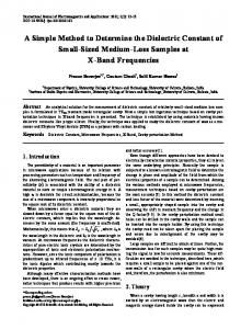
The area close to the center of the data has no volume relative to the rest of the space. Figure 1 illustrates this phenomena in 2 dimensions. Here the center of the data is (0.5, 0.5) and we draw a circle of radius 0.5 around this point and a cube with sides of length 1 such that (0.5, 0.5) is at the center of this cube. The shaded area represents the points not near the center. The previous result tells us that as d increases, this shaded ‘volume’ increases relative to the ‘volume’ of the points ‘near’ the center. From a data perspective, it suggests that as one goes into higher dimensions, the draws from the distribution will reside in the tails instead of the middle. Figure 1. Nonoverlapping ‘volume’ of a hypercube and a hypersphere.
● ●
What this figure illustrates more generally is that fixing covariates at a given level to evaluate a gradient may not be representative of the data. There is nothing inherently wrong with this process in general. Instead, it is worth suggesting that when an applied researcher fixes the data at a point, 2This would be the case if the data were distributed uniformly.
4
THE 45◦ PLOT
they should think of how realistic the resulting estimates are if they are not representative of the data broadly. 2. Visualizing Gradient Estimates – The 45◦ plot To visualize multivariate gradient estimates we introduce the 45◦ degree plot. This figure plots the estimated gradients against themselves, along with either bootstrap or asymptotic confidence bands. Next, the horizontal and vertical axes are plotted. These plots will easily allow the user to distinguish where a bulk of the effects lie, which effects are significant and which effects are insignificant. In sum, these plots can help to clarify the nature of the heterogeneity that exists in ones estimates stemming from the nonlinear model. The elegance of this type of presentation for the results is that it no longer requires selection of where to fix the remaining variables when attention is placed on a specific variable. Given this, we argue that the marginal effect of a covariate for each observation is to be calculated at the observed values of all the covariates for the given observation. This means that while calculating, for example the marginal effect of crime on housing prices in a locality, we evaluate the impact at the observed values of the covariates for the given locality. This is more intuitive and meaningful. It does not make much sense to compute the marginal effect of crime on housing prices in high crime areas, holding the values of the other covariates at the mean if areas with high crime also have other covariate values far from the mean. It is easy to acknowledge areas with higher crime rates also have a lower proportion of high income individuals and may be near industrial areas with poor air quality. To illustrate this concept we provide a simple example in the statistical environment R. We use the Hedonic dataset of Harrision & Rubinfeld (1978).3 Our dependent variable is log(mv), the logarithm of the median value of owner-occupied homes within a census tract in the Boston metropolitan area, while our explanatory variables are lstat, the proportion of people who are of low income status within the tract; nox, the annual average nitrogen oxide concentration in each census tract; ptratio, the pupil to teacher ratio within each tract; and crim, the crime rate within a tract. We use local-constant kernel regression with 2nd-order Gaussian kernels and bandwidths selected using least-squares cross-validation. Standard errors are calculated using a wild bootstrap with 399 replications. One unattractive component of presenting results from nonparametric models is the lack of a predefined form that allow users/readers to gauge the shape of the estimated function. For example, it is common to present a density or histogram of the estimated effects. However, these density plots cannot adequately convey information regarding the statistical significance of a given point since the height of the density is composed of more than one data point for which the confidence intervals are not the same. Moreover, there is the issue of bandwidth (bin width) selection for the density plot that the user must also grapple with. To remedy this it is common to present partial slope plots which hinge on ‘fixing’ the other covariates in the model. Thus, the results can be 3This dataset is available in the Ecdat package (Croissant 2011) in the R statistical environment.
THE 45◦ PLOT
5
entirely dependent upon the level the other variables are set at. Here the 45◦ plot allows graphical depiction of the results while relieving the user of selecting fixed levels for the additional covariates. In the example above, if each of the other three variables are set at their means to construct a partial slope plot, then at best 50% of the actual data lies within a standard deviation of the mean (for ptratio), while for crim, only 36.5% of the observations for the fixed observations are within a standard deviation of the mean. The 45◦ plots for the example are provided in Figure 2. There are several noticeable features from these plots. First, all four of the covariates have estimated positive and negative effects. However, the majority of the estimated gradients for lstat are negative. Consistent with a quadratic type specification, the estimated gradients for both crim and nox appear equally clustered around zero. These could further be enhanced by also plotting a straight line (either vertically or horizontally) where the mean effect lies.
Figure 2. 45 ◦ plot of the estimated gradients for lstat, nox, ptratio and crim.
0.04 0.00
0.05
−0.03
−0.01
0.01
Estimated Gradient
ptratio
crim
● ●
●
−0.010
0.000
Estimated Gradient
0.010
0.001
Estimated Gradient
● ●●● ● ●● ●● ● ● ● ●● ● ● ● ● ● ● ● ● ●● ● ● ● ● ● ● ● ● ● ● ● ● ● ● ● ● ● ● ● ● ● ● ● ● ● ● ● ● ● ● ● ● ● ● ● ● ● ● ● ● ● ● ● ● ● ● ● ●● ● ● ● ● ● ● ● ● ● ● ● ● ● ● ● ● ● ● ●● ● ● ● ● ●● ● ●
● ●
●
●●
−0.003 −0.001
0.01 −0.01
−0.05
●● ●●● ●●● ● ● ● ● ● ● ● ● ● ● ● ● ● ● ● ● ● ● ● ● ● ● ● ● ● ● ● ● ● ● ● ● ● ● ● ● ● ● ● ● ● ● ● ● ● ● ● ● ● ● ● ● ● ● ● ● ● ● ● ● ● ● ● ● ● ● ● ● ● ● ● ● ● ● ● ● ●● ●●
−0.06
●
Estimated Gradient
●
●
●
Estimated Gradient
0.1 −0.1
● ● ●
●● ●●● ● ●● ● ● ● ● ● ● ● ● ● ● ● ● ● ● ● ● ● ● ● ● ● ● ● ● ● ● ● ● ● ● ● ● ● ● ● ● ● ● ● ● ● ● ● ● ● ● ● ● ● ● ● ● ● ● ● ● ● ● ● ● ● ● ● ● ● ● ●● ● ● ● ● ●● ●● ●● ●●
−0.15
Estimated Gradient
nox
−0.3
Estimated Gradient
lstat
0.03
●
●● ●
●● ●● ●● ● ● ●●● ● ●●●● ● ● ● ● ● ● ● ● ● ● ● ● ● ● ● ● ● ● ● ● ● ● ● ● ● ● ● ● ● ● ● ● ● ● ●● ●● ● ● ● ● ● ●● ●● ●● ● ● ● ● ● ● ● ● ● ●
●
−0.0015
−0.0005
0.0005
Estimated Gradient
THE 45◦ PLOT
6
It is also possible to plot out only the significant effects. Doing this results in Figure 3. A slightly clearer picture of how these four variables influence property values. Now a majority of the significant gradients estimates for crim are negative and the effects for nox are equally distributed around 0. The variables also provide estimated effects that are economically significant given that the dependent variable is measured logarithmically while the independent variables all enter the model in levels. Thus, the correct interpretation for ∂y/∂x is to multiply these estimated gradients by 100. Figure 3. 45 ◦ plot of the statistically significant estimated gradients for lstat, nox, ptratio and crim.
0.05
0.04
●●
−0.01
0.01
ptratio
crim
●
−0.010
0.000
0.010
−0.003 −0.001
● ●●● ●● ●●● ● ●● ● ●● ●●● ● ● ● ● ● ● ● ● ● ● ● ● ● ● ● ● ● ● ● ● ● ● ● ● ● ● ● ● ● ● ● ● ● ● ● ● ● ● ●●● ● ● ● ● ● ● ● ● ● ● ● ●● ● ● ● ● ● ● ● ● ● ●● ● ●
0.001
Estimated Gradient
●
●
0.03
Estimated Gradient
●
● ●
●
−0.03
Estimated Gradient
0.01 −0.01
−0.05 0.00
● ●●● ●●● ● ● ● ● ● ● ● ● ● ● ● ● ● ● ● ● ● ● ● ● ● ● ● ● ● ● ● ● ● ● ● ● ● ● ● ● ● ● ● ● ● ● ● ● ● ●● ● ● ● ● ● ● ● ● ● ● ● ● ● ● ●● ●●
0.00
●
−0.06
●
●● ●● ● ● ● ● ● ● ● ● ● ●● ● ● ● ● ● ● ● ● ● ● ● ● ● ● ● ● ● ● ● ● ● ● ● ● ● ● ● ● ● ● ● ● ● ● ● ● ● ● ● ● ● ● ● ● ● ● ● ● ● ● ● ● ● ● ● ● ●● ● ● ● ● ●●● ●● ●● ● ● ●
Estimated Gradient
0.1 −0.1
● ● ●
−0.15
Estimated Gradient
nox
−0.3
Estimated Gradient
lstat
● ● ●●● ●● ● ● ● ● ● ● ● ● ● ● ● ● ● ●● ● ●● ● ● ●● ● ● ● ● ● ● ● ●● ●●● ● ● ● ● ●●●
●
● ●
−0.0015
Estimated Gradient
●● ● ●
−0.0005
0.0005
Estimated Gradient
3. Conclusion While no figure can fully characterize the features of a nonlinear model, the 45◦ plots introduced here should become a useful component of the applied researcher’s toolkit when evaluating and
THE 45◦ PLOT
7
presenting results. Recall that the method is not designed to relay the explicit form of the nonlinearity of the estimated slope, but to provide general features of the extant nonlinearity in a graph that does not hinge on fixing the additional covariates at prespecified levels. Alternative uses of the 45◦ plot could be to construct returns to scale from a translog production function, and to plot out estimated returns to scale (along with their standard errors) with horizontal and vertical lines at 1 (as opposed to the axes). References Croissant, Y. (2011), Ecdat: Data sets for econometrics. R package version 0.1-6.1. URL: http://CRAN.R-project.org/package=Ecdat Harrision, D. & Rubinfeld, D. L. (1978), ‘Hedonic housing prices and the demand for clean air’, Journal of Environmental Economics and Management 5, 81–102. Kottaridi, C. & Stengos, T. (2010), ‘Foreign direct investment, human capital and non-linearities in economic growth’, Journal of Macroeconomics 32, 858–871.