A Study of Website Navigation Methods Thomas S. Tullis, Ellen Connor, Lori LeDoux, Ann Chadwick-Dias, Marty True, & Michael Catani Fidelity Investments 82 Devonshire St, V4A, Boston, MA 02109 USA Contact:
[email protected] This is a case study of an effective approach to finding an optimal design solution. We used an online study to evaluate six different navigation methods for the same website and chose one based on the results. Introduction In the midst of a project during which we overhauled an internal website, we ran into some issues in deciding on a navigation method for the redesigned website. We want to share with you our approach to selecting an appropriate navigation method for the site. Our client favored a style that we predicted would create usability issues; we favored a style that the client wasn't overly fond of. Therefore, we decided to conduct a usability study and let users choose for us! What We Evaluated From our benchmark usability study of the site, it was apparent that many of the difficulties users had with the site were caused by a poor navigational structure. Because there was a difference between our recommended navigation and what the client wanted we decided to take a somewhat different approach towards deciding on a method. We had our UI design team put together prototypes using 6 different navigation approaches. Though the navigation differed, the site content was the same in each prototype. The six approaches are illustrated in the following figures.
Figure 1. "Yahoo-style" Menu. All items under each heading on the left are listed and are selectable, which means that users can go directly to the page they want. However, due to the length of the menu, the page must be scrolled vertically to see the entire menu.
UPA 2005
A Study of Website Navigation Methods
Page 1
Figure 2. Rollover Menu. On mouseover of each menu item, each heading visually changes and provides some textual description of the sub-items. Since this is a one-level menu, there must be a sub-level page that provides links to the sub-topics.
Figure 3. Flash Menu. Clicking on a heading opens the menu item to show its sub-items, and automatically closes the previously opened menu. We have seen usability issues in which the "autoclose" feature annoys some users.
UPA 2005
A Study of Website Navigation Methods
Page 2
Figure 4. Expand/Collapse Menu. Clicking on a "closed" menu opens it. Clicking on an "open" menu closes it. Menus are not closed automatically, though "Open All" and "Close All" functionality is provided. Some people think this type of control is more suited to an online "book."
Figure 5. Drop-down Menu. On mouseover, these menus open automatically, with no clicking required. Sub-menu items are selectable.
UPA 2005
A Study of Website Navigation Methods
Page 3
Figure 6. Fly-out Menu. On mouseover, these menus open automatically, and sub-items are selectable. We have seen usability issues with this type of menu, when users attempt to select a submenu item and mistakenly move the mouse over another menu item, thereby losing the fly-out they originally wanted. This is often called the “diagonal problem”. How We Conducted the Study Since we wanted a large number of participants, we conducted the study online. We advertised for participants in the company email that is distributed daily to all employees. Each participant was randomly assigned to one of the six navigation styles, and that was the only navigation style that the participant used to complete a set of 12 tasks. Each task required the participant to navigate through the prototype to find the answer to a question. The participant had to supply an answer (via an "Answer Number" embedded on the web page) for each task. Users were also provided an “I don’t know” option. Here are samples of the tasks: 1.
You're going to work from home via Remote Access and your company has given you a computer to use. Your boss thinks you need a form from security to take the computer home. Locate this form.
2.
Assume that you work on the 4th floor of 245 Summer St, mail zone V4A. Find out who your floor warden is.
3.
Two representatives from IBM will be coming to Boston next week to work with you on a project. They will be staying several days. Find out what needs to be done for them to get access to your building.
4.
You're going to New Jersey on business next week. Find out any special precautions you should consider before visiting New Jersey.
UPA 2005
A Study of Website Navigation Methods
Page 4
Data We Collected For each task, we collected the following data: 1. 2. 3.
How long it took the user to answer the question. A user-provided rating of the ease/difficulty of each task. The accuracy of the participant's answer.
At the end of the study, we asked for: 1. 2.
An overall rating of the effectiveness of the navigation technique that the participant used. Comments about the navigation technique.
Results A total of 706 employees participated in the study! The random assignment to each of the navigation styles resulted in the following breakdown of participants:
121 121 116 128 110 110
used used used used used used
the the the the the the
Yahoo-style menu Rollover menu Flash menu Expand/Contract menu Drop-down menu Fly-out menu
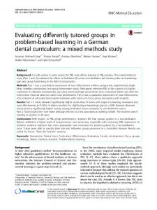
Error Data The Yahoo-style and Drop-down menus resulted in significantly fewer errors than the other menu styles. "Errors" included the cases where the participant gave no answer or indicated that they did not know. (See Figure 7.) Error Rate 30% 25% 20% 15% 10% 5%
Fl you ts
ns ro pdo w
D
ol la ps e
Fl as h
Ex pa nd /C
ol lo ve r R
Ya ho ost yl e
0%
Figure 7. The Yahoo-style and Drop-down menus resulted in significantly lower error rates than the other navigation methods. ("Errors" include the cases when participants gave no answer.) Since these results showed significant differences between the methods, we used these data as a primary factor in our decision.
UPA 2005
A Study of Website Navigation Methods
Page 5
Time Data Figure 8 shows that there were no significant differences in time per task between any of the navigation methods. Participants took almost the same amount of time with each method, so time was not a factor in making our decision. Time per Task 45 40
Time (sec)
35 30 25 20 15 10 5
Fl you ts
ns
D
Ex pa nd /C
ro pdo w
ol la ps e
Fl as h
ol lo ve r R
Ya ho ost yl e
0
Figure 8. There were no significant differences in time per task between the navigation methods. The time included: time to read the question, find the answer, provide an "ease/difficulty" rating on the task, and provide optional comments on the task. Because there was no significant difference, we didn't use these data when deciding which navigation method to choose. Subjective Ratings All of the subjective ratings (on a seven-point scale) were very high. There were no significant differences between any of the methods, as shown in Figure 9. Overall Subjective Rating 6.0 5.0 4.0 3.0 2.0
Fl you ts
ns ro pdo w
D
ol la ps e
Fl as h
Ex pa nd /C
ol lo ve r R
Ya ho o
1.0
Figure 9. The overall subjective ratings were all very high (which is good), and showed no significant differences between the navigation methods. Because there was no significant difference, we didn't use these data when deciding which navigation method to choose.
UPA 2005
A Study of Website Navigation Methods
Page 6
Which Navigation Method Did We Select? Since the Time Data and Subjective Ratings showed no significant differences between the navigation methods, we didn't use that data in our decision. Instead, we focused on the accuracy/error data. The Yahoo-style and Drop-downs were identical. Therefore, we needed to look at the pros and cons of using each method. Yahoo-style Pros: The entire site structure is spelled out in the menus, so users can see everything at once. The user can click directly on the target link, without having to select the link from a sub-menu or interim menu-like page. Cons: This method takes up lots of screen real estate, and requires vertical scrolling to see the entire menu, which ends up "below the fold," even when the browser window is maximized. Drop-downs Pros: This menu takes up far less screen real estate that the Yahoo-style, thus leaving more room for actual page content. Making additions or changes to the menu doesn't change the amount of real estate required for it. It does not require vertical scrolling to see the entire menu. Cons: You can’t see the entire set of selections without at least mousing over each header. The window may need to be maximized (depending on the actual control used to implement the menu) to see the full set of menu headers across the page without scrolling. Conclusion After evaluating the pros and cons, we decided to choose the Drop-down menus as our navigation method. A subsequent lab-based usability test of the complete prototype using the drop-down menus showed that users were able to use it to navigate the site very effectively. For more information about that usability test, and the entire context of the redesign, see the related paper at UPA 2005 on “Extreme Makeover: UI Edition”. This process shows the impact of gathering usability data to support your user interface design choices.
UPA 2005
A Study of Website Navigation Methods
Page 7