A Visual Workspace for Constructing Hybrid MDS Algorithms and Coordinating Multiple Views Greg Ross*
Matthew Chalmers† Department of Computing Science, University of Glasgow, Glasgow, United Kingdom
Abstract Data can be distinguished according to volume, variable types and distribution, and each of these characteristics imposes constraints upon the choice of applicable algorithms for their visualisation. This has led to an abundance of often disparate algorithmic techniques. Previous work has shown that a hybrid algorithmic approach can be successful in addressing the impact of data volume on the feasibility of multidimensional scaling (MDS). This paper presents a system and framework in which a user can easily explore algorithms as well as their hybrid conjunctions and the data flowing through them. Visual programming and a novel algorithmic architecture let the user semi–automatically define data flows and the co-ordination of multiple views of algorithmic and visualisation components. We propose that our approach has two main benefits: significant improvements in run times of MDS algorithms can be achieved, and intermediate views of the data and the visualisation program structure can provide greater insight and control over the visualisation process. CR Categories: I.5.3 [Pattern recognition]: Clustering – Algorithms; E.1 [Data Structures]: Graphs and networks; D.1.7 [Programming Techniques]: Visual Programming; I.3.6 [Computer Graphics]: Methodology and Techniques – Interaction techniques; Keywords: Data-flow, visual programming, multidimensional scaling, multiple views, hybrid algorithms, complexity
1 Introduction There is a multitude of algorithms available for clustering and laying out abstract data. The different algorithmic approaches seem to be tailored to specific types of data. Some algorithms perform well with data sets of low cardinality and dimensionality, such as the basic spring model [Eades 1984]. Other algorithms work best with high cardinality data, an example of which is the self–organising map or SOM [Kohonen et al. 2000]. In training, a substantial training set allows the SOM to reveal complex nonlinear structure in a very large body of data. ---------------------------------------------* e-mail:
[email protected] † e-mail:
[email protected]
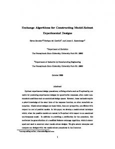
Other features of the data set also affect the applicability of algorithms, such as data distribution. For example, K-means clustering [MacQueen 1967] is most effective when the data is distributed in spherical Gaussian clusters [Bradley and Fayyad 1998]. In a working environment, corporate memory and project-specific databases tend to start off small and gradually evolve into large information repositories. While it would be feasible to visualise the inter-object relationships with a force-directed layout algorithm in the infancy of such a database, it would become less and less effective as the database matures and demands a more computationally feasible solution. Previous work has shown that hybrid algorithmic approaches to visualisation scale up to relatively high-volume data sets, even though some of the constituent algorithms would be too costly on their own if applied to the entire set [Morrison et al. 2002]. This would suggest that when applied to a growing database, algorithmic steps could be bypassed in the repository’s infancy and incorporated as it approaches maturity. Or, in the case that volume fluctuates, the hybrid algorithm could fluctuate and adapt with it. We present an implemented system and framework called HIVE (Hybrid Information Visualisation Environment) that utilises direct manipulation to allow users to interactively create and explore hybrid MDS algorithms. Figure 1 shows screen-shots of the system. Visual programming and a novel algorithmic architecture are proposed as a means to let the user semi– automatically co-ordinate multiple views and interactively steer data flows. This paper expands on a shorter version [Ross and Chalmers 2003] in which we provided an account of earlier work on HIVE. Within the following pages we shall give a more detailed account of HIVE’s implementation of the data-flow model, visual programming techniques and system architecture and also discuss recent developments such as dynamic run-time loading of algorithmic and visualisation components (Section 4.1.1). The paper has seven sections. Section two describes related work including multidimensional scaling, the data-flow model and visual programming. Section three illustrates the hybrid algorithmic framework, upon which the system is built. Section four describes the HIVE architecture and implementation. Early experience of using HIVE is discussed in section five. Finally, sections six and seven present future work and conclusions respectively.
Figure 1. Two screen-shots of the HIVE interface. The image on the left illustrates interconnected components that import, transform and render multidimensional data. The algorithmic components collectively represent the O(N√N) hybrid MDS algorithm of [Morrison et al. 2002]. Thick lines that link modules represent data-flows while thin ones, connecting scatterplots and other visualisations, represent the connections between interlinked interactive views. The image on the right shows the same scatterplots enlarged and supplemented with a fisheye table component (bottom-right) and histograms (bottom-left). The data consists of 5000 points sampled from a 3D ‘S’ shaped distribution.
2 Related work
2.2 Visual programming
The HIVE system permits users to easily create and experiment with hybrid algorithms for generating visualisations of their data. This process is a visual one in that algorithms and visualisations are represented by visual components that afford direct manipulation. The following sub-sections describe topics in the literature that have influenced HIVE’s development.
At around the time when scientific visualisation was being established, the concept of visual programming was also becoming prominent [Haeberli 1988; Upson et al. 1989]. Conventional programming languages, whether high level or low level, tend to be built around a vocabulary where the ‘words’ consist of primitives (characters). Visual programming languages are at a higher level of abstraction than conventional languages. Haeberli [1988] states that a visual programming environment is any system that has adopted a graphical 2D notation for the creation of programs. The visual primitives that make up the vocabulary of these programs are essentially representations of well-defined aggregates and the (direct) manipulation of these aggregates means that complex programs can be produced more easily than with conventional languages. This is because the abstraction allows a greater degree of code or function reuse and the workings of the programs themselves are more readily understood and communicated due to their visual and spatial properties. It can also be argued that if the manipulation of the visual constructs is flexible enough—for example, the user may wish to place them arbitrarily on the display surface—then this allows greater freedom for externalising the plans and thoughts of the user [Hendry and Harper 1999].
2.1 Multidimensional scaling In the application of MDS we are primarily concerned with a lower dimensional representation of multivariate proximity data. Such data are composed of elements or observations that have three or more variables (multidimensional) and where the similarity between one datum and any other can be quantified. The appeal in reducing dimensionality is simple: to cater for visualisation. For example, scatterplots are extremely useful graphical tools, but they are restricted to a 2D spatial representation – they only have two real axes. MDS has a relatively long history and there are many techniques. In [Buja et al. 1998], two categorisations of MDS methods are devised that are based upon the underlying mechanics of early work in [Torgerson 1952], [Shepard 1962] and [Kruskal 1964]. Torgerson’s work is derived from the Eckart-Young SVD approximation theorem [Eckart and Young 1936]. We feel that the abundance of MDS techniques justifies our system, HIVE, as a visual workspace in which it is possible to implement, combine and compare them.
Using visual programming for constructing InfoVis algorithms reinforces our commitment to and interest in graphical interaction in computing. With regard to the means-end relationship, the means are a visual process and the end result is a tool that produces the visual information originally sought after— visualisations are useful for producing other visualisations.
2.3 Data-flow model Before visual programming was available in scientific visualisation tools, the functional components of the tools were hidden from the users and they had no control of the flow of data between them. The stream of data from input through calculation functions to mapping, filtering and rendering graphics and their control was pre-set and the scientists and engineers had to make do as best as they could for their tasks. In the words of Haeberli, “Instead of the user driving an application, the user is often driven and constrained by the application.” Visual programming addressed a number of these problems, moving away from these monolithic and static applications and providing integrated environments where a user without programming expertise could customise his or her applications. Visual programming in the application design cycle takes the form of a data–flow architecture. In this architecture, users are presented with a library of modules—application components— with specific functions. The users can select which modules will be useful in their application and draw, via direct manipulation of graphical representations, a block diagram and create connections between modules for the data to flow through. This quick and easy process meant that scientists and engineers could concentrate on the problems being studied instead of dealing with the overhead of re-coding and configuring monolithic applications.
2.4 Multiple-view co-ordination Multiple view co–ordination allows two or more related views of data to run concurrently, with views evolving as data flows into them from some common ancestor in the data flow graph, or as the user interacts with one of them. A well–known example of this is brushing and linking [Becker and Cleveland 1987]. By coordinating multiple views so that changes made in one view are reflected in other views, interaction can be said to flow between them. This lets the user focus on specific parts of the data set, and see them within the context of other views. In evaluating their snap-together visualisation system, North and Shneiderman have found that this enhances user-performance in data analysis tasks [North and Shneiderman 2000]. Co-ordination of activity across multiple views gives the user greater control over the visual representations of the data. This ultimately nurtures discovery. In [Buja and Swayne 1996] it is described as linking “…a graphical query to a graphical response”, and in [Eick and Wills 1995] it is stated that it gives users the impression that they are touching the data. HIVE takes advantage of the data-flow model and visual programming. To create a hybrid algorithm, a user drags components from the system’s tool bar into the drawing region (see figure 1) and then interconnects them by dragging links between ports on the components. Not only is the data-flow set up in this manner, but the view co-ordination can also be defined this way. After connecting visualisation tools such as scatterplots to the output ports of algorithmic components, ‘Select’ ports can be linked between view components to establish ‘brush and link’ functionality. Hybrid algorithms can exhibit a lower run-time than spring models run upon the whole data set, as discussed in [Morrison et al. 2003], but they also lend themselves to the production of intermediate visualisations. The benefits of this hybrid approach
are two-fold: efficiency is enhanced and intermediate views provide more insight into the data. For example, the hybrid algorithm depicted in Figure 1 (left) uses a spring model of a sample of the full data set, to gain an initial small-scale 2D layout. In the left frame of Figure 1, scatterplots have been hooked up to intermediate stages of the hybrid algorithm to allow for comparison. The three layouts have been positioned by the user on the right hand side of the frame. The sample layout is fed into another module, which interpolates the remainder of the set to produce a third and final scatterplot, shown in to the right of the frame. In the right hand frame in the figure, the fisheye table shows the layout points sorted on the x dimension and histogram views have also been connected to depict the x and y distributions of the 3D set. If we then use brushing to select a range of rows in the table or a region in a histogram, we highlight the corresponding points in the scatterplots and reveal more of the structure of the data. An extension of the work presented in [Ross and Chalmers 2003] allows for the neatly tiled layout of visualisation components, as in the right hand frame of the figure.
3 Hybrid algorithmic architecture HIVE has been inspired by some of the existing data-flow and visual programming systems that are prominent in the literature and common in the marketplace. Upson et al’s Application Visualisation System (AVS) [Upson et al. 1989] and North and Shneiderman’s snap-together system [North and Shneiderman 2000] are two good examples. AVS is predominantly aimed at scientific visualisation, for modelling or simulating physical processes such as fluid dynamics, and concentrates on channelling data through algorithmic processes for transformation and rendering. The emphasis here is on the data-flow. North and Shneiderman’s snap-together system, on the other hand, is concerned with information visualisation. In this system there is less emphasis upon the algorithmic processes for transforming data and more on the transformation of graphical representations by way of multiple interconnected views. Here the flow of interaction takes precedence.
Data import
Data transformation
Render
Data transformation
Render
Render
Figure 2. Data-flow and view co-ordination combined. Solid arrows represent data-flow between visual modules and dashed arrows depict co-ordination links between multiple views in HIVE. HIVE borrows from the data-flow model of AVS to be flexible in creating efficient algorithms for the visualisations, effectively opening the algorithmic ‘black box’ and allowing the user to interactively steer the flow of data. However, to be in line with the goal of information visualisation, it concentrates on exploration rather than simulation. This is achieved by supplementing the data-flow with interaction flow across multiple views, rather like
the snap-together system (see Figure 2). It must be said, however, that this approach does not come without drawbacks. It is important to note that if the level of abstraction used in the visual programming language is too low then there might be too many visual modules, in that programming would become complicated and the flow networks too large and hard to manage in the available screen space. As exhibited by the left hand frame of Figure 1, the modules used in only one hybrid algorithm can potentially use up much of the display space making it difficult to run more than one algorithm concurrently. One solution being considered is to allow the user to dynamically increase the level of abstraction by aggregating groups of modules, simplifying the graph of interconnected modules and the programming task. As well as implementing visual programming to steer data-flow and co-ordinate multiple views, HIVE has at its core a novel hybrid algorithmic framework, exploring a general approach to the composition of efficient and flexible hybrid algorithms. The choice of each algorithmic component is influenced by many characteristics including computational cost, the cardinality, dimensionality and distribution of the data, and the other interaction components that might be used within a larger workspace, such as scatterplots and fisheye tables. We suggest that these choices can be made incrementally, so that the user employs intermediate representations as they work with and explore their data. We also suggest that the system can assist the user by using a pre-authored classification of data—based on, initially, cardinality and dimensionality of data sets—and a corresponding classification of available algorithmic components based on the classes of data each is suited for. This offers us an incremental and combinatorial approach to the creation of efficient and informative hybrid visualisations.
Cardinality (N)
object: D. We roughly categorise D and N using an ordinal range (high, medium and low), and then we can categorise an algorithmic component with values of D and N for ‘good’ inputs and for the component’s outputs, effectively stating our opinion that the component is best suited to such combinations of D and N. For example, we consider that the input to K-means clustering should be medium to high in D and N, whereas a canonical O(N2) spring model algorithm can only handle low N and low to medium D. As shown in Figure 3, the choice of components and how they are connected allows one to solve familiar problems in new ways. The hybrid algorithm of [Morrison et al. 2003] transforms a large set of data of high D to low D. It can be thought of as a move across the grid of combinations of D and N, stepping from (H, H) to (L, H)—but taking an indirect route via (H, L) and (L, L) that involves sampling, spring model layout of the sample, and interpolation based on that intermediate representation. It should be noted that in the previous example the representative goal state of the data is equivalent to (L, H) in figure 3 – a lowdimensional representation of each and every datum. However, this might not always be the best representation. In cases where there are a large number of elements in a data set it might be better to aggregate groups of objects to avoid occlusion and save screen space. For example, it might be wise to plot only cluster centroids in a scatterplot and have another view updated with the cluster members each time a centroid is selected. This representation could be equivalent to the (L, M) state in Figure 3. Tentative default values for these ordinal categories of data are as follows. We derived these values from our own experience of constructing hybrid algorithms, however, HIVE allows the user to tailor them: Low D < 3
Dimensionality (D)
H, H
H, M
H, L
3