An Integrated Task-Based Framework for the Design and Evaluation of Visualizations to Support Preferential Choice Jeanette Bautista and Giuseppe Carenini Department of Computer Science University of British Columbia 201-2366 Main Mall Vancouver BC V6T 1Z4
bautista,
[email protected] ABSTRACT In previous work, we proposed ValueCharts, a set of visualizations and interactive techniques to support the inspection of linear models of preferences. We now identify the need to consider the decision process in its entirety, and to redesign ValueCharts in order to support all phases of preferential choice. In this paper, we present our task-based approach to the redesign of ValueCharts grounded in recent findings from both Decision Analysis and Information Visualization. We propose a set of domain-independent tasks for the design and evaluation of interactive visualizations for preferential choice. We use the resulting framework as a basis for an analytical evaluation of ValueCharts and alternative approaches. We conclude with a detailed discussion of the redesign of our system based on our analysis.
Categories and Subject Descriptors H.5.2 [Information Interfaces and Presentation]: User Interfaces—Graphical user interfaces (GUI); I.3.6 [Computer Graphics]: Methodologies and Techniques—Interaction Techniques; H.4.8 [Information Systems Applications]: Types of Systems—Decision Support
General Terms Design, Human Factors
Keywords Visualization techniques, preferential choice, task analysis
1.
INTRODUCTION
In decision theory the process of selecting the best option out of a set of alternatives is called preferential choice. Many personal, business, and professional preferential choice decisions are made everyday. Often these are complex decisions that require consideration of multiple objectives. We seek
Permission to make digital or hard copies of all or part of this work for personal or classroom use is granted without fee provided that copies are not made or distributed for profit or commercial advantage and that copies bear this notice and the full citation on the first page. To copy otherwise, to republish, to post on servers or to redistribute to lists, requires prior specific permission and/or a fee. AVI ’06, May 23–26, 2006, Venezia, Italy. Copyright 2006 ACM 1-59593-353-0/06/0005 ...$5.00.
217
the perfect win-win situation, but in most cases, this solution does not exist and we are forced to consider tradeoffs among our objectives. For instance, consider the decisions that may have to be made when planning a vacation. When selecting a hotel within a specified price range, you may find one that is situated at the ideal location but does not have all the amenities you seek. In this case you will have to consider the tradeoffs. People are generally not very effective at considering tradeoffs among objectives, and require support to make this process easier [7]. Decision analysis in the last forty years has investigated methods to support decision-making with conflicting objectives, but the use of tools to facilitate the learning and use of these methods are not widespread. According to prescriptive decision theory, effective preferential choice should include all steps of the decision-analysis process. We identify this iterative process as three distinct interwoven phases. First, in the model construction phase, the decision maker (DM) builds her decision model based on her objectives: what objectives are important to her, the degree of importance of each objective, and her preferences for each objective outcome. Secondly, in the inspection phase, the DM analyzes her preference model as applied to a set of alternatives. Finally, in sensitivity analysis, the DM has the ability to answer “what if” questions, such as “if we make a slight change in one or more aspects of the model, does it effect the optimal decision?” [7]. In the development of a tool for preferential choice, we argue that full support for and fluid interaction between - all three phases are essential in making good decisions. In [6] we presented ValueCharts (VC), a set of interactive visualization techniques to support preferential choice. VC in its original form was designed by mainly focusing on supporting the model inspection phase. The design of the interface relied on a rather simple task analysis exclusively based on decision theory. In this paper, we present the second major iteration in the development of VC, in which we have redesigned our system by taking into account the decision process in its entirety. We present the Preferential choice Visualization Integrated Task model (PVIT): a much more sophisticated compilation of domain-independent tasks than our previous set as it considers all aspects of preferential choice, some new ideas from decision theory, and more importantly, an integration of task frameworks from the area of Information Visualization (InfoVis). To first illustrate the usefulness of our task model, we performed an analytical evaluation of proposed tools and
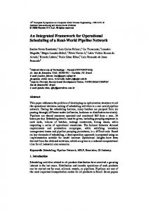
Figure 1: The original ValueCharts and a decision model based on the hotel domain Results of both studies indicated that although VC was very well-received by the subjects, the fact that VC does not effectively support all the tasks involved in preferential choice has a negative impact on the quality of the decision process and on the users’ perception of it. These results further support our argument and the need to take a more comprehensive look at all tasks that ValueCharts should support.
related work. This analytical process identifies both the strengths and weaknesses of the original VC as well as other tools, driving the redesign of our new system that aims to provide support for all the PVIT tasks. In the remainder of the paper, we first briefly describe the original idea of ValueCharts and its development since its introduction in 2004. We then detail the more sophisticated and comprehensive hierarchical task analysis that we performed and the resulting task model. Next, we discuss related work through a summary of the analytical evaluation of competing tools according to our integrated task framework. Finally, we introduce ValueCharts Plus and explain the rationale behind our redesign of the interface.
2.
3. TASK ANALYSIS In order to identify a set of domain-independent tasks that should be supported by interactive visualizations for preferential choice, we incorporate frameworks and task taxonomies from the field of InfoVis with concepts from Decision Theory.
VALUECHARTS
ValueCharts is a set of interactive visualization techniques for preferential choice that aid in the analysis of a DM’s preference model based on the Additive Multiattribute Value Function (AMVF) 1 . The objectives in the AMVF are arranged hierarchically, and are represented at the column headings of the VC (See Figure 1). The horizontal length of each column indicates the relative weight assigned to each objective. Each row represents an alternative, thus each cell portrays an objective corresponding to an alternative. The amount of filled color relative to cell size depicts the alternative’s preference value of the particular objective. The values are then accumulated and presented in a separate display in the form of horizontal stacked bars, displaying the resulting score of each alternative. Several interactive techniques are available in the current prototype to further enable the inspection of the preference model. For instance, sensitivity analysis of objective weight is enabled by sliding the column headings to the desired weight. Double-clicking on the column heading ranks the alternatives accordingly. Center-clicking on each cell displays the corresponding domain value and range of values, respectively. The original ValueCharts proposal enables all tasks that were intended to be supported. From the description it is apparent that VC provides only limited support for preferential choice when considering the decision process in its entirety [7]. Since the introduction of ValueCharts, two studies and preliminary evaluations were performed. The first investigated how the preference model enhances a data exploration tool by integrating ValueCharts with a dynamic query interface. The second was a case study intended to observe users working with VCs in a domain of their own interest.
3.1 Building the PVIT model The process of preferential choice In the development of our hierarchical PVIT model, we take a top-down, task-based approach that begins with the goal that defines preferential choice: to select the best alternative. The general decision-analysis process is depicted in Figure 2b [7]. The main steps in the process can be identified within 3 main phases (or general higher level decisionmaking tasks): construction, inspection, and sensitivity analysis (Figure 2a). We take these phases to represent the first decomposition in our task analysis (Figure 3, Level 1).
b. a. construction
Identify the decision situation and understand objectives Identify alternatives Decompose and model the problem
inspection
Choose the best alternative Sensitivity analysis
sensitivity analysis
Is further analysis needed? Implement chosen alternative
Figure 2: (a) Higher-level tasks that group steps from (b) the decision analysis process
1 For a detailed description of AMVF and ValueCharts, see [6]
218
Higher-level InfoVis tasks
and knowledge task approaches characterize two different types of visualizations. Shneiderman’s TTT can effectively model visualizations that allow the DM to explore a set of alternatives according to their attributes’ domain values (data visualization) (e.g. [17, 19]). In contrast, Amar and Stasko’s framework suggests that by bridging the analytical gap between the data and the representing model, a visualization can effectively model to help the DM to examine alternatives according to a model of her preferences (model visualization). The suggested best solution is to have both model and data visualization and to integrate them well [10]. We consider this principle in our task analysis and conjoin the TTT for data visualization with Amar and Stasko’s model visualization framework. Since the analytical gaps represent what is needed for effectively perceiving and explaining relationships, the juncture between the two frameworks results from expanding the relate task from [16] with the set of knowledge tasks from [1]. The resulting tasks from this integration can then be designated as subtasks that support each of the decision-making phases. Although relate would have to span all of construction, inspection, and sensitivity analysis, the further refined knowledge tasks fittingly classify into each phase (Figure 3, Level 2). These high-level visualization tasks constitute our general framework for the design and evaluation of a visual interface that supports preferential choice.
We take a shift in our perspective and focus on taxonomies of tasks, both old and new, proposed in the field of Information Visualization. Probably the most influential task taxonomy proposed in InfoVis is Ben Shneiderman’s proposal of a task by data type taxonomy (TTT) [16] where the data types (1-, 2-, 3dimensional, temporal, multidimensional, tree and network) are on the left side of the TTT, and are organized by the problems users are trying to solve. For the task domain, only a set of very abstract tasks is described, noting that more refinements would be the next natural steps in expanding this table. This set of tasks expands the information-seeking mantra of “Overview first, zoom and filter, then details on demand” with three other tasks: relate, history, and extract. Although TTT was originally proposed as a descriptive and explanatory taxonomy, it has been often interpreted as a prescriptive framework. Several researchers developing novel information visualization tools have referred to TTT as a justification for their methodological approaches. A literature survey of 52 citations of [16] suggest that Shneiderman’s information-seeking mantra should merely be used as a guideline [8]. Thus, in the initial stage of our analysis, we use TTT as the next abstract level after the first decomposition based on decision theory (see Figure 3 Level 2a).
Applying specific tasks from decision theory
Further decomposition is guided by a very recent proposal by Amar and Stasko [1] for a knowledge task-based framework for the design and evaluation of InfoVis systems. They note that frameworks like TTT typically center on faithful correspondence and representation of data, but fail to facilitate higher-level analytical tasks such as decision-making and learning. They introduce the concept of “analytical gaps” which are the gaps between representation and analysis. To bridge these analytical gaps, the authors propose a taxonomy of common subtasks to better support designers and evaluators of information visualization systems. They present higher-level knowledge tasks that visualization systems should support for complex decision-making and learning. The knowledge tasks are categorized into two major types of gaps that need to be bridged. The Rationale gap is the gap between perceiving a relationship and actually being able to explain confidence in and usefulness of that relationship. To bridge this gap the authors suggest the following knowledge tasks: expose uncertainty (expose and show possible effects of uncertainty in data measures and aggregations), concretize relationships (clearly present what comprises the representation of a relationship, present concrete outcomes where appropriate), and formulate cause and effect (clarify possible sources of causation). To bridge the Worldview gap, or the gap between what is being shown and what actually needs to be shown to draw a conclusion, they propose the following subtasks: determine domain parameters (provide facilities for creating, acquiring and transferring knowledge about important domain parameters within a data set), multivariate explanation (provide support for discovery of useful correlative models and constraints) and confirm hypothesis (provide support for the formation and verification of hypothesis). The integration of these knowledge tasks with TTT in PVIT is based on the following consideration. The TTT
We continue our top-down approach with the next step to apply concepts from decision theory to our high-level framework. To integrate a decision-theoretic point of view at this level of the hierarchy, we first apply the original set of tasks proposed by Carenini and Lloyd [6]. Besides the task to provide an overview of all relevent information, the basic tasks fit as a model visualization into the knowledge task framework. For multivariate explanation, tasks to support assessment of the contribution to each alternative’s total value of each objective, comparison of alternatives with respect to objective value, inspection of the hierarchy of objectives, and assessment of objective weight contribution to total are applied. To concretize relationships, they suggest tasks to enable comparison of alternatives with respect to total value, and inspection of range and value function. The only task that does not fall within the inspection phase is sensitivity analysis of changing a weight, which is used to formulate cause and effect. This set of tasks incorporated into PVIT is represented in Figure 3, Level 3a. This illustration apparently shows that the task analysis for ValueCharts was limited to the inspection of the DM’s preference model with some support for sensitivity analysis. At this stage in our analysis, it is clear that support for preferential choice requires us to consider a larger set of basic tasks. First, the construction of the decision model involves the definition of the objectives, alternatives, value function, and initial weighting. These tasks can be naturally placed under zoom/filter and determine domain parameters. Secondly, although Carenini and Lloyd’s list contributed greatly to the inspection tasks, two more should be added according to our framework. Domain values should be incorporated as details on-demand. In addition, the representation and display of missing data should be added to expose uncertainty. Finally, several other tasks should be included to strengthen the sensitivity analysis phase. Manipulation of
219
GOAL: SELECT THE BEST ALTERNATIVE CONSTRUCTION level
LEGEND
Zoom/Filter
task 1
1. DECISION SUPPORT TASKS
INSPECTION
2
SENSITIVITY ANALYSIS
Details on-demand
Filter out uninteresting alternatives (list creation) Addition/modification of alternatives at any point
8
alternatives
Inspection of domain values of each alternative
Overview
2. a)
9
Maintain an overview of all relevant information
Shneiderman's TTT
Relate
b)
confirm hypothesis
Amar & Stasko's Knowledge Tasks
3
Selection/marking of an alternative
multivariate explanation 10
11
3. a) Carenini & Lloyd's basic cognitive tasks
b) New tasks from our task analysis
c)
determine domain parameters 4 5
New tasks from VFT and ADM
History/Extract 18
6 7
expose uncertainty
For each alt, assessment of the contribution to total value of each objective
14
Comparison of alternatives with respect to objective value
Represent/display missing data
concretize relationships
12
Assessment of the extent to which each objective weight contributes to total
15
Comparison of alternatives with respect to total value
13
Inspection of hierarchy of objectives
16
Inspection of component value function
17
Inspection of range on which each primitive objective is defined
Selection of objectives (hierarchy creation) Definition of value function of each primitive objective Determine initial objective weighting Addition/modification of objectives at any point
Comparison of results among different evaluations
formulate cause & effect 19
Sensitivity analysis of changing a weight
20
Sensitivity analysis of changing a component value function
model and alternatives
model
Figure 3: PVIT: Preferential choice Visualization Integrated Task model the value function should be incorporated in order to formulate cause and effect, as well as undo, save, and print capabilities for comparison of results among different evaluations (history/extract). We present this supplementary list of tasks to complete our set in Figure 3, Level 3b. At first glance, it appears that this consequential list is sufficient for our analysis. On the contrary, it fares well for traditional decision theory methods, but is incomplete due to the necessary consideration of the changes in decision theory over the 1990s. In behavioural decision theory, a large number of studies have shown that human decision making is inherently adaptive and constructive (Adaptive Decision Making - ADM) [13]. In prescriptive decision theory, we have witnessed a move from an alternative-focused approach to a Value-Focused Thinking (VFT) approach [11]. One key property of ADM is that stating preferences is a process rather than a one-time permanent listing. This view is further supported by VFT’s emphasis on how the iterative process of refinement and objective quantification can reveal further hidden objectives. Furthermore, according to VFT, focusing on values first stimulates the DM to search for more desirable alternatives or possibly creatively devise new alternatives that better achieve her objectives. We identified the need to add tasks that should be enabled to consider the new conceptual shifts in decision theory (Figure 3, Level 3c): (i) addition or modification of objectives at any point, and (ii) addition or modification of alternatives at any point.
and sensitivity analysis. It depicts the integration of the two frameworks, and further illustrates how they fit basic tasks that deal with visualization of data (alternatives), the preference model, and a combination of both.
3.2 Application of PVIT The result of our task analysis is a set of 20 basic tasks that is beneficial to the design and evaluation of visualization interfaces to support preferential choice. The task set can be used to guide the design of such decision support systems, as well as act as a set of heuristics for the analytic evaluation of prototypes. In addition, the PVIT list can also serve as a basis of user tasks for empirical evaluations. We first use the PVIT model to compare alternative designs for tools intended to support preferential choice. Meanwhile we take a closer look at the current design of ValueCharts to identify aspects that may need some redesign.
4. ANALYTICAL EVALUATION In order to gain a deeper understanding of how our system fares when compared to competing tools, we performed an analytical evaluation.
4.1 Survey of related tools We first explored related work to determine which tools we should consider in the detailed evaluation. We found that some InfoVis proposals such as [19, 17] only allow the user to explore the set of available alternatives according to their attributes’ domain values and not according to a model of the user’s preferences. In addition, some systems do con-
The complete PVIT model is outlined in Figure 3 as subtasks of the three main tasks of construction, inspection,
220
Figure 4: Results of the analytical evaluation by phase
4.3 Evaluation results
sider the user’s preference model, but only provide minimal inspection of it [5, 14]. There are also some proposals and commercial tools inspired by decision theory that we find only incorporate simple charts and traditional visual means [12, 18]. After this preliminary screening, we decided to conduct the analytical evaluation on three systems that support visualizations of alternative domain values when applied to preference models. AHP Treemaps (TM) [3] is an interface that uses a treemap visualization to inspect preference models based on the Analytic Hierarchy process, a different, but comparable method with ours. CommonGIS (CGIS) [2] is a tool for interactive exploration and analysis of georeferenced data which supports many different methods of decision making including linear models. It introduces two methods for visualizing preferences: utility signs and parallel coordinates views. Finally, among the commercial tools for decision analysis, we chose Visual Interactive Sensitivity Analysis (VISA) [4] which stresses visual analysis and boasts a focus on sensitivity analysis techniques.
Construction It is apparent from the summary that CGIS and VISA are the only tools that provide a method of constructing the preference model. Their total scores indicate that they are missing support for some construction tasks, and a closer look at the individual objective scores indicate a number of reasons for this. First, CGIS supports only selection from given information, whereas VISA only supports construction of new models: for tasks 1 and 4, CGIS only supports a) filtering alternatives and selecting objectives, and VISA only supports b) alternative and objective creation. Secondly, CGIS has limited support for specifying value function, since it only supports positive and negative linear functions for only continuous domain values. CGIS does, however, provide support for marking alternatives, while VISA does not. Both tools support changes at any point (tasks 2 and 7), and neither tool supports a definition of initial weighting.
Inspection
4.2 Comparison scoring
ValueCharts outscores the other interfaces in the inspection phase, though the analysis indicates room for improvement. VC only ranks third in task 9 (overview) because the objective names are often hidden when the objective is lowweighted. The range of values (task 17) is an on-demand feature as opposed to CommonGIS, which has a persistent view of the minimum and maximum values. VC’s detailson-demand domain value feature (task 8) provided only limited capability for comparison: only one alternative’s value of only one objective is available. CommonGIS, which uses two visual techniques that can be used in coordination, ranks second overall in the inspection phase. One major shortcoming of CGIS is that it does not consider a hierarchy of objectives (task 13) which directly affects other inspection tasks (10 and 11 considers both a) primitive and b) abstract objectives). Treemaps also scored fairly well in this category, but some comparison techniques are difficult in this view (see [6] for a detailed comparison to VC). Support for tasks to concretize relationships (16 and 17, w.r.t. AHP) is lacking, as it seems in [3]
Our method of evaluation compares each interface task by task 2 , with further refinements of the basic tasks into subtasks where appropriate. These subtasks may be defined in [6], or resulted from further task decomposition as we discovered different techniques offered by the systems (to be explained later in the discussion). We first looked at whether or not the task was supported, and if there was an obvious difference in the extent of support we ranked them appropriately, according to known concepts from Information Visualization and Human-Computer Interaction. The ranked scores were then applied to the SMARTER [9] weighting technique and then normalized to a value between 0 and 1. The result of our analysis was then plugged into a ValueCharts and is summarized by phase in Figure 43 . 2
Please refer to the numbering scheme in Figure 3. In addition to preferences, ValueCharts was also developed for use in evaluations, as we demonstrate in this section. See [6] for details. 3
221
that it was developed for users with extensive knowledge in AHP. VISA ranks last in our evaluation mainly because only simple techniques of visualization on a per-objective basis are available, resulting in cumbersome inspection and comparison. Notice that no interface supports the representation of missing data (task 14).
ated sensitivity analysis interaction would also be confusing. The user would be changing the function points up and down while the resulting chart view dynamically updates the view left and right. So, instead of trying to incorporate the value function to our design, we decided to adjust our design to fit the value function. We propose a new version, the rotation of ValueCharts (Figure 5). This vertical design addresses the problem described above by providing a consistent orientation between value bars and function axis.
Sensitivity analysis When looking at the sensitivity analysis results, VC’s low ranking strongly suggests that there are clear opportunities for improvement in our redesign. An important consideration would be the incorporation of value function sensitivity analysis, since no tool provides support for task 20. The subtasks of task 19 from [6] are broken down even further from our analysis. For task a) (how changes affect other weights) other tools except VC provide support for changing all other weights proportionally (i), and only VC and TM support effective tradeoff between two objectives (ii). For task b) (how alternative values are affected), all tools provide at least some support for dynamic display of total scores with respective changes from a) (i), but only CGIS and VISA provide additional computational means (ii): CGIS has a procedure of automatic variation of the weights, and VISA provides the ability to create and analyze sensitivity graphs. Finally, for task 18, VISA and CGIS provide the most support. Both systems provide a save function (a) as well as a snapshot function that saves an image of the current view. Printing the display is available for both CGIS and VISA (b), and VISA offers an extensive undo function. With the assessment of the three competing tools, not only did we point out their shortcomings, but we recognized the particular strengths of their methods as well. In contrast to approaches such as [6, 15], we evaluated each interface with constructive intent rather than just critically. With the redesign of ValueCharts, our objective is to address the tasks that are not currently enabled, as well as enhance components that have room for improvement and may be implemented better by the other tools. Several key findings from this evaluation are now considered in the redesign.
5.
Figure 5: The new design: ValueCharts Plus To examine the implications of this rotation on our analytical evaluation, we will first look at task 16. CGIS, VISA and VC received the same score on this task but for different reasons. Value functions in CGIS are permanently on the display, but the view is limited to showing only the value direction (positive/negative). VISA provides a more complete graphical view (at least for continuous values), but it requires several clicks to access it. VC provides a textual specification of the value function but it can be accessed with only one click. In contrast, we argue that the rotated version of VC ranks higher because it provides a graphical view, is persistent, and is available for all types of objectives. The rotated version also addresses two of VC’s shortcomings indicated in the analytical evaluation: (i) the range of domain values for each objective (task 17) are always readily visible, which makes the DM more aware of the actual tradeoff; (ii) objective names are more readable (which affects task 9), because the label width is now only affected by the depth of the tree instead of the number of objectives. Also notice that readability of alternatives is not compromised by the rotation , since we can now take advantage of text slanting (this was not an option for objectives because of the hierarchical structure).
REDESIGN RATIONALE
We now take the information gathered from our task analysis and analytical evaluation to redesign VC into a new interface: ValueCharts Plus (VC+).
5.1 Rotation of display One key result of our task analysis was that in the sensitivity analysis phase the user should be also allowed to effectively manipulate the value function (task 20). We will explain the rationale behind the new design to support this task and then describe its effects to rectify various details noted in our analytical evaluation. To keep our compact design consistent, we concluded that since there is a value function for each primitive objective, the most natural way to add the value function view to VC is to have it correspond with the objectives by placing each value function at the bottom of each corresponding objective column. However, such a solution presents a serious problem. We would have a mismatch between how value is displayed for alternatives (as horizontal bars) and how value is represented in the value function views (i.e., vertically). This would not only be visually misleading but the associ-
222
We do recognize potential problems with this design. With increasing objectives and decreasing row height, sensitivity analysis is hindered due to the small graph size. For this reason, an on-demand feature is enabled, presenting a bigger graph on a separate view. In addition, we designed the graphs so that if the objective weighting is too small, the moveable points and x-axis details are removed, hence the general shape of the function is retained (see Figure 5, “size”). Also, the entire view is optional and can be removed with a menu item selection. Another issue was the possible waste of screen real-estate at the top-left corner (Figure 5). We use it to our advantage to improve our capability of domain value-view (task 8), in which we now provide a listing of the selected alternative’s domain values.
Next, the DM must set each value function according to her initial preferences. Each objective, when selected from a list, will present a graph according to the alternative values: for objectives of discrete domain, each possible value will be presented along the bottom, and for objectives of continuous domain, the x-axis ranges from the lowest possible value to the highest possible value according to the alternative set. The DM can set each objective’s value function initially by setting a best and worst value (of 1 and 0 utility, respectively), and setting all others as she sees fit. For objectives of continuous domains, the DM can select default functions (i.e. positive, negative linear, etc), as well as specify the step values for step-wise sensitivity analysis. Finally, the interface incorporates the SMARTER [9] technique of weighting using rank importance orders. In the initial weighting view, the DM is presented a list of the objectives and their corresponding best and worst domain values according to the specified utility. The DM must go through a wizard that asks her to rank the attributes in the order of importance for the attribute changes from their worst level to the best level. Upon completion of the weighting, clicking the OK button presents the constructed ValueChart. Once the VC view is presented, the DM can select an initial preferred alternative to be marked, which satisfies task 3. Our construction interface allows the DM to import a datafile, as well as construct the decision model from scratch. Our analysis of CommonGIS and VISA are key contributors to this combined design. In addition, it is not only used for the initial construction of the decision model, but also used to satisfy the tasks 2 and 7. At any point, the subject can pull up the construction view in order to modify, add or delete objectives and alternatives.
5.2 Construction interface The goal of the development of the construction interface is to provide an intuitive method of preference modelbuilding that relies as much as possible on the representations used in VC. From our analysis we gather that there are four main tasks (steps) required to build an initial VC: definition of objectives, alternatives, value function, and initial weighting (tasks 1, 4, 5 and 6). We considered a separate wizard-like interface, so that users focus on only one step at a time, but for the sake of flexibility we instead adopted a tabbed-based interface where navigation through all the steps is available in any order.
5.3 Additional sensitivity analysis techniques As we researched the proper weighting methods, it became evident that the original design of ValueCharts was very limited. Users could only perform a tradeoff between two objectives within a family. We now allow users to tradeoff between any objective, by rearranging them by position then performing the slide weighting manipulation. To support task 19a-i, we introduced a pump tool, similar to that of the Treemaps system [3]. When the pump option is turned on, the user clicks on an objective to change it by a certain increment, and all other objectives will change accordingly. Finally, we added several other comparison capabilities to satisfy task 18. In addition to undo, print, and save capabilities, we incorporated two other functions. Like CGIS and VISA, we added a snapshot function that takes a screenshot of the current ValueChart area. We also incorporated the ability to open a second window of the current preference model for comparison with sensitivity analysis results.
Figure 6: Construction: objective modelling According to VFT, the objectives of the decision problem should be considered first. We present the construction interface with the objective view at the first tab (Figure 6). The hierarchy of objectives is built by either adding (rightclicking on the objective brings up a window to add a new objective) or selecting objectives from the list on the righthand side (by drag-and-drop). The DM can also remove or rearrange objectives on the tree in the same manner. This display closely resembles the exploded-divided bar chart, so the DM seemingly builds the VC view directly. Upon creating the objective hierarchy, the DM inputs the alternative information. The data at this point should be entered since our value function and weighting is driven by the alternative domain values. For consistency with the VC representation, the alternative view displays a table with objectives listed along the left-hand side, the columns represent the alternatives, and the data can be entered directly into the corresponding cells.
Figure 7 presents a summary of a new PVIT-based evaluation in which VC+ is compared with VC and all other alternatives4 . Notice the great improvement of VC+ from VC, as well as scoring 30% or better than the other tools. To visualize the results that include the new VC+ design, we present an improved display of the analysis on ValueCharts Plus. 4 For this summary, we first weighted all 20 tasks evenly, then assigned each phase of equal weighting.
223
[2] N. V. Andrienko and G. L. Andrienko. Informed Spatial Decisions through Coordinated Views. Information Visualization, 2:270–285, 2003. [3] T. Asahi, D. Turo, and B. Shneiderman. Visual Decision-Making: Using Treemaps for the Analytic Hierarchy Process. In Proceedings of CHI ’95, pages 405–406, New York, NY, USA, 1995. ACM Press. [4] V. Belton. VISA: Visual Interactive Sensitivity Analysis. SIMUL8 Corporation, Boston, MA, 2005. [5] J. Blythe. Visual Exploration and Incremental Utility Elicitation. In Proceedings of AAAI ’02, pages 526–532, Edmonton, AB, Canada, 2002. AAAI Press. [6] G. Carenini and J. Lloyd. ValueCharts: Analyzing Linear Models Expressing Preferences and Evaluations. In Proceedings of AVI ’04, pages 150–157, Gallipoli, Italy, 2004. ACM Press. [7] R. T. Clemen. Making Hard Decisions. Duxbury Press, Belmont, CA, USA, 2nd edition, 1996. [8] B. Craft and P. Cairns. Beyond Guidelines: What Can We Learn from the Visual Information Seeking Mantra? In Proceedings of IV ’05, pages 110–118, Washington, DC, USA, 2005. IEEE Computer Society. [9] W. Edwards and F. H. Barron. SMARTS and SMARTER: Improved Simple Methods for Multiattribute Utility Measurement. Organizational Behavior and Human Decision Processes, 60(4):306–325, 1996. [10] W. Johnston. Model Visualization, pages 223–228. Information Visualization in Data Mining and Knowledge Discovery. Morgan Kauffman, 2001. [11] R. Keeney. Value-Focused Thinking: A Path to Creative Decision Making. Harvard University Press, Cambridge, 1992. [12] Logical Decisions, Inc. Logical Decisions for Windows V. 5.1. Logical Decisions, Inc., Falls Church, VA, 2004. [13] J. W. Payne, J. R. Bettman, and E. J.Johnson. The Adaptive Decision Maker. Cambridge University Press, 1993. [14] P. Pu and B. Faltings. Enriching Buyers’ Experiences: The SmartClient Approach. In Proceedings of CHI ’00, pages 289–296. ACM Press, 2000. [15] P. H. Z. Pu and P. Kumar. Evaluating Example-Based Search Tools. In Proceedings of EC ’04, pages 208–217, New York, NY, USA, 2004. ACM Press. [16] B. Shneiderman. The Eyes Have It: A Task by Data Type Taxonomy for Information Visualizations. In Proceedings of VL ’96, page 336, Washington, DC, USA, 1996. IEEE Computer Society. [17] R. Spence and L. Tweedie. The Attribute Explorer: Information Synthesis Via Exploration. Interacting with Computers, 11(2):137–146, 1998. [18] P. Todd and I. Benbasat. Inducing Compensatory Information Processing through Decision Aids that Facilitate Effort Reduction: An Experimental Assessment. Journal of Behavioural Decision Making, 13:91–106, 2000. [19] C. Williamson and B. Shneiderman. The Dynamic HomeFinder: Evaluating Dynamic Queries in a Real-estate Information Exploration System. In Proceedings of SIGIR ’92, pages 338–346, New York, NY, USA, 1992. ACM Press.
Figure 7: VC+ and the final evaluation summary
6.
CONCLUSIONS AND FUTURE WORK
We identified the need for a comprehensive task framework that integrates principles from both Information Visualization and Decision Theory. We conducted a task analysis based on literature from these fields, and developed the Preferential choice Visualization Integrated Task model. The PVIT model assisted us substantially in the redesign of ValueCharts by enabling us to look closely at the previous design in comparison with other techniques. Although our redesign incorporated most tasks of PVIT, the summary in Figure 7 also conveys that our system still lacks support for a number of tasks. Future work will address these shortcomings. In particular, we would like to investigate how to represent uncertainty by displaying missing data, consider methods to incorporate a computational display of sensitivity analysis, and also study ways to integrate known data exploration techniques into the construction phase. In the meanwhile, we plan to perform an empirical evaluation of ValueCharts Plus based on the PVIT model. Since the analytical evaluation indicates that the other tools fare considerably worse than VC+ in supporting the tasks of the PVIT model, we give low priority to a comparison study. What we intend to do instead is focus on testing our interface by having participants work with real data in a domain of their interest. We propose to apply PVIT to our evaluation design by mapping the lower level tasks to specific domains.
7.
REFERENCES
[1] R. Amar and J. Stasko. A Knowledge Task-based Framework for Design and Evaluation of Information Visualizations. In Proceedings of InfoVis ’04, pages 143–150, Austin, TX, USA, 2004. IEEE Computer Society. Best Paper.
224