An Interaction Model for Visualizations Beyond The Desktop Yvonne Jansen and Pierre Dragicevic
Fig. 1. Examples of beyond-desktop interactive visualizations: a) tangible range sliders for wall-sized displays [32], b) a rearrangeable physical 3D chart [33], c) an interactive data sculpture of time series [54], d) an interactive shape-changing display [40]. Abstract—We present an interaction model for beyond-desktop visualizations that combines the visualization reference model with the instrumental interaction paradigm. Beyond-desktop visualizations involve a wide range of emerging technologies such as wallsized displays, 3D and shape-changing displays, touch and tangible input, and physical information visualizations. While these technologies allow for new forms of interaction, they are often studied in isolation. New conceptual models are needed to build a coherent picture of what has been done and what is possible. We describe a modified pipeline model where raw data is processed into a visualization and then rendered into the physical world. Users can explore or change data by directly manipulating visualizations or through the use of instruments. Interactions can also take place in the physical world outside the visualization system, such as when using locomotion to inspect a large scale visualization. Through case studies we illustrate how this model can be used to describe both conventional and unconventional interactive visualization systems, and compare different design alternatives. Index Terms—Information visualization, interaction model, notational system, physical visualization
1
I NTRODUCTION
External, physical representations of information are older than the invention of writing [50, p.94]. External representations promote external cognition and visual thinking [11], and humans developed a rich set of skills for crafting and exploring them. In addition to mere visual exploration, the manipulation of external representations has been shown to be a key component of external cognition [35, 18, 36, 46]. Computers immensely increased the amount of data we can collect, process and visualize, and diversified the ways we can represent it visually. Visualization systems became powerful and complex, and sophisticated interaction techniques are now necessary to control them. With the widening of technological possibilities beyond classic desktop settings, new opportunities have emerged (see Figure 1 for a small sample). Not only display surfaces of arbitrary shapes and sizes can be used to show richer visualizations, but also new input technologies can be used to manipulate them. These include multitouch surfaces and tangible controllers, which promise to take better advantage of our natural abilities to manipulate physical objects [31]. New opportunities also arose in the area of physical information visualization [33], where visualizations themselves are made physical, either to enrich their perception or to facilitate their manipulation. With digital fabrication technologies and fab labs, the production of physical visualizations became easier and accessible to all. With recent advances in actuated physical displays [47], computationallyaugmented physical visualizations are now starting to be considered.
• Yvonne Jansen is with Inria and Universit´e Paris Sud. E-mail:
[email protected]. • Pierre Dragicevic is with Inria. E-mail:
[email protected]. Manuscript received 31 March 2013; accepted 1 August 2013; posted online 13 October 2013; mailed on 4 October 2013. For information on obtaining reprints of this article, please send e-mail to:
[email protected]. 1077-2626/13/$31.00 © 2013 IEEE
However, new opportunities also bring new challenges. Some of these are technological and are actively being researched. Another serious challenge lies in the informed design of beyond-desktop visualization systems, i.e, building systems that harness both human capacities and the power of new technologies. Although theories and models have been proposed that help design desktop visualizations, interaction with visualization systems now needs to be seen as situated in the midst of heterogeneous displays and interaction instruments [39]. Due to the lack of new conceptual models, it is hard to build a coherent picture of beyond-desktop systems that have been proposed so far, and to reflect on this work in a way that can inform future design. We present a conceptual interaction model and visual notation system that aims to facilitate the description, comparison and criticism of beyond-desktop visualization systems. This model refines and unifies the information visualization reference model [11, 13] and the instrumental interaction model [7]. We first introduce our model and illustrate it with simple examples. Many of these examples are taken from desktop visualization systems, as these have reached maturity, they are familiar to most readers, and they support a number of complex interactions. We believe that better understanding desktop visualization systems can help understand beyond-desktop systems and vice versa. We then illustrate how to use our model and visual notation through case studies of less conventional visualization systems. We conclude with a discussion of the strengths and the limits of our model. 2 A N A DAPTED I NFOVIS P IPELINE The process of information visualization can be described as a sequence of data transformations that go through several stages until a final image is produced. This process is referred to as the visualization reference model or the “infovis pipeline” and has been described by Card et al. [11] and Chi and Riedl [13], and refined by others [12, 56]. While the infovis pipeline is extremely useful for understanding information visualization systems, previous models have been essentially focusing on desktop systems. In this section we describe an infovis pipeline that shares many similarities with previous models but has been extended to better capture non-conventional setups. Published by the IEEE Computer Society
Accepted for publication by IEEE. ©2013 IEEE. Personal use of this material is permitted. Permission from IEEE must be obtained for all other uses, in any current or future media, including reprinting/ republishing this material for advertising or promotional purposes, creating new collective works, for resale or redistribution to servers or lists, or reuse of any copyrighted component of this work in other works.
Fig. 2. Our extended version of the infovis pipeline. The visualization system is to the right and reads from bottom to top as in [12].
Since we model interactions as modifications to the infovis pipeline, we attempt to provide a clear description of the pipeline, illustrated with examples. In contrast with Chi and Riedl [13] we focus on the visualization stages rather than on the early data processing stages. We clarify Carpendale’s [12] and Heer’s [21] conceptual distinction between partially defined visualizations and ready-to-render visualizations. We then explicitly consider the physical rendering of the visualization into the real world. This stage can be thought of as the final “view” stage that is common to all infovis pipelines but has so far been ill-defined. We then proceed to additional stages that roughly capture how the visualization is seen and read. As we will later see, explicitly introducing the end user into the pipeline helps understand how different setups support external cognition in different ways. 2.1
From Raw Data to Physical Presentation
We first describe the stages (rectangles in Figure 2) and transformations (ellipses) that are part of the visualization system, and are typically implemented on a computer. The initial stage is the raw data. Each subsequent stage of the infovis pipeline is a state that is entirely defined by the transformation applied to the previous stage. In other terms, information in this pipeline is only stored in the raw data, and all additional information is stored in the subsequent transformations. Data Transformation. The role of data transformation is to process raw data into a form that is suitable for visualization. This can include compiling data from several sources [11], filtering and aggregating the data to suit the analyst’s questions, and making the data compatible with the visualization technique used in the next stage [13, 22]. For example, suppose a usability analyst wants to visualize the outcome of usability studies whose data has been stored in multiple log files (e.g., a CSV file per participant). She is not interested in seeing all measurements but rather in getting an idea of the participants’ respective performances. Accordingly the data transformation can consist in deriving aggregated measures for each participant in a format that is compatible with a given visualization. If boxplots are chosen, the format can consist in a table of five-number summaries [62]. This synthetic format corresponds to the processed data stage1 . 1 This stage corresponds to Chi and Riedl’s [13] visualization abstraction stage, which does not refer to an abstract visualization but rather to an abstraction of data suitable for a particular family of visualizations.
Visual Mapping. This transformation gives an initial visual form to the processed data by mapping data entities to visual marks and data dimensions to visual variables [11]. On computer systems, those typically correspond to graphical primitives and graphical attributes. This stage constitutes the core part of information visualization and is what distinguishes one visualization technique from another. For example, a 2D scatterplot visual mapping takes tabular data as input and creates a shape for each record. The shape’s position is a function of the record’s value on two data columns, and some of its attributes (size, shape, color) may also be mapped to other columns. A parallel coordinates visual mapping processes the same data very differently. In our boxplot example, for each five-number summary, the visual mapping creates a rectangle whose length is determined by the inter-quartile range, a line whose position is determined by the median, and two T-shaped line pairs whose extremities are determined by the upper and lower extremes [62]. The visual mapping transformation also holds information on dimension assignment, i.e., which dimensions of the processed data it takes as input and in which order. The outcome of the visual mapping transformation makes up the abstract visual form. This form is abstract because the visualization at this point is not yet fully defined. For example, the boxplot visual mapping is indifferent to the vertical scale and to the horizontal placement of boxes and most of their visual attributes (color, border width, etc.). We call those free visual variables, to contrast them with encoding visual variables that are constrained by the visual mapping. Encoding visual variables may also be only partially defined: a scatterplot’s data points may be laid out in normalized coordinates (e.g., in the range [0, 1]) and given a normalized color index instead of an actual color. Presentation Mapping. This transformation turns the abstract visual form into a fully-specified visual presentation that can be displayed, printed or fabricated. This involves operations such as: • Specialization involves specifying the final details of all encoding visual variables. This includes applying scaling functions to normalized positions and applying color scales to color indices. • Styling consists of assigning free visual variables in a consistent manner across the entire visualization. For example, all boxes from a boxplot can be filled with gray and drawn with a black border. • Optimization consists in assigning free visual variables in a way that facilitates the reading of a visualization. An example is sorting boxplots from left to right per participant ID. More elaborate operations include graph layout and matrix reordering. • Decoration consists in adding non-coding graphical primitives to facilitate the reading and interpretation of a visualization. Examples include axis labels, grid lines, legends and captions. The presentation mapping holds all parameters for these operations, e.g., which style or layout algorithm is used. In addition, it holds information on overriding operations, which are local visual operations that take precedence over all systematic operations. Highlighting a chart element overrides styling. Adjusting a graph node manually overrides optimization. Adding a freehand annotation overrides decoration. The outcome of the presentation mapping is the visual presentation, a complete visual specification which can be thought of as a bitmap image, a scenegraph, or a 3D model in a computer implementation. Rendering. The rendering transformation makes the visual presentation perceivable by bringing it into existence in the physical world. For example, a boxplot can be displayed on a screen or printed on paper. The same is true for a 3D molecule visualization, although it can also be presented on a volumetric display [20] or 3D-printed. The rendering transformation holds all the information and settings necessary for this process. Examples include view projections (pan and zoom settings, 3D camera viewpoint), anti-aliasing and shading options, final cropping and positioning operations by the window manager, the configuration of output device drivers, and hardware settings. The physical presentation is the physical object or apparatus that makes the visualization observable, in the state defined by the rendering transformation. It can be a piece of paper with ink on its surface, a physical LCD display with its LEDs in a particular state, or a rapidly spinning enclosed 2D display (a swept-surface volumetric display).
2.2
From Physical Presentation to Insights
So far we captured how raw data is made visual and brought into existence in the objective world independently from any observer. Here we consider how the physical presentation is read and used. Cognitive processes are complex, poorly understood and differ across users [41], therefore our model does not try to capture those in detail. Percept Transformation. This transformation defines how the physical presentation becomes a percept. Roughly defined, a percept is what an observer sees at a given point in time. For example, a user facing a volumetric display will see not a spinning disc, but a glowing object resembling a 3D molecule. A user facing a computer screen will see not an array of LEDs but a spatially continuous boxplot chart. While a visualization designer can use her knowledge on percept transformations to design visual or physical presentations, this transformation is outside the visualization system pipeline and therefore outside the system’s control. Part of it is under the user’s control. For example, a user can move around to get a different perspective [9]. Other examples include switching on a desk light to examine boxplot printouts or dimming the light before using a volumetric display. Environmental factors determine how distal stimuli (physical presentations) are turned into proximal stimuli (retinal images). In addition, the percept transformation includes all psychophysical mechanisms that turn proximal stimuli into percepts, and that are largely outside the user’s control. These include general mechanisms like light adaptation and individual factors like color blindness. Those also include the mechanisms that make the time- and space-discretized stimuli from electronic displays appear as coherent shapes. Integration. This transformation defines how a new percept is combined with previous percepts to update a mental visual model of the visual presentation. For example, inspecting a molecular model from different angles or panning and zooming a dense 2D visualization help to construct a visual mental model that aligns with the original visual presentation. However, both percepts and mental visual models are ephemeral in nature and extremely incomplete [41]. Most of the visual information gathered from the external world is forgotten and re-accessed when it is needed [49]. Mental visual models are only rough sketches that help users maintain an overview of what is where and remain oriented during the visual information gathering activity. Decoding + Insight Formation. This transformation defines how information is extracted from the visual mental model. Decoding refers to the extraction of data values, such as retrieving the median performance of a specific participant. Decoding initially requires identifying which visual mapping function has been applied and subsequently being able to “invert” it. The ease of this process is determined by the recognizability and readability of a visualization, which in turn depend on the user’s visual literacy and degree of training [37, 41]. Once the visual mapping is understood, not all information retrieval tasks require explicit decoding, as tasks in the data domain can translate into tasks in the visual domain [24]. For example, medians between participants can be compared by looking at relative positions of lines. Other information can be gathered directly from the boxplot’s visual presentation, such as the degree of variation between medians, the existence of possible outliers, or performance trends per age. Similarly to the visual mental model, the information gained from a visualization is ephemeral due to limits of short term memory, but can serve to guide later visual information retrieval such as obtaining relevant detailed information [51]. Also, once combined and put into context, multiple pieces of information can lead to insights that can be remembered and guide decision making [11]. For example, our usability analyst might realize that elder users have issues with the new user interface and decide to have her team explore alternative designs. 2.3 Branches At each stage of the pipeline, a separate visualization pipeline can branch out (see star icons in Figure 2 and legend in Figure 3). For example, the usability analyst may use the boxplot together with a
scatterplot that shows mean performance against age for each participant. In that case another branch starts from raw data and goes through an alternative data transformation and visual mapping. Branches can exist higher up in the pipeline. For example, the processed data used by the boxplot can also feed a bar chart showing only median performances. Or the boxplot’s abstract visual form can be fed to a secondary visual presentation with a different participant ordering. Branches can merge, a common example being multiple visual presentations shown on a single screen – or multiple “views”. Multiple views can be merged by the rendering transformation at the window manager level. Integrated views such as magic lenses [10] can be merged further below in the pipeline. Branched pipelines can also lead to separate physical presentations, i.e., a boxplot and a scatterplot can be shown on two separate screens or printed on separate sheets of paper. When seen by a single user, those two physical presentations lead to two visual mental models that can be later merged by the decoding+insight formation transformation. When the same visual presentation is shown twice (e.g., at different scales), the merging can be done by the integration transformation. Finally, in colocated collaborative settings multiple users can be observing the same physical presentation. In that case, each user has a unique viewpoint onto the shared physical presentation and a unique percept transformation. In a distributed pipeline system such as a Web app, multiple users can be observing the same visual presentation through separate and possibly remote physical presentations. 2.4 Information loss Transformations can be seen as functions that are preferably but not necessarily bijective [65]. Information is often intentionally filtered out during data transformation. During rendering, some information can be lost due to display limitations, and lots of information can also be lost when cropping a visual presentation to fit a viewport or projecting a 3D visual presentation on 2D. By faithfulness we refer to the ability of a rendering transformation to preserve information. In our visual notation, this is represented by the amount of overlap between the visual and physical presentation icons (see Figure 3). Even with a faithful rendition, however, a large quantity of information can be lost at the percept transformation and subsequent stages, due to limits in human abilities to perceive and interpret visual information [24]. 2.5 Concrete vs. Conceptual Pipelines A pipeline can be either concrete or conceptual. A concrete pipeline is a pipeline whose stages and transformations have an actual existence in the world. One example is a computer visualization system: the raw data is stored in hard-drive or memory and all transformations exist as executable code. As a result, images can be automatically produced on the screen from the raw data. A different situation involves physical presentations that have a conceptual pipeline attached underneath (grayed out, see Figure 3). A conceptual pipeline is a pipeline that, if it was made concrete, would yield the same physical presentation. Consider for example a person who sees a chart in a newspaper. A journalist could have produced this chart automatically using a software such as Tableau [1]. Tableau implements a concrete pipeline, and this pipeline accurately describes how the chart was produced. But the journalist could have also authored this chart with a drawing tool. In that case, no concrete pipeline was used to produce the chart, but the chart can nonetheless be described using conceptual pipelines. While these pipelines do not capture how the chart was created, this is irrelevant to the newspaper reader who only sees the end result. Two pipelines are conceptually equivalent if they yield the same end result. There can be an infinite number of conceptually equivalent pipelines for a given visualization. A manually-authored infographics or data sculpture may or may not have a conceptual pipeline. When no conceptual pipeline exists, the artifact cannot be generalized to other datasets and therefore does not qualify as a visualization [37]. Note that the terms concrete and conceptual are not used to qualify our model, but the entities that are being modeled. Our infovis pipeline model is a conceptual model. But we can use it to reason about, e.g., a hypothetical visualization system using self-reconfigurable matter as output, in which case we are reasoning about a concrete pipeline.
Fig. 3. Elements of our visual notation for interactive information visualization pipelines. For the meaning of pipeline icons see Figure 2. These elements and all other illustrations from this article are available for download as vector graphics at www.aviz.fr/beyond.
3 I NTERACTIVITY By interactivity we refer to users’ ability to alter the infovis pipeline. While several interaction taxonomies for visualization have been proposed they all try to answer one or several of these questions: 1. What is the user doing? That is, what is the effect of the interaction? 2. Why is she doing it? That is, what is the goal behind producing this effect? 3. How does she do it? That is, what are the means by which this effect is achieved? Immediate goals have been previously addressed in tasks taxonomies [3, 23, 41, 51, 64] while general goals have been discussed in textbooks and essays [11, 58]. Effects and means have received comparatively less attention and can vary widely across systems. Effects and means can be understood from two perspectives. From the pipeline’s perspective (i.e., in a real or conceptual system), they refer to what is affected in the pipeline (e.g., which level is modified) and how (e.g., what hardware and software mechanisms are involved). From the user’s perspective, effects and means refer to the user’s subjective perception of what is being modified (e.g, what happens to the visualization) and how this modification is achieved (e.g, by direct manipulation or done automatically by the system). We first briefly discuss goals, then address effects and means from the pipeline’s perspective, and finally address the effects and means from the users’ perspective. 3.1 Goals As mentioned in the previous section, information can be intentionally filtered out in the pipeline in order to accommodate very large datasets, or can be lost because of technological or human (perceptual and cognitive) limitations. The primary function of interactivity in visualization systems is to allow users to dynamically alter the pipeline to reveal other aspects of the data. Users can then integrate the various percepts and pieces of information over time in order to build a richer picture of the data and accumulate insights. This dynamic process is often referred to as data exploration [11]. Data exploration can be thought of as being goal-directed and decomposable into elementary analytical tasks [3, 41, 51, 61, 64]. Interactivity can be used not only to explore, but also to correct, update or collect data. Data collection is often considered a problem outside the realm of infovis: raw data is considered as “given”. Although data from the physical world (e.g., temperature measurements) can be automatically collected, lots of information initially only exist in human minds (e.g., opinion polls) and need to be explicitly externalized. When the person using a visualization system is the same as the person who provides (or is able to correct or update) the data, data input becomes an infovis problem. This problem has started to be discussed in research [6], although it has long been addressed by PIM software such as calendar tools, which provide both visualizations of personal data and the means for entering and updating this data. Finally, interactivity can also have social functions, such as helping users coordinate and communicate in collaborative settings or helping analysts present data to an audience [29, 23]. An interesting example of storytelling involving interaction with an improvised physical visualization is “Hans Rosling’s shortest Ted Talk” [48].
3.2 Effects – The Pipeline’s Perspective From the pipeline’s perspective, the effect refers to the part of the pipeline that is modified during interaction and the nature of the change. Any part of a visualization system’s pipeline that stores information can potentially be modified, namely the raw data level and all subsequent transformations. An example for a data transformation modification is changing the range of a filter. An example for a visual mapping modification is swapping two axes on a scatterplot. An example for a presentation mapping modification is reordering a matrix visualization. An example for a rendering modification is zooming. Percept transformations can also be modified. Examples include repositioning a laptop computer, moving around in a large display environment, manipulating a physical visualization, and virtually any action that changes the percept of a physical presentation: turning off the room’s lights, placing one’s finger on a screen, etc. Conceptual pipelines can be modified too. A conceptual pipeline is modified when the concrete entity it is connected to changes. For example, consider a card player who keeps scores using tally marks on a paper sheet. A simple conceptual pipeline is one that takes the scores as raw data, creates a visual form using a “tally mark” visual mapping, then produces a physical presentation consisting in ink on paper. But if the card player adds a mark, the original pipeline becomes inconsistent with the changed physical presentation. A correct conceptual pipeline has to be substituted, and a parsimonious one would use the new scores as raw data and leave the rest unchanged. Therefore, drawing a tally mark conceptually modifies the pipeline at the raw data level. As will be discussed in the next section, the effect of an interaction can also consist in a higher-level modification, such as creating a new branch on the pipeline or removing an existing branch. 3.3 Means – The Pipeline’s Perspective From the pipeline’s perspective, the means consist in interaction techniques, i.e., all the hardware and software elements that provide a way for users to produce the effect of interest on the pipeline [57]. Many interaction techniques can produce the same effect. For example, a scatterplot can be filtered through SQL queries, dynamics queries [11], using tangible props [32], or even by speech recognition. Interaction techniques can be complex and require elaborate forms of communication between different levels of the pipeline. We call these mechanisms propagation. We first describe the different types of propagation (see legend in Figure 3), and then discuss how interaction techniques can be modeled in our pipeline in the form of instruments. Forward and Back Propagation. As a general principle, effects propagate forward, e.g., if a user changes the data transformation, then the new transformation is applied to the raw data, after which all the subsequent transformations are applied all the way to the physical presentation. This type of propagation is common to all infovis pipelines (arrows in Figure 2) and will be referred to as forward propagation. In addition to forward propagation, some interaction techniques also require back propagation. For example, consider brushing & linking on two scatterplots [8]: every time the mouse moves, its position needs to be translated from screen coordinates into visual presentation coordinates, then the glyph below this point needs to be matched to the corresponding data record [15]. In other terms, all geometrical transformations from the data transformation to the physical presentation are inverted. Then the “highlighted” attribute of the data point is set to true and the change is propagated forward to the second scatterplot.
Branching. Branching consists in creating a new branch in a pipeline (see section 2.3 on branches). This involves instantiating all pipeline entities from the branching point upwards, then performing a forward propagation. Branching also serves to generate an initial pipeline from a raw dataset. In a desktop setting, a common example of branching interaction is creating a new “view” (e.g., window) of the same data, or activating a magic lens. In both cases, the two branches usually merge before the physical presentation level, whereas printing a visualization on paper creates a branch with a separate physical presentation. Branches can also be suppressed (e.g., closing a window). In addition, some visualization systems support branch substitution [1, 60]. Branch substitution consists in suppressing a branch starting from a certain level (e.g., processed data), then creating a new branch that ends up being displayed at the same physical location. One example is switching from parallel coordinates to a matrix visualization. Automatic vs. Manual Propagation. Propagation in a concrete pipeline can be either automatic, manual, or in-between. Propagations in integrated visualization systems are typically fully automatic: every change to one level is immediately reflected to the levels above – i.e., all transformations are applied – without any user intervention. An example of user intervention at the data transformation level is exporting part of a dataset as a graphml file to be visualized as a node-link diagram. Another example at the rendering level would be exporting a molecule visualization as a 3D model to be displayed by a separate viewer. In both examples, every time the raw data changes, updating the physical presentation requires user intervention. There is a continuum between automatic and manual propagation. For example, opening a raw dataset with a spreadsheet and copying values one by one into another spreadsheet would be a rather manual way of doing data transformation. Invoking a parsing script instead would be a more automatic – yet not fully automatic – way of doing the same job. Crafting data sculptures such as Mount Fear [4] can involve varying degrees of automaticity at different levels of the pipeline. Repeated vs. One-shot Propagation. At any level of a pipeline, forward propagation can be either repeated or one-shot. Repeated forward propagation means that information is propagated forward more than once. A computer visualization system typically supports repeated forward propagation at all levels, meaning that changes to the raw data can be reflected on the same physical presentation. If propagations are also fully automatic, the physical presentation can be continuously updated and display streaming data [45]. Propagation can also be one-shot, meaning that forward propagation is only performed when the branch is initially created, but not afterwards. Examples of one-shot propagation at the rendering level include paper printouts and 3D fabrication. Any change affecting layers below the physical presentation stop being propagated to these physical presentations. Seeing the changes would require branching, i.e., producing a new printout or physical model. Each physical presentation can however possess a conceptual pipeline that is a snapshot of the pipeline initially used to create it, and that can be modified separately. Instruments. Following the instrumental interaction framework [7], we model interaction techniques as instruments. Instruments are inspired by tools: a screwdriver acts as a mediator between humans and screws. In interactive systems, an instrument acts as a mediator between the user and the object being modified – in our case, the visualization pipeline. The role of an instrument is to interpret user input into modifications of the pipeline and to provide user feedback. Instruments have a physical part and a logical part [7]. In our model, an instrument can have two physical parts: i) a physical handle, i.e., an object that the user can physically operate; and ii) a physical presentation that gives user feedback. An instrument’s physical handle can be colocated with its physical presentation (e.g., touchscreen), physically remote (e.g., mouse), or non-existing (e.g., mid-air pointing) [44]. We model the logical part of an instrument as a pipeline. Several intercommunicating pipelines can form a compound instrument. A dynamic query [2] example is given in Figure 4. A scatterplot pipeline (to the right) is augmented with a range slider instrument, as well as
Fig. 4. Filtering scatterplot data through a dynamic query instrument.
a pointing instrument. The scatterplot’s data transformation exposes its parameters to the range slider as raw data (1). A subset of this raw data – the range for filtering a given data dimension – is visualized in the form of two slider thumbs (2). The pointing instrument has a physical handle (3) whose position is shown as a mouse cursor. All three pipelines merge at the rendering level, which displays the range slider next to the scatterplot and overlays the mouse cursor on top. When the mouse’s physical handle is operated (3), the raw sensor data is updated, the new position of the mouse cursor is computed and visualized on the screen. An event is also generated (e.g., a mouse drag). This mouse event is interpreted by the rendering transformation and sent to the range slider’s visual presentation (2), which backpropagates the change to the scatterplot’s data transformation (1) [15]. This is only one example, and many other forms of instruments exist. In general, an instrument is composed of one or several secondary pipelines that intercommunicate. These pipelines provide visual feedback and feedforward, and can sometimes be considered as visualizations by themselves. For example, a range slider can show the data distribution [32], or a data view can be temporarily used as an instrument for controlling another view [8]. In all cases, at one end the user produces raw sensor data, and at the other end, the main visualization pipeline is modified at a specific level. We will later see how to simplify the representation of instruments by ignoring the pipeline’s internals and focusing on users’ subjective experience. Versatility and Genericity. In order to avoid the proliferation of instruments and to facilitate learning, it is important for instruments to be versatile. An instrument is versatile if it is compatible with a large number of visualization pipelines. An instrument is generally versatile if it is loosely coupled with the element it controls (transformation or raw data) or if this element is loosely coupled with the rest of the pipeline. For example, dynamic query sliders are versatile because they operate on data transformations (i.e., range queries on quantitative or ordinal dimensions) that are compatible with many visualization techniques. Versatility is also linked to usefulness: although range sliders could in principle be used with nominal data, such queries are meaningless, and this therefore limits the versatility of the instrument. Versatile instruments also exist at the rendering level, e.g., pan-andzoom, interactive image processing [17] or window management tools. Instruments that operate on visual mappings and presentation mappings tend to be visualization-specific. Examples include baseline adjustment tools for stacked histograms [16], sorting tools for matrix visualizations, or edge deformation tools for node-link diagrams [63]. However, in many cases similar functionality can be achieved at the rendering level: tools could in principle be designed that perform advanced geometrical operations on scenegraphs (e.g., alignment, sorting, overlap removal or annotation), without any knowledge of the underlying visual mapping. Such rendering-level visualization-agnostic instruments seem to be a promising area of future research. An instrument is generic if it is versatile and if the same user actions produce the same effects on different visualization pipelines. For example, range sliders and pan-and-zoom instruments are generic because they are versatile and their effects are consistent across all com-
patible visualizations. An instrument that is rather versatile but not generic is the rectangular selection tool: this tools lets users select 2D data ranges on scatterplots and line graphs [26], but has different semantics on node-link diagrams. Similarly, an instrument for dragging visual marks can be versatile but can have very different effects on different visualizations (e.g., reordering rows and columns on matrices vs. changing the raw data on scatterplots). More generally, direct manipulation instruments that require back-propagation may be versatile but are rarely generic because spatial manipulations need to be interpreted according to the visual mapping used. 3.4
Effects – The User’s Perspective
In Section 3.2 we considered the effects of interactions on the visualization pipeline. We now discuss the user’s perception of these effects. Instruments produce multiple observable effects. A user who operates the range slider of Figure 4 can attend to the changes on the scatterplot but also to the slider’s thumb, the cursor on the screen, or the physical mouse. However, instruments are not the object of the task and unless they need to be fixed or reconfigured [55, Chap.2][7], users normally focus on the data being explored. In the instrumental interaction framework this data would be referred to as the domain object [7]. However, this framework does not consider the visualization process and equates the domain object with its visual presentation. We therefore discuss where in the pipeline effects are perceived to occur. Although effects are made observable by the physical presentation, they are usually not perceived at this level. A person using a computer does not see pixels changing on a screen but instead perceives action happening “behind” [55, Chap.2]. In our pipeline model, the entity that best aligns with what the user perceives is the visual presentation. The perception of changes in a pipeline’s transformations tends to shift towards the visual presentation level. For example, when panning and zooming a tree visualization or rotating a 3D molecule, one may perceive not a “camera” motion, but a change to the position and orientation of the tree or of the molecule2 . If the presentation mapping changes (e.g., a tree branch is collapsed), the change will also be perceived as happening to the tree or to the molecule. The interpretation of changes occurring lower in the pipeline likely varies across users, especially since not all users think of visualizations in terms of pipelines. For example, when comparing a boxplot with a newer version where a participant has been removed, an information visualization expert may “correctly” interpret the new version as having a different data transformation. But other users may prefer to think of an alteration of the raw dataset, or may simply consider that a box has been removed from the visual presentation. Regardless, a change in the visual presentation is likely to be the initial perception for all users, while further interpretations may require additional cognition. To summarize, the subjective perception of interaction effects may vary across time and across users but in most typical situations, the dominant and immediate perception is that of changes happening to the visual presentation of the data being explored. 3.5
Means – The User’s Perspective
From the user’s perspective, the means refer to how a user perceives he produces the effects he observes. This subjective experience depends on the instrument used. A category of instruments that have generated considerable interest in HCI are “direct manipulation” techniques [28, 52, 19, 7], which we discuss here in the context of infovis. While the instrumental interaction framework [7] helpfully clarifies the different levels of directness an instrument can elicit, it does not capture the subjective experience of manipulation. We therefore introduce the concept of instrumental manipulation. Instrumental Manipulation vs. Operation. Instrumental manipulation is the experience of self-agency for the perceived effect. Anything else is instrumental operation. 2 Similarly, changes to the percept transformation can be shifted towards the physical presentation. Examples are rotating a computer screen or placing a post-it note on a screen, which can be seen as happening to the screen.
The sense of self-agency, i.e., being the cause of something [53], is a key component in how interactions are experienced. Consider a node-link diagram visualization where the user has two alternatives: i) the user presses a button and the diagram is automatically laid out by the computer; or ii) the user manually drags the nodes to the same final positions. The perceived outcome of both actions – i.e., the effect – is the same change to the visual presentation, but in i), the user is doing instrumental operation while in ii), it is instrumental manipulation. Self-agency is always experienced with the physical handle and can be transferred to the next instruments in the chain [55, Chap.7], sometimes with the feeling that these instruments have been incorporated to the body [42, 5]. In the scenario i) above, the user feels he is the one who is depressing not only the physical mouse button, but also the widget on the screen, after which the computer takes over. In the range slider of Figure 4, the user experiences self-agency for moving the physical mouse, as well as the mouse pointer and the range slider’s thumb. Then, self-agency may or may not be experienced for the effects on the scatterplot’s visual presentation. Self-agency is transferred when observed effects can be easily predicted from physical actions. This is the case when effects and actions have a high degree of compatibility [7], but also when they are linked by a simple relationship [42, 34]. If the range slider operates on a scatterplot axis, actions and effects are directly correlated and the user may perceive he is “stretching” the scatterplot. If the scatterplot motions are reverted or rotated by 90 degrees, agency is still transferred. But if another dimension is filtered, points will appear and disappear in an unpredictable manner, and self-agency will stop at the slider’s thumb. The visual presentation will not be experienced as being manipulated and the user will be performing instrumental operation. Instruments have a simplified visual notation where the means from the pipeline’s perspective are not shown (see Figure 3). If the instrument supports instrumental manipulation the icon is placed in front of the visual presentation. Otherwise it faces the effect on the pipeline. Direct vs. Indirect Instrumental Manipulation. In addition to providing the illusion that the visual presentation is being manipulated, some instruments give the illusion that it is being directly manipulated. Factors that contribute to this illusion include [7]: • A high degree of compatibility between actions and effects. For example, filtering a scatterplot by dragging an axis is more compatible than using a range slider, since motions are not reverted. • A low degree of indirection, which refers to a low spatial and temporal offset between the user’s actions and the observed effect. Here we interpret this as being the degree of indirection between the physical handle and the visual presentation. • A degree of integration of 1, which refers to physical actions and the observed effect having the same dimensionality. A counterexample is using a computer mouse to operate the range slider: although the range slider has two degrees of freedom, only one degree of freedom of the mouse is used to operate it. There is a continuum between indirect and direct instrumental manipulation. For example, dragging objects on a touchscreen feels very direct, yet the illusion is imperfect due to possible parallax and lag, inconsistent tactile cues, and impoverished hand gestures [59]. In our compacted visual notation, the position and shape of the icon encodes information about how direct the instrument feels (Figure 3). To summarize, the user’s subjective experience of interacting with a visualization can be either instrumental manipulation or instrumental operation. For an instrument to elicit a sense of manipulation, changes shown at the visual presentation level have to be predictable, e.g., bear similarities with the user’s gestures on the physical handle. Additional factors can contribute to an experience of directness. But given the current state of technology, the ultimate experience of directness, or “true” direct manipulation, can only be achieved by the manipulation of physical objects without any mediating instrument. While supporting directness can be extremely valuable [28, 52, 2], indirections such as in light switches can also be useful [7]. Furthermore, instrumental operation is useful when the user wishes to partly relinquish control to the computer because manipulation would be too complex or too repetitive [19] (e.g., when reordering a matrix).
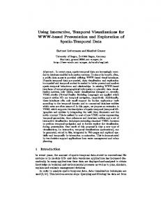
Fig. 5. Tangible Remote Controllers [32] are physical widgets attached to tablet devices that support mobile interaction with wall-size displays.
4
C ASE S TUDIES
We now use our model to describe, discuss, and compare several interactive visualization systems that employ non-conventional hardware setups, including large-scale visualizations, tangible controls, physical visualizations and shape displays. Terms from our model will be highlighted in italics. 4.1
Interacting with Large-Scale Visualizations
Large-scale visualizations involve physical presentations that are much larger than a regular computer screen. They provide new opportunities but also impose new constraints. One is that users need to be mobile to take full advantage of the available space. Tangible Remote Controllers. Tangible remote controllers for wall-sized displays (TRC) [32] solve mobility issues through portable instruments. Figure 5 illustrates a typical interaction involving dynamic queries. A user is equipped with her own set of physical controls attached to a tablet device. She is therefore mobile and can modify her percept transform (1) to explore different areas of the visualization. She can also filter the data from any location by acquiring one of the tangible range sliders (2). By adjusting its thumbs, she defines a new range (3), effectively modifying the data transformation of the main pipeline (4). This interaction is continuously forwarded (automatic and repeated forward propagation), allowing her to observe the effect of her action on the scatterplot. As a comparison, consider again the desktop setup of Figure 4: • The instrument’s physical handle is bound to the scatterplot’s physical presentation, although on large displays this constraint can be relaxed with mobile physical handles or mid-air pointing [44]. • In a desktop setting the visual presentation of the range slider and of the scatterplot are shown side-by-side on the same physical presentation. While this is acceptable in a desktop setting, on a large display this would make the instrument’s visual presentation hard to see from certain angles [9] and thus hard to operate. Deporting instruments’ physical presentation not only solves this problem but also better supports multiple users. • Most importantly, Figure 4 involves a pointing instrument whereas in Figure 5 the user directly operates the range slider, which considerably increases the instrument’s degrees of freedom. • Since widgets imitate real-world controls, the range slider’s rendering transformation is more faithful. Both its physical handle and physical presentation match the user’s mental model of a slider. While we only illustrated dynamic query interactions, the system also supports other forms of interaction: physical controls can be
Fig. 6. FatFonts [43] appear as a heatmap from far and shows numbers from close. By moving around, users conceptually switch between two visual mappings.
freely rearranged on the tablet surface (customization of the instrument’s visual presentation by true direct manipulation) and their function can be reassigned through pop-up menus (customization of the visual mapping transformation) [32]. It is hard to imagine such a high degree of flexibility on a desktop system, where some toolbars can be customized to a certain degree but through cumbersome interactions. FatFonts. The TRC system supports multi-user mobile interaction, but shared displays also require coordination among users: if one user changes the visualization, then this affects all users. FatFonts [43] provide an original solution to this problem by utilizing each user’s percept transform without affecting the physical presentation. FatFonts show data values with numbers whose thickness is also a function of the value, yielding visualizations that elicit different percepts from different viewing distances. Figure 6 top shows a map overlaid with an array of numbers indicating elevation. Users who are close can read the numbers while users standing back see a heatmap. This can be modeled through a conceptual pipeline with two branches: one that uses a numerical visual mapping (1), and another one that employs a heatmap visual mapping (2). The rendering transform merges the two visual presentations. Therefore each user has his “own” conceptual pipeline, and when he moves around (3), he conceptually switches between two visual mappings (2). Although viewpoint-dependent visualization through user tracking would allow much more possibilities, FatFonts show how real-world interaction outside the pipeline also deserves to be considered. 4.2 Interacting with Physical Visualizations So far we only considered visualizations beyond the desktop involving traditional pixel-based displays – only on a larger scale. But visualizations can also take physical shape themselves. This brings interesting possibilities, as physical visualizations can leverage our natural abilities to perceive and manipulate physical objects. The Emoto Data Sculpture. Emoto [54] is a 3-meter wide museum installation showing Twitter sentiments collected during the 2012 Olympic Games (see Figure 7). The system combines two pipelines: one where time-series data was visually encoded as a 3D surface and rendered as a physical object through one-shot propagation (1), and another one where a subset of the data corresponding to a particular theme is encoded as a heatmap and projected on the 3D surface (2). Both visual presentations thereby share the same physical presentation (3). Visitors can explore the data using a jog wheel instrument located nearby. Turning the wheel moves a time cursor (overriding decoration) and displays details about the Tweet underneath (4), while pushing the wheel cycles through different Tweet themes and changes the whole heatmap (5). This is another example
Fig. 7. Emoto [54], a large-scale visualization operated with a jog wheel. Fig. 9. A reorderable physical chart rendered by digital fabrication [33].
of a large-scale visualization, although quite different from the wallsize display setup of Figure 5. The system combines physical/static and virtual/dynamic rendering to produce an extremely rich physical presentation. This richness affords data exploration through visual inspection and percept transformation. The instrument is however limited: only one user can operate it at a time, and since it is fixed in the room, users cannot closely inspect or touch the visualization while they operate the instrument. Coral Props. While large-scale physical presentations cannot be manipulated, smaller-scale physical presentations can. Figure 8 illustrates a system that combines physical and virtual rendering like Emoto, but at a smaller scale and through separate physical presentations [38]. The pipeline visualizes scientific data on corals. The 3D model of a coral can be both 3D-printed (1) and shown on a large stereoscopic display with additional information (2). A 3D-printed coral model can be turned into an instrument by attaching a location and orientation sensor that controls the on-screen visualization (3). The system also includes a pen (not shown) for selecting locations of interest on the physical coral and having the corresponding data displayed on the screen. As a rotation and selection instrument, the physical coral has a perfect degree of integration and a high compatibility, solely the spatial indirection is high. Also, its rendering is highly faithful. However, this object is only a physical model of a coral. The associated numerical data is shown on the screen visualization and the physical coral only serves as physical prop [25] to rotate the model on the screen and navigate the data. Although the use of an actual physical model may facilitate these tasks, pen selection likely requires split visual attention. This problem can be addressed by using physical models not simply as instruments, but as the visualizations themselves. Rearrangeable Physical Charts. Figure 9 shows a physical 3D bar chart that has been rendered through semi-automatic one-shot propagation: pieces were automatically laser-cut from the data, then painted and assembled manually [33]. It shows unemployment rates over 10 years for 10 countries. The chart gives an overview over trends across both dimensions, without the perceptual drawbacks of 3D on a screen [33]. The object is passive, i.e., it contains no electronics, but interactions are still possible at the percept transformation level (1), including rotating the chart, or using fingers to mark data points [33]. In contrast to the monolithic model in Figure 8, this bar chart is modular. Each country is a 2D bar chart that can be taken out and
Fig. 8. Using a physical prop to navigate an on-screen visualization [38].
manipulated separately. This simple design choice enables a user to perform a range of additional tasks (2): she can sort countries, filter them out by moving them away, or compare countries by superimposing them. These interactions can be seen as modifying a conceptual pipeline: rearranging the visualization amounts to modifying free visual variables at the presentation mapping level, or more specifically, performing optimization overriding operations. Such operations are supported through true direct manipulation and are very versatile. In contrast, on a desktop system these tasks would typically be considered separately and supported by different instruments. Legos. Passive physical objects can also support modifications to the raw data level of a conceptual pipeline. Figure 10 (left) shows how Lego bricks can help users keep track of their time management [4]. Each tower shows time use for one day and an entire board contains data for one week. Different colors encode different projects. A layer is one hour, horizontally subdivided in four quarters of an hour. When the user decides to switch to a new project, she encodes the information according to her self-defined mapping (1), amounting to an inverse encoding & insight formation transformation, by picking a brick of the appropriate color, and adds it to today’s tower (2) thereby changing the contained raw data. The constant availability of this interface makes it easy for the user to log personal activity data on-the-fly, without interrupting her tasks. At any time, she can also use the same data storage interface as a visualization to get insights. A new tower could be created each week to keep a personal record of time use. However, such a physical database would rapidly consume physical space and money after a few weeks. DailyStack. The DailyStack system [27] shown on the right of Figure 10 provides similar means as the Lego visualization but includes computational components. The user’s way of encoding (1), storing (2) and reading information is very similar to the Lego interface. The main difference is that the DailyStack not only modifies the
Fig. 10. Data input with Lego bricks [4] and DailyStack [27].
Fig. 11. Direct interaction with topographic data using Relief [40].
conceptual pipeline of the physical stack (3) but also propagates the change to a concrete pipeline on a computer (4). This pipeline visually encodes the data across several days and displays it on a separate physical presentation (5), a screen. While this method allows data to be shown both physically and on dynamic displays, transfer of information is still one-way: there is no forward propagation from the raw data in the concrete pipeline to the physical stack. The same is true with the Lego bricks: new towers could be generated from data by 3D printing, but this would only support automatic one-shot propagation, and not automatic repeated propagation. Relief. Some data sculptures can dynamically update themselves with data (i.e., they fully support automatic repeated propagation), but they are typically dataset-specific [33]. Technologies exist that are more generic. For example, shape displays are matrices of actuated bars that make it possible to display any 2.5D data in a physical form. The Relief system [40] explores user interaction with shape displays through back-propagation, by adding sensing capabilities to the bars as well as a depth camera sensing. In Figure 11, Relief shows a topographical map where elevation data is visualized by a shape display covered with a rubber sheet (1) and surface data is projected on top (2). The user can touch the surface to mark positions on the map (3) or use mid-air gestures to pan and zoom (4). In other demo applications, users can press the bars to, e.g., change data. Relief shows how instrumental manipulation and true direct manipulation can coexist on a visualization system. However, as the authors discuss [40], shape displays impose many physical constraints. Bars cannot be pulled up, nor can they be pushed sideways: the only supported direct manipulation gesture is pushing on bars. Interactive shape displays are only a first step towards a truly direct interaction with complex data, as the interactions supported by Relief capture only a small subset of what our hands are capable of (e.g., see Figure 9). Still, it is time we step back from desktop computing stereotypes and consider display and sensing technologies that will become possible in the near future. In particular, programmable matter [30, 14] will allow to dynamically display arbitrary physical surfaces and will create new challenges for interactive visualization design. 5 D ISCUSSION AND F UTURE W ORK We presented an interaction model for beyond-desktop visualizations that refines and unifies the information visualization reference model [11, 13] and the instrumental interaction model [7]. Our contributions include: • an extended infovis pipeline model that: i) clarifies the role of each level from the raw data to the visual presentation through concrete examples, ii) introduces additional levels, from the physical presentation to the information extracted by the user, • a reframing of the problem of describing interaction through three questions: what (effects), why (goals) and how (means), • a characterization of the effects and means from the system’s perspective involving: i) the modeling of instruments as secondary pipelines that modify the visualization pipeline at specific levels, ii) a typology of propagation and branching mechanisms, iii) the explicit integration of data collection and modification tasks, iv) the notion of conceptual pipelines to capture interactions happening in the physical world, v) the notions of versatility and genericity,
• a characterization of the effects and means from the user’s perspective that captures the experiences of manipulation and of directness, • a domain independent visual notation for a compact description of traditional and non-conventional interactive visualization systems, • eight case studies using the model to discuss and compare different types of beyond-desktop visualization setups. Our case studies clearly illustrate the power of interactions that take place in the physical world outside the visualization system, such as locomotion and object manipulation. Physical object manipulation can be very versatile and even entirely passive physical visualizations such as the rearrangeable bar charts or the Lego system already support non-trivial visualization tasks. The entire design space of passive physical visualizations is largely unexplored. Although more powerful instruments can be designed that involve sensing, actuation and computation, passive object manipulation remains a useful source of inspiration when designing any instrument. Powerful instruments require rich physical handles. Touchscreens – and especially multitouch screens – are richer handles than computer mice, but our hands can do more than just drag “pictures under glass” [59]. Still we will always need instrumental operations as those allow to carry out complex tasks that have no real world counterpart (e.g., automatic sorting, brushing & linking). More research is needed to find best practices for blending physical and computing elements in a sensible way. We believe our model can help abstract currently existing point solutions and reflect on best practices, but it is only one step towards a comprehensive model. There is still a need for a holistic model that captures both visual design and interaction design considerations, and the interplay between the two. The why, i.e., tasks, goals and intents [3, 23, 41, 51, 61, 64] also need to be integrated. Other important aspects of interaction are not explicitly captured yet, such as the spatial arrangement of devices and users, the serial and concurrent use of multiple instruments [7], analytics activities across different systems and environments [46], as well as history and provenance [46]. An interaction model should ideally be descriptive, comparative, and generative [7]. Our model retains the properties of the instrumental interaction model, although our case studies focus on its descriptive power. We nonetheless believe that a model that helps understand and relate unconventional designs can also help generate new designs. Our model helps compare designs but is not prescriptive nor predictive: it does not provide recipes or metrics for choosing the best solution to a given problem. We believe interactive visualizations need to be better understood before these goals can become realistic. Finally our model is not a taxonomy, although it does define concepts that can help build taxonomies. We believe that classifying instruments according to the what and the how, and then overlaying findings from user studies can be a step towards a “science of interaction” [46]. Such a taxonomy could help researchers identify unexplored areas of research, contrast their contributions from existing work, and identify missing or conflicting evidence for the efficiency of various instruments given tasks of interest. We see our interaction model and the concepts it introduces as the missing toolbox for this important next step. ACKNOWLEDGMENTS We thank Jean-Daniel Fekete for fruitful discussions, and Petra Isenberg and our reviewers for helpful comments on this paper. R EFERENCES [1] Tableau software. www.tableausoftware.com. [accessed 2013-03-30]. [2] C. Ahlberg, C. Williamson, and B. Shneiderman. Dynamic queries for information exploration: An implementation and evaluation. In Proc. CHI’92, pages 619–626. ACM, 1992. [3] R. Amar, J. Eagan, and J. Stasko. Low-level components of analytic activity in information visualization. In Proc. Infovis 2005, pages 111– 117. IEEE, 2005. [4] Aviz. List of physical visualizations. tinyurl.com/physvis, 2013. [accessed 2013-03-30]. [5] M. Bassolino, A. Serino, S. Ubaldi, and E. L`adavas. Everyday use of the computer mouse extends peripersonal space representation. Neuropsychologia, 48(3):803–811, 2010.
[6] T. Baudel. From information visualization to direct manipulation: extending a generic visualization framework for the interactive editing of large datasets. In Proc. UIST’06, pages 67–76. ACM, 2006. [7] M. Beaudouin-Lafon. Instrumental interaction: an interaction model for designing post-wimp user interfaces. In Proc. CHI 2000, pages 446–453. ACM, 2000. [8] R. A. Becker and W. S. Cleveland. Brushing scatterplots. Technometrics, 29(2):127–142, 1987. [9] A. Bezerianos, P. Isenberg, et al. Perception of visual variables on tiled wall-sized displays for information visualization applications. TVCG, 18(12), 2012. [10] E. A. Bier, M. C. Stone, K. Pier, W. Buxton, and T. D. DeRose. Toolglass and magic lenses: the see-through interface. In Proc. SIGGRAPH’93, pages 73–80. ACM, 1993. [11] S. Card, J. Mackinlay, and B. Shneiderman. Readings in information visualization: using vision to think, pages 1–34. Morgan Kaufmann, 1999. [12] M. S. T. Carpendale. A framework for elastic presentation space. PhD thesis, Simon Fraser University, 1999. [13] E. Chi and J. Riedl. An operator interaction framework for visualization systems. In Proc. InfoVis’98, pages 63–70. IEEE, 1998. [14] CMU & Intel Research. Claytronics video. tinyurl.com/claytronics, 2006. [accessed 2013-03-30]. [15] S. Conversy. Improving usability of interactive graphics specification and implementation with picking views and inverse transformation. In Proc. VL/HCC’11, pages 153–160. IEEE, 2011. [16] A. Dix and G. Ellis. Starting simple: adding value to static visualisation through simple interaction. In Proc. AVI’98, AVI ’98, pages 124–134, New York, NY, USA, 1998. ACM. [17] N. Elmqvist, A. Moere, H. Jetter, D. Cernea, H. Reiterer, and T. JankunKelly. Fluid interaction for information visualization. Information Visualization, 10(4):327–340, 2011. [18] M. Fjeld and W. Barendregt. Epistemic action: A measure for cognitive support in tangible user interfaces? Behavior research methods, 41(3):876–881, 2009. [19] D. Gentner and J. Nielsen. The Anti-Mac interface. Commun. ACM, 39(8):70–82, Aug. 1996. [20] T. Grossman and R. Balakrishnan. The design and evaluation of selection techniques for 3d volumetric displays. In Proc. UIST’06, pages 3–12. ACM, 2006. [21] J. Heer and M. Agrawala. Software design patterns for information visualization. TVCG, 12(5):853–860, 2006. [22] J. Heer, S. K. Card, and J. A. Landay. Prefuse: a toolkit for interactive information visualization. In Proc. CHI’05, pages 421–430. ACM, 2005. [23] J. Heer and B. Shneiderman. Interactive dynamics for visual analysis. Queue, 10(2):30, 2012. [24] M. Hegarty. The cognitive science of visual-spatial displays: Implications for design. Topics in Cognitive Science, 3(3):446–474, 2011. [25] K. Hinckley, R. Pausch, J. C. Goble, and N. F. Kassell. Passive real-world interface props for neurosurgical visualization. In CHI’94, 1994. [26] H. Hochheiser and B. Shneiderman. Dynamic query tools for time series data sets: timebox widgets for interactive exploration. Information Visualization, 3(1):1–18, Mar. 2004. [27] A. Højmose and R. Thielke. Dailystack. tinyurl.com/dailystack, 2010. [accessed 2013-03-30]. [28] E. L. Hutchins, J. D. Hollan, and D. A. Norman. Direct manipulation interfaces. Human–Computer Interaction, 1(4):311–338, 1985. [29] P. Isenberg, N. Elmqvist, J. Scholtz, D. Cernea, K.-L. Ma, and H. Hagen. Collaborative visualization: definition, challenges, and research agenda. Information Visualization, 10(4):310–326, 2011. [30] H. Ishii, D. Lakatos, L. Bonanni, and J. Labrune. Radical atoms: beyond tangible bits, toward transformable materials. interactions, 19(1):38–51, 2012. [31] H. Ishii and B. Ullmer. Tangible bits: towards seamless interfaces between people, bits and atoms. In Proc. CHI’97, pages 234–241. ACM, 1997. [32] Y. Jansen, P. Dragicevic, and J.-D. Fekete. Tangible remote controllers for wall-size displays. In Proc. CHI’12, pages 2865–2874, New York, NY, USA, 2012. ACM. [33] Y. Jansen, P. Dragicevic, and J.-D. Fekete. Evaluating the efficiency of physical visualizations. In Proc. CHI’13, pages 2593–2602. ACM, 2013. [34] S. H. Johnson-Frey. What’s so special about human tool use? Neuron, 39(2):201–4, 2003. [35] D. Kirsh. Interaction, external representation and sense making. In Pro-
[36]
[37]
[38]
[39]
[40]
[41]
[42] [43]
[44] [45] [46] [47]
[48] [49]
[50] [51] [52] [53] [54] [55] [56]
[57] [58] [59] [60]
[61] [62] [63]
[64]
[65]
ceedings of the Thirty First Annual Conference of the Cognitive Science Society, pages 1103–1108, 2009. S. Klemmer, B. Hartmann, and L. Takayama. How bodies matter: five themes for interaction design. In Proc. DIS’06, pages 140–149. ACM, 2006. R. Kosara. Visualization criticism-the missing link between information visualization and art. In Information Visualization, IV’07, pages 631–636. IEEE, 2007. K. J. Kruszy´nski and R. van Liere. Tangible props for scientific visualization: concept, requirements, application. Virtual reality, 13(4):235–244, 2009. B. Lee, P. Isenberg, N. Riche, S. Carpendale, et al. Beyond mouse and keyboard: Expanding design considerations for information visualization interactions. TVCG, 18(12), 2012. D. Leithinger, D. Lakatos, A. DeVincenzi, M. Blackshaw, and H. Ishii. Direct and gestural interaction with relief: A 2.5 d shape display. In Proc. UIST’11, 2011. Z. Liu and J. T. Stasko. Mental models, visual reasoning and interaction in information visualization: A top-down perspective. TVCG, 16(6):999– 1008, 2010. A. Maravita and A. Iriki. Tools for the body (schema). Trends in cognitive sciences, 8(2):79–86, 2004. M. Nacenta, U. Hinrichs, and S. Carpendale. FatFonts: combining the symbolic and visual aspects of numbers. In Proc. AVI’12, pages 407– 414. ACM, 2012. M. Nancel, J. Wagner, E. Pietriga, O. Chapuis, and W. Mackay. Mid-air pan-and-zoom on wall-sized displays. Proc. CHI’11, 2011. A. Norton, M. Rubin, and L. Wilkinson. Streaming graphics. Statistical Computing and Graphics Newsletter, 12(1):11–14, 2001. W. A. Pike, J. Stasko, R. Chang, and T. A. O’Connell. The science of interaction. Information Visualization, 8(4):263–274, 2009. M. K. Rasmussen, E. W. Pedersen, M. G. Petersen, and K. Hornbæk. Shape-changing interfaces: a review of the design space and open research questions. In CHI’12, 2012. H. Reininger. Hans Rosling’s Shortest TED talk. http://youtu.be/UNsziziPyo, 2012. [accessed 2013-03-30]. R. A. Rensink. Internal vs. external information in visual perception. In Proceedings of the 2nd international symposium on Smart graphics, pages 63–70. ACM, 2002. D. Schmandt-Besserat. How writing came about. University of Texas Press, 1996. B. Shneiderman. The eyes have it: A task by data type taxonomy for information visualizations. In VL/HCC’96, pages 336–343. IEEE, 1996. B. Shneiderman. Designing the user interface. Pearson Education, 1998. H. A. Skinner. A Guide to Constructs of Control. J Pers Soc Psychol., 71(3):549–570, Sept. 1996. M. Stefaner and D. Hemment. Emoto. tinyurl.com/emotovis, 2012. [accessed 2013-03-30]. D. Svanaes. Understanding Interactivity: Steps to a Phenomenology of Human-Computer Interaction. PhD thesis, NTNU, 2000. M. Tobiasz, P. Isenberg, and S. Carpendale. Lark: Coordinating colocated collaboration with information visualization. TVCG, 15(6):1065– 1072, 2009. A. B. Tucker. Computer science handbook. Chapman & Hall/CRC, 2004. J. J. Van Wijk. The value of visualization. In Proc. VIS’05, pages 79–86. IEEE, 2005. B. Victor. A brief rant on the future of interaction design. http://tinyurl.com/picsunderglass, 2011. [accessed 2013-03-30]. F. B. Viegas, M. Wattenberg, F. Van Ham, J. Kriss, and M. McKeon. Manyeyes: a site for visualization at internet scale. TVCG, 13(6):1121– 1128, 2007. S. Wehrend and C. Lewis. A problem-oriented classification of visualization techniques. In Proc. VIS’90, pages 139–143. IEEE, 1990. H. Wickham and L. Stryjewski. 40 years of boxplots. Am. Stat., 2011. N. Wong, S. Carpendale, and S. Greenberg. Edgelens: an interactive method for managing edge congestion in graphs. In Proc. InfoVis’03, pages 51–58. IEEE, 2003. J. S. Yi, Y. ah Kang, J. T. Stasko, and J. A. Jacko. Toward a deeper understanding of the role of interaction in information visualization. TVCG, 13(6):1224–1231, 2007. C. Ziemkiewicz and R. Kosara. Embedding information visualization within visual representation. In Advances in Information and Intelligent Systems, pages 307–326. Springer, 2009.