Rev Socionetwork Strat (2016) 10:33-51
BLOCKS: Efficient and Stable Online Visualization of Dynamic Network Evolution Ji QI1) and Yukio OHSAWA 1) 1) School of Engineering, the University of Tokyo 7 Chome-3-1 Hongo, Bunkyo 113-8654, Tokyo, Japan
[email protected] [email protected] http://www.panda.sys.t.u-tokyo.ac.jp/index_en.html
Received: 18 April 2016 / Accepted: 4 June 2016 © Springer 2016
Abstract. It is computationally and cognitively expensive to observe the evolution of community structure on dynamic networks in real-time, not only because the data sets tend to be complex, but also because the visual interfaces are often complicated. We introduce BLOCKS, a simple but efficient framework to abstract and visualize the evolution of community structure on dynamic networks. Instead of indicating detailed changes of nodes and links temporally, BLOCKS regards communities as visual entities and focuses on representing their behaviors and relation changes on a time series. Experiments detected a stable performance of BLOCKS compared with previous methods while detecting the community structure of networks. We also present a case study that shows an effective learning process of network evolution with BLOCKS. Keywords: Information visualization, Network analysis, Dynamic network visualization, Community detection, Network evolution
1 Introduction Dynamic network visualization is a challenging but essential technology that has attracted much attention during the past decades. Visualization technology has been
34
Rev Socionetwork Strat (2016) 10:33-51
widely used for understanding and analyzing network data. Moreover, networks are usually dynamic in the real world, and many data analyzing tasks are based on network dynamics. As a result, dynamic network visualization has become a hot research topic. However, a time dimension as an additional dimension always leads to a more complicated user interface and learning process. Too many parameters and sub-views result in information overload and a high learning cost for the visualization. Another problem when adding a time dimension is the high computational cost of visualization due to the increase of data size. We introduce BLOCKS as an online visualization of dynamic networks. Different from previous methods using nodes and links, we employ an ordered adjacency matrix of communities to conduct the major presentation of the visualization. An incremental algorithm driven by a link stream is also implemented to update community structure in the background. The network evolution is represented by animation corresponding to community behaviors for easy tracking. This paper is organized as follows: In Section 2, we briefly review related works according to three features of visual design. In Section 3, we fully introduce the design of BLOCKS. In Section 4 we introduce the algorithms behind the design and in Section 5, we present experiments to test both the incremental community detection algorithm and the visualization, respectively. Finally, in Section 6, we conclude our work in this paper with remaining future work.
2 Related works There are three important features to be considered in advance of designing dynamic network visualizations: (1) use of a 2D plane vs. a 3D space, (2) matrix vs. node-link diagram, and (3) animation vs. a timeline. We briefly review previous approaches based on these three features and discuss the advantages and disadvantages for both sides. 2.1 2D vs. 3D Nearly all visualization technologies are presented on either a 2D plane or in a 3D space. Figure 1 shows an example of both a 2D and a 3D representation of an HIV protease structure. The 2D appearance of the visualization can be generated much faster and easier than the 3D one. Additional dimensions involve more information and computation, which is the case with dynamic visualization. On the other hand, the 3D appearance is more expressive because it provides different perspectives of observation. In the 2D appearance, overlap is an important problem because it may bring confusion
Rev Socionetwork Strat (2016) 10:33-51
35
in understanding the figure, but it is not a problem for 3D visual techniques, which have a richer means of exploration. At the same time, 3D exploration also brings drawbacks such as visual occlusion, depth perception issues, and more complicated navigation.
Figure 1. Representation of HIV protease structure1 : (a) 2D appearances, and (b) 3D appearance
Previous approaches of dynamic network visualization employed either 2D or 3D representation. For example, Greilich et al. introduced TimeArcTrees aligned captures of network evolutions as 2D graphs [1]. Burch et al. employed 2D parallel coordinates for alignments [2]. Dwyer and Eades introduced a visualization that used 2D cylinders to represent nodes over a time passage [3]. On the other hand, Erten et al. introduced a different way of performing top-down layout by using multiple surfaces in a 3D space as different time steps [4]. Federico et al. developed a demo system that predefined three views of 3D networks with a fixed camera perspective and layer positions [5], while Itoh et al. released these setting to users [6]. 2.2 Matrix vs. node-link diagram Previous research suggests that a node-link diagram performs better on small and sparse networks, while an adjacency matrix works better on a large and dense matrix [7]. Also, many tasks such as quick node/link counting and searching and central node detecting and tracking can benefit from the readability of a matrix layout with no occlusion on nodes and links (nodes are represented by matrix rows/columns, and links are represented by elements inside the matrix). However, the layout of the node-link diagram is more flexible than the matrix, which can be adjusted more easily. Figure 2 shows an example of network visualization by either the node-link diagram or the adjacency matrix.
1
The figure is from http://www.nature.com/nprot/journal/v7/n4/full/nprot.2012.004.html
36
Rev Socionetwork Strat (2016) 10:33-51
Figure 2. Representation of a sample network [8]: (a) node-link diagram, and (b) adjacency matrix
Previous research has employed the matrix. Bach et al. introduced a represented matrix as a 3D cube, where the third dimension was a time series [8]. Burch et al. employed the sequence of a bar chart on a horizontal axis inside matrix cells to show the change of links [9], while Stein et al. used a grey scale for the same purpose [10]. Also, Brandes and Nick introduced gestaltlines, a new expression of matrix cells [11]. In contrast, Misue et al. first introduced adjustment methods of node-link graph layout dynamically [12]. Brandes and Wagner introduced random field models for uniformly representing different layout models [13]. Instead of choosing from various layout models, Lee et al. regarded the dynamic node-link graph layout problem an optimization problem, and tried to meet different requirements by adjusting certain parameters [14]. 2.3 Animation vs. the timeline A more intuitive way of representing dynamics in visualization is animation, which provides easy tracking of entities. However, it is difficult to use animation-based visualization to compare different time steps. Timeline-based approaches list all the time steps in the same view for better comparison, but it is generally hard to track entities, and captures tend to be small with a large number of time steps. Figure 3 shows an example of both animation-based and timeline-based representation of the evolution process of a network. In the animation-based approach, a change of placement on elements can be tracked by their actions, while it is visually difficult to perform tracking on sub-views of a timeline.
Rev Socionetwork Strat (2016) 10:33-51
37
Figure 3. Representation of time dimension on a sample network2 by: (a) animation-based approach, and (b) timeline-based approach
Many previous approaches employed animation representation. Diehl et al. introduced a foresighted layout for stably presenting animation representation [15]. After that Diehl and his colleagues extended the foresighted layout to focus on the adjustment strategies in different cases [16]. Instead of generating a super graph, Erten et al. connected equivalent nodes by virtual links in their demo system named GraphAEL [17]. Some other approaches employed timeline representation. Ohsawa et al. implemented a tool for visualizing transient causes in time-series data [18]. Sugimoto et al. detected word clusters with a temporally updated corpus using a sequence of word networks [19]. Also virus-like visualization of node changes were represented by using timeline expression [4], [5].
3
BLOCKS
Based on the reviews in the previous section, we have designed BLOCKS to be a 2D, matrix-like, and animation-based approach because the 2D appearance provides faster implementation more appropriate for online tasks. In addition, we employ a matrix so that our method can be executed on large networks. Furthermore, to simplify tracking tasks on our visualization, we designed our visualization to be animation based. Instead of applying an adjacency matrix of nodes as in previous approaches, BLOCKS applies the adjacency matrix of community, which highlights the community structure of a network. By considering a physical topological structure as the microlevel structure of a network that illustrates the placement of links or nodes, the
2
Figure is from https://www.youtube.com/watch?v=exBDkQkKQEk
38
Rev Socionetwork Strat (2016) 10:33-51
community structure can be regarded as the macro-level structure of a network, which describes the partition of networks based on linkages between nodes. In this case, discussing and analyzing community structure is more meaningful for real tasks, especially when the network is so large that topological features cannot even be observed by the human eye. In addition, employing an adjacency matrix of communities can definitely save computational expense when compared with maintaining information of all the nodes and links. Also, using communities as visual entities can improve the efficiency of recognizing and tracking communities in networks.
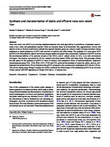
Figure 4. The BLOCKS user interface screenshot: a) Upload file, b) Start and pause, c) Speed control, d) Scale ruler showing community size, e) Tip of node labels inside communities, f) Community block in the main view, g) Connection block in the main view
Figure 4 shows an overview of the user interface of BLOCKS. Data presented in this figure is a randomly generated network using the names of several programming languages as node labels. There are two kinds of blocks in BLOCKS: those alongside the diagonal of the matrix are community blocks, which represent communities in the network (Figure 4-f), and connection blocks, which indicate the inter-relation between communities (Figure 4-g). Here, the size of community blocks shows the size of communities, and brightness shows the graph density of a community (the brighter, the denser). Labels on community blocks belong to the most central node in community,
Rev Socionetwork Strat (2016) 10:33-51
39
where centrality is measured by degree. Labels of all the nodes in a community are shown as a tag cloud (Figure 4-e). Three behaviors of the communities were represented in BLOCKS as follows: Splitting. One community can be split into two over time. In BLOCKS, this splitting process is represented by the decomposing of the community block. For instance, community A is split into C and D as Figure 5-a shows. Merging. Two communities can be merged into one, as Figure 5-b shows, where community A and B are merged into a single community D. Both the two communities and related connections will be merged respectively. Ordering. Rows/columns of a matrix can be automatically ordered, and larger and denser communities with more connections are preferred on the top-left part of the matrix. As Figure 5-c shows, community A is relocated to the most right-bottom of the matrix, since A has only one connection to B and this connection is weaker than that between C and B.
Figure 5. Behaviors of communities in BLOCKS
4
Methodology
Figure 6 shows the architecture of BLOCKS based on a Web framework for simulating a data stream arriving in real time. The user first uploads the link data file to the web browser (Figure 6-a), and then a detailed request is sent to the application via the server (Figure 6-b, c). Next, the application responds to the web browser (Figure 6-d, e), and finally presents the visualization to the user (Figure 6-f). Details about each part in the process are explained as follows: Web Browser. This part contains the visual interface, where all the animations and interactions are realized and presented. We use D3.js, which is a popular JavaScript library that has been widely used on information visualization, combined with JQuery to implement the user interface. Works rely on HTML/CSS. Server. This part processes all the requests and responses between the web browser and the background application. We employ Bottle.py to build the server. Bottle.py is a light-weighted web framework written by Python.
Rev Socionetwork Strat (2016) 10:33-51
40
Application. All the background algorithms are implemented in this part. Every time a new link arrives, it will fall into one of the following four situations: adding a new community or connection, or adding to an existing community or connection, and the application progresses based on these conditions.
Figure 6. Architecture of BLOCKS
4.1 Preliminary definitions Before describing the algorithm of the dynamically updating network structure, we present the following definition: Definition. For community , , where is the node set inside and is the link set, and one bipartition of , say and , such that ⋃ and ⋂ ∅, we as follows: define the bipartition ratio | | | |
(1)
where is the number of links between and in . Here, the denominator of this formula is the total number of possible edges between and . It is easy to understand that if is smaller, the linkage between and is less tight, which leads to a better separation of by and . Here, for a new community generated by adding a link a, b , the bipartition is initialized such as a, b and ∅. 4.2 Algorithms 4.2.1 Splitting / merging algorithm
We implemented an algorithm to incrementally update the bipartition ratio of a community with a new link arriving continually, as shown in Algorithm 1. This
Rev Socionetwork Strat (2016) 10:33-51
41
algorithm will be executed twice, respectively, for the two end nodes of the new arriving link. For node , the algorithm first computes in two cases: by adding new and . Then these two ratios are node to either or , with results notated as compared, and the case with the smaller is realized. Algorithm 1. Bipartition Algorithm 1. Procedure Bipartite( , , , ): 2. ← . ⋃ , ⊳ . ← . , ⋃ 3. 4. If then 5. . 6. If ∈ then 7. . ⊳ . 8. End If 9. Else 10. . 11. If ∈ then 12. . 13. End If 14. End If 15. Return X, Y 16. End Procedure
,
⊳ : new node coming :get for and in ⊳ .
: add : remove
to from
can The time complexity of our algorithm is nearly , is a constant, as be calculated as | | | | | |, where is the link set of the community , are the set of links in and . As a result, the algorithm can be very efficient. and Details about the algorithm's complexity are discussed with the experiments later in Section 5 With bipartitions updated, the algorithm makes decision about which communities should be split/merged. The conditions of splitting and merging are as follows: 1. If a community with a bipartition and satisfies the following formula, will be split based on and : ,
2.
If two communities and community ,
, and , are eligible to be merged as one should satisfy the following condition: ,
where is a threshold of experiment).
(2)
(3)
(this will be studied in section 5 as part of the
Rev Socionetwork Strat (2016) 10:33-51
42
4.2.2 Ordering algorithm
We also implemented the ordering algorithm to capture the ordering behavior in the matrix layout. Here, we employed the extended version of a simple approach introduced by Liiv et al. called COUTNONES [20]. The rows/columns were ordered on the following metric: ∑
(4)
∈
where is the value of the row/column for ranking, is the collection of blocks row (the same for columns since the matrix (both community and connection) in the is symmetric), is the block size, and is the block density defined as follows: | | , (5) | | | |, | |
|
|
| | | |
,
,
(6)
where notates the node set of community , and notates the link set. With a higher R value, a row/column shows a larger and denser community corresponding to this row/column, and closer relations between this community and other communities. Rows/columns are ranked on from large to small, so that rows/columns in the topleft part of the matrix are denser.
5 Experiment and discussion To evaluate the performance of our visualization method, we conducted several experiments for the algorithm and visualization, respectively. To evaluate the bipartition algorithm of the dynamically detecting network community structure, we performed both a parameter study and a comparison study. The parameter study showed as the threshold of the splitting and merging condition, while the the setting of comparison study compared the performance of our method with previous outstanding methods of community detection. In these two studies, network data were generated by employing the Lancichinetti-Fortunato-Radicchi (LFR) benchmark, which is a famous algorithm for generating benchmark networks to evaluate community detection algorithms [20]. To evaluate the visualization, we conducted a case study based on a real network that contains the membership information of 136 people in five
Rev Socionetwork Strat (2016) 10:33-51
43
organizations at a time before the American Revolution. 3 The network is very sparse as only 160 edges were contained. This could be a challenge for community detection as most of the communities in this network are sparse. 5.1 Parameter study In this experiment, we employed the LFR benchmark network generator of binary networks contributed by Fortunato.4 Parameters were set as follows: 20 for the average degree, 50 for the maximum degree, 2 for the minus exponent of degree distribution, and 1 for the minus exponent of community distribution. Also, we set two ranges of community size: “B” notated a community with 10 ∼ 50 nodes, and “S” notated a community with 20∼ 100 nodes. The total number of nodes in the network were set to be either 1000 or 5000. As a result, there were four cases of networks: 1000S, 1000B, 5000S, and 5000B. Also, we set the mixing parameter 0.1, which varied in the comparison study. This parameter setting, provided by the author of the LFR benchmark algorithm, is popular for evaluating community detection algorithms [21]. to vary between 0.2 and 0.8 with an offset of 0.05, so there were totally We set setting and each network setting, the algorithm was 13 settings of . For each executed 100 times and the average value of Normalized Mutual Information (NMI) was collected. In our experiments, NMI was measured as: ,
,
(7)
, ,… represents the community distribution of the ground where truth, which is measured by the LFR benchmark in our case, and similar to , which is the community detection result. , represents the mutual information between and , which is defined as follows: ,
∑
∑
n
,
log
⋅
,
⋅
.
(8)
Where , are the number of communities in community distribution and , is the total number of nodes in the network, , is the number of nodes in both community in and the community in , and is the number of the community in (similar to ). , indicates the sharing nodes in the information between and . Meanwhile, the denominator indicates the covariance, where and represent entropies of these two distributions. Here, is measured as follows (similar for ):
3 4
Downloading is available from http://konect.uni-koblenz.de/networks/brunson_revolution Downloading is available from https://sites.google.com/site/santofortunato/inthepress2
Rev Socionetwork Strat (2016) 10:33-51
44
∑
.
(9)
Figure 7 shows how the NMI measure was conducted by mutual information and entropy. For two distributions/groups of objects, such as GT and CD, , is actually the shared part between
and
, while
can be
regarded as another expression of the joint entropy , based on Pearson's correlation. As a result, NMI describes the percentage of the information shared between and within the total amount of information.
Figure 7. Venn diagram for explaining various information measures associated with NMI
NMI is a metric function (the larger, the better) since a good result is expected to have a larger ratio of common information between the detection result and the ground truth. NMI has been suggested as being reliable as an evaluating criterion to test the community detection algorithm [21].
Figure 8. Variation of NMI by employing different
Figure 8 shows the experimental result as a line chart. The four lines are nearly 0.5 , which provided the best overlapped with each other, and they all point to performance. We discussed the result and concluded it to be reasonable since a too high leads to over-splitting, and a too low value results in over-merging. Overall, value of 0.5 provides the best performance, and we used this setting for we concluded that the rest of the experiments.
Rev Socionetwork Strat (2016) 10:33-51
45
5.2 Comparison study In the comparison study, we compared our approach with five previous algorithms of community detection. The LFR benchmark networks were generated by the same setting, except the mixing parameter , which varied from 0.1 to 0.8 with an offset of 0.05. All the methods for comparison are listed in Table 1. The mixing parameter is defined as follows for every node in the network: (10) is the number of where is the number of all the neighbors of node , and neighbors outside the community that belongs to. A higher mixing parameter leads to a vaguer boundary of communities. As a result, it is more difficult to detect the community structure of networks with a higher . Table 1. List of community detection algorithms for comparison
Algorithm Greedy optimization [22] Fast modularity optimization [23] Algorithm by Radicchi [24] Maps of random walks [25] Potts model approach [26]
Abbreviation CLAUSET ET AL. BLONDEL ET AL. RADICCHI Infomap RN
Figure 9 illustrates the comparison results, where our approach is notated as BIPARTITE. Results of previous methods were well evaluated and published in the work by Lancichinetti and Fortunato [18]. In this work, the authors suggest Informap, BLONDEL ET AL., and RN topped the performance. As Figure 9-a,b,c shows, the performance between different network settings were stable. However, all underperformed when the mixing parameter was high ( 0.65). We also found the same situation for both RADICCHI and CLAUSET ET AL. Especially for RADICCHI, whose NMI became 0 at a very early stage of 0.55 for all the network settings. In contrast, our approach provided a relatively stable performance with the increase of the mixing parameter. Also, the network settings affected the algorithm performance slightly, compared with RADICCHI and CLAUSET ET AL., who were significantly affected. Based on the experimental result, we concluded that our algorithm presented a stable performance for detecting the community structure of different networks. Algorithm complexity is essentially linear in network size for both Infomap and BLONDEL ET AL, which are the fastest among all the algorithms. The method RN provides a relatively worse time complexity (super-linear in the number of links in the network) than Infomap and BLONDEL ET AL, but better performance than our algorithm with a linear complexity on the number of links. CLAUSET ET AL., in next,
Rev Socionetwork Strat (2016) 10:33-51
46
and can achieve a complexity of with an efficient data structure, and . However, this is in the case of static RADICCHI has the complexity of community detection. In the dynamic case, our algorithm can top performance with a nearly constant complexity of computation in each step. We recorded the time usage of our algorithm and found that it only took 0.0015 seconds on average for a new link that arrived with an update of the community structure.
Figure 9. Comparison between our approach and previous approaches
5.3 Case study In the case study, we simulated a learning process related to the American Revolution dataset. In Figure 10, we presented only six time steps in the evolution process, which indicated the changes of the community structure. The node-link diagrams were generated using Gephi, which is a widely used tool for network visualization [27].
Rev Socionetwork Strat (2016) 10:33-51
47
Figure 10. Visual results by both Gephi and BLOCKS
A total of four people were invited as experimental participants. Two were university students (notated s1, s2), and the other two were employees in a company (notated e1, e2). Participants were required to play as either 'explainers' or 'listeners', which we defined as follows: through observing node-link diagrams, explainers were required to describe the network evolution to listeners based on two features: (1) how many communities in each step, and (2) which two communities were connected. Then the listeners checked what percentage of the visual results by BLOCKS matched the
48
Rev Socionetwork Strat (2016) 10:33-51
description. Participants were trained how to detect communities in both network captures and BLOCKS before the experiment, and they were separated into two groups: in one group s1 was the explainer and e1 was the listener, and in the other group, e2 was the explainer and s2 the listener.
Figure 11. Information highlighted by BLOCKS but missed by explainers at t = 157: (a) the links highlighted between community 2 and 4 in the node-link diagram, and (b) the connections clearly shown in BLOCKS
Results from the two groups were fairly good, nearly 95% of the description from the explainer were matched by BLOCKS. One common divergence of observation from both groups was at 31, where community 5 was not recognized as a community by the explainer, but was represented in BLOCKS. Another interesting observation was at 157. In group (s1, e1), the explainer did not mention there was a connection between community 2 and 4, while BLOCKS showed that there was, as Figure 11 highlights. Then the explainer checked again on the network capture and was finally able to identify that the connection existed. Also, the participants made some comments, the most common among all four participants being about the structure inside the communities. They were all interested in what the community might look like inside BLOCKS because they did not accept the visualization at 100% without being able to observe the details themselves. Based on the experimental results and the comments from the participants, we concluded that BLOCKS can accurately present the evolution of a network community structure. Additionally, surprising observations were made compared with the traditional node-link diagram because of the problem of occlusion. More information
Rev Socionetwork Strat (2016) 10:33-51
49
such as the detailed structure of the communities is still desired and should be provided in the future, as suggested by the participants.
6 Conclusion and future work In this paper, we introduced BLOCKS, a 2D matrix-like animation-based approach for online dynamic network visualization. In addition, we proposed how to improve computational performance and reduce the complication of a visual interface by applying an adjacency matrix of communities instead of nodes and links on a 2D plain, so that the computational expense of the representation can be significantly reduced. Our background algorithm was designed to be fast but stable and as a result, our approach is very effective as a whole. On the other hand, employing the community as a visual entity also simplified the detecting and tracking process of network structures in evolution, which improved the efficiency of the learning process. Future research is necessary, some of which was suggested by the experiment's participants. First, a detailed structure inside communities should be considered in future versions. However, increased detail also increases the risk of information overload. Second, performance on large networks in the real world is also desired. Finally, in this work, we applied the COUNTONES approach for dynamically ordering the matrix online. However, COUNTONES is almost the same as a simple sorting algorithm, and we think there should be a better solution for a dynamic matrix layout problem, by which more information, such as a community of communities, can be detected.
Acknowledgements We would like to thank the Japan Science and Technology Agency (JST) for their support.
References 1.
Greilich M., Burch M., Diehl S.: Visualizing the evolution of compound digraphs with TimeArcTrees, Computer Graphics, Blackwell Publishing Ltd, Vol. 28, No. 3, pp. 975-982, Jun, 2009
50
2. 3. 4. 5.
6. 7. 8. 9. 10. 11. 12. 13. 14. 15. 16. 17. 18. 19. 20. 21.
Rev Socionetwork Strat (2016) 10:33-51
Burch M., Vehlow C., Beck F., Diehl S., Weiskopf D.: Parallel edge splatting for scalable dynamic graph visualization. Visualization and Computer Graphics, IEEE Transactions on, 17(12):2344-53, Dec 2011 Dwyer T., Eades P.: Visualising a fund manager flow graph with columns and worms. InInformation Visualisation, 2002. Proceedings. Sixth International Conference, IEEE, 147-152, 2002 Erten C., Kobourov S. G., Le V., Navabi A.: Simultaneous graph drawing: Layout algorithms and visualization schemes, Graph Drawing, Springer Berlin Heidelberg, Volume 21, 437-449, Sep, 2003 Federico, P., Aigner, W., Miksch, S., Windhager, F., Zenk, L.: September. A visual analytics approach to dynamic social networks. Proceedings of the 11th International Conference on Knowledge Management and Knowledge Technologies, ACM, p. 47, Sep 2011 Itoh M., Toyoda M., Kitsuregawa M.: An interactive visualization framework for timeseries of web graphs in a 3D environment. InInformation Visualisation (IV), 2010 14th International Conference, Volume 26, 54-60, Jul, 2010 Ghoniem M., Fekete J. D., Castagliola P. A. comparison of the readability of graphs using node-link and matrix-based representations. InInformation Visualization, 2004. INFOVIS 2004. IEEE Symposium, IEEE, 10 (pp. 17-24), Oct, 2004 Bach B., Pietriga E., Fekete J. D.: Visualizing dynamic networks with matrix cubes. In Proceedings of the SIGCHI Conference on Human Factors in Computing Systems, ACM, 26, 877-886, Apr, 2014 Burch M., Schmidt B., Weiskopf D.: A matrix-based visualization for exploring dynamic compound digraphs, 2013 17th International Conference on Information Visualisation, IEEE, 1, 66-73, Jul, 2013 Stein K., Wegener R., Schlieder C.: Pixel-oriented visualization of change in social networks, 2010 International Conference on Advances in Social Networks Analysis and Mining, IEEE, 9, 233-240, Aug, 2010 Brandes U., Nick B.: Asymmetric relations in longitudinal social networks. Visualization and Computer Graphics, IEEE Transactions, 17(12), 2283-90, Dec, 2011 Misue K., Eades P., Lai W., Sugiyama K: Layout adjustment and the mental map. Journal of visual languages and computing, 6(2), 183-210, Jun, 1995 Brandes U., Wagner D.: A Bayesian paradigm for dynamic graph layout. Graph Drawing, Springer Berlin Heidelberg, Volume 18: 236-247, Sep, 1997 Lee Y. Y., Lin C. C., Yen H. C.: Mental map preserving graph drawing using simulated annealing. Proceedings of the 2006 Asia-Pacific Symposium on Information Visualisation, Australian Computer Society, Inc., Volume 60, 179-188, Jan, 2006 Diehl S., Görg C., Kerren A.: Preserving the mental map using foresighted layout. Springer Vienna, 2001 Diehl S., Görg C.: Graphs, they are changing, Graph drawing. Springer Berlin Heidelberg, Volume 26 (23-31), Aug, 2002 Erten C., Harding P. J., Kobourov S. G., Wampler K., Yee G.: GraphAEL: Graph animations with evolving layouts. Graph Drawing, Springer Berlin Heidelberg, Volume 21, 98-110, Sep, 2003 Ohsawa Y., Ito T., Kamata M. I.: Kamishibai KeyGraph: Tool for Visualizing Structural Transitions for Detecting Transient Causes. New Mathematics and Natural Computation, 6(02), 177-91, Jul, 2010 Sugimoto M., Ueda T., Okada S., Ohsawa Y., Maeno Y., Nitta K.: Discussion analysis using temporal data crystallization. InNew Frontiers in Artificial Intelligence, Springer Berlin Heidelberg, 30, 205-216, Nov, 2012 Lancichinetti A., Fortunato S., Radicchi F.: Benchmark graphs for testing community detection algorithms. Physical review E, 24;78(4):046110, Oct, 2008 Lancichinetti A., Fortunato S.: Community detection algorithms: a comparative analysis. Physical review E, 80(5):056117, Nov, 2009
Rev Socionetwork Strat (2016) 10:33-51
22. 23. 24. 25. 26. 27.
51
Clauset A., Newman M. E., Moore C.: Finding community structure in very large networks. Physical review E, 6; 70(6):066111, Dec, 2004 Blondel V. D., Guillaume J. L., Lambiotte R., Lefebvre E.: Fast unfolding of communities in large networks. Journal of statistical mechanics: theory and experiment, 9; 2008(10):P10008, Oct, 2008 Radicchi F., Castellano C., Cecconi F., Loreto V., Parisi D.: Defining and identifying communities in networks. Proceedings of the National Academy of Sciences of the United States of America, 2; 101(9):2658-63.25, Mar, 2004 Rosvall M., Bergstrom C. T.: Maps of random walks on complex networks reveal community structure. Proceedings of the National Academy of Sciences, 29; 105(4):111823, Jan, 2008 Ronhovde P., Nussinov Z.: Multiresolution community detection for megascale networks by information-based replica correlations. Physical Review E, 14; 80(1):016109, Jan, 2009 Bastian M., Heymann S., Jacomy M.: Gephi: an open source software for exploring and manipulating networks. ICWSM., 17;8:361-2, May, 2009