A key issue when visualizing graphs in information visualization is the size of the data. Many applications of graph visualization require analysis of graphs with ...
Density Functions for Visual Attributes and Effective Partitioning in Graph Visualization Ivan Herman
M. Scott Marshall
Guy Melançon*
Centre for Mathematics and Computer Sciences (CWI)
Abstract Two tasks in Graph Visualization require partitioning: the assignment of visual attributes and divisive clustering. Often, we would like to assign a color or other visual attributes to a node or edge that indicates an associated value. In an application involving divisive clustering, we would like to partition the graph into subsets of graph elements based on metric values in such a way that all subsets are evenly populated. Assuming a uniform distribution of metric values during either partitioning or coloring can have undesired effects such as empty clusters or only one level of emphasis for the entire graph. Probability density functions derived from statistics about a metric can help systems succeed at these tasks. CR Categories and Subject Descriptors: I.3.6 [Computer Graphics]: Methodology and Techniques – Interaction Techniques; I.3.8 [Computer Graphics]: Applications Additional Keywords: graph visualization, graph navigation, metrics, clustering
1. INTRODUCTION A key issue when visualizing graphs in information visualization is the size of the data. Many applications of graph visualization require analysis of graphs with several thousand nodes and edges. Innovative techniques are needed to navigate, to filter, or to create abstractions from these graphs in order to make them usable in practice. Many interesting results have been published in the past few years and this area of research is still very active (see, for example, the survey on graph navigation[1]). The use of metrics is one of the interesting techniques in this area. The concept of a metric appears in several places in the literature[2-6], although the terminology varies. In this paper, we will use the term to refer to a measure that is associated with a node or an edge in the graph. The measure can be application-
*
P.O. Box 94079, 1090 GB Amsterdam, The Netherlands
Email: {I.Herman, M.S.Marshall, G.Melancon}@cwi.nl
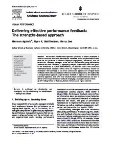
specific, can be the result of some function (usually combinatorial) of the graph structure, or a combination of these. A few examples of metrics based on graph structure are the degree of a node (i.e., the number of edges adjacent to the node), the size of a subtree for a tree, or the measure of the flow of information in a directed graph. In general, the goal is to define the relative importance of a node or an edge with respect to some semantics, where elements with high metric values are considered more interesting than those with low values. Metric values that are associated with nodes and edges can be used to determine visual attributes such as color and saturation in order to emphasize differences among elements. A technique that we find useful renders an edge with continuously shaded color that reflects the metric values of the nodes at its endpoints. In this approach, higher metric values are considered more interesting and are assigned higher saturation values for emphasis. The overall effect is the emphasis of edges in the graph with the “most interesting” metric values. This design of graphical attributes based on metrics has already been discussed in [5, 6]. For example, Figure 1 shows this effect when zooming into the details of a graph; the darker and thicker lines help to navigate towards more complex areas of the graph (this particular example uses the Strahler metric, described in Herman et al. [5]). Another use of metrics is the generation of fisheye views, as presented in the seminal paper of Furnas[2]1, where he computes the “degree of interest” of elements in a tree. Elements with low values are hidden to improve the display of the structure (sometimes referred to as semantic fisheye) and help emphasize the more important elements in the tree. Generating such visual cues is not the only way to use metrics. In a type of divisive clustering, data sets are partitioned according to metric values, with the metric value determining group membership. This subdivision helps the user to partition the graph into subgraphs of manageable sizes. This technique is not only vital to navigation in large graphs but also helps the user to identify important relations among elements, thereby making the information visualization application much more effective (see Section 5 for an example). Such subdivision procedures become particularly important if the underlying graph structure is not a tree, where no “natural” subdivision (i.e., subtrees) exists. It is important to note that all these techniques are automatic, in the sense that no further user input is necessary to generate the visual attributes or the clusters. A straightforward approach is to apply a simple linear mapping from the metric values to, for example, color saturation. This approach can work well when there is a uniform distribution of metric values. However, experience shows that more control over this mapping is necessary for cases
1
Furnas used the term “degree of interest” but, in our terminology, his DOI function could be considered a type of metric.
Figure 1. Effects of emphasis mapping on a tree. The right side shows the same portion of a tree but with edges emphasized through metric values. where the distribution is not uniform. Essentially, the spread of the metric values over the full interval should be taken into account: a finer subdivision might be necessary in more densely populated areas when doing clustering or assigning colors. Mathematically, this means that the statistical behavior of the metric values should be taken into consideration in the mapping. Presenting this approach is the focus of this paper. The examples in this paper use directed acyclic graphs (DAGs). DAGs form an intermediary class between trees and general graphs: efficient methods exist which first extract a DAG from a directed graph as a pre-processing step (see, for example, the book of Battista et al.[7]), which makes them generally useful in information visualization. The general methodology presented here is not restricted to DAGs, although some of the details may have to be investigated for the general case. The rest of the paper is organized as follows. In Sections 2 and 3, we discuss visual attribute mapping, generalizing the method illustrated by Figure 1. The same methodology can be reused for hierarchical clustering; Section 4 will present the details. A detailed example is shown in Section 5, followed by conclusions and directions for future research in Section 6.
2. ASSIGNING COLORS USING METRIC DENSITY Assigning a visual attribute (e.g., color, brightness, color saturation, or line width) consists of two steps: 1. Assign an abstract value, usually between zero and one, to each displayable element based on the element’s metric value. We will refer to this abstract value as the emphasis of the element, and we will also refer to this mapping as the emphasis mapping. 2. Map the emphasis to a visual attribute. We will refer to this mapping as the attribute mapping. The two mappings have different characteristics. It is therefore important to conceptually separate them. The mapping that generates the final visual attributes, is closely related to issues of perception and cognition, lighting conditions, display gamma values, and underlying graphics systems (see Ware’s book[8], for example). In some cases, a simple linear mapping from an emphasis value to, for example, color saturation is acceptable. In other
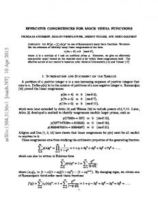
cases, a non-linear mapping is necessary. In our view, a visualization system should give the end-user some means of controlling the mapping used in order to adjust for his/her viewing conditions. The technique used to produce the images in this paper involves mapping emphasis values to three visual attributes: color, saturation, and line width. We interpolate between two colors as well as between low and high saturation based on the emphasis value. Similarly, high emphasis values map to thicker line widths. This paper, however, focuses on the emphasis mapping and not on the attribute mapping, which would require a separate investigation of its own. An obvious approach to emphasis mapping is to apply a simple linear function: the metric values for a specific graph are normalized and linearly mapped onto the unit interval. More precisely, the emphasis value associated with a metric value x is computed by ( x − m) /( M − m) , where m and M are the minimum and maximum metric values in the graph. This is the mapping used to generate the images in Figure 1 which shows that, at least in some specific cases, this mapping works well. But this is not always the case. Figure 2/(a) shows the image of a DAG. We can use what we call the flow metric to emphasize important parts of the graph. This metric, introduced in [6], simulates the flow of information in a DAG using concepts similar to Kirchoff’s equations for electrical current.2 However, if we use a linear emphasis mapping, the result is a practically blank image, because most of the edges have very low color saturation. It should be noted that this is not the result of artifacts in the attribute mapping: modifying the distortions of the attribute mapping will not improve the picture, just make all edges uniformly darker, for example. The reason is that the linear mapping does not take into consideration how the metric values are spread over the available interval. If the distribution is uniform, the linear mapping works fine. The values of the Strahler metric on trees, for example, are “almost” uniformly distributed and this is why the example on Figure 1 works well. However, the flow metric produces a relatively large number of low values. If a linear mapping is used with the flow metric, most of the metric values yield a low emphasis value, which leads to low visual attribute values.
2
Another useful analogy for this metric is the flow of water if poured into the entry nodes at the top of the graph.
(a) Graph without emphasis mapping
(b) Graph with emphasis mapping: highlighted edges are the “important” edges with regard to flow metrics
Figure 2. Two views of the same graph. Right side uses emphasis mapping. A more precise formulation is that the linear mapping does not take the distribution of the metric values into account. Using a linear mapping is equivalent to assuming that the distribution of values is uniform. In probabilistic terms, the distribution function f can be used to calculate the probability that a given metric value x is associated with an element in the graph. This is true if the set of possible metric values is discrete. When the set of possible values is infinite and fully covers an interval of real numbers, it only makes sense to ask for the probability that a metric value lies in a given sub-interval [a, b]. In this case, the probability can be obtained by summing up probabilities using the integral: b
∫ f ( x)dx a
If all values have equal probability of appearing, then the distribution is uniform and appears as a simple horizontal line above the set of possible values. (f(x) is zero outside this domain). If the distribution is not uniform, some intervals will have a higher probability than others and the curve will be more complex. For technical reasons, the density function is often used rather than the distribution: x
F ( x) =
∫
f (t )dt
−∞
The density function also has an intuitive meaning: it gives the probability that a value is smaller than a specific value x. Since the density function is monotonically non-decreasing, and it is, in most cases, one-to-one, it can be inverted over the domain of metric values3. This property is essential, as we shall see in Section 4. It is easy to show that the density function obtained from a uniform distribution is piecewise linear and is given by:
3
If the function is not one-to-one, i.e., it has constant values on some intervals, the inverse can be deduced using some simple heuristics on those intervals.
0 x − m F ( x) = M − m 1
x