Sep 7, 2006 - Figure 3. Viewers found the colored backgrounds of text mes- ... Figure 2. Images representing category to
Designing Glanceable Peripheral Displays
Tara Lynn Matthews Jodi Forlizzi Stacie Rohrbach
Electrical Engineering and Computer Sciences University of California at Berkeley Technical Report No. UCB/EECS-2006-113 http://www.eecs.berkeley.edu/Pubs/TechRpts/2006/EECS-2006-113.html
September 7, 2006
Copyright © 2006, by the author(s). All rights reserved. Permission to make digital or hard copies of all or part of this work for personal or classroom use is granted without fee provided that copies are not made or distributed for profit or commercial advantage and that copies bear this notice and the full citation on the first page. To copy otherwise, to republish, to post on servers or to redistribute to lists, requires prior specific permission. Acknowledgement This work was supported in part by the National Science Foundation under grant IIS-0325351.
Designing Glanceable Peripheral Displays Tara Matthews EECS Department University of California, Berkeley, CA, USA
[email protected]
Jodi Forlizzi and Stacie Rohrbach HCI Institute and School of Design Carnegie Mellon University, Pittsburgh, PA, USA {forlizzi, slr}@cs.cmu.edu
ABSTRACT
minimize the demand for attention in information interactions is a rich area for exploration. While many novel ambient display designs have been proposed for everyday environments [10,11,26,27], most are point designs in a space that have rarely been systematically evaluated for effectiveness or even desirability [2,6]. After attention is captured by a peripheral display, it moves to foveal vision and information must be interpreted. We separate attention capture (explored by [2,6]) and focus on rapid interpretation of information once information is being attended to.
In this paper, we present a multi-faceted exploration of glanceable design. We seek answers to the question how do we design peripheral, visual displays that are highly glanceable? By glanceable, we mean enabling users to understand information quickly and easily. Glanceability is critical to peripheral display design because users need to quickly glance at and read displayed information with minimal interruption to their primary task. Our contributions are a taxonomy of visual variables and a set of design principles for using the visual variables to accomplish glanceable design. Our design principles are derived from interviews of experienced designers, a case study designing many variations of an email peripheral display using our visual variables, and a literature survey.
In this paper, we explore the issue of glanceable design. By glanceable, we mean enabling users to understand information with low cognitive effort. We seek answers to the question how do we design peripheral, visual displays that are highly glanceable? Glanceability is critical to peripheral display design because users need to quickly glance at and read displayed information with minimal interruption to their primary task.
Categories and Subject Descriptors: H5.2 User Inter-
faces–Graphical user interfaces. H5.m Miscellaneous.
General Terms: Human Factors, Design Keywords: Interaction design, information visualization, peripheral displays, glanceability
We begin with a discussion of key issues affecting glanceability. We support our interest in the topic and position with a discussion of related work in information visualization, cognitive science, and peripheral display literature. We present an analysis of peripheral displays, leading to the construction of the visual variable taxonomy. Next, we explain the application of the visual variables to a case study design exploration of an email peripheral display. We present results from interviews with nine experienced designers who shared their ideas on glanceable display design. Lastly, we present the combined results gathered from the interviews and the case study. Our findings enable us to propose a set of design principles that can be applied to the design of glanceable displays. The design principles are intended to aid the visual design of glanceable displays in divided attention situations. The generalizable principles can support a variety of usable and accessible peripheral display designs. Our contributions are a taxonomy of visual variables and a set of design principles for using the visual variables to accomplish glanceable design.
INTRODUCTION
People who engage regularly with technology interact with hundreds of visual, auditory, and multimodal displays each day. These displays, which have been described as calm technology [26] or peripheral or ambient displays, move information from the periphery to the center of human attention and back. If we can leverage design methods to reduce the time it takes to extract information from a display, allowing information comprehension to linger on the periphery for even a fraction of a second, both human and financial resources could be greatly maximized. Peripheral displays receive varying amounts of attention depending on how easily users can interpret the information they convey. Understanding what design variables might
A DEFINITION OF GLANCEABILITY
Our work is based on a definition of peripheral displays presented in [18]: the display is a tool in at least one activity of the user and the display is used at the operation level (i.e., its usage requires relatively low cognitive cost). For a peripheral display to be well designed by this definition,
1
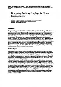
Table 1: The taxonomy of design variables was derived from an analysis of existing peripheral and glanceable displays. The design variables we studies and a portion of the displays we analyzed is shown here. We utilized several of the design variables in our email case study: (visual variables) abstract, realistic, two-dimensional, amount, location, proximity, hierarchy, size, shape, color hue, color intensity, transparency, blur/clarity, resolution, and (temporal variable) duration. Notations of evaluation methods and key features of each example are listed along the bottom of the diagram.
interpreting information on it must be very quick and easy (i.e., it must be glanceable). This definition was derived from an Activity Theory [20] analysis of peripheral displays, which assumes they are part of a complex system of multiple, ongoing activities. The authors also differentiate between notification displays and peripheral displays. Noti-
fication displays are defined as those that are used at the action level (i.e., they demand focal attention). (See [18] for a detailed discussion.) Our discussion of glanceability does not include issues of notification or attention capture, since they are applicable to a different class of applications (i.e., notification displays). 2
Glanceability is separate from the issue of attention capture, since it refers to the invocation of operations rather than actions. Design variables used for capturing user attention include abrupt onset, flashing, bouncing, and other motion.
factors, and graphic design. However, little is known about how glanceable these displays are or how to determine this. Glanceability is an important design characteristic of peripheral displays. Cognitive science research on visual search provides a better understanding of what makes a display glanceable. Finding targeted information in a display is a visual search task. The psychology literature describes two major types of visual search mechanisms. The first are top-down goal-driven mechanisms that invoke cognitive processes [7]. The second are bottom-up mechanisms, which are thought to operate on raw sensory input, rapidly and involuntarily shifting attention to salient visual features of potential importance. Many researchers have pointed out that neither mechanism works in isolation in a particular situation; instead, the mechanisms work together interactively. Typically, bottom-up mechanisms act early in the visual perception process, and then top-down mechanisms take over, generally within a time on the order of 100 milliseconds [7].
Glanceability refers to how quickly and easily the visual design conveys information after the user is paying attention to the display. Glanceability is greatly affected by the amount and type of information being displayed. Interpreting a display of one piece of information will be much easier than interpreting a display of many bits of information. Also affecting glaceability are design elements such as color, shape, position, size, and contrast, which are used to represent information in a variety of ways. We later present a taxonomy of visual variables that affect glanceability. RELATED WORK
The Dangling String is a landmark peripheral display that fostered an increasing interest in the design of calm technology that engages the periphery of attention, while conveying information. Created by artist Natalie Jeremijenko, the Dangling String is an 8-foot piece of plastic wire hanging from a small electric motor mounted in the ceiling. The motor, mounted to a nearby Ethernet cable, reflects network activity by spinning the wire to create a shape and a characteristic noise [26]. This piece is an example of calm technology that unlike most information systems, allows users to initiate interaction based on their needs, rather than technology pushing information.
Our glanceability research is concerned with finding visuals that enable faster top-down and bottom-up search processes without being distracting. Visuals that support top-down search will be easy to cognitively interpret. Visuals that support bottom-up search enable relevant information to pop-out [1]. Pop-out is a bottom-up drawing of attention to an object, which occurs when an object within the visual field is distinctive along some visual dimension (for example, possessing a distinctive color or brightness when compared with other objects in the field). Prior studies have identified a range of visual features which can induce popout effects, including color, brightness, movement, direction of illumination, distinct curvature, and tilt [3,14,22]. If visual features are to be used successfully in glanceable displays, they will need to balance distinctiveness with too much demand for attention.
Many ambient displays have been created using the theme of calm technology. Some displays are physical, using materials such as wire, string, pinwheels, water ripples, and bubbles [11,26,27]. Some reference lifelike forms such as plants, water, and grass [11,13,21,27]. Other displays rely on projected digital images, and allow for user interaction with the display [10,12]. These displays have been informed by research in the field of psychology, human
We also reviewed literature on perception, attention, and a
Figure 1. Shown here are three of the displays we analyzed that supported the construction of our peripheral and glanceable display taxonomy. (A) The Georgia Tech InfoCanvas communicates quantitative information in a qualitative form by using visual representations of known objects. Changes in concrete concepts such as stock prices are represented in the amount, color, size, and shape of objects. (B) The U.C. Berkeley IC2Hear application for the deaf uses design variables such as color, intensity, size, duration, and location to visually communicate sound information. (C) The position of the gear shift provides sufficient gear information, functioning as a peripheral display. Numbers provide redundancy.
3
TAXONOMY OF DESIGN VARIABLES
series of experiments found in psychology literature that examine the onset of information in two-dimensional displays. Of particular interest were issues of spatial proximity [9] and display size and location, use of relatively unstudied design variables such as transparency and subtle motion, and supporting cognitive processes at the instance of presenting new information by creating an “interruption lag” — the analog of white space in a peripheral display [2].
Based on a literature survey of existing peripheral displays and our own design experience, we have created a taxonomy of design variables that can be used to convey information quickly and easily. With this taxonomy, we hope to address the following questions:
The human factors literature also reveals knowledge about the process of searching for information, particularly in time-critical environments, such as vehicle operation. In these mission-critical contexts, particular design treatments such as color and shape can be used to make a target more or less conspicuous [16]. For example, the proximity compatibility theory argues that like information will be more interpretable if placed proximally near a similar visual design treatment on the display such that the two can be compared [25]. Vicente and Rasmussen [24] present an ecological approach to display design that offers an integrated information presentation mechanism to save workers time when reading a display in critical environments. Proximity compatibility and ecological approaches to display design might be successfully used to make complex information glanceable.
•
What makes information glanceable? What design variables are quickest and easiest to interpret?
•
What makes information learnable and easy to recall? Can variables contribute to learning and remembering information?
To create the taxonomy, we collected examples of a wide range of existing peripheral and glanceable displays. Examples are illustrated in Figure 1. These examples range from things that are observable in the world (e.g., the dividing line on a highway or a gear shift in an automobile) to peripheral displays that are the work of other designers and researchers (e.g., A Peripheral Display Toolkit [17] and An Interactive Poetic Garden [28]). We next examined and articulated the design variables found in this diverse set of examples. Informed by research done on visual variables in static designs [4,8,15,23] we created an initial list of design variables (such as color, hue, transparency, and location) found in these displays. We separated the variables into four categories based on the similar variables and methods they used to communicate information. We discovered that in some cases the most prominent and important variables were visible in the overall structure of the display while others applied to specific components (parts) of the displays. In a few cases we found that temporal variables (i.e., those that included motion) communicated the greatest amount of information, while others used non-visual modalities (e.g., sound and touch) as a means of conveying content. Forming categories based on the prominence and communication value of the design variables used in the displays enables us to compare and contrast the examples more effectively. The categories include:
In the domain of graphic design, several researchers have identified visual design variables and underlying principles to assist with the interpretation of information. For example, Bertin [4] identified seven basic graphic design variables (value, hue, texture, shape, position, orientation, and size) to assist in creating useful visual representations. According to Dondis [8], line, color, shape, direction, texture, scale, dimension, and motion are the basic design primitives used in graphic design. One property may dominate another at a given time, based on what is being designed or, if looking at a composition in nature, what exists. The additional properties of balance, stress (stability), leveling, and sharpening add further visual order to a composition. Similarly, glanceability is increased when the design elements used to communicate information are quickly identified and easily related to the content they represent [15]. We incorporate these graphic design variables and basic primitives into our taxonomy and examine their ability to contribute to glanceable displays. Our work will integrate and extend research in these domains, representing a contribution in the field of interaction and interface design. An interface designer has control over many design criteria when designing an interface. Primarily, she must decide where the information will go on the display, when the information will be displayed, and how it will be represented — using abstraction, detail, and particular visual, auditory, and tactile treatments. Our work is constrained to research on visual variables to easily communicate peripheral information.
1.
static visual variables that apply to the entire two- or three-dimensional display (visual variables (whole) in Table 1);
2.
static visual variables that apply to specific parts of the two-dimensional display (visual variables (parts));
3.
temporal variables; and
4.
variables that apply to other modalities.
From this set, we extracted a list of design variables that we believe have the greatest potential for communication of information through visual representations of content. Our selection was based on our analysis of existing displays. Visual variables that appeared in numerous studies and produced positive results seemed worthwhile to investigate in greater depth. The taxonomy is shown in Table 1. It illustrates a portion of the displays we analyzed and all of the design variables we examined. 4
Figure 2. Images representing category topics (sender groups, here) were rated highly by viewers.
Figure 3. Viewers found the colored backgrounds of text messages to be informative and easily recognizable.
Figure 4. Viewers did not prefer the changing orientation of bars as a means of attaining information. The connection of orientation to topics is a big cognitive leap.
Figure 5. Viewers did not favor changes in dot transparency because differences are not easy to recognize when seen in isolation. Viewers also reacted unfavorably to a value system being attributed to sender categories.
To evaluate the effectiveness of our design variables in one context, we have applied them to a case study designing email peripheral display variations. We present this case study of thirty designs in the next section.
Each version focuses on a single variable. The variable is changed based on what sender group the message is from. In all examples, viewers see four email messages (sender group from top to bottom: spam, administrative, work, and personal), each coupled with a visual element that varies based on a theme (e.g., image in Figure 2, color in Figure 3, orientation in Figure 4, transparency in Figure 5, and so on). The email variables column in Table 1 indicates which variables we tested.
EMAIL PERIPHERAL DISPLAY DESIGN CASE STUDY
Using variables from our peripheral display taxonomy, we designed thirty versions of an email display. In some cases particular variables were used in multiple versions of the study because they inherently offer numerous forms of applicable representation. For example, color was applied to the text in one version of the study and to the background of another. Each of these versions were warranted but produced significantly different results. In creating the displays, we explored the glanceability and effectiveness of our variables in the email domain, and how the taxonomy can inform the design of glanceable displays.
Email Information Caveat
The selection of email information shown in a peripheral display is critical to its success. While we chose to display the sender group (personal, work, administrative, and spam), sender, and subject, many other pieces of information could be shown, changing the success of the display. Cadiz et al. [5] surveyed information workers to learn how they determine the importance of email messages. The ten most important factors in determining a message’s priority are as follows: reply to my message, from manager, I’m in
The purpose of the email display is to allow readers to quickly determine whether to read or ignore a message. 5
the TO line, “high importance” flag, from a project member, from a direct report, from the management chain, from a peer, interesting auto-preview, interesting subject line. Five of these refer to senders, which we featured in our design variations.
based on a theme. This treatment creates a hierarchy of information (e.g., small to large sized elements, elements positioned low to high, low to high alpha values, numbers, and so on). In studying the content of email messages, we discovered that we could separate senders into a relatively small number of groups. We explored prioritizing the sender groups from most to least important as follows: personal, work, administrative, spam. Then we assigned visual elements to the groups, creating a visual hierarchy (e.g., a small rectangle represented spam whereas a large rectangle signified personal). However, most interviewees thought this hierarchy was artificial because sender groups aren’t inherently ordered. One participant said, “I could be waiting for a very important administrative email; this would be confusing.” Another said, “If you use a continuum it should be because the data really is a continuum.” In practice, one should use design elements that imply order only when representing ordered information, thus matching viewer expectations.
We presented our email designs to experienced designers in interviews described in the next section. INTERVIEWING DESIGNERS
To gather a diverse, unbiased idea of how to design glanceable displays, we interviewed 9 experienced designers: 3 professional designers, 2 professors of design, and 4 graduate students with prior design experience. Interviewees listed their areas of expertise as follows: 5 in interaction design, 4 in graphic design, 2 in information design, 1 in typographic design, 1 in branding, and 1 in print design. The interview began with a discussion of the glanceability of existing peripheral displays. Then interviewees sketched their idea of a glanceable email display. Next, we showed interviewees our email design variations. Interviewees rated each variation with a number from 1 (very poor glanceability) to 7 (very good glanceability), and supplied reasons for their scores (see Figure 6 for rating results). Finally, interviewees shared their opinions on the general principles and visual elements that contribute to glanceable design.
Unordered, Finite Group
Unordered information can be separated into two types: finite group and infinite group. Finite groups are similar to categories in that they don’t contain a hierarchical structure. Examples include email sender groups, book genres, types of recipes, and so on. Abstract or literal design elements that do not imply a particular order can be used for finite groups: colors of similar hue, icons, photos, shapes, and so on.
We present results from interviews in the next section along with lessons learned from the email design case study and our literature survey.
Email senders can be separated into a finite set of groups. Interviewees gravitated toward design elements that represented information in a categorical, unordered manner. For example, colored backgrounds and iconic images were well received. Interviewees considered it reasonable to use a relatively arbitrary mapping of design elements (e.g., color) to content because the number of variables was small, making each easy to learn and recognize through repeated use.
DISCUSSION OF GLANCEABLE DISPLAY DESIGN
Our analysis of glanceable display design has led to a better understanding of how information types being conveyed affect the use of visual variables. Our email case study has helped us better understand how our taxonomy variables should be used. Finally, our interviews have given us a better understanding of the important themes in glanceable design. We discuss these findings in this section.
Unordered, Infinite Group
The second type of unordered information relevant to glanceable displays is infinite group. Infinite groups contain practically unlimited pieces of information, much of which may be unrelated. Examples include email message contents, news articles, blog postings, and so on. Abstract design elements are less effective in representing infinite groups of information because the amount of variables needed to appropriately communicate content exceeds that which is easily recognized and associated to concrete ideas. Essentially, users would need to learn a robust new visual language in order to interpret the meaning of information. Therefore, text is the most effective way to communicate infinite groups of information. This is especially true since infinite group content may be unpredictable. For example, email message content can include any text and any topic.
Choosing Visuals Based on Information Types
Prior to designing the email study, we realized that the nature of the content inherently included several types of information. Based on our observations and inspired by [29], we found it necessary to separate the information into three groups for the purposes of glanceable design: ordered, finite, and infinite. The designers we interviewed reinforced the validity of the groupings by stating the importance of appropriately matching design elements to the information being represented. We describe each group, explore visualizations where appropriate, and make glanceable design recommendations based on our findings. Ordered
Ordered information falls along a continuum and has a hierarchical structure: small to large, light to dark, low to high priority, and so on. Ordered information can be logically represented by using abstract or literal elements that vary
From a design perspective, a very large group (e.g., names in the phone book) is essentially an infinite group because no mapping of design elements to items in the group would 6
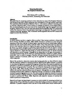
The next most popular email design variation used color for the message 6.0 box background (Figure 3). Interviewees liked how the color 5.0 stood out, primarily because the colors were bright and they covered a much larger portion of the display 4.0 than elements in our other designs. This draws out an important point: 3.0 glanceability means that visual elements must stand out (i.e., be large, 2.0 bright, or distinct enough to draw the eye). Designers also liked how the color drew the eye to the interesting, 1.0 associated information on the display (the sender’s name). One designer 0.0 warned that distinctly different colors should be chosen, saying that our green and blue looked too similar. Another designer thought that the colors should be distinguishable, but Figure 6. Interviewee ratings of email variables are shown here. 1 = very poor glancealso have similar saturation so that no ability; 7 = very good. color stood out over the others (since no priority should be placed on the sender categories). be learnable. For example, displaying a different color for each caller’s name in the phone book would not help people The third most popular variation was multiple dots repreidentify callers. senting the priority of the email sender group (1 dot for Our interviewees thought infinite group information was spam, 2 for administrative, 3 for work, and 4 for personal). not appropriate in peripheral displays, emphasizing that Interviewees complained about the artificial prioritization they should remain “less detailed,” “simple,” and “clear.” of sender groups. However, they thought the dots were One participant said, “You should not include much devisually distinguishable in a quick glance, even if the distail… You need to decide where to draw the line between play only showed one email message at a time: “There is no information that is appropriate for a peripheral display and subtlety about it: no comparing fuzziness. You can tell from information that needs to be in the interactive application.” a mile away: 4 [dots] is 4 [dots].” Some techniques that could improve the ability to convey The least popular email design involved varying the orieninfinite group information glanceably, include categorizing tation of a bar (Figure 4). Interviewees had two main an infinite group into finite groups (e.g., groups of email reasons for disliking the use of orientation. First, it had “no senders) and summarizing (e.g., selecting keywords from an semantic meaning” with relation to email sender groups. email message). Second, it was “hard to distinguish” the bars. re pr es co ent lo at re ive d b a im ck ag tra ns mu gro e pa ltip un d re nc le d o y & ts c o le t lo t e r re d re do ct t an gl blu e r l su en bj e gth siz ct s e ize ch an ge ba sha r % pe ou fi tlin lled e & f il l te let xt te co ur rs lo e s re d ize tra bo ns pa ce rde re le r nc br y it y of pi d o xe ts la ti o op ac bo u n it y n c co lo ch a e re ng d co a e lo l t ri nt ext en c o pr sity lo ox re im ba d s ity r o ub rie jec nt t at io n
Variable Ratings
Email Case Study Ratings
Another of the less popular variations included dots with different levels of transparency (Figure 5). The main reason transparency did not work in this case was that it was “hard to differentiate” the levels of transparency. One interviewee also noted that the dots did not draw her eye and so she was “still going to read the message. Having the dots won’t stop me.”
Figure 6 shows the ratings that interviewees gave the email case study design variations. The most popular design augmented the message preview with images representing the sender group: a can of spam for spam, a calculator for administrative, a briefcase for work, and a lock for personal (Figure 2). One interviewee said, “This works really well for categories. It enables easier learning of mappings.” Several people emphasized the need to select visually distinct images, using “different colors, shapes, orientation, and contrast,” for example. Others thought images would be more glanceable if they were abstracted. For example, certain distinguishable features could be over-emphasized to enhance quick recognition. In general, interviewees thought images largely improved glanceability: “A picture or icon stands for an entire idea, concept or sentence. The time it takes to decipher that picture is much less than the time it takes to read that sentence.”
Properties of Glanceable Displays
Several themes came out very strongly in interviews. First, interviewees gravitated toward designs that were semantically meaningful, like images or abstract icons. Creating mappings between information and visuals that have meaning enables people to quickly learn and interpret a display. In other words, the visual matches a person’s expectations of what information it conveys.
7
things… [Here] I am changing the color of the bell. That bell means three things: warning, caution, or [alarm].” The consistent visuals (the bell icon) conveyed one meaning across multiple icons, and the single variation (color) conveyed additional information.
Second, information should be represented abstractly, so that it is simple and lower in detail. As one designer noted, “There is a threshold of what level of detail is appropriate for a peripheral display.” Several interviewees emphasized the need for “simple,” “minimalistic,” designs. Abstraction is a tool for accomplishing simpler designs, since it involves extracting or removing information from the original source. For example, one interviewee talked about John Lennon’s sketched self-portrait that used only a few lines to show his most recognizable features: long hair, round glasses, and a long nose. It is abstract, but unmistakably Lennon. This designer emphasized that abstractions should “over-emphasize recognizable features.” An effective way to use abstraction is to select only the essential bits of information to convey. All interviewees thought that abstract visuals, such as the representative image (Figure 2), were effective and glanceable in our email case study.
In the next section, we distill this results discussion into design principles for glanceable displays. GLANCEABLE DISPLAY DESIGN PRINCIPLES
From our experience creating peripheral displays, existing literature, a case study exploring email display design, and interviews of designers, we derive the following set of design principles for glanceable displays: match user expectations, use abstraction, make visuals distinct, and maintain consistency. Match user expectations: Visual representations should logically match viewer expectations (e.g., strong match: red=hot; weak match: square=hot), since this will reduce learning effort.
Third, visuals need to be distinct so that they can be quickly interpreted in a glance, if they represent information that needs to be identified (e.g., finite groups). All interviewees called out the importance of visual elements being distinct from each other and from their surroundings: “elements have to be able to be distinguished in an instant.” One of the major complaints with our email designs that used slight variations on a theme – transparency (Figure 5), orientation (Figure 4), amount, duration, resolution, blur, color intensity, and size – was that the differences were not distinct enough. Of these designs, one interviewee said, “When elements have meaning when compared to each other, they need to be very different, especially when seen alone.” Though interviewees liked the representative image design (Figure 2), most thought the images could be improved by making them more distinct from each other: “It is hard to pick distinguishable images. You need to use different colors, shapes, orientation, and contrast. These look too similar.” Another designer pointed out the importance of selecting visual elements that can convey many levels of information: “To [me], work is ten projects. There would need to be a way to create finer distinctions.” Varying transparency, for example, does not allow for enough distinction to convey many finite groups. However, transparency may be effective for giving viewers a rough sense of some amount, as long as it is distinguishable from its surroundings.
Use abstraction representations: Extracting or simplifying information to its essential qualities is critical for glanceable design because it reduces the amount of details needed to effectively communicate information (e.g., picking a recognizable feature of the information and exaggerating it in an iconic representation). Make visuals distinct: Design elements that are meant to be identified should be visually distinct from each other and their backgrounds. Distinct visuals improve the identification of elements. They also help draw the viewer’s eye to important or new information. Maintain consistency: Design elements that represent similar information should be kept consistent whenever possible. For example, changing the placement, behavior, and/or color of design elements causes disorientation and negatively affects the amount of time viewers need to perceive and process information. CONCLUSION AND FUTURE WORK
This paper has presented research on glanceable displays. We conducted a literature review and examined a number of peripheral displays that led to an initial taxonomy of visual design variables for glanceable displays. We designed thirty versions of a glanceable email display and evaluated them with nine designers. The results of this work led to several initial design principles for glanceable displays. Our contributions to the field of interaction design include the taxonomy of visual variables and the set of design principles for using the visual variables to accomplish glanceable design.
Fourth, visual elements should be consistent. One designer gave an example: “In a lot of interfaces you’ll see a magnifying glass that lets you zoom in, and in other interfaces the magnifying glass lets you search. It can’t mean both in the same context – that’s confusing.” Likewise glanceable displays have to use consistent visuals in order to avoid confusion. Consistency can enhance mechanisms for conveying information glanceably. For example, one participant described a set of icons he designed: “Behind each icon there is a family of icons that represent variations on a particular state. [Each] one will have 4 or 5 sister icons and a [single] variation in that symbology means different
We are currently conducting a lab study to gather quantitative results about the effects of our glanceable email designs on user performance in multitasking situations. This empirical knowledge, combined with the implicit knowledge of the designers that contributed to our first study, will
8
14. Julesz, B. “A brief outline of the text on theory of human vision.” Trends in Neuroscience, 7(2), pp. 41-45, 1984.
allow us to refine and extend our initial design principles for glanceable displays. ACKNOWLEDGEMENTS
15. Kossyln, S.M. Principles of Graph Design. W.H. Freeman and Company, 1994.
This work was supported in part by the National Science Foundation under grant IIS-0325351.
16. MacEachren, A.M., How Maps Work. Guilford Publications, 1995.
REFERENCES
1. Baldassi, S., and Burr, D.C. “‘Pop-out’ of targets modulated in luminance or colour: the effect of intrinsic and extrinsic uncertainty.” Vision Research, 44(12), pp. 1227-1233, 2004.
17. Matthews, T., Dey, A.K., Mankoff, J. Carter, S., Rattenbury, T. “A toolkit for managing user attention in peripheral displays.” Proceedings of UIST. pp. 247-256, 2004.
2. Bartram, L., Ware, C., and Calvery, T. “Moticons: detection, distraction and task.” Journal of HumanComputer Studies, 58(5), pp. 515-545, 2003.
18. Matthews, T., Rattenbury, T., Carter, S. “Defining, designing, and evaluating peripheral displays: An analysis using activity theory." Technical Report No. EECS2005-20, EECS Department, University of California, Berkeley, 2005.
3. Beck, J. “Textural segmentation.” Organization and representation in perception, J. Beck (ed.), Erlbaum, 1982.
19. Miller, T. and Stasko, J. “Artistically conveying information with the InfoCanvas: A highly personalized, elegant awareness display.” Proceedings of AVI, pp. 4350, 2002.
4. Bertin, J. Semiology of graphics: diagrams, networks, maps. University of Wisconsin Press, 1983. 5. Cadiz, J.J., Dabbish, L., Gupta, A., Venolia, G.D. “Supporting email workflow.” Technical Report No. MSRTR-2001-88, Microsoft Research, 2001.
20. Nardi, B. (ed.) Context and Consciousness: Activity Theory and Human-Computer Interaction. MIT Press, 1996.
6. Chewar, C.M., McCrickard, D.S., and Sutcliffe, A.G. (2004). “Unpacking critical parameters for interface design: Evaluating notification systems with the IRC framework.” Proceedings of DIS04, pp. 279-288.
21. Raffle, H., Joachim, M., and Tichenor, J. “Super cilia skin: An interactive membrane.” Proceedings of CHI, pp. 808-809, 2003.
7. Conner, C.E., Egeth, H.E., and Yantis, S. “Visual attention: Bottom-up versus top-down.” Current Biology, 14, pp. R850-R852, 2004.
22. Treisman, A. “The perception of features and objects.” Visual attention, R.D. Wright (ed.), Oxford University Press, pp. 26-54, 1998.
8. Dondis, D.A. A Primer of Visual Literacy. MIT Press, 1973 (reprint 2000).
23. Tufte, E.R. Envisioning Information. Graphics Press, 1990.
9. Fisher, D.L., Coury, B.G., Tengs, T.O., and Duffy, S.A. “Minimizing the time to search visual displays: The role of highlighting.” Human Factors, 31(2), pp. 167-182, 1989.
24. Vicente, K.J., and Rasmussen, J. “The ecology of human-machine systems II: Mediating ‘direct perception’ in complex work domains.” Ecological Psychology, 2, pp. 207-250, 1990.
10. Fogarty, J., Forlizzi, J., and Hudson, S.E. “Aesthetic information collages: Generating decorative displays the contain information.” Proceedings of UIST, pp. 141150, 2001.
25. Wickens, C.D. and Andre, A.D. “Proximity compatibility and information display: effects of color, space, and objectness on information integration.” Human Factors, 32(1), pp. 61-77, 1990.
11. Heiner, J.M., Hudson, S.E., and Tanaka, K. “The information percolator: Ambient information display in a decorative object.” Proceedings of UIST, pp. 141-148. 1999.
26. Weiser, M., and Brown, J.S. “Designing Calm Technology,” 1995. Available online at www.ubiq.com/weiser/calmtech/calmtech.htm. 27. Wisneski, C., Ishii, H., Dahley, A., Gorbet, M., Brave, S., Ullmer, B., and Yarin, P. “Ambient displays: Turning architectural space into an interface between people and digital information.” Proceedings of CoBuild, pp. 22-32, 1998.
12. Holmquist, L.E., and Skog, T. “Informative art: Information visualization in everyday environments.” Proceedings of GRAPHITE, pp. 229-235, 2003. 13. Holstius, D., Kembel, J., Hurst, A., Wan, P-H., and Forlizzi, J. “Infotropism: Living and robotic plants as interactive displays.” Proceedings of DIS, pp. 215-221, 2004.
28. White, T., and Small, D. “An interactive poetic garden.” Extended abstracts of CHI, pp. 335-336, 1998. 29. Wurman, R., Leifer, L., Sume, D., and Whitehouse, K. Information Anxiety 2. Macmillan Computer Publishing Company, 2000.
9