to accomplish her task, a developer today typically uses a development environment to .... http://www.codeproject.com/csharp/CsGATetris.asp. In order to collect ...
Easing Program Comprehension by Sharing Navigation Data Robert DeLine, Mary Czerwinski, and George Robertson Microsoft Research, Microsoft Corporation, Redmond, USA
Abstract Large software projects often require a programmer to make changes to unfamiliar source code. This paper describes a set of tools, called Team Tracks, designed to ease program comprehension by showing the source code navigation patterns of fellow development team members. One technique shows a list of Related Items, given that the user is viewing a given method or class. Another technique shows the Favorite Classes, by showing a class hierarchy view that hides less frequently visited classes, methods, and members. Two user studies, a laboratory study and a field study, were run to evaluate the effectiveness of these techniques. The results of the two studies demonstrate that sharing navigation data can improve program comprehension and are subjectively preferred by users.
Introduction In large, long-term software projects, team membership and responsibilities change frequently. As a result, a developer must often correct, enhance, or refactor unfamiliar source code. To learn enough about the code to accomplish her task, a developer today typically uses a development environment to read selected parts of the code, to execute the code in the debugger, and to navigate the code through overviews like call graphs, class hierarchies and UML diagrams. Previously, we described usability problems that we observed during a formative study in which we asked developers to make corrections and add features to an unfamiliar code base [1]. We selected the seven participants, with an average of 18 years of development experience, for their familiarity with the development environment (namely, Visual Studio 2003) and the problem domain (GUI programming). We selected the code base from a software repository web site for its relatively small size (3 KLOC) and its high rating among the site’s community. Despite the participants’ expertise, we saw several problems as they attempted to complete their tasks: • They wanted more documentation to help identify the important parts of the code and to describe how the parts are related. • They got lost as they navigated around the code base, particularly as the number of open documents increased.
• They relied heavily on textual search to find relevant parts of the code, lost time separating good search results from bad, and became distracted by results that seemed relevant but were not. In this paper, we describe a set of visualizations, called Team Tracks, that addresses these issues and then report the results of two usability studies to evaluate whether these visualizations aid in program comprehension.
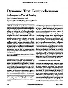
Visualizations based on Shared Navigation Each of our participants expressed the desire to “pick the brains” of the code’s original authors. Such communication, whether in the form of meetings, email or documentation, can have a considerable cost, particularly once the original authors have left the team. To avoid this cost, we instrument the team’s standard development environment to record where each developer navigates in the code base as she accomplishes her daily programming tasks. Once per second, our instrumentation peeks at the location of the editor’s text cursor and records which project, file, class and member correspond to that location. At this low sampling rate, the user does not notice the recoding, and the storage cost is negligible. We then mine this navigation data to provide visualizations to help those unfamiliar with the code. Our visualizations are based on two intuitions: • The more often a part of the code is visited, the more importance it has for someone new to the code. • The more often two parts of the code are visited in succession, the more related they are. Based on the first intuition, Team Tracks uses the navigation data to filter the typical hierarchical information that the development environment presents about the program. Figure 1(A) shows Visual Studio’s Class View, which is a tree that contains the program’s projects, the classes in each project, and the members in each class. Figure 1(B) shows our visualization called Class View Favorites, which organizes this same hierarchical information, based on the navigation data. For each node in the Class View tree, Class View Favorites splits the node’s children into those that were frequently visited and those that were not. The infrequently visited items are placed under a new ellipsis node, whose label is based on the item type (“More members,” “More classes,” or “More projects”). By placing the unpopular items under their own tree
C
B A
Figure 1. Screen shot with (A) the typical class view, (B) our Class View Favorites, and (C) our Related Items. node, that node can be collapsed to hide the unpopular items while keeping them accessible. The user can adjust the hierarchy to establish her own working set: unchecking an item moves it under the ellipsis node; checking an item under an ellipsis node moves it up. The projects, classes, and members where the team collectively navigated the most often during development are a small subset of the whole program, as witnessed by the size of the scrollbar in Figure 1(A) and the lack of a scrollbar in (B). Visual Studio also provides a file-based view of the program, called Solution Explorer, and we similarly provide a navigation-filtered version called Solution Explorer Favorites. Based on the second intuition, Team Tracks provides a visualization, called Related Items, shown in Figure 1(C). Based on the program definition currently selected in the editor (in this case, the method InitFigure),
Related Items shows those parts of the program that were most frequently visited either just before or after the selected item. The list is presented in ranked order by frequency of visits, and a bar chart drawn lightly in the background depicts the ranking. In this instance, the team navigated back and forth between InitFigure and the method InitNextFigure the most often; between InitFigure and the field nextFig, the next most often; and so on. Selecting an item in the list displays that item’s definition in the preview area to the right of the list. This allows the developer to learn more about the item, without losing the current editing context. Doubleclicking on an item navigates to that item in the editor. Because the appearance of an item in the Related Items list is based only on the team’s navigation, we cannot provide a reason why the two are related. However, in general, a recommender system is more trusted if it provides a rationale for a recommendation.
Here, we provide an icon for each item in the list as a surrogate for an explicit rationale. A right arrow means that the definition in the editor directly means the list mentions the list item; a left arrow item directly mentions the definition in the editor; and a star is a catch-all that means that no other relationship holds. The fact that InitFigure mentions (in this case, calls) Figure.CanDraw is not the reason why Figure.CanDraw appears in the list, but this fact provides a reasonable guess about why the team navigated frequently between the two. For now, our prototype only looks for two kinds of relationships, namely, A directly references B or B directly references A. We could add other relationships that programmers readily understand, each with its own icon, such as A transitively references B, A and B each reference a third item, code was copied-and-pasted from A to B, and so on. The starred items are the most interesting, and hence we have enlarged the size of these icons to a small degree, since they represent a frequent navigation for which the system could not find one of its known relationships. These we hypothesize to be “diamonds in the rough,” navigationally speaking, for programmers unfamiliar with the code.
across team members and across time to filter the user interface makes Team Tracks an instance of social filtering [10]. The Favorites views were inspired by Lee and Bederson’s Favorite Folders [6], which also showed elided material and provided an explicit means for the user to specify which folder items to retain in the view. The difference in Team Tracks, is that the choice of which items to show initially is driven by statistical analysis of a team’s navigation history. Favorite Folders requires the user to manually specify which folders to promote and which to elide. More generally, there have been many attempts to use software visualization techniques to improve how programmers navigate large and complex programs, in addition to understanding the code better (e.g., [7],[8], [11]). Visualization of code evolution has also been used to help programmers understand why programs are structured the way they are [1] and to assist with software debugging [4]. Many of these techniques use visualization of the actual lines of code, while we have chosen to provide user interface features that provide users with suggestions about what parts of a code base might be more relevant to the programmer’s task.
Related Work Hill, Holland, Wroblewski and McCandless introduced the idea of computation wear, namely, capturing a user’s interaction history with a document and making that history available to others interacting with the same document [3]. Their intention was to increase group awareness. More recently, Schneider, Gutwin, Penner and Paquette applied this idea to software artifacts in particular [9]. They store a team’s interactions with a code base in the code’s source control system to increase team awareness, for instance, to show which team member is working on which part of the code. Our contribution is to demonstrate that such interaction histories can be used to help newcomers more quickly learn about shared artifacts.
User Studies
Team Tracks is most closely related to Kersten and Murphy’s Mylar, an extension to the Eclipse development environment that helps a developer manage her working set [5]. Mylar records an individual developer’s interactions with a code base to compute a degree-of-interest (DOI) function; the more a developer interacts with a program element, the more interest she expresses in it. Mylar then uses that DOI function to highlight related items and elide unrelated items in Eclipse’s user interface. Team Track’s biggest difference is that it persists interaction data and combines the data across all team members. Using data
We ran the study on a Compaq EVO 510 desktop computer with an Intel P4 2.8 GHz processor, 2 GB of RAM and a 40 GB hard drive, running Windows XP Pro SP2. The computer had Dual NEC 18” flat panel monitors, running at 2560x1024 total resolution. We used Visual Studio.net 2003 as the software development platform, with the Team Tracks features added at the beginning of the session. The experimenter initially placed the new features for the user in our preferred locations (for the favorites lists, this was as an alternative tab in each of the Solution Explorer and Class Hierarchy views, and for the related items list this
Study 1 We brought in 9 software developers who work on small to medium-sized software teams to evaluate the prototype. The average age of the participants is 35 years old (ranging from 29 to 44 years old), and they had been programming an average of 17.9 years. We screened the participants so that they were all familiar with programming in Microsoft’s Visual Studio.net and were experienced in the creation of graphical user interfaces. We ran participants singly in the lab, and an experimenter was present during the sessions.
was at the bottom of Visual Studio, as shown in Figure 1. However, users were allowed to move or resize the windows as desired. Although two users did resize the windows so that they could see more or less of the views, no users moved the windows from their original location. We used code from the game Tetris for a number of reasons. First, the source code was of a modest, but nontrivial size and complexity. Second, since domain expertise is a critical factor in code comprehension, we chose a game that all our participants had played many times to ensure that they were familiar with the functionality that the program provides. The version we used is called GATetris, available at Code Project at http://www.codeproject.com/csharp/CsGATetris.asp. In order to collect quantitative information about the code exploration process, we developed an add-in to Visual Studio.net to catch various editing, debugging and browsing events. Since text cursor movement is not surfaced as an event, we also poll the cursor at a onesecond interval. The logger writes all interaction events with timestamps to a raw data file. A C# customizable script was used to crawl over logs and aggregate the events into statistics and path analyses.
used the same order as the previous study.) The first two tasks are to answer questions, and the second two are to add features. 1. Which method in the source code determines the next game piece that falls? 2. When a new game begins, the pieces fall at a rate of one grid square per second. What conditions in the game play cause this rate to speed up? Which method contains the logic to increase the speed? 3. The game currently features several different figures, shown below:
Line
LThunder1
RThunder
LeftT
RightT
Triangle
However, the game does not feature a square figure like this one:
Tutorial We provided a ten-minute introduction to the new features to users. During this introduction, the experimenter explained that a previous group of developers had been brought in to carry out the exact same tasks that would be performed in the current session and that we had logged their navigation in the code base as they successfully complete the tasks. In other words, we told the participants that the previous developers’ well traveled areas of the code provide hints about how to complete the tasks we were going to give them to do. We showed the new Favorites views to the participants, as well as how to interact with the items in those views to jump to different areas of the code. Finally, we explained the Related Items list, its ranking, icons, preview area and navigation affordances. After explaining the new user interface features to each participant and letting him try them out, we began the experimental tasks. Experimental Tasks As in the previous formative study [2], each participant was given an opportunity to explore the source code and program behavior for ten minutes. Then, we asked the participant to do the following four tasks, always in the same sequential order. (We fixed the order because the tasks start out very simple and increase in difficulty and
Square
4.
Add this square figure to the game. Notice that unlike the existing figures, rotating a square figure has no effect – the square looks the same at every rotation angle – which makes it simpler to implement than the other figures. Be sure to update the game logic to ensure that the square figure is a candidate for falling. Change the game so that hitting the space key during game play causes the current figure to fall immediately as far down as it can. This feature spares the player from having to hit the down arrow key many times in succession. The figure’s fast fall does not need to be animated. The figure can simply disappear from its
1 The names of the figures appear throughout the source code. The names LThunder and RThunder are both inconsistent with the names LeftT and RightT (L and R rather than Left and Right) and should presumably be named Lighting or Bolt rather than Thunder. We left the names as-is since inconsistent and confusing names are typical.
current position and reappear at the bottom of the grid. (Note that the actual game does include the Square figure, which we removed from the source code to support task 3.)
well. The participants from the current study, having the benefit of Team Tracks, did score significantly higher on the comprehension quiz, t(16)=-2.04, p