Enabling Self-Awareness for Knowledge Workers Through Visualization of Instrumentation Data Sidharth Thakur∗
Paul Jones†
Steve Cox‡
RENCI, Chapel Hill, NC
North Carolina State University, Raleigh, NC
RENCI, Chapel Hill, NC
A BSTRACT Computer activity logging tools can provide useful high-level overviews of a user’s computer usage and interaction patterns, but currently available tools usually lack specificity and can deliver only limited insights. Instrumentation tools that can capture and visualize richer activity-related data can especially benefit knowledge workers in exploring their personal context and activity histories while they undertake information analysis tasks. Moreover, providing users access to their personal activity data through engaging and effective visualizations is an incentive for them to participate in data gathering efforts. We are undertaking an effort to instrument computer workstations of knowledge workers to gather digital data to study the process of information analysis. As part of this effort we have developed visualizations to enable our user base to explore their instrumentation data and gain awareness about their personal context. This has allowed them to gain actionable insights can improve their working patterns. Index Terms: H.5.2 [Information Interfaces and Presentations (e.g., HCI)]: User Interfaces—Screen design (e.g., text, graphics, color); K.8.m [Personal Computing]: Miscellaneous— 1
I NTRODUCTION
Understanding how people interact with and use computers has been fundamental to creating more effective human-computer interfaces and technologies. A standard approach is to capture and analyze activities and actions of people during their interaction with computer interfaces, such as during casual interactions and during complex tasks such as gaming and information search and analysis. While much effort has been expended on studying behavior and requirements of people engaged in those complex activities, there is a growing need to develop tools that enable users to objectively explore their own actions and behaviors and gain insights about their personal context [1]. One class of computer users who can particularly benefit from insights derived from collecting, visualizing, and analyzing personal activities are knowledge workers. Very generally, a knowledge worker is someone who needs to routinely deal with, analyze, and make decisions based on complex data and information. A knowledge worker can be a student, researcher, clinician, data analyst, or anyone else who needs to derive sense from complex information. A motivating example for instrumenting a knowledge worker’s activities is provided by insights from Stephen Wolfram about his own activities from nearly two decades of personal data on email, keystrokes and phone conversations [2]. Few people can collect such comprehensive data but there are many benefits of doing so.
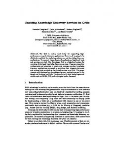
Figure 1: Visualizations of a user’s personal activity data from their organization’s social network platform (Yammer). For example, such data can provide interesting insights about worklife balance and routines. These insights can be helpful in understanding one’s personal context and possibly even detecting and avoiding non-productive or unhealthy behaviors [3]. While activity logging and visualization tools are common, many lack specificity in information communicated or are too highlevel to provide detailed, actionable information. Moreover, capturing diverse data and at large scale can be prohibitive. To address these limitations, we have developed a computer instrumentation platform that captures event-based data from personal workstations using plug-ins called instrumentation agents. The data contain information about applications used, messages created, and, on a higher level, tasks and actions performed. The agents capture detailed and specific information about user actions that are usually not made available by standard activity logging tools. In this paper we describe visualizations we are developing to enable knowledge workers to explore their personal instrumentation data. The visualizations provide self-awareness, but are also a great incentive for our user base to allow us to instrument their computers. Main contributions of this work are as follows: • We outline personal context for a knowledge worker. We use the dimensions developed by Huang et. al. [1] to describe and discuss our usage scenario. • We discuss novel visualizations we have developed to explore personal activity data and discover interesting patterns such as trends and outliers in activity patterns.
∗ e-mail:
[email protected] † e-mail:
[email protected] ‡ e-mail:
[email protected]
2
BACKGROUND
The landscape and scope for monitoring oneself is vast. Popularization and wide availability of monitoring devices and applications on mobile devices have spurred movements such as Quantified Self [4]. Such efforts seek to build holistic, pervasive views of one’s
Figure 2: The core fields in our ‘event protocol’ data exchange format, which represent user activities from instrumentation agents. Optional fields are shown in gray; mandatory fields in black. activities and focus broadly on health, physical workout, and social aspects. Our focus is more on a specific context that involves providing knowledge workers self-awareness about their activities when handling digital data. Many software tools and applications are available that capture data on computers and provide personal histories and insights about a user’s activities. Examples include RescueTime [5] and DeskTime [6]. These types of tools attempt to guess how productive a user is being based on their application usage and web-browsing habits (using a dictionary of apps and sites classified into categories). One challenge is that such tools use a narrow definition of productivity and information presented to user generally lacks context. There has of course been vast research on computer-human interactions and behavioral patterns during computer activities but the bulk of past work has focused primarily on developing better user models and on improving understanding of user actions from a research perspective. In this work we seek to address niche requirements of tools and applications that can provide knowledge workers better self awareness through instrumentation of their computer activities. 3 A K NOWLEDGE W ORKER ’ S P ERSONAL C ONTEXT Recently Huang et. al. [1] outlined a need for developing visualizations and tools focused specifically on personal context. According to the authors, personal context of an individual deals with requirements, motivations, and scenarios that differ from those that commonly occur within a professional context. Thus, personal context is focused on an individual’s interests, and not limited to personal data, though visualization for personal context is inclusive of analysis and visualization of personal data. Our overall data instrumentation effort is focused on studying tradecraft of information analysis and we are also interested in developing tools that help our user base gain self-awareness of their activity patterns, habits, and context of their actions. Motivations for exploring personal data in our situation are multi-fold. For example, some users might want to analyze their work/life balance and habits based on their activity data, while others might be curious to analyze their productivity and how they compare to other users in their organization. We briefly analyze our domain requirements based on a taxonomy proposed by Huang et. al., which they produced by analyzing literature on personal visualization and analytics. The discussion below lists the four main dimensions of personal context and their sub-dimensions (in square brackets). Levels of sub-dimensions from the taxonomy are shown in italics. • Data [Scope, Effort, Agency]: Scope: Scope of our domain is
Figure 3: Visualization of aggregated hourly usage (orange bubbles) and unusual patterns (dark edges) for common applications used by a single person. The central chart shows hour-wise time series and basic statistics for the ‘Terminal’ application. community of knowledge workers in our organization, which includes students, academic and industry researchers. We primarily gather event-oriented computer activity data generated during high-level interactions and activities on computers, such as application usage and web browsing. Effort: Effort expended can vary; some data are collected through background software agents (sensors), while other types of data can require significant participation on part of the user (manual entry of data). Agency: All data we collect, with exception of studies involving formal human subjects, is available to our user base. • Context [Design context, Settings, Influence context]: Design: The tools and visualizations were designed through participatory collaboration with our user base. Setting: Currently the data are available only to our user base in a shared, public mode. Influence: The application is intended both for researchers studying knowledge workers and individual users who aim to gain self-awareness through their data. • Interaction [Attentional demand, Explorability] Attentional demand: is low to moderate depending on complexity of visualization. Explorability: is medium to high based on features implemented in visualization and query interface in our data portal. • Insight [Actionability, Automated analysis] Actionability: can vary in the range [low, medium, high] depending on complexity of visualizations. Automated analysis: We use variety of data mining and analysis tools. 4 I NSTRUMENTATION OF P ERSONAL ACTIVITY DATA We have created a novel, versatile instrumentation framework to gather computer activity data [7]. Our goal is to instrument computer workstations used by knowledge workers to address challenges in gathering, processing, and analyzing activity log data to improve information analysis tradecraft. Our instrumentation system collects user activity data using instrumentation agents, which are software applications and plug-ins deployed on workstations or through web browsers to capture specific types of information. For example, one agent captures us-
Figure 4: Visualizations showing a user’s history of generating messages through their organization’s social networking application (Yammer).
age of applications on Mac OS (OSX) computers, while another monitors web usage and URLs visited. Other agents capture usergenerated data from third-party servers. These external data sources include messages published on an organizational social networking site (Yammer) and issues related to software engineering efforts (recorded in GitHub). All the disparate data are converted into a standard key-value event format before being stored in a back-end data store. Figure 2 shows the core part of our event format and some of the information we capture. The event protocol can be extended as needed by instrumentation agents. The data are then made available back to our user base through a query interface and custom visualizations. 5 V ISUALIZATIONS OF P ERSONAL ACTIVITY DATA 5.1 Personal Timelines (TACO) We depict a user’s aggregated data using an interactive plot that we call TACO (Timeline visualizations of Aggregated Client Observations). The plot uses a circular layout to show activities for recurring time periods such as a day, week, or month. Figure 3 is a TACO plot that displays events generated by a user while using most popular applications on a Mac OS computer. Each track or ring corresponds to one application, and variable-size bubbles indicate relative frequency of usage of the application. The plot shows hourly aggregated counts from the user’s entire historic data. A additional plot in the center shows a time series and basic statistics for the selected application. Options are provided to normalize bubble sizes by maximum over all applications to see relative differences. The plot depicts unusual or non-normal activity for the aggregated hourly rates to show whether an application was used more or less than usual. We measure unusual activity using the standard z-score for computing outliers. Here, for all historic values of event count for a given hour we compute how far an observed value is from the mean for that hour. The thickness of dark edges around bubbles in Figure 3 is used to convey the strength of the outliers. Figure 4 shows a set of plots that visualize a user’s pattern of generating messages within their organization’s social networking site called Yammer over the course of a year (Jan - Aug 2015). The TACO plot on the left shows aggregated hourly rates of messages broken down by different application platforms (email, web app,
and mobile). The plot on the right in figure 4 shows cumulative rates for all messaging platforms aggregated according to different time granularities. Darker shades of colors in the plot represent periods of high activities. The bars around the outside periphery of the plot show daily counts of messages over the different months. 5.2
Personal Vis Dashboard
We have also implemented a visualization dashboard that provides contextual information from a user’s instrumentation data. The idea is that when a user logs into our central system, they are shown a dashboard with plots populated by their personal data. Unlike traditional dashboards, such as RescueTime, which provide mostly historic timeline views of user’s activities, our dashboard provides more contextual information about user’s actions drawn from their instrumented data. The dashboard contains a number of different types of plot. For example, the set of figures on the right in Figure 1 display personal metrics such as a user’s word cloud and frequency of hash tag terms from the user’s text-oriented data such as Yammer or GitHub messages. Other useful metrics such as rate of messaging, conversation group, and size of messages for the user are also shown. Another plot, shown in Figure 5, displays a user’s personal event volumes using a calendar-based visualization layout. We employ sparklines to show daily event volumes and potentially entire history of activity for a user in a single chart. An interesting tool to explore personal application usage patterns is an ‘app graph’, shown in Figure 6. The graph displays common applications used by a user and transitions between those applications. The graph is part of a study that is investigating how people develop and use tools with workflows. 6
D ISCUSSION
AND
C ONCLUSIONS
Our main goal with this work is to provide knowledge workers with self-awareness that will lead to a number of actionable insights. Some examples of such insights that we are able to provide include: • understanding of current personal working patterns and working pattern histories. This is useful both to determine when someone is likely to be available (in the office, or for teleworking), and also when they might be more likely to be
Figure 5: A partial view of a calendar-style visualization showing activity of a single user using sparklines of daily volumes. interrupt-able, since we can see what types of work they are doing at any given time. These insights can help knowledge workers and their managers schedule meetings at appropriate times. • generation of activity summaries for individuals, and also for their teams and organizations. Self-awareness metrics, when combined with visualizations such as those described in this paper, can be used to automatically generate content for progress reports, and perhaps even for performance appraisals, although clearly much care is required for this. • usage of specific applications, which may require particular resources to be available. For instance, use of the Terminal application on Mac OS may indicate that someone is about to access server infrastructure, and perhaps may be about to run a computationally intensive task. This kind of information is useful for pro-active resource allocation. • indications as to when people tend to get distracted by nonproductive tasks. We are considering options for constructing a focus metric that measures the level of flow [8] that a knowledge worker might be experiencing. In a given time period (say one hour), some variables that could be used to construct such a focus metric include: – time spent active in applications (or working with documents) that are classified as productive, – frequency of transitions to other complementary / supplementary applications that continue the flow of productivity, – frequency of transitions to short-lived, or distracting applications. Reacting to e-mail (or other desktop notifications) might fall into this category. The intuition here is that ‘100% focus’ could be approximated as a scenario in which a knowledge worker spends the entire time period active in one application that is classified as productive and with no transitions to other applications, or where all transitions are to other productive applications. Conversely, a low focus metric should be obtained when little time is spent in productive applications, or when there are many transitions to distracting applications. Exposing such a metric to users, even if it is a very crude approximation, could allow people to take action to block distractions during certain times, or to find ways to better deal with them. To summarize, we have described several visualizations that allow knowledge workers to very quickly obtain self-awareness of their working patterns and personal context. When combined, these enable users to gain detailed insights so they can take actions to improve their working and personal lives. Our visualizations are enabled by careful instrumentation of user workstations and subsequent analysis. Research in this space is highly active in our group, and is focusing on ways to measure a person’s information analysis workflow, and to find ways in which this might be improved.
Figure 6: A directed activity transition graph from our Mac OS instrumentation agent providing preliminary insight into tool usage patterns. Thicker lines represent a larger number of transitions between pairs of applications (the number of transitions is shown alongside) ACKNOWLEDGMENTS
This material is based upon work supported in whole or in part with funding from the Laboratory for Analytic Sciences (LAS). Any opinions, findings, conclusions, or recommendations expressed in this material are those of the author(s) and do not necessarily reflect the views of the LAS and/or any agency or entity of the United States Government. The authors would like to thank staff at the LAS for providing funding and inspiration for much of this work. R EFERENCES [1] D. Huang, M. Tory, B. Aseniero, L. Bartram, S. Bateman, S. Carpendale, A. Tang, and R. Woodbury, “Personal visualization and personal visual analytics,” IEEE Transactions, Visualization and Computer Graphics, vol. 21, pp. 420–433, March 2015. [2] S. Wolfram, “The personal analytics of my life.” https://blog.stephenwolfram.com/2012/03/ the-personal-analytics-of-my-life/, 2012. [Online; accessed 20-Aug-2015]. [3] I. Li, A. Dey, J. Forlizzi, K. H¨oo¨ k, and Y. Medynskiy, “Personal informatics and hci: Design, theory, and social implications,” in CHI ’11 Extended Abstracts on Human Factors in Computing Systems, CHI EA ’11, (New York, NY, USA), pp. 2417– 2420, ACM, 2011. [4] D. Nafus and J. Sherman, “Big data, big questions— this one does not go up to 11: The quantified self movement as an alternative big data practice,” International Journal of Communication, vol. 8, p. 11, 2014. [5] RescueTime, “RescueTime.” https://www. RescueTime.com/, 2014. [Online; accessed 11-July2014]. [6] DeskTime, “DeskTime.” https://www.desktime. com/, 2014. [Online; accessed 11-July-2014]. [7] P. Jones, S. Thakur, and S. Cox, “A versatile platform for instrumentation of knowledge worker’s computers to improve information analysis,” 2015. [Unpublished; under review]. [8] M. Csikszentmihalyi and M. Csikzentmihaly, Flow: The psychology of optimal experience, vol. 41. HarperPerennial New York, 1991.