ICOTS8 (2010) Invited Paper
Lehrer, Kim & Konold
HOW STUDENTS’ SPONTANEOUS USE OF STATISTICAL TOOLS SHAPES THEIR THINKING ABOUT PRECISION Rich Lehrer1, Min-Joung Kim1 and Cliff Konold2 1 Vanderbilt University, United States of America 2 University of Massachusetts Amherst, United States of America
[email protected] We describe transitions in students’ conceptions of variability as they invented and revised a measure (statistic) of the precision of a collection of repeated measurements of a length. Our analysis highlights the role played by mediating agents (peers, teachers) and tools (TinkerPlots) in fostering transitions in students’ conceptions. We present two cases of student invention to illuminate how invention supported reasoning about multiple senses of variability and how these multiple senses were aligned in classroom conversations. We conclude by considering the role that TinkerPlots functions and representations played in spurring new lines of thought and in grounding conversations among students about the important representational characteristics of the measures they invented. BACKGROUND Variability is foundational to statistics. Cobb and Moore (1997) suggest that the very need for the discipline of statistics arises from the omnipresence of variability, and Wild and Pfannkuch (1999) suggest “noticing and acknowledging variation” (p. 226) as a critical initial step for initiating statistical reasoning. Yet most research in statistics education has focused on students’ conceptions of measures of center, resulting in comparative neglect of how students conceive of variability (Shaughnessy, 1997). During the past decade, we have systematically explored the affordances of contexts of repeated measure for coordinating conceptions of center and variability (Konold & Pollatsek, 2002; Petrosino, Lehrer & Schauble, 2003). In these contexts, the need for a measure of center is motivated as an estimate of the “true” measure, or signal, of the measurement process. The need for a measure of variability is motivated by differences in a collection of measures, which suggests the utility of characterizing the extent to which the measurements tend to agree (traditionally termed the precision of measure). To engage students in these issues, they each measure a fixed but unknown length, such as the length of a person’s arm-span or the height of a tall tree. What emerges is a collection of measurements. To estimate true measure and the precision (error) of measure, students invent measures of center and of variability, respectively. Students then use their measures of center and variability to quantify the effects of a change in the measurement process on the resulting distribution of measurements. For example, students measure the same attribute twice, once with a crude tool and a second time with a more refined tool, and then use statistics to answer questions such as: “How much more precise were the measurements obtained with better tools, compared to measurements obtained with the crude tools?” “Does the estimate of the real length change?” Here we consider how 6th grade students employed a dynamic computer tool, TinkerPlots (Konold & Miller, 2004), to develop measures of variability when they collectively measured the height of the school’s flagpole. A screen capture program (IshowU) recorded transitions in the tools selected by students and the displays generated by TinkerPlots. Student-student and studentteacher interactions were video-recorded. We present two cases of student invention. Although both students (Shakira and Jamir) began with intuitions of precision as indicating something about agreement among individual measures, the cases illustrate different trajectories of invention. Our description refers to a classroom teacher (the teacher), to one of us (RL), and to a visiting researcher. The height of the pole served as the signal, and the different tools for measure (paces, tape) produced significant differences in the precision of measure. CASES OF INVENTION Case 1. Shakira’s method Episode 1. We analyzed two days of Shakira’s interactions with TinkerPlots, teachers and classmates as she invented a measure of precision (about 1.5 hrs of instructional time). Shakira In C. Reading (Ed.), Data and context in statistics education: Towards an evidence-based society. Proceedings of the Eighth International Conference on Teaching Statistics (ICOTS8, July, 2010), Ljubljana, Slovenia. Voorburg, The Netherlands: International Statistical Institute. www.stat.auckland.ac.nz/~iase/publications.php [© 2010 ISI/IASE]
ICOTS8 (2010) Invited Paper
Lehrer, Kim & Konold
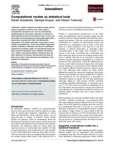
initially described her initial measure as: “Doing organize it shows what the measurements are and then it shows how many people there are they agrees on it (best guess). I am going to label numbers.” Her intuition seemed to be that if a measurement was the same as a “best guess” (center), then it was precise. This accords with a view of proximity to the signal as indicating precision. Shakira then used TinkerPlots (see Figure 1) to create intervals of size 10, labeled the value of each measurement, ordered the measurements horizontally within each interval, and used an option that indicated in which bin the mean and median were located (red and blue lines at the bottom of the 40-49 interval). The display was consistent with her initial focus on center, but it was not clear how Shakira would think about “agrees on.” Episode 2. The next class, Shakira puzzled about how to consider agreement. Overhearing Shakira’s question, Henry suggested: “I think it’s how close they are.” Shakira gestured toward the display (Figure 1) and said: “These [the measurements less than 72 in Figure 1] are close to it. And these two [121s] are too far from it. This. Dang? 50 is closest to it. Okay. There we go. Let’s see.” Episode 3. The teacher suggested that a vertical display might be easier to read, so Shakira transformed her display into that depicted in Figure 2 (she added the drawn region later). Her actions on the plot resulted, we think unintentionally, in interval widths of 70 instead of 10, with all but three of the values in the interval (0-69). Cases within the intervals are stacked and ordered vertically within the stack by their value.
Note: The color is based on the measured value. Thus the value of each case is actually portrayed in three different ways in this graph. The bars at the bottom of the 40-49 interval indicate that the median and mean are located somewhere in that interval.
Figure 1. Shakira’s first display, showing values in intervals of size 10, ordered within each interval, and with the values added as a label
Figure 2. Shakira’s reorganization of the data, following the suggestion of her teacher
Shakira stared at the display for about 10 seconds. We anticipated that she would modify it to make intervals of 10. Instead, she shouted: “Wait! I got the perfect method.” Shakira turned to Henry to explain: I stack mine like this. It's in the group of 60 though. Okay. Now. Look. Let me see. You know that median is over here. Right? This [gestures toward a case value] is far away from it. Mode is. I mean “mean” [turning on mean function in TinkerPlots] is over here too, right? Cause look. You know your [true] measurement is either 49 [the mean] or 48 [the median]. What’s closest to those are - it was around right here in this area. Let me get the [program’s] pencil to find out.
She then drew the region outlined in Figure 2. This new display apparently inspired Shakira to indicate precision in a new way, by marking the neighborhood of values close to the presumed true measure. Episode 4. Shakira then changed her display (Figure 3.a), perhaps so that measurements were ordered with the direction of the x-axis. She re-drew the region but revised it to include two values of 50 not previously captured. We conjecture that this display helped her notice that 50 was between 51 and 49. Her teacher came by, and Shakira started to explain her method: “That’s my International Association of Statistical Education (IASE)
www.stat.auckland.ac.nz/~iase/
ICOTS8 (2010) Invited Paper
Lehrer, Kim & Konold
method. All the measurements are close to the right end [we are uncertain about the reference to right end] than anything. This is the separate column, so you already know that this is not part of the median and mode [perhaps the 3 other values].” When Shakira mentioned mode, the teacher pointed out that the data were multimodal. Shakira responded by re-stacking and ordering vertically, and then marking the second mode, 39, and the value 38, which was close to the mode (see Figure 3.b.) She explained to a visiting researcher:
Figure 3a. Ordered and stacked horizontally R Shakira R Shakira R Shakira
Figure 3b. Ordered and stacked vertically
So you put a circle around…. The ones closest around the mode and the median. Okay? And now what’s your next step? Cause remember, you are supposed to come to a number. Dr. Rich wants to hear a number that tells you how precise you are. The number that tells how precise they are, to ME, would be the median, which is 48. 48 is the median. But that’s the measure of your best guess. It's not the measure of precision. Exactly! Measure of precision that I am trying to say is that around the median are the numbers that are further out and then the numbers that are closer in…. So those median numbers that are precision presents around the mode, I mean the medians.
We interpret this exchange to suggest that Shakira has developed a visual method for indicating regions of proximity to multiple measures of center. This is a significant transformation of her initial thinking about precision. However, she does not yet have a way of expressing precision as a quantity, nor does it appear that she sees any necessity for doing so. Episode 5. As Shakira presented her method to her class, she said: What I did was I circled the median and mode, our numbers that close to it.” It was noteworthy that Shakira outlined how her method would represent differences in precision by growing or shrinking: “All the numbers will figure out how do difference, all the numbers that are outside of the circle, if we disagree on them, they will get bigger” [pointing to measurements outside of the regions depicted in Figure 3b]. All the numbers inside here [pointing to outlined region in Figure 3b]. See how small they are? If we agree on them, they will get bigger. But if we disagree on them, they will get smaller [pointing again to the interior of the outlined region in Figure 3b].” After her presentation, the class offered a critique, pointing out that Shakira’s method of drawing was sensible for her, but it did not provide common grounds for deciding on the boundaries of the “close” and “far” regions. As we describe more fully elsewhere (Lehrer & Kim, 2009), classmates pressed Shakira to define the boundaries of the regions to be enclosed and to justify why both modes should be included. After a series of interactions, a classmate proposed an alternative approach, one that defined precision as the median deviation between each measurement and the “best guess.” The classmate argued that the differences eliminated the need for ad hoc definitions of a boundary, yet still preserved Shakira’s sense of the importance of proximity to the best guess (true measure). The meaning of precision and its measure was not fully resolved for Shakira during these interactions, but negotiating with her classmates resulted in the need to justify and clarify the attributes of the collection that were worthy of attention when considering variability. International Association of Statistical Education (IASE)
www.stat.auckland.ac.nz/~iase/
ICOTS8 (2010) Invited Paper
Lehrer, Kim & Konold
Case 2: Jamir’s method Episode 1. Like Shakira, Jamir worked from an intuition of agreement among measurers as the basis for developing a measure of precision. However, his approach used TinkerPlots differently. Figure 4 is the first display that Jamir created with TinkerPlots. If more than one person obtained the same measurement, then one could also have more confidence that the measurement was “right.” To make this sense of agreement more visible, Jamir employed a “Connect Equal Values” command, which he discovered on his own. After he created the display (Figure 4), he called one of us (RL) to explain what he did, and this interaction concluded with a request from RL to create a quantity. Jamir
RL Jamir RL Jamir
I am thinking that you can use how much our measures tend to agree. And um... I did fuse rectangular and then I put [connecting lines] to make it easier to see how much they agree. I did. Let’s do this [talking to himself]. I wanted to the line meter, the line thing [the vertical line connecting equal values], and then I click Connect Cases with Equal Values. And shows the ones with equal values. The ones with equal values, right? And show how much they tend to agree’ Okay. So how are you going to convert that into a number? That’s what you have to think about. Humm.! [an expression that J often used to indicate his interest.]
Episode 2. Jamir signaled RL and said: “I am still confused.” RL provided more direct scaffolding: “So one way to think about this is… How many do you have… and then how many of those tend to have multiple values? That would be one way to think about how might you think about one number that represents that. So think about that.”
Figure 4. Jamir’s first display to show how much the measurements tend to agree.
Figure 5. Jamir’s second display
(The cases have been fused into a histogram-style display, ordered vertically by value, and labeled with values. The vertical lines connect cases with the same value.)
Episode 3. Following the suggestion from RL, Jamir created the display shown in Figure 5. He removed the measurements occurring only once on the left side of the graph by modifying the axis to start at 35. He used another TinkerPlots function to remove single cases from view, resulting in Figure 6. Episode 4. After several exchanges, RL asked: “How do I make this into a number?” Like Shakira, it was challenging for Jamir to generate a quantity from the display. The display showed what precision meant (repeated values), but just how could that be transformed into a quantity? Jamir RL
That’s the part I am confused. What does that mean? I don’t know. It's up to you that you tell me. So you have the method here. So we start out with 49 [cases]. So, OK? So if we have 49. We have one, two, three, [continues counting] thirteen of them that have repetitions. 13 out of 49. Now. Now what would happen if we have 49 values and they all agree? It would be 49 out of 49 right? That would be perfect, right? What could we do with
International Association of Statistical Education (IASE)
www.stat.auckland.ac.nz/~iase/
ICOTS8 (2010) Invited Paper Jamir RL
Lehrer, Kim & Konold
this to show that this is not as perfect as this? How could we do it? Percents? Maybe? How about that? [Rich writes 13/49.] What kind of number would that give? So maybe this is the best you can do. The closer you get to it, the better? Why don't you think about if that makes sense to you?
RL suggested one way to convert Jamir’s idea about repetition into a quantity. This method involved computing the percentage of cases that had repeated values. Rich wrote 13/49 in Jamir’s notebook and asked him to consider whether or not this measure was sensible. Episode 5. The next day, the class continued to work on inventing measures of precision. Jamir again was exploring TinkerPlots. One of his explorations resulted in something new, as displayed in Figure 7. In this graph, Jamir fully separated the collection of measurements so that there were no longer intervals. In the upper right was the total number of cases with shared values (cases with unique values were still hidden, with the exception of the case at 121 which somehow had found its way back into the display). This display seemed to highlight for Jamir the fact that there were 32 cases of the original 49 that were not unique values. Jamir then considered how he might apply his method of determining precision to the collection of measurements obtained using a tape measure. In the exchange that follows, RL asked Jamir whether his method yielded sensible results: The precision number was higher for the more tightly clustered data obtained using the tape measure. Jamir noticed this, but he also asked RL why this might be so. A brief reminder from RL about the difference in the process that generated the two collections seemed to suffice.
Figure 6. Jamir’s graph showing only measurements with multiple cases RL Jamir
RL Jamir RL Jamir
Figure 7. Jamir’s revised display of multiple measures
What did you find out in your new...um? Okay. Well. There is 10 out of 46 [10 distinct values with multiple instances, 46 total values]. That’s like how we did over here. 15/49 [a reminder about the previous sample]. I counted all of them. 34 out of 46. And then their equal to 73%. Okay. So that says. Can I see? That says that this one [tape measure data] is more precise than the other one [paced data]. Do you think that is true looking at it? Ya. Because this one it agrees less [measured with paces], but I think when you measured again, they agree more, but why? Well. Not only did we measure again, but we used a different tool. Oh, yeah.
RL asked Jamir to investigate his method further by considering a “thought experiment.” What would his precision value be for the set of measurements shown in Figure 8? Jamir immediately noted that “it’s hard because they all agree,” suggesting difficulty reconciling the holes in the data with the fact that his method would here give a value of 100% agreement. This investigation led Jamir to eventually adopt the median deviation method (the median of the absolute values of the deviation scores) invented by other classmates.
International Association of Statistical Education (IASE)
www.stat.auckland.ac.nz/~iase/
ICOTS8 (2010) Invited Paper
Lehrer, Kim & Konold
CONCLUSION We reported two cases of inventing measures of precision. These were mediated by the affordances of TinkerPlots displays and related functions, and they were also shaped by exchanges with peers and researchers. Although some of the use of TinkerPlots by these students could be predicted from the nature of the functions and displays that the software employs, much of what students did was contingent on results of their explorations and emerged as they noticed something new resulting from these explorations. It was noteworthy that the software supported very different trajectories of learning. Although both students were inspired by a view relating precision to “agreement,” Shakira’s method was motivated by proximity to different centers, while Jamir’s method focused on cases with equal values. Shakira took a figurative approach in that she used TinkerPlots as a graphics tablet to display regions where she could see this agreement. Jamir’s approach was also anchored to display, but he was more ready to employ the quantities (counts, percents, etc.) that TinkerPlots provides as tools for characterizing distributions. His use of connecting lines was particularly innovative, a use that the software designers certainly had not anticipated.
Figure 8. Conducting a Thought Experiment A commonality of the two cases was the challenge that both students experienced when they attempted to translate their visualizations of variability into quantities. Quantification of variability was revolutionary in its time, and we believe that it is revolutionary for our students as well. It may be commonplace to develop a measure of length or other physical attributes, but it is far more challenging to create an epistemic framework for which the idea of a measurement extends to collections of data. Developing such an epistemology is an enduring challenge for designing instruction in statistics. REFERENCES Cobb, G. W., & Moore, D. S. (1997). Mathematics, statistics, and teaching. The American Mathematical Monthly, 104 (9), 801-823. Konold, C., & Pollatsek, A. (2002). Data analysis as the search for signals in noisy processes. Journal of Research in Mathematics Education, 33(4), 259-289. Konold, C., & Miller, C. (2004). TinkerPlots. Data analysis software for middle school curricula. Emeryville, Calif.: Key Curriculum Press. Lehrer, R., & Kim, M. J. (2009). Structuring variability by negotiating its measure. Mathematics Education Research Journal, 21(2), 116-133. Petrosino, A. J., Lehrer, R., & Schauble, L. (2003). Structuring error and experimental variation as distribution in the fourth grade. Mathematical Thinking and Learning, 5(2&3), 131-156. Shaughnessy, J. M. (1997). Missed opportunities in research on the teaching and learning of data and chance. Paper presented at the MERGA 20, Aotearoa. Wild, C. J., & Pfannkuch, M. (1999). Statistical thinking in empirical enquiry. International Statistical Review, 67(3), 223-248.
International Association of Statistical Education (IASE)
www.stat.auckland.ac.nz/~iase/