Ignoring Color in Transparency Perception Peter Kramer and Paola Bressan Dipartimento di Psicologia Generale, Università di Padova, Italy
Peter Kramer and Paola Bressan, Dipartimento di Psicologia Generale, Università di Padova, Via Venezia 8, 35131 Padova, Italy (e-mail:
[email protected],
[email protected]). Telephone: 346 355-6264; Fax: +39 049 827-6600.
Abstract Human beings are among the species with the best color perception of all mammals. Yet, transparency can be perceived in scenes in which color cues point to opacity. Why do we ignore such color cues? Here we argue that colors, rather than being passively registered, must be actively recreated and then bound to other stimulus attributes. In this process, the visual system faces fundamental problems, some of which are logically impossible to solve. The resulting unreliability of color perception may go some way toward explaining why color cues cannot usually veto transparency percepts. Other stimulus attributes, however, affect transparency perception strongly even though they are not processed in foolproof ways either. How come? We argue that our trichromatic color perception is likely to have been a late, and for that reason less than fully integrated, addition to an already existing visual system that was colorblind to red and green.
Although transparent surfaces are fairly uncommon in our environment, we have nevertheless evolved to perceive certain surfaces as either completely or partially transparent. This is not so surprising when one realizes that the air we breathe, and the water we drink, are transparent too, and that variations in this transparency can contain important clues to potential usefulness or danger. Perceiving local reductions in transparency, for example, may help us avoid inhaling toxic fumes when there is a fire, or muddy water when we wish to drink. Oddly, though, in many situations our visual system ignores color cues to transparency. It is possible, for example, to draw a stimulus that appears like a green cross extending behind a red transparent disk (Figure 1), despite that no natural red filter could attenuate green light in such a way that it would look red1. Why does our visual system, in some situations, ignore the physical impossibility of what we see? Why do we perceive as transparent something that we know to be opaque? And why do we realize the inconsistency only after logical contemplation?
Figure 1. Top panel: a small red cross (here in gray) is placed on top of a larger green cross (here in white) on a black background. The red cross is presented closer to the observer than the green one (with the help of a «stereoscopic disparity»). Bottom panel: what observers see is a transparent red disk on top of a green cross; the green cross is perceived as extending underneath the red filter, despite that this would be physically impossible with a real red filter. Adapted from Nakayama, K., Shimojo, S., Ramachandran, V.S. (1990), Transparency: relation to depth, subjective contours, luminance, and neon color spreading, “Perception”, 19: 497-513.
One reason could be that color information is inherently unreliable. It is unreliable primarily due to the fact that the visual system’s passive registration of colors2 is poor and prone to genetic problems, and that its active recreation of colors—on the basis of probabilistic environmental regularities—is inevitably susceptible to failure. We will argue, however, that there could be another reason: our trichromatic color perception evolved after a mechanism for transparency perception that was blind to red and green had already developed to completion. Our visual system, in this view, is not the final result of optimal design, but a mere half-product
of ongoing evolutionary tinkering.
Registering color Any natural mechanism that needs to process color information requires neural tissues, nutrients and oxygen; its benefits come at a cost. Evolution, for this reason, does not necessarily endow us with the most accurate color perception possible, but only with that which benefits the survival of our genes. This is nicely illustrated by bees, that despite having good color vision, are blind to the color red, and have little need to overcome this disability. The bees obtain nutrients from particular flowers, but it was not the bees that adapted their visual system to these flowers3, but rather the flowers that adapted their colors to the bees’ visual system. Today, as a result, although the flowers that are pollinated by hummingbirds and bats are often red, those pollinated by bees either do not contain any red at all or, at least, have additional colors that bees can see well. The common poppy, for example, is not only red but also ultraviolet, and this is the color in which the bees see it. Objects reflect electromagnetic waves, and these provide information about the objects’ nature. The color of a red tomato, for example, signals to us that the tomato is ripe and edible, whereas a brownish one is rotten and should be avoided. The larger the number of color receptors a visual system has, the better it can discriminate between different colors, and the better it can make use of color information. Most birds and various species of fish, amphibians, reptiles, arachnids, and insects are tetrachromats and have four different color receptors. Old-world monkeys and apes (including humans) are only trichromats, whereas most other mammals—including
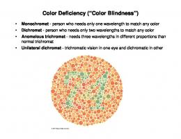
cats and dogs—are dichromats4. In normal human beings, the eyes contain three types of cone-shaped color receptors (the cones), packed especially in the central part of the retina (the fovea). The cones are sensitive to a rather narrow band of electromagnetic waves, which they convert into electrical signals that are sent to the brain. Although all three cone types are sensitive to the same electromagnetic waves, each is maximally sensitive to a different range. The relative activation of the three cone types codes the color of the light that enters the eye. A ripe tomato in white light, for example, will reflect mostly red light, and activate the most those cones that pick up long waves (the «red» cones), and to a much lesser extent those that pick up medium-long (the «green» cones) and short waves (the «blue» cones). In white light, therefore, a ripe tomato will usually look red. A rather large number of men, and a very small number of women, are redgreen colorblind (daltonic; about 8% of Caucasian males5). Yellow-blue colorblindness is rare, as is complete colorblindness (although, due to inbreeding, a whopping 10% of the total population of the pacific island of Pingelap suffers from it, while one person out of three carries genes that can cause colorblindness in their offspring6). A daltonic will call the color red «red» just like healthy humans do, because that is what this person has heard other people call this color; but when lightintensity differences (i.e., luminance differences) between red and green are neutralized, the deficit is revealed, and the daltonic is incapable of distinguishing the two colors. Most forms of colorblindness are caused by a defect on the X chromosome, of which men have only one copy, and women have two, and that is why men are much more often colorblind than women. Ironically, though, it is when
colorblindness runs in the family that rare cases emerge in which women turn out to be tetrachromats7. Each cell of a developing female embryo contains two X chromosomes. If colorblindness runs in the family, it can happen that the genes on one X chromosome of a woman code for cones that are maximally sensitive to wavelengths that are far apart (associated with good color perception), whereas the genes on the other X chromosome code for cones that are maximally sensitive to wavelengths closer together (associated with poor color perception). Normally, after a certain number of cell divisions, one of the two X chromosomes in each cell, at random, is inactivated. In some cells, this will be the defective X chromosome, in others the healthy one. The result, after gene expression, is a mix of cones that are sensitive in either the ordinary, or the abnormal, way. The abnormal cone type usually turns out to be maximally sensitive to wavelengths in between that of the red and the green cones. The resulting tetrachromacy allows the discrimination of up to 100 million, instead of the normal 1 million, different colors8. Yet, the superwomen who are blessed in this way do remain carriers of genes that can cause colorblindness in their offspring. Circumstances similar to those that can turn the females of a trichromatic species into tetrachromats can also turn the females of a dichromatic species into trichromats. Amazingly, it turns out that if the gene responsible for sensitivity to a third color is introduced into the eyes of squirrel-monkey males, which are all dichromats by nature, then they too become trichromats9. Despite that the investigated squirrel monkeys were red-green colorblind from birth, there was no need to modify the color-processing parts of their brain; mere gene therapy in the eye was sufficient to allow them to distinguish the two colors. Given the genetic similarity between
squirrel monkeys and humans, the discovery also holds great promise for a cure of colorblindness in our species, although—as we will show shortly—there is more to color vision than just the registration of colors. In sum, of the electromagnetic waves that objects reflect, we can register just a narrow band, and this registration is performed with only three different types of cones that, especially among men, are susceptible to genetic problems. Although a cure might be on its way, it could be that these limitations and problems constitute one reason for the colorblindness of transparency perception.
Recreating color In a relatively dark environment, cones do not work, and more peripheral rodshaped receptors take over. A tomato, that normally looks red, now looks some shade of gray, and it is no longer possible to tell whether it is ripe and edible, immature, or already rotten. What this example shows is that illumination is an important factor in color perception. In fact, even if well illuminated, a ripe tomato would look black, rather than red, if the color of the light were blue (a color that the surface of a red tomato cannot reflect). From an evolutionary standpoint, what is most informative to us is not the color of the light that enters our eye, but the color of the objects themselves, or more precisely the reflective properties of their surfaces: their reflectances. To see reflectances, our visual system must somehow discount variations in illumination, and part of the visual system’s attempt at doing so is to calculate contrasts. A sugar cube, for example, may reflect a billion times more light in the sun than in the shadow, but
even in the shadow, it will reflect more light than most other objects in that same shadow (typically, 30 times more than a piece of licorice). The calculation of the ratio between a sugar cube’s luminance and its surrounding-regions’ luminance can then render a measure of the cube’s reflectance that is less biased by illumination than the light reflected by the cube itself. Similarly, incoming sunlight contains more shortwave (blue) light at noon than at sunset. Yet, at any time of day, a red tomato reflects more long-wave, and less short-wave, light than objects of other colors do. Contrast is therefore also a more robust measure of color than the light reflected by the tomato itself. A side effect of the reliance on contrast, though, is that a sugar cube looks whiter on a dark mahogany table than it does among other sugar cubes, and a red tomato looks redder among green leaves than among other tomatoes. Another problem is that the reliance on luminance ratios allows one to see an object as lighter than another, or redder than another, but not as light or red in an absolute sense. A sugar cube is no longer white, but just lighter than non-white objects, and a tomato is no longer red, but redder than non-red objects. The visual system uses various rules of thumb to tackle this problem, but these carry it further away from passively registering colors, and closer to actively recreating them. In a black-and-white scene, for example, one such rule of thumb is the highestluminance rule. It states that the region with the highest luminance in the scene is assigned the value «white»10. In a completely dark room, as a consequence, a well-lit piece of black paper does not look black, but white11. As soon as a piece of white paper is held next to the one that is actually black but perceived as white, the latter immediately appears to turn black. If the white piece is removed, though, then the black piece will once again look white. What is true for achromatic colors (shades of
gray), is also true for chromatic ones (like red, green, and blue). Surfaces, for example, that reflect more red light than light of other colors may—because of the visual system’s rules of thumb—even look green12. Ultimately, on the basis of just the light that enters our eyes, it is logically impossible to separate differences in reflectance from differences in illumination. Consider a situation in which each region of a scene is uniformly illuminated by its own dedicated spotlight. In this case, it is impossible to distinguish a poorly illuminated white region from a strongly illuminated black one, or to distinguish a red region in white light from a white region in red light. Whereas, in natural scenes, such extreme situations are rare, more common circumstances can lead to distortions too.
Figure 2. Left panel: all four diamonds have the same reflectance, that is, the same shade of gray, but the top two seem lighter than the bottom two (Adelson’s snake illusion). Right panel: again the top two diamonds seem lighter than the bottom two (a regular contrast effect), but the effect is much smaller than in the left panel. The left panel is adapted from Adelson, E. H. (2000), Lightness perception and lightness illusions. In M. Gazzaniga (Ed.), The New Cognitive Neurosciences (pp 339-351). MIT Press: Cambridge, MA).
Determining the color of an object becomes more complex still if this color is perceived through a partially transparent medium (like smoke, humid air, dirty glass, or muddy water). The problem is not just that such a medium distorts our registration of color, but that the determination of the medium’s very existence cannot be accomplished in any foolproof way. Figure 2 (left), for example, is obviously entirely opaque, but one has the impression that it contains transparent horizontal bands. This illusion dramatically affects our color perception, and the top two diamonds seem much lighter than the bottom two13. The top two diamonds are located on a darker background than the bottom two, but Figure 2 (right) shows that, in the absence of an illusion of transparency, such contrast differences cannot produce an equally large effect14. On the basis of just the light that enters our eyes, it is logically impossible to distinguish a scene that contains transparent surfaces from one that does not. This circumstance, in turn, renders reliable color perception logically impossible too. It is not just illusions of transparency that can lead to failures in our perception of color, illusions of illumination can too. Figure 3, for example, shows how the gradient of an edge between two surfaces can suggest a difference in illumination and lead to an illusory color difference between the two surfaces that, physically, does not exist.
Figure 3. The edges of the top and bottom halves create the illusion that these halves have different shades of gray. The entire upper half seems darker than the entire bottom half. Cover the central area with your finger to reveal that the inner parts of two halves are actually identical. Illustration by Purves, D., Shimpi, A., Lotto, R. B. (1999), An empirical explanation of the Cornsweet effect, “The Journal of Neuroscience”, 19: 8542-8551.
In sum, not only is the passive registration of colors problematic, their active recreation is too, and this could be another reason for the relative insensitivity of transparency perception to color.
Binding color Although they may respond to a variety of different stimulus attributes, many visual cortical areas are nevertheless specialized in the processing of just one or two of them. Cortical area V5, for example, is specialized in the processing of motion and stereoscopic depth, V3 in the processing of form, and V4 in the processing of color. If we see a red car passing a green tree, then it is important that the red color is
attributed to the car, and the green color to the tree, and not vice versa. Yet, due to the somewhat independent processing of color, form, and motion, linking the appropriate stimulus properties to one other (the binding problem) can be complicated, and can fail as dramatically as the registration, and recreation, of colors15. Moutoussis and Zeki16, for example, demonstrated one such failure when they let a number of squares oscillate up and down and switched their colors during the motion. They found that the switches in motion direction and in color were perceived in synchrony not when they physically were, but when the color switches followed the motion-direction switches (contrary to the expectation of the very opposite result that was based on both the work by Livingston and Hubel17 and the overly popular «whatwhere» doctrine18). That is, the color switches were perceived faster than the motiondirection switches, and the visual system was incapable of binding the right color to the right direction of motion. Similarly, Nijhawan19 flashed a small yellow bar on a large green one that was moving (Figure 4, top). He found that observers perceived the large bar as being ahead of the small one rather than at the same position, and most importantly for our present purpose, perceived the small bar as being red, rather than yellow (Figure 4, bottom). To our visual system, yellow is a mix of red and green (as shown by the TV screen, that only contains red, green, and blue phosphors, and lights up red and green phosphors simultaneously to produce yellow). In the experiment, people’s visual systems apparently attributed the green to the large bar, and the red to the small bar, rather than both to the small bar.
Figure 4. Top panel: a small yellow bar (here in light gray) is flashed on top of a larger green one (here in dark gray) that is moving in the direction of the arrow. Bottom panel: the percept induced by the scene in the top panel: the large green bar is not perceived as being underneath the yellow one, but as having passed it already, and the small yellow bar is perceived as being red. Adapted from Whitney, D. (2009), Neuroscience: Toward Unbinding the Binding Problem, “Current Biology”, 19: R251-R253.
The moving bar was perceived as ahead of the small one, even though it physically was not, because of the visual system’s motion extrapolation. The extrapolation caused observers to see the bar, not where it was, but where it most likely would be a short moment later. That the visual system jumps ahead of actual events in this way is thought to compensate for the delay with which neural responses to motion arrive in the cortical areas that process them. Consistent with this extrapolation theory, the color misattribution did not occur in a control condition in which the large bar did not move. In sum, even when colors are registered properly, and recreated in the right way,
they may still end up being bound to the wrong objects, and this could be yet another reason for the colorblindness of transparency perception.
Did trichromatic color perception evolve too late? In the colored version of Figure 1, a green cross is perceived that extends behind a red transparent filter. The cross is seen as uniform in color. That this percept is inconsistent with the laws of physics only surprises observers when they are informed about it, or realize it after logical contemplation. In principle, it would be possible to see the cross as having a different color underneath the transparent disk than elsewhere. The cross could, for example, be seen as white—or even red—underneath the red disk (shown here in gray), and green elsewhere (shown here in white). In this case, the color of the cross would change exactly at the edge of the disk. Coincidences are improbable, but although it tends to shy away from coincidental interpretations of a scene, the visual system sometimes does adopt them. At a river’s edge, for example, due to dust deposits above the water, and growth of moss below it, a boulder often has a different color above than below the transparent surface of the water. Our visual system accepts the coincidence that the boulders change color exactly at the waterline. The green cross of Figure 1, instead, is not perceived to change color at the edges of the disk: it is perceived to be uniform in color, and the disk is seen as transparent nonetheless. The visual system adopts a physically impossible interpretation and ignores the color cues against it. Under exceptional circumstances, especially when all colors have the same luminance, color cues can tip the balance against an interpretation of a surface as
transparent, but in far more circumstances color has little effect20. The unreliability of the registration, recreation, and binding of color may go some way toward explaining why the visual system normally does not allow color cues to veto any particular percept of transparency. The registration, recreation, and binding of both chromatic and achromatic colors, however, are unreliable, and yet the effects of achromatic colors on transparency are much stronger than those of chromatic ones. Could there be another reason for the relative insensitivity of transparency perception to color? Kramer and Bressan21 argued that there is. The earliest primates, they observe, were nocturnal and might not have used color perception much; as most mammals today, they were dichromats and blind to the difference between red and green22. This means that the early primates could not possibly have seen the difference between the two colors that Nakayama et al. used in their demonstration (Figure 1). They would not have been able to see that these colors are inconsistent with an interpretation of the disk as transparent. Although early primates could not distinguish red from green, they could see the difference between yellow and blue, and it is possible to create a yellow-and-blue version of Figure 1. Would dichromats, like those early primates, see this version as opaque? Would they notice the inconsistency between the colors and an interpretation of the disk in Figure 1 as transparent? The answer is still no. Suppose, for example, that the transparent disk were yellow and the cross blue. In this case, the parts of the blue cross that are seen through the yellow disk should look green (due to subtractive color mixing, whereby the yellow disk absorbs some, but not all, of the blue light that the cross reflects), but—as we said before—green is exactly one of the colors dichromats do not see well.
Kramer and Bressan23 argued that transparency evolved to determine whether water is potable (when highly transparent) or not (when less transparent). If so, then transparency perception in primates might have developed early, and before the rather late evolution of trichromatic color perception. As Old-world monkeys and apes (including us) emerged, evolution could not start from scratch with a perfect design that fully integrated trichromatic color perception, but had to fiddle with a red-green colorblind visual system that was already in place. Motion and stereoscopic depth perception also evolved before color perception, and their relative insensitivity to color is indeed also intensely debated24. In conclusion, the limited reliability of the registration and recreation of colors, and of their binding to other stimulus attributes, explains why colors cannot veto a percept of transparency that is well supported by other cues. The registration, recreation, and binding of color, however, are unreliable for both chromatic and achromatic colors, and yet, the latter affects transparency perception much more than the former. A more cogent explanation for the relative insensitivity of transparency perception to chromatic color might therefore be that transparency perception developed in ancestors who had dichromatic color perception (which cannot exploit chromatic color cues to transparency), and that trichromatic vision evolved only after that mechanism was already in place—too late to matter much.
References ADELSON, E.H. – 2000, Lightness perception and lightness illusions, in M. Gazzaniga (ed.), The New Cognitive Neurosciences, Cambridge, MA, MIT Press: 339-351 BRESSAN, P. – 2006, The place of white in a world of grays: a double-anchoring theory of lightness perception, “Psychological Review”, 113: 526-553 – 2007, Il colore della luna. Come vediamo e perché, Roma-Bari, Laterza BRISCOE, A.D. AND CHITTKA, L. – 2001, The evolution of color vision in insects, “Annual Review of Entomology”, 46: 471-510 BYRNE, A. AND HILBERT, D.R. – 2003, Color realism and color science, “Behavioral and Brain Sciences”, 26: 3-64 CHEN, V.J. AND D’ZMURA, M. – 1998, Test of a convergence model for color transparency perception, “Perception”, 27: 595-608 CROPPER, S.J. AND WUERGER, S.M. – 2005, The perception of motion in chromatic stimuli, “Behavioral and Cognitive Neuroscience Reviews”, 4: 192-217. DA POS,
O.
– 1977, Contributo teorico sperimentale allo studio della percezione della trasparenza parziale con colori, “Atti dell’Istituto Veneto di Scienze Lettere ed Arti”, 135: 47-70. DEEB, S.S. – 2005, The molecular basis of variation in human color vision, “Clinical Genetics”, 67: 369-377 GELB, A. – 1929, Die ‘Farbenkonstanz’ der Sehdinge, in W.A. Bethe, Von (ed.) Handbuch der Normal und Pathologische Psychologie, Berlin, Springer: 594-678 GILCHRIST, A. ET AL. – 1999, An anchoring theory of lightness perception, “Psychological Review”, 106: 795-834 ISBELL, L.A. – 2006, Snakes as agents of evolutionary change in primate brains, “Journal of Human Evolution”, 51: 1-35 JACOBS, G.H. – 1993, The distribution and nature of colour vision among the mammals, “Biological Reviews”, 68: 413-471
JAMESON, K.A., HIGHNOTE, S.M., WASSERMAN, L.M. – 2001, Richer color experience in observers with multiple photopigment genes, “Psychonomic Bulletin and Review”, 8: 244–261 KRAMER, P. AND BRESSAN, P. – 2009, Clear waters, murky waters: Why transparency perception is good for you and underconstrained, “Perception”, 38: 871-872 LAND, E. – 1983, Recent advances in Retinex theory and some implications for cortical computations: Color vision and the natural image, “Proceedings of the National Academy Science of the United State of America”, 80: 5163-5169 LIVINGSTONE, M.S. AND HUBEL, D.H. – 1987, Psychophysical evidence for separate channels for the perception of form, color, movement and depth, “Journal of Neuroscience”, 711: 3416–3468 MANCUSO, K. ET AL. – 2009, Gene therapy for red-green colour blindness in adult primates. “Nature”, advanced online publication doi:10.1038/nature08401 METZGER, W. – 1955, Über Durchsichtigkeits-Erscheinungen (Vorläufige Mitteilung) [About transparency phenomena (preliminary report)], “Rivista di Psicologia”, 4:187-189 MOUTOUSSIS, K. AND ZEKI, S. – 1997, A direct demonstration of perceptual asynchrony in vision, “Proceedings of the Royal Society of London, Series B”, 264: 393–399 NAKAYAMA, K., SHIMOJO, S., RAMACHANDRAN, V.S. – 1990, Transparency: relation to depth, subjective contours, luminance, and neon color spreading, “Perception”, 19: 497-513 NEITZ, J., CARROLL, J., NEITZ, M. – 2001, Color vision: almost reason enough for having eyes, “Optics & Photonics News”, 12: 26-33 NIJHAWAN, R. – 1997, Visual decomposition of colour through motion extrapolation, “Nature”, 386: 66–69 OKABE, M. AND ITO, K. – 2008, Color Universal Design (CUD): how to make presentations and figures that are friendly to colorblind people, “J*Fly data depository for drosophila researchers”, 9-24-2008 RICHARDS, W., KOENDERINK, J. J., VAN DOORN, A. – 2009, Transparency and imaginary colors, “Journal of the Optical Society of America A”, 26: 1119-1128
SIMMONS, D.R. AND KINGDOM, F.A.A. – 1995, Differences between stereopsis with isoluminant and isochromatic stimuli, “Journal of the Optical Society of America A”, 12: 2094-2104 SACKS, O. – 1997, The island of the colorblind, New York: Knopf WHITNEY, D. – 2009, Neuroscience: Toward Unbinding the Binding Problem, “Current Biology”, 19: R251-R253 ZEKI, S. – 1993, A vision of the brain, Oxford: Blackwell Scientific Publications
NOTE
1
Nakayama, Shimojo, Ramachandran 1990; see also Metzger 1955 and Richards, Koenderink, van Doorn 2009. 2 Here we define “color” as the spectrum of emitted or reflected light; readers interested in alternative definitions of color and their presumed implications may want to read Byrne and Hilbert 2003. 3 Briscoe and Chittka 2001. 4 Jacobs 1993. 5 Okabe and Ito 2008. 6 Sacks 1997. 7 Deeb 2005 and Jameson, Highnote, Wasserman 2001. 8 Neitz, Carroll, Neitz 2001. 9 Mancuso et al. 2009. 10 For a complete discussion, see Bressan 2006. 11 Gelb effect: see Gelb 1929 and Gilchrist et al. 1999. 12 Land 1983 and Zeki 1993. 13 Adelson 2000. 14 Bressan 2007. 15 For a brief review, see Whitney 2009. 16 Moutoussis and Zeki 1997. 17 Livingston and Hubel 1987. 18 See Zeki 1993. 19 Nijhawan 1997. 20 Chen and D’Zmura 1998; see also da Pos 1977 and Richards et al. 2009. 21 Kramer and Bressan 2009. 22 Isbell 2006 and Jacobs 1993. 23 Kramer and Bressan 2009. 24 See, for example, Cropper and Wuerger 2005; Simmons and Kingdom 1995.