iHAT: interactive Hierarchical Aggregation Table Corinna Vehlow∗
Julian Heinrich†
Florian Battke‡
VISUS University of Stuttgart
VISUS University of Stuttgart
Integrative Transcriptomics University of Tubingen ¨
Daniel Weiskopf§
Kay Nieselt¶
VISUS University of Stuttgart
Integrative Transcriptomics University of Tubingen ¨
A BSTRACT In the search for single-nucleotide polymorphisms (SNPs), genome wide association studies have become an important technique for the identification of associations between genotype and phenotype of a diverse set of sequence-based data. In this work, we present a methodology for the visual assessment of SNPs using interactive hierarchical aggregation techniques combined with methods known from traditional sequence browsers and cluster heatmaps. Our prototype tool iHAT supports the visualization of multiple sequence alignments, associated metadata, and hierarchical clusterings. Moreover, data-type dependent colormaps and aggregation strategies as well as different filtering options support the user in finding correlations between sequences and metadata. Similar to other visualizations such as parallel coordinates or heatmaps, iHAT is aimed at exploiting the human pattern-recognition ability for spotting patterns that might indicate correlation or anticorrelation. Together with its interactive features and a database backend for fast data retrieval, we consider iHAT as a prototype for a visual analytics system for genome-wide association studies. Keywords: genome wide association studies, hierarchical aggregation, phenotype-genotype correlation. Index Terms: H.5.m [Information Systems]: Information Interfaces and Presentation—Miscellaneous; H.3.3 [Information Storage and Retrieval]: Information Search and Retrieval—Information filtering; H.5.2 [Information Interfaces and Presentation]: User Interfaces—Graphical user interfaces (GUI); J.3 [Computer Applications]: Life and Medical Sciences—Biology and genetics; 1 I NTRODUCTION Genome wide association studies (GWAS) are used to study the variation of genes between individuals (the genotype), and their association with a variety of complex traits (the phenotype), e.g. diabetes, heart disease, or arthritis. GWAS have become an established method to alleviate the identification of genetic risk factors of diseases, as they make use of recent technologies that allow a rapid and cost-effective analysis of genetic differences. Within the last five years, many single-nucleotide polymorphisms (SNPs) could be identified with the help of GWAS, implicating hundreds of loci for common traits [13]. The huge amount of data produced by GWAS implies a great challenge for data analysis and visualization. In this paper, we use interactive hierarchical aggregation together with a sequence alignment viewer as a tool for the visual analysis of correlations between sequence data and associated metadata. ∗ e-mail:
[email protected] [email protected] ‡ e-mail:
[email protected] § e-mail:
[email protected] ¶ e-mail:
[email protected] † e-mail:
IEEE Symposium on Biological Data Visualization October 23 - 24, Providence, Rhode Island, USA 978-1-4673-0002-5/11/$26.00 ©2011 IEEE
Sequence alignment viewers use tables to represent large datasets and color coding for the illustration of data attributes. This concept is similar to that of the heatmap (mostly used for large-scale expression data) [3, 26]. While table-based visualizations are very useful for getting an overview of a dataset and visually finding patterns that might be difficult to spot with automatic methods, there are two drawbacks of sequence alignment viewers or heatmaps: First, the patterns that emerge depend on the order of rows and columns. For time-series expression data and sequence alignments, column-order is usually fixed and hence does not pose any problem. Where applicable, row and/or column order can be partly defined (i.e. within groups) using hierarchical clustering. Heatmaps therefore often include a dendrogram visualizing the result of hierarchical grouping of rows and/or columns. Second, the number of data items that can be visualized is restricted by the number of pixels that are available. As a consequence, many datasets produced today cannot be visualized in a single image using the traditional tools. To mitigate the problem, most implementations provide a scrolling mechanism that enables the user to adapt the region of interest. However, scrolling the view does not provide an overview and hence contradicts the information seeking mantra [18]. While aggregation is used in sequence alignment viewers as a tool for zooming, none of the existing visualizations facilitate the aggregation of multiple sequences in order to reduce the amount of data items that have to be rendered. Similar to traditional heatmaps, our tool iHAT consists of a tablebased visualization of both primary sequence data and metadata with an attached dendrogram. In contrast to other tools that include table-based visualizations, iHAT allows the user to apply different colormaps and aggregation strategies. Both depend on the type of data for every column, i.e. nominal, ordinal, ratio, and interval data are aggregated based on different methods and mapped onto different (single- or multi-hue) colormaps. Rows can be aggregated using either the attached hierarchy or according to interactive selection. To find associations between the genotype and phenotype, the aggregation process is guided by the metadata representing the phenotypes. We demonstrate our techniques with multiple sequence alignments of DNA and amino acid sequences with attached phenotype metadata. For the analysis of DNA data, we use the IEEE VAST 2010 Challenge Data [8]. For proteins, we use amino acid sequence data of the neuraminidase protein of 15 H5N1 influenza virus samples [10]. Using our aggregation techniques, correlations between sequence positions and metadata become apparent. 2
R ELATED W ORK
Heatmaps represent matrices of data values in the form of twodimensional tables whose tiles are colored with respect to the underlying data values. The idea of a semi-graphic table that displays values of a data table by levels of shading is quite old, first used in 1873 by Loua to visualize social statistics [26]. Within the cluster heatmap, the matrix view is expanded by trees for the row and column association matrices. This approach of appending trees
63
to the rectangular matrix was introduced by Gower and Digby in 1981 [26]. Eisen et al. [3] developed a system that applies clustering to genome-wide expression data from DNA microarray hybridization. They used the average-linkage method to arrange genes with respect to some similarity in their patterns of gene expression. As a result, all elements are assembled within a dendrogram, which is appended to the rows of the similarity matrix to indicate the nature of relationships computed among genes. The matrix contains the similarity scores for all pairs of genes, mapped to colors. However, their tool does not allow the user to (interactively) change the derived hierarchy or to aggregate clusters within the hierarchy. Another example of the cluster heatmap is the hierarchical clustering explorer (HCE) by Seo and Shneiderman [17]. Besides a matrix view and dendrogram, the HCE provides the user with a two-dimensional scatterplot showing the expression profile of genes. The scatterplot is bidirectionally linked to the matrix view via brushing and linking. Seo and Shneiderman used clustering to perform microarray data analysis and identify genes with similar profiles and thus likely similar function. The hierarchy of genes is constructed iteratively by pairing genes with the most similar expression profiles in each step. Similar to other cluster heatmaps, the hierarchy is displayed as a dendrogram. Dynamic queries/filtering can be applied to hide uninteresting clusters or highlight interesting ones. In contrast to iHAT, the HCE does neither support interactive construction of hierarchies nor aggregation of subhierarchies. As the size of datasets increases, it is more and more difficult to analyze them and keep track of the overview. Hierarchical aggregation is an important and successful method to reduce the amount of data. A data-driven aggregation enables the user to reveal patterns within the data. For the purpose of visual inspection, it is necessary to summarize large amounts of data effectively, making visual representations of these data more scalable and less cluttered. Elmqvist and Fekete [5] developed a model for building, visualizing, and interacting with multiscale representations of information visualization techniques through the use of hierarchical aggregation. They pointed out that the visual representation of the aggregate should convey information about the underlying data. Furthermore, the aggregation method should depend on the underlying data type. Based on the discussion of available visualizations, which already include hierarchical aggregation, they derived a set of general guidelines for the design and implementation of aggregation techniques. Matrices, displayed in cluster heatmaps, can visualize information and data structures of various types. The Zoomable Adjacency Matrix Explorer (ZAME), developed by Elmqvist et al. [4], represents a graph in the form of an adjacency matrix. The three main components of ZAME include the hierarchical aggregation, automatic reordering of components, and accelerated rendering. The hierarchical clustering of edges is defined by a pyramid of recursive edge merging. Exactly four children are aggregated into a new internal node, which is not flexible enough to create hierarchies of rows. The aggregation is performed differently depending on the underlying data type, which might be numerical, nominal, or categorical. Attributes of aggregates like average, minimal, or maximum values are mapped to visual attributes, e.g. with a histogram. While heatmaps use colored matrices to illustrate data values of a table, sequence viewers use them to show aligned sequences of nucleic acids or amino acids. Color is employed to indicate the type of nucleic acid or amino acid, or it represents some attribute of the alignment. There are many sequence viewers with different extents of functionality. Tools like JBrowse [19] and the human genome browser at UCSC [11] only serve as sequence viewing software, whereas other tools like ClustalW/ClustalX [23], Jalview [25], CINEMA (Colour INteractive Editor for Multiple Alignments) [14], and STRAP (Interactive Structure based Sequences Alignment Program) [6] also include capabilities for the visualization of (multiple) sequence alignments. The Integrative
64
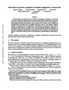
Figure 1: Illustration of the terminology used in iHAT. Rows and columns are addressed by indices. Rows can further be aggregated, resulting in a hierarchy indicated by the dendrogram. For the example of vertex v of the tree, the set of leaf nodes of v is a collection of rows Rv (highlighted red). The aggregated value for column C3 and the red vertex is thus determined using the values highlighted in red and green respectively.
Genomics Viewer (IGV) [16] further supports the import and visualization of microarrays and genomic annotations. SeaView [7] also enables the user to construct and investigate phylogenetic trees of the alignments. Unfortunately, none of these tools facilitate the aggregation of sequences. In order to use the screen space efficiently, one could use the Table Lens approach by Rao and Card [15] as a focus and context technique to have a closer look at some sequences while fading others into the background. Similar to other tools like the traditional heatmap or the hierarchical clustering explorer, our tool consists of a table view linked with an aligned dendrogram. The key difference to other tools is that it supports the interactive construction of trees from arbitrary data. Furthermore, it allows one to aggregate flexible numbers of rows. Several functionalities were implemented to support the user during the aggregation process. These will be described in more detail in the next sections. 3 T ERMINOLOGY In this paper, we present a method for the visualization of hierarchical multivariate data. To be precise, we consider multivariate data as a set of N samples (rows), each comprising the same number of values (columns) from a set of M variables. Each variable has a scale type [21], which can be one of: • Nominal: Nominal data has neither ordering nor metric. Only the equality operation (=) is defined for values on this scale. • Ordinal: Ordinal data defines an ordering. In addition to the operations allowed for nominal data, the order operator (