Improving Blog Exploration through Interactive Visualization Nelson Marques, Ricardo Dias, Manuel J. Fonseca Department of Computer Science and Engineering INESC-ID/IST/Technical University of Lisbon R. Alves Redol, 9, 1000-029 Lisboa, Portugal
[email protected],
[email protected],
[email protected] ABSTRACT Blogs are widely used today to publish information on a regular basis. However, users have difficulty in exploring their content and in discovering relevant information. This is due, among other things, to blogs rigid structure, with very long pages, and to the lack of mechanisms for effective navigation and exploration. To overcome these problems, we developed an exploration tool, to help users navigate, browse and visualize blogs. It was developed based on the following four design principles: i) a blog should provide an overview of its activity and content to help users identify publication patterns and relevant entries; ii) blogs should present rich compact representations of entries to help readers anticipate the content of posts; iii) comments should have a relevant role, since they convey the social component of the blog; iv) blogs should offer an interactive filtering mechanism to help users explore and find relevant posts. A comparative evaluation with users confirmed the validity of the design principles, since our solution was more efficient, effective and usable than the usual blog interface and the Google Reader.
Categories and Subject Descriptors H.5.2. [Information Interfaces and Presentation (e.g. HCI)]: User Interfaces; H.4.3. [Information Systems Applications]: Communication Applications—information browsers
General Terms Design, Experimentation, Human Factors.
Keywords Blog exploration, blog reading, dynamic queries.
1.
INTRODUCTION
A blog can be referred as a frequently updated website in which added entries are usually listed in a reverse chronological order [4]. Usually only one entry is above-the-fold
Permission to make digital or hard copies of all or part of this work for personal or classroom use is granted without fee provided that copies are not made or distributed for profit or commercial advantage and that copies bear this notice and the full citation on the first page. To copy otherwise, to republish, to post on servers or to redistribute to lists, requires prior specific permission and/or a fee. AVI ’12, May 21-25, 2012, Capri Island, Italy Copyright 2012 ACM 978-1-4503-1287-5/12/05 ...$10.00.
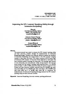
and a few recent posts are shown on the first page of the blog, making its exploration and navigation difficult, if we are concerned about more than what is immediate. Old entries that can still be relevant are hard to locate, since blogs rely mostly on archive links and tag clouds to support exploration. Even in those blogs that support search, is hard for users to know what to look for because blogs do not give any clue about the entries that might be more interesting. As an example, suppose that a reader wishes to know: the potentially most interesting or popular entries in a blog (entries with various comments); the name of the most active commenter; or the topic most discussed in the blog during the last year. The solution, using the blog interface or typical blog readers, is going through the entries of the blog and collect the information needed to answer the questions. As we can imagine, in blogs with a large collection of entries, this process will be tedious, very time consuming and in some cases almost impossible to complete. Recently, Blogger tried to overcome some of these problems by providing new dynamic templates that take advantage of the images present on blog entries to improve recognition. iBlogVis [6], a visualization tool to browse blog archives, presents entries and correspondent comments along a chronologically ordered timeline, providing a good overview of the blog activity and of the social interaction history. Bross and colleagues presented PostConnect [3], an interactive visualization tool that uses a circular interface to display all the posts from a blog and their relationships, but only when they have few entries and no comments. TRIB [7] is a tool able to show clusters of large amounts of blog comments through hierarchical visualization. Aggregators are another type of tools that can be used to browse and read blogs, but they usually lack a flexible navigation mechanism and support for comments. Although, these solutions (and others) solve individual problems, none offers an integrated solution to support an overview of the blog activity, information about comments and commenters, a filtering mechanism, and an integrated navigation between posts, comments, tags and other metadata associated to them. These features are even more important when we deal with frequently updated blogs, blogs with a strong community participation (comments), and blogs whose content remains relevant over time. To solve these problems, we developed an interactive blog reader, called Vibe. It offers a new way to explore, navigate and visualize blogs based on the information associated to posts and comments, namely their metadata, images and videos (see Figure 1). Vibe is characterized by the following
Figure 1: General view of the Vibe graphical user interface (cut in the middle). four aspects: i) it provides an overview of the blog enabling users to identify the publication habits of the authors over time, the most discussed topics, the most active commenters and the most popular entries; ii) it enriches collapsed posts with thumbnails of images and videos from blog entries, allowing users to better anticipate the content of posts before opening them for the first time and also providing recognition rather than recall when users look for posts already read in the past; iii) it promotes comments and commenters to important information when blog entries are collapsed (at the same level of posts) giving relevance to the social component of the blog; iv) it offers an interactive filtering mechanism based on dynamic queries [1] created using the information associated to posts and comments, allowing users to explore the blog archive and look for old posts that remain relevant in the blog context. Although, the visualization and interaction techniques used are not new, the contribution of our work is in their correct combination to achieve a more effective, efficient and easy to use solution for blog exploration and visualization. The evaluation with users showed that our solution is more efficient, effective and usable than the original blog and the Google Reader (www.google.com/reader). Both quantitative and qualitative results of the study confirmed the usefulness of the design options used in Vibe, showing that they can be used to complement the current user interface design of blogs or news sites.
2.
PROPOSED SOLUTION
Our foremost concern during the design of Vibe was to develop a solution that could enrich individual blog exploration and reading, giving users an improved and integrated blog structure combined with a better navigation mechanism. To achieve this objective, Vibe offers an overview of the overall blog (including posts and comments), enriched collapsed posts and an effective filtering mechanism.
2.1
Interface Design
The design of the user interface was done considering three main aspects: Blog entries; Overview; and the Interactive filtering. Blog entries are displayed in the navigation window (Figure 1 left), the overview is provided on the sidebar and the interactive filtering is available on the overall interface.
2.1.1
Blog Entries
Since typical blogs list entries in a reverse chronological order, we keep this order, by default, to reduce user adaptation and learning time. To avoid visual clutter and to allow the simultaneous display of several posts, we present blog entries in collapsed form. While typical blog readers display only the title of the post, a few words and the time of publication, our collapsed entries are richer. They contain the title of the post, the publication date and time, the tags associated to the post, thumbnails of the images and videos from the post, a graphical representation of the length of the post and a list of small squares representing its comments. We added support for read wear [5], by changing the text and background colors of collapsed posts and comments and also the color of the comment squares. All this information helps users identifying easily the content of posts and their status. While for unread posts image and video thumbnails allow users to get a notion of the posts content without opening it, in the case of already read posts, users could use the thumbnails to recognize the desired blog entry. The length of the post and of the comments, serves as an indication for how much time the user will take to read it, influencing her/his decision to read it or not.
2.1.2
Overview
We designed the sidebar of our application to provide overview, taking into account the information visualization guideline ”overview first, zoom and filter, details on demand” [9]. Its functionality serves both as an overview of the blog and as a complementary exploration mechanism, allowing users to understand the dynamic of the blog, and when they want they can filter and get details of the blog entries. The sidebar is organized in four tabs. One to sort posts by date, popularity, post length, number of images and videos. The second tab includes the tags list, and the correspondent number of posts where they appear, providing an overview of the blog in terms of topics. The third contains the list of commenters, and the last presents a calendar, which gives an overall indication of post publication over time. There, users are able to identify the most active periods of time and get a notion of the most common trends of publication along each year, month, week or day of the week.
2.1.3
Filtering
The design of our solution considered that every information associated to a post can be used to create queries dynamically, and consequently filter the posts that are visible at a given time. Our decision is in line with the users expectation that Indratmo found while evaluating iBlogVis with users [6]. This means that selecting time, date or tag elements leads to the application of a filter that reduces the posts visible on the navigation window.
2.2
Interaction Design
The interaction in Vibe is done with two main purposes: expand collapsed posts and comments to read their contents and explore and filter posts to locate a desired entry.
2.2.1
Collapsing and Expanding Posts
To expand a post the users can click on it, and get access to its content. Collapsed posts also allow users to sequentially browse through the thumbnails of the contained images and videos, without expanding it. Clicking on a thumbnail shows a gallery of images or videos from that post. Below the post we can see a bar with a list of squares, each one representing an individual comment associated to the post. Clicking on the background of the comment bar reveals a list of collapsed comments associated to the post. To provide more efficiency, comments can be accessed directly by clicking on the correspondent square on the comment bar. Clicking on the background of expanded posts, comments and comment lists restores their collapsed form.
2.2.2
Exploring and Filtering Posts
to the following aspects. i) how effective they were in providing a good overview of the blog dynamics and topics; ii) how effective they were in giving information about the community participation; iii) how well they helped users finding the desired entries. We defined 16 tasks, involving navigation, exploration, visualization and identification of information within the blog, grouped in six categories: 1)Time tasks (finding the date of the first and last post; the day/month/year with more posts; and the day of the week with more activity); 2)Topic tasks (identifying the most used tag and the most used tag in a time interval); 3)Commenter tasks (identifying the regular commenters and the most active commenters); 4)Popularity tasks (finding the most popular blog entries and the most popular blog entries in a time interval); 5)Finding tasks (locating entries according to their topic, tags, commenter and publication date and time); 6)Revisitation tasks (finding already read entries and posts or comments not read yet).
3.2
The exploration method in Vibe revolves around the integrated filtering mechanism. This mechanism makes use of the meta information associated to posts and comments to perform sequential filtering operations, so that users can successively reduce the number of visible results. As mentioned before, the information present in the sidebar can also be used as filters to create dynamic queries. Contrary to the filters in posts and comments, filters in the sidebar have two numbers associated to them. One is the number of posts that contain that filter and the other is the number of posts associated with it that satisfy the current combination of filters. The majority of the filters found in posts are replicated in the sidebar and integrated with the overview mechanism. Like posts, the available filters on the sidebar are adjusted to reflect the filtering operations, thus preventing users from selecting filters that would lead to empty results.
3.3
3.
3.4
USER EVALUATION
To assess the usability of our prototype we compared it with the original blog user interface and with the Google Reader, using both objective (percentage of completed tasks and time) and subjective (user satisfaction) measures. To that end, we used a blog with the following characteristics: frequently updated; strong community participation; several posts published over time; containing tags, images and videos (http://tostoescadecasa.blogspot.com).
3.1
Tasks
We designed the tasks to be representative of the typical blog use, and to evaluate the three solutions according
Participants
We recruited 30 users (13 females, 17 males), familiar with Web interfaces, with ages ranging from 14 to 64 years old (mean = 31.5). All users revealed to usually follow at least one blog, ten usually write comments on posts and six actively participated in blogs as authors. The majority of the users (23) read blogs using only the original interface of the blog. We performed a between-subjects testing to have different users testing different solutions. The 30 participants were divided into three groups, with similar characteristics in terms of gender, age and experience with blogs, and were randomly assigned to an application.
Procedure
We first introduced the application under evaluation to the respective group of users, and let them explore a blog (http://raizeseantenas.blogspot.com) for 5 minutes using it. Then, we asked users to perform the 16 tasks using the application assigned to them and using the selected blog, while we registered the time needed to complete each task. After concluding each set of tasks belonging to a category (e.g. Time), users had to classify its level of easiness (e.g. Understanding how posts were published over time was ...) on a Likert scale from 1 (not easy at all) to 5 (very easy). Finally, users completed a satisfaction questionnaire about the interface under evaluation, and answered the set of questions from the System Usability Scale (SUS) [2]. The group that evaluated our prototype filled a complementary set of questions to evaluate the usefulness of some of the most important features included in our solution.
Results and Findings
The Vibe prototype achieved the highest effectiveness with users concluding 98% of the tasks (157 in 160 tasks), followed by the original interface of the blog with 63% of completed tasks (101 in 160) and finally Google Reader with only 34% of completed tasks (55 in 160). In terms of efficiency, Vibe was the fastest on 10 of the 16 tasks, while both the Reader and the original blog interface were the fastest on three tasks each. Users took on average 39 seconds (SD = 22) to complete a task on Vibe, 58 seconds (SD = 25) on the blog interface and 64 seconds (SD = 32) on Google Reader. Vibe was the fastest on tasks related to time, tags, commenters and popular-
ity (comments), confirming the usefulness and flexibility of our solution on providing appropriate sorting techniques and suitable filters integrated with an overview mechanism. On the other extreme of the effectiveness and efficiency was the Reader, where users exhausted the limit of three minutes on six of the 16 tasks. This happened mainly because it does not provide any tags or comments for blog entries. Reader was the fastest only for tasks related to text searching. About the other six tasks where Vibe was not the fastest, we think that it was due to two reasons. One was the learning time associated to the filtering mechanism, and the other was the lack of a text searching functionality. Taking into account that when users visit a blog they do mainly exploration tasks in the hope of finding something interesting and not lookup tasks [8], we can see the design principles of Vibe as a supplement to the current blog interfaces, mainly for the exploratory tasks. '"
?5,:" ;+69+2" @)A+"
&" %" $" #" !"
4.
We presented Vibe, an interactive blog reader, which improves the visualization and exploration of individual blogs, in particular those receiving frequent updates, including images and videos, and receiving comments from the community. Vibe specifically allows users to create dynamic queries, using the metadata associated to blog entries and comments, for filtering and exploring the list of posts. The comparative evaluation revealed that Vibe was the most effective, efficient and usable of the three solutions evaluated. The interface and interaction design of Vibe provide a better navigation combined with a global filtering mechanism, that makes use of the information associated to posts and comments, namely author, publishing time and date, tags, text length and commenters. This mechanism allows contextual exploration of blogs, since users can filter posts according to the information that is immediately visible on each entry, and also through the information presented in the overview elements (calendar, list of tags and list of commenters). The graphical representation of the length of the posts and comments, while the posts are collapsed, was not well accepted by the users. A possible solution to use these space is to present the first words of the post and the first words of the comments, as most aggregators do.
5. +" ()*
(,
-
)."
2 01+ 456 *+ ,* 3 , /
" 2)17
8)0
9
" )0:
6>
)1