Improving the UI Design of Indoor Navigation Maps Arto Puikkonen Merja Haveri Nokia Research Center Visiokatu 1 33720 Tampere, Finland
[email protected]
Ari-Heikki Sarjanoja Nokia Research Center Yrttipellontie 1 90230 Oulu, Finland
[email protected]
ABSTRACT
In this poster, we examine the UI design of indoor navigation maps through a user study involving 23 people using a mobile phone based, location sensitive shopping mall service. Here, we reveal findings indicating that visualizations and UI designs resembling conventional outdoor maps or floor layouts are not optimal for indoor navigation, and open discussion on recommendations for future design of indoor navigation systems. ACM Classification: H5.2 [Information interfaces and
presentation]: User Interfaces. - Graphical user interfaces. General terms: Design, Human Factors Keywords: Indoor navigation, mobile devices, user interface design, user studies. INTRODUCTION
Digital navigation devices have become common, and nowadays a GPS terminal or a mobile phone integrated map service often replaces a traditional paper map. Most of the navigation systems concentrate on outdoor navigation, where street level maps are used. Pedestrian navigation is an obvious segment among positioning applications, and the goal of developing efficient and easy-to-use user interfaces (UIs) for them has inspired researchers to design UIs enhancing multimodality, such as making use of auditory landmarks [1], as well as new types of concepts, such as the Rotating Compass [5]. However, the research on indoor navigation has so far considered mainly technical implementations and their feasibility, e.g. [2], or user interface design for physically impaired users, such as in [3]. In our research, we chose to look at the UI design aspects of more generic use, anticipating a future where indoor navigation systems become more prevalent in shopping malls, large exhibitions, indoors theme parks, and such. Since navigation systems can be utilized in numerous other ways in addition to simple route finding, as e.g. in locationsensitive advertising or friend tracking, the matter of charting the UI design recommendations for such systems is relevant. Here, we present the results related to an indoor map UI design based on a user study, where we observed and interviewed 23 participants using a mobile positioning
Copyright is held by the owner/author(s). UIST’09, October 4–7, 2009, Victoria, BC, Canada.
Jussi Huhtala Jonna Häkkilä Nokia Research Center Yrttipellontie 1 90230 Oulu, Finland
[email protected]
system for a shopping mall, developed in the Kamppi research project. STUDY SETTING Kamppi Indoor Positioning Based Mobile Service
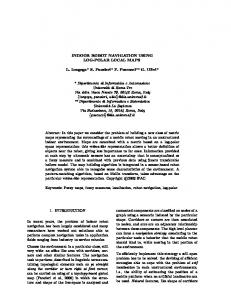
The Kamppi Indoor Navigation Service is a service optimized for mobile devices. The service is a webpage, which can be accessed by using an internet browser (kamppi.nokia.mobi). On the feature side, the service offers a thorough map of the Kamppi shopping center and its each floor. The map view shows names of selected shops, the architectural design of the floor, exits, lavatories and escalators. Landmarks, such as escalators and lavatories, are shown in the form of icons. See Figure 1. The service also points out the stores’ locations, one’s own location and the location of one’s Facebook friends. The service uses WLAN-based locating to track the user’s position. The whereabouts of a user is given with the accuracy of a map section, for example floor 4, section A. In addition the service offers gift vouchers, discount coupons and information about the stores and the shopping center itself. The service developed in a research project has novelty in combining indoor positioning, social networking and advertisement aspects, which makes it an excellent platform for investigating the UI design space of location-aware services through a user study in an authentic environment.
Figure 1: Kamppi mobile service and screenshot showing the map. User Study
A two-day user study was conducted in the Kamppi shopping center, which is located in the center of Helsinki, Finland. The center consists of 6 floors covering a total of
135 000 m² and an estimate of 100 000 people visit the center daily [4]. For the study, a total of 23 users were recruited, which formed two groups: 11 students and 12 regular Kamppi visitors. The users formed an age range of 20 to 41. The 1.5 hour session with each participant consisted of a background questionnaire of demographics and prior behavior, tasks to be completed with the mobile service, each followed by a few interview questions and grading of the features, and an end survey. Each performing user was shadowed by a user researcher. The tasks utilized the different features of the service, especially the ones related to the understanding the map and finding targets. In addition, based on the expected needs of the users, the two groups performed tasks that were optimized for the particular target users. Students performed tasks, which related to finding their Facebook friends in the mall and regular visitors performed tasks, which related to finding certain stores. For the sake of finding a Facebook friend, other study participants performing simultaneously were added to the students’ networks before the start. All tasks were carried out individually. FINDINGS
The usability problems found during the user study can be divided into three topics:navigation/positioning, UI, and the data transfer speed, which sometimes was not optimal. Of these, the problems related to navigation were the most common ones. Especially, users had trouble reading the map and placing themselves on it. Based on our experience, the following issues should be considered when designing indoor navigation maps and UI: • • • • •
Vertical navigation Orientation and relative positioning Meaningful routing Navigation by visible landmarks Consistency between UI design and real world.
The number of floors presents a severe issue for accurate location on indoor maps. In addition to the traditional 2D location, indoor navigation system should be able to spot the users location also vertically - not only in meters but in actual floors, which may not have a standard height. The positioning accuracy may decrease due to the leakage of the signal e.g. on a nearby escalator, which easily causes usability problems. Thus, special attention should be devoted to this when designing the technical set-up. The vertical navigation has effects also on indoor routing. Problems emerged mainly when trying to find the closest targets, which in fact were not always the easiest to get to. The users clearly had no idea of compass directions or the location of the streets outside the mall, so the only way of navigation was by using some eye-catching items and landmarks inside the building. Our maps did not point out all landmarks by default, which made the navigation rather difficult - especially for those users who were not already
familiar with the mall. Many users asked for more detailed location information, e.g. a shop location behind a corner, next to the public restrooms, etc., and often in terms of their own relative position. In our maps certain landmarks were marked with icons, for example escalators, exits and lavatories. Not pointing out these landmarks in UI was a problem. However, in our experience, the use of icons was not an optimal solution either. Users clearly had difficulty connecting these symbols to actual artifacts in their vicinity, as mobile UI icons typically represent some abstract, application related things rather than something that is part of the physical architecture. This was most apparent when the users failed to notice that there was an icon pointing out an escalator, even though escalators where one of the biggest eye-catchers. Not all location problems can be solved by a map designer: Even if the map and the location system work perfectly, it has very little value if the physical location fails to express floor information clearly enough. In our case using terms like 4A to indicate a specific part of the mall did not help the users at all, since these markings were not well indicated on the physical location. CONCLUSIONS
Designing indoor maps brings new requirements to the traditional mobile map UI design. Pedestrian navigation involves different points of interests, orientation aids and physical navigation references which affect the UI design, and simple zooming in from outdoor map designs or use of floor layout plans is not enough to ensure optimal user experience. ACKNOWLEDGEMENTS
The authors would like to thank the researchers in Kamppi project for the technical implementation and set-up used in the study. REFERENCES
1. Baus, J., Wasinger, R., Aslan, I., Krüger, A., Maier, A., Schwartz, T. Auditory Perceptible Landmarks in Mobile Navigation. In Proc. of IUI’07, ACM 2007, 302-304. 2. Fischer, C., Muthukrishnan, K., Hazas, M., Gellersen, H., Ultrasound-Aided Pedestrian Dead Reckoning for Indoor Navigation, In Proc. of MELT’08, 2008, 31-36. 3. Hub, A., Diepstraten, J., Ertl, T., Design and Development of an Indoor Navigation and Object Identification System for the Blind. In Proc. of ASSETS’04, 2004, 147-152. 4. Kamppi. (Last accessed 26 Jun 2009): http://fi.wikipedia.org/wiki/Kamppi_(kauppakeskus)). 5. Rukzio, E., Müller, M., Hardy, R.. Design, Implementation and Evaluation of a Novel Public Display for Pedestrian Navigation: The Rotating Compass. In Proceedings of CHI’09, ACM Press 2006, 113-122.