2St. Pölten University of Applied Sciences, Austria. 3MODUL ... The main goal in time series analysis is to find a model for given ... select and adjust time series models, utilize the prediction capabilities of models, and compare the prediction of.
EuroVis Workshop on Visual Analytics (2015) E. Bertini and J. C. Roberts (Editors)
Integrating Predictions in Time Series Model Selection M. Bögl1 , W. Aigner1,2 , P. Filzmoser1 , T. Gschwandtner1 , T. Lammarsch3 , S. Miksch1 , and A. Rind2 1 Vienna
University of Technology, Austria
2 St.
Pölten University of Applied Sciences, Austria
3 MODUL
University Vienna, Austria
Abstract Time series appear in many different domains. The main goal in time series analysis is to find a model for given time series. The selection of time series models is done iteratively based, usually, on information criteria and residual plots. These sources may show only small variations and, therefore, it is necessary to consider the prediction capabilities in the model selection process. When applying the model and including the prediction in an interactive visual interface it is still difficult to compare deviations from actual values or benchmark models. Judging which model fits the time series adequately is not well supported in current methods. We propose to combine visual and analytical methods to integrate the prediction capabilities in the model selection process and assist in the decision for an adequate and parsimonious model. In our approach a visual interactive interface is used to select and adjust time series models, utilize the prediction capabilities of models, and compare the prediction of multiple models in relation to the actual values. Categories and Subject Descriptors (according to ACM CCS): G.3 [Mathematics of Computing]: Probability and Statistics—Time Series Analysis H.5.2 [Information Interfaces and Presentation]: User Interfaces—Graphical user interfaces
1. Introduction In time series analysis, the main goal is to find a model for a given time series and to apply this model to predict future values [BK11, BJR08]. In previous work [BAF∗ 13], we introduced a Visual Analytics (VA) approach to support domain experts in the task of selecting adequate seasonal autoregressive integrated moving average (ARIMA) models. This class of time series models are widely used for prediction tasks, for instance predicting electricity prices [CENC03], system failure analysis [HXG02], and in different financial and medical domains [SS11]. During evaluation of the prototype it became apparent that including the possibility to perform actual prediction would improve the model selection process considerably. Integrating the prediction capabilities into the exploration environment offers another perspective on the adequacy of the model for a given time series and raises the confidence in the resulting model. In addition to our previous work [BAF∗ 13], we integrate the prediction functionality in the model selection process (Section 2). This work is a refined and extended version of our preliminary ideas presented in [BAF∗ 14]. Based on feedback and discussions we focus our contribution to integrate the prediction capabilities in the model se-
lection process and to compare the prediction of multiple model candidates. We demonstrate the benefit of this approach in a usage scenario using a dataset about the water quality in the San Francisco bay [JC14] (Section 3). To support domain experts in the task of model selection, we propose a VA approach that utilizes the prediction capabilities of the models. Our approach therefore provides visual interactive means to • explore different types of predictions, • explore differences of predicted and actual values, and • compare the prediction of multiple time series models. This helps to adjust and re-select the time series models.
2. Visual Analytics Approach In our VA approach we propose a close coupling of the prediction capabilities with the visual model selection interface. Including predictions in the interactive exploration environment during the iterative model refinement enables domain experts to judge the prediction capabilities and select a parsimonious model with fewer parameters. The principle of parsimony [BJR08] needs to be considered during the model selection, to prevent models from getting too complex.
c The Eurographics Association 2015.
The definitive version is available at http://diglib.eg.org/ . http://dx.doi.org/10.2312/eurova.20151107
Bögl et al. / Integrating Predictions in Time Series Model Selection
(1a)
(2a) (2d)
(1b) (1c)
(2b) (2c)
(2e)
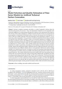
Figure 1: Interactive model selection environment, displaying the example data used in the usage scenario (Section 3). (2ae) shows our prototype, where (2a) is the time series display showing the prediction of future values, (2b) is the toolbox for model selection and prediction, (2c) are the autocorrelation and partial autocorrelation plots for selecting the model orders, (2d) are the diagnostic plots for the residual analysis, (2e) is the model selection history including the information criteria. In our approach users can change the view of (2a) to the Qualizon Graph view, as shown in (1a-c) for visualizing the difference between the one-step-ahead prediction and the actual values. Each line, (1a, 1b, 1c) shows these differences for a different model (m1, m2, m3) respectively. In Section 3 we discuss the interpretation of these three possible models.
Our approach is based on the Box-Jenkins methodology [BJR08], which describes how to find an adequate ARIMA model for a given time series. A seasonal ARIMA(p, d, q) × (P, D, Q)s model combines a nonseasonal ARIMA(p, d, q) with a seasonal ARIMA(P, D, Q)s model multiplicatively. Both have an autoregressive component (AR(p), AR(P)), a moving average component (MA(q), MA(Q)), a difference transformation (d, D). The seasonal length is specified by s. The parameters p, P and q, Q describe the model order of the AR and MA components and specify the number of parameters that are estimated by, for instance, a maximum likelihood estimator. For more details about the ARIMA models cf. [BJR08, SS11]. In general, the application of an ARIMA model for prediction is based on the available observations x1 , x2 , . . . , xn at the time points t1 ,t2 , . . . ,tn . The predictions of the next m time points tn+1 , . . . ,tn+m are then denoted by xˆn+1 , . . . , xˆn+m , where m is an integer ≥ 1. Thus, the term predict refers to the predictions of these values, using the corresponding time series model. If we want to compare predictions with actual values, we mimic this process: The time series is split at time point tk , with 1 < k < n, the model parameters are estimated based on x1 , . . . , xk , and the predicted values xˆk+1 , . . . , xˆn are computed. These values can be compared with the observed values xk+1 , . . . , xn . A variant is the one-step-ahead prediction, where k is set, e.g., to n/2 and step-by-step increased by one until k = n. In each step, the model is fit to the data points x1 , . . . , xk and the predicted value xˆk+1 is derived. In that way, prediction is successively done at only one time point using all previous information.
For more details about the estimation of the parameters and the error terms, cf. [SS11]. To support the ARIMA model selection with the prediction capabilities of the model, we combine both in our interactive model selection environment. The graphical user interface (cf. Figure 1; for details see [BAF∗ 13]) consists of five main areas: (2a) the time series display showing the input time series and, if applied, the predicted values, (2b) the model selection and prediction toolbox, (2c) the autocorrelation and partial autocorrelation (ACF/PACF) plots (the model selection is steered by interactively moving the vertical lines), (2d) the residual plots to perform the model diagnostics and decide for an adequate model, and (2e) the information criteria for the same purpose as (2d) and for investigating the model selection history. In this paper, we focus on the relevant elements for the prediction and how the prediction is integrated in our approach. After the exploration of the input data, the user iteratively increases the model order and applies transformations. The model is applied to the time series and the resulting visual representations to judge the adequateness of the model are consulted. To couple the prediction with the model selection process, we provide prediction controls. The user can apply a model candidate to show the prediction of future values and one-step-ahead prediction that predict values within the given time series. The time series display is used to show the predicted values. This can be done any time throughout the model selection process. Therefore, the user selects either the prediction of future values or the one-stepahead prediction, which triggers the computation of the prec The Eurographics Association 2015.
Bögl et al. / Integrating Predictions in Time Series Model Selection
dicted values using the currently selected model. For both types of prediction, the predicted values are represented as points connected with a differently colored line. In addition a dashed line shows the upper and the lower prediction error boundary, cf. Figure 1.2a. To emphasize on the accuracy of the prediction, there are several ways to visually support this. We showed different ways of highlighting the difference between actual and predicted values in the one-step-ahead prediction [BAF∗ 14]. There are two limitations we want to address here. First, it is not possible to judge details on what the difference actually means, mainly in context of the error boundaries of the prediction. Second, it is limited in the number of model predictions that can be compared. In Section 4, we describe the work by [HJS∗ 09, HJM∗ 11], where the authors use a diverging color scale to encode the difference between the predicted and the actual values with respect to the standard deviation. Using such an accuracy color band, enables to save vertical space and use this to stack visual representations for multiple models. Usually domain experts are interested in how much predicted and actual values differ, for example if the distance is small, medium, or large, considering the standard error of the prediction. Therefore, we suggest to use a categorical diverging color scale instead of a continuous one, like in CareCruiser [GAK∗ 11], where the authors use a diverging color scale to highlight the progress of parameter values from the initial value toward the intended value of applied treatments. They use the full height to encode the difference with color. Like in [JSMK14], either the background of a plot can be used to encode the deviation of actual and predicted value, or just a small color band below and/or above the line to avoid visual clutter. If multiple model predictions need to be shown, the proposed approach above would limit the vertical space and skew the line of the line plots. As another variant for analyzing the difference we propose to display the difference using Qualizon Graph [FHR∗ 14], as we show in Figure 1 (1a-c) for three different models. Qualizon Graphs are extensions of Horizon Graphs [Rei08] and two-tone pseudo coloring [SMY∗ 05] with qualitative abstractions. In our case, we use these qualitative abstractions for the differences between the predicted and the actual values. By using a diverging color scale, this can unveil more radical changes. The benefit of this visual representation is the vertical space-efficiency, which enables the comparison of predictions of more than one time-series model. In Figure 1.1ac we show how the stacking of the predictions of multiple models can be integrated in the prototype for model selection. Each line (1a, 1b, 1c) represents a Qualizon Graph showing the difference between the one-step-ahead prediction and the actual value of one time series model (m1, m2, m3) respectively. The user can select the model candidates using the model selection history in Figure 1.2e. In addition c The Eurographics Association 2015.
to the residual plots, this graph gives an impression on how well the models are able to predict the data. The qualitative abstraction unveils the deviation of the prediction to the actual values in relation to the standard error of the prediction. The difference di = xˆi − xi between the predicted values xˆi and the observed values xi for k ≤ i ≤ n is calculated and shown in the Qualizon Graph. We use a diverging color scale with six colors, as shown in Figure 1.1ac. In the negative direction, meaning that the predicted value is below the observed value xˆi < xi , we use three violet color classes ���, in the positive direction, meaning that the predicted value is above the observed value xˆi > xi , we use three green color classes ���. The directions are indicated in the labels as + and -. For our example we use two boundary levels. This results in three classes of difference for each direction (+/-). For the qualitative abstraction we use the distance between the one-step-ahead prediction and the actual value. Based on the chosen boundaries, in our example xi ± 0.84∗standard error and xi ± 1.96∗standard error, the distance is used to assign the color class for the difference based on the direction (+/-) and the distance to the actual value. The light color �� is used for close predictions, where the difference is within the first boundary. If the difference is larger, meaning outside the first boundary, but inside the second boundary, we use medium color ��, and dark color �� for differences where the distance is outside the second boundary. In the following section, we discuss the details of each line in Figure 1.1a-c in a usage scenario. 3. Usage Scenario To illustrate how the prediction of different models are compared and how the prediction is integrated in the model selection process, we use a usage scenario from the environmental domain. The dataset is about the water quality in the San Francisco bay area [JC14]. We use the measurement from one station in depths above 5 meters. We aggregate the data to monthly averages and interpolate missing month with linear interpolation. We use a calculated measurement based on the water temperature and salinity of the water from the years 1986 to 2004. In our scenario an analyst from an environmental department in the city council needs to model the time series to predict the expected water quality based on this measurement. As a first step the analyst loads the dataset and explores the raw data in the time series display (Figure 1.2a) and the behaviour of the ACF/PACF in the corresponding plot (Figure 1.2c), which suggests an AR(p) component with order p = 1. Adding this component improves the residuals (Figure 1.2d) and shows the remaining seasonal dependency clearly. Adjusting the model order to P = 1 for the seasonal AR(P) component improves the residuals further (m1). The residual plots (Figure 1.2d) indicate a remaining seasonal structure, but the analyst first applies the model to predict two seasonal cycles in the future (Figure 1.2a), which shows
Bögl et al. / Integrating Predictions in Time Series Model Selection
already a good pattern and behaviour. Because of the remaining seasonal structure, the analyst increases the model order of the seasonal AR(P) to P = 2 (m2). The analyst recognizes in the residuals, that there may be an improvement of the model by adding an MA(q) component of model order q = 1 (m3). The residuals show a model that fits the time series adequately. The analyst applies again the model to predict two seasonal cycles in the future, and recognises that the error boundary got slightly narrower for this model. Furthermore, in the information criteria (Figure 1.2e) there are three model candidates quite close together. The analyst selects these three models and switches the time series view (Figure 1.2a) to the Qualizon Graph view (Figure 1.1a-c). In this view the analyst recognizes that there is still a seasonal reoccurring pattern in the prediction, but interestingly the model (m1) in (1a) has smaller differences in the one-step-ahead prediction as the others. The models (m2) and (m3), which where superior according to the residual plots and the information criteria, do not perform so well in the one-step-ahead prediction. This is visible by the increase in dark colored areas from (m1) to (m2) and finally (m3). Although the error boundary for the prediction of future values of model (m3) narrowed compared to the one of model (m1), it is good enough for the analyst’s purpose and according to the principle of parsimony [BJR08] the analyst decides for the least complex model (m1) with only two parameters. Furthermore, the analyst recognizes that all three models underestimate the first and second quarter, but overestimate the third and fourth quarter of each year. This under- and overestimation is minor in model (m1) compared to the others, and therefore a better choice for the analyst.
4. Related Work TimeSearcher [BPS∗ 07] is a visualization tool to search and explore time series data. With dynamic queries it finds patterns and displays multiple forecasts, provided by similaritybased prediction. TimeSearcher uses a data-driven approach that needs exceptional events to be excluded and requires large datasets compared to model driven methods, like ARIMA [BPS∗ 07]. Hao et al. [HJS∗ 09, HJM∗ 11] use a heat-band with a diverging color scale to indicate the accuracy of the prediction compared to the actual values using the normalized differences according to the standard deviation. They apply a moving average smoothing with peak preserving algorithm for the prediction and do not support the selection of ARIMA models. In [JSMK14], the authors use a similar metaphor to encode anomaly scores along the underlying time series. They use the full height in the background of the line chart for the more compact stripe view, but can also switch to encode the anomaly scores in stripes below and above the time series to avoid visual clutter.
The x12GUI [KMST12] package for R offers an interactive tool for the X-12-ARIMA software for seasonal adjustment. The focus is on the exploration of the time series and the results of the seasonal adjustment as well as the manual editing of outliers [KMST12]. For selecting a time series model and adjusting the parameters for the X12-ARIMA call, form-based input is used. For the computed models there is a history, which allows for loading previous settings, but not to browse and directly compare them. For single models x12GUI provides also the possibility to predict and visualize future values, but this is not integrated in the model selection process.
5. Discussion and Conclusion Predicting future values is one of the main goals of time series analysis [BJR08, BK11]. Integrating the prediction capability of time series models for analyzing and selecting ARIMA models, supports users in finding a parsimonious and adequate model. Our approach uses an integrated analysis workflow with visual feedback on the selected models and human involvement in the selection process. This enables users to directly examine and judge the prediction capability of one or more models, and choose an adequate model, even if the residual plots do not show recognizable structures and the information criteria differ only slightly. The usage scenario illustrates how our approach supports users in comparing different models regarding the one-stepahead prediction. Our approach assists in choosing a model by considering factors, which have not been taken into account in state-of-the-art tools. The visual comparison of the prediction of multiple time series models using Qualizon Graphs resulted in a less complex model, which satisfies the principle of parsimony. Our approach relies on user expertise to judge the adequateness of the model candidates and does not automatically propose an adequate model. The approach is also limited to the class of seasonal ARIMA models and univariate time series. It is possible to enable a comparison against other time-series models during model selection. A full integration of these models in our interactive environment might require adaptation of the approach, as they do not follow the same model selection process. Finally, it is important to assess the prediction quality in our approach and to evaluate its applicability via user studies with statisticians, and to validate it on new usage scenarios. Acknowledgements The authors thank Bilal Alsallakh for valuable discussions and suggestions. This work was supported by: Austrian Federal Ministry of Science, Research, and Economy via CVAST (#822746), a Laura Bassi Centre of Excellence; Vienna University of Technology by the Doctoral College for Environmental Informatics; Austrian Science Fund (FWF) through HypoVis (#P22883) and KAVA-Time (#P25489). c The Eurographics Association 2015.
Bögl et al. / Integrating Predictions in Time Series Model Selection
References [BAF∗ 13]
B ÖGL M., A IGNER W., F ILZMOSER P., L AM T., M IKSCH S., R IND A.: Visual analytics for model selection in time series analysis. IEEE Transactions on Visualization and Computer Graphics 19 (2013), 2237–2246. doi: 10.1109/TVCG.2013.222. 1, 2 MARSCH
[BAF∗ 14] B ÖGL M., A IGNER W., F ILZMOSER P., G SCHWANDTNER T., L AMMARSCH T., M IKSCH S., R IND A.: Visual analytics methods to guide diagnostics for time series model predictions. In Proceedings of the 2014 IEEE VIS Workshop on Visualization for Predictive Analytics (2014). 1, 3 [BJR08] B OX G., J ENKINS G., R EINSEL G.: Time Series Analysis: Forecasting and Control, 4th ed. John Wiley & Sons, Hoboken, 2008. 1, 2, 4 [BK11] B ISGAARD S., K ULAHCI M.: Time Series Analysis and Forecasting by Example. John Wiley & Sons, Hoboken, 2011. 1, 4 [BPS∗ 07] B UONO P., P LAISANT C., S IMEONE A., A RIS A., S HNEIDERMAN B., S HMUELI G., JANK W.: Similarity-based forecasting with simultaneous previews: A river plot interface for time series forecasting. In Proceedings of the International Conference on Information Visualisation (2007), IEEE, pp. 191–196. doi:10.1109/IV.2007.101. 4 [CENC03] C ONTRERAS J., E SPINOLA R., N OGALES F., C ONEJO A.: ARIMA models to predict next-day electricity prices. IEEE Transactions on Power Systems 18, 3 (2003), 1014– 1020. doi:10.1109/TPWRS.2002.804943. 1 [FHR∗ 14] F EDERICO P., H OFFMANN S., R IND A., A IGNER W., M IKSCH S.: Qualizon Graphs: Space-efficient time-series visualization with qualitative abstractions. In Proceedings of the 12th International Working Conference on Advanced Visual Interfaces, AVI (2014), ACM, pp. 273–280. doi:10.1145/ 2598153.2598172. 3 [GAK∗ 11] G SCHWANDTNER T., A IGNER W., K AISER K., M IKSCH S., S EYFANG A.: CareCruiser: Exploring and visualizing plans, events, and effects interactively. In Proceedings of the 4th IEEE Pacific Visualization Symposium, PacificVis (2011), pp. 43–50. doi:10.1109/PACIFICVIS.2011.5742371. 3 [HJM∗ 11] H AO M. C., JANETZKO H., M ITTELSTÄDT S., H ILL W., DAYAL U., K EIM D. A., M ARWAH M., S HARMA R. K.: A visual analytics approach for peak-preserving prediction of large seasonal time series. Computer Graphics Forum 30, 3 (2011), 691–700. doi:10.1111/j.1467-8659.2011.01918. x. 3, 4 [HJS∗ 09] H AO M., JANETZKO H., S HARMA R., DAYAL U., K EIM D., C ASTELLANOS M.: Poster: Visual prediction of time series. In Poster presented at IEEE Symposium on Visual Analytics Science and Technology, 2009. VAST 2009 (2009), pp. 229– 230. doi:10.1109/VAST.2009.5333420. 3, 4 [HXG02] H O S. L., X IE M., G OH T. N.: A comparative study of neural network and Box-Jenkins ARIMA modeling in time series prediction. Computers & Industrial Engineering 42, 2 (2002), 371–375. doi:10.1016/S0360-8352(02)00036-0. 1 [JC14] JASSBY A. D., C LOERN J. E.: wq: Exploring water quality monitoring data, 2014. R package version 0.4-1. URL: http://CRAN.R-project.org/package=wq. 1, 3 [JSMK14] JANETZKO H., S TOFFEL F., M ITTELSTÄDT S., K EIM D. A.: Anomaly detection for visual analytics of power consumption data. Computers & Graphics 38 (2014), 27–37. doi: 10.1016/j.cag.2013.10.006. 3, 4 [KMST12]
KOWARIK A., M ERANER A., S CHOPFHAUSER D.,
c The Eurographics Association 2015.
T EMPL M.: Interactive adjustment and outlier detection of time dependent data in R. In Conference of European Statisticians, Work Session on Statistical Data Editing (Oslo, Norway, 2012), United Nations - Economic Commission for Europe. 4 [Rei08] R EIJNER H.: The development of the horizon graph. In Electronic Proceedings of the VisWeek Workshop From Theory to Practice: Design, Vision and Visualization (2008). 3 [SMY∗ 05] S AITO T., M IYAMURA H. N., YAMAMOTO M., S AITO H., H OSHIYA Y., K ASEDA T.: Two-tone pseudo coloring: Compact visualization for one-dimensional data. In IEEE Symposium on Information Visualization, InfoVis (2005), pp. 173–180. doi:10.1109/INFVIS.2005.1532144. 3 [SS11] S HUMWAY R. H., S TOFFER D. S.: Time Series Analysis and its Applications. With R examples., 3rd ed. Springer, New York, 2011. 1, 2