Recent advances in flow cytometry technologies are changing how researchers
collect, look at and present their ... plots that published figures often (and inex-.
© 2006 Nature Publishing Group http://www.nature.com/natureimmunology
C O M M E N TA R Y
Interpreting flow cytometry data: a guide for the perplexed Leonore A Herzenberg, James Tung, Wayne A Moore, Leonard A Herzenberg & David R Parks Recent advances in flow cytometry technologies are changing how researchers collect, look at and present their data.
R
ecent advances in fluorescence-activated cell sorting (FACS) technology offer new and exciting approaches for understanding, monitoring and combating immune-related diseases. However, these technological advances also introduce considerable challenges for the producers, reviewers and readers of today’s immunology literature. Although some laboratories have readily adopted today’s improved FACS data acquisition and analysis methods, too many others have found it difficult to understand how or even believe that using the older methods can lead to serious misinterpretations of FACS data. In essence, results for the same sample can be very different (as described below) depending on whether the data for the sample are collected and displayed with the older or newer methods. In fact, disputes can arise over what might seem to be incompatible data, but the contradictions could simply reflect unrecognized differences in how the data are processed and displayed. These problems and limitations are becoming more apparent and more important as measurement technologies change and as the number of fluorescence labels being routinely measured increases. For example, when the older technology is used to display a FACS data set, a subset of cells without expression of either of two surface markers may remain mostly hidden. However,
Leonore A. Herzenberg, James Tung, Wayne A. Moore, Leonard A. Herzenberg and David R. Parks are in the Department of Genetics, Stanford University School of Medicine, Stanford, California 94305-5318, USA. e-mail:
[email protected]
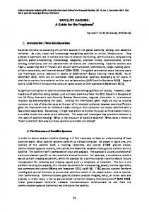
with the newer technology, the complete subset is visible (Fig. 1, bottom left regions containing ‘double-negative’ cells, logarithmic versus ‘logicle’). Far from ‘magically’ creating a new subset, the newer display method simply makes an appropriate place on the visual scale for cells whose fluorescence values are close to zero. The older methods typically assign such cells to the lowest value of the (logarithmic) visual scale and thus ‘pile them up’ on the axis. In the absence of an understanding of these differences between old and new technologies (explained below), long-lasting disagreements could develop simply because different laboratories are using incommensurate methods. The discussion here focuses on closing this knowledge gap and making findings with the newer and better FACS technology more accessible both to FACS users and to investigators who need to understand and interpret the diverse FACS data in today’s literature. The goal is to clear up misunderstandings and help a community schooled in the older FACS vernacular ‘retrain’ in the modern idiom. Technical details are intentionally restricted to those essential to understanding how differences between the older and newer FACS technologies affect FACS-based findings. Though FACS aficionados may find this discussion useful, they will no doubt prefer the sources on which it is based1–6. The ‘logicle’ solution FACS data are commonly presented as onedimensional histograms or two-dimensional displays (dot displays or contour maps) with logarithmic axes that extend over a ‘four- to five-decade’ range, representing cells with flourescence values that differ 10,000- to 100,000-fold between the lower and upper ends
NATURE IMMUNOLOGY VOLUME 7 NUMBER 7 JULY 2006
of the scale. Researchers use these logarithmic displays to visualize data during instrument setup and data collection as well as to analyze and publish FACS data. Over the years, these displays have become such a staple in FACS plots that published figures often (and inexcusably) omit axis values and even axis ‘tick marks’ that identify the scale as logarithmic. Nonetheless, old habits are changing. Many investigators are now forsaking that well established technology in favor of newly introduced ‘logicle’ (or ‘bi-exponential’) displays, which were specifically designed for the display of FACS data so that they incorporate the useful features of logarithmic displays but also provide accurate visualization of populations with low or background fluorescence1 (Fig. 1). ‘Logicle’ displays provide good visualization of all subsets, regardless of the amount of cell-associated fluorescence. Logarithmic displays, in contrast, provide similar representation of subsets of cells with medium to large amounts of fluorescence associated with surface and internal markers. However, these latter widely used displays present deceptive, truncated views of subsets in data dimensions in which they have little or no cell-associated fluorescence. This occurs because logarithmic scales, by their nature, spread data at the lowest on-scale values and cannot accommodate values at or below zero. We demonstrate here the considerable difference between the ‘logicle’ and logarithmic display methods by presenting the same data set plotted on logarithmic axes (Fig. 1, left) and ‘logicle’ axes (Fig. 1, right) and visualized with ‘color density plots’ (Fig. 1, top) and ‘quantile contour maps’ (Fig. 1, middle). Although each of the four plots represents data for all of the cells in the sample, the minimally fluorescent
681
© 2006 Nature Publishing Group http://www.nature.com/natureimmunology
C O M M E N TA R Y subset that is visible in the ‘logicle’ displays (centered near zero on both axes) seems to be missing from the logarithmic displays. However, as indicated above, this subset is present but is represented mainly by data points and contours that are ‘piled up’ on the plot axes. The location of the median fluorescence value in each dimension (Fig. 1, dark red crosses) further demonstrates the problem with logarithmic data visualization. By definition, half of the data values in each rectangular region are greater than the median and half are less than that value. However, whereas the locations of the median values in the ‘logicle’ displays (Fig. 1, right) correspond to the visual centers of the subsets, the locations of the median values in the logarithmic displays (Fig. 1, left) are substantially offset from the apparent peak of the subset. In fact, each of the subsets in the logarithmic display is broken up into a ‘false peak’ above the median value, a sparsely populated region between this peak and the baseline, and a ‘pileup’ of a large fraction of the cells on the baseline. This artificial subdivision is also visible when data are plotted as a one-dimensional histogram on a logarithmic scale (Fig. 1, bottom left). The sharp rise at the lowest value on the scale reflects the ‘pileup’ of the minimally fluorescent cells at the lowest value on the scale. This ‘peak’ tends to be overlooked because it is nearly coincident with the axis. However, it represents roughly 40% of the minimally fluorescent population and 20% of the cells in the overall population. The ‘valley’ and the ‘false peak’ are also in the histogram, creating a total of three peaks rather than the two that actually exist. This problem does not occur in histograms plotted on ‘logicle’ axes (Fig. 1, bottom right), in which the minimally fluorescent cells form a peak centered at or near zero and extending symmetrically above and below the peak center, thereby representing the cells whose measured fluorescence values are below zero. In two-dimensional logarithmic displays, cells whose fluorescence measurements are at or below zero in one or both dimensions are ‘piled up’ on the axes and are represented by contours along both axes in contour displays (Fig. 1, middle left) and by colored dots, visible with keen eyes, on the axes in color density displays (Fig. 1, top left). The contours (and dots) range along a large proportion of both the x and y axes, indicating that cells with fluorescence values at or below zero in one dimension may have equivalently low fluorescence in the other dimension or may have very high fluorescence values in this second dimension. Surprisingly, given how modest the contours along the axes seem, they represent about 40%
682
‘Logicle’
Logarithmic 10
5
10 4
+
10
5
10
4
10
3
+
10 3
10 2
+
+
+
+
0
10 1
10
5
10
4
105
+
10
4
+
10 3 103 10
lgD
2
+
+
0
+
+
10 1
10 1
10 2
10 3
10 4
10 5
0
10 3
10 4
10 5
10 3
10 4
10 5
CD5 50%
50%
2000
4000
1500
3000
1000
2000
30%
30% 50
1000
0 10
1
10
2
10
3
10
4
10
5
0 0
CD5 Figure 1 ‘Logicle’ displays provide improved representation of cells with minimal fluorescence. Cells with minimal fluorescence can be visualized with ‘logicle’ displays (right) but are ‘piled up’ on the axis with logarithmic displays (left). The true center of each gated population (median fluorescence value in each dimension; dark red crosses) matches the visual peak for that population in ‘logicle’ displays (right, top and middle) but does not match the visual peak in the logarithmic displays (left, top and middle). Because logarithmic scales cannot display cells with zero or negative values, these cells are ‘piled up’ on the axis in the logarithmic displays. However, they are properly visualized in the ‘logicle’ display (bottom right, red shaded region). Data provided by E. Ghosn (Stanford University, Stanford, California).
of the cells in the sample. Notably, these ‘missing’ cells are readily visible in ‘logicle’ displays, which enable visualization of fluorescent measurements for essentially all cells in the sample, including those whose fluorescence values are at or below zero in either dimension (Fig. 1, right). The importance of seeing less than nothing As FACS instruments measure cell-associated fluorescence that can be essentially zero but not negative, how can a FACS data set contain values below zero and why are some cell populations found to be distributed symmetrically around zero? The answer lies in the way the FACS instrument collects data and routinely corrects (compensates for) the data for spec-
tral overlap before visualization in histograms, dot plots and contour maps. In essence, background light and electronic noise make a small but important contribution to the overall signals the FACS instrument obtains for each cell. The FACS apparatus measures this background when no cells are present and subtracts it from the signals the detectors record for each cell. This instrument background correction introduces statistical variation, which may cause the measurements that the detectors record for cells that have no cell-associated fluorescence to be a little above or a little below the measurement set as the instrument zero. As a result, the corrected measurements distribute symmetrically around zero. This distribution is often broadened sub-
VOLUME 7 NUMBER 7 JULY 2006 NATURE IMMUNOLOGY
C O M M E N TA R Y
Logarithmic 10 5
‘Logicle’ 10 5
Uncompensated
10 4
10
3
10
2
10 4
10 3
0
© 2006 Nature Publishing Group http://www.nature.com/natureimmunology
Yellow 10 1 10 1
10 2
10 3
10 4
10 5
0
Green 10 5
10
10 4
10 5
5
Compensated
10 4
10
10 3
10 4
3
10 3 10 2
0
PE
10 1 10 1
10 2
10 3
10 4
10 5
0
10 3
10 4
Figure 2 ‘Logicle’ displays are superior to logarithmic displays in determining whether compensation has been properly applied to the sample. Uncompensated data for a sample stained with fluorescein isothiocyanate– conjugated antibody are presented in logarithmic (top left) and ‘logicle’ (top right) displays. Fluorescent colors (yellow and green) are used to designate the axes because they represent uncompensated color measurements. Many events are ‘piled up’ on the axis in the logarithmic display, whereas all events are visible in the ‘logicle’ display. Bottom, compensated data for samples above. In a properly compensated sample, the location of the median phycoerythrin fluorescence in the FITC– population by definition matches the location of the median phycoerythrin fluorescence in the FITC+ population. This match is apparent in the ‘logicle’ display but not the logarithmic display (bottom right versus bottom left). In the ‘logicle’ display (bottom right), the distribution of the ‘phycoerythrin’ fluorescence in the FITC+ population is broader than the distribution of the low fluorescence measured for the FITC– population. This difference is due to statistical variance of the fluorescence measurements, which increases with the amount of overlap fluorescence that must be subtracted. Red dashed lines above the populations (bottom right) indicate the thresholds (gates) needed to identify the PE+ events in the FITC+ and FITC– populations in this simple analysis. With more complex stain sets, FMO controls are useful for setting these thresholds.
10 5
FITC
stantially by the effects of spectral overlap between dyes when two or more dyes are used to stain a cell suspension. During FACS data collection, separate detectors are dedicated to each fluorochrome and measure most light from the target fluorochrome. Some of the light from this fluorochrome, however, may be emitted and detected in the wavelength range assigned to a different fluorochrome. Fluorescence compensation is the process by which the amounts of spectral overlap are estimated and subtracted from the total detected signals to yield an estimate of the actual amount of each dye. Single-laser, two-color FACS experiments in the mid-1970s showed that fluorescence compensation is important6. It is now recognized as an obligate step in most FACS analyses. For measurement of the spectral overlaps, the fluorescence detected on all measurement channels is evaluated for ‘compensation control’ samples, which have each been labeled with only one of the fluorochromes used in the composite stain set. These measurements are used to make the fluorescence compensation corrections. That is, they are used to estimate and subtract the contribution of the spectral overlap to the overall signal that each detector measures for cells stained with the composite stain set. When a population has little or no detectable cell-associated fluorescence for a particular dye, the subtraction of overlapping fluorescence by the fluorescence compensation process results in a population distributed symmetrically around zero (or cell autofluorescence) in the corresponding data channel. Statistical uncertainties inherent in primary and overlapping fluorescence measurements will determine the width of this distribution. As these uncertain-
ties become more pronounced as the size of the correction increases, larger corrections will result in broader distributions that nonetheless will still be centered on the average autofluorescence of the cells (Fig. 2, bottom right, vertical dimension). Applying the compensation to the data for the compensation control samples and using ‘logicle’ displays to visualize the results for these samples provide a straightforward way to determine whether the applied compensation is correct. This is demonstrated by the position of populations displaced from the origin along the x or y axis. A population centered above the unstained cell background indicates undercompensation; a population centered below the unstained cell background indicates overcompensation; and a population centered at the unstained background indicates that the compensation correction is, like Goldilocks’ porridge, just right. Collect, then compensate Given the difficulty or impossibility of setting correct compensation visually using logarithmic displays, the appropriate way to set correct compensation is to rely on values computed by software from appropriately gated compensation control samples. As noted above, ‘logicle’ displays of compensation control data can be used to confirm that nothing has gone wrong in the process and the resulting compensation is correct. Setting compensation manually from logarithmic displays is in effect ‘flying blind’ and routinely leads to substantial under- or overcompensation. This is a shocking realization, as the instrument-based method (compensate by eye first; collect the data after) was the only method
NATURE IMMUNOLOGY VOLUME 7 NUMBER 7 JULY 2006
available for many years and is still widely used today. Thus, much of the older FACS data, and a fair part of today’s FACS data, have been compromised to some extent, particularly with respect to distinguishing ‘dull’ (weakly positive) from negative populations or evaluating small differences in the expression of a marker on two subsets. The solution to this problem is simple and straightforward: data should be collected and stored uncompensated (that is, written to data files before compensation is applied); data for compensation samples should also be collected and ‘written to’ data files; and the compensation should be computed and applied when the data are analyzed. This recommendation, which is made in the strongest terms, goes against common practice. It is time for that practice to change. The errors introduced by compensating the data before collection are no longer tolerable in an era where fluorescence compensation can readily be done after the (uncompensated) data have been collected and stored. Recognizing the necessity for this shift to post-collection compensation, FACS software designers have already introduced software packages to provide this (and related) functionality. Among those that are already familiar (Supplementary Note online), the ‘FacsXpert’ protocol design software (http:// www.ScienceXperts.com) provides labels for plot axes and table columns and specifies the necessary compensation and other controls; the FlowJo FACS data analysis software (http:// www.TreeStar.com) computes and applies compensation corrections, enables visualization of all data on ‘logicle’ axes and provides quantile (‘probability’) contour displays; and the DIVA software on newer Becton-Dickinson
683
© 2006 Nature Publishing Group http://www.nature.com/natureimmunology
C O M M E N TA R Y instruments (http://www.BD.com) provides utilities for viewing data on ‘logicle’ scales during data collection while collecting and storing uncompensated data. For viewing data during cell sorting, it is of course necessary to use the compensation tools provided by the instrument (as the data must be compensated before its visualization). In addition, it is often desirable to monitor data during data collection, which again must be compensated with ‘on board’ compensation utilities. As indicated above, some of the newer analyzers and cell sorters offer the ability to view data and sort cells with compensation in place while still allowing the collection and storage of uncompensated data (along with the compensation specification used on the instrument). However, with the older instruments, there is no choice but to use the instrumentbased compensation utility to approximate the compensation. Do not overstep the boundaries Although unstained cell populations are centered close to zero when displayed on the ‘logicle’ scale, the width of these populations can vary considerably, depending on the size of the fluorescence correction. Therefore, determining whether cells are dully stained or belong to a broad unstained population is not as simple as drawing a threshold based on unstained cells as is done, for example, with the commonly used ‘quadrant’ method for specifying gates. Similarly, basing a threshold on amounts obtained for cells stained with an isotype control can give an erroneous impression of the location of the true threshold with which to separate unstained and dully fluorescent cells. The best way to determine this threshold is to run ‘fluorescence minus one’ (FMO) controls2,7 for all dyes for which the threshold is in question; that is, where spectral overlap correction may lead to greater uncertainty as to what constitutes background staining. In an FMO control stain set, all reagents used in a given multicolor stain are included except the reagent for which the threshold is to be determined. Alternatively, an isotype control reagent is used to replace the antibody for which the threshold is sought (if the isotype control is assumed to have the same nonspecific ‘stickiness’ as the staining antibody). To show the threshold that distinguishes dully fluorescent cells from cells that do not express the determinant detected by the reagent omitted from the FMO control, data are collected for cells stained with FMO control stain sets and are compensated, displayed and gated in the same way as cells stained with the full stain set. The background fluorescence for each subset in the display is demonstrated by the upper boundary
684
1 × 10⁴ cells 10
Dot plots
5
10
10 4
10
5 × 10⁴ cells
10
10 2
Quantile contours CD4 CD8 F4/80
3
10
1 3
1 4
10 4
5 10 10 5
3
10 2
0 0
5
10 4
10 2
0
10
10
10 4
3
5
5
1.5 × 10⁵ cells
0 0
10 3
10 4
10 4
5 10 10 5
3
10
3
10
3
10
2
10
2
10
2
0 0
IgD
1 3
1 4
10 5
10 3
10 4
10 5
0
10 3
10 4
10 5
10 4
10
0
0
0 0
10 3
10 4
10 5
Figure 3 Quantile contour plots provide more accurate data representation than dot plots. Samples containing 1 × 10⁴, 5 × 10⁴ and 1.5 × 10⁵ events are plotted as quantile contour plots plus outliers (bottom) or as dot plots (top). The contours in the quantile contour plots (bottom) in each sample are preserved regardless of the numbers of events displayed. Color density plots (Fig. 1) are similar to quantile contour plots in this respect. In contrast, the commonly used dot plots (top) become saturated and populations become harder to separate as more events (cells) are displayed. In addition, lowfrequency populations may seem to be present at higher frequencies when large numbers of events are displayed. Some software packages offer the ability to display contour plots that include dots showing the location of cells outside the lowest contour. In the commonly used 5% quantile contour plots presented here (bottom), 95% of the cells are bounded by the contour lines. The remaining cells are displayed as dots that, as in all dot plots, increase in number as the number of cells analyzed increases.
of the subset in the FMO control. We present here an FMO control in the simplest possible form (Fig. 2, bottom right). The threshold for identifying cells with phycoerythrin above background should be set differently for fluorescein isothiocyanate–negative and fluorescein isothiocyanate–positive populations (Fig. 2, red dashed lines). Let standards serve as a guide Running stable multicolor fluorescent microspheres (‘beads’) and adjusting the FACS apparatus so that the bead fluorescence in each channel precisely match the fluorescence in previous experiments allows the instrument to be tuned to return data that are highly reproducible from one experiment to the next. Standardizing the instrument in this way is desirable but realistically is very hard to achieve without computer-based standardization tools. In the absence of such tools, the best that can be done (and should be done) is to run a multicolor bead sample, adjust the instrument so that the fluorescence in each channel is close to the desired value and collect a data set showing where the bead fluorescence was during that FACS assay. This procedure will bring the instrument into roughly standard conditions and provide a way of knowing how closely fluorescence on subsets can be expected to match
between experiments. The bead-based standardization method is now growing in popularity and is replacing the older method in which instruments are ‘standardized’ by analyzing unstained cells and tuning the instrument so that these cells are in the center of the first ‘decade’ of the logarithmic amplifier display. This cell-based method is flawed because of problems with displaying cells near the axes on logarithmic displays (as described above) and because it references data to the least accurate measurements being made; that is, to values for nonfluorescent or autofluorescent cells. Therefore, the bead-based method is the method of choice for instrument standardization. Follow the dots (with better displays) There are three readily available choices for displaying two-dimensional data. Perhaps the most commonly used, the monochrome ‘dot plot’, dates back to the use of oscilloscopes to visualize FACS populations and has been ‘carried forward’ as the printed version of the screen view available on the primitive instrument. In its time, the dot plot was the best display that could be achieved. Today it is the worst. Watching dot plots develop as data is collected demonstrates the considerable limitations inherent in this type of display.
VOLUME 7 NUMBER 7 JULY 2006 NATURE IMMUNOLOGY
C O M M E N TA R Y
© 2006 Nature Publishing Group http://www.nature.com/natureimmunology
BOX 1 SUGGESTED GUIDELINES FOR FACS DATA PRESENTATION4 Instrument: Identify the FACS instrument and the software used to collect, compensateand analyze the data. Include model and version number where more than one exists. Graphic displays: Choose smoothing, graph and display options according to the dictates of the study. Be consistent across all displays in an analysis. Indicate the number of cells for which data are displayed and, where applicable, the contour or color density intervals used in the figure. Scaling: Show all parts of the plot axis necessary to indicate the scaling that was used (such as log, linear or ‘logicle’). Numerical values for axis ‘ticks’ can be eliminated except when necessary to clarify the scaling. For univariate (onedimensional) histograms, the scale for the abscissa (y axis) should be linear and should begin at zero unless otherwise indicated. Numerical axis values should not be included with the zero-based linear axes but should be shown for other axes. Gating: Display the gates used at each step in the gating sequence when gates are set manually (subjective gating). Show data for control samples when these are used to set gates. If necessary, present this information in supplementary figures. When an algorithm is used to set gates, define it explicitly and state that it has been used. Gating is assumed to be subjective unless otherwise stated. Frequency measurements: Show the frequencies (or percentages) of cells in gates of importance in the study. Compute these values relative to the total number of cells presented in the display on which the values appear. If a different frequency computation is used, define the method that was used and where it was applied. The graph itself cannot convey this requisite information. Intensity measurements: Explicitly define the statistic applied (mean, median or a particular percentile). All statistics should be applied to the ‘scaled’ intensity measurement rather than to ‘channel’ numbers.
Once a cell triggers the placement of a dot on the screen, hundreds or thousands of cells measured at the same fluorescence will effectively be invisible because they will all be represented on the screen by the initial dot. In addition, if enough cells are analyzed, sparse regions will become populated with enough dots at a density of one cell per dot to form a contiguous (black) region indistinguishable from and often merged with highly populated black regions saturated with thousands of dots and potentially thousands of signals per dot (Fig. 3). Curiously, although this problem with ‘live’ dots plots is fairly well recognized, many investigators have adopted computer-generated dot plots as their preferred method for viewing and publishing data. Some of these investigators believe (erroneously) that dot plots provide the most accurate representation of the subsets that are present. However, quantile contour plots (sometimes called probability plots) and color density plots actually provide a much more accurate rep-
resentation of the data. By representing the frequencies of cells present at each point in the plot, these plots avoid the dynamic range problems encountered with monochrome dot plots. Thus, they become more rather than less accurate as the number of cells for which data are collected increases (Fig. 3). Furthermore, because they facilitate the discrimination of densely and sparsely populated regions, these contour and color density plots enable precise localization of the peaks and valleys that distinguish subsets of cells. The FACS ‘Tower of Babel’ From a reader’s or a reviewer’s point of view, the lesson here is that comparison of FACS data can be difficult even in the same laboratory when data are collected on the same FACS instrument. Dully stained cell populations can seem to be negative, unstained populations can seem to be positive, and irritating controversies can arise, all because one investigator used online data visualization and compensation methods based on
NATURE IMMUNOLOGY VOLUME 7 NUMBER 7 JULY 2006
logarithmically displayed data, whereas the other collected uncompensated data and used offline compensation and ‘logicle’ visualizations for analysis. This gap can be even greater when the comparison is between uncompensated data collected on the older FACS machines with logarithmic amplifiers and peak detection electronics and data collected on the newer machines with linear digital signal processing. Even when the data are correctly compensated in both cases and when the data are visualized with the same analysis program, cell populations at both ends of the scale tend to be more accurately represented when data are collected with the newer machines, because the older electronic systems tend to render signals less accurately in the lowest and often also the highest regions. Thus, readers and reviewers accustomed to the older FACS instruments and the older displays may encounter surprises in data acquired with the newer technologies, whereas readers and reviewers steeped in data acquired with the newer technologies may miss data features they are accustomed to seeing. Overall, this means that as the field transitions from the older to the newer technologies (which may take some time), it will be necessary for investigators at all levels to recognize the differences between the technologies and for authors submitting papers to ensure that the information that accompanies FACS data is sufficient for reviewers to understand which technologies were used for data collection, compensation and display. Although this kind of information has sometimes been considered superfluous, it is now essential for making FACS data interpretable. Therefore, the development of a standard to specify the minimal acceptable information necessary to accompany FACS data is obviously in order, the sooner the better (Box 1). 1. Parks, D.R., Roederer, M. & Moore, W.A. Cytometry A (in the press). 2. Tung, J.W., Parks, D.R., Moore, W.A., Herzenberg, L.A. & Herzenberg, L.A. Clin. Immunol. 110, 277–283 (2004). 3. Tung, J.W., Parks, D.R., Moore, W.A., Herzenberg, L.A. & Herzenberg, L.A. Methods Mol. Biol. 271, 37–58 (2004). 4. Roederer, M., Darzynkiewicz, Z. & Parks, D.R. Methods Cell Biol. 75, 241–256 (2004). 5. Herzenberg, L.A. et al. Clin. Chem. 48, 1819–1827 (2002). 6. Loken, M.R., Parks, D.R. & Herzenberg, L.A. J. Histochem. Cytochem. 25, 899–907 (1977). 7. Roederer, M. Cytometry 45, 194–205 (2001).
685