Assessing Interaction Styles in Web User Interfaces Alistair Sutcliffe and Antonella De Angeli Centre for HCI Design, School of Informatics, University of Manchester, P.O. Box 88, Manchester M60 1QD, UK
[email protected]
Abstract. An evaluation of two websites with the same content but different interface styles (traditional menu-based and interactive metaphors) is described. A formative usability evaluation was carried out with heuristic assessment of aesthetics followed by post-test memory. The subjects had more problems with the metaphor-based site, but rated it more favourably on the aesthetics heuristics. There was no difference in free memory recall between the sites. The implications for website design and evaluation are discussed.
1 Introduction Conceptions of “new usability” propose that overall satisfaction with user interfaces involves not only traditional usability but also other factors such as user engagement, experience, and aesthetics [5]. Some heuristic evaluation techniques make reference to aesthetics and user engagement [8], [12], [13]. However, few experimental investigations into aesthetic components of usability have been carried out apart from those by Tractinsky [17], who demonstrated that users’ perception of aesthetic qualities was an important, and culturally variable, component in the rating of quality in experiments with ATM user interfaces. Further evidence for the importance of aesthetics can be found in the study by Hassenzahl et al. [6], who asked users to compare six different designs of a process control application, with questionnaire inventories for experience, hedonic and appeal qualities. Hassenzahl et al. concluded that both experience and hedonic qualities contributed approximately equally to the overall judgement of appeal. However, these studies either did not specify which design features they varied to test aesthetic quality or varied on simple aspects such as colour and layout consistency as in Tractinsky’s studies. To our knowledge, no comparative studies have been undertaken on how interaction might influence aesthetics or user judgement of their “experience”. One design feature which may attract users’ attention, animated banner adverts, has been extensively researched. Bayles [1] found that animation in banner adverts was not effective in promoting memorability, while Guan and Zhang [4] and Diaper and Waeland [3] reported that although attention was directed towards animated adverts in terms of eye-tracking fixations, users did not comprehend or remember the information. Hornof and Halverson [7] have demonstrated that even fixations on animated adverts are not reliable indicators of attention, let alone comprehension of content. However, other factors which might contribute to the users’ overall satisfaction, such as interaction and aesthetics have received less attention. M.F. Costabile and F. Paternò (Eds.): INTERACT 2005, LNCS 3585, pp. 405 – 417, 2005. © IFIP International Federation for Information Processing 2005
406
A. Sutcliffe and A. De Angeli
This paper reports an evaluation of two websites with different design styles, one traditional, the other with interactive metaphors and more aesthetic design features. The study also investigates the link between design, usability, user perception and memory. In the following section we describe the experimental methods and materials. Section 3 reports the results of the usability, aesthetics heuristics and memory tests. The discussion then reviews the implications of the results for website evaluation and design.
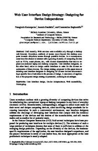
2 Method Two live websites were selected from the ThinkQuest Library, a collection of educational sites entered in an international competition sponsored by the Oracle Education Foundation. These websites presented the same content on Astronomy with very different design styles, one exploiting animated metaphors and more aesthetic features (metaphor-based), the other a traditional menu-based style. Example screenshots are shown in Fig. 1.
(a)
(b)
Fig. 1. (a) Metaphor-style interface showing the planets and cockpit metaphors, and (b) Menubased user interface
The sites had 210 content pages organised in four main sections – planets, universe, exploration, news, resources and glossary with further pages linking to mainly disabled interactive features such as chat rooms and feedback forms. From the home page (http://library.thinkquest.org/28327/), the user can select which style she/he prefers. In the interactive metaphor version, an animated representation of the solar system is displayed with a “cockpit” metaphor of controls at the bottom of the screen (see Fig. 1a). Moving the mouse over the planets causes an orbit to highlight, then clicking on the planet or its orbit causes the planet’s name to appear in the cockpit display. Information about the planet can then be accessed by “Go” in the cockpit metaphor. Some fast moving planets such as Mercury were difficult to access, while Uranus and Neptune were not easily visible. The side panels in the cockpit
Assessing Interaction Styles in Web User Interfaces
407
contain other navigation links to chat rooms, universe, exploration, etc., although the user has to mouse over the panel to display the option name. The menu interface style, in contrast, (Fig. 1b) has a standard link menu structure to access information without any intervening displays. The top-level menu leads to sub-menus for the planets, and each planet has an introductory text followed by a sub-menu of information relevant to that planet. The key differences between the two interface styles which we hypothesised should influence user perception of engagement and aesthetics are summarised in Table 1. Table 1. Informal assessment of the aesthetic/user engagement differences between the two interface styles Menu-based style
Metaphor-based style
Interaction
Menu and links
Interactive planets and cockpit metaphors
Use of colour
Black background, green and white text
Black background, green and white
Layout & presentation
Conventional block structures layout
Shape and shading emphasised
Use of media
Text plus still image
Animation in several places, interactive captions on images
Background image
Starfield display borders
Starfield display background
Table 2. Instruments and techniques used during the evaluation Usability
•
Memorabilty
•
Free recall memory test and attitude rating on 5 point scale (5 very negative, 1 very positive)
Aesthetics
• •
Heuristics for attractiveness [15], [16]) 10-item perceived website aesthetic scale on a 7-point Likert scale [9]
Service quality
•
3 items measuring service quality on a 7-point scale [9]
Engagement
•
3 items measuring engagement on a 7-point scale
Willingness to use
•
Post-test group discussion
•
Self-report and severity rating of usability problems (1 minor problem; 5 major problem) 5-item usability scale on a 7-point Likert scale [9]
To summarise the informal assessment, the two interfaces had minor differences in the layout, presentation, and graphics/font aspects of aesthetics; both used the same fonts and colour scheme, although the metaphor site used more interesting graphical and shading on titles and layout frames for the information. The clear differences lay in the interactivity, such as the solar system metaphor for accessing information, and information presentation with animation and pop-up captions on images. There was a slight difference in the use of background image to frame displays, with the metaphor site using the starfield space image more extensively.
408
A. Sutcliffe and A. De Angeli
The websites were evaluated for usability, memorability of content and interface features, aesthetics, service quality, entertainment and willingness to use. A list of the techniques and instruments used in the study is reported in Table 2; details of the experimental procedure are reported in the following sections. 2.1 Subjects Twenty-five undergraduate and postgraduate students (21 male and 4 female) from the School of Informatics, University of Manchester participated in the experiment. They all had basic knowledge of HCI, usability evaluation techniques and the aesthetic heuristics used in the experiment from the Multimedia and Virtual Reality course they had recently attended. 2.2 Procedure Data were collected in a group setting, with each participant working individually for almost three hours. On arriving for the experimental session, the subjects received verbal and written instructions followed by a brief pre-test questionnaire recording personal data, Internet experience, and level of interest and knowledge of Astronomy. Then each subject was randomly assigned to one of the two websites and had to perform six information-retrieval tasks (e.g. what is the orbital period of Jupiter, what is the percentage of hydrogen in the composition of Jupiter) reporting their answers on a task sheet. Optimal task performance required visiting 17 pages in the menubased condition and 14 pages in the metaphor condition, the difference being pop up menus in the cockpit metaphor which allowed a shorter path. While performing the tasks, subjects were invited to describe the usability errors they encountered and rate their severity. Once they had completed the tasks, subjects completed a free recall memory test. This required listing the first ten facts/items/issues they could remember about the website, and rating the quality of these memories on a five point scale as favourable, neutral or adverse. Then, they briefly revisited the site and completed the attractiveness heuristics and a questionnaire combining the remaining measures listed in Table 1. After a short break, the procedure was repeated with the other website and a new set of equivalent tasks which varied the planet chosen as subject (Jupiter, Uranus/Saturn, Neptune). Finally, a group discussion was run to investigate overall preferences and reasons behind them. Interaction style was manipulated within-subjects, so that each participant evaluated both the menu-based and the metaphor-based interfaces. Evaluation order and tasks were counterbalanced among subjects and conditions.
3 Results All scales and measures showed high reliability (Cronbach alpha > .78), thus comparative analyses were based on scale averages. Unless otherwise specified, intersite differences were tested by paired samples t-test.
Assessing Interaction Styles in Web User Interfaces
409
3.1 Task Performance None of the subjects had any prior knowledge of the websites, and the overall knowledge and interest in the topic matter was moderately low. Nevertheless, information-retrieval performance was extremely accurate, with only 6% of 300 tasks resulting in inaccurate or wrong information. No difference between experimental conditions emerged. 3.2 Usability Overall the usability evaluation favoured the menu-based website. On average, subjects reported significantly more problems when evaluating the metaphor-based site (mean/subject = 4.2) than the menu-based design (mean/subject = 2.32) t(24) = 3.41, p < .01. The problems associated with the metaphor-based style were also judged to be more severe (mean = 3.65) than those associated with the menu-based style (mean = 3.02), t(160) = 3.10, p < .01. Usability problems were clustered in five general categories according to their cause, as illustrated in Table 3. Table 3. Percentage frequencies of usability problems and average severity rating on a 1 to 5 scale (5 worst) classified by cause
Poor menu/navigation Poor graphical design Poor information Unexpected effect Other Total
Freq 25 16 8 5 4 58
Menu-based % Severity 43 2.80 27 2.60 14 3.00 9 4.20 7 2.50 100 3.02
Freq 71 18 9 4 3 105
Metaphor-based % Severity 68 3.54 17 3.17 8 3.44 4 4.50 3 3.67 100 3.65
As can be seen from Table 3, problem frequency is significantly affected by interaction style (χ2(2) = 6.62, p < .05) and the metaphor style encountered twice as many problems. Poor menu/navigation were usability problems which caused operational difficulties, i.e. critical incidents [11], whereas poor graphical design reflected adverse comments on aesthetic aspects and the subjects’ design preferences, and poor information covered adverse comments on the clarity and completeness of the information architecture and content. Unexpected effect refers to unpredictable system behaviour that interrupted the user’s task flow (e.g. unexpected pop-up window) or functionality failures. When evaluating the metaphor-based interface, it was found that subjects reported 25% more poor menu/navigation problems than with the menu-based interface. However, with evaluation of the menu-based interface, subjects were 10% more likely to complain about graphical design than with the metaphor-based interface. It is worth noting that this distribution difference is not responsible for the difference in severity rating between the two styles. Indeed, an Anova on individual errors with style (2) and error category (3) as between-subjects factors indicated a significant effect for style, but neither for category nor for the interaction (F < 1). The metaphor-based
410
A. Sutcliffe and A. De Angeli
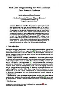
style was consistently evaluated more seriously in every problem category than the menu-based style; see the average severity scores in Table 3. In the menu-based style, the most frequent problems in the poor menu/navigation category were the need for scrolling (N = 6 events) and inconsistent use of the back and home button (7). In poor graphical design, the most common complaints were the unpleasant colour combination of green on black (6) and inconsistent use of text fonts (8). In this style most problem reports related to overall dissatisfaction with the design, and less frequently content, rather than problems with particular design features, apart from links (7). In the metaphor-based style the more common problems were the lack of a caption for the planet name in the solar system metaphor (N = 14); the difficulty of selecting a planet (double click procedure) (10) and the obscure interaction in the cockpit menu (8). The most troublesome design features were the solar system and planets metaphor, which was responsible 22% of the total errors, followed by the cockpit metaphor with 7%. In contrast to the menu style, usability problems were frequently associated with specific design features. The trend emerging from the objective usability analysis is reflected in the subjective evaluation. As shown in Fig. 2, subjects in the metaphor-based condition evaluated the usability of the site as significantly worse than in the menu-based design, t(23) = 3.02, p < .01.
7
6
average score
5
menu-based metaphor-based
4
3
2
1 clear
easy to use
easy to navigate
has easy orientation
convenient
Fig. 2. Ratings in a post-test questionnaire on usability as a function of interaction style
3.3 Aesthetics Following the factorial configuration proposed and validated by Lavie and Tractinsky [9], two dimensions were used: classical and expressive aesthetic. The classical aesthetics dimension included questions on pleasant, clear, clean, symmetric and aesthetic design; while expressive aesthetic dimension consisted of creative,
Assessing Interaction Styles in Web User Interfaces
411
7
average score
6
5 menu-based metaphor-based
4
3
2
as an t ae st he tic sy m m et ric al
pl e
cl ea r
cl ea n
or ig in so al ph is tic at ed fa us sc es in at sp in ec g ia le ffe ct s cr ea tiv e
1
item
Fig. 3. Average scores on aesthetic evaluation factors as a function of interaction style
5
average score
4
menu-based metaphor based
3
2
e
la yo ut
st yl
ry et m
co lo ur
sy m
of us e
a
id ch en al t it le y ng in g m de at ch si gn to us er m oo d
ed i v is
ib ilit
y
of
of m
e ch oi c
de pt h
of
fi e ld s
1
item
Fig. 4. Average scores on the expressive and classic clusters of the attractiveness heuristics
fascinating, original and sophisticated design with use of special effects. These two factors were then entered as dependent variables in a repeated-measure Anova with aesthetic dimension (2) and interaction style (2) as within-subjects factors. Both the main effects and their interaction were significant, namely aesthetic dimension: F(1, 22) = 8.06, p