from the web pages into a working area (the WorkPad) and to edit and rearrange ..... It is easy to compare multiple web-sites using the tool. 4. 5. It is easy to refer ...
NetWorker: a practical web-based tool to support the Collect-Compare-Choose cycle Paul Lyons, Chris Phillips, Elizabeth Kemp, and Jaimee Alam
Institute of Information Sciences and Technology, Massey University, Private Bag 11-222, Palmerston North, New Zealand (p.lyons,c.phillips,e.kemp) @massey.ac.nz jaimee_2 @hotmail.com
Abstract. An earlier paper has covered the development of a paper prototype of NetWorker, a tool designed to facilitate a Web usage referred to as the Collect-Compare-Choose cycle. Here we describe an initial implementation of the tool, a small scale evaluation, and modifications that were implemented subsequent to the evaluation. NetWorker is a PC application with a single window containing multiple web browsers and a text pane. It allows users to download and view pages from multiple web-sites in parallel, to drag text from the web pages into a working area (the WorkPad) and to edit and rearrange information within the WorkPad. The browsers and the WorkPad can be rearranged in various ways to make optimum use of the available screen space.
1
Introduction
An earlier paper [1] described a paper prototype of a tool designed to support Web users who need to make decisions based on comparisons between items of information collected from multiple web-sites. This style of Web usage has been called the Collect-Compare-Choose cycle [2]. Here, we briefly review the background to the tool, and describe an initial implementation called NetWorker, a small scale evaluation of this implementation, and subsequent modifications. A study of Web usage by Morrison et al. [3] indicated that, for 51% of the users surveyed, it was important to evaluate multiple products or answers to make decisions. Indeed 71% of the respondents were searching for multiple pieces of information. When reviewing the significance of this study, Nielsen [2] observed that it appeared to be almost three times as important for users to find multiple pieces of information as it was for them to locate single pieces of information. Currently available browsers provide good support for users who wish to access single locations, but none for users who need to make decisions based on information from
multiple web-sites. As Nielsen noted, Morrison et al.’s study used the critical incident method, which is not intended to provide a complete overview of user activities. In spite of this restricted focus, the study pinpointed the importance of supporting the Collect-Compare-Choose cycle. The Collect phase of this cycle involves accessing a series of web-sites, assessing the quality and relevance of the contents of each site, and retaining a reference to suitable sites. The Compare phase involves viewing information from more than one web-site on the screen, moving relevant information to the support tool, where it can be rearranged into a format which facilitates comparative analysis, and performing the comparative analysis in this single workspace. The Choose phase involves returning to the original web-site to implement a decision, by making a purchase, for example. Note that the phases of the cycle do not have to be performed in a strict sequence.
2
Requirements of the Tool
There are various metasites that will compare prices for users on the dimension of interest. Expedia, [4] for instance, enables people to compare airfares, hotel rates, etc. PriceSpy [5] lists prices for computer equipment from a number of suppliers and it includes links back to the suppliers’ sites for ordering purposes. However, Expedia does not access Tourist Board sites to obtain information about the views of those who have already stayed in the hotels. Similarly, PriceSpy does not include a review, for example, of the cheapest piece of equipment. Such metasites still cannot handle the situation where a user needs to access a variety of information. Bearing in mind the facilities available in the tools already on the market and the support needed for handling the content from multiple web-sites, the following requirements were initially identified: Functional Requirements The tool should: • permit the user to access and then keep references to several web-sites; • permit the user to view content from more than one web-site at a time; • provide the user with a working area (a ‘WorkPad’) onto which web content can be pasted, URLs can be referenced, notes can be made, and calculations carried out; • permit the user to switch focus between web-sites, and between web-sites and the WorkPad; • allow the user to control the number of windows to be displayed at any time; • permit the user to switch between vertical and horizontal arrangement of windows, to suit the information being browsed; • provide for system placement of windows, with window size(s) being a function of the number of windows being displayed at any time, and the chosen orientation (horizontal or vertical).
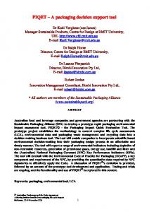
NetWorker Hide Browser Window
Hide Workpad
URL box
Workpad Freedomair Going out: Adult NZ$346, Taxes NZ$28 Air New Zealand Out: Adult NZ$558 incl taxes
Fig. 1. Paper prototype of the interface - horizontal alignment of the two main panels
Non-functional Requirements The user interface of the tool must • be consistent with the user interface of the browser; • provide for each of the following functions to be carried out by the user in a single operation: - opening browser windows; - opening web-sites; - switching focus between displayed web-sites; - switching focus between displayed web-sites and the WorkPad; - revisiting previously accessed web-sites; - changing the number of windows being displayed; - switching between vertical and horizontal arrangement of windows; - transferring web content to the work pad; • make the system status clear to the user at all times; • provide user help and support.
3
Early Prototyping
Early development of the tool concentrated on low fidelity or paper prototypes. These are most commonly based on sketches or drawings of screens [6]. During this phase, design decisions were made in regard to a number of the requirements outlined above:
Number of web-sites viewable at any time: As the number of on-screen sites increases, so the viewable content area of each site decreases. It was decided that two sites provided the best compromise. Horizontal and vertical window arrangement: Consideration was given to providing only vertical arrangement in order to simplify the user interface. It was decided that this was too restrictive, and accordingly controls are provided for switching between the two formats. Mechanisms for providing access to previously visited sites: Three mechanisms were considered: tabs, buttons and a URL box. Tabs were considered superior to buttons as they occupy less space and are more familiar to users. URL boxes are standard in browsers and it was decided to offer both URL boxes and tabs to provide flexibility. Availability of WorkPad: Consideration was given to having the WorkPad available at all times in order to simplify the user interface. It was decided that the need to maximize the viewable content of web-sites during the comparison and processing phases of the process should take precedence, and accordingly controls are provided for displaying and hiding the WorkPad. Fig. 1 shows a paper mock-up of the tool. This diagram shows a single browser, and the browser panel on the left and the WorkPad panel on the right. An alternative arrangement, with the browser panel above the WorkPad was also envisaged, and the possibility of adding a second browser in the browser window. This would allow a user could keep two web-sites plus the WorkPad on-screen during the comparison phase, while information is being copied onto the WorkPad. Following analysis of the collected information, and once a choice had been made, the user could reduce the number of windows to one, in order to focus on the chosen web-site, and to facilitate interaction with it (e.g. placing an order for a service or product). Buttons to hide the WorkPad and a browser window are shown on the toolbar to the right of the arrow buttons.
4
First Delphi Prototype
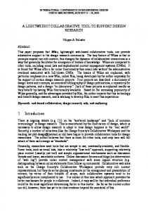
A prototype, called NetWorker, was written in Object Pascal, using version 7 of Borland’s Delphi IDE [7]. The main window for this prototype, shown in Fig. 2, is divided into three areas; interface controls are shown across the top of the window, and web browser and WorkPad areas appear below these controls. The layout of the lower part of the window is quite flexible; the browser panel and the WorkPad panel can be arranged vertically or horizontally; the number of browsers can be varied between zero and two; an individual browser can be maximised (hiding other browsers and the WorkPad); the WorkPad can be maximised (hiding the browsers). After loading a page, the user can drag text from the browser into the WorkPad, and edit it there. Whenever the user loads a webpage, its URL is added to a tab at the top of the browser window, and to a drop-down list associated with the URL box, so that the user can subsequently reload a page. The complete URL history is available in each browser, and survives the closure of all browsers. This version of NetWorker lacked some of the common features of commercial browsers such as “back,” “forward,” and “reload” buttons.
Fig. 2. The first version of NetWorker. It displays several controls at the top of the window arrows for toggling between horizontal and vertical window layout, a button for adding another browser, and a close button to terminate the application. Here, the user has added a second browser, loaded a webpage into each of the browsers, and clicked on the right arrow to align the browsers from left to right. Each browser window has a URL box and its own close button. The bottom half of the window is occupied by the WorkPad, with several (unimplemented) menu options and a minimise control.
5
Evaluation
It is important to identify the goals of an evaluation [8, 9]. We wished to identify the prototype’s strengths and weaknesses [10]. Suitable protocols include observation and timing of users’ actions [11], “think aloud,” and jargon-free, specific, positivelyworded [9] questionnaires, with a user population of five to twelve [10]. Five evaluators, representative of people who regularly use the web (three Computer Science postgraduate students and two Computer Science staff members) evaluated NetWorker. They were told that the system was being evaluated, and not their actions. The evaluation procedures were fully explained in advance and the evaluators’ informed consent was obtained. Documentation about NetWorker was provided and the evaluators were allowed to explore the system for about a quarter of an hour before the evaluation proper began. The evaluators were asked to carry out three typical web-related tasks – (1) to find the most competitive price for the collector’s edition of “The Lord of the Rings,” where payment could be made by international credit card, (2) to find the most competitive home loan available, and (3) to find a cheap motel room with specified services in a certain location. Evaluators were told that they had 10 minutes to complete a task. They were observed and asked to “think aloud.” Their comments were recorded. No usability laboratory was available, so an observer made notes about their actions. The sessions were timed and the observer noted how many times the WorkPad was accessed, how frequently horizontal and vertical layouts were selected and whether new browsers were added.
Table 1: Task statistics Task # 1 2 3
Mean time (mins)
Number succeeded
Total WorkPad accesses
8.96 6.14 7.2
3 5 4
8 10 10
At the end of the session, the evaluators filled out a questionnaire (see Table 2). A Likert scale from 1 (strongly disagree) to 5 (strongly agree) was used. Some questions, relating to efficiency, control and affect (2, 7, 9, 10 and 11) were based on SUMI [12]. Others specifically related to the Collect and Compare activities (3, 4, 5 and 6). Finally, the value (1 and 12) and novelty (13) of the tool were ascertained.
6
Results
Table 1 shows that the mean time for carrying out task 1 substantially exceeded the mean time for tasks 2 and 3, and that two of the five evaluators failed to complete it. The WorkPad was used regularly - 28 accesses overall with a mean of 5.6 times. Only three of the evaluators selected a second browser window. The others copied information from a page to the WorkPad and then loaded another page into the same window. Four of the five selected both the vertical and horizontal layout at some time in the proceedings. The fifth always used the default vertical layout. Whilst the sample is very small, some trends emerged (Table 2). The results for the questionnaire showed that the median for item 12 was five, indicating that most of the users strongly agreed with the proposition that the tool would be useful for personal or academic activities. The users disagreed with the statement that the tool was similar to other tools used. The medians for items 1, 2, 3, 4, 6, 8 and 9 were all four, indicating an overall level of satisfaction. The users were not so happy about referring back to web-sites, making the software do exactly what they wanted and arranging the work space to meet their needs (all with a median of three). Speed was not an issue though, as users disagreed with the proposition that the software responded too slowly. Analysis of the transcripts and open-ended questions revealed some problems. All evaluators wanted to be able to directly resize a window/WorkPad. Four mentioned the lack of a “back” button. Two amplified this, noting that the interface lacked typical browser features. Three people did not like the fact that the last level visited in a web-site could not be accessed. Instead the initial URL was accessed. Two people complained that they had to log in to both NetWorker and Internet Explorer. Finally, two people noted that the close button was duplicated. When asked to comment on aspects of the tool that they really liked, four users mentioned the WorkPad facility and three the value of being able to return to previously visited web-sites. Finally two of the five users appreciated the option of using two browser windows.
Table 2: Questionnaire responses Item Number 1 2 3 4 5 6 7 8 9 10 11 12 13
7
Item
Median
It is clear what the purpose of the tool is It is clear how to use the tool and move from one part of the task to another It is easy to collect and view web-sites using the tool It is easy to compare multiple web-sites using the tool It is easy to refer back to visited web-sites It is easy to copy important information It is easy to make the software do exactly what you want The work space of the tool can be arranged to my needs The labels and icons on the buttons can be clearly read and are understandable The tool has an attractive presentation The software responds too slowly to inputs The tool will be useful to my academic or personal activities on the Net The tool is similar to other tools I have used
4 4 4 4 3 4 3 4 4 3 2 5 2
Current Version
Informal discussion with the evaluators led to the incorporation of several improvements (see Fig 3). These are detailed below: Tool tips: The evaluators had previously had no experience with tools that allow a user to create and destroy multiple web browser windows; one did not understand the controls for accomplishing these tasks. Accordingly, all the controls now display a brief description of their function, whenever the cursor hovers over them for 2.5s. Close buttons: The evaluation version of the software sported two types of close button – one for closing the whole application, and one (replicated in each browser window) for closing individual browser windows. Although the background colours of these buttons differed, users confused them. Accordingly, the application-close button now shows the caption “Close NetWorker,” and the browser-close button now shows the caption “Close This Browser.” The tool tips referred to above are also active for these buttons. Maximise WorkPad: In the evaluation version of the software, there was a button on the WorkPad that contained the caption “Hide WorkPad” when the WorkPad was on display, and “Show WorkPad,” when the WorkPad had been minimised. Users did not feel comfortable with these captions, and they have been changed to “Minimise WorkPad” and “Restore WorkPad,” and Windows standard icons for minimise and restore buttons have been added. Source Button: Users felt that it would be useful to display the URL for the page from which a piece of information had been transferred to the WorkPad. A button with the caption “Source” has been added to the WorkPad which adds the URL to the text shown in the WorkPad.
Fig. 3. The static appearance of the interface produced in response to the user evaluation
Tile Browsers button: The buttons for tiling browsers horizontally and vertically contained right- and down-pointing arrows respectively, but otherwise gave no indication of their purpose, and were ill understood by the evaluators. They were replaced by a single button. When the browsers are tiled vertically the button contains the caption “Tile browsers across” and a right-pointing arrow. When the browsers are tiled horizontally, it contains the caption “Tile browsers down” and a down-pointing arrow. Maximise browsers feature: When all three NetWorker windows - two browsers and a workpad area – were on display, users sometimes found that web pages were too large to fit comfortably into the available space. Accordingly, “Maximise” buttons have been added to the browser windows and to the WorkPad. When one of these buttons is pressed, its window takes over the complete display region. The button changes to a “Restore” button, which returns the display to its former appearance. Smooth Transitions: Transitions from one screen layout to another are no longer instantaneous, but morph smoothly. Although this modification was not requested, the implementers feel there was an unacceptable cognitive load associated with the instantaneous transitions, and this has been reduced significantly. Multiple Browsers: The restriction to two browsers has been lifted. Resizable windows: The browser and WorkPad panels can now be directly resized Colour: Background colour has been changed from the Windows standard beige to a more interesting blue. Fig. 3 shows an abbreviated image of the updated interface, with all the static changes – buttons, icons, etc. – visible.
8
Discussion
The terms browsing and surfing imply a certain degree of aimlessness about the way users navigate the Web. Although we surmise that nearly all users, at least
occasionally, allow serendipity to govern their traversal of the Web, many engage in a more purposeful behaviour pattern called Collect-Compare-Choose. NetWorker has been designed to provide a greater degree of support for the Collect-Compare-Choose cycle than conventional browsers. A small-scale evaluation of NetWorker has produced two types of result. First, users felt that the tool would benefit from a number of improvements - most of which have now been incorporated - to its interface and capabilities. Secondly, the subjects felt quite strongly that NetWorker was unlike other tools they had used, and that they would be likely to use such a tool in their academic and personal activities. A tool such as NetWorker does not perform hitherto impossible functions. Rather, it integrates, and therefore simplifies an approach to Web-based information processing that can be achieved in a more circuitous fashion by a combination of other tools.
9
Future Work
The software described in this paper is in a very early stage of development; it was intended to act as a tool for experimenting with the look and feel of an interface paradigm combining multiple browser windows and a workpad. However, time for implementing the software was severely limited and the interesting new functionality was implemented at the cost of a number of familiar browser and editor functions. Users tend to have a holistic approach to evaluating software and were, understandably, critical of these omissions. Accordingly, future versions of NetWorker will incorporate such obvious features as back and forward buttons for the browser, and methods to implement the menu items shown in the WorkPad. A related problem concerned returning to pages that had previously been displayed in a browser tab; when a user opens a page in a NetWorker browser tab, then navigates to other pages by clicking on hyperlinks, the URL stored by the software for that page is not updated. Consequently, if the browser reloads, the page that appears is the one that was first loaded. Users found this particularly annoying, and in future versions, a history of URLs for the tab will be implemented. Thus the tab will be able to be reloaded with the page associated with the most recent URL, and back and forward functions, as described in the previous paragraph, will be supported by the same mechanism. Some problems with the interface remain; for example, some web-sites, when queried, produce results in popup windows. It will not necessarily be obvious to a naïve user that information can be dragged from a popup window into the WorkPad just as effectively as from a browser within NetWorker. Further, when information is dragged from a web browser into a RichEdit box, it sometimes displays as text, sometimes as a mixture of text and table, and sometimes as a mixture of body text, table, and HTML. A more reliable way of displaying text alone will need to be found. One of the features in the original list of functional requirements has not been incorporated into the current implementation; there is no facility for performing calculations using values from websites (calculating sales tax, for example). Adding this feature to the system could prove something of a challenge, in terms of designing an intuitive user interface, and in terms of cleaning up the text dragged from a web page. Such text may or may not incorporate HTML, and any HTML it contains may be malformed. For example, tags may not be terminated, or contextual tags that should surround the text (table layout information, for example) may be missing.
References [1] Collect, Compare, Choose: Supporting the decision making cycle on the web, Proc of CHINZ’03, ACM, Dunedin, New Zealand, 3-4 July 2003, 33-38. [2] Nielson, J., (2001): The 3Cs of Critical Web Use: Collect, Compare, Choose, Available at http://www.useit.com/alertbox/20010415.html, April 15, 2001 [3] Morrison, J.B., Pirolli, P., and Card, S.K. (2001): A Taxonomic Analysis of What World Wide Web Activities Significantly Impact People's Decisions and Actions., Interactive poster, presented at the Association for Computing Machinery's Conference on Human Factors in Computing Systems, Seattle, March 31 - April 5, (2001). [4] www.expedia.com: Accessed 8 Sept 2003. [5] www.PriceSpy.co.nz: Accessed 8 Sept 2003. [6] Rettig, M. (1994): Prototyping for Tiny Fingers, CACM, 37, No 4, 21-28, 1994. [7] Borland Software Corporation, Delphi Version 7.0 (Build 4.453): http://www.borland.com © 1983-2002. [8] Shneiderman, B., (1997): Designing the User Interface: Strategies for Effective Human-Computer Interaction, 3rd ed., Reading, Mass, Addison-Wesley. [9] Preece, J, Rogers, Y, Sharp, H, (2002): Interaction Design NY, Wiley. [10] Dumas J.S and Redish J.C. (1999); Exeter, Intellect. [11] Preece, J, Rogers, Y, Sharp, H, Benyon, D, Holland, S, and Carey, T, (1994): Human Computer Interaction. Reading, Mass, Addison-Wesley. [12] Porteous M., Kirakowski J. and Corbett M. (1993): SUMI User Handbook, Human Factors Research group, University College, Cork.