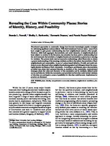
Matthew Cooperâ ... (d) A complementary view of the clusters with uniform bands. 'Feature .... ordinates display provide a good overview of the global structure.
Revealing Structure within Clustered Parallel Coordinates Displays Jimmy Johansson∗
Patric Ljung∗
Mikael Jern∗
Matthew Cooper∗
NVIS - Norrk¨ oping Visualization and Interaction Studio, Link¨ oping University, Sweden
(a) A linear transfer function has been applied to the high-precision texture (b) A logarithmic transfer function is applied to a selected cluster. The in order to prevent cluttering and to provide overview of the data.
structure is preserved and emphasis is put on the low density regions.
(c) Local cluster outliers are enhanced. A square root transfer function is (d) A complementary view of the clusters with uniform bands. ‘Feature used and the outliers are visible even through high-density regions.
animation’ presents statistics about the clusters and acts as a guidance.
Figure 1: An example data set containing 7,800 7-dimensional data items classified into 6 clusters. Different transfer functions are used to map density values to opacity revealing different aspects of the clusters in the parallel coordinates display. Since all operations are performed on high-precision textures, details are preserved and the feedback is instantaneous and independent of the size of the data set and of the clusters.
A BSTRACT
1
In order to gain insight into multivariate data, complex structures must be analysed and understood. Parallel coordinates is an excellent tool for visualizing this type of data but has its limitations. This paper deals with one of its main limitations — how to visualize a large number of data items without hiding the inherent structure they constitute. We solve this problem by constructing clusters and using high-precision textures to represent them. We also use transfer functions that operate on the high-precision textures in order to highlight different aspects of the cluster characteristics. Providing pre-defined transfer functions as well as the support to draw customized transfer functions makes it possible to extract different aspects of the data. We also show how feature animation can be used as guidance when simultaneously analysing several clusters. This technique makes it possible to visually represent statistical information about clusters and thus guides the user, making the analysis process more efficient.
Today, multivariate data are common and as soon as we collect data or perform a simulation, we are faced with the difficulties of analysing and understanding complex data structures. Since these data sets are rapidly increasing in size, many of the standard multivariate visualization techniques (see [4] for an overview) encounter problems. They have limitations in how many data items can be simultaneously perceived and interactively investigated. This problem is particularly relevant in the area of exploratory data analysis — the process of examining data without knowing exactly what relationships or anomalies to expect. The parallel coordinates technique [12, 11], where N - dimensional data items are represented in a 2-dimensional display using parallel axes, is commonly used for analysing multivariate data and makes it possible for the user to get an overview of the data. There is, however, one major limitation with the parallel coordinates technique: even for a medium sized multivariate data set the display suffers from ‘over-plotting’, resulting in an image which is far too cluttered to perceive any trends, anomalies or structure. One solution to this problem is to perform an initial clustering of the data [6]. Instead of visualizing each single data item, each cluster is then visualized. In order to fully investigate a data set, however, the cluster representations must reveal detailed information about each individual cluster. In this paper, we display clusters in the parallel coordinates display and present a number of techniques that allow for efficient investigation of the structure within these clusters.
CR Categories: I.3.6 [Computer graphics]: Methodology and techniques—Interaction techniques; I.5.3 [Pattern recognition]: Clustering—Similarity measures Keywords: Parallel coordinates, clustering, transfer function, feature animation. ∗ e-mail:{jimjo,plg,mikje,matco}@itn.liu.se
I NTRODUCTION
The major contributions of this paper are: • A method for revealing and displaying cluster structure based on using a high-precision structure texture (figure 1(a)) together with a flexible and user-driven method for enhancing and tracking local outliers (figure 1(c)). These methods treat all data items in a cluster as a single image making interactive analysis of large clusters possible and the user is able to visually interpret each cluster individually or all clusters simultaneously. • The concept of using a transfer function (TF) in conjunction with parallel coordinates to allow for a more powerful and customized analysis process (figure 1(b)). A TF, defined as T(s) = α(s),
(1)
enables the user to easily investigate different aspects of the data by mapping a data value, s, to an opacity value, α. Both pre-defined as well as user-defined TFs may be used. • ‘Feature animation’ as an intuitive way of visualizing statistical properties of the clusters (figure 1(d)). Both the variance and skewness of a cluster may be used as a guidance as to where to start the analysis. The remainder of this paper is organized as follows. Section 2 presents related work concerning clustering in parallel coordinates together with previous work on how to reveal cluster structures. Section 3 describes our methods for creating high-precision textures to reveal the cluster structure and how a TF can be used in conjunction with parallel coordinates. We also present a method for analysing local outliers. Section 4 presents the feature animation technique and discusses its use in parallel coordinates. Section 5 deals with performance and implementation details. Finally, in Section 6, we discuss our results and our future research work. 2
R ELATED W ORK
A clustering algorithm aims at grouping data items so that items in a cluster are as similar as possible and as different from data items in the other clusters as possible. Clusters can be expressed in different ways [9, 10]. A cluster may be exclusive, so that any data item belongs to only one cluster. The clusters can be overlapping; a data item may belong to several clusters. In a probabilistic cluster, each data item belongs to all clusters with a certain probability. Finally, the clusters may form a hierarchical structure. There has been work on how to extend the parallel coordinates technique to display and analyse the results produced by many of these clustering approaches. Fua et al. [6] propose a multiresolutional view of the data via hierarchical clustering. Each cluster is visualized as a band faded from a completely opaque centre to a transparent edge. This technique reveals the true size of each cluster but presents limited information about the structure within each cluster. Their implementation provides a number of interaction techniques, such as drilldown, dimension zooming and structure-based brushing. Berthold and Hall [5] use fuzzy rules to first cluster the data and then use parallel coordinates for displaying and analysing the result. Their visual representation is similar to the one presented in [6]. They use a solid line to represent the centre of each cluster with the centroid of the cluster defining the centre value. As in [6], they use a fading region but this shows information about each data item’s cluster membership. Andrienko and Andrienko [1] suggest “striped” envelopes and ellipse plots as two methods for displaying properties and structure of subsets in parallel coordinates. Both of these methods are based on dividing the value range of each axis into equal frequency intervals. A limitation of both methods is that they convey
information about each variable independently of each other, hence it is not possible to investigate the relation between two adjacent dimensions. Another approach based on the concept of representing each cluster as an envelope or polygon is presented by Novotny [15]. He presents an approach based on representing the data using different striped textures to help the user distinguish between the different clusters. The above methods for representing clusters in the parallel coordinates display provide a good overview of the global structure of the data but do not completely succeed in revealing all relevant aspects of the structure within the clusters. When analysing a large number of clusters, the parallel coordinates display provided by all of the above methods suffers, to a greater or lesser degree, from cluttering. Another way to tackle this problem of cluttered parallel coordinates displays is suggested by Miller and Wegman [14], where line density plots are suggested. Density plots are also implemented in Wegman and Luo [17], where each line is rendered with a userdefined transparency value aiding in the visual search for clusters in the cluttered parallel coordinates display. Rodrigues et al. [13] use frequency plots to highlight highly populated regions to facilitate the analysis of cluttered parallel coordinates. They calculate the frequency for each data item in each dimension independently and the intensity along each line is set by interpolating between the line’s endpoint values, that is the intensity of a line between two axes is not constant making it hard to see correlations between two adjacent dimensions. Artero et al. [2] attempt to highlight significant relationships between axes in the parallel coordinates display by constructing a density plot using a 3 × 3 averaging filter applied to a pre-calculated frequency-matrix. This may give rise to artefacts because it creates lines in the parallel coordinates display that do not directly map to data items in the original data set. 3
R EPRESENTING C LUSTER C HARACTERISTICS H IGH -P RECISION T EXTURES
USING
This section describes how to generate a high-precision texture that can be used to reveal different types of cluster information. We also describe how TFs and enhancement of local outliers may be used to improve and highlight different aspects of data visualized with parallel coordinates. The process of creating the parallel coordinates display and how the different textures are put together is illustrated in figure 2. After reading the data into memory and calculating clusters, information from the clustering algorithm is used to construct the high-precision structure texture, outlier texture and animation texture (described in section 4). The cluster representation is then constructed by compositing these textures on top of a coloured polygon representing the chosen cluster representation. The visualization methods presented here can be used to analyse exclusive, overlapping and hierarchical clusters. When using a probabilistic clustering algorithm, however, where all data items are present in all clusters, this approach is inappropriate. For the purpose of our experiments, we have chosen to use the well-known partitioning cluster algorithm K-means [9, 10] to classify the data items into exclusive clusters. 3.1
Constructing the Structure Texture
In parallel coordinates the different individual lines overlap each other and make trends discernible. These trends must be preserved as much as possible and limiting this information may guide the user into drawing false conclusions about the data. The most obvious way to show the structure within a single cluster would be to show the parallel coordinates for the data included in that cluster overlaid upon the representation of that cluster. However, as the number of data items within the cluster increases, the display will
Data
Outlier parameters Clustering Transfer function parameters
Animation parameters
Animation texture
Outlier texture
Structure texture
Rendered image Figure 3: The high-precision texture used to represent the cluster structure. In this example, the texture contains information about 3 clusters and the bottom third shows the image part used for 1 cluster.
User display
Figure 2: The process of creating the parallel coordinates display with the high-precision texture for the cluster structure and textures for local outliers and animation. All of these textures can be interactively manipulated by the user and the outlier and animation textures can also be independently switched on or off.
become cluttered. The number of intensity levels necessary to capture all the structure within a cluster is, in theory, only limited by the number of data items. When dealing with very large data sets, the number of lines needed to be rendered may cause limitations in interactivity. As an alternative to rendering each individual line, a high-precision texture will be used. A high-precision texture can be defined as T = tm,n ∈ N, with tm,n < 2B and B > 8.
(2)
Typically B = 16 or B = 32 is used. N denotes the natural numbers. Besides ensuring the same interactivity regardless of data and cluster size, the texture approach gives a number of other advantages, described in detail in this and the forthcoming sections. The high-precision texture to hold the structure information of each cluster is created as a pre-processing step using graphics hardware. This is a fast operation but it introduces a precision problem due to the fact that the framebuffer has a limited precision. A framebuffer of B bits supports 2B different intensity levels (B usually being 8, yielding 256 different intensity levels). If a cluster in the parallel coordinates display contains more than M = 2B − 1 different intensity levels, this information can not be revealed using additive blending. This can, however, be solved by rendering the data in subsets of M items and accumulating these rendered subsets in a higher precision buffer. This ensures that the maximum number of intensity levels never exceeds M, thus additive blending may be safely used without the risk of saturation. The subset technique deals with the precision problem but another problem still remains. The problem is that in order to ensure that the maximum available intensity range is used in each cluster, it is necessary to count the number of intersecting data items present anywhere in the display, not simply those which occur at
the axes. This value, ρ, is used to normalize the intensity range ensuring that all intensity information is retained. Without using a texture, ρ would be computationally expensive to extract because it would be necessary to calculate, for each pixel in the parallel coordinates display, the number of overlapping lines. Using a texture this is simply done by finding the maximum value in an array. Obviously the value of ρ will vary from cluster to cluster and, usually, it will be much lower for a small cluster than for a large one. The complete procedure for creating the high-precision structure texture is outlined below and an example of the result is illustrated in figure 3. 1. Specify a coordinate system to be used for rendering lines in the framebuffer and a 2-dimensional texture size. 2. For each cluster i, where i = 1, . . . ,C, perform the following steps: (a) Select all data items belonging to cluster i. (b) Render the selected data items in subsets of M data items, read pixels from the framebuffer and accumulate the results. The opacity value for each line is set to 1/M. This ensures that, when using additive blending, the precision in the framebuffer is never exceeded. (c) In the resulting image, find the maximum value ρi . 3. Find ρglobal , the largest of the ρi values and normalize the intensity range. Depending on the normalization method used, different aspects are revealed. If we normalize the resulting image using ρglobal , clusters with a small maximum intersecting value will be more transparent. Normalizing each cluster individually using ρi , each cluster’s maximum intersecting value will be perceived as equally dense. Both approaches are, in a sense correct, only highlighting different aspects. In the clustered parallel coordinates display, each cluster can either be represented as a uniform band, displayed at the cluster cen-
3.2.1
Pre-defined Transfer Functions
Our implementation supports a number of pre-defined functions. Figure 5 illustrates 4 different TFs and the results applied to a cluster in the parallel coordinates display. Figure 5(a) shows the result of applying a linear TF. A square TF (figure 5(b)) filters out all the sparse regions leaving only the areas of highest concentration. If the data set contains much noise, this TF may help clear up the view. In contrast, in order to enhance areas of low concentration, a square root or logarithmic TF can be used (figures 5(c) and 5(d)). This is useful when searching the cluster for potential outliers. 3.2.2
Figure 4: The interactive TF editor used together with the parallel coordinates display. In this example, a TF is drawn, using a square root space, to enhance the lowest and highest regions.
troid, or represented with its true size. Evidently, the latter representation gives a correct visual mapping but representing each cluster as a uniform band may, in some situations, have its advantages. First of all, for a larger number of clusters, a thin band will not take up as much vertical space and can therefore be used to get a good overview of the data. Secondly, the feature animation technique is easier to interpret when using a uniform band. By letting the user decide which cluster representation to use, different aspects of the data may be investigated. The uniform bands are drawn with a relaP tive width, ψ, according to ψ = Pmax κ,where P is the population of the current cluster, Pmax is the population of the largest cluster and κ is a user-defined scaling factor. During run-time it is possible to interactively select a cluster for a more detailed analysis as well as changing the width of the uniform cluster bands. To get a better visual separation between each cluster, we use the hue, saturation and value (HSV) colour model [7]. The saturation and value components are set to fixed values and the angle, φ , between each hue component is calculated as φ = 2π C . Applying the high-precision structure texture to a coloured polygon reveals the cluster structure and ensures that no information is lost. Figure 1(a) shows an example of this applied to a synthetic data set.
3.2
Using Transfer Functions for Customized Cluster Visualization
The high-precision texture reveals the cluster structure but, due to the sometimes large range of intensities, the human eye has difficulty in perceiving the smallest intensity values (which may be only a thousandth or less of the maximum value). As in previous work [2], a linear scaling may be used to scale the intensity range in a cluster and make the smallest intensity values visible to the human eye. However, this has the disadvantage that the highest intensity values may be clamped and so a major part of the cluster structure could be lost. A better way of manipulating the intensity values is to use a transfer function (TF) which allows non-linear as well as user-defined mapping. A more complete definition of the TF than the one given in section 1 is T(s) = α(s), with α(s) ∈ [0, 1] and s ∈ [0, ρ]
(3)
where α(s) can, for example, be a square root function or a table lookup.
User-defined Transfer Functions
Besides using a pre-defined TF, it is possible to draw a function either free-hand or by assigning a number of control points. This gives the user an active role in the visualization process and provides a more powerful analysis than by only using the pre-defined TFs. Since the TF operates on the texture, the feedback is instantaneous and the response time is the same regardless of the size of the data set or clusters. Figure 4 shows a screenshot of the clustered parallel coordinates display together with the interactive TF editor. When drawing a free-hand TF, one common thing to do is to try to isolate the data items having the lowest intensity values in order to search for anomalies. This can, however, be difficult due to the high intensity range: the precision in the low region of the drawing space is simply not high enough. Instead of using a linear drawing space it is more convenient to draw the TF using a square root or logarithmic space. This gives the necessary precision in the lower regions and it is easier to isolate the data items having the lowest intensity. 3.3
Enhancing Local Outliers
In order to gain additional insight into a data set, outliers must be investigated. It is thus of interest to be able to highlight these in the visualization. Before we discuss the method we have used for this, it is important to define what actually constitutes an outlier. In the most general case an outlier is a data item that differs from the main characteristics of the data set. This can be measured in many different ways, see [16] for a more detailed discussion of this. In our case, we focus on local outliers — a data item that differs from the main trend in a particular cluster. In this section, a local outlier is simply termed an outlier. We use a method based on the interquartile range [8] to define if a data item is an outlier or not. This is a robust estimate of the spread of the data, since changes in the upper and lower 25 percent of the data do not affect it. For iqr each cluster, i, and dimension, j, the interquartile range, Qi j , is defined as the difference between upper and lower quartiles, Q3i j Q1i j , where Q1i j is the 25th percentile and Q3i j is the 75th percentile. The data items that belong to cluster, i, are determined to be outliers iqr if they fall β Qi j above Q3i j or below Q1i j . This is done for each dimension, j, independently. The value of β may be interactively changed, but one commonly used rule when searching for outliers is to use β = 1.5. Larger values of β can be used to identify more extreme outliers. Since the outlier test is applied to each dimension independently, the matrix, R, containing the data items classified as outliers may contain doubles or triples, and so on. Having the same data item twice in R means that the data item is an outlier in two dimensions. A threshold value, γ, may be used to specify in how many dimensions a data item needs to be classified as an outlier in order that the entire data item can be deemed to be an outlier of the cluster. The complete procedure for constructing the outlier texture is as follows.
1
0 0
ρi (a) A linear TF is applied to the high-precision texture.
1
0 0
ρi (b) A square TF is used and only dense regions become visible. This facilitates analysis of many clusters simultaneously.
1
0 0
ρi (c) Applying a square root TF enhances low density regions and makes it easier to search for outliers.
1
0 0
ρi (d) Using a logarithmic TF puts even more emphasis on the lower density regions. Figure 5: 4 different TFs applied to a cluster in the parallel coordinates display. For the current cluster, ρi = 891.
(a) A negative skewness. (a) The 6 strongest outliers enhanced (β = 1.5, γ = 2).
(b) A symmetric distribution (no skewness).
(c) A positive skewness.
Figure 7: Different types of skewness which can be detected using the feature animation technique.
(b) The 4 strongest outliers enhanced (β = 2.5, γ = 2).
Figure 6: Enhancing local outliers calculated using the interquartile range. Since the outliers are enhanced they are clearly visible even when they overlap dense regions.
1. Specify a coordinate system to be used for rendering lines in the framebuffer and a 2-dimensional texture size. 2. For cluster i, i = 1, . . . ,C, do the following steps: (a) For each data item, use the interquartile range to test if the current data item is an outlier. (b) In matrix R, find the data items that appear with a frequency greater or equal to γ. (c) Render each line with a user-defined transparency value and read pixels from buffer. This will produce an image containing only those data items classified as outliers. The enhanced outliers are displayed using a separate texture, thus they can be easily switched on or off, see figure 2. Since it is possible to specify both how much a single data item needs to differ from the main cluster trend as well as in how many dimensions it must be an outlier, this is a flexible and useful tool for the user when trying to understand the data. It is also possible to interactively set a scaling value to specify the opacity telling how much the outliers should be enhanced. By studying the enhanced outliers in figure 6 we get information about the performance of the clustering algorithm used. In figure 6(b) it is seen that the green and blue clusters have the strongest outliers. Figure 6(a) also shows that the magenta cluster contains a strong outlier. This indicates that the algorithm has had most problems constructing these clusters. 4
F EATURE A NIMATION
Animation has been widely used in visualization to enhance the understanding of time-varying variables. In conjunction with parallel coordinates, however, there are few examples. The most interesting work has been done by Barlow and Stuart [3] who animate the line
segments in the parallel coordinates display to enhance the understanding of how objects within the multidimensional space change over time. We also use animation together with the parallel coordinates display but for a different purpose. We do not use it for animating time changes but for conveying statistical properties about clusters. The technique, which we call ‘feature animation’, is used to disclose the skewness or variance of each dimension and cluster and consists of a set of moving lines close to each axis, with different phase velocities. The lines are implemented using a pre-defined texture and the appearance of movement is created by translating the polygon’s texture coordinates across the texture. For the variance the phase velocity is always positive, while for the skewness it is possible to display a positive as well as a negative skewness. The phase velocity, Vi j , for cluster, i, and dimension, j, is calculated as follows. For the variance � �ε Vi j = σi2j η, (4) while for the skewness ( Vi j =
if σi j = 0
0, 3
∑Kk=1 (Xi jk −µi j ) (K−1)σi3j
ζ,
if σi j 6= 0
(5)
where K is the number of data items in cluster i, µi j is the mean of the Xi jk values and σi j is the standard deviation. The lines which are used in the animation are created using a separate texture. The animation is performed by using Vi j to determine the speed in which the vertical texture coordinates should be translated. η and ζ are global constants used to control the speed of the animation. ε is, by default, set to 1 but can be increased to display the quadratic variance, cubic variance, and so on. This is important in order to identify which regions have substantially larger variance than the average. For a specific dimension where all data items have the same value, that is σi j = 0, there will be a divide by zero in the skewness equation (5). In this case, the skewness is set to 0. By animating the variance the user can quickly examine each cluster to see if the cluster is tight or loose. Typically, we want to isolate loose clusters and try to find out why the clustering algorithm has done a poor job constructing these clusters. The skewness is a measure of the amount of asymmetry in the distribution. The direction and speed of the animation indicate the direction, as shown in figure 7, and magnitude of the skewness, respectively. The animation technique can be used regardless of which geometric cluster representation is used. It is, however, more effective when used together with the uniform band cluster representation since the cluster overlap is far less than when representing the clusters at their true size. Figure 8 shows an illustration of the feature animation with
visualizing large clusters, the pixel resolution of the mouse pointer would not be high enough since the width of each line would be smaller than a single pixel. The same problem would, however, be present when rendering each data item as an individual line. Currently, these types of selections within the clusters are not supported in our system.
(a)
(b)
Figure 8: Animating the cluster variance or skewness attracts the user’s attention and provides guidance when analysing a larger number of clusters. (a) presents an overview of the data and the user can easily see areas of rapid movement which indicate a strong variance, or a strong negative or positive skewness. In (b) a specific cluster is selected for a more detailed analysis.
the moving lines close to each axis. In the same way as the outlier texture, this texture may be independently switched on or off, see the illustration in figure 2. 5
P ERFORMANCE AND I MPLEMENTATION
Our visualization methods are implemented using C++ and OpenGL. The time it takes to create the high-precision texture in the pre-processing step depends on the texture size, the number of data items and the dimensionality of the cluster. As an example, using a standard desktop PC with a 2.4 GHz Intel P4 CPU, 1 GB RAM and an NVIDIA Quadro FX 500 graphics card, it takes approximately 700 ms to perform the procedure described in section 3.1 to create high-precision textures for 10 clusters of a 7-dimensional data set containing 7,800 data items. Each of the 10 cluster representations is constructed using a texture of size 1024 × 512. Applying TFs to the high-precision textures is even less computationally expensive and the same 10 clusters are updated in approximately 90 ms. For the logarithmic function, which is by far the most time-consuming operation, a lookup table was used. If an extremely large texture is used, the delay when applying a TF could become a problem. This can, however, be overcome by using a floating point buffer and performing all operations directly on the GPU. During the visualization, we are able to maintain a frame-rate of 140 frames per second, using a display window with a resolution of 1600 × 800 pixels, regardless of data size. A limitation of our texture approach is that, for example, selecting a single data item or a subset of data items is more complicated than when drawing each line individually. This is because all data items in a cluster are treated as the same object. A seemingly straightforward solution for this would be to compare the coordinates of each data item and the mouse pointer. However, when
6
C ONCLUSIONS AND F UTURE W ORK
In this paper, we have described a method for revealing structure in clusters visualized with parallel coordinates. This is done by using a high-precision texture that can be used to prevent cluttering and ensure that the entire available intensity range is preserved. To accomplish this, we normalize the intensity range using a maximum data item overlap, which may be present anywhere in the parallel coordinates display and thus do not limit the calculation to those overlaps occurring at the axes. This guarantees that no structure is lost, either in the low or high-density regions. The high-precision cluster structure technique has been used to visualize numerous data sets, up to as large as 100,000 data items, and so far we have not observed any cluttering artefacts. The structure is clearly seen and it is easy to detect potential sub-clusters and trends. A transfer function (TF) may be used on the high-precision texture to perform a linear, non-linear or user-defined mapping. This gives new possibilities when analysing large clusters in parallel coordinates and as illustrated in figure 5, it is possible to perceive very low intensity regions while preserving the structure in high-density regions. The use of TFs becomes, due to the increasing range of intensity levels, more and more important as the number of data items increases. Having the ability to draw a free-hand TF can be a powerful tool when trying to investigate a specific feature. It can, however, be difficult to draw a function that highlights relevant features and it often takes numerous attempts to accomplish this. As a complement to drawing a free-hand TF to highlight low-density regions, different degrees of local outliers may be enhanced using a technique based on the interquartile range. The advantage of this technique is that it is possible to track these data items through the high-density cluster regions. All of our techniques are implemented using textures and this has the advantage that the size of the data set and the clusters do not affect the interactivity. Also, since all calculations when using the TF editor are performed on the texture, the feedback is instantaneous and different aspects and characteristics of a cluster can quickly be revealed. In this paper, we have also employed a technique called feature animation, which intuitively provides the user with information about the cluster variance and skewness. The feature animation technique has been tested on several data sets and figure 8 shows an example of 7,800 7-dimensional data items classified into 10 clusters. This gives 70 different intersection points that may require analysis. Feature animation acts as an efficient guide for the user and reduces the number of intersection points that need to be analysed. For future work it would be interesting to study whether advanced image analysis methods could be used on the high-precision texture to further reveal and highlight cluster properties. We have so far experimented with simple methods such as Sobel and Laplace filters for edge detection but, compared with using TFs, these have not been found particularly effective. Using simple lines for the animation has so far worked well and quickly provides the user with relevant information. However, it would be interesting to study how more complex animation schemes may be used.
ACKNOWLEDGEMENTS This work has been funded by grant A3 02:116, supported by the Swedish Foundation for Strategic Research. R EFERENCES [1] G. Andrienko and N. Andrienko. Parallel coordinates for exploring properties of subsets. In Proceedings of the second IEEE International conference on coordinated and multiple views in exploratory visualization, pages 93–104, 2004. [2] A. O. Artero, M. C. F. de Oliveira, and H. Levkowitz. Uncovering clusters in crowded parallel coordinates visualizations. In 10:th IEEE Symposium on Information Visualization, pages 81–88, 2004. [3] N. Barlow and L. J. Stuart. Animator: A tool for the animation of parallel coordinates. In Eighth IEEE International Conference on Information Visualisation, pages 725–730, 2004. [4] W. Basalaj. Proximity Visualization of Abstract Data. PhD thesis, University of Cambridge, 2000. [5] M.R. Berthold and L. O. Hall. Visualizing fuzzy points in parallel coordinates. In IEEE Transactions on Fuzzy Systems, pages 369–374, 2003. [6] Y. H. Fua, M. O. Ward, and E. A. Rundensteiner. Hierarchical parallel coordinates for exploration of large datasets. In IEEE Visualization, pages 43–50, 1999. [7] R. C. Gonzales and R. E. Woods. Digital image processing. Prentice Hall, second edition, 2001.
[8] J. Han and M. Kamber. Data Mining:concepts and techniques. Morgan Kaufmann, 2001. [9] D. Hand, H. Mannila, and P. Smyth. Principles of Data Mining. MIT Press, 2001. [10] T. Hastie, R. Tibshirani, and J. Friedman. The Elements of Statistical Learning. Springer, 2001. [11] A. Inselberg. The plane with parallel coordinates. In The Visual Computer, pages 69–92, 1985. [12] A. Inselberg and B. Dimsdale. Parallel coordinates: A tool for visualizing multidimensional geometry. In IEEE Visualization, pages 361–378, 1990. [13] J. F. Rodrigues Jr., A. J. Traina, and C. Traina Jr. Frequency plot and relevance plot to enhance visual data exploration. In XVI Brazilian Symposium on Computer Graphics and Image Processing, pages 117– 124, 2003. [14] J. J. Miller and E. J. Wegman. Construction of line densities for parallel coordinate plots. Computing and graphics in statistics, pages 107–123, 1991. [15] M. Novotny. Visually effective information visualization of large data. In Proceedings of the 8th Central European Seminar on Computer Graphics (CESCG 2004), pages 41–48, 2004. [16] D. Pyle. Data Preparation for Data Mining. Morgan Kaufmann, 1999. [17] E. J. Wegman and Q. Luo. High dimensional clustering using parallel coordinates and the grand tour. Technical Report 124, Fairfax, Virginia 22030, U.S.A., 1996.