The CO2 Pollution Map: Lessons Learned from Designing a Visualization that Bridges the Gap between Visual Communication and Information Visualization Jeremy Boy, Jean-Daniel Fekete
To cite this version: Jeremy Boy, Jean-Daniel Fekete. The CO2 Pollution Map: Lessons Learned from Designing a Visualization that Bridges the Gap between Visual Communication and Information Visualization. IEEE Conference on Information Visualization [Poster paper], Nov 2014, Paris, France. 2014.
HAL Id: hal-01061773 https://hal.inria.fr/hal-01061773 Submitted on 8 Sep 2014
HAL is a multi-disciplinary open access archive for the deposit and dissemination of scientific research documents, whether they are published or not. The documents may come from teaching and research institutions in France or abroad, or from public or private research centers.
L’archive ouverte pluridisciplinaire HAL, est destin´ee au d´epˆot et `a la diffusion de documents scientifiques de niveau recherche, publi´es ou non, ´emanant des ´etablissements d’enseignement et de recherche fran¸cais ou ´etrangers, des laboratoires publics ou priv´es.
The CO2 Pollution Map: Lessons Learned from Designing a Visualization that Bridges the Gap between Visual Communication and Information Visualization Jeremy Boy and Jean-Daniel Fekete Abstract— We present the design of the CO2 Pollution map, a web-based visualization that uses motion design techniques to assist users in interpreting semantic information about the data. We describe our motivations and inspirations, found in the fields of graphic and motion design, and present how free visual variables can be used to create an impression of what the data are about. We finish by reporting an early evaluation of the impact of the visualization, which we published in the form of a data journalism article. Index Terms—Graphic design, Motion design, Design for interpretation, Pollution map
1
I NTRODUCTION
We present the design of the CO2 Pollution map, a web-based visualization that uses techniques borrowed from motion design to convey semantic information about the data. As visualizations are now often used as “new media” (e. g., for journalistic purposes), we need to bridge the gap between visual communication and information visualization (Infovis). Inspirations can be found in the practices of graphic and motion design. Graphic design can inform us on how to communicate using visual forms, and motion design can provide a wide range of design solutions for creating film-like visual effects. Here, we introduce a way in which these inspirations can impact visualization design choices, and illustrate it with our implementation of the CO2 Pollution map. This visualization presents a visual metaphor for pollution, built upon a particle system that both encodes the data and helps users interpret what they are about. We discuss some of the benefits and tradeoffs of this design, and conclude by presenting early insights into the impact of the design choices we made for the CO2 Pollution map. 2 2.1
BACKGROUND Three Levels of Visual Communication
Ruedi Baur [4] states that the work of a graphic designer is to produce artifacts or documents (e. g., websites, printed documents, or signage systems) that communicate with a user on three levels: an interpretation level, an orientation level, and an information level. On the interpration level, the artifact or document should immediately reveal what it is, what its purpose is, and what it is about. On the orientation level, specific elements of the document should provide cues on how it should be read and used. On the information level, the document should reveal the content and meaning of the communication. 2.2
Pollution Maps?
A simple Google search of the terms “co2 pollution map” reveals that most maps that encode pollution related data use heatmap or choropleth encodings. While such encodings are quite efficient on the information and orientation levels—provided they include legends, they fail on the interpretation level, since they do not communicate directly (i. e., without the use of text) what the data are about. Such encodings could just as well represent population densities or temperature. Other
• Jeremy Boy is with Inria, Telecom ParisTech, and EnsadLab. E-mail:
[email protected]. • Jean-Daniel Fekete is with Inria. E-mail:
[email protected]. Manuscript received 31 Mar. 2014; accepted 1 Aug. 2014; date of publication xx xxx 2014; date of current version xx xxx 2014. For information on obtaining reprints of this article, please send e-mail to:
[email protected].
ways of designing pollution maps include bubble chart overlays and cartograms,which also fail on the interpretation level. To produce a visualization that is effective on the interpretation level, we need to create a visual metaphor that allows users to immediately connect the visual features of the display with the semantic nature of the data. 2.3 Designing for Interpretation Michael Danziger [5] declares that visualization designers “should try to identify design vectors that position and emphasize Infovis as part of our intellectual, social, and cultural experience, rather than a cryptic, computational artifact that requires an explicit set of skills to decode. [...] Without an immediate cue as to the nature of the data being visualized, a non-committed viewer is likely to skip the graphic.” He encourages the development of a semantic design approach for visualization, based on the creation of a structured visual language. A noticeable, working example of this is Wattenberg and Viegas’ much acclaimed Wind Map [13]. Interpreting this visualization is almost instantaneous, as the animated trails effectively convey the impression of wind blowing across the map. An amazingly rich source of inspiration for such semantic designs can be found in the film industry, and more precisely in animated films and special effects. Our design of the CO2 Pollution map builds upon some of these techniques. 3 D ESIGNING CO2 E MISSIONS 3.1 Metaphor To design for interpretation, we need to find the right visual metaphor. Unlike most metaphors used in Infovis, which serve to explicit structural components of the data, or to describe interaction techniques, this metaphor should convey semantic information about the data. The first question to answer is: “What does the data’s topic make me, and others, think of?” For the CO2 Pollution map, we claim that the dark-gray smoke that emanates from exhaust pipes and chimneys reminds us of the presence of CO2 in the air. Therefore, using the combined potentials of d3.js, javascript, and SVG, we extend the bubble chart overlay encoding by transforming bubbles into animated smoke particles, and introduce a visual metaphor for “CO2 emissions.” 3.2 Particle system In motion graphics and film post-production, a common way of designing smoke is to use a particle system [8]. Particle systems are a collection of graphic objects (particles) that are dynamic, chaotic, and generated from a source (emitter) [11]. Important attributes of a particle system are: 1) emitter type, 2) particle type, 3) number of particles emitted (nParticles) within a given time period (tEmit), 4) evolution of individual particles over life, and 5) color of particles. Due to space limitations, we will not describe all the parameters of these attributes in detail. For more information, refer to [10, 11].
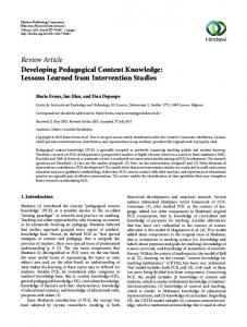
Fig. 1. In the Smog: the CO2 Pollution map. Light gray countries indicate that data are unavailable.
To prevent our particle system from hindering the actual mapping of the data, which uses position (i. e., the particle emitter) and number of visual marks (i. e., nParticles) as encoding visual variables [7], we use five free visual variables for the visual metaphor, namely animation, shape, size, opacity, and color. For 1), we use a box emitter. In two-dimensional space, boxes are rectangular areas in which particles are generated at random X, Y positions. We use the SVG bounding boxes of countries (previously rendered using a d3-geo-projection) for which data are available. For 2), we use feathered spheres, as they are SVG compliant (i. e., circles with a blur effect), and well-suited for designing smoke. For 3), we determine nParticles for each country by transforming the raw values into proportions of the maximum value (i. e., a proportion of the highest amount of CO2 emissions), which we then map to a [0, 20] scale. We set the maximum number of particles to 20 due to technical limitations. SVG elements populate the HTML Document Object Model (DOM) tree, and the more nodes there are, the more computational power is required for rendering the tree. Thus, the highest of all CO2 emissions (≃ 6000 million tones in China in 2007) is displayed using 20 particles, each of which roughly encodes 300 million tones of CO2. At this point, we also set tEmit to 4 seconds. For 4), the life of each particle (tParticle) is set to match tEmit (i. e., tParticle = tEmit = 4s). This way, when a particle “dies,” it is immediately replaced by a new one, insuring that at any point in time, nParticles are displayed for a given country. The evolution of particles over life is composed of three phases: birth (0s), full growth (tParticle/2 = 2s), and death (tParticle); and consists in the animation of two variables: size and opacity. At birth, particle size and opacity are set to 0. At full growth, particle size is set to 10 pixels, with a degree of randomness of [−5, 5] pixels, and opacity is set to 0.5. We use size randomness to ensure that particles never look exactly the same. This gives the smoke a more “realistic” look. In addition, the 0.5 opacity nicely blends overlapping particles, also contributing to the realistic look. At death, particle size and opacity are both set back to 0, and “dead” particles (tParticle> 4s) are removed. Finally for 5), each particle is given a random color selected along a linear [“dark gray”, “light gray”] color scale. 4
(compared to China or the USA), the map shows that together they emit quite a lot (see Fig.1). Choropleth maps cannot show this, as they do not reveal densities across country borders. However, there are also some limitations to this design. As it is, extracting specific values is almost impossible. The 300 million tones per particle limitation forces a rough encoding of the data for several countries. A finer encoding could be achieved by re-implementing the visualization using HTML Canvas instead of SVG, because Canvas elements do not populate the DOM. Nevertheless, the use of animation and the randomness of particle positions within the emitter would still prevent precise readings. For example, Fig.1 shows a high concentration of smoke over the center of the USA, while it should be expected to be centered around the North East and West coasts. This is due to the aggregation of the data on a national scale, and the box emitter we used. A solution would be to find non-aggregated data (i. e., on a local scale), which would allow emitters to be changed to points (i. e., invariant X, Y positions) and centered on individual cities. However, this would increase the density of the visual marks (i. e., nParticles), which would still make it almost impossible to extract precise values. Overall, the purpose of this visualization is to give an impression of pollution concentration to the viewer. It is not designed to perform advanced visual analytic tasks. Tversky et al. [12] have indeed emitted warnings about the use of animation, due to the difficulty of perceiving and conceptualizing it. However, Lockyer et al. [9] have shown that motion textures can successfully communicate affect. We believe more work is needed in the vein of Huber and Healey’s analysis of the perceptual properties of motion [6] to explore how this impression, and the potential affect it communicates, might alter users’ ability to perform complex analytical tasks. 5 E ARLY EVALUATION AND C ONCLUSION We published the CO2 Pollution map in the beginning of 2014 in a data-journalism-like article [1] on the Mediapart Club website (french press) [2], and on visualizing.org. It was referenced by visualisingdata.com as one of the “Best of the visualisation web... January 2014” [3]. By April 2014, the visualization had received over 3000 individual browser connections, and the average connection time was ≃ 2min. These simple indicators suggest that the CO2 Pollution map successfully captures viewers’ attention. At this early stage, we expect this success to be the result of the emphasis we put on designing for interpretation, i. e., on designing the visual metaphor, although further study is necessary to truly assert this. R EFERENCES [1] [2] [3] [4] [5] [6] [7]
[8] [9]
D ISCUSSION
The CO2 Pollution map has the benefit of immediately conveying the semantic nature of the data. Informal feedback has confirmed that people interpret “pollution” from the smoke effect. In addition, the map helps uncover certain specificities of the data that other mappings cannot. While the number of visual marks encoding and the use of animation may be sub-par considering the desired pre-attentiveness of visual mappings, the overall density of smoke effectively reveals the concentration of CO2 in different regions. For example, while European countries individually emit relatively low amounts of CO2
[10] [11] [12]
[13]
http://tinyurl.com/CO2PollutionMap. http://tinyurl.com/MediapartCO2. http://tinyurl.com/VisDataBestOfJan. R. Baur. Les 101 Mots du Design Graphique a l’Usage de Tous. Archibooks, 2013. M. Danziger. Information Visualization for the People. Massachusetts Institute of Technology, Department of Comparative Media Studies, 2008. D. E. Huber and C. G. Healey. Visualizing data with motion. In IEEE Visualization, page 67. IEEE Computer Society, 2005. Y. Jansen and P. Dragicevic. An Interaction Model for Visualizations Beyond The Desktop. IEEE Transactions on Visualization and Computer Graphics, 19(12):2396 – 2405, Nov. 2013. A. Kramer. http://tinyurl.com/GreenSmokeTut. M. Lockyer, L. Bartram, and B. E. Riecke. Simple motion textures for ambient affect. In Proceedings of the International Symposium on Computational Aesthetics in Graphics, Visualization, and Imaging, CAe ’11, pages 89–96, New York, NY, USA, 2011. ACM. Red Giant. Trapcode Particular User Guide. Download at: http:// tinyurl.com/TrapcodeDoc. W. T. Reeves. Particle systems—a technique for modeling a class of fuzzy objects. ACM Trans. Graph., 2(2):91–108, Apr. 1983. B. Tversky, J. B. Morrison, and M. Betrancourt. Animation: Can it facilitate. International Journal of Human-Computer Studies, 57:247–262, 2002. F. Viegas and M. Wattenberg. Wind map. http://hint.fm/ projects/wind/, 2012.