Cover Sheet Pages Six pages plus cover sheet. Name and affiliation of each author Trent Apted, Judy Kay, Andrew Lum and James Uther School of Information Technologies, University of Sydney, Australia 2006 {tapted, judy, alum, jimu}@it.usyd.edu.au Name and brief biography of the presenter Andrew Lum is currently a PhD student in the Smart Internet Technology research group at the School of Information Technologies, University of Sydney. His research work is in the area of scrutable user models, ontologies and the visualisation of ontologies and personal data. Title of Paper Visualisation of Ontological Inferences for User Control of Personal Web Agents Abstract This paper describes a visualisation tool, VlUM, designed to support users in scrutinising models of their interests, preferences and knowledge. We also describe MECUREO, a tool for building lightweight ontologies from online dictionaries. It enables a user to see a model describing both their interests and additional ontologically inferred interests. We report a small qualitative evaluation of this combined system. This indicates that users were able to use the system to explore models of two hypothetical users, making use of varying levels of ontological inference. Contact author Andrew Lum
Address School of Information Technologies Madsen Building, F09 University of Sydney NSW 2006 AUSTRALIA
Work Telephone +61 2 9351 3423
Fax +61 2 9351 3838
Email
[email protected]
Visualisation of Ontological Inferences for User Control of Personal Web Agents Trent Apted, Judy Kay, Andrew Lum and James Uther School of Information Technologies, University of Sydney, Australia 2006 {tapted, judy, alum, jimu}@it.usyd.edu.au Abstract This paper describes a visualisation tool, VlUM, designed to support users in scrutinising models of their interests, preferences and knowledge. We also describe MECUREO, a tool for building lightweight ontologies from online dictionaries. It enables a user to see a model describing both their interests and additional ontologically inferred interests. We report a small qualitative evaluation of this combined system. This indicates that users were able to use the system to explore models of two hypothetical users, making use of varying levels of ontological inference. Keywords: ontology, visualisation, ontology construction, user modelling.
1. Introduction The Semantic Web [1] is a vision for the future of the Web where software agents can roam from page to page and carry out complex task for users. For many such tasks, this can only happen if we have a suitable representation of the content of documents and if the agents can carry an effective model of the individual user. These agents need to be able to make ontological inferences about both the user information and the semantic content of a document. Such ontological inferences pose some challenging problems related to user control. For example, if a user entrusts a small amount of personal information to a software agent, what might that agent infer, on the basis of ontological inference? The solution described in this paper enables users to see what an agent believes about them and what ontological inferences can be made from this information. The basic idea is that users can choose to let out a small amount of information using the vocabulary in an ontology. The visualisation will show the
information released, and it will also include other terms that are relevant to that shared information. The system has been designed so that we could take a small amount of information about a user, since it is common that this is all that is practically available, and use this information to infer many more things about the user. The role of VlUM is to make the ontology available to the user so that they can scrutinise it. In particular, we would like users to be able to check the inferences that have been made. We conducted a small, qualitative experiment designed to determine whether users could make effective use of the visualisation interface and to assess whether participants could make sense of the idea that a user might provide a single piece of information and the system would make many inferences from this. We also assessed whether users could make sense of the controls over the level of inference. This paper is structured as follows. Section 2 describes the visualisation tool. A tool for automatically generating ontologies is shown in Section 3. A usability study on the visualisation of the automatically generated ontologies is then described in Section 4, followed by our discussions and conclusion in Section 5.
2. VlUM Visualisation Tool VlUM, for Visualisation of Large User Models, can effectively display large user models in web-based systems [2]. Kobsa and Wahlster define a user model as a knowledge source containing explicit assumptions about all relevant aspects of the user that can be decoupled from the rest of the system [3]. The user model that VlUM uses consists of components and beliefs about those components. They are structured as digraphs, as each component has interconnections to other components that are related to it.
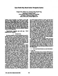
Figure 1: VlUM displaying an ontology generated from MECUREO. The concept Microsoft Word is selected. Concepts that are related are shown in a secondary focus such as MS Word, Microsoft Office, Word for Windows and word processor.
Importantly, it is able to perform the following tasks: • display the component description • display the system's certainty of its beliefs • display the value of the beliefs • allow selection of a focus component and then make closely related parts of the model the most visible • display comparative models These features have been subject to an empirical evaluation, more details can be found in [2]. The visualisation is a Java Applet that can be loaded in a standard web browser with support for Java Swing. It has been designed to ensure that there is sufficient screen real estate available for the display of other, related information so that this can be studied in conjunction with the visualisation. VlUM has been modified to allow the visualisation of ontologies. These ontologies will provide an underlying structure to the user model. Each concept in the ontology will become a component in the user model, where it can be augmented with a score and certainty. The score represents some heuristic value of the user’s knowledge, interest or preference in this concept. The certainty is the system’s degree of belief that the score is accurate.
The concepts in the ontology are displayed in a vertical listing. It utilises perspective distortion to enable users to navigate the user model. At any point in time, the component with the largest font is the one currently selected. A subgraph is created encompassing this term and those that are deemed related. Topics connected directly to the selected concept are put into a secondary focus, appearing in a larger font size, spacing and brightness than those further away in the ontology. Similarly, concepts at lower levels in the tree are shown in progressively smaller fonts, less spacing and lower brightness. Concepts that are not relevant are bunched together in a small dimmed font. Users can navigate through the ontology by clicking on a concept to select it. The display changes so that the newly selected concept becomes the focus. A slider allows users to limit the spanning tree algorithm to the selected depth. The visualisation uses colour and horizontal positioning to show the score and certainty respectively. A value that can be adjusted by the user can be used to tweak the colours – scores above the user’s chosen value are shown in green, ones below are shown in red. The further away from this value, the stronger the colour hue. The greater the certainty, the more to the left the concept is positioned.
This modified version of VlUM addresses the classic visualisation tasks [4] in the following way: •
•
•
• •
• •
Overview: the entire user model is shown on the display with green text indicating aspects of interest, and red indicating aspects not of interest. Zoom: users can focus on a particular concept on the ontology. It becomes selected and the display changes to highlight related concepts. Filter: concepts that are irrelevant to the focus concept are hidden with a smaller font and darker colour. Users can choose to only visualise a particular relationship type and hide the rest through the Filter menu. Details-on-demand: can find out more about the focused concept from items in the Action menu. Relate: related items to the currently focused one are shown in a progressively larger font the more closely related they are. History: users can step back through previously focused concepts. Extract: a search function is provided, that puts in focus concepts that match the search criteria.
3. Ontology Generation We take a broad interpretation of an ontology as an explicit specification of a conceptualisation. Our goal is to provide a shared understanding of a domain and provides a common vocabulary for inter-operating systems [5]. Although ontologies have the potential to be very useful, they are generally difficult and time-consuming to construct manually. There is considerable appeal in finding ways to automate the process [6]. We have been exploring ways to automatically construct an ontology from existing documents and, in particular, from existing dictionaries. This has been used in a tool for visualising large user models. The ontology provides the structure that enables the visualisation tool to operate effectively. The user can select a focus concept on the display and the ontology is then used to ensure that the most closely related concepts are visible. This makes the ontology an essential part of the visualisation that assists users in exploring domains with hundreds of concepts. MECUREO is a system for automatic generation of an ontology [7]. It can parse semistructured dictionary and glossaries to generate an ontology. The word and definition tuples in the dictionary are parsed to create a digraph of keywords linked to related keywords that appear in the definition. Grammatical conventions in
the definition are used to add typing to the links. A point query can be executed from a term in the ontology. A spanning tree from this point is created. MECUREO also provides facilities to merge point queries into single subgraphs. We have used MECUREO to build ontologies from the Free On-Line Dictionary Of The Computing (http://www.foldoc.org). process results in an ontology of computer science and technology related terms. This is represented as a weighted digraph. Each node in the ontology is a concept from the dictionary. Links between these have weights (0, 1]. These associate a cost with the link, with a smaller weight or cost meaning that the concepts are more strongly related. This is in contrast to the approach of OntoExtract [8] which gives higher weightings to stronger connected concepts. In the MECUREO approach, if two concepts x and y are not directly connected, but have one or more intermediate concepts, we can calculate how closely related x and y are by adding the weights of the links on the path between them. The value of the weight on each link is calculated in terms of the relationship type and the positions of the terms in their definition text. This is described more fully elsewhere [9]. MECUREO builds a large ontology from FOLDOC: 23,095 concepts and 57,550 directed relationships, with 55,038 of these between distinct concepts. Essentially, we use point queries to grow user models. So, for example, if a user specifies an interest in Haskell, we make a point query on this term, with a suitable cost-distance value such as 2.0. This returns a subgraph within the full ontology. We use this to make additional inferences about the user’s explicit interests to build a model of a wider set of likely interests. We have adapted VlUM to be able to visualise the MECUREO generated ontologies and point queries. Output filters allow MECUREO to serialise the ontologies in different formats. An output filter has been written for MECUREO to allow it to save the ontologies in the VlUM specific RDF specification.
4. Evaluation The participants in the evaluation were five upper high school students attending a summer school in which they would learn to program in Python, and five undergraduate computer science students. These users are representative of a quite computer literate group. Each user explored two quite different examples of point queries. These were Microsoft Word and Python, both graphs having about
seventy concepts. We presented users with the following scenario: James is about to subscribe to a PersMag, personalised computer magazine. He has filled in a form to say that he interested in Microsoft Word. The owners of PersMag are using a tool which enlarges this basic information from James. It is uses an online dictionary of computing to find more things that James is likely to be interested in. You can see how this work in the display which we provide for you to check out. PersMag normally sets this display to a value 2 on the slider. This means that they consider that James would like to learn about all the things that are shown in green on the display. A. Look around the display and comment on whether you think the company is doing a reasonable thing. B. See if you consider it would be better if the system were set at a smaller value, say 1? C. What about a larger value, say 3? D. Now Riichiro also wants to subscribe to PersMag and his form shows that he is interested in Python. Explore the same issues, this time for Riichiro. E. What do you think of this overall idea of using the approach to save people having to give lots of information but then being able to use something like this tool to easily provide a richer set of things they want to know about? F. What do you think of PersMag doing this rather than having the users (James and Riichiro) doing it themselves? This task was framed in terms of two hypothetical users so that participants would be less likely to judge the relevance of the task for them, personally. Questions A and D encouraged them to simply explore the display. We observed them doing this and encouraged them to think aloud, explaining what they were doing and what they thought. Questions B and D encouraged participants to explore the idea of restricting the amount of inference while Questions C and D asked them to consider making more extended inference. More importantly for us, all of Questions B to D also assessed whether participants could make sense of such questions in this context. Questions E and F were mainly an exploration of the participants’ views of the whole enterprise; at the same time, it gave them more opportunities to talk about the task at hand and to indicate whether they appreciated just what was involved in the process.
The responses to Question A indicate that the participants could work out how to interpret the purpose of the display and could explore it. Participant #10 noted that the interface is unfamiliar and novice users need to spend a few minutes trying it to become confident in understanding it. Similarly, Participants #1, #2, #5 disliked the clutter that is part of this approach to the visualisation but were able to explore the display effectively. For the central purposes of this evaluation, the critical thing is that the participants appeared to make sense of the task and were able to make use of the interface to explore the interests of the hypothetical James. Only Participant #8 described the display as confusing and Participant #3 needed more detail about the visualisation interface. Some users were not entirely happy with the ontology: Participant #2 hoped to find the concept Clipart and spent some time looking for it, without success; Participant #6 had expected to be able to see competing products. Responses to Question B are summarised in Table 1. This required the participants to adjust the VlUM display so that it imposed a tighter constraint on how closely linked the concepts should be to the initial query. This also indicates the participant’s ability to use and interpret the display. At the same time, since it restricts the number of user model components selected, it makes it easier for the user to focus on their accuracy. Participant #10 was the only one to consider that the smaller number of concepts was appropriate. All participants made sense of the task. As none commented on problems with the terms visible, this smaller display failed to disclose any problems there might have been in the ontology. Table 1: Responses to question about a more restricted inference distance in the ontology. User 1 2 3 4 5 6 7 8 9 10
Summary of responses for Question B. It’s too basic. Not enough information. I want to see other stuff there. The number of concepts is too narrow. Could miss out on words. 1 seems quicker to navigate - although a lot of depth is lost. Not smaller. Maybe. No. Probably somewhere in the middle. Not too detailed but enough to get some ideas. Yes, anything higher than 1 seems to be overloaded with information -> user becomes confused.
Table 2 shows the results for the opposite question. Interestingly, Participants #1, #2, #7 recommended an even more extensive inference distance because there were still concepts missing. It seems that this much of the ontology did not match with all the elements they had hoped to see. At the same time, the
participant’s ability to deal effectively with this question is additional support for the general plausibility of the ontology and the effectiveness of the scrutability support that VlUM gives for exploring the inferred student model. Answers to Question D confirmed this general conclusion. Overall, the participants seemed to manage this task somewhat better and seemed to have higher approval of the ontology displayed for Riichiro and the Python-based inference.
10
Table 4: User assessment of the principal of inference rather than explicit user input. User 1 2 3
Table 2: Responses to question about a more extended inference distance in the ontology. User 1 2 3 4 5 6 7 8 9 10
The idea is good but the interface is quite confusing at first with regard to its purpose. This is particularly the case for the left panel. If settings inappropriate it looks very messy and unreadable.
4
Summary of responses for Question C. Depth 4 or 5, more information. Still missing stuff. Overload of information, too many things not legible. It’s too overwhelming to read. Hard to read without moving the mouse over it. Too busy. Could be better to have larger value. No. 3 is good. Not too large, not too much at a basic level that it isn't understood. Gives user a chance to think to cover a wider area for that interest. No definitely no. Everything seems to be highlighted. It defeats the whole purpose of this interface - i.e. to assist the user with searching/browsing interested topics.
5 6
7 8 9
10
Summary of responses for Question F. Quick to use for user. 2 sliders means less options to choose. Gives in-depth look. Its good the company is doing it but users should be able to change it. Users should be able to control the information, but people who are not educated with the program will need guidance. It looks like it is doing too many things at once. Users should be able to play around with it and adjust to what they want. No response given. Dunno. Depends on the quality of the form filled in by the user. Perhaps will have to make judgements based on limited info - decisions better left to users, I think. Besides, MORE POWER TO THE USER. Saves a lot more time and could expose the users to other interests and relevant related topics that they didn't think of. Good but would have to be much more clearly and attractively displayed and more intuitive. Maybe have [it so that] after the selection is made, update the description on the right. Make sure colours aren't too light. i.e. on 'Python' section, can't see 'xlist'. So that users don't need to know exactly what they are looking for. But at the same time, it may slow them down because they are not used to such information.
The last two questions, concerning the general idea of making inferences and reducing the need for users to explicitly provide information, were consistently answered in favour of the value of inference. Only Participant #2 mentioned the need for user control. However, the participants appear to have presumed that the VlUM display would be available to users like James and Riichiro to see the ontology. Some participants expressed concern at the need for some training in the use of the interface.
Overall, the experiment suggests that the participants considered the two pointontologies plausible. Also, they could readily appreciate the general principle of the system, taking a single piece of user input and using that to generate a much larger set of data. In addition, although several participants made negative comments about aspects of the interface, all appeared to be able to use it effectively for the experiment.
Table 3: User assessments of the overall idea of inference.
5. Conclusion
User 1 2
VlUM is inspired by the work by Murtagh on his Automatist Storyteller System [10]. It is a narrative engine that produces interactive presentations from material with keyword annotations. In particular, the Material Listing in the Dexter application forms the basis for the interaction model in VlUM. We wish to apply the visualisation to existing standards such as topic maps [11] and DAML+OIL[12] ontologies. There are a number of limitations that need to be overcome in the visualisation, in particular:
3
4 5 6 7 8 9
Summary of responses for Question E. The screen is good to look at and use. Good, help busy people who don't have time, e.g. at school or at work. Depth adding information is good, but can't see the point of using the standard slider. Why not have vertical be the ranking instead? Or group concepts along the vertical? Good idea, but company might miss out on a piece of information even though they can adjust it. No response given. Pretty cool, actually. I think I'd prefer a layout -> [tree diagram] It is better approach because it allows users to see related information and it would be easier for them to work from a centralised site. User interface not intuitive enough. Wizard kind of setup would be easier to follow. Idea of helping them specify interests is good though. It is a good idea. People also do less, which is good. Users generally hate filling in forms, this eliminates the use of that.
• •
A way to express the membership roles in associations on the visualisation. The menu-based filter is designed for a small number of relationship types.
•
The interface can only associate one occurrence with each element on the display.
There are several innovative aspects to the work we have described. First, there has been very little work on building ontologies automatically from existing resources such as dictionaries and glossaries. There has been much work done that uses more heavier-weight approaches, as for example Kietz et al [13]. There is also the challenging task of evaluating ontologies which was an aspect that preoccupied some of the participants in our experiment. A third contribution of this work is its exploration of visualisation of ontologies, in particular using them to form the basis for a scrutable user model. There has been some work on visualisation of a single node and its neighbours in a student model by Zapata-Rivera and Greer [14]. The combination of all these elements is a further innovation. The qualitative evaluation we have described is rather limited. It has also designed to be easily understood by users in a short period of time. Even so, our evaluation indicates the promise of the approach. It also indicates that the participants in our study could make sense of the task and could use the VlUM display to explore the ontology. They also shared our appreciation of the power of this approach to building detailed user models from minimal user input based on ontologies that would exist on the semantic web. Ontological inference is quite feasible. Our experiment suggests that MECUREO’s lightweight automatically constructed ontology gave plausible ontological inferences. This indicates the potential for such inferences about users. There is a serious issue for user control if users provide a small amount of information about themselves and much is inferred as we did with MECUREO. Part of the answer to this issue lies with visualisation tools like VlUM.
1. References 1. Berners-Lee, T., Hendler, J., and Lassila, O., The Semantic Web, in Scientific America. 2001. 2. Uther, J., On the Visualisation of Large User Model in Web Based Systems, PhD Thesis, 2001, University of Sydney 3. Kobsa, A. and Wahlster, W., eds. User models in dialog systems. 1989, Springer-Verlag: Berlin. 4. Shneiderman, B. The eyes have it: A task by data type taxonomy for information visualizations. in proceedings 1996 IEEE Conference on Visual Languages. 1996. Boulder, CO.
5. Gruber, T., Toward Principles for the Design of Ontologies Used for Knowledge Sharing. Formal Ontology in Conceptual Analysis and Knowledge Representation, 1993. 6. Reimer, U., et al., Ontology-based Knowledge Management at Work: The Swiss Life Case Studies, in Towards the Semantic Web: Ontologydriven Knowledge Management, F.v. Harmelen, Editor. 2003, John Wiley & Sons: West Sussex, England. p. 197-218. 7. Apted, T. and Kay, J. Automatic Construction of Learning Ontologies. in proceedings International Conference on Computers in Education. 2002. Auckland, New Zealand: Technische Universiteit Eindhoven. 8. Engels, R.H.P. and Lech, T.C., Generating Ontologies for the Semantic Web: OntoBuilder, in Towards the Semantic Web: Ontology-driven Knowledge Management, J. Davis, D. Fensel, and F.v. Harmelen, Editors. 2003, John Wiley & Sons: West Sussex, England. p. 91-111. 9. Apted, T. and Kay, J. Generating and Comparing Models within an Ontology. in proceedings Australian Document Computing Symposium. 2002. Sydney, Australia: School of Information Technologies, University of Sydney. 10. Murtagh, M., The Automatist Storytelling System: Putting the Editor's Knowledge in Software, Masters, 1996, Massachusetts Institute of Technology 11. XML Topic Maps (XTM) 1.0, 2001, Available at http://www.topicmaps.org/xml/1.0/ 12. McGuinness, D., et al., DAML+OIL: An Ontology Language for the Semantic Web. IEEE Intelligent Systems, 2002. 13. Kietz, J.-U., Volz, R., and Maedche, A. Extracting a Domain-Specific Ontology from a Corporate Intranet. in proceedings Computational Natural Language Learning and of the Second Learning Language in Logic Workshop. 2000. Lisbon, Portugal. 14. Zapata-Rivera, J.D. and Greer, J., Inspecting and Visualizing Distributed Bayesian Student Models, in Intelligent Tutoring Systems, G. Gauthier, C. Frasson, and K. VanLehn, Editors. 2000. p. 544553.
Acknowledgements We would like to thank Hewlett-Packard for funding parts of this research.