TOWARDS AN UNDERSTANDING OF VISUAL APPEAL IN WEBSITE DESIGN Mart´ın Varela1 , Toni M¨aki1 , Lea Skorin-Kapov2 , Tobias Hoßfeld3 1
VTT Technical Research Centre of Finland Email: {Martin.Varela,Toni.Maki}@vtt.fi 2
3
University of Zagreb, Department of Electrical Engineering Email:
[email protected]
University of W¨urzburg, Institute of Computer Science, W¨urzburg, Germany Email:
[email protected] ABSTRACT
In this paper we study the assessment of visual appeal (VA) in website design, as part of a larger-scope work on Web QoE. Our current working hypothesis is that VA has an non-triclai impact on Web QoE, and hence meeds to be understood. We carried out two largescale (>350 users each) crowdsourced campaigns to test the influence of several factors often found in design best practices recommendations on how users actually assess the resulting designs. 1. INTRODUCTION 1.1. Motivation The subject of Web QoE has gained significant attention in recent years. An ever-increasing number of services on which we depend on daily, from banking to social networking, are routinely accessed through a Web-based interface. Going back over ten years, research on QoS for web services was usually limited to, for example, testing the tolerance of users to the load times for a single image. More recently, actual research on Web QoE has begun taking place, and more interesting issues related to load times of web pages, considering for example different tasks vs. free browsing, and different loading times for different page elements [?]. All this research assumes, reasonably, that loading times are the dominating factor in the users’ perception of a website’s quality. There may, however, be other factors unrelated to website performance that affect Web QoE. Two examples of such factors are the visual design of the website, and the ease of use (e.g. a measure of the site’s usability). While there exist metrics for usability, the visual appeal of a website’s design is, in principle, something that cannot be easily quantified. Moreover, understanding the characteristics of the design that make it more or less appealing is also an open problem. In this paper we provide a first step towards the quantification of the visual appeal of a website’s design, based on simple-tocharacterize aspects of it, with the goal of understanding its role in Web QoE (either directly, or by modulating the effect of waiting times, for example). To achieve our goal, we worked with typographic and color design elements, following and breaking best practices (as for example laid out in [1] for typography or [2] for color theory). We carried out two large-scale (>300 users each) crowd-sourced campaigns, covering 81 test conditions, in order to accomplish two things: 1. Identify visual designs that are decidedly bad, good or
mediocre, for use in the on-going Web QoE experiments, and 2. Find a model relating the design factors considered and the visual appeal of the resulting designs, as established by the crowd-sourced tests. 2. BACKGROUND AND RELATED WORK Previous research efforts have clearly shown that perceived aesthetics is one of the key dimensions impacting a user’s experience when interacting with websites. While some have treated aesthetics as a one dimensional construct (e.g., van der Heijden [3], Hall and Hanna [4]), others have studied different dimensions of perceived visual aesthetics (Lavie and Tractinsky [?], Cai et al. [?], Cyr et al. [5], Lee and Koubek [6], Tuch et al. [7]). In the context of different terms and dimensions that have been used when studying website aesthetics (e.g., perceived attractiveness [3], classical and expressive aesthetics [8]), the notion of visual appeal has been previously considered by Lindgaard et al. with respect to end user’s first impressions when accessing a website ( [9]). Cai et al. [?] have further proposed a two-dimensional website aesthetics model which structures aesthetics into two dimensions: visual appeal and organization. The authors specify the visual appeal of websites as referring “to the degree to which a consumer believes that the website is pleasing to the eye and stimulates the desire to explore”, while organization refers to “the degree of lawfulness governing the relations among the elements of a website”. Various aesthetic manipulations have been tested in previously conducted empirical studies. Hall and Hanna [4] studied different web pages (educational and commercial content) and found that black and white combinations applied to text and background proved less aesthetic than non-greyscale color combinations, while Cheng et al. [10] showed that warm colors had a positive effect on user perception in the case of online stores. Cyr et al. [5] conducted experiments across multiple cultural groups, and studied the impacts of different web site color treatments (yellow, blue, grey) on user trust, satisfaction, and e-loyalty. Their results showed that increased color appeal resulted in greater satisfaction, with differences observed across different cultures. Other studies have also stressed the fact that cultural factors play a key role in understanding end user color appreciation with respect to interface design [11]. Going beyond studying the relationship between visual appeal factors and perceived aesthetics, researchers have extensively stud-
ied the relations between aesthetics and usability (e.g, Van der Heijden [3], Tuch et al. [7], Hartmann et al. [12], and Lee and Koubek [6]) in particular related to the relationships between perceived usability, perceived aesthetics, and overall user preference in website interaction. Such studies generally manipulate aesthetic factors so as to include a limited number of “aesthetic levels” (e.g., low, medium, high aesthetic quality). Lee and Koubeck [6] manipulated the aesthetics of an information retrieval website between two levels, differing in color combination, layout, and text font (using as basis previous findings reported by Hall and Hanna [4], Cheng et al. [10], Tractinsky et al. [13]). A “high aesthetic” system was created using an analogous color harmony scheme, an attractive layout, and appealing fonts, while a “low aesthetic system” was created using greyscale colors, awkward layouts, and unappealing fonts. Experimental results showed that differences in aesthetics significantly influenced user preferences to use a system, both before and after actual use. Tuch et al. [7] studied the relation between website usability and aesthetics, for which purpose they manipulated aesthetics by changing background color, background texture, and decorative graphic elements. As input to their study, users rated 20 different online shop designs, in order to enable choosing among them a representative high aesthetic and representative low aesthetic design. With regards to web site usability, researchers have addressed the impact of typography on the readability of web pages (e.g., Ling and Schaik [14])(MORE REFS). In addition to usability aspects, factors related to typography (e.g., fonts, font sizes, line lengths, spacings, and font colors) may also be considered as having an impact on the visual appeal of a website (McCracken and Wolfe [15]). In this paper, we present the results of a large scale experimental study which quantifies the impact of visual appeal factors on perceived visual design quality of tested web sites. We manipulated four design factors (colors, number of colors used, fonts, and number of fonts used), as described in the following section, and studied their correlations and impacts on subjective user ratings of visual design quality. To the best of our knowledge, no previous studies have specifically addressed the correlative effects of these four factors, and their joint impacts on the visual appeal of different types of websites. The results provide input for further Web QoE studies which are looking to test the quality dimension of visual appeal in studying Web QoE. The practical value of considering visual appeal in Web QoE studies is targeted towards web site designers looking to optimize QoE with respect to aesthetics. The majority of previous studies addressing the impact of web site aesthetics on user experience have conducted tests in controlled lab environments. However, as pointed out by Rush et al. [16]), there is a shortage of large-scale studies being conducted in Internetbased research that would report findings related to best practices for web design. The concept of crowdsourcing has as of recently been adopted by the QoE community as an approach for conducting online subjective QoE studies. In this work, we have employed crowdsourcing methodology to conduct tests with a large number of users. Adopting this approach has entailed the need for implementing mechanisms to check for reliability among collected test results, as will be further discussed in the following section. 3. DESIGN AND SETUP OF SUBJECTIVE USER EXPERIMENTS 3.1. Test Content Preparation As discussed in the introduction, we looked at typographic and color design factors, starting with what could be called “best practices”
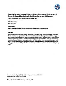
and then going against them, in order to assess what kind of impact the factors considered actually have on the resulting design’s visual appeal. For both color and type, it is often stated that “less is more”, and so minimizing the number of colors and typefaces used is a good design practice. We then chose to have several versions of each test content with different number of color variations and typefaces (we treated each factor independently), ranging from one to three. In the case of color, the “number of colors” is not the total number of colors per-se, but an ordering on the size of the palette used, which in turn results in a higher number of changed colors with respect to the original design. A second factor related to both color and type, is their suitability to the content. This is an inherently subjective factor, which is hard to quantify or express in general terms. Regarding type, one should consider the ligibility of the font used, the congruence of content and type design (for instance, typesetting a medieval poem in a modern Grotesk typeface would not be congruent), the way the different typefaces used match each other (for example, are the ’a’ glyphs both two-storey foundational-style, or is there one that is single storey, or are the main axes of the typeface matching, etc.). Other, more global concerns regarding choice of typefaces relate to how dark it makes the text (i.e. the proportion of “inked” surface to backgorund color), etc. Concerning color, similar considerations apply regarding the choice of color combinations, but these are a bit simpler to understand than those related to type, as they can more easily be seen in a color wheel. In particular, there are ways to characterise palettes based on where in the color wheel each color sits with respect to the rest. Besides this, there are also considerations of contrast, which affects legibility and reading fatigue, and so on. Different palettebuilding strategies were used for the different “color goodness” targets, by using for example Analogous-, Triadic- and Tetradic-based1 palettes based on a given base color. Example of color manipulation is illustrated in Figure 1 displaying two versions of the same page with the original colours (assumeably good) and the manipulated colours. With this in mind, and mindful of our limitations as designers, we chose to start from professionally-designed content (four of them) and then degrade them by systematically modifying the design’s styling. We used four types of content each representing a different use case in order to decrease the possible bias caused by the context of use or the task at hand. We used openly available templates and Bootstrap [17]-based designs (except for one content whith originally was an simplification of Der Spiegel’s site’s design initially prepared by other research team [?], which we reimplemented in Bootstrap). Bootstrap was selected as the content framework, because of its portability, ease of use and adaptation features. We then instrumented the test content creation in order to be able to easily parametrize the number of colors and typefaces, as well as their goodness, or suitability for the content at hand2 . The four designs we used corresponded to a news site (“DailyBootstrap”), an informational website (“Seagulls”), an electronics shopping site (“Shoppingcart”), and a photo gallery (“Photogallery”) site. For each of those, we built a set of color palettes and font schemes, and added those as configurations for our instrumentation. We considered four parameters in total, namely number of colors, color goodness, number of fonts, and font goodness. As mentioned before, each factor could take one of three values (1 · · · 3 for number 1 The exact color choices were not just e.g. the Triadic or Tetradic values, but some variation of those based on shade or tint shifts. 2 This is of course bound to our design sensitivities, which in turn are affected by our cultural backgrounds and exposure to current design practices in the Western world, for the most part
of colors/typefaces, and either good, mediocre, or bad for their goodness). 3.2. Experimental Setup It was decided early on that in order to have a large set of assessments, a crowd-sourcing approach would be taken. This imposed some restrictions in how the assessments should be carried out. In particular, sessions needed to be kept short, the assessment itself needed to be simple, and some form of subject validation needed to be included in the assessment itself, in order to exclude sputious assessments. In order to get enough coverage of our test conditions, we divided them into groups of nine, each group covering all possible combinations of two factors. The other factors (including the content type) in each group were drawn randomly. Each group consisted of the nine conditions resulting from iterating over two 3-valued factors, plus one repeated condition which was placed in a random location in the sequence, in order to check for assessment consistency. We targeted at least 20 users per group, and a total of over 300 users. Three versions of each group was generated, in order to cover more test conditions (remember that while two parameters were iterated, the other two were drawn). Out of the possible 81 test conditions, our choice covered 72. For each test condition, a content-dependent question was chosen, which users had to answer during the assessment. This was done to both ensure that users had to read the content (thus being exposed to issues of legibility caused by the design factors in each test condition), and also acted as a validation by proxy for the assessment themselves, as we discarded users who did not answer the questions earnestly or correctly (we considered 70% correct answers as our lower bound for acceptance). The consistency of the voting was tested by repeating one test condition (in random order, so that no pattern of repetition was identifiable), and discarding users whose assessment of that same sequence was off by more than 1 point in the 5-point MOS-like scale used (namely very poor, poor, fair, good, very good3 ). We did not include a training phase for the assessment, and this resulted in some users being dropped from the assessment due to they not understanding how they should perform it from the instructions alone (this became obvious when manually inspecting their answers). It is likely that better assessment yields could have been obtained by introducing some training conditions in the test. The choice not to include the training sessions was made for the sake of shortening the test’s duration. The assessments were conducted on an especially designed test application, which greeted users with information about the task they were about to carry out, and instructed them on how to perform the assessment, namely by assigning a value to the visual design of the page being displayed (in the scale described above), and to answer a question that appeared for each condition. The application then collected some demographic data about the users, technical characteristics of their environment (notably screen resolution and user agent), questions about their vision (whether they required vision correction and / or they were colorblind). Then they were guided through the assessment pages, which displayed the content in a seamless HTML iframe, and the assessment controls and content-related question at the bottom of the page (illustrated in Figure 1). Once the task was finalized, the users were provided with a unique token to use as proof 3 The commonly used wording of bad and excellent was changed to as depicted, in order to avoid semantic issues with users with potentially low English language skills.
of completion in order to claim their earnings at the crowd-sourcing site. Two assessment campaigns were carried out, roughly one month apart, and using two different task compensations (20 US$ cents in the first campaign, and 60 US$ cents in the second one).
(a) Good color palette
(b) Bad color palette Fig. 1. Evaluation of content “Seagulls” with test application.
4. USER RATINGS AND WEB QOE In total, 375 and 494 users participated in the two crowdsourcing experiments C1 and C2 , while 82 % and 75 % of those users are considered to be reliable with seven or more correct content questions and consistent rating of the repeated test condition (≤ 1 point). First, the reliable user ratings are analyzed in more detail (Sec. 4.1), before the key influence factors (KIF) are derived by means of ANOVA (Sec. 4.2). Attempts at modeling this data, and the problems found are discussed in (Sec. 4.3). Then, the influence of visual appeal (VA) and page load times (PLT) on Web QoE is compared (Sec. 4.4). 4.1. Analysis of User Ratings The ratings from the reliable users are evaluated depending on demographic information collected in the survey. Users from 45 different countries participated with 54 % from Asia, 33 % from Europe, and 13 % from other continents. We found that the ratings for users of different countries significantly differ, such that we have to consider the user origin in the KIF analysis. The overall percentage of males and females particpating were 81 % and 19 %, respectively. The test subjects were also asked about their age which ranges from 13 to
88 years. The mean age is 26.5 years. The interquartile range is 30 − 22 = 8 years with a median of 24 years. Figure 2 takes a closer look at the impact of age on the user ratings. Users are grouped in equally sized bins according to their age, such that there are 200 user ratings from 20 different users per age group except for the last age group. The last group consists of 4 users only (65, 65, 76, 88 years) which are older than the 99 % quantile of 55 years. The x-axis depicts the average age per group, while on the y-axis the mean rating per group and the corresponding 95 % interval are plotted. It can be seen that average user ratings per group lie between 3.5 and 4.0 except for the last age group which shows a significantly lower value. Without having a sound explanation for this observation (e.g. oldage amblyopia, e.g. unreliable users), we consider these four users above 65 years as statistical outliers and ignore their ratings in the remainder of the analysis. Fig. 3. Standard deviation depending on MOS values for different test configurations. Comparison with random user ratings and a study on aesthetic attributes [19].
tion, while ANOVA has the stronger assumption that the popularions have normal distributions. In both cases, it is assumed that all observations are mutually independent. Both hypothesis tests return the p-value for the null hypothesis that all samples are drawn from the same population. If the p-value is near zero, it casts doubt on the null hypothesis and suggests that at least one sample mean is significantly different than the other sample means. In other words, if the p-value is smaller than a typical significance level of 0.01, the corresponding influence factor has a major impact and is considered as KIF on VA QoE. Fig. 2. Mean rating for different age groups with 200 user ratings from 20 different users per group. The last age group of 73.5 years shows significant lower user ratings and is ignored in the data set. Throughout the measurement campaigns, 128 different test conditions were tested by varing (a) web page content, (b) number of colors Cn , (c) color goodness Cg , (d) number of fonts Fn , and (e) font goodness Fg . In order to quantify the user diversity, the mean opinion scores (MOS) and the standard deviation of the opinion scores (SOS) over all users with similar test conditions are calculated [18]. Figure 3 shows the MOS and SOS for each test condition. It can be seen that the MOS ranges from 3.12 to 4.24, while the SOS ranges from 0.56 up to 1.40 which is close to random ratings, cf. Fig. 3. The large user diversity in terms of SOS per test condition is however typical for aesthetics studies. For example, [19] evaluates subjectively aesthetic attributes like ’artistic’, ’harmony’, or ’meaningful’ and the MOS and SOS for those attributes are also given in Fig. 3. As a consequence of the high user diversity of our test results, any model will return high error quantities, cf. Sec. 4.3. 4.2. Identification of Key Influence Factors on VA QoE For deriving the KIF on visual appeal, the importance of the influence factors is evaluated by means of analysis of variances (ANOVA) and a Kruskal-Wallis (KW) test. While ANOVA compares the means for different values of an influence factor (referred to as population), the KW test compares the medians and is a nonparametric version of the classical one-way ANOVA. The KW test assumes that all ratings come from populations having the same continuous distribu-
Fig. 4. p-value under the null hypothesis that all samples in X are drawn from populations with the same mean. A value p ≤ 0.01 indicates a key influence factor on VA QoE. Figure 4 shows the p-value of ANOVA and the KW test for different factors. It can be seen that the results for ANOVA and KW test lead to the same conclusions. First, the number of colors Cn , and the number of fonts Fn are not identfied as KIF which is in contrast to accepted best practice guidelines in design [1, 2] showing a strong influence of Fn and Cn . Second, the age of the test subjects has no significant influence which can also be seen from Fig. 2. Third, the color goodness Cg and the font goodness Fg have a major impact on
VA QoE. Fourth, the origin of the test user is also a KIF. In particular, it is distinguished between users from Asia and other continents. Although the result seems to be surprising, it is inline with different studies where Western and Eastern MOS differ significantly e.g. for VoIP [?].
Fig. 6. Average user ratings depending on web page content and font goodness Fg and color goodness Cg .
Fig. 5. Main effects plot for the different web pages and the VA parameters depending on the origin continent of the test subject. Figure 5 plots the main effects for the different web pages and the VA parameters depending on the origin continent of the test subject. Thereby, page 1, 2, 3, 4 indicates the web site DailyBootstrap, Photogallery, Seagulls, Shoppingcart, respectively. The main effect for a factor (like ’web page’) is computed by averaging all user user ratings for the different settings of this factor (i.e. the four pages) independent of the other parameter settings (i.e. Cn , Cg , Fn , Fg ). Further, the 95 % confidence interval is computed. It can be seen that the origin continent leads to statistically significant differences of the main effects without overlapping confidence intervals. The strongest impact can be seen for the font goodness and the color goodness, while the actual number of fonts and colors has only minor effects. We conclude that it is therefore not possible to assess VA QoE by objectively measurable metrics like Cn , Fn . Further, we see that the web page has obviously a significant impact on VA QoE. However, there is a strong interaction between the type of web page and the origin continent which makes objective QoE assessment by analyzing web pages even more complex. Especially for the web page 2 ’Photogallery’, very different results are observed for Asian and other subjects. By means of two-way ANOVA, the interactions between parameters were additionally investigated. As a result, statistical significant interactions between (a) continent and web page, (b) continent and Fg , and (c) web page and Fg were observed, while no clear interactions between font and color choices can be obtained from the data. A detailed look on the interactions of the user ratings between web pages, font goodness, and color goodness is depicted in Fig. 6. It can be seen that the MOS values per page are not strictly increasing which hinders to derive a simple closed-form mathematical model for VA QoE. 4.3. Modeling Visual Appeal One of the goals in this work was to come up with a model for visual appeal, to use later in a larger-scope modeling task for Web QoE. Unfortunately, with the data available, no suitable model was found. From observing the data, not clear mathematical model was
found. Several attempts were made using Random Neural Networks (RNNs) to try and capture the VA behaviour, but while some of the resulting networks did present reasonable correlations with subjective scores ( 0.67), overall they were not reliable when a standard 10-fold cross-validation was performed. This was the case for several combinations of parameters taken as inputs. The above, coupled with the SOS depicted in Fig. 3, suggests that the data we collected is too noisy for modeling. This, in turn, points out the need to collect more data, probably under more controlled conditions. 4.4. Visual Appeal and Page Load Times in Web QoE From the analysis above, it is evident that Web QoE is affected by VA in addition to loading times for those web pages. A logarithmic relationship Q(t) between page load time (PLT) t and Web QoE for single-page, read-oriented sites is postulated in [20]. Q(t) = −a ln(t) + b .
(1)
The corresponding differential equation describing the impact of PLT on the sensitivity of Web QoE follows according to [21] as a d Q(t) = − . dt t
(2)
In the following Gedankenexperiment, we assume that there is no interaction between PLT and VA. Then, VA only affects the parameter b in Eq.(1), while a only depends on PLT. Then, VA gives an upper bound for Web QoE, if the page is loaded and displayed without any perceivable delay t0 . As a consequence, a low VA is comparable to an increase by ∆t of the PLT to t0 + ∆t for a high VA page. In the subjective tests, the minimum MOS and the maximum MOS observed over all test conditions was Vmin and Vmax , respectively. Then, we have −a ln(t0 + ∆t) + Vmax = Vmin which Vmax −Vmin
a . In [20], the parameter can be transformed to t0 +∆t = e a is between 0.6 and 1.0 for browsing of single-page, read-oriented sites. With Vmin = 3.11 and Vmax = 4.36 in terms of MOS (cf. Fig. 3), we obtain the results in Figure 7. Depending on the PLT parameter a, the VA of a site accounts like an additional delay on the overall Web QoE. As a result from this Gedankenexperiment, we conclude that bad VA may appear like PLTs above 4 s leading to MOS values below 3
[7] Sangwon Lee and Richard J. Koubek, “Understanding user preferences based on usability and aesthetics before and after actual use,” Interacting with Computers, vol. 22, no. 6, pp. 530–543, 2010. [8] Alexandre N. Tuch et al., “Is beautiful really usable? toward understanding the relation between usability, aesthetics, and affect in hci,” Computers in Human Behavior, vol. 28, no. 5, pp. 1596–1607, 2012. [9] Talia Laviea and Noam Tractinsky, “Assessing dimensions of perceived visual aesthetics of web sites,” International Journal of Human-Computer Studies, vol. 60, pp. 269–298, 2004. [10] Gitte Lindgaard, Gary Fernandes, Cathy Dudek, and J Brown, “Attention web designers: you have 50 milliseconds to make a good first impression!,” Behavior & Information Technology, vol. 25, no. 2, pp. 115–126, 2006. Fig. 7. Low VA is equivalent to high VA with increased PLT t0 +∆t.
which are not accepted by end user [22]. Hence, optimizing the delivery of web sites, e.g. by network providers at the cost of additional network resources, may be useless in case of bad VA. Nevertheless, the interaction between PLT and VA on Web QoE has to be analyzed which was the basic assumption of this Gedankenexperiment. As concerns future work, we will execute a series of subjective user studies to investigate the joint influence of page load times and visual appeal on Web QoE. 5. CONCLUSIONS AND OUTLOOK 6. ACKNOWLEDGMENTS This work was partly funded by the COST QUALINET Action IC1003. The authors alone are responsible for the content. M. Varela and T. M¨aki’s work was partially funded by Tekes the Finnish agency for research innovation, in the context of the CELTIC+ project QuEEN. 7. REFERENCES [1] D. Strohmeier, S. Jumisko-Pyykk¨o, and A. Raake, “Towards task-dependent evaluation of Web-QoE: Free exploration vs. ’Who Ate What?,” in IEEE Globecom, Anaheim, CA, Dec. 2012. [2] Robert Bringhurst, The Elements of Typographic Style, Hartley & Marks Publishers, 2nd edition edition, 2002.
[11] Fei-Fei Chenga, Chin-Shan Wub, and David C. Yenc, “The effect of online store atmosphere on consumer?s emotional responses ? an experimental study of music and colour,” Behaviour & Information Technology, vol. 28, no. 4, pp. 323– 334, 2009. [12] J Noiwan and A Norcio, “Cultural differences on attention and perceived usability : investigation colour combinations of animated graphics,” International Journal of Human-Computer Studies, vol. 64, 2006. [13] Jan Hartmann, Alistair Sutcliffe, and Antonella De Angeli, “Towards a theory of user judgement of aesthetics and user interface quality,” Transactions on Computer?Human Interaction, vol. 15, no. 4, 2008. [14] N. Tractinsky, A.S. Katz, and D. Ikar, “What is beautiful is usable,” Interacting with Computers, vol. 13, no. 2, pp. 127– 145, 2000. [15] Jonathan Ling and Paul van Schaik, “The influence of font type and line length on visual search and information retrieval in web pages,” International Journal of Human-Computer Studies, vol. 64, no. 5, pp. 395–404, 2006. [16] Daniel D. McCracken and Rosalee J. Wolfe, User-Centered Web Site Development: A Human-Computer Interaction Approach, Prentice Hall, 2004. [17] Sella Rush et al., “Internet-Based Research for the Desktop and Beyond: Building a Foundation of Excellence for Information Design on the Web,” in Proc. of IEEE International Professional Communication Conference, 2009, 2009, pp. 1– 5.
[3] Leatrice Eisemann, Pantone’s Guide to Communicating with Color, HOW Books, 2000.
[18] Twitter Inc., “Twitter Bootstrap,” Jan. 2013.
[4] Hans van der Heijden, “Factors influencing the usage of websites: the case of a generic portal in the netherlands,” Information and Management, vol. 40, no. 6, pp. 541–549, 2003.
[19] Tobias Hoßfeld, Raimund Schatz, and Sebastian Egger, “SOS: The MOS is not enough!,” in QoMEX 2011, Mechelen, Belgium, Sept. 2011.
[5] Richard H. Hall and Patrick Hanna, “The Impact of Web Page Text-Background Color Combinations on Readability, Retention, Aesthetics, and Behavioral Intention,” Behaviour & Information Technology, vol. 23, no. 3, pp. 183–195, 2004.
[20] P. Koutsabasis and T.G. Istikopoulou, “Perceived web site aesthetics by users and designers: implications for evaluation practice,” IGI-Clobal (accepted for publication), 2013.
[6] Dianne Cyr, Milena Head, and Hector Larios, “Colour appeal in website design within and across cultures: A multi-method evaluation,” International Journal of Human Computer Studies, vol. 68, pp. 1–21, 2010.
[21] Sebastian Egger, Peter Reichl, Tobias Hoßfeld, and Raimund Schatz, “Time is Bandwidth? Narrowing the Gap between Subjective Time Perception and Quality of Experience,” in 2012 IEEE International Conference on Communications (ICC 2012), Ottawa, Canada, June 2012.
[22] Markus Fiedler and Tobias Hoßfeld, “Quality of ExperienceRelated Differential Equations and Provisioning-Delivery Hysteresis,” in 21st ITC Specialist Seminar on Multimedia Applications - Traffic, Performance and QoE, Phoenix Seagaia Resort, Miyazaki, Japan, Mar. 2010. [23] Raimund Schatz, Tobias Hoßfeld, Lucjan Janowski, and Sebastian Egger, “From Packets to People: Quality of Experience as New Measurement Challenge,” in Data Traffic Monitoring and Analysis: From measurement, classification and anomaly detection to Quality of experience, Maja Matijasevic Ernst Biersack, Christian Callegari, Ed. Springers Computer Communications and Networks series, 2012.