Journal of Numerical Cognition jnc.psychopen.eu | 2363-8761
Research Reports Visual Comparison of Two Data Sets: Do People Use the Means and the Variability? Robin S. S. Kramer* ab, Caitlin G. R. Telfer b, Alice Towler b [a] Department of Psychology, Trent University, Peterborough, Canada. [b] Department of Psychology, University of York, York, United Kingdom.
Abstract In our everyday lives, we are required to make decisions based upon our statistical intuitions. Often, these involve the comparison of two groups, such as luxury versus family cars and their suitability. Research has shown that the mean difference affects judgements where two sets of data are compared, but the variability of the data has only a minor influence, if any at all. However, prior research has tended to present raw data as simple lists of values. Here, we investigated whether displaying data visually, in the form of parallel dot plots, would lead viewers to incorporate variability information. In Experiment 1, we asked a large sample of people to compare two fictional groups (children who drank ‘Brain Juice’ versus water) in a one-shot design, where only a single comparison was made. Our results confirmed that only the mean difference between the groups predicted subsequent judgements of how much they differed, in line with previous work using lists of numbers. In Experiment 2, we asked each participant to make multiple comparisons, with both the mean difference and the pooled standard deviation varying across data sets they were shown. Here, we found that both sources of information were correctly incorporated when making responses. Taken together, we suggest that increasing the salience of variability information, through manipulating this factor across items seen, encourages viewers to consider this in their judgements. Such findings may have useful applications for best practices when teaching difficult concepts like sampling variation. Keywords: informal inferential reasoning, comparing groups, mean difference, pooled standard deviation, variability
Journal of Numerical Cognition, 2017, Vol. 3(1), 97–111, doi:10.5964/jnc.v3i1.100 Received: 2016-11-03. Accepted: 2017-03-14. Published (VoR): 2017-07-21. *Corresponding author at: Department of Psychology, Trent University, Peterborough, Ontario K9J 7B8, Canada. E-mail:
[email protected] This is an open access article distributed under the terms of the Creative Commons Attribution 4.0 International License, CC BY 4.0 (http://creativecommons.org/licenses/by/4.0), which permits unrestricted use, distribution, and reproduction in any medium, provided the original work is properly cited.
When deciding whether two groups are different on some measure, one of the most important concepts to understand is the mean or “average”. Indeed, many teachers have focussed on determining the best ways to convey this idea to students at an early age, both through calculation and visual impression (Gal, 1995; Watson & Moritz, 1998). Even in adulthood, we are often presented with mean values in newspapers or television adverts (e.g., comparing the miles per gallon of two car models or the battery life of two smartphones) and expected to decide whether there is a meaningful difference. Problematically, research suggests that we place more weight than we should on these types of average ratings (e.g., de Langhe, Fernbach, & Lichtenstein, 2016). Statistically, information about the means alone is insufficient for making such decisions. One also requires knowledge of the variances (or some other measure of the “spread” of the two groups) in order to determine the size and importance of any difference. Unfortunately, understanding the concept of sampling distributions is both difficult for people (delMas, Garfield, & Chance, 1999) and under-researched (Meletiou, 2000).
Visual Comparison of Data Sets
98
For several years, studies have investigated what has been termed ‘informal inferential reasoning’, where judgements are made based on prior knowledge but not formal statistical procedures. Here, we consider whether people are sensitive to both the average and the spread of data when asked to make such judgements. Recent research provides some evidence that both the mean differences and the set variances correctly influence decisions about which of two groups is larger when the data are presented as lists of raw values (Morris & Masnick, 2015). However, with a greater number of mean and standard deviation conditions, and longer lists of numbers, Saito (2015) found that participants correctly judged an increase in effect size for larger mean differences but perceived incorrectly that effect size also increased as standard deviations increased. Obrecht, Chapman, and Gelman (2007) showed that participants gave little consideration to either the sample size or the standard deviation when presented with two lists of raw data. Instead their judgements were primarily driven by the mean differences. In addition, researchers have shown that between-group variability (the difference between the means) influences decisions when displaying raw data but participants did not respond to changes in within-group variability (each group’s spread) when comparing groups (Masnick & Morris, 2008). Even experience with introductory-level statistics did not guarantee that within-group variability would be given sufficient consideration (Trumpower, 2015; Trumpower & Fellus, 2008; Trumpower, Hachey, & Mewaldt, 2009). In fact, after extensive training, secondary-school mathematics teachers continued to show difficulties with the concept of sampling distributions in the context of comparing two groups (Makar & Confrey, 2004). So far, the raw data for the two groups have been presented as lists of numbers from which participants were expected to make summary judgements. In addition, several studies have investigated the potential effects of displaying summary statistics such as the mean, sample size, and standard deviation (e.g., using visual analogue scales; Obrecht, Chapman, & Suárez, 2010). For instance, work with box plots as a presentation method has shown that using these in combination with in-depth instruction may facilitate students’ understanding of sampling variability, along with how to compare two sets of data (Bakker, Biehler, & Konold, 2005; Pfannkuch, 2006; Pfannkuch, Arnold, & Wild, 2015). Reading and Reid (2005, 2006) model the learning progression in students as a shift from thinking about only the means to a strong consideration of variation. Also of relevance to the current research is how people understand visual representations of data more generally. As mentioned, little is known about how people compare two sets of raw data presented visually. However, evidence suggests that even our interpretations of simple line graphs, depicting three variables, are often incomplete and incorrect, and such graphs require complex processes in order to comprehend (Carpenter & Shah, 1998; Shah & Carpenter, 1995). Further, presenting the data as bar versus line graphs, for example, appears to influence viewers’ interpretations – the former encourages descriptions of x-y interactions while the latter results in descriptions of main effects and z-y interactions (Shah & Freedman, 2011). Indeed, bar graphs also suffer from a ‘within the bar’ bias, where data points falling within the area of the bar itself are seen as more likely than those appearing outside the bar (Newman & Scholl, 2012). As one would predict, the particular layout and details of the graph play an important role in how the data are interpreted, as does participants’ graph-related prior knowledge (Okan, Galesic, & Garcia-Retamero, 2016; Okan, Garcia-Retamero, Galesic, & Cokely, 2012; Shah & Freedman, 2011). To our knowledge, only one study has displayed raw data (that is, each value separately) visually. Fouriezos, Rubenfeld, and Capstick (2008) used a cluster of vertical bars to represent each group (each bar was a data point) and asked participants to judge which of the two clusters were taller. The results showed that the mean
Journal of Numerical Cognition 2017, Vol. 3(1), 97–111 doi:10.5964/jnc.v3i1.100
Kramer, Telfer, & Towler
99
difference had a large effect on participants’ responses, while the sample sizes and standard deviations showed statistically significant, but far smaller, effects on decisions. However, there is a large variety of options available when depicting datasets (e.g., Cleveland & McGill, 1985). Here, we investigate whether displaying the two groups’ data as parallel dot plots may help participants to incorporate information about spread into their decisions. Previous research has shown that observers are capable of accurately comparing the means of two groups when displayed on a single scatter plot (Gleicher, Correll, Nothelfer, & Franconeri, 2013). However, participants were not required to make decisions regarding the size of the differences between groups, and within-group variability was not manipulated or investigated. In the current work, we investigate the possibility that viewers previously failed to incorporate information regarding variability because data were presented as lists of numbers, summary values, or in graphically inaccessible ways. We hypothesise that visually presenting the data using dot plots may provide this type of information in a readily accessible format. In two experiments, we investigate whether this presentation method will result in both the means and standard deviations influencing participants’ responses.
Experiment 1 In this first experiment, we investigated whether the means and standard deviations of the simulated data would affect responses when tested across participants. That is, each participant was presented with only one version of the graph, and was asked to make a single rating. In this way, our design is similar to real-world decision-making, whereby information on two products are compared and one is chosen.
Method Participants We recruited participants from three sources in order to incorporate a wide range of ages and education levels. The first group (n = 77) comprised members of the public who attended an interactive psychology event, open to everyone and held in the city centre. There was no cost of admission for the event and participants were not compensated for taking part. The second group (n = 17) comprised students at a university in the northeast of England, who received either course credits or money for their participation. The third group (n = 71) comprised secondary school students and teachers who attended an open day at the university. These participants received no compensation for taking part. The three groups represented convenience samples that, when combined, would provide a spread of ages and education levels. Large amounts of variation along these dimensions were also present within groups, in particular the first group comprising members of the public. As such, the uneven sizes of these nominal groups, of itself, was not important. In total, 165 people (112 women; age M = 25.30 years, SD = 12.97 years) participated. Complete demographic information can be found in the Supplementary Material. All participants provided verbal consent before taking part, and were given both a verbal and written debriefing after completion. The experiment’s design and procedure were approved by the university psychology department’s ethics committee (identification number 484) and conform to the Declaration of Helsinki.
Journal of Numerical Cognition 2017, Vol. 3(1), 97–111 doi:10.5964/jnc.v3i1.100
Visual Comparison of Data Sets
100
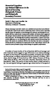
Materials We gave participants a pen-and-paper questionnaire describing a study in which a new product, ‘Brain Juice’, was being tested for its memory-boosting ability. Participants were informed that in this fictional study, one group of 20 children drank water before their memory test while a second group of 20 children drank Brain Juice. The two groups were reported as identical in all other ways. The children’s memory test scores were then presented in a graph on the questionnaire for the participants to examine (see Figure 1).
Figure 1. Example version of a graphical representation of the data shown to participants in Experiment 1 (Condition 4 in Table 1).
We created seven versions of this pen-and-paper questionnaire (see Table 1 and the Supplementary Material), varying only the data parameters according to those used by Saito (2015). The use of seven conditions represented a compromise between achieving variation in mean differences and standard deviations while limiting the number of groups, given the between-participants nature of the design. Table 1 Summary of the Seven Versions of the Graph and Participants’ Responses Water
Brain Juice
Participants’
Condition
n
M
SD
M
SD
Cohen’s d
Ratings
1
24
40
10
45
10
0.5
3.21 (2.02)
2
24
40
20
50
20
0.5
3.67 (1.76)
3
24
40
10
50
10
1.0
3.83 (1.55) 5.29 (1.49) 3.96 (1.85)
4
24
40
10
60
10
2.0
5
23
40
5
50
5
2.0
6
23
40
10
80
10
4.0
6.17 (1.64)
7
23
40
2.5
50
2.5
4.0
4.35 (1.72)
Note. n is the number of participants that completed each version of the questionnaire. Participants’ ratings, given in response to the rating question, were calculated during the analysis and are presented as M (SD).
The children’s test scores were produced using customised MATLAB software. For each set of values, 20 normally distributed random numbers were generated and then standardised, resulting in a mean of zero and a standard deviation of one. These were then multiplied by the standard deviation specified for that condition (see Table 1), and then the corresponding mean value was added. Therefore, all condition means and standard deviations were exact even though the values were originally generated using random numbers.
Journal of Numerical Cognition 2017, Vol. 3(1), 97–111 doi:10.5964/jnc.v3i1.100
Kramer, Telfer, & Towler
101
Procedure Each participant received one version of the questionnaire only, determined by the order in which they took part – the first person was given Condition 1, the second Condition 2, and so on, with the eighth starting at 1 again. Table 1 summarises how many people completed each version of the questionnaire. After reading the description of the fictional study and examining the graph that followed, the questionnaire then asked, “If you were asked to give a rating, how large do you think the Brain Juice improvement was?” Participants circled their answer on a labelled rating scale from 0 (‘none’) to 9 (‘very large’) on a 10-point scale. Next, participants read, “If a reporter asked you if the Brain Juice group did better than the children who drank water, what would you say?” Answers were given by circling either ‘yes’ or ‘no’. This second question was designed to investigate real-world outcomes, where participants are required to make a decision regarding, for example, the purchase of one particular car over another. Finally, demographic information was collected: age, sex, and how much mathematics/statistics education participants had previously received. For this question, several options were provided (e.g., secondary school, undergraduate degree) for participants to select, or they could choose ‘other’ and provide an open response. Throughout testing, participants were instructed not to confer, and were not shown other versions of the questionnaire.
Results Participant data and visual stimuli can be found in the Supplementary Material. The data were analysed using multiple regression in order to determine which factors predicted participants’ judgements of the Brain Juice improvement. First, the amount of statistics education that participants had received was converted to an ordinal variable, ranging from 1 (primary school) to 5 (PhD). Next, several regression models were explored with participants’ ratings as the dependent variable, and condition variables (mean difference, pooled standard deviation, Cohen’s d) as predictors. The mean difference was simply M(Brain Juice) minus M(water), whereas the pooled standard deviation always equalled the standard deviation of either group since both had equal standard deviations. Cohen’s d, a statistical measure of the size of the difference between the two groups, was given by the mean difference divided by the pooled standard deviation. Modelling Average Ratings First, we averaged ratings across participants for each condition (see Table 1, final column). Using regression models, we then explored whether condition variables predicted mean responses for our participant sample as a whole. Note that averaging across conditions, while smoothing out potential noise due to individual differences in responses, resulted in only seven observations. As such, any conclusions from these analyses are limited in their scope. In Models 1-3 (see Table 2), we find that the mean difference between the two groups (water versus Brain Juice) is the best individual predictor of participants’ ratings. In Model 5, we include all three variables (the collinearity statistics remain within acceptable ranges) and find a decrease in performance in comparison with Model 1. While Model 4 suggests a slight improvement (higher adjusted R 2) to Model 1 if the pooled standard deviation is included, this increase in explanatory power is not statistically significant, R 2change = .030,
Journal of Numerical Cognition 2017, Vol. 3(1), 97–111 doi:10.5964/jnc.v3i1.100
Visual Comparison of Data Sets
102
Fchange(1,4) = 1.53, p = .284. Therefore, the best model includes only the mean difference as a predictor of averaged ratings. Equally, a stepwise linear regression, initially entering all three variables, also results in Model 1 as the best solution. Table 2 Results of the Multiple Regression Analyses on Average Ratings in Experiment 1 Model
Variable
1
Mean difference
2
Pooled standard deviation
3 4
t
p
Adjusted R
2
F
0.944
6.42
.001
.870
41.27
-0.143
-0.32
.760
.176
0.10
Cohen’s d
0.742
2.48
.056
.461
6.14
Mean difference
0.950
6.79
.002
.883
23.58
-0.173
-1.24
.284
0.829
3.10
.054
.858
13.08
-0.056
-0.22
.844
0.186
0.55
.620
Pooled standard deviation 5
Beta
Mean difference Pooled standard deviation Cohen’s d
Note. The mean difference, pooled standard deviation, and Cohen’s d refer to the characteristics of the two groups that participants judged. The adjusted R 2 and F values refer to the model.
Modelling Individual Ratings Next, we used multiple regression in order to model participants’ individual ratings. This approach allows us to consider the potential influence of individual differences (sex, age, education level). In Models 1-4 (see Table 3), we find that the mean difference between the two groups (water versus Brain Juice) is the best predictor of participants’ ratings. Table 3 Results of the Multiple Regression Analyses on Individual Ratings in Experiment 1 Variable
Beta
1
Mean difference
0.464
6.69