Visual Analytics
Visual Data Mining in Large Geospatial Point Sets M
any existing and emergent applications collect and reference data by geospatial location. Credit card transactions, for example, include addresses of both the place of purchase and the purchaser; telephone records include addresses and sometimes cell phone zones and geocoordinates; and population census tables contain addresses and other location information. These data sets are sources of potentially valuable information that can give their The Wide Area Layout Data holders a competitive advantage. Government agencies also publish Observer (Waldo) a wealth of statistical information that data analysts can apply to key complements uniquely problems in public health and safety or combine with proprietary human abilities with current data. The difficulty lies in finding the details that reveal the fine struccomputing technologies to tures hidden in this data. Many approaches to analyzing find location-related such data exist—for example, statistical models, clustering, and associpatterns in large geospatial ation rules. Effective spatial data mining, however, must focus on data sets. finding location-related patterns and relationships. Interactive visual data exploration is important to spatial data mining.1,2 The wide area layout data observer (Waldo) involves the analyst in data exploration, thus complementing human perceptual skills, imagination, and flexibility with current computer systems to process large volumes of data and generate sophisticated displays. In this setting, the analyst directly interacts with the data, solving problems by applying domain expertise and general background knowledge to form and validate new hypotheses. In recent decades, visual data-mining techniques have proven valuable in exploratory data analysis, and they have strong potential in the exploration of large databases.3 Visual data exploration is particularly useful when little is known about the data and when goals are indistinct. Because users directly guide the exploration process, they can easily shift or adjust the goals as need-
36
September/October 2004
Daniel A. Keim, Christian Panse, and Mike Sips University of Constance, Germany Stephen C. North AT&T Labs
ed. However, analyzing the torrent of spatial details available in these large (terabytes and beyond) databases to extract interesting knowledge or general characteristics is almost impossible for users. Thus we need new, more scalable visual techniques.
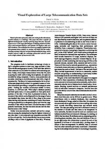
Visualizing geospatial data Geospatial data describe real-world objects or phenomena with specific locations and associated statistical values or attributes. By considering just one statistical attribute at a time, we can interpret geospatial data sets as points in a 3D data space—that is, two geographical dimensions and a statistical dimension. Because real-world data set distributions are often nonuniform, the data points form readily identifiable 3D point clouds. Figure 1a shows a household income distribution in a 3D data space spanned by longitude, latitude, and median household income. Figure 1b shows an xy-plot of the 3D point clouds. Visualizing large geospatial data sets involves mapping the two geographical dimensions to screen coordinates and encoding the statistical value by color. (Keim et al. give a good overview of visual data-mining techniques for geospatial data sets.4) The difficulty is finding a useful mapping function f. When using a simple dot plot mapping function f, developers encounter two important visualization challenges: ■
■
Overplotting obscures data points in densely populated areas; however, sparsely populated areas waste space while conveying scant detailed information. Small clusters are difficult to find. In general, they aren’t noticeable enough in conventional maps and are often occluded by large clusters.
These difficulties lead to three important visual exploration goals for geospatial data, which we express as mapping constraints: no overlap, position preservation, and clustering. (The “Visual Exploration Goals” sidebar describes these goals.) We bring visualization to data analysts’ desktops to
Published by the IEEE Computer Society
0272-1716/04/$20.00 © 2004 IEEE
.0 .2 .4 .6 .8 1.0
y
1.0 0.8 0.6 0.4 0.2 0.0
Income
Latitude
1.0 0.8 0.6 0.4 0.2 0.0 Longitude
(a)
Income
Income
l l lllllllllllllllllll ll l lllll llllll ll Income Income l lll lllll llll llllllll ll lllll ll llll lllll l lllllllllllllllllllll lllllllllllll l llllllllll lllllllllllllllllllllllllllllllllllllllllllllll ll l ll ll l l l llll lll l ll lll lllll l llllllll ll llllllllllll l llllllllllllllllllllllllllllllllllllllllllllllllll l l llllll l lllllll l llllllllllllllllll llllll llllll l llll l lllllllllllllllllllll lllll l lllllllllllllllllllllllllllllll l l Income Income l l l
ll l lllll l
.0 .2 .4 .6 .8 1.0
lllll
Income lll llll lll l l
l llllll lllll lllllllllllllllllll l ll llllll ll lllllllllllllll lllllllll Income l l ll ll l l ll l l l l l ll lll l llllllllllllll
1.0 0.8 0.6 0.4 0.2 0.0
.0 .2 .4 .6 .8 1.0
x
(b)
1 Plotting of geospatial data points on (a) longitude, latitude, and statistical attribute (income in this example) 3D-point clouds arises even in small real-world data sets (1 percent of the data); and (b) an xy-plot of the 3D-point clouds. The goal is to display all 3D-point clouds in a single continuous display without overlap. (Example shows a small sample, 1 percent, from the US Census; see http://www.census.gov, 1999 New York Household Income data set.)
Visual Exploration Goals We define the visualization of georeferenced data as a mapping of input data points, with their associated positions and statistical attributes, to unique positions on an output map. The mapping function must satisfy three main constraints: no overlap, position preservation, and clustering. We formally define these constraints as follows. Let A be the set of input points A = {a0, …, aN−1}, where ai=a ix,a yi is each point’s original position and S1(ai), …, Sk(ai) are its associated statistical parameters. We assume A is large, so we will likely have many data points i and j for which the original positions are very close or even identical—that is, ai ≈ aj. We define the data display space (screen or window space) DS ⊂ INT2 as DS = {0, … , xmax − 1} × {0, …, ymax − 1}, where xmax and ymax are the display bounds. The algorithm attempts to determine a mapping function f of the original data set to a solution set B = {b0, …, bN−1, 0 ≤ b xi ≤ xmax =1, 0 ≤ b yi ≤ ymax =1 such that f : A → B,
(1)
(2)
f(ai) = bi ∀i = {0, …, N − 1}—that is, f determines the new position bi of ai. Figure A shows graphical representations of the mapping constraints. Visual exploration techniques aim to balance the position preservation and clustering constraints under the condition that the no-overlap constraint is always satisfied. No overlap. All data points are individually visible, with each assigned a unique pixel position (Figure A1). We express this formally as i ≠ j ⇒ bi ≠ bj ∀i, j ∈ {1, …, N − 1}. Position preservation. New positions should be as close as possible to the original positions. We measure this constraint using the points’ absolute distance from their original positions (Figure A2) or their relative distance from each other (Figure A3). This gives us the following optimization goals: continued on p. 38
(3)
(4)
A Problem definition constraints: (1) no overlap, (2) absolute position preservation, (3) relative position preservation, and (4) clustering constraint. Visual exploration aims to find a good tradeoff between 2, 3, and 4 such that 1 is always satisfied.
IEEE Computer Graphics and Applications
37
Visual Analytics
encourage more intuitive and productive exploration of large geospatial data resources. High-resolution pixilated displays are increasingly available in both wall-sized and desktop units. Although extra display pixels let us show more data, this technology alone doesn’t eliminate overplotting. Figure 2 shows the resulting visualization in case of zoom in. Figure 3 shows how the degree of overlap—that is, the degree to which data points share a pixel position—varies with screen resolution. Although the number of points assigned to the same position decreases as resolution increases, even large, high-resolution displays, such as the display in Figure 4a, can’t achieve a zero overlap and could lose potentially interesting patterns. Another common solution is to aggregate all data points in each region and only show a summary. With this approach, the visualization reflects all the data points but doesn’t show all available information in the dense regions. (See the “Related Work” sidebar for a discussion of other approaches.)
(a)
(b)
(c)
Wide area layout data observer
2
Zooming solves neither the overplotting nor pixel coherence problems. (a) Overplotting on a conventional map with interactive zooming, showing only a small sample of the data. (b) PixelMap showing 100 percent of the data without overplotting. (c) Household income histogram. Green represents low income and red represents high income.
attribute Si (where Si, i ∈ {0, … , k}) are near each other (Figure A4). (We assume clustering depends on the statistical attribute S ∈ {S0, … , Sk}.) In other words, other points in the neighborhood of any given data point should have similar values, yielding pixel coherence. To formalize this constraint, we define the neighborhood NH of a data point ai and a distance function dS on the statistical attribute S:
continued from p. 37 ■ absolute position preservation, N −1
(
)
∑ d ai ,bi → min
i =0
■ relative position preservation, N −1 N −1
(
) (
)
2
∑ d bi ,b j − d ai ,a j → min i = 0 j = 0 ,i ≠ j ∑
The application determines the weighting between absolute and relative position preservation to be used. We define the distance function d by an Lm − norm (m = 1 or 2):
(
) (
d bi ,b j = m bix − b jx
) + (b m
y i
− b jy
)
m
Clustering. The clustering constraint involves repositioning the data points so those with high similarity in statistical
38
In addition to a basic visualization technique, successful data exploration often involves adjusting the
September/October 2004
N −1
∑ ∑
dS (S (bi ),S (b j )) → min
i = 0 b j ∈NH ( bi )
This neighborhood function sums up all the differences in S between each point and its neighboring points. We define the function as NH(bi) = {bj | d(bi, bj) < ε}. Because Si can have a highly nonuniform distribution, applying nonlinear scaling to S before computing distances dS might also be necessary. In addition, in some situations many similar points might be in some regions of the map, while only a few are in others. In this case, varying ε in the region under consideration might be helpful.
1.0 0.4
0.6
Powerwall
Map like visualization no longer useful (a)
0.0
0.2
Degree of overlap
0.8
Screen resolution 30% of all data points can’t be directly placed
0×0 500 × 500
1,000 × 1,000 2,000 × 2,000 1,500 × 1,500 Resolution (pixels)
3 Varying degree of pixel overlap depending on screen resolution. Even with a screen resolution of 1,600 × 1,200, overlap is about 0.3 degrees; 30 percent of our data points (about 12,000 points) from the US Year 2000 Census Household Income data set can’t be directly placed without overwriting occupied pixels. (b)
Related Work Rather than aggregate data, Gridfit1 avoids overlap in the 2D display by repositioning pixels locally. In areas with high overlap, however, the repositioning depends on the ordering of the points in the database, which might be arbitrary. Gridfit places the first data item found in the database at its correct position, and moves subsequent overlapping data points to nearby free positions, making their placement quasirandom. Cartograms are another common technique dealing with advanced map distortion.2 Cartogram techniques let data analysts trade shape against area and preserve the map’s topology to improve map visualization by scaling polygonal elements according to an external parameter. Thus, in cartogram techniques, the rescaling of map regions is independent of a local distribution of the data points. A cartogram-based map distortion provides much better results, but solves neither the overlap nor the pixel coherence problems. Even if the cartogram provides a perfect map distortion (in many cases, achieving a perfect distortion is impossible), many data points might be at the same location, and there might be little pixel coherence. Therefore, cartogram-based distortion is primarily a preprocessing step.
4 Large displays solve neither the overplotting nor the pixel coherence problems. Only alternative pixel-based visualization techniques can solve these problems. (a) In a conventional map, overplotting obscures data points even on high-resolution displays. (b) In Waldo, we avoid overplotting on a regular LCD-display. visual representation of data to suit the task at hand. Waldo is a pixelbased visual exploration system combining several relevant interaction techniques. Such techniques let data analysts directly interact with the geospatial data visualizations, dynamically changing them according to the exploration objectives. Waldo also lets analysts relate and combine multiple visualizations. Waldo is more effective than stand-alone automatic data-mining techniques in that it ■
References 1. D.A. Keim and A. Herrmann, “The Gridfit Algorithm: An Efficient and Effective Approach to Visualizing Large Amounts of Spatial Data,” Proc. IEEE Visualization Conf., IEEE CS Press, 1998, pp. 181-188. 2. D.A. Keim, S.C. North, and C. Panse, “Cartodraw: A Fast Algorithm for Generating Contiguous Cartograms,” IEEE Trans. Visualization and Computer Graphics (TVCG), vol. 10, no. 1, 2004, pp. 95-110.
■ ■ ■
yields results quickly, with a high degree of user satisfaction and confidence in findings; lets analysts guide the search and shift or adjust goals on the fly; deals with nonhomogeneous and noisy data; requires less understanding of complex mathematical or statistical algorithms or parameters; and
IEEE Computer Graphics and Applications
39
Visual Analytics
5 Rescaling reduces the size of virtually empty regions, reallocating the unused pixels to dense regions. We created this series by moving Waldo’s distortion slider.
■
provides a qualitative overview of data, letting analysts isolate unexpected phenomena for further quantitative analysis.
Basic visualization technique We use PixelMaps5 as our basic visualization technique. PixelMaps rescales map subregions to better fit dense, nonuniformly distributed points to unique output positions. The technique is novel in at least two ways: ■ ■
It provides meaningful and intuitive graphical representations of large data sets. It combines well-founded clustering algorithms with pixel-oriented visualization, thus exploiting a computer’s data processing and graphics power and the flexibility, creativity, and domain knowledge of human data analysts.
PixelMaps aims to represent dense areas while preserving some of the key structures of the original geographical space a xi, a yi, and to allocate all data points to unique display pixels, even in dense regions. To provide nonoverlap pixel displays, PixelMaps follows a four-step process. Density-based map distortion. PixelMaps uses recursive partitioning to approximate equal density in the two geographical dimensions a xi, a yi. Splitting the data set at low-density positions (less than 10 percent of (l + r)/2 of the data points) achieves efficient partitioning (gridfile-like operations). Applying every split to two areas with an equal number of points but different input screen space determines the map’s distortion. In the first split, for example, PixelMaps considers two
40
September/October 2004
areas that each have about 50 percent of the data points but unequal screen space. It then applies distortion to give each half of the data equal area in the output map. Allocation and scaling. For efficient rescaling, we perform quadtree split operations on the extent of the 2D screen space, causing empty areas to shrink and dense areas to expand. We propose a new data structure to simultaneously manage allocation and scaling of both data and screen space. It combines gridfiles (to manage input point partitioning) and quadtrees (to manage new screen space positions). The computed rescaling reduces the size of virtually empty regions, reallocating the unused pixels to dense regions. Figure 5 illustrates the rescaling of certain map regions. Array-based clustering. PixelMaps next computes an array-based clustering of each partition. It divides the third (statistical) dimension into intervals, from minimal to maximal value. The number of intervals depends on the application scenario, and can be user specified. PixelMaps data structure stores each interval’s end points in an array. Each interval corresponds to a class (income class, for example) and can be quickly determined for each statistical value using a binary search. PixelMaps then colors pixels according to cluster class indices. Cluster positioning heuristic. Finally, after rescaling and clustering, PixelMaps assigns data points to pixels, starting with the densest regions and choosing the smallest cluster in each region first. Figure 6 shows our cluster-positioning heuristic. To determine the placement sequence, we sort all final partitions (leaves of the
PixelMaps data structure) by the number of data points contained. The pixel placement step provides visualizations that trade off position, distance, and cluster preservation.
Data : P : data points belonging the same partition P; DS: Display Space Result PixelMap : for Pi ∈ P do if ||Pi||< min ∧ Var(Pi, Cntrd(Pi))>√ i|| ||P then CNoise ← CNoise ∪ Pi; else C ← C ∪ Pi; C ← sort C acc Pi with Pi ∈ C; for Ci ∈ C do if Ci pixels are free around Cntrd(Ci) in DS then DS ← SetPixels(Ci, Cntrd(Ci)); else /* Find Closest Free Pixels */; fp ← FndClsstFrPxls(Ci, Cntrd(Ci), DS); DS ← SetPixels(Ci, fp, DS); for Ci ∉ CNoise do if DS[pos(p)] == 0 then DS ← SetPixel{p, pos(p), DS}; else /* Find Closest Free Pixel */; fp ← FndClsstFrPxl(p, pos(p), DS);
Exploratory data analysis Visual data exploration involves three steps in a process so common that researchers have called it the information-seeking mantra6: ■ ■
■
Overview—an analyst examines a summary of the data; Zoom and filter—the examination might reveal interesting patterns or data subsets meriting further investigation; and Details on demand—the analyst focuses on the patterns identified in the previous step, inspecting details to form or validate hypotheses.
A PixelMaps overview of geospatial data reveals subsets with interesting structures by allocating larger display areas to dense regions with many potentially interesting subsets and smaller areas to less interesting items. PixelMaps provides the basic visualization technology in Waldo and bridges the gap between the three visual exploration steps. Visual exploration using Waldo resembles a hypothesis-generation process: PixelMaps lets analysts gain insight into data and thereby develop and confirm new hypotheses. To complement visualization, we can use automatic techniques from statistics, pattern recognition, or machine learning to verify the hypotheses.
6
Cluster-positioning heuristic.
Interaction with PixelMaps Waldo uses several relevant interaction techniques to adjust the visual representation of data to suit the Low High task at hand. First, relate and combine lets analysts display data from several maps 7 Traditional map versus PixelMaps displays using New York state interest and dividend in multiple linked views, often with income data for 2000. identical coordinate systems. Secondary statistical parameters typically appear on alternative maps, with data points at ed items to their representations in other views. For the same positions but colored by other parameters. example, an analyst might compare points in PixelMaps This makes it easy to compare parameters and detect to traditional displays such as 2.5D aggregated plots and local correlations, dependencies, and similar patterns. bar maps. Next, interactive distortion sliders let analysts adjust the level of detail to change the distortion level. Figure Application examples 5 shows the effect of changing spatial distortion. An important issue in visual data mining is determinA selection mechanism lets analysts isolate a subset of ing the effectiveness of the proposed visualizations. Our the displayed data for further processing, such as high- evaluation compares PixelMaps displays with traditionlighting, filtering, or quantitative analysis. Analysts can al approaches and provides examples using census select data on the visualization itself (direct manipula- records and a telephone call volume data set. tion) or through dialog boxes and other queries (indiFigure 7 shows a zoomed view of New York using a rect manipulation). traditional map and a PixelMap made by Waldo. The Finally, linking and brushing lets analysts relate select- degree of overlap for a 1,200 × 1,200 screen resolution
IEEE Computer Graphics and Applications
41
15
Visual Analytics
10
Texas
New_York Florida
5
PixelMaps computation time (sec.)
California
0
Illinois Pennsylvania Ohio Michigan New_Jersey North_Carolina Georgia Virginia Massachusetts Missouri Arizona Maryland Tennessee Wisconsin Louisiana Minnesota Alabama Kentucky Colorado Oregon South_Carolina Oklahoma Connecticut Utah Washington Nevada New_Mexico Nebraska Idaho Maine ew_Hampshire Montana outh_Dakota Wyoming Vermont
0
50,000
100,000
150,000
200,000
250,000
Number of data points assigned to the same position (Cumulated time: 83.411 seconds; total data points assigned to the same position: 1,472,687)
8
Computation time based on the number of points assigned to the same xy-position using a standard screen resolution. Most PixelMaps can be computed in less than 5 seconds. In case of high overplotting, the computation time is suitable for efficient data exploration.
is 0.82 for the region. We based both visualizations on US Census Interest and Dividend Household Income data. The traditional map provides random results in areas with a high degree of overlap (Manhattan, for example) but leaves sparsely populated areas virtually empty. PixelMaps increases space allotted to the densest regions so all data points can be close together. We ran PixelMaps on the most detailed data we have at the census block level. To demonstrate its scalability, we created individual data points for each household, initially placing them at the block centers. As the figure shows, clusters of households with very high investment income are in Manhattan and Queens, and households with low investment income are in the Bronx and Brooklyn. A salient cluster of wealthy households are on the east side of Central Park.
Census demographic analysis We performed a census demographics analysis using data sets from the US Census Bureau. For the analysis, we extracted household income, investment income, and the asking price of vacant homes for every state in the US. The average number of data points assigned to the same position in each state’s input data set heavily influences PixelMaps performance, as Figure 8 shows.
42
September/October 2004
California, Texas, New York, and Florida had the most points assigned to the same position and were therefore the most interesting states for PixelMaps. For these four states, we ran PixelMaps in suitable time (less than 20 seconds) for an efficient data exploration; for all other states we ran PixelMaps in real time. We ran the experiments on a 2.4-GHz Intel Xeon computer with a 4-Gbyte main memory. As Figure 9 shows, household income is strongly correlated to investment income. The figure also shows that California has only a few vacant homes with low or medium asking prices (blue areas indicate nonvacant homes) and that New York has a few vacant homes in less desirable neighborhoods with lower asking prices. Florida has relatively more vacant homes, and the price asked for these houses is strongly correlated with household income in these areas. Although, median household income and investment income are strongly correlated in each state—in particular, wealthy households are noticeable on the east side of Central Park, on Florida’s Gold Coast, and on the California coast. A detailed analysis of PixelMaps efficiency and effectiveness with respect to the defined visual exploration goals is available elsewhere.5,7
Call volume analysis Marketing analysts and network engineers look for interesting patterns in network usage data to help them recognize and respond to changing conditions quickly. One of Waldo’s key motivations is the need to analyze extremely large customer service data sets. The example visualization in Figure 10 shows the call volume of a telephone service during a 24-hour period. The traditional map (Figure 10a) gives random results in areas with a high degree of overlap while leaving sparsely populated areas virtually empty. The Waldo visualizations (Figures 10b−d) show the advantages of the PixelMaps algorithm. The maps show that New York City and Los Angeles County are the population areas with the highest call volume in the US. The PixelMaps displays can show the local distribution of call volumes in these regions.
Conclusion Detecting interesting local patterns in large data sets is a key research challenge. Particularly challenging today is finding and deploying efficient and scalable visualization strategies for exploring large geospatial data sets. One way is to share ideas from
9 PixelMaps results for US Census demographics analysis showing interest dividends income, median household income, and price asked for (a) California, (b) Texas, (c) New York, and (d) Florida.
(a)
(b)
(c)
Low
High
(a)
(b)
(c)
(d) Low
the statistics and machine-learning disciplines with ideas and methods from the information and geovisualization disciplines. PixelMaps in the Waldo system demonstrates how data mining can be successfully integrated with interactive visualization. The increasing scale and complexity of data analysis problems will require tighter integration of
(d)
10 Call volume analysis using (a) traditional maps and (b−d) PixelMaps with increasing screen resolution: (b) 800 × 347 pixels, (c) 1,024 × 445 pixels, and (d) 1,600 × 695 pixels.
High
interactive geospatial data visualization with statistical data-mining algorithms. Further information on visual analysis of massive geospatial data sets, as well as an implementation of the PixelMaps algorithm and Waldo, is available at the PixelMaps Project Web site at http://dbvis.inf.uni-konstanz. de/~sips/pixel_based_dm/. ■
IEEE Computer Graphics and Applications
43
Visual Analytics
Acknowledgments The Information Society Technologies Programme of the European Commission, Future and Emerging Technologies, partially funded this work under the IST2001-33058 PANDA project (2001-2004). We thank Waldo Tobler for his very helpful comments, Dave Belanger and Mike Wish for encouraging this investigation, and Eleftherios Koutsofios for providing data and other assistance.
References 1. A.S. Fotheringham and P. Rogerson, Spatial Analysis and GIS, Taylor and Francis, 1994. 2. K. Koperski, J. Adhikary, and J. Han, “Spatial Data Mining: Progress and Challenges,” Research Issues on Data Mining and Knowledge Discovery, ACM Press, 1996. 3. D.A. Keim et al., “Pushing the Limit in Visual Data Exploration: Techniques and Applications,” Proc. Advances in Artificial Intelligence, 26th Ann. German Conf. AI, LNAI 2821, Springer-Verlag, 2003, pp. 37-51. 4. D.A. Keim, C. Panse, and M. Sips, “Information Visualization: Scope, Techniques, and Opportunities for Geovisualization,” to be published in Exploring Geovisualization, J. Dykes, A. MacEachren, and M.-J.Kraak, eds., Elsevier, 2004, pp. 15-44. 5. D.A. Keim et al., “PixelMaps: A New Visual Data Mining Approach for Analyzing Large Spatial Data Sets,” Proc. 3rd IEEE Int’l Conf. Data Mining (ICDM 03), IEEE CS Press,
Help shape the IEEE Computer Society of tomorrow. Vote for 2005 IEEE Computer Society officers.
Polls open 13 August –
2003, pp. 565-568. 6. B. Shneiderman, “The Eyes Have It: A Task by Data Type Taxonomy for Information Visualizations,” Proc. IEEE Visual Languages Conf., IEEE CS Press, 1996, pp. 336-343. 7. D.A. Keim et al., “Pixel Based Visual Mining of Geospatial Data,” Computers and Graphics (CAG), vol. 28, no. 3, June 2004, pp. 327-344.
Daniel A. Keim is a professor of computer science at the University of Constance, Germany. His research interests include information visualization and data mining. Keim has a PhD in computer science from the University of Munich. He is an editor of the IEEE Transactions on Visualization and Computer Graphics, the IEEE Transactions on Knowledge and Data Engineering, and the Palgrave Information Visualization Journal.
Christian Panse is pursuing a PhD in the Data Mining and Visualization Group at the University of Constance. His research interests include visual data mining on large spatial data and cartogram drawing. Panse has an MS in computer science from the Martin-Luther-University Halle-Wittenberg, Germany. He is a member of the IEEE Computer Society.
Mike Sips is completing his PhD studies in the Data Mining and Visualization Group at the University of Constance. His research interests include visual data mining on large spatial data, spatial data transformation, information visualization, and advanced visual interfaces. Sips has an MS in computer science from the Martin-Luther-University HalleWittenberg. He is a member of the IEEE Computer Society, the ACM, and the German Society for Informatics.
Stephen C. North is head of Information Visualization Research at AT&T Labs. His research interests include software visualization, applied computational geometry, reusable software design, dynamic and large-scale graph layout, and spatial data transformation. North has a PhD in computer science from Princeton University. He is a senior member of the IEEE and a member of the ACM.
6 October www.computer.org/election/
44
September/October 2004
Readers may contact Daniel A. Keim at Dept. of Computer and Information Science, Univ. of Konstanz, Universitatsstr. 10, Box D78, D78457 Konstanz, Germany;
[email protected].