Ecological Informatics 32 (2016) 185–193
Contents lists available at ScienceDirect
Ecological Informatics journal homepage: www.elsevier.com/locate/ecolinf
Visualizing and interacting with large-volume biodiversity data using client–server web-mapping applications: The design and implementation of antmaps.org Julia Janicki a, Nitish Narula a, Matt Ziegler a, Benoit Guénard a,b, Evan P. Economo a,⁎ a b
Okinawa Institute of Science and Technology Graduate University, Onna, Okinawa 904-0495, Japan The University of Hong Kong, School of Biological Sciences, Kadoorie Biological Sciences Building, Pok Fu Lam Road, Hong Kong, SAR, China
a r t i c l e
i n f o
Article history: Received 22 January 2016 Received in revised form 26 February 2016 Accepted 26 February 2016 Available online 03 March 2016 Keywords: Ants Web-mapping Database User-centered design Cartographic design Client–server Biodiversity informatics D3js
a b s t r a c t The rise of informatics has presented new opportunities for analyzing, visualizing, and interacting with data across the sciences, and biodiversity science is no exception. Recently, comprehensive datasets on the geographic distributions of species have been assembled that represent a thorough accounting of a given taxonomic group of species (e.g. birds, mammals, etc.), and which form critical tools for both basic biology and conservation. However, these databases present several challenges for visualization, interaction, and participation for users across a broad range of scientists and the public. In support of the development of a new comprehensive ant biodiversity database containing over 1.7 million records, we developed a new client–server web-mapping application, antmaps.org, to visualize and interact with the geographic distributions of all 15,050 ant species and aggregate patterns of their diversity and biogeography. Our application development approach was based on usercentered design principles of usability engineering, human-computer interaction, and cartography. The resulting application is highly focused on providing efficient and intuitive access to geographic biodiversity data using a client–server interaction that allows users to query and retrieve data on the fly. This is achieved with a backend solution to efficiently work with large volumes of geospatial data. The usability and utility of the final version of the application was measured based on effectiveness, efficiency and user satisfaction, and assessed using questionnaires, usability lab studies and surveys. While the development of antmaps.org was motivated by a particular ant biodiversity dataset, the basic framework, design, and functionality are not specific to ants and could be used to interact with biodiversity data of any taxonomic group. © 2016 The Authors. Published by Elsevier B.V. This is an open access article under the CC BY-NC-ND license (http://creativecommons.org/licenses/by-nc-nd/4.0/).
1. Introduction 1.1. Background The information revolution has ushered biology into an era of big data, presenting new challenges and opportunities for data-driven research (Howe et al., 2008; Kelling et al., 2009; Reichman et al., 2011; Marx, 2013; Arts et al., 2014). Studies and initiatives that utilize technologies for data integration, analysis and communication have increased exponentially within the biological and ecological fields (Gonzales et al., 2009; Paton, 2009; Ferreira et al., 2011; Graham and Kennedy, 2014). Biodiversity science, as the study of life's variations, is an inherently information-rich enterprise and is currently undergoing a rapid transformation due to the aggregation and synthesis of large databases and various methods for interacting with and visualizing datasets (Guralnick and ⁎ Corresponding author. E-mail address:
[email protected] (E.P. Economo).
Hill, 2009). Biodiversity information comes in many forms, from physical specimens to genomic sequences to field observations. While some new sources of data, such as DNA sequences, have emerged due to technological innovation, much of the recent advances relate to the digitization and consolidation of vast amounts of existing information. Much of this information that has accumulated over the last few hundred years is distributed in countless museum collections and in (sometimes difficult-to-access) published literature (Graham et al., 2004). Recent efforts to aggregate, process, and utilize biodiversity information have presented new challenges and opportunities for the field (Guralnick et al., 2006, 2007; Guralnick and Hill, 2009; Goodwin et al., 2015). The importance of consolidation and digitization is especially true for a core data type in biodiversity science: records of where each species occurs (or has occurred) on Earth. In the aggregate, such data gives us a map of life on Earth and patterns relevant both for our understanding of basic biology and for designing effective conservation efforts. For example, the aggregation of species occurrence records in order to see overall patterns plays a pivotal role in inferring ecological and evolutionary processes (Jetz
http://dx.doi.org/10.1016/j.ecoinf.2016.02.006 1574-9541/© 2016 The Authors. Published by Elsevier B.V. This is an open access article under the CC BY-NC-ND license (http://creativecommons.org/licenses/by-nc-nd/4.0/).
186
J. Janicki et al. / Ecological Informatics 32 (2016) 185–193
et al., 2012). While these datasets are nowhere near complete for most groups of organisms (Meyer et al., 2015), the consolidation of large biodiversity datasets in vertebrates and plants has already led to insights into the global ecology and evolution of biodiversity (Schipper et al., 2008; Orme et al., 2005; Kier et al., 2005; Kreft and Jetz, 2007; Buckley and Jetz, 2007), as well as served as a critical guide to global conservation efforts (Joppa, 2015; Pimm et al., 2014). While methods for consolidating and curating such biodiversity data are an important and active research area, we focus here on the problem of visualizing and interacting with the data through the web after a dataset is created. Our interest is driven by needs that have arisen during the recent construction of a new database on global ant biodiversity, the Global Ant Biodiversity Informatics (GABI) database (Guénard et al. In preparation). In this contribution, we report on the design and implementation of antmaps.org, a new web-mapping application focused on biodiversity data. We first discuss the database and problem that motivates this new tool as well as how it relates to existing tools. 1.2. The GABI database Comprehensive biodiversity datasets exist for birds (eBird, 2012), mammals (Wilson and Reeder's Mammals species of the world's, 2005), amphibians (AmphibiaWeb, 2016), fish (FishBase, 2015), and plants (GBIF, 2016, USDA and NRCS, 2016). However, comprehensive datasets that cover the vast majority of biodiversity–terrestrial invertebrates– remain a major hole in our knowledge and are an important need for both basic biology and conservation. The GABI project is intended to be a first step towards addressing this knowledge gap by developing comprehensive data on one ecologically important animal group: ants. Although ant biodiversity is much less well documented than vertebrates, they are relatively well studied compared to most invertebrates due to their ecological importance and dominance in natural communities, their economic importance, and their fascinating social biology (Hölldobler and Wilson, 1990). This, combined with their moderate levels of diversity, makes them a good choice for a representative invertebrate group. The GABI database is a combination of museum collection data, online specimen databases, and most notably, published literature. Species distribution data for over 8650 publications have been incorporated into the database thus far. The full description of the methods and results of this data compilation will be presented elsewhere in a dedicated publication (Guénard et al. In preparation), but the basic format of the data is species occurrences; species observed in a given location. As of December 2015 there are 1.7 million such records in the database, and the data is being actively used for biodiversity research (e.g. Economo et al., 2015a, 2015b). As collectors have only begun using latitude-longitude information relatively recently, the majority of the older data in the database do not have associated geographic coordinates. A long-term goal is to geo-reference these records to increase the resolution of the data, but as an intermediate step the GABI records are currently assigned to a system of polygons covering Earth's surface. These polygons are chosen practically to maximize data inclusion, and while locality information of older collections often do not include geographic coordinates, they can be easily assigned to political regions and (if applicable) island names. Admin 1 (state- or province- level) was used for larger countries (e.g. USA, China), while Admin 0 (country-level) was used for smaller countries (e.g. Ecuador, France). In some cases a biogeographic unit such as an island (e.g. Borneo, New Guinea) was used even if it spanned political regions. To summarize, the GABI data are arranged as a set of individual records where species names are associated with an area, geographic coordinates (if available), and citation information. Taxonomy is standardized and continuously maintained to keep pace with developments in systematics. Native/introduced status is recorded, and introduced ants only known from quarantine or other indoor environments are distinguished from
records of exotic establishment. In addition, the GABI participants curate the records in a continual effort to cull errors and identify dubious records. 1.3. Existing tools for visualizing biodiversity data Data visualization has become not only a way to present results for specific studies, but also serve as exploration tools that researchers can use throughout the scientific process (Fox and Hendler, 2011). Particularly, web-mapping applications are becoming increasingly important in our daily lives as well as in scientific research (Tsou, 2011; Zastrow, 2015) as they enable such visualization of geographically referenced data through a web interface available online. They are good choices for presenting spatial datasets and play an essential role in facilitating the analysis and communication of these datasets. Many web-mapping applications or online databases have been designed to centralize taxon- or region- specific biodiversity data (Flemons et al., 2007, Auer et al., 2011, Ferreira et al., 2011, Borges et al., 2010; Janicki et al., 2014), each with their own solutions to effectively serve the dataset and visualize it in an intuitive, useful manner that is suitable for its target users. Auer et al. (2011) developed HerbariaViz, an interactive mapping application that visualizes a database of California's floral observation data. Its main goals are to present solutions to address large volumes of spatiotemporal point data and to make use of good cartographic design to create a flexible, usable client-side interface. The authors chose to visualize their data using graduated point symbols to represent aggregated count data as it enables the users to easily see the distribution of a species while having the background as a context, and coxcombs allow users to identify temporal periodicity of the dataset. Another example is the GBIF-MAPA, a web-based GIS tool to explore biodiversity data on a global scale (Flemons et al., 2007). The tool was developed in order to effectively utilize the large amount of legacy biodiversity data served by GBIF. Many challenges had to be overcome during the development of the application, from assuring fast speed of access to handling large amount of data to building a flexible and intuitive mapping interface. The particular solution that is most relevant to antmaps.org is how they optimized the effectiveness of viewing distributional data by allowing user selection of symbology for displaying map search results and by allowing the user to view or hide base map layers. The Map of Life (MOL) 2016 project has provided an online application that serves as a global, collaborative interface for storing and serving species distribution information (Jetz et al., 2012). It stores over 370 million records, visualizes species ranges and provides species lists for different geographic areas for over 930,000 species. Its main goal is to refine species distributional knowledge and it aims to improve quality control of data by means of data integration and to increase the potential of data by simplifying the process of scientific exploration and analysis. The interface includes two views, species and location, each with clear entry points for intuitive user navigation and good filtering options to effectively handle the large dataset. Several biodiversity web resources focused on ants are available. In particular, both AntWeb.org (AntWeb, 2016) and AntWiki.org (AntWiki, 2016) are multifaceted resources on ant biodiversity that include information on geographic distribution. These sites are essential tools for myrmecologists (and are used daily by the authors of this ms) and have significant value for outreach and education. But, neither currently have the capability to present all the data types included in the GABI dataset, and neither are optimized for geographic data exploration given their more generalized goals. 1.4. Objectives for antmaps.org The motivation behind the application is to support ant biology and biodiversity research by creating a tool for researchers and other interested parties based on the GABI dataset, while drawing upon the
J. Janicki et al. / Ecological Informatics 32 (2016) 185–193
187
knowledge of the wider community to improve the dataset. The objectives are 1) to provide a framework to visualize and access information about the distribution of species and the faunal composition of areas, 2) visualize and explore aggregate diversity patterns such as species richness and other biogeographic patterns at different taxonomic levels within the ants, 3) provide a mechanism for users to identify gaps and errors in the data and provide relevant feedback, 4) achieve the above in an application that is highly intuitive, efficient, focused, and optimized for ant researchers and the taxonomic scales involved, and 5) more generally to explore new application environments and design elements for the visualization of biodiversity data that may be useful for other datasets and taxonomic groups. To some degree, the objectives listed above overlap with existing applications mentioned in the previous section, in particular GBIF and Map of Life. Those applications are very comprehensive in taxonomic scale (covering all organisms), and provide a broader range of information in addition to geographic distribution. Our application, antmaps.org is not intended to compete with those efforts, but rather complement them by providing an optimized framework for mapping and exploring ant geographic data taking into account the taxonomic scale of the group and the structure of the underlying dataset. The model of a generalized resource working in concert with a more taxonomically specialized resource seems to work well with Encyclopedia of Life and AntWeb.org, for example. AntWeb.org provides a highly efficient access to species information and images in an environment optimized for ant researchers, at the same time data is shared with the more generalized Encyclopedia of Life so it can be easily accessed by the broader community of biologists and the public. It is possible that mapping applications could move in a similar direction in the future. More generally, we feel the existence of excellent tools already developed should not preclude the exploration of new approaches and innovation in client–server data visualization frameworks.
1.5.2. Map browsing flexibility Map browsing is the combination of panning and zooming of a map that is too large or detailed to be viewed by the available screen space (Roth and Harrower, 2008). Flexibility is the provision of multiple interfaces by the application to the user to complete a single task, allowing for task completion through multiple paths (Cooper and Reimann, 2003, Roth and Harrower, 2008). antmaps.org was implemented to account for map browsing flexibility, and includes five map browsing solutions: direct manipulation of the map, smart scroll bars, keyboard controls, zoom and re-center under mouse click (Harrower and Sheesley, 2005), and zoom under dropdown menu selection.
1.5. Design principles
2. Application
An effective web-mapping application should take into consideration the utility, usability and the target users of the application (Roth et al., 2015). Understanding the user's needs and expectations of an application and taking into consideration the user's technical ability and domain expertise are essential for effective and transparent interface design (Cooper and Reimann, 2003). User Centered Design (Norman, 2002), the central approach taken during the development of antmaps.org, relies upon an iterative process of interface evaluation at all stages of development (Krug, 2000). Input was gathered from target users throughout the design process, usability problems and different use-case scenarios were addressed, and the interface was iteratively refined. Cartographic design principles were also taken into consideration in order to achieve effective web map design and create an esthetically pleasing web map. Specific guidelines for usable interactive maps were also followed: (1) Overview first, details on demand (Shneiderman, 1996). (2) Provide map browsing flexibility (Roth and Harrower, 2008). (3) Utilize interface redundancy. (4) Provide interaction flexibility.
2.1. Application description
1.5.1. Overview first, details on demand The navigation of antmaps.org was designed in accordance with Shneiderman's (1996) information seeking mantra of “overview first, zoom and filter, then details on demand”, a design philosophy for revealing new insights into large datasets. The entry point of the application is a global view of overall ant species richness. The user can hover over a region to retrieve summarized information, click on a region to retrieve more detailed information, or filter the results by selecting an option from the dropdown menu.
1.5.3. Interface redundancy Redundancy refers to repetition of content in different formats, such as using graphics as well as descriptive text. Redundancy of graphics and words is most beneficial to accommodate individual differences in cognitive abilities (Tindall-Ford et al., 1997). The interface of antmaps. org was designed accordingly as it utilizes redundancy in various places, for example, many icons are designed to be intuitive and reflect their functionalities, but tooltips are also included and display the associated text for each icon when a user hovers over it. 1.5.4. Interaction flexibility Providing the user the ability to complete a task by taking different paths allows for a more flexible interface. To accommodate the user and create a more usable interface, the incorporation of interaction flexibility is prioritized during the design of antmaps.org. For example, the species range map of a particular species can be reproduced in many ways, by selecting a species from the information panel of the Diversity View or Region Comparison View, by typing in a species name directly in the autocomplete box within the Species Range Maps View, or by filtering using the dropdown menus from within the Species Range Maps View.
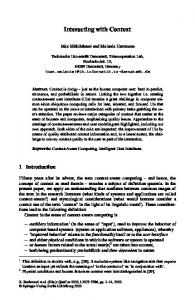
Antmaps.org consists of two main panels, the map panel and the side panel (Fig. 1). These panels are consistent across three views: Diversity View, Species Range Maps View, and Region Comparison View. The map panel includes the view title, the current selection, pan and zoom widgets, reset all and reset zoom widgets, links to AntWiki.org and AntWeb.org for each species being displayed, base map filters, and the central map area. A choropleth map–where numerical data for contiguous polygons is represented by color fill (Slocum et al., 2009)– is overlaid on top of a tiled base map that is meant to provide context and allow for the comparison of the data with the underlying terrain. The side panel includes buttons to switch views, dropdown menus and autocomplete text box to filter queries, and legends for the three views. The Diversity View (Fig. 1) is designed to visualize ant species richness across regions, optionally filtered by taxonomy. The area of each region is shaded in proportion to the number of species recorded there. The default view displays the overall ant species richness on a global scale, and the user can either filter by subfamily or genus to visualize the diversity pattern of the selected taxon. The user can click on a region to retrieve more detailed information, including a list of species and the total records and type of records of the selected taxon in that region. The Diversity View summarizes point occurrence records to visualize the aggregate diversity patterns and species richness by region, which can provide new insights to researchers in the fields of biogeography and evolutionary biology. The species occurrence record is the most fundamental unit of biodiversity datasets (Guralnick and Hill, 2009). The Species Range Maps View (Fig. 2) visualizes species occurrence records of a particular
188
J. Janicki et al. / Ecological Informatics 32 (2016) 185–193
Fig. 1. The two panels and three views of antmaps.org. The Diversity View is displayed, which maps the species richness of all ants or any taxonomic subset of ants.
species, as well as its status (native, exotic, indoor introduced, needs verification, or dubious) in a given region indicated by color coding. It is essential to recognize whether a species is native, exotic or something else in order to understand its role in a particular area, its potential impacts on natural resources and the environment, and to take appropriate measures in terms of management or conservation. The user selects a species by typing a species name into the autocomplete
text box, or by filtering through the dropdown menus. The user can click on a region to retrieve more detailed information including a list of records (with accession number, type of data and short citation) and the total records and type of records of a species in that region, or click on a point record to retrieve its geographic coordinate and citation.
Fig. 2. The Species Range Maps View. Colors reflect different status of the species in each area (e.g. native, exotic, etc.). (For interpretation of the references to color in this figure legend, the reader is referred to the web version of this article.)
J. Janicki et al. / Ecological Informatics 32 (2016) 185–193
189
Fig. 3. The Region Comparison View. The map displays the diversity in each area, but only displaying species present in a focal area (e.g. in this example the combined distributions of all species in Okinawa), highlighting regions of biogeographic similarity.
The Region Comparison View (Fig. 3) is (to our knowledge) a novel way of visualizing data through web-mapping applications. It displays the number of shared species between a selected region and the other regions, providing a coarse estimate of similarity between regions globally. The area of each region is shaded in proportion to the number of shared species found in both that region and the selected region. By using this view, researches can find patterns of regions with similar fauna and gain insights in questions related to biodiversity patterns and biogeography. The user can either directly click on a region on the map, or filter by region using the dropdown menu. The user can click on a region to retrieve more detailed information including a list of species and the total number of species in common between the clicked region and the selected region.
2.2. Application structure antmaps.org uses a client–server architecture, with part of the application running on the user's computer (the “client”), part of the application running on a web server, and the two parts communicating over HTTP. The client-side application renders the maps and provides the interface to the user, while the server-side application handles data retrieval and processing. The client side of antmaps.org is built with HTML, CSS, and JavaScript, and the JavaScript libraries Leaflet, D3, and jQuery. Leaflet is used to generate the slippy map and the tile layer, as well as zoom and pan controls. D3 is used to render the SVG map, and used to generate and manipulate DOM (Document Object Model) elements. jQuery is used for DOM manipulation. The server-side part of antmaps.org is written on Python/ Django, running on an Apache server. The Django application fetches records from the database and processes them before sending the data to the client for mapping.
2.3. Database design and performance considerations 2.3.1. Database design and implementation The data accessible through antmaps.org is managed using PostgreSQL, an open source relational database management system. The database is hosted on PostgreSQL database server version 9.4. The server is configured to be a hot-standby to the GABI database, which is separately hosted on a different PostgreSQL server. In the hot-standby configuration, all data available in the GABI database is continuously replicated, through PostgreSQL Streaming Replication, and changes are made in the GABI database with little delay. This configuration also limits the hot-standby server to host read-only databases, thereby prohibiting the antmaps.org web application to overwrite and change the data available in the GABI database. Within the GABI database, any information that can be displayed on antmaps.org is located in a separate schema. As the data to visualize is a subset of, or is calculated from, the primary GABI records table, we implemented a number of materialized views to accommodate the range of tasks users can perform on the antmaps.org frontend while maintaining fast performance and accessibility.
2.3.2. Performance When visualizing datasets with large number of records, there is an inherent need for high performance in order to produce a usable and enjoyable application. When designing tools to explore large datasets, the natural perceptual and cognitive limitations of humans should also be taken into consideration (Andrienko and Andrienko, 2007). Most tools designed to visualize large collections of data involve either data aggregation or data filtering in order to reduce the dataset to a manageable size. Data aggregation is where data is gathered and expressed in a summarized form. Data filtering is where only data subsets that match user's queries are displayed (Andrienko and Andrienko, 2007). Performance of antmaps.org is not only improved with good relational database structure including the use of materialized views and
190
J. Janicki et al. / Ecological Informatics 32 (2016) 185–193
Table 1 Evaluation method and respective metrics. Evaluation method/metric
Effectiveness
Efficiency
Satisfaction
Questionnaire Usability testing Survey
X X
X
X X X
indexing on the database relations, but is also optimized by data aggregation and data filtering on the design end.
3. Usability and utility assessment The resulting application, antmaps.org, was assessed iteratively during the development and design process to ensure usability (Nielsen, 1993), with the main goal being design refinement. Specifically, usability tests were conducted to identify potential usability problems, to alter the interface to become more intuitive, and to determine essential functionalities for target users. The final version was also assessed prior to the release in order to evaluate the interface success and determine whether the performance and human experience objectives have met their goals. The usability of an interface can be measured based on (1) effectiveness: the ability of users to complete tasks using the system and the quality of the output of those tasks, (2) efficiency: the time consumed in performing the tasks, and (3) satisfaction: users' subjective reactions to using the system (Brooke, 1996). This paper only describes the summative testing that was used to evaluate the final version of the interface prior to its release as opposed to the formative testing that was conducted iteratively throughout the design process. Before its release, antmaps.org was evaluated using two assessment methods: Usability lab studies and questionnaires. In general, both quantitative and qualitative evaluation methods (Montello and Sutton, 2013) should be used concurrently to complement each other. Questionnaires with Likert scale questions (quantitative) can inform the user's attitude towards the interface. Usability lab studies (qualitative) may reveal unexpected design issues or new insights by means of user attitude, task completion and time in task completion.
We mix-and-matched the two assessment methods based on the needs of our situation and evaluated the interface over two types of sessions. First, five participants were asked to partake in a think-aloud usability lab studies and were given the questionnaire at the end of their sessions. Second, the same set of scenarios and tasks along with the same questionnaire were sent out to five myrmecologists who were in remote locations in order to gain insight from users with high levels of domain expertise. As they were not able to participate in think aloud usability lab studies in person, they were asked to fill out a survey on top of the questionnaire documenting their impressions of the application along with suggestions on interface design, map interaction and application utility. Overall, the interface effectiveness was evaluated from the usability lab studies and the surveys while efficiency (time consumed for each task) was evaluated only from usability lab studies (Table 1). 3.1. Means of assessment 3.1.1. Questionnaires There are many standardized usability surveys to measure participants' preferences towards an interface. Tullis and Stetson (2004) carried out a systematic comparison and concluded that the SUS (System Usability Scale) generated the most reliable results across sample sizes (Çöltekin et al., 2009). The questionnaires included 10 Likert scale preference questions and were provided to a total of 10 participants: Five participants who took part in the think aloud usability lab studies were given the questionnaire at the end of their session and five participants who were all myrmecologists in remote locations were given the questionnaire as part of the survey they completed. 3.1.2. Usability testing Usability testing sessions were conducted with five participants who are all researchers in biological fields. The sessions followed a thinkaloud protocol (Nielson Normal Group) as the participants were asked to continuously think out loud as they move through the user interface. We constructed two scenarios (Table 2) intended to cover common tasks expected from our target user community. The two scenarios were presented in paragraph form but with individual tasks marked. Each session started with introducing antmaps.org to the participants (without instruction of how to use the site), who were then asked to
Table 2 Usability testing scenarios and tasks, with associated goals of each task. Scenarios and tasks
Goal of task
Scenario 1: You are a taxonomist and you collected an ant specimen in Panama, and you know it is in the genus Atta. You want to know what Atta species are found in Panama to compare the specimen you collected to these species (Task 1). You also want to see how Atta is distributed across the world (Task 2).
Retrieve data from a specific region (overall species, a specific subfamily or a specific genus)
Visualizing the overall ant species richness on a global scale, or the species richness of a specific subfamily or genus You have identified the specimen as Atta cephalotes. You want to know the geographic distribution of this Visualize the range of a specific species species (Task 3). You also want to know the total number of records for the species from Panama (Task 4). Retrieve information on citation, number of records and type of data of a particular species from a particular region Scenario 2: You collected some specimens of Pheidole megacephala, a globally distributed invasive ant Visualize the status of a species in a particular region species, in Taiwan. You want to check Pheidole megacephala's status in Taiwan (native, exotic…) and you want to get an overall picture of the species' native range (Task 5). You want to learn more about this species since it is one of the most problematic invasive ant species. To Be able to access external tools from within antmaps.org do so you would access the external link to AntWiki for this species from within antmaps.org (Task 6). Quickly scan over the range maps one after another of the 20 Pheidole species that come after Pheidole Compare subfamily or genus diversity or species ranges one after megacephala alphabetically (Task 7). another Since you are collecting in Taiwan, you want to see how the ant fauna in Taiwan is distributed across the Compare fauna across regions rest of the world (Task 8). Suppose a species found in Taiwan is also found in Bolivia, you believe that there is an issue with the data Report data issue since there are no other species from Taiwan that are also found in South America. You want to report the data issue to the antmaps.org administrators (Task 9). Finally, given that there are many similar species found in Myanmar and Taiwan, you would like to see Compare fauna of two specific regions the how the species in Myanmar are distributed globally, and then find the number of species in common between Taiwan and Myanmar, complete this task assuming you didn't know where Myanmar is on the map (Task 10).
J. Janicki et al. / Ecological Informatics 32 (2016) 185–193
work through the two scenarios that included 10 map-use tasks, and asked to “thinking aloud” while using the interface. After task completion, discussions were carried out and input was gathered on various aspects of the application, from interface design to map interactions to the utility of the application. At the end of the session, the participant was asked to complete the SUS questionnaire. 3.1.3. Surveys for remote myrmecologists The same set of scenarios and tasks along with the same SUS questionnaire were sent out to five myrmecologists who were in remote locations, in order to gain insight from users with high levels of domain expertise. 3.2. Results 3.2.1. Effectiveness, efficiency and satisfaction All participants were able to complete all of the tasks, though the quality of task completion varied, which we were able to use to infer the ease-of-use of the interface and make changes accordingly. Certain tasks were more intuitive than others across the board, while time completion of other tasks differed greatly among subjects as a result of variation in domain and map-reading expertise. User satisfaction was evaluated from the discussion with participants during the usability lab testing, from the survey that includes questions geared towards understanding the user's attitude towards the interface, as well as from the questionnaires answered by all ten participants. Overall, the participants seem to be very satisfied using the application according to their comments regarding usability. This is also evident from the SUS (System Usability Scale) scores of the participants (Table 3). Many of the participants expressed that they found the interface well-designed and found nothing particularly confusing, while others were generally satisfied, but had some suggestions how the interface could be improved, including using a different color scheme, adding extra functionalities, changing certain map element designs, improve dropdown menu and autocomplete design, among others. 3.2.2. Release antmaps.org was first released in June 2015 to the ant research community through announcements on social media, the authors' website, and through an email announcement set to colleagues. From there, the website was reposted on numerous ant-related blogs and websites, receiving an overall positive reception. Usage of the website was tracked through Google Analytics. During July 2015, we had 3152 sessions and 2451 new and returning users to the site. Feedback expressed online or directly to the authors was generally positive. Subsequently, in August 2015, antmaps.org was mentioned in a press release from the University of Hong Kong, and was picked up by the international media through wire services and disseminated through international news organizations (e.g. The Guardian, 2015), as well as science-oriented media (e.g. Science Magazine, Normile, 2015) leading to a huge amount of traffic; 8666 sessions alone on August 7, 2015 and 45,931 sessions and 57,108 page views between August 1, 2015 and September 30, 2015. The website drew an unanticipated amount of interest from the general public, even though the site is based around species names and not actual ant photographs or other layman-friendly visual information. We attribute this to the esthetic appeal of interacting with visually pleasing, zoomable maps. The appeal of the website was very international with users from 78 countries visiting the site. Since August 2015, user load has stabilized a steady level of
191
approximately 80 sessions per day originating from around the globe, reflecting widespread use by the myrmecological research community. 4. Discussion & conclusion With more biodiversity data becoming available in electronic form every year, tools that facilitate data-user interaction via the web are increasingly relevant. While several excellent tools have already been developed, we pursued the development of antmaps.org both to address the specific needs of a particular dataset/project, and to explore new environments for interacting with web databases that could be more generally useful for other data or contexts. Biodiversity-oriented web applications must balance a tradeoff between specialism and generalism, both in taxonomic scope and in the breadth of data and functions available. At this point it is difficult to foresee whether the biodiversity informatics web-ecosystem will tend towards generalized or specialized, or if some symbiotic combination of tools will emerge in the long-term. Our application, antmaps.org, highlights what can be accomplished with a more specialized site: it is highly focused on the problem of visualizing and interacting with a specific type of data (i.e. geographic distribution) on a single taxonomic group, ants (~ 15,000 species) in an intuitive and efficient manner. The iterative, user-centered design process resulted in a framework that is easy to learn for both specialists and non-specialists. With modest experience using the site, specialists can quickly and efficiently retrieve some data of interest about ant geographic distributions. The application facilitates exploration of biogeographic and biodiversity patterns that can stimulate research directions. Moreover, for the managers of the underlying database, it provides a framework to easily and efficiently identify errors, and efficiently draw upon expertise around the globe. An outlier on a map is far easier to spot than an outlier in a data table. There are several features of our end-design that we believe contribute to its usability, and could inform development of future applications. The first is the three views, which capture the three main perspectives biodiversity scientists may take in approaching biodiversity data. Users may be interested in the native and non-native distribution of a particular species (species view), they want to look at the distribution of whole taxonomic groups or all ants (diversity view), or they want to investigate the fauna of a given place (region view). The first two are very familiar to most biologists, but the third is more novel and is particularly good at identifying clusters of biogeographic affinity. The second feature we want to highlight is that aside from a very simple menu that switches between views, users can essentially interact with the dataset through the map itself. Each area is clickable and pops up either a list of records (in species view), a list of species (in diversity and region views). The pop-up information window can then be used to navigate further including change modes. The application was designed to complement existing applications available for ant biodiversity research and education. In particular, AntWeb.org and AntWiki.org are more comprehensive resources that provide a range of information on ant species and higher taxa. Although they include maps and other geographic information, this is not the main focus and must be balanced with other information. For example, standardized images, taxonomic information and high-quality specimen data are best found on AntWeb.org. AntWiki.org is a more freeform repository of various types of information including behavior, ecology, and non-standard images. Maps including literature records and other curated geographic data are easily found and explored on antmaps.org. It is possible that one web framework can absorb all of
Table 3 System Usability Scale (SUS) scores of each participant. Persons 1 to 5 are general biologists, and 6–10 are ant biologists. Participant
p1
p2
p3
p4
p5
p6
p7
p8
p9
p10
Mean
SUS
92.5
92.5
82.5
85.0
97.5
97.5
100.0
92.5
85.0
80.0
90.5
192
J. Janicki et al. / Ecological Informatics 32 (2016) 185–193
these functions and maintain efficiency, but at present it seems to us that a set of mutually reinforcing web applications can be most efficiently utilized by a knowledgeable user. To facilitate the synergy between sites, we have made prominent links that allow the user to easily jump from a species or higher taxon map to the corresponding page in AntWeb.org or AntWiki.org. It is also worth questioning why taxon-specific sites might be useful when generalized tools that cover all taxonomic groups are available (Flemons et al. 2007; Map of Life, 2016). While we don't have any conviction that this will remain true in the long-term, at present the taxonspecific applications facilitate more efficient interaction for researchers, and more direct control over display and curation of the data in a way that is tailored to the taxon of interest. This means that the menus are focused on the taxonomic scales that are relevant for ants, and features like the range classification (native, introduced, indoor introduced, need verification)–that may not be relevant for all taxa–can be implemented. At the same time, specialized sites like ours may be difficult to find for biologists outside the ant research community or the general public, who may casually or occasionally want to find information on ant biodiversity. The obvious advantage of a centralized website is that it is easily discoverable. Our near-term goal is to develop mechanisms that allow our data to sync with these other websites. This would suggest one long-term model for the biodiversity related web-ecosystem: a huband-spoke network of focused websites that are tailored to specific taxa of interest, connected to centralized, generalized websites. Biodiversity research is as important and pressing as it ever has been, and not for positive reasons (Guénard et al., 2012). The relatively new field of biodiversity informatics is poised to muster the considerable capabilities of modern computation and data-science just when it is needed most. Here we introduced a novel tool that may assist scientists in the study of ant biodiversity by providing efficient access to comprehensive biogeographic data and to visualize and discover biotic patterns. While the antmaps.org site is tuned for our focal taxon with respect details such as the taxonomic levels of the menus, the minimalist biodiversity-mapping framework could easily be adapted for other groups. No doubt, the ecosystem of biodiversity-related web applications will continue to grow and self-organize in the coming years and decades. Acknowledgments We warmly thank all the data contributors and collaborators on the GABI project, and all those who volunteered their time to help us test evaluate the antmaps.org application during the design process. We additionally thank K. Dudley for technical GIS assistance. We thank B.L. Fisher and two anonymous reviewers for comments on the manuscript. The antmaps.org project is supported by subsidy funding to OIST. References AmphibiaWeb, 2016. Information on amphibian biology and conservation. AmphibiaWeb, Berkeley, California ([web application] Available: http://amphibiaweb.org/. (Accessed 20 January 2016)). Andrienko, N., Andrienko, G., 2007. Designing visual analytics methods for massive collections of movement data. Cartographica 42 (2), 117–138. AntWeb, 2016. (web application) Available: https://www.antweb.org (Accessed 20 January 2016). AntWiki, 2016. (web applicatonapplication) Available: http://www.antwiki.org/wiki (Accessed 20 January 2016). Arts, K., van der Wal, R., Adams, W.M., 2014. Digital technology and the conservation of nature. Ambio 44 (Suppl. 4), S661–S673. Auer, T., MacEachren, A.M., McCabe, C., Pezanowski, S., Stryker, M., 2011. HerbariaViz: a web-based client–server interface for mapping and exploring flora observation data. Ecol. Inf. 6 (2011), 93–110. Borges, P.A.V., Gabriel, R., Arroz, A.M., Costa, A., Cunha, R.T., Silva, L., Enesima, M., Martins, A.M.F., Reis, F., Cardoso, P., 2010. The Azorean biodiversity portal: an internet database for regional biodiversity outreach. Syst. Biodivers. 8 (4), 423–434. Brooke, J., 1996. SUS: A “Quick and Dirty” Usability Scale. Usability Evaluation in Industry. Taylor and Francis, London, UK, pp. 189–194.
Buckley, L.B., Jetz, W., 2007. Environmental and historical constraints on global patterns of amphibian richness. Proc. R. Soc. Lond. Ser. B 274, 1167–1173. Çöltekin, A., Heil, B., Garlandini, S., Fabrikant, S.I., 2009. Evaluating the effectiveness of interactive map interface design: a case study integrating usability metrics with eyemovement analysis. Cartogr. Geogr. Inf. Sci. 36 (1), 5–17. Cooper, A., Reimann, R., 2003. About Face 2.0: The Essentials of Interaction Design. Wiley, Indianapolis. eBird, 2012. An online database of bird distribution and abundance. ([web application] Ithaca, New York. Available: http://www.ebird.org. (Accessed 14 January 2016)). Economo, E.P., Klimov, P., Sarnat, E., Guénard, B., Lecroq, B., Knowles, L.L., 2015a. Global phylogenetic structure of the hyperdiverse ant genus Pheidole reveals the repeated evolution of macroecological patterns. Proc. R. Soc. B 282, 20141416. Economo, E.P., Sarnat, E.M., Janda, M., Clouse, R., Klimov, P., Fischer, G., Blanchard, B.D., Ramirez, L.N., Andersen, A., Berman, M., Guénard, B., Lucky, A., Rabeling, C., Wilson, E.O., Knowles, L.L., 2015b. Breaking out of biogeographic modules: range expansion and taxon cycles in Indo-Pacific Pheidole. J. Biogeogr. 42, 2289–2301. http://dx.doi. org/10.1111/jbi.12592. Ferreira, N., Lins, L., Fink, D., Kelling, S., Wood, C., Freire, J., Silva, C., 2011. BirdVis: visualizing and understanding bird populations. IEEE Trans. Vis. Comput. Graph. 17 (12), 2374–2383. FishBase, 2015. (web application) Available: http://www.fishbase.org (Accessed 14 January 2016). Flemons, P., Guralnick, R., Krieger, J., Ranipeta, A., Neufeld, D., 2007. A web-based GIS tool for exploring the world's biodiversity: the global biodiversity information facility mapping and analysis portal application (GBIF-MAPA). Ecol. Inf. 2, 49–60. Fox, P., Hendler, J., 2011. Changing the equation on scientific data visualization. Science 331 (2011), 705–708. GBIF: Global Biodiversity Information Facility, 2016. (web application) Available: http:// www.gbif.org (Accessed 14 January 2016). Gonzales, R., Cardille, J.A., Parrott, L., Gaudreau, C., Deest, G., 2009. SFMN GeoSearch: an interactive approach to the visualization and exchange of point-based ecological data. Ecol. Inf. 4 (4), 196–205. Goodwin, Z.A., Harris, D.J., Filer, D., Wood, J.R., Scotland, R.W., 2015. Widespread mistaken identity in tropical plant collections. Curr. Biol. 25, 1066–1067. Graham, M., Kennedy, J., 2014. Vesper: visualizing species archives. Ecol. Inf 24, 132–147. Graham, C.H., Ferrier, S., Huettman, F., Moritz, C., Peterson, A.T., 2004. New developments in museum-based informatics and applications in biodiversity analysis. Trends Ecol. Evol. 19, 497–503. Guénard, B., Weiser, M.D., Dunn, R.R., 2012. Global models of ant diversity suggest regions where new discoveries are most likely are under disproportionate deforestation threat. PNAS 109 (19), 7368–7373. Guénard, B., Weiser, M.D., Gomez, K., Economo, E.P., 2016. Revealing the distribution of ants: the Global Ant Biodiversity Informatics database (GABI) (in preparation). Guralnick, R.P., Hill, A., 2009. Biodiversity informatics: automated approaches for documenting global biodiversity patterns and processes. Bioinformatics 25 (4), 421–428. Guralnick, R.P., Wieczorek, J., Hijmans, R.J., Beaman, R., the Biogeomancer Working Group, 2006. Biogeomancer: automated georeferencing to map the world's biodiversity data. PLoS Biol. 4, 1908–1909. Guralnick, R.P., Hill, A.W., Lane, M., 2007. Towards a collaborative, global infrastructure for biodiversity assessment. Ecol. Lett. 10 (8), 663–672. Harrower, M., Sheesley, B., 2005. Designing better map interfaces: a framework for panning and zooming. Trans. GIS 9 (2), 77–89. Hölldobler, B., Wilson, E.O., 1990. The Ants. Springer, Berlin. Howe, D., Costanzo, M., Fey, P., Gojobori, T., Hannick, L., Hide, W., Hill, D.P., Kania, R., Schaeffer, M., St Pierre, S., Twigger, S., 2008. Big data: the future of biocuration. Nature 455 (7209), 47–50. Janicki, J., Guo, C., Conway, M., Donohue, D., Roth, R.E., 2014. Weevil viewer: an interactive mapping application for geographic and phenological exploration of Wisconsin's primitive weevils. J. Maps 10 (2), 1–8. Jetz, W., McPherson, J.M., Guralnick, R.P., 2012. Integrating biodiversity distribution knowledge: toward a global map of life. Trends Ecol. Evol. 27, 151–159. Joppa, L.N., 2015. Technology for nature conservation: an industry perspective. Ambio 44 (Suppl. 4), S522–S526. Kelling, S., Hochahcka, W.M., Fink, D., Riedwald, M., Caruana, R., Ballard, G., Hooker, G., 2009. Data-intensive science: a new paradigm for biodiversity studies. Bioscience 59 (7), 613–620. Kier, G., Mutke, J., Dinerstein, E., Ricketts, T.H., Kuper, W., Kreft, H., Barthlott, W., 2005. Global patterns of plant diversity and floristic knowledge. J. Biogeogr. 32, 1107–1116. Kreft, H., Jetz, W., 2007. Global patterns and determinants of vascular plant diversity. PNAS 104 (14), 5925–5930. Krug, S., 2000. Don't Make Me Think: A Common Sense Approach To Web Usability. New Riders Publishing, Berkeley, CA. Marx, V., 2013. Biology: the big challenges of big data. Nature 498, 255–260. Meyer, C., Kreft, H., Guraknick, R., Jetz, W., 2015. Global priorities for an effective information basis of biodiversity distributions. Nat. Commun. 6 (8221). MOL: Map of Life, 2016. (web application) Available: http://www.mol.org/ (Accessed 14 January 2016). Montello, D., Sutton, P., 2013. An Introduction to Scientific Research Methods in Geography. SAGE, Thousand Oaks, CA. Nielsen, J., 1993. Usability Engineering. Academic Press, Boston. Norman, D.A., 2002. The Design of Everyday Things. Basic Books, New York. Normile, D., 2015. New interactive map shows where the world's ants are. Science (August 7 Retrieved from: http://www.sciencemag.org/news/2015/08/new-interactivemap-shows-where-world-s-ants-are. (Accessed 20 January 2016)).
J. Janicki et al. / Ecological Informatics 32 (2016) 185–193 Orme, C.D.L., Davies, R.G., Burgess, M., Eigenbrod, F., Pickup, N., Olson, V.A., Webster, A.J., Ding, T.S., Rasmussen, P.C., Ridgely, R.S., Stattersfield, A.J., Bennett, P.M., Blackburn, T.M., Gaston, K.J., Owens, I.P.F., 2005. Global hotspots of species richness are not congruent with endemism or threat. Nature 436, 1016–1019. Paton, A., 2009. Biodiversity informatics and the plant conservation baseline. Trends Plant Sci. 14 (11), 629–637. Pimm, S.L., Jenkins, C.N., Abell, R., Brooks, T.M., Gittleman, J.L., Joppa, L.N., Raven, P.H., Roberts, C.M., Sexton, J.O., 2014. The biodiversity of species and their rates of extinction, distribution, and protection. Science 344, 987–998. Reichman, O.J., Jones, M.B., Schildhauer, M.P., 2011. Challenges and opportunities of open data in ecology. Science 331 (2011), 705–708. Roth, R.E., Harrower, M., 2008. Addressing map interface usability: learning from the lakeshore nature preserve interactive map. Cartogr. Perspect. 60 (spring 2008). Roth, R.E., Ross, K.S., MacEachren, A.M., 2015. User-centered design for interactive maps: a case study in crime analysis. ISPRS Int. J. Geo-Inf. 4 (2015), 262–301. Shneiderman, B., 1996. The eyes have it: a task by data type taxonomy for information visualizations. Proceedings of the 1996 IEEE Symposium on Visual Languages. IEEE Computer Society Press, Boulder, Colorado. Schipper, J., et al., 2008. The status of the world's land and marine mammals: diversity, threat, and knowledge. Science 322, 225–230. Slocum, T.A., McMaster, R.B., Kessler, F.C., Howard, H.H., 2009. Thematic cartography and geovisualization. 2009. Pearson Prentice Hall.
193
The Guardian, 2015. Where are the world's ants? first ever map detailing 15,000 species launched. The Guardian (August 7 Retrieved from: http://www.theguardian.com/ environment/2015/aug/07/where-are-the-worlds-ants-first-ever-map-detailing15000-species-launched. (Accessed 20 January 2016)). Tindall-Ford, S., Chandler, P., Sweller, J., 1997. When two sensory modes are better than one. J. Exp. Psychol. Appl. 3 (4), 257–287. Tsou, M.H., 2011. Revisiting web cartography in the United States: the rise of usercentered design. Cartogr. Geogr. Inf. Sci. 38 (8), 250–257. Tullis, T.S., Stetson, J.N., 2004. A comparison of questionnaires for assessing website usability. Proceedings, Usability Professionals Association Conference (UPA 2004), Minneapolis, Minnesota, pp. 7–11. USDA, NRCS, 2016. The PLANTS Database. National Plant Data Team, Greensboro, NC 27401-4901 USA ([web application] Available: http://plants.usda.gov. (Accessed 14 January 2016)). Wilson & Reeder's Mammals species of the world [web application]. 2005. John's Hopkins University Press. Available: http://vertebrates.si.edu/msw/mswcfapp/msw/index. cfm. (Accessed 14 January 2016). Zastrow, M., 2015. Science on the map. Nature 519 (2015), 119–120.