An Empirical Evaluation of User Interfaces for a Mobile Video Game Kevin Browne Department of Computing and Software, ITB-229 McMaster University 1280 Main Street West Hamilton, Ontario L8S 4K1
[email protected]
Christopher Anand Department of Computing and Software, ITB-202 McMaster University 1280 Main Street West Hamilton, Ontario L8S 4K1
[email protected]
Abstract In this paper we empirically test the effectiveness and enjoyability of three user interfaces used to play an iPod Touch scroll shooter video game. Mobile devices are currently undergoing a surge in market penetration both in business and with consumers. These devices allow for user interface options such as touch screens and accelerometers, which are novel to mobile platforms themselves and certainly novel to large portions of the general public. To explore the effectiveness and enjoyability of these user interface options, the game was implemented with an accelerometer based interface, a touch screen based interface involving simulated buttons and a touch screen based interface involving finger gestures. The game has been formally tested with 36 human subjects each playing the game with each of the three interfaces. We present statistically significant results that the accelerometer based interface was the preferred interface and the interface in which participants performed best. We hope manufacturers will consider using the approach used in this paper to test user interfaces in-house before releasing them, since, as we show, it is inexpensive to obtain statistically significant results. We propose heuristics for mobile user interface design based on an analysis of the results and suggest an avenue for future work. Keywords: mobile computing, mobile user interfaces, video game user interfaces 1. Introduction Mobile computing devices such as smartphones, ereaders and tablet computers are currently undergoing a phenomenal surge in market penetration. Market tracker iSuppli Corp. expects smartphone shipments to rise 105% from 246.9 million in 2010 to 506 million units in 2014 [1]. Shipments of tablet computers like the iPad are expected to grow from 19.5 million units in 2010 to 208 million units in 2014, according to Gartner Inc. media analysts [2]. Some of these mobile computing devices, such as the iPhone, offer user interface capabilities beyond physical Preprint submitted to Entertainment Computing
buttons, such as accelerometers and touch screens capable of recognizing the movements of multiple fingers. While strictly speaking these user interface capabilities are not completely novel, never before have they been available in mobile devices with such deep market penetration. According to estimates by Canalys, for instance, in Q4 2009 touch screen enabled smartphone sales grew by 138% year-on-year whereas the overall smartphone market grew by 41%, in fact, 55% of all smartphones shipped were touchscreen enabled [3]. Mobile video games are expected to ride the wave of popularity of these new devices over the next five years, as Strategy Analytics predicts that mobile gamers will June 11, 2011
increase by 57%, from 532.1 million users in 2010 to 835.7 million in 2015 [4]. One can expect that maximizing user enjoyment of these games will be of critical interest to the firms developing them. The surge in mobile device usage will likely have an impact far beyond video games, as researchers work towards using mobile devices for a broad range of tasks, from maintenance and inspection tasks in the rail industry [5], to mobile payment systems [6], to health care delivery [7]. Given the broad range of potential applications and the recent history of computing technologies increasing productivity and standards of living, the potential for mobile computing to have similar benefits for society should be evident. The promise of these new devices may remain unfulfilled if users resist or reject the device because the device or its software is not enjoyable to use, or is not intuitive and easy to learn. For instance, when it was first released the touch screen enabled Blackberry Storm was criticized by reviewers [8, 9] for the difficult learning curve of its user interface. One user who returned the device described their dissatisfaction: “I found myself wanting to throw it in the ocean due to my frustration with its overall usability” [10]. We cannot capture the promise of these new devices if users return them to retailers (or throw them into the ocean!) out of frustration with their user interfaces. Given the growing importance of mobile user interfaces to society, and our evident lack of mastery of the subject thus far, we are motivated to explore what insights into mobile user interface design can be found through user studies comparing different mobile user interfaces. The main result of this work is the derivation from the results of an experiment, design heuristics (i.e. characteristics of a good user interface) and principles for better mobile user interfaces with respect to enjoyability, ease of use, learnability and user performance. As mobile video games are at present a widely popular application genre for these devices, we decided to use a mobile video game as the basis for our work. We developed a “scroll shooter” game for the iPod Touch, a device similar to the iPhone except for the lack of cell phone capabilities. In the scroll shooter game, the user controls a spaceship capable of firing projectiles with the aim of destroying incoming enemies, which themselves are also capable of firing projectiles. The enemies appear at the top of the screen and move downwards across the screen until they are either destroyed or “disappear” off the bottom edge of the screen (hence the game may be described as a vertical scroll shooter). The game can be played with three different user interfaces: accelerometer, touch screen gesture (“touch
gesture”) and touch screen simulated button (“simulated button”). In the accelerometer interface, the user plays the game by tilting and shaking the device. Within the touch gesture interface the user plays the game by swiping their finger across the touch screen and tapping the touch screen. Finally, with the simulated button interface the user plays the game using a simulated directional pad (d-pad) and button. The more novel work of this paper is the discussion and conclusions derived from the results of the experiment, with the game itself containing no real groundbreaking innovations. However, an overview of the game itself is presented in Section 2 as it is very important to give context to the results presented here. The experiment involved having the participants play the game with each of the three interfaces, during which we measured their performance with each interface and recorded their feedback via questionnaires. Aside from the primary goal of deriving more general design heuristics and principles for mobile user interfaces, we have achieved other peripheral and related research objectives using the results gathered, such as determining which user interface would be most preferred, and which would elicit the highest in-game performance. In both cases, we found it to be the accelerometer interface. The design of the user study conducted is outlined in Section 3 and the results are presented in Section 4 with some discussion. Much work has been done in the area of empirically studying user interfaces for video games and mobile devices. However, we could not find any work comparing our selection of user interface options (which we felt derived naturally from the capabilities of the iPod Touch) with this type of mobile video game. Given the success of the iPhone and the iPod Touch, and mobile gaming on these devices through the App Store, we found this surprising. In work done by Gilbertson et al [11], accelerometer based control of a 3D first-person driving game called Tunnel Run is compared experimentally with physical button (joystick) based control. In a paper by Wei et al [12], a new touch screen finger gesture based interface for playing first person shooters on a PDA device is developed and tested experimentally against a physical button interface. While not a comparative study, in work published by Chehimi et al [13], an accelerometer based interface is developed for a 3D space shooter game and was empirically tested with a group of participants. None of these papers use simulated button interfaces, an interface of interest given the rise in popularity of touch screen interfaces for mobile devices, and none of these papers compare our chosen selection of user 2
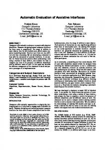
interfaces. In a paper by Rouanet et al [14], three user interfaces for navigating a robot through an obstacle course are tested empirically. Two of these user interfaces are implemented using the iPhone; one is a simulated keypad and another uses touch screen gestures. The third is an accelerometer based interface implemented using the Nintendo Wii Remote. While the selection of user interfaces in this study is very similar to our selection of user interfaces, the problem domain of navigating a physical robot in real space is completely different. Our experiment design was influenced by this paper in particular, but also the mobile video game related papers cited. 2. Scroll Shooter We developed the scroll shooter game for the iPod Touch using the game engine source code examples found in the book iPhone Game Development: Developing 2D and 3D Games in Objective-C by Paul Zirkle and Joe Hogue [15] as a starting point. Before the game was used for the experiment, we had four colleagues informally test the game in an effort to prevent using an interface with obvious flaws in the experiment. Several changes were made as a result of this informal feedback and will be mentioned. A screenshot of the gameplay is shown in Figure 1, note that the game is exclusively played and held in the “portrait mode” of the iPod Touch shown in the screenshot. The bottom portion of the screen, 100 pixels in length, is reserved for the simulated buttons in the case that the simulated button interface is selected. In the case that the touch gesture or accelerometer interface is selected, this section of the screen is left black. The player can move their ship anywhere within the top 380 x 320 pixel portion of the screen where the actual gameplay occurs. The game is played with a fixed overhead camera viewpoint, so unlike some games moving the player’s ship does not cause the view of the “‘game world” itself to change. An argument can be made that by leaving the bottom portion of the screen blank for two of the interfaces, we are forcing a limitation of the simulated buttons onto these interfaces and not presenting them in their optimal implementation. However, if the gameplay was extended into the bottom portion of the screen for the other two interfaces, the game would not be the same across all three interfaces. After some discussion we chose to keep the bottom portion of the screen blank in the inter-
Figure 1: Gameplay screenshoot
est of measuring performance with each interface without introducing an extraneous variable. In every interface, the player’s ship can move up, down, left, right, up-left, up-right, down-left and downright. The ship moves at a constant speed in the relevant direction; there is no momentum or acceleration to the ship’s movement. Finally, the player’s ship can fire rectangular red projectiles, at a rate no greater than one every 185 milliseconds. If these projectiles come into contact with an enemy ship, the projectile will disappear and the enemy ship will explode and disappear. There are three different enemy ships: H-Ships, SShips and T-Ships. All ships move from the top of the screen to the bottom of the screen with the same vertical velocity. T-Ships move horizontally in a sinusoidal pattern to make their destruction more difficult. S-Ships and H-Ships do not move horizontally. New ships are always initialized just outside the top of the gameplay screen, and then “fly into play”. H-Ships fire rectangular green projectiles directly forward. S-Ships fire four circular green projectiles at a time, two to each side, on an angle and with slightly different velocities. T-Ships fire blue circular projectiles, which at their time of firing are given a flight path towards the current location of the player’s ship on the screen, forcing the user to dodge the projectile. The player’s ship starts off with three “stars of health” as seen in Figure 1. If an enemy projectile or ship comes 3
Wave
into contact with the player’s ship, it is destroyed, and the player’s ship loses a health star. If the player’s ship loses all three health stars, it is also destroyed and gameplay concludes as a “game over” screen is presented to the user. In order to best judge the performance of the user interfaces it was decided that the users would be allotted three health stars instead of one to reduce the chances that a “fluke hit” would distort the results. The game can be played in either a demo mode, or one of three levels. In the demo mode, H-Ships are created randomly at different horizontal positions, and fire randomly. The purpose of the demo mode is to allow users to learn how to use the different user interfaces. Each level is a stack of events which occur in sequence, with enemy ships being created at the exact same time and position, and enemy ships firing at the exact same times, each time the same level is played. The end of a level is reached when all events have occurred and all enemy ships and projectiles are no longer in the gameplay screen, so long as the player’s ship has survived. The levels were created to be of approximately the same difficulty. The last events for each of the levels occur at 3 minutes and 30 seconds into gameplay, and as such each level can be considered to be approximately that long in length. In order to create levels of approximately equal difficulty, each level was broken down into 7 waves of 30 seconds each. Within each wave, independent of the level, the same number of TShips, S-Ships and H-Ships will appear, and they will fire projectiles the same number of times. However, for each level the order, position and timing in which these ships appear is different, as well as the position and timing of the projectiles. Play within each level gets progressively harder, as the number of ships created and projectiles fired in each wave increases. The details of the waves are found in Table 1. The levels were designed to get harder in a slow and steady fashion, to try to capture more precisely how users perform with each user interface. We believe that with this design the time played before the game over screen is reached becomes a more meaningful measure to compare user interface performance than if levels were consistently difficult, as time played reflects the ability of the player to survive at different levels of difficulty. Having the player’s ship destroyed by the first wave of enemy ships should be rare for even inexperienced gamers, and beating a level should be near impossible for even the most experienced gamers.
1 2 3 4 5 6 7
Time 0-30s 30-60s 60-90s 90-120s 120-150s 150-180s 180-210s Total:
Enemy Ships 5 10 15 20 25 30 40 145
Enemy Projectiles 5 15 25 30 40 70 165 350
Table 1: Enemy ships and projectiles for each wave
would expect. Tapping the fire button fires a projectile, holding a finger or thumb down on the fire button has no automatic fire effect, but the user can continually tap the fire button if they wish. When a finger is touching the up, down, left or right prongs of the d-pad, the player’s ship will move in that direction. When a finger touches the space in between the up and right prongs of the dpad, the player’s ship will move in that direction, and so forth. The user can drag their finger from one area of the d-pad to the next, and the ship will change direction, i.e. the user does not have to lift their finger off the d-pad and retouch another area of it to change directions. The d-pad of the simulated button interface has a length of approximately 13mm, for comparison’s sake the Nintendo DS Lite has a d-pad of length 18.6mm. While a larger d-pad would be ideal, it would cost more of the already limited gameplay portion of the screen. Early builds of the game used an even smaller d-pad, but the informal feedback received from colleagues for the smaller size of d-pad was very negative, whereas this size was deemed appropriate. The touch gesture interface responds to finger swipes across the screen and taps on the screen. The tapping and finger swipe movements can occur anywhere on the screen, either in the top gameplay portion or in the black panel at the bottom of the screen where the simulated buttons would appear in the simulated button interface, it makes no difference. Tapping the screen fires a projectile, and again holding a finger down has no automatic fire effect, but the user can continually tap the screen if they wish. Dragging or swiping a finger across the screen will cause the player’s ship to move in the up, down, left, right, up-left, up-right, down-left or downright direction that the finger is being dragged. When the finger is lifted up off the screen, the ship will stop moving. If the finger does not lift up, but is simply held in place after dragging in a given direction, the ship will continue to move in that direction. If the finger changes
The simulated button interface works much like one 4
direction as it is being dragged across the screen, the movement of the ship will change to reflect that new direction. So for instance in Figure 2, when the user started dragging their finger from point 1 to point 2, the player’s ship would move in an up-right direction. When the player started moving their finger from point 2 to point 3, the ship would move in an upwards direction, until the user lifted their finger from the screen.
be as symmetrical as possible, so as not to give one interface any obvious advantage during gameplay. This is why in every interface only the discussed eight directions of movement are available, the ship always has the same constant speed in whatever directions it is moving, and projectiles may only be fired at the maximum rate of one every 185 milliseconds. That said, one asymmetry is worth making note of. While it is very easy to both move the ship and fire projectiles with the simulated button and accelerometer interfaces, it is unreliable to do so with the touch gesture interface. Our attempts to use the multi-touch capabilities of the device to allow for this were unsuccessful, as tapping to fire can be interpreted by the game as a finger dragging gesture and the movement of the player’s ship may be temporarily affected. During informal testing we found that solutions to allow for tapping and dragging at the same time, like setting aside a portion of the screen for taps and a portion of the screen for dragging, were rejected by our colleagues for taking away from the simplicity of the current implementation. As such, we allowed this asymmetry between the user interfaces to remain. The game score starts at zero and increases in increments of 100 every time an enemy ship is destroyed; it is more for cosmetic effect to allow users to keep track of their progress. The game keeps track of other information during gameplay however, including: • total time played • number of player projectiles fired • number of player projectiles that connected with enemy ships
Figure 2: Touchscreen movement
The accelerometer interface responds to tilting and shaking the device. When the user gently shakes the device vertically, a projectile is fired. If the user continuously shakes the device projectiles will continue to be fired, but at a rate no greater than the maximum rate of one every 185 milliseconds. Starting with the device held in portrait mode, flat and parallel to the ground, if the user tilts the left side of the device towards the ground, the player’s ship moves to the left. Similarly tilting the right side of the device towards the ground moves the player’s ship to the right. Tilting the top of the device towards the ground moves the player’s ship up, and tilting the bottom of the device towards the ground moves the player’s ship down. By combining tilting of the device in different directions, the ship can be moved in the standard diagonal directions. The capabilities of the user interfaces were created to
• number of enemy ships destroyed • how much time the ship spends moving in each of the eight directions • how much time the ship spends in the nine sections of the screen denoted in Figure 3 We are obviously able to compute the accuracy of the user’s projectile firing attempts given the total projectiles fired and the number connected, a potentially interesting statistic. The sections of the screen for which we keep track of movement are uneven in size because we found in informal testing that users simply don’t move to the very top of the screen very often, for the obvious reason that it is a very risky gameplay manoeuvre. 5
5. Each user interface was demonstrated for the participant for about a minute. 6. The participant was given the chance to practice playing the game in the demo mode with each user interface (in whatever order) for no more than three minutes, or until the participant felt no more practice was necessary. 7. The participant played the game with a predetermined user interface, on a pre-determined level. 8. The participant answered the interface experience questionnaire for that user interface. 9. Steps 7-8 were repeated for the other two user interfaces and levels. 10. The participant completed the final postexperiment questionnaire. Because exactly 36 participants were recruited, all 36 possible combinations of level orders and interface orders were used for steps 7-8 of the protocol. Such a factorial experiment design [16] was used because if we always tested with the same level and/or interface orders, this could obviously skew the results, since, for instance, players could simply learn to play the game better regardless of the interface by the time they get to the third time playing with a level/interface. Several test environments were used, however they all included somewhere comfortable to sit down, which all participants did. The game was played by all participants without headphones or sound. We felt it important to allow participants to acclimate themselves with the user interfaces before playing through the levels. We did not want participants to lose while playing through a level because they were still learning how to use the interface on a basic level.
Figure 3: Screen sections
3. Experiment Design Experiment participants were gathered from both the student body of McMaster University and the general public. Recruitment was done with on-campus posters, department-wide e-mails to several departments in diverse areas of study, a wall post on a McMaster computer science Facebook group and broadcast-style oneto-many messages to one of the author’s Facebook friends. Word-of-mouth advertising also played a factor in recruitment as some participants recommended the experiment to others.
3.2. Quantitative Observations
3.1. Experiment Protocol
The quantitative observations were made using the data recorded by the game such as the total time played, ship movement, projectile accuracy, etc., which were discussed in Section 2. These quantitative observations are only recorded when the participants play through the levels, and not in the demo modes. Observations as to how the participant perceived each user interface were recorded with the interface experience questionnaire of Section 3.5. The data is given numerical values in order to quantify the experiences relative to one another in more precise terms than English descriptions of the experiences could provide.
The following protocol was followed with each experiment participant. The protocol refers to the preexperiment questionnaire in Section 3.4, the interface experience questionnaire in Section 3.5 and the postexperiment questionnaire in Section 3.6. 1. The participant read and signed a consent form. 2. The participant completed a paper copy of the preexperiment questionnaire. 3. The participant was told the goal of the experiment. 4. The rest of the experiment procedure was outlined for the participant. 6
3.3. Qualitative Observations The post-experiment questionnaire of Section 3.6 allowed for more informal English descriptions as to which user interface the participant preferred and why they preferred that interface. Any expressions that the participants made, such as expressions of frustration or jubilation, were recorded or made note of as well.
For analysis purposes these expertise levels were assigned the numeric values 1-5 from no expertise to expert. 3.5. Interface Experience Questionnaire The participants were asked to rate how much they agree (Likert scale) with the following statements: • S1 Using this interface was enjoyable.
3.4. Pre-Experiment Questionnaire The following information was gathered with the preexperiment questionnaire:
• S2 Learning this interface was easy. • S3 This interface was comfortable to use.
• Gender (M/F/Other)
• S4 Moving the ship was easy with this interface.
• Handedness (Right/Left/Ambidextrous)
• S5 Firing at enemies was accurate with this interface.
• Student at or graduated from a Computer Science or Software Engineering University or College program (Y/N)
• S6 Evading enemies and enemy projectiles was accurate with this interface.
• Student at or graduated from any University or College program (Y/N)
• S7 My intended actions were accurately carried out on screen when using this interface.
• Age
• S8 I feel like more practice time with this interface would have made a significant difference to my performance.
The participants were also asked to rate their expertise with the following different media and interfaces: mobile phones, console or PC video games, iPhone / iPod Touch (general usage), iPhone / iPod Touch video games, touch screen interfaces and accelerometer controls (e.g. Wii). Participants rated their expertise by selecting one of the following expertise levels, based on the description of the expertise level given to them:
The participants could choose from: disagree, somewhat disagree, neutral, somewhat agree and agree. Again for analysis purposes these descriptions were assigned numeric values 1-5 from disagree to agree. 3.6. Post-Experiment Questionnaire The following questions were asked on the postexperiment questionnaire. Beyond the restriction of selecting only one most preferred and only one least preferred user interface, this section was intended to be relatively “free form” where subjective experiences could be surveyed in a non-numerical manner. As such, participants were given boxes to write down why an interface was their most preferred and why an interface was their least preferred.
1. No Expertise I have never or almost never used this media/interface. I am not sure how to use this media/interface at all. 2. Some Expertise I use this media/interface 0-1 times a week on average. I can accomplish what I want using this media/interface, but do not feel sure that I know how to use it properly. 3. Typical Expertise I use this media/interface 2-3 times a week on average. I can accomplish what I want using this media/interface, and I feel sure that I know how to use it properly. 4. Above Average Expertise I use this media/interface 4-5 times a week on average. I would feel comfortable explaining how to use this media/interface to a friend. 5. Expert I use this media/interface 5+ times a week on average. I would feel comfortable writing an instruction manual on how to use this media/interface, including more advanced capabilities.
1. Which interface was your most preferred user interface? Select only one. 2. Why was this your most most preferred user interface? 3. Which interface was your least preferred user interface? Select only one. 4. Why was this your least preferred interface? 5. Is there anyway that you believe this experiment’s participant experience could have been improved? 7
4. Results and Discussion The 36 experiment participants, 13 females and 23 males, ranged in age from 19 to 43 with an average age of 26 and a standard deviation of 4.36. There were 4 left-handed, 2 ambidextrous and 30 right-handed participants. There were 26 participants who were either a student at or who had graduated from either a University or College program, and 13 of those graduated from a Computer Science or Software Engineering program. With a sample group of this age and education range, the results of this study cannot be extended in a statistically significant way to the general population of the world. However, given the reasonably random participant selection process, we believe some of our results are statistically significant for the sampled population of those who came in contact with the recruitment procedures that were outlined in Section 3. When we talk about results being statistically significant for the population, it is this population we refer to and not the general population. If we cannot say something about a result with a p-value of 0.05 or less, we do not consider the result to be statistically significant. In the case of establishing statistical significance for proportions, we make inferences based on the z-score for a sample proportion. In the case of establishing statistical significance for mean values, we compute the z-score for that sampled mean value. When we discuss one mean value’s significance relative to another, we compute the difference of the values in question for each participant, and then compute the proportion of participants for which a value is greater. We can then make inferences based on the z-score for this proportion. The data regarding participant expertise with various media and interfaces which was collected in the pre-experiment questionnaire is presented in Table 2. The average reported expertise with most of the interfaces/media was between “below average expertise” and “average expertise”. Interface/Media Mobile phones Console or PC video games Mobile video games iPhone / iPod Touch (general usage) iPhone / iPod Touch (video games) Touch screen interfaces Accelerometer controls (e.g. Wii)
Avg. 3.58 3.28 2.64 2.44 2.19 2.72 2.64
Figure 4: Most preferred user interface
The percentage of participants who most preferred each user interface is presented in Figure 4. One very statistically significant result was the overwhelming preference for the accelerometer interface. We can say with statistical significance (p-value 0.02) that the majority of the population most prefers the accelerometer interface. We cannot make a statistically significant comparison between the simulated button and touch gesture user interfaces. The percentage of participants who least preferred each user interface is presented in Figure 5. Unfortunately given how close the percentages are we cannot say anything statistically significant about which interface is least preferred from this data.
SD 1.11 1.11 1.1 1.42 1.33 1.11 1.13
Figure 5: Least preferred user interface
In the written feedback the participants gave several common reasons describing why the accelerometer interface was their most preferred. Virtually all of them wrote that the controls were either “intuitive”, “natural” or “easy to learn”. Other common reasons cited in-
Table 2: Participant expertise data - average and standard deviation
8
cluded the fact that it was easiest to fire projectiles and move at the same time, that their hands weren’t covering the screen and that the interface was more fun because this interface was a new type of experience for them. Amongst the comments of those participants who most preferred either the simulated button or touch gesture interfaces there was no real common thread as to why they most preferred those interfaces. The written feedback describing why each user interface was least preferred was fairly informative. In the case of the touch gesture interface, many participants complained that it was too difficult to fire and move at the same time. Several participants complained that their fingers would block the screen while playing the game. Several participants complained about the sensitivity of the ship’s movement relative to their finger’s movement, one describing it as like a “low sensitivity mouse”. Talking to the participants, we believe what they expected was for the ship to move either as fast as they swiped their finger and/or to where they swiped their finger. While this sort of implementation was not possible for this experiment in the interest of keeping the capabilities of the user interfaces symmetrical, we believe the participants make an excellent point. We believe either of these suggestions would give the interface a more intuitive feel as more properties of the finger’s physical movement, such as speed or location, would be directly translated into the properties of the ship’s movement in the game. A final point of particular interest with this user interface was that one female participant with long finger nails could not effectively control the ship with this interface, as both the skin and nail of her finger were contacting the device, and as a result this interface was essentially useless for her. In the case of those who least preferred the simulated button interface, a majority complained about a lack of responsiveness or a lack of accuracy in regards to ship movement. We do not believe this is due to a lag on a part of the game in detecting touches on the d-pad. We believe after talking to participants what was happening is that nearly the entire thumb of the participant was covering the d-pad, and so with nothing to see or feel, they were moving their finger around like it was a joystick or analog stick. However, if for instance a user who was moving right decided to move left, there would be a delay in the time that they started dragging their finger left and the time their finger was over the left prong of the d-pad, causing a perception of delayed response and/or inaccuracy. Finally a few others complained that the simulated button interface was uncomfortable, or that their fingers felt crowded on the screen. There were two common complaints amongst those
who least preferred the accelerometer interface. One was that focusing on the screen was difficult when the screen was being moved in order to play the game; a couple of participants complained about screen reflections in particular. The other was that shaking to fire was imprecise compared to tapping the screen or a simulated button. Table 3 contains the population’s average response to the interface experience questionnaire statements (found in Section 3.5), computed from our sample results with 95% confidence interval. The results for S1 indicated with statistical significance (p-value 0.05) that the majority of the population would more strongly agree that the accelerometer interface is enjoyable than either of the two other interfaces.
S1 S2 S3 S4 S5 S6 S7 S8
Touch Gesture 3.69±0.32 4.36±0.29 3.72±0.33 3.42±0.42 3.56±0.38 3.19±0.38 3.11±0.37 3.65±0.38
Accelerometer Simulated Button 4.50 ± 0.23 3.22 ± 0.36 4.58 ± 0.23 4.47 ± 0.32 3.97 ± 0.33 3.11 ± 0.42 4.14 ± 0.35 3.00 ± 0.49 3.61 ± 0.36 4.08 ± 0.35 3.94 ± 0.32 3.08 ± 0.39 4.11 ± 0.29 3.14 ± 0.45 4.36 ± 0.26 3.97 ± 0.35
Table 3: Interface experience questionnaire population average (95% confidence interval), computed from sample results
Looking at the results for S2 we should note that the percentage of the participants that either somewhat agreed or agreed that an interface was easy to learn was 81% for the touch screen gesture interface, 97% for the accelerometer interface and 92% for the simulated button interface. As a result we can say with statistical significance (p-value 0.01) that the majority of the population would either somewhat agree or agree that the interfaces were easy to learn. We believe this adds some credibility to our experiment method and results, as the vast majority of participants were not struggling to learn the interfaces themselves. The higher mean values of the accelerometer interface for the remainder of the statements is consistent with the preference for the accelerometer interface, and the interface performance statistics to be discussed. The results with regard to user interface performance contained some statistically significant differences. Likely the best metric of how “well” participants 9
performed in the game with each user interface overall was how long they lasted playing through a level before having their ship destroyed (no player completed/“beat” a level, as intended). Figure 6 shows the average time at which game over occurred with each user interface.
Total Shots Fired Total Shots Connected Shot Accuracy Shots Fired Per Second
Total Shots Fired Total Shots Connected Shot Accuracy Shots Fired Per Second Figure 6: Average time game over was reached for each user interface
Total Shots Fired Total Shots Connected Shot Accuracy Shots Fired Per Second
As participants played through three levels each, one for each interface, we observed that 67% lasted the longest with the accelerometer interface, 19% with the simulated button interface and 14% with the touch gesture interface. We can therefore say with statistical significance (p-value 0.04) that the majority of the population would last longer with the accelerometer interface than the other interfaces. On the other hand, 11% lasted the smallest amount of time in a level with the accelerometer interface, 42% with the simulated button interface and 47% with the touch gesture interface. However, these differences are not statistically significanct. The gameplay statistics relating to the firing of player projectiles are presented in Table 4. Some context is needed to interpret these results properly; the insight provided by the total shots fired and total shots connected statistics is limited by the fact that on average participants played much longer with the accelerometer interface than the others. As such we instead look at shots fired per second of gameplay, and we find with statistical significance (p-value 0.001) that the majority of the population fires more shots per second with the accelerometer interface than the touch gesture interface, but are unable to make further statistically meaningful comparisons. The shot accuracy statistics show no statistically significant differences between interfaces, which is consistent with the perception of participants reflected in the interface experience questionnaires.
Touch Gesture Avg. Min Max 80.14 17 316
SD 73.62
18.86
2
63
73.62
28%
7%
94%
16%
0.99
0.43
3.36
0.64
Accelerometer Avg. Min Max 150.53 34 431
SD 92.15
32.61
8
91
18.53
24%
5%
42%
10%
1.49
0.49
3.57
0.71
Simulated Button Avg. Min Max 117.06 2 564
SD 40.37
21.19
1
107
21.80
23%
7%
53%
12%
1.33
0.18
3.7
0.89
Table 4: Projectile-related gameplay statistics
Performance differences between the user interfaces in regards to movement of the player’s ship also showed some statistically significant differences. We recorded how long participants moved the player’s ship in each of the eight available directions, and this did not directly give us any interesting data because given the “boxed” nature of the gameplay a ship moves left about as much as it does right and down about as much as it does up. However, as presented in Table 5, we also looked at the percentage of time that a ship moved during gameplay (PTM) and the percentage of that time that the ship moved along one of the four available diagonal directions (PD). We found no statistically significant difference between the user interfaces in regards to PTM, however we found with statistical significance (p-value 0.001) that the majority of the population will 10
Pos. move more diagonally with the touch gesture user interface than the other user interfaces.
PTM PD
PTM PD
PTM PD
Touch Gesture Avg. Min Max 43% 19% 76% 31% 7% 69% Accelerometer Avg. Min Max 44% 21% 77% 7% 0% 31% Simulated Button Avg. Min Max 50% 25% 73% 11% 0% 35%
1 2 3 4 5 6 7 8 9
SD 14% 15% SD 12% 7%
Touch Gesture 10.6 ± 2.3 33.6 ± 5.6 11.7 ± 2.4 5.5 ± 1.6 21.6 ± 4.3 5.6 ± 1.5 1.5 ± 0.7 8.1 ± 3.4 1.8 ± 0.8
Accelerometer Simulated Button 18.2 ± 3.1 19.5 ± 3.6 40.7 ± 4.2 35.0 ± 3.6 21.7 ± 3.2 16.1 ± 2.7 3.1 ± 1.2 4.5 ± 1.0 8.5 ± 3.7 8.3 ± 2.1 3.0 ± 1.1 4.1 ± 1.4 1.2 ± 0.9 4.1 ± 1.9 2.7 ± 1.5 6.4 ± 2.9 1.0 ± 0.53 2.1 ± 0.8
Table 6: Player’s ship position population average (95% confidence interval), computed from sample results
SD 12% 8%
to whether participants felt their intended actions were carried out on screen correctly using the touch gesture interface, indicating that the actions the users did carry out were intended. This suggests that the differences in gameplay style observed for the touch screen interface were really intended by the participants and not accidental. Looking at how closely aligned preference for a user interface was aligned with performance within a user interface, all but 5 participants most preferred the user interface that they performed best in the game with (lasted longest until game over), and all but 11 participants least preferred the interface that they performed worst with. It is possible that preference for an interface causes better performance with that interface, or that better performance with an interface causes a preference for that interface. Determining if either of these situations was the case for our experiment was beyond the aims of this research, but we note that the literature indicates that preference for and performance with an interface are not necessarily correlated [17]. We also tried to find any statistically significant correlations between gender, age or prior experience with media/interfaces and either performance with or preference for user interfaces. One interesting gender difference was that every single participant who most preferred the simulated button interface was male, and 8 out of the 13 females least preferred the simulated button interface. We can speculate that perhaps this is due to the fact that more males grew up playing video game consoles which use d-pads, however the pre-experiment questionnaire does not show a statistically significant difference between male and female expertise with console and PC video games. Other than this however, any differences found when comparing results that have been filtered for certain participant characteristics did
Table 5: Movement-related gameplay statistics
Recalling the gameplay screen positions of Figure 3, the percentage of time (95% confidence interval) that the population will have the player’s ship located in each position is presented in Table 6. One thing that we noticed observing the participants playing the game was that they tended to stay at the bottom of the screen (positions 1-3) during much of the gameplay, a good strategy to be sure, but that they did so less in the case of the touch gesture interface. Strictly looking at the average percentage of time spent at any of the positions 4-9, the portion of the gameplay screen above positions 13, we found values of 44.10%, 19.43% and 29.48% for the touch gesture, accelerometer and simulated button interfaces respectively. We are able to say with statistical significance (p-value 0.001) that the majority of the population will spend more time in positions 4-9 with the touch gesture interface than the accelerometer interface, and with statistical significance (p-value 0.01) that the majority of the population will spend more time in positions 4-9 with the touch gesture interface than with the simulated button interface.
We have found that the touch gesture interface led to more diagonal movement and for the player’s ship to be more likely positioned at higher positions of the gameplay screen than other interfaces. The interface experience questionnaire response for S7 found in Table 3 does not show strong disagreement with regards 11
not yield statistically meaningful or noteworthy results.
Looking at heuristic H3, we believe that for instances where diagonal direction input is either required from or desired by the user, an interface similar to our touch gesture interface is preferred. This is based on our results showing that participants moved diagonally more with the touch gesture interface than the others. We believe users were simply finding it easier to essentially draw a diagonal line with their finger across the screen to move diagonally than to alternatively try to dip the device in two different directions at the same time to move diagonally. Regarding heuristic H4, the written and verbal feedback provided to us by the participants indicated that they wished they could manipulate the sensitivity of the touch gesture user interface. Much like an operating system allows one to manipulate the sensitivity of a mouse, we believe the same should be true of touch screen and accelerometer interfaces which depend upon physical gestures. Finally, H5 is the heuristic we believe may prove to be the strongest and most generalizable. We strongly believe based on the written and verbal user feedback that disappointment with the touch gesture interface was related to the fact that gestures on the touch screen did not lead to “intuitively expected” results. Participants would swipe their finger up and to the right and their ship would move up and to the right, but participants would complain that it would not move as fast as they swiped their finger or to the position that they swiped their finger. We believe what was actually at issue was that the participants felt intuitively that the ship’s movements would mimic the real-world properties of their gesture movement. When these physical properties were not translated into the gameplay, that intuition was left unrealized and the participant had to “re-think” what they knew about movement for the game world. We speculate that this was not the case for the accelerometer interface because the participant’s intuition about the physical properties of the gestures involved was more directly translated into the game world. If a marble were resting on the iPod Touch as it was being held flat and parallel to the ground, and a user were to tilt the device downward in a given direction, the marble would move (and ultimately fall off) in that direction. Similarly, with our accelerometer interface the player’s ship moves in the direction that the user tilts the device. Physical properties and intuitions about movement in this case are translated into the gameplay. Heuristic H5 essentially works under the premise that we should not force users to (re)learn anything. They should be able to use their pre-existing understanding of the physical world to control the device as much as pos-
5. Conclusion The main purpose of this work was to derive design heuristics for mobile user interfaces based on the data and insights from our experiment. We must be cautious and note that our design heuristics are based on a single experiment involving one type of mobile video game, with a sample not large or diverse enough to be representative of the human population as a whole. In particular, we believe our design heuristics for mobile user interfaces are relevant for mobile video games and non-games with input requirement scenarios that may resemble the gameplay of the scroll shooter game. That said, we believe that this study shows that it is relatively inexpensive to get statistically significant results regarding user interface preferences. We hope that manufacturers will consider using the approach used in this paper to test user interfaces in-house before releasing them. Our list of design heuristics in no particular order of significance is as follows: • H1 An accelerometer-based user interface should be available. • H2 Multiple user interfaces should be available. • H3 Touch gestures should be utilized when diagonal direction input is either required from or desired by the user. • H4 Interface sensitivity should be configurable. • H5 Physical properties of gestures should be directly translated into virtual properties. Firstly, regarding heuristic H1, we believe that considering the strong consensus found in our results that the accelerometer interface was both most preferred by the participants and elicited the best participant performance, that an accelerometer-based interface should essentially always be made available if feasible. Though they were the minority, given the significant number of participants who most preferred other interfaces or performed better using other interfaces we suggest in heuristic H2 that a multiple user interface implementation of a game is the best solution if feasible. We also suggest this sort of multiple interface implementation because of the participant who was simply unable to use an interface effectively due to her finger nail length; it may be possible that some users just cannot use certain interfaces. 12
sible. We suggest that in many problem domains this is best accomplished when as many of the physical properties of the gesture as possible are translated as directly as possible into the virtual properties of the interface’s reaction to that gesture. In order to determine how novel this idea is we have conducted a literature search. We believe this idea is similar to the direct manipulation human-computer interaction style [18], where virtual interfaces are designed using an appropriate physical model of reality, in the sense that the user’s understanding of the physical world is used to help them more easily use a virtual interface. This idea is also related to Affordances, situations where an object’s sensory characteristics intuitively imply its functionality and use, as proposed by Donald Norman [19]. The principle of the moving part of the thirteen principles of display design advocated by Wickens et al [20] suggests that moving elements on a display which represents some real world system move in a way which is compatible with the user’s mental model of that system. Again, this is an example of an understanding of the physical world being used to help the user more intuitively understand the interface. Turning our attention towards industry documentation for mobile user interfaces, we looked at the user interface guidelines provided by Research in Motion for the Blackberry devices [21], the iPhone human interface guidelines provided by Apple [22], the human interface guidelines provided by Palm for webOS [23] and finally the user interface guidelines for Android provided by Google [24]. All of these documents contain the user interface guidelines (i.e. principles and heuristics) currently being suggested to the developers working with these platforms. Apple’s human interface guidelines suggest that a developer should, when possible, “model your application’s objects and actions on objects and actions in the real world”, which is related to our suggestion but not the same. Though in our literature search we found arguments for incorporating understanding of the physical world in gestures, we couldn’t find anything advocating specifically what we are advocating with this heuristic regarding physical property translation. As an example of what we are suggesting, consider the swiping motion a user makes with their finger to go from one page of applications to the next on an iOS device such as an iPod Touch. This could have been programmed in such a manner that any swipe from right to left on the screen would instantly move the screen a page over to the right, which would still take advantage of the user’s understanding of the physical world. But instead the page also flips over at a speed relative to how quickly you swiped your finger. Strictly speaking
this is not necessary, as the device would be as capable of switching pages without this feature of the interface, but we believe this gives the device a more natural feel and makes it more enjoyable to use. What we suggest is not just that the expected result of a gesture in the physical world be reproduced in the interface, but that as many physical properties as possible of the gesture are translated into the effect of the gesture. However, we caution that this approach may be less useful in problem domains in which translating as many physical world properties of the gesture as possible into the state of the interface makes the software too hard to use. For example, we would expect that a golf game with an accelerometer interface that fully translated every aspect of a real world golf swing into a virtual world would become less satisfying for some participants who lack the ability to swing a golf club properly. We have no data to suggest that this is the case, but it is something we feel should be explored. We propose for future work further experiments which would investigate turning heuristic H5 into a stronger mobile user interface design principle: Principle of physical property translation for gestures • Whenever possible the interface should emulate behaviour expected in the physical world in response to gesture interactions. • As many of the physical properties (speed, position, etc.) of touch screen and accelerometer gestures as possible should be translated as directly as possible into virtual properties of the in-game (or in-software) change in state, so long as these properties are reasonably within the abilities of the user. We propose this principle of physical property translation for gestures as a hypothesis which should be tested with experiments designed to quantify it in a diverse set of problem domains, ideally with a much larger and more diverse set of participants. For a diverse set of problem domains, different gesture-based interfaces which translate progressively more physical properties of the gesture into the gameplay or software state should be implemented, and then tested against the set of participants for performance and preference differences. If the principle is not falsified by these experiments then we believe the next step would be the construction of formalized laws quantifying expected user satisfaction for gesture-based interfaces which take into account user expertise and ability as well as the number 13
and type of physical properties being translated, and the fidelity of those translations. Regarding generalizability of the heuristics beyond mobile video games with similar input requirements, we believe that heuristics H1 and H3 may be less generalizable than the other heuristics. For example, if multiple user controlled objects are on screen, heuristic H1 may simply not apply as the input requirements are different than the scroll shooter. Regarding heuristic H3, it is possible that waving the device could provide diagonal direction input as effectively as the touch screen gesture interface, but our experiment did not cover this possibility. We believe that heuristics H2, H3 and H5 have the most potential to be generalized but believe that such generalization is dependent on conducting further experiments.
[13]
[14]
[15] [16]
[17] [18]
References
[19]
[1] I. Sherr, Global smartphone shipments to double in four years - iSuppli, http://www.totaltele.com/view.aspx? ID=456081, 2010. Last accessed August 31st, 2010. [2] Gartner says worldwide media tablet sales on pace to reach 19.5 million units in 2010, http://www.gartner.com/it/page. jsp?id=1452614, 2010. Last accessed May 28th, 2011. [3] Canalys, Majority of smart phones now have touch screens, http://www.canalys.com/pr/2010/r2010021.html, 2010. Last accessed August 31st, 2010. [4] J. Jefferson, Mobile Gaming Expected To Soar as Focus Turns to Cell Phones, http://www.brighthand.com/default. asp?newsID=16916&news=Mobile+Gaming+Consoles+ Decline, 2010. Last accessed August 31st, 2010. [5] Y. Dadashi, Fundamental Understanding and Future Guidance for Handheld Computers in the Rail Industry, Ph.D. thesis, University of Nottingham, 2009. [6] T. Yamabe, V. Lehdonvirta, H. Ito, H. Soma, H. Kimura, T. Nakajima, Applying pervasive technologies to create economic incentives that alter consumer behavior, in: Ubicomp ’09: Proceedings of the 11th international conference on Ubiquitous computing, ACM, New York, NY, USA, 2009, pp. 175–184. [7] S. Chatterjee, S. Chakraborty, S. Sarker, S. Sarker, F. Y. Lau, Examining the success factors for mobile work in healthcare: A deductive study, Decis. Support Syst. 46 (2009) 620–633. [8] S. Segan, RIM BlackBerry Storm 9530 (Verizon), http: //www.pcmag.com/article2/0,2817,2331977,00.asp, 2008. Last accessed August 31st, 2010. [9] B. Cha, RIM BlackBerry Storm (Verizon Wireless), http://reviews.cnet.com/smartphones/ rim-blackberry-storm-verizon/4505-6452_ 7-33311850.html#reviewPage1, 2008. Last accessed August 31st, 2010. [10] A. Sharma, S. Silver, BlackBerry Storm Is Off To Bit of a Bumpy Start, http://online.wsj.com/article/NA_WSJ_ PUB:SB123292905716613927.html, 2009. Last accessed August 31st, 2010. [11] P. Gilbertson, P. Coulton, F. Chehimi, T. Vajk, Using “tilt” as an interface to control “no-button” 3-d mobile games, Comput. Entertain. 6 (2008) 1–13. [12] C. Wei, G. Marsden, J. Gain, Novel interface for first person shooting games on pdas, in: OZCHI ’08: Proceedings of the
[20] [21] [22] [23]
[24]
14
20th Australasian Conference on Computer-Human Interaction, ACM, New York, NY, USA, 2008, pp. 113–121. F. Chehimi, P. Coulton, Motion controlled mobile 3d multiplayer gaming, in: ACE ’08: Proceedings of the 2008 International Conference on Advances in Computer Entertainment Technology, ACM, New York, NY, USA, 2008, pp. 267–270. P. Rouanet, J. Bechu, P.-Y. Oudeyer, A comparison of three interfaces using handheld devices to intuitively drive and show objects to a social robot: the impact of underlying metaphors, 2009. P. Zirkle, J. Hogue, iPhone Game Development: Developing 2D and 3D Games in Objective-C, O’Reilly Media, 2009. T. Lundstedt, E. Seifert, L. Abramo, B. Thelin, sa Nystrm, J. Pettersen, R. Bergman, Experimental design and optimization, Chemometrics and Intelligent Laboratory Systems 42 (1998) 3 – 40. A. D. Andre, W. C. D., When users want whats not best for them, Ergonomics in Design 3 (1995) 10–14. B. Shneiderman, The future of interactive systems and the emergence of direct manipulation, in: Proc. of the NYU symposium on user interfaces on Human factors and interactive computer systems, Ablex Publishing Corp., Norwood, NJ, USA, 1984, pp. 1–28. D. A. Norman, The Psychology Of Everyday Things, Basic Books, 1988. C. D. Wickens, J. Lee, Y. D. Liu, S. Gordon-Becker, Introduction to Human Factors Engineering (2nd Edition), Prentice-Hall, Inc., Upper Saddle River, NJ, USA, 2003. Research In Motion, Blackberry Smartphones UI Guidelines, 2010. Version 2.4. Apple Inc., iPhone Human Interface Guidelines, 2010. 2010-0803. Palm Inc., Human Interface Guidelines, http://developer. palm.com/index.php?option=com_content&view= article&id=1836&Itemid=52&limitstart=2, 2010. Last accessed September 2nd, 2010. Google Inc., User Interface Guidelines, http://developer. android.com/guide/practices/ui_guidelines/ index.html, 2010. Last accessed September 2nd, 2010.