analyzing a large data set on the customers, the structure of data can be highly ... methods in analyzing the web customer data and compared their rela-.
Customer Data Mining and Visualization by Generative Topographic Mapping Methods Jinsan Yang and Byoung-Tak Zhang Artificial Intelligence Lab (SCAI) School of Computer Science and Engineering Seoul National University Seoul 151-742, Korea {jsyang, btzhang}@scai.snu.ac.kr Abstract Understanding various characteristics of potential customers is important in the web business with respect to economy and efficiency. When analyzing a large data set on the customers, the structure of data can be highly complicated due to the correlations and redundancy of the observed data. In that case a meaningful insight of data can be discovered by applying a latent variable model to the observed data. Generative topographic mapping (GTM) [2] is a latent graphical model which can simplify the data structure by projecting a high dimensional data onto a lower dimensional space of intrinsic features. When the latent space is a plane, we can visualize the data set in the latent plane. We applied GTM methods in analyzing the web customer data and compared their relative merits on the clustering and visualization with other known method like self-organizing map (SOM) [10] or principle component projections (PCA). When applied to a KDD data set, GTM demonstrated improved visualizations due to its probabilistic and nonlinear mapping.
KEYWORDS: visualization, generative topographic mapping (GTM), self-organizing map (SOM), clustering, web data mining
1
Introduction
The complexity and amount of data in commercial and scientific domain grow explosively by the advance of data collecting methods and computer technologies and the development of internet has changed patterns and paradigm of business in an unprecedented way The application of data mining techniques to web data and related customer information is important with respect to economy and efficiency. For efficient analysis of such data, the understanding of structure and characteristics of data is essential. The complex nature of data can
be expressed through various models. The model from biological origin is the neural networks which is inspired from extraordinary capabilities of biological systems (via ensembles of neurons) in learning a complex task. By training the neurons in the artificial neural networks the case with several input features can be classified with (supervised) or without (unsupervised) knowing the target [8]. A graphical approach for expressing the data structure can be done by using Bayesian belief networks which show graphically the inter-relations of the various features with local conditional probabilities and log-likelihood of fitness [14]. More direct and intuitive methods of expressing the data structure are the visualization of data through dimension reduction from data space into the visible 2D or 3D space. One of traditional methods is PCA by projecting the data into a lower subspace through minimizing errors. PCA intrinsically assumes that the given data structure can be modeled by linear or flat planes and can show meaningful data structure when this is the case. For the general nonlinear case, SOM is used for visualization. SOM can reflect the structure of the data [10] by expressing the cluster centers in the 2D plane topographically. By selecting the winning node in the plane for each data point, the high dimensional data can be visualized. GTM [2] is a more flexible way of data visualization using a generative model based on their posterior likelihood. GTM can be thought as a nonlinear PCA [7]. Like SOM, GTM maps high dimensional data into a visible 2D plane using predetermined grid. By selecting each grid point in probabilistic way, GTM can project each data point over the entire plane allowing better visualizations. GTM can be connected with SOM by regarding the latent vector as a neuron and the basis function as a connecting strength between neurons [9]. For the clustering of data, we projected the data into the latent space and performed the clustering analysis using k-means clustering algorithm. For the case of SOM, [16] has used the node set as a projection of data for the clustering. But due to the limitation of nodes, the projection is limited to the given nodes (compare Figure 4 and 5 in Section 3). We will explain more details about GTM in Section 2 and apply them in analyzing the KDD 2000 data of web customers. In section 3, the results of analyzing KDD data under several feature selections are discussed. In section 4, some conclusions and future works are discussed.
2
Visualizing complex data by generative topographic mapping
In the analysis of high dimensional data, there are several extensively used dimension reduction methods. The latent variable model is one of the methodologies by assuming hidden variables and finding the relationships between observed data and hidden variables. GTM can be regarded as a nonlinear generalization of factor analysis to model the nonlinear mappings between latent space and data space. The complexity of data can be taken as a reflection of the intrinsic features or factors and if we can express the data in terms of this intrinsic
features, the data complexity can be greatly reduced allowing correct and easy analysis. GTM assigns each data point to a set of grids based on a probabilistic model (soft clustering) while in SOM the data point is assigned to the closest node or neuron to the data point (hard clustering). Since in GTM, each grid can assume a posterior probability of taking a data point, the clustering can be expressed over the whole latent space. SOM is an unsupervised neural network algorithm inspired from the biological phenomenon of human brain. When the external images are perceived in the sensory cortex of brain, part of the neurons are stimulated to respond for the incoming spatial images. Similarly SOM maps each high dimensional data point to a 2 dimensional array of nodes preserving topologies of the data structure. By updating reference vectors repeatedly the data structure is reflected in the nodes of the plane. The expression of data structure by SOM is limited on the given node set by winner-take-all selection method and the relationship between data and node set is ambiguous. GTM allows more flexible expression by adopting soft clustering through responsibility of each data point. GTM is a nonlinear PCA for a set of basis functions and much more flexible than PCA when the relationship between feature and latent variable is not linear. The basic assumption of GTM is through a generative model which defines a relationship between data space and latent space [2]. For t ∈ RD (a data space), x ∈ RL (a latent space) with noise e and a parameter matrix W , the form of generative model of a non-linear mapping y becomes t = y(x, W ) + e where y(x, W ) is a product of basis function and weight vector for each observed data. The data point is assigned according to its posterior probability or responsibility. The responsibility of assigning the n-th data point to the k-th grid point is p(tn |xk , W )p(xk ) rkn = p(xk |tn , W ) = p(tn |W ) To avoid computational difficulties in calculating the denominator, the distribution of x in the latent space is assumed to be a grid. p(x) =
K 1 � δ(x − xk ) K k
Under appropriate settings, it can be shown that this grid vector in the latent space corresponds to a neuron of the SOM and the corresponding basis function corresponds to a binding strength between data and neuron [9]. The basis functions usually consist in three different forms corresponding to bias, linear (polynomial) trends and nonlinearity of the data {1, x, Φ(µ; σ 2 )} where Φ is a Gaussian kernel. Given the specified grid and a set of basis functions, the data can be modeled
iteratively using EM algorithm by updating the parameter matrix W (M-step) and assigning each data point according to its responsibility (E-step). After modeling the data structure, the data can be projected into the latent space according to the posterior probabilities of grid points for visualization. We analyzed a real web data using topographical mapping methods and compared their visualization aspects in great detail in the next section. selection criteria selected feature sets
Discriminant analysis v229, v240, v304 v368, v283, v396 v394, v80
Decision trees v234, v237, v240 v243, v245, v304 v324, v368, v374 v412
naive Bayes v18, v108, v229 v369, v417, v451 v452, v457
Table 1: The composition of feature sets from the three different selection criteria
3
Web customer data mining and visualization
KDD Cup 2000 data (Question 3) is a record of the web customers who have visited an internet company, Gazelle.com which sells leg care/wear items during the period of Jan. 30, 2000 ∼ March 30, 2000. Understanding these customers can save lots of money and time and provide a useful directions for future marketing and saling of this company. The primary concern of the company is to analyze the characteristics between heavy spenders who spend over $12 and light spenders who spend less than $12. The data has 426 features over 1700 cases with a target variable for indication of heavy/light spenders. The features are various measurements of categorical, discrete and continuous characteristics. Examples of features include residence area (categorical), age (discrete), income (discrete), rate of discounted items (continuous) and so on.
3.1
Feature selection
Since there are over 400 various measurements of features in the data set, appropriate feature selection for the purpose of data analysis is necessary before applying the latent variable model. Feature selection process [3] is summarized in the following four steps: (1) generation of feature set (2) evaluation by specific criteria (3) stopping conditions (4) validation by test set. In each step of the selection process an appropriate evaluation method has to be assumed. Distance measure and information gain are two typical selection criteria for the measure of discrimination of clusters. The distance measure is used in evaluating the feature set by measuring the distance between clusters while the information gain is used by measuring the prior and posterior entropy for the feature set. The distance measure used for instance in the discriminant
1
0.8
0.6
0.4
0.2
0
−0.2
−0.4
−0.6 −1
−0.8
−0.6
−0.4
−0.2
0
0.2
0.4
0.6
1
0.8
0.6
0.4
0.2
0
−0.2
−0.4
−0.6
−0.8
−1 −1
−0.8
−0.6
−0.4
−0.2
0
0.2
0.4
0.6
0.8
1
−0.8
−0.6
−0.4
−0.2
0
0.2
0.4
0.6
0.8
1
0.8
0.6
0.4
0.2
0
−0.2
−0.4
−0.6
−0.8
−1 −1
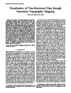
Figure 1: Three GTM plots of KDD data by the feature set selected from discriminant analysis (above), decision tree (middle) and naive Bayes criteria (below) .(o: light spender, x: heavy spender)
90
80
70
60
50
40
30
20
10
0
−10 −10
0
10
20
30
40
50
60
70
80
Figure 2: The PCA plot of KDD data ( ’x’: heavy spenders ’o’: light spenders
analysis is the Mahalanobis distance that is a generalization of Euclidian distance. The densities of each class can be assumed as multi-variate normal or can be estimated by non-parametric density estimations based on kernels or k-nearest neighbor methods [6]. For the selection method, distance measure uses stepwise selections to avoid the redundancy in the feature set. The selection of attributes in the discriminant analysis can be controlled by adjusting the threshold values of selection criteria. On the other hand the decision tree algorithm [12] is utilizing the information gain and the features in the pruned trees can be selected. Other than above two, naive Bayes classifiers [11] select features by calculating the posterior probability of feature selection assuming the conditional independence of features given the target value. Table 1 shows different sets of features in the KDD data which are selected by each selection method mentioned in the previous section. The discount rate in ordered items (v229,v234 ∼ v237), the weight of items (v368, v369) are common for all three methods and the minimum order shipping amount (v304) is common for the first two selections. The third selection contains several interesting features: the geographic location (v18), products purchased on Monday (v108), number of lotion, men, children product views (v417, v451, v452) and average time spent for each page view (v457). The features about men’s sports collections (v283), house value (v80), number of free gift (v394), vender (v396) views are in the first selection set. Order line amount (v243, v245), number
1 0.8
0.6
0.4
0.2 0
−0.2
−0.4
−0.6 −1
−0.8
−0.6
−0.4
−0.2
0
0.2
0.4
0.6
Figure 3: The GTM plot of KDD data with 7 clusters. ’x’: heavy spender, ’o’: light spender
of leg care, replenishment stock, main template views (v324, v412, v374) are among the second set. In Figure 1, the plots of three methods applied to the KDD data are compared with respect to the clustering and visualization. The first plot shows a cluster of light spender and three groups of heavy spenders. The second plot has two clusters of light spenders and a cluster of mixed spenders. The third one shows two clusters of light spenders mixed with heavy spenders. The performance of each selection method depends on the nature of data and it is not easy to see which method is better than the others with respect to the visualization.
3.2
Data mining and visualization
We selected 8 variables by parametric discriminant analysis with 75.1 % of canonical correlation rate and used them for the analysis of KDD data. In PCA plot (Figure 2), the clustering of heavy/light spenders is not so evident. Especially in one cluster (the bottom left cluster in Figure 2) they are heavily mixed indicating non-linear trend of KDD data. Such ambiguities are greatly resolved in GTM plot (Figure 3) where the clusters are divided and reshaped into 7 clusters. The heavy spenders are divided
Figure 4: The SOM of KDD data marked with 7 clusters of GTM. The darker color indicates longer distance between neurons
Figure 5: The SOM for the whole set and for each variables: v229,v240,v368 ,v283,v396 and v80
1
0.8
0.6
0.4
0.2
0
−0.2
−0.4
−0.6
−0.8
−1 −1
−0.8
−0.6
−0.4
−0.2
0
0.2
0.4
0.6
0.8
1
0.4
0.3
0.2
0.1
0
−0.1
−0.2
−0.3
−0.4 −0.4
−0.3
−0.2
−0.1
0
0.1
0.2
0.3
0.4
0
0.05
0.1
0.15
0.2
0.25
0.3
0.35
0.3
0.2
0.1
0
−0.1
−0.2
−0.3
−0.4 −0.05
Figure 6: The hierarchical GTM plot of KDD data. The three plots are for clusters 1, 2 and 6 each from top to the bottom
cluster # heavy /light spenders wear frequently (·/overall%) hear from (·/overall%) residence area (·/overall%)
1 76/9
2 141/10
3 62/0
4 0/38
hosiery (34.2%/17.6%) friend/family (6.6%/33.4%) west (27.6%/15.2%)
hosiery (29.6%/17.6%) friend/family (9.9%/33.4%) west (27.6%/15.2%)
hosiery (38.3%/17.6%) other (40.3%/29.4%) east (53.2%/39.5%)
trouser socks (24.3%/15.2%) other (54.1%/29.4%) east (94.6%/39.5%)
Table 2: The composition of seven clusters and their characteristics cluster # heavy /light spenders wear frequently (·/overall%) hear from (·/overall%) residence area (·/overall%)
5 3/46
6 89/1297
7 3/117
.
casual socks (34.3%/27.8%)
athletic socks (47.9%/17.0%)
friend/family (46.7%/33.4%) middle (26.7%/15.9%)
west (49.9%/15.2%)
Table 3: The composition of seven clusters and their characteristics (cont’d from Table 2.) into cluster #1 (mixed with 11.84% of light spenders). #2 (mixed with 7.09% of light spenders) and #3 (not mixed) and the light spenders are divided into clusters #4 (not mixed), #5 (mixed with 6.12 % of heavy spenders), #6 (mixed with 6.86% of heavy spenders) and #7 (mixed with 2.56% of heavy spenders). Each cluster shows its own characteristics (Table 2 and 3). One notable result is the formation of cluster #4 which is exactly the group of people who have more than 40% of discounted items in their ordering. Facts from the KDD data indicate that customers who know the company by hearing from friend/family are light spenders ($8.80), by other way are heavy spenders ($32.19) and customers wearing athletic and casual socks are light spenders. Clusters #1 ∼ #3 reflect the first two facts and clusters #6 and #7 reflect the third fact (Tables 2 and 3). In Figure 4, the analysis of KDD data by SOM is proved in U-Matrix (unified distance matrix) with labels of clusters and component-wise SOM plots for each feature are also provided. The U-matrix in the SOM visualizes the relative distance between the neurons by different tones of coloring scales (in Figure 4, darker color represent larger distances between neurons as indicated in the middle scale bar)
There appear about 7 ∼ 9 clusters in the SOM plot divided by dark boundary of the scaled grey level. Clusters #7, #4, #3 and #6 can be identified easily whereas clusters #1,#2 and #5 are expressed as two clusters each. In component-wise SOM (Figure 5), v229 (the rate of discounted item in order) and v240 (rate of friend promotion in order) highlight clusters #1∼#3, clusters #4 and #5 whereas v304 (minimum shipping amount) highlights #4. For KDD data, PCA does not show the structure of the data since the complexity of data goes beyond linearity. In SOM, several clusters are visualized but there still remains some ambiguity since the expression is limited up to the node set. Much flexibility is allowed in GTM since data points can be expressed over the whole latent plane expressing each cluster more compactly. For instance, cluster #4 (lower left corner) in SOM plot (Figure 4) is expressed in GTM as a point reducing ambiguity greatly. To understand the characteristics of data of complex features, we visualized hierachically the structure of data into the latent plane by GTM in Figure 3 for clusters 1,2 and 6. Depending on the purpose of analysis, each cluster can be further visualized.
4
Conclusions and discussions
We have used GTM for mining a real-life web data. Applied to the KDD Cup 2000 data, the results were compared with those of PCA and SOM. GTM showed a meaningful cluster structure and provided a clear underlying structure of clusters. Since GTM relies on a generative model for the visualization, features are assumed to take continuous measures and categorical variables are not considered in the formation of modeling. Missing values are treated as taking another value (= 0) in this analysis. If they are approximated properly, a more informative results can be expected. Automatic visualization system based on GTM can be developed with proper parameter selection plans as a future application. When the structure of data is changing dynamically through time, the corresponding visualization process would be much more complicated. Appropriate methods are waiting for the future development.
Acknowledgement This work was supported by BK21-IT Program, Brain Science and Engineering Project and IITA.
References [1] Ansari,S., Kohavi R., Mason, L. and Zhang, Z.(2000). Integrating ecommerce and data mining, Technical report Blue Martini Software, CA.
[2] Bishop, C.M., Svenson, M. and William, C.K.I. (1998) GTM: The generative topographic mapping. Neural Computation, 10(1). [3] Dash, M. and Liu, H. (1997) Feature selection for classification. Intelligent Data Analysis, Vol.1, no. 3. [4] Famili, A. and Bruha, I. (2000) Workshop on post -processing in machine learning and data mining: interpretation, visualization, integration and related topics. The sixth ACM SIGKDD International Conference on Knowledge Discovery and Data Mining. [5] Fayyad, U., Shapiro, P., Smyth, P., Uthurusamy R. (1996) eds. Advances in Knowledge discovery and data mining. CA, AAAI Press. [6] Hand, D.J. (1981) Discrimination and classification New York: John Wiley & Sons. [7] Hastie, T. and Stuetzle, W (1989) Principle curves. Journal of the American Statistical Association, 84(406): pp. 512-516 [8] Haykin, S. (1999) Neural Networks: A Comprehensive Foundation. Upper Saddle River, N.J., Prentice Hall. 2nd ed. [9] Kiviluoto K. and Oja E. (1997) S-Map: A network with a simple selforganizing algorithm for generative topographic mappings. NIPS Vol.10, pp.549-555. [10] Kohonen, T. (1990) The self-organizing map. Proceedongs of the IEEE 78(9): pp. 1464-1480 [11] Kontkanen, P., Myllymaki, P., Silander, T. and Tirri, H. (1998) BAYDA: Software for Bayesian classification and feature selection. CA, AAAI Proceedings. [12] Quinlan J. (1986) Induction of decision trees. Machine Learning, 1:pp. 81106. [13] Rao, C.R. (1964) The use and interpretation of principle component analysis in applied research. Sankhya A, 26, pp. 329-358. [14] Spiegelhalter, D.J., David, A.P., Lauritzen, S.L., and Cowell, R.G. (1993) Bayesian analysis in expert systems. Statistical Science , 8, pp. 219-247. [15] Vesanto J. (1999) SOM-based data visualization methods. Intelligent Data Analysis, Vol. 3, no. 2. [16] Vesanto J. and Alhoniemi E. (2000) Clustering of the Self-Organizing Map. Transc. on Neural Networks, Vol.11, No.3, pp.586-601.