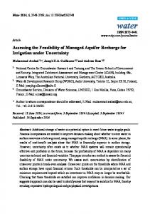
ASSESSING THE FEASIBILITY OF SELF-ORGANIZING MAPS FOR DATA MINING FINANCIAL INFORMATION Tomas Eklund Turku Centre for Computer Science and IAMSR / Åbo Akademi University, Turku, Finland Phone: +358 2 215 3334, Fax: +358 2 215 4809 E-mail:
[email protected] Barbro Back Åbo Akademi University, Department of Information Systems, Turku, Finland Phone: +358 2 215 4750, Fax: +358 2 215 4809 E-mail:
[email protected] Hannu Vanharanta Pori School of Technology and Economics, Pori, Finland Phone: +358 2 627 2759, Fax: +358 2 627 2727 E-mail:
[email protected] Ari Visa Tampere University of Technology, Department of Information Technology, Tampere, Finland Phone: +358 3 365 4388 E-mail:
[email protected]
ABSTRACT Analyzing financial performance in today’s information-rich society can be a daunting task. With the evolution of the Internet, access to massive amounts of financial data, typically in the form of financial statements, is widespread. Managers and stakeholders are in need of a data-mining tool allowing them to quickly and accurately analyze this data. An emerging technique that may be suited for this application is the self-organizing map. The purpose of this study was to evaluate the performance of self-organizing maps for analyzing financial performance of international pulp and paper companies. For the study, financial data, in the form of seven financial ratios, was collected, using the Internet as the primary source of information. A total of 77 companies, and six regional averages, were included in the study. The time frame of the study was the period 1995-00. An example analysis was performed, and the results analyzed based on information contained in the annual reports. The results of the study indicate that self-organizing maps can be feasible tools for the financial analysis of large amounts of financial data.
528 ECIS 2002 • June 6–8, Gdańsk, Poland
— First — Previous — Next — Last — Contents —
Assessing the Feasibility of Self-organizing Maps for Data Mining Financial Information
1.
INTRODUCTION
There are many parties interested in the financial performance of a company. Investors want to find promising investments among the thousands of stocks available on the market today. Managers want to be able to compare the performance of their own company to that of others, in order to isolate areas in which the company could improve. Creditors want to analyze the company’s long-term payment ability, and auditors want to assess the accuracy of a company’s financial statements. Financial analysts want to compare the performance of a company to that of others, in order to find financial trends on the markets. (Bendell et al., 1998) Using ordinary spreadsheet programs, one can easily compare two to six companies at a time according to one ratio at a time. However, if one wants to obtain an overview of the competitors on the market, or want to take into account several ratios at the same time, spreadsheet programs are no longer of any use. For this kind of analysis, clustering tools are a viable alternative. Neural networks, in the form of self-organizing maps, provide a new tool for clustering and visualization of large amounts of information. This technique analyses the different characteristics of the input, and groups samples with similar characteristics together. Kiang and Kamur (2001) compared the use of selforganizing maps to factor analysis and K-means clustering. The authors compared the tool’s performances on simulated data, with known underlying factor and cluster structures. The results of the study indicate that self-organizing maps can be a robust alternative to traditional clustering methods. A similar comparison was made by Costea et al. (2001), who used self-organizing maps and statistical cluster analysis (K-means) to compare the economical situations in a number of Central-East European countries, based on a number of economical variables. The authors found the self-organizing map “a good tool for the visualization and interpretation of clustering results”. In this report, we perform a financial analysis of pulp and paper companies using self-organizing maps. Thus, in the financial comparison conducted in this report, the self-organizing map will be used to analyze selected financial ratios of companies, grouping companies with similar financial performance together. The term self-organizing map has become a very popular topic in today’s information technology society. Since its invention in 1981 over 4,300 research papers have been written on the subject of self-organizing maps (Neural Networks Research Centre, 2000). Some examples of more resent research papers include cloud classification (Ambroise et al., 2000), image object classification (Becanovic, 2000), breast cancer diagnosis (Chen et al., 2000), classifying and clustering Internet traffic (Raivio et al., 2000), and extracting knowledge from text documents (Visa et al., 2000). Generally these reports can be divided into two groups, analyses and surveys. The analyses take a more technological approach towards the algorithm and function of the self-organizing map, while surveys take the practical application of the self-organizing map into consideration (Kaski et al., 1998). However, although many papers on self-organizing maps have been published, very few studies have dealt with the use of self-organizing maps for financial analysis. An example of the application of neural networks for financial analysis is the study by Martín-del-Brío and Serrano-Cinca (1993). Martín-del-Brío and Serrano-Cinca used self-organizing neural networks to study the financial state of Spanish companies, and to attempt to predict bankruptcies among Spanish banks during the 1977-85 banking crisis. Back et al. (1998) compared 120 companies in the international pulp and paper industry. The study was based on standardized financial statements for the years 1985-89. The companies used in the experiment were all based in one of three regions: North America, Northern Europe or Central Europe. The companies were clustered according to 9 different financial ratios: Operating profit, Profit after financial items, Return on Total Assets (ROTA), Return on Equity (ROE), Total Liabilities, Solvency, Current Ratio, Funds from Operations, and Investments. The ratios were chosen by interviewing a number of experts on which ratios they commonly used. The objective of the study was to investigate 529 ECIS 2002 • June 6–8, Gdańsk, Poland
— First — Previous — Next — Last — Contents —
Tomas Eklund, Barbro Back, Hannu Vanharanta, Ari Visa
the potential of using self-organizing maps in the process of investigating large amounts of financial data. Back et al. (1997; 2000) are follow-up studies to the 1998 paper. The principle difference is that maps for the different years were trained separately in Back et al. (1998), while a single map was used in Back et al. (1997; 2000). Moreover, in Back et al. (2000) the data was from 1996-1997 and collected from the Internet. The results showed that a single map makes it easier to follow the companies’ movements over years. Eklund (2000) continued using the Internet as a data source and collected data for 1995-99. The results of the studies gave further evidence that self-organizing maps could be feasible tools for processing vast amounts of financial data. The purpose of this study is to continue to assess the feasibility of using self-organizing maps for financial analysis. In particular, in analyzing the results, we will assess the discovered patterns by putting more emphasis on interpreting the results with existing domain knowledge. This paper is a continuation of the findings of Eklund (2000), published in Eklund et al. (2001). The rest of the paper is organized as follows: Section 2 describes the methodology and the choice of financial ratios and companies. Section 3 presents the construction of the self-organizing maps and Section 4 presents a detailed analysis of the maps. The conclusions of this paper are presented in Section 5.
2.
METHODOLOGY
In this section we provide a description of the self-organizing map and describe the choice of financial ratios. 2.1.
Self-Organizing Maps
The self-organizing map technique creates a two-dimensional map from n-dimensional input data. This map resembles a landscape in which it is possible to identify borders that define different clusters (Kohonen, 1997). These clusters consist of input variables with similar characteristics, i.e. in this report, of companies with similar financial performance. The methodology used when applying the self-organizing map is as follows (Back et al., 1998): 1. Choose the data material. It is often advisable to pre-process the input data so that the learning task of the network becomes easier (Kohonen, 1997) 2. Choose the network topology, learning rate, and neighborhood radius. 3. Construct the network. The construction process takes place by showing the input data to the network iteratively using the same input vector many times, the so-called training length. The process ends when the average quantisation error is small enough. 4. Choose the best map for further analysis. Identify the clusters using the U-matrix and interpret the clusters (assign labels to them) using the feature planes. From the feature planes we can read per input variable per neuron the value of the variable associated with each neuron. The network topology refers to the form of the lattice. There are two commonly used lattices, rectangular and hexagonal. In a rectangular lattice a node has four neighbors, while in a hexagonal lattice, it has six. This makes the hexagonal lattice preferable for visualization purposes (Kohonen, 1997). The learning rate refers to how much the winning input data vector affects the surrounding network. The neighborhood radius refers to how much of the surrounding network is affected. The average quantisation error indicates the average distance between the best matching units and the input data vectors. Generally speaking, a lower quantisation error indicates a better-trained map.
530 ECIS 2002 • June 6–8, Gdańsk, Poland
— First — Previous — Next — Last — Contents —
Assessing the Feasibility of Self-organizing Maps for Data Mining Financial Information
To visualize the final self-organizing map we will use the unified distance matrix method (U-matrix). The U-matrix method can be used to discover otherwise invisible relationships in a high-dimensional data space. It also makes it possible to classify data sets into clusters of similar values. The simplest Umatrix method is to calculate the distances between neighboring neurons, and store them in a matrix, i.e. the output map, which then can be interpreted. If there are “walls” between the neurons, the neighboring weights are distant, i.e. the values differ significantly. The distance values are also displayed in color when the U-matrix is visualized. Hence, dark colors represent great distances while brighter colors indicate similarities amongst the neurons. (Ultsch, 1993) By viewing the individual feature planes it is possible to visualize the values of a single vector column, i.e. in this study, the maps for one financial ratio. These feature planes can be analyzed in order to discover how well the companies have been doing according to single financial ratios (Kohonen et al., 1996). Thus, using the feature planes, it is simple to see where the companies with good profitability are located on the map, and in the same fashion, where the companies with poor profitability are located. 2.2.
Choice of Companies
For the study, we have selected companies from five regions: Japan, Canada, Continental Europe, Northern Europe (the Nordic Countries) and the USA. Africa, the rest of Asia, and South America were excluded due to lack of information. The companies were chosen based on the annual Top 150 ranking published in Pulp and Paper International (Rhiannon et al., 2001). There is also an average of every region included as an additional “company”. The total number of companies is 83. 2.3.
Choice of data and information
The starting point of this study was to only use the Internet as a source of financial data. Therefore, the data collection part of this research was executed by searching for financial statements on the homepages of the companies, as well as in different databases on the Internet. Many of the companies did not have financial information for more than three years on their homepages. Therefore, in most cases, these data were complemented with financial information from databases such as the U.S. Securities and Exchange Commission (http://www.sec.gov) for American companies, the System for Electronic Document Analysis and Retrieval (http://www.sedar.com) for Canadian companies and Japan Financials (http://japanfinancials.com) for Japanese companies. Since no good database was found for the Continental European companies, the financial information has been complemented with annual reports received via regular mail. 2.4.
Choice of Ratios
To conduct the financial analyses of the companies, the companies’ financial statements have been used as the source of information. From these financial statements, seven financial ratios have been calculated for each company and used as input data when training the self-organizing map. These financial ratios will be briefly presented in the following section. The selection of relevant financial ratios was based on an empirical study by Lehtinen (1996), in which international accounting differences were analyzed in more detail, especially concerning the reliability and validity of the ratios. Seven financial ratios, which fulfilled the criteria of good validity and reliability, were selected and calculated for each of the companies. The key ratios can be divided into four different classes: profitability ratios, liquidity ratios, solvency ratios and efficiency ratios. It is common to choose ratios that measure different aspects of financial behavior. In this study, more emphasis was put on profitability since it can be regarded as the driving force behind most public companies. Three profitability ratios were selected; Operating Margin, Return on Total Assets (ROTA) 531 ECIS 2002 • June 6–8, Gdańsk, Poland
— First — Previous — Next — Last — Contents —
Tomas Eklund, Barbro Back, Hannu Vanharanta, Ari Visa
and Return on Equity (ROE). In the class liquidity, only one ratio was selected, Quick Ratio. The solvency of a company was regarded to be nearly as important as profitability and therefore two ratios were selected, Equity to Capital and Interest Coverage. In the final class, efficiency, only one ratio was selected, the Receivables Turnover ratio.
3.
TRAINING THE MAPS
The software we used for training and creating the self-organizing map is called The Self-Organizing Map Program Package Version 3.1 (SOM_PAK), and is based on the Kohonen self-organizing algorithm. The software package has been developed by the SOM programming team at the Helsinki University of Technology. During the training process, several tests were carried out in order to determine suitable parameters. The hexagonal lattice type was preferred for the visualization of the output map. Furthermore, the map ought to be rectangular, rather than square, in order to achieve a stable orientation in the data space (Kohonen et al., 1996). Commonly, the x-axis should be about 30 percent greater than the y-axis, thus forming a rectangular output map. Another recommendation is that the training length of the second part should be at least 500 times the number of network units, in order to reach statistical accuracy (Kohonen, 1997). To ease the neural network’s learning process and improve the quality of the map, the data were preprocessed. For example, if one of the selected financial ratios has a range of 0 to 1, while another financial ratio has a range of –100 to 100, the contribution of the second input will likely be given more weight than the first one. Because of this, it is essential to preprocess the input data so that their value reflects their importance, or at least that the value is similar in relation to the other input data (Bishop, 1995). In Eklund (2000), normalization according to the variance was used to preprocess the data. In this study, preprocessing has been done using histogram equalization. Histogram equalization is a method for mapping rare events to a small part of the data range, and spreading out frequent events. Readers are referred to Klimasauskas (1991) for more information on histogram equalization. The constructed map was trained using input data for the years 1995-00, i.e. only one map was created. The reason for creating only one map for the period 1995-00, and not one map for each year, is that now the same clusters appear for all years, and in the same places. If one map would be trained for each year, different clusters would probably appear, and would have to be analyzed and interpreted separately. (Back et al., 1998) The final trained map is of the size 7 x 5 neurons. On this map, it is fairly simple to define the different clusters by looking at the color shades of the borders between the hexagons. The brighter colors of the hexagons imply similar characteristics, while darker colors represent greater distances. The colored borders between the hexagons are of great value when trying to determine and interpret clusters. Furthermore, it is also possible to visualize company movements in an interpretable fashion on this size of map. The software we have used to visualize the final constructed self-organizing maps and the feature planes in this report is a program called Nenet version 1.1a. This software was developed by the Nenet team at the Helsinki University of Technology. Nenet is a user-friendly program designed to illustrate the use of self-organizing maps, and provides an easy way to visualize the output maps with not only the U-matrix method but also the Interpolated 2D U-matrix method, and as individual parameter level maps.
532 ECIS 2002 • June 6–8, Gdańsk, Poland
— First — Previous — Next — Last — Contents —
Assessing the Feasibility of Self-organizing Maps for Data Mining Financial Information
Figure 1. The feature planes maps for Operating Margin, ROE, ROTA, and Equity to Capital.
Figure 2. The feature plane maps for Current Ratio, Interest Coverage, and Receivables turnover. The feature planes in Figures 1 and 2 show a map for each of the financial ratios in this study, on which lighter shades represent high values, which in our case implies good values, and darker shades show low values, which in our case implies poor values. A high value does not necessarily imply a good value, but it does in the case of our selected financial ratios. Several hundred maps were trained during the course of the experiment. The best maps, rated according to quantization error and ease of readability, were then selected and used as a basis when training further maps. In order to achieve statistical accuracy (Kohonen, 1997), the initial phase includes 1,750 steps and the final phase 17,500 steps. The learning rate factor was set to 0.5 in the first phase and 0.05 in the second, which are commonly used starting points. The neighborhood radius was set to 9 for the first phase and 1 for the second. The initial network radius was very large, but seemed to provide for the overall best maps. Decreasing the radius only resulted in poorer maps. As Kohonen (1997) noted, the selection of parameters appears to make little difference in the outcome when training small maps. With different selections of parameters, the changes in the quantization error were very small, usually as little as 0.001. 3.1.
Defining the Clusters
By studying the final U-matrix map (Figure 3 a), and the underlying feature planes of the map (Figures 1 and 2), a number of clusters of companies, and the characteristics of these clusters, were identified (Figure 3 b).
B
C
A
F
E
D
G
Figure 3. (a) The final U-matrix map and (b) identified clusters on the map. The groups and their characteristics are presented below. Group A can be seen as the best performing group. The group has very high values in all profitability ratios. The group also shows high or very high values in all other ratios, except for Quick Ratio, which is poor for half of the group, and excellent for the other half. Group B is an above average group, performing well according to almost all ratios. The group has average to very good profitability. Solvency and efficiency are average. The remarkable thing with 533 ECIS 2002 • June 6–8, Gdańsk, Poland
— First — Previous — Next — Last — Contents —
Tomas Eklund, Barbro Back, Hannu Vanharanta, Ari Visa
this group is the extremely high liquidity. All companies in this group have very high values in liquidity. Group C is another slightly above average group. The group has average values in profitability and liquidity, and average to very high values in efficiency. However, the main characteristic for this group is high values in solvency ratios. Also, in part because of the high solvency, values in ROE are low in this group. Group D is the final average group. Profitability in this group is average, with the exception of ROE values, which are often high. The major difference between this group and Group C is low solvency and liquidity. In Group E, performance is below average. Profitability and liquidity are low to very low, and solvency varies between high and very low. However, efficiency is very high in this group. Group F is one of the two really poor groups. Profitability is very poor and solvency is low to average. Efficiency and liquidity is average, with some high values. Group G is the poorest performing group, doing poorly according to all ratios. The characteristics of the different groups, derived from analysis of the feature planes, are summarized in Table 1 (VL = very low, L = low, M = medium, H = high, and VH = very high values). Operating Margin ROE ROTA Equity to Capital Quick Ratio Interest Coverage Receivables Turnover
A VH M - VH H - VH M - VH VL - VH H - VH H - VH
B M - VH M - VH M - VH L-M VH M-H L-M
C M-H M M M-H M-H M-H M - VH
D M M-H L-M VL - L VL -L L-M L - VH
E L-M L L VL - H L L H - VH
F L VL - L VL - L L-M M - VH VL - L M-H
G L VL - L VL - L VL VL - L VL - L L
Table 1. Characteristics of the different clusters found on the map.
4.
BENCHMARK ANALYSIS OF THE COMPANIES OVER TIME
In section 3, the clusters of companies on the self-organizing output maps were identified and analyzed. In this section, a more detailed analysis is conducted concerning company movement during the years 1995-00. Furthermore, the competing companies will be benchmarked against each other. In Eklund (2000), several benchmarks were performed, including country averages, best and worst performers, largest companies, regional benchmarks, and merger analysis. However, only the top 5 benchmarking is illustrated in this study. 4.1.
Top 5 Pulp and Paper Companies
In Figures 4 and 5, the largest pulp and paper manufacturing companies (Rhiannon et al., 2001) are benchmarked against each other. According to Rhiannon et al., the largest pulp and paper companies ranked according to net sales are: 1. International Paper, 2. Georgia-Pacific, 3. Proctor & Gamble, 4. Stora Enso, 5. Oji Paper, 6. Nippon Unipac Holding, and 7. Smurfit Stone Container Corp. Movements from year to year are illustrated using arrows, white for International Paper, gray for Stora Enso (Figure 4), white for Georgia-Pacific, gray for Oji Paper, and black for Smurfit-Stone Container Corp (Figure 5). Proctor & Gamble was number three in Rhiannon et al., but we did not feel that the company could be included, since only 30 percent of Proctor & Gamble’s turnover comes from pulp or paper operations. The following company on the list, Nippon Unipac Holding, was formed in 2001, and was therefore still included as two separate companies (Nippon Paper Industries and Daishowa Paper). Therefore, Smurfit-Stone Container Corp. rose into the Top 5 instead of the two previously mentioned companies. 534 ECIS 2002 • June 6–8, Gdańsk, Poland
— First — Previous — Next — Last — Contents —
Assessing the Feasibility of Self-organizing Maps for Data Mining Financial Information
Stora Enso_98
International Paper_98 International Paper_99
Stora Enso_95
International Paper_97
Stora Enso_00
International Paper_00
International Paper_96 Stora Enso_97
International Paper_95 Stora Enso_99
Stora Enso_96
Figure 4. Movements of International Paper and Stora Enso during the years 1995-00.
Georgia-Pacific_96 Georgia-Pacific_97 Smurfit-Stone Cont_98
Jefferson-Smurfit_95 Jefferson-Smurfit_96 Jefferson-Smurfit_97 Smurfit-Stone Cont_99 Smurfit-Stone Cont_00 Georgia-Pacific_98 Georgia-Pacific_00
Georgia-Pacific_95 Georgia-Pacific_99
Oji Paper_96
Oji Paper_99 Oji Paper_00
Oji Paper_95 Oji Paper_97 Oji Paper_98
Figure 5. Movements of Georgia-Pacific, Oji Paper, and Smurfit-Stone Container during 1995-00. An interesting note is that with the exception of 1995, International Paper, the largest pulp and paper manufacturer in the world for several years, consistently shows poor performance, particularly in profitability ratios. In 1995, the company is located in Group A, but for the following years, the company can be found in Groups D, E, and F, indicating worsening performance. Georgia-Pacific, the second largest in the world, rose into the Top 5 through its acquisition of Fort James. With exception of during 1995 and 1999, GP’s performance is not very convincing. Profitability is average to poor, and solvency is very poor. The company can be found in Group A during two years (1995 and 1999), but for other years the company can be found in Groups D or E. However, performance is better than that of International Paper. Stora Enso, the fourth largest in the world, moves from very good in 1995 (high profitability and liquidity but low solvency, Group B) to downright poor performance in 1997 (low profitability, liquidity, and solvency, Group D). After this, solvency improves but profitability remains poor in 1998 (Group E). In 1999, profitability improves considerably, and Stora Enso movies into Group A. In 2000, Stora Enso can be found in Group B, profitability higher than in 1999, but solvency somewhat lower. Oji Paper, the fifth largest producer in the world, consistently shows poor performance, which is very much in line with the average performance of Japanese companies as is indicated in Eklund et al. (2001). In Eklund (2000) and Eklund et al. (2001), the effects of the Asian Financial Crisis are illustrated using self-organizing maps, which show that Japanese performance drops noticeably during 1998. Oji Paper can be found in Group G, the poorest Group, for all but one year of the experiment.
535 ECIS 2002 • June 6–8, Gdańsk, Poland
— First — Previous — Next — Last — Contents —
Tomas Eklund, Barbro Back, Hannu Vanharanta, Ari Visa
Smurfit-Stone Container Corp., the seventh largest producer in the world, is consistently a very poor performer. The company does not move very much during the experiment, with the exception of 1998, when performance was even poorer. The company consistently shows low profitability and liquidity, and very low solvency, remaining in Group E for most years. With the notable exception of Stora Enso, performance among the top companies is very poor, particularly in profitability ratios. In the Top 150 list from 1998 (Matusek et al., 1999), the Top 5 still included Kimbely-Clark and UPM-Kymmene (currently eighth and ninth). These companies, in particular Kimberly-Clark, are very good performers, as was shown in Eklund et al. (2001). The ongoing consolidation of the industry has led to very large, but also largely inefficient companies.
5.
CONCLUSIONS
In this study, financial information for 77 companies in the international pulp and paper industry has been collected using the Internet as a source of information, and a financial database has been created. A number of financial ratios, chosen from a previously published empirical study, have been selected and calculated based on the information in the database. Then, a data-mining tool, the self-organizing map, has been used to perform a financial competitor benchmarking of these companies. The discovered patterns were confirmed by reading the annual reports, in order to verify that the companies were correctly clustered. In Eklund (2000), a number of benchmarks were performed, of which a further refined version of the performance of the top 5 companies was illustrated here. The results of the study provide further evidence that the self-organizing map is a feasible and effective tool for analyzing vast amounts of financial data. The results are easy to visualize and interpret, and provide a very practical way to compare the financial performance of different companies. In the future, we hope to carry out an empirical study to see how useful financial managers would consider this application.
6.
ACKNOWLEDGEMENTS
The financial support from TEKES (grant number 40943/99) and the Academy of Finland is gratefully acknowledged.
REFERENCES Ambroise, C., G. Seze, F. Badran, and S. Thiria (2000). Hierarchical Clustering of Self-Organizing Maps for Cloud Classification. Neurocomputing, 30 (1), 47-52. Back, B., K. Sere and H. Vanharanta (1997). Analyzing Financial Performance with Self-Organizing Maps. In Proceedings of the Workshop on Self-Organizing Maps WSOM'97, Espoo, Finland, in June 4-6, 356361. Back, B., K. Sere, and H. Vanharanta (1998). Managing Complexity in Large Data Bases Using Self-Organizing Maps. Accounting Management and Information Technologies, 8, 191-210. Back, B., K. Öström, K. Sere and H. Vanharanta (2000). Analyzing Company Performance Using Internet Data. In Proceedings of the 11th Meeting of the Euro Working Group on DSS, Ed. By Zaraté, Toulouse, France, 52-56. Becanovic, V. (2000). Image Object Classification Using Saccadic Search, Spatio-Temporal Pattern Encoding and Self-Organization. Pattern Recognition Letters, 21 (3), 253-263. Bendell, T., L. Boulter, and J. Kelly (1998). Benchmarking for Competitive Advantage. Pitman Publishing. London. Bishop, C. M. (1995). Neural Networks for Pattern Recognition. Oxford University Press, Avon. Chen, D., R. Chang, and Y. Huang (2000). Breast Cancer Diagnosis Using Self-Organizing Map for Sonography. Ultrasound in Medicine and Biology, 26, 405-411
536 ECIS 2002 • June 6–8, Gdańsk, Poland
— First — Previous — Next — Last — Contents —
Assessing the Feasibility of Self-organizing Maps for Data Mining Financial Information Costea, A., A. Kloptchenko and B. Back (2001). Analyzing Economical Performance of Central-East-European Countries Using Neural Networks and Cluster Analysis, Proceedings of the Fifth International Symposium on Economic Informatics, ed. by Ivan, I. and Rosca, I., 1006-1011 Eklund, T. (2000). On the Application of Self-Organizing Maps in Benchmarking – As Applied to the Pulp and Paper Industry. Unpublished Masters Thesis at the Department of Information Systems, Åbo Akademi University, Turku. Eklund, T., B. Back, H. Vanharanta, and A. Visa (2001). Benchmarking International Pulp and paper Companies Using Self-Organizing Maps. TUCS Technical Report No 396, Turku Centre for Computer Science, Turku. Kaski, S., J. Kangas, and T. Kohonen (1998). Bibliography of Self-Organizing Map (SOM) Papers 1981—1997. Neural Computing Surveys, 1, 102-350. Available on the Internet at (read July 24th 2000). Kiang, M. and A. Kumar (2001). An Evaluation of Self-Organizing Map Networks as a Robust Alternative to Factor Analysis in Data Mining Applications. Information Systems Research, 12 (2), 177-194. Klimasauskas, C. C. (1991). Applying Neural Networks, Part IV: Improving Performance. PC/AI Magazine, 5 (4), 34-41. Kohonen, T., J. Hynninen, J. Kangas, and J. Laaksonen (1996). SOM_PAK: The Self-Organizing Map Program Package. Helsinki University of Technology, Helsinki. Kohonen, T. (1997). Self-Organizing Maps. 2nd edition. Springer-Verlag. Heidelberg. Lehtinen, J. (1996). Financial Ratios in an International Comparison. Acta Wasaensia, 49, Vasa. Martín-del-Brío, B. and C. Serrano-Cinca (1993). Self-organizing Neural Networks for the Analysis and Representation of Data: Some Financial Cases, Neural Computing and Applications, 1993, 1, 193-206. Matussek, H., I. Janssens, J. Kenny and J. Riannon (1999). The Top 150: A Tale of Two Halves, Pulp and Paper International 1999: September, 27-39. Neural Networks Research Centre (2000). 4311 Works That Have Been Based on the Self-Organizing Map (SOM) Method Developed by Kohonen. On the Internet at (read October 24th 2000). Raivio, O., J. Riihijärvi, and P. Mähönen (2000). Classifying and Clustering the Internet Traffic by Kohonen Network. Proceedings of the ICSC Symposia on Neural Computation (NC’2000), May 23-26, 2000 in Berlin, Germany. ICSC Academic Press. Rhiannon, J., C. Jewitt, L. Galasso, and G. Fortemps (2001). Consolidation Changes the Shape of the Top 150. Pulp and Paper International, September 2001, 43 (9), 31-41. Ultsch, A. (1993). Self organized feature planes for monitoring and knowledge acquisition of a chemical process. Proceedings of the International Conference on Artificial Neural Networks, 864-867. Springer-Verlag. London Visa, A., J. Toivonen, B. Back, and H. Vanharanta (2000). A New Methodology for Knowledge Retrieval from Text Documents. Proceedings of TOOLMET2000 Symposium – Tool Environments and Development Methods for Intelligent Systems, 147-151.
537 ECIS 2002 • June 6–8, Gdańsk, Poland
— First — Previous — Next — Last — Contents —