30 ECTS thesis submitted in partial fulfillment of a M.Sc. degree in Computer Science. Copyright c ..... Chapter 5 descr
Downsampling Time Series for Visual Representation
Sveinn Steinarsson
Faculty Faculty of of Industrial Industrial Engineering, Engineering, Mechanical Mechanical Engineering Engineering and and Computer Computer Science Science University University of of Iceland Iceland 2013 2013
DOWNSAMPLING TIME SERIES FOR VISUAL REPRESENTATION
Sveinn Steinarsson
30 ECTS thesis submitted in partial fulfillment of a Magister Scientiarum degree in Computer Science
Advisors Jóhann Pétur Malmquist Kristján Jónasson Faculty Representative Bjarni Júlíusson
Faculty of Industrial Engineering, Mechanical Engineering and Computer Science School of Engineering and Natural Sciences University of Iceland Reykjavik, June 2013
Downsampling Time Series for Visual Representation 30 ECTS thesis submitted in partial fulfillment of a M.Sc. degree in Computer Science c 2013 Sveinn Steinarsson Copyright All rights reserved
Faculty of Industrial Engineering, Mechanical Engineering and Computer Science School of Engineering and Natural Sciences University of Iceland Hjarðarhagi 2 – 6 107, Reykjavik, Reykjavik Iceland Telephone: 525 4000
Bibliographic information: Sveinn Steinarsson, 2013, Downsampling Time Series for Visual Representation, M.Sc. thesis, Faculty of Industrial Engineering, Mechanical Engineering and Computer Science, University of Iceland.
Printing: Háskólaprent, Fálkagata 2, 107 Reykjavík Reykjavik, Iceland, June 2013
Dedication To my daughter Svanfríður
Abstract As human beings, we often wish to visualize certain information in order to make better sense of it. This can be a somewhat challenging enterprise for large amounts of data and might require downsampling the data, retaining only the important visual characteristics. The focus of this thesis is to explore methods for downsampling data which can be visualized in the form of a line chart, for example, time series. Several algorithms are put forth in the thesis and their features are discussed. Also, an online survey was conducted where participants were asked to compare downsampled line charts against a non-downsampled chart. Some of the algorithms are based on a well-known technique in cartography which involves forming triangles between adjacent data points and using the area of the triangles to determine the perceptual importance of the individual points. According to the survey, algorithms based on a triangle area approach consistently proved to be effective, and one in particular when efficiency is also taken into account.
Útdráttur Oft þarf að setja upplýsingar fram á sjónrænan máta til að gera sér betur grein fyrir þeim. Það getur verið erfiðleikum háð ef um er að ræða mikið magn upplýsinga og þá gæti þurft að grisja gögnin og halda aðeins þeim hluta sem felur í sér mikilvæg sjónræn einkenni. Markmið þessa verkefnis er að kanna aðferðir til að grisja gögn sem setja skal upp á sjónrænan máta sem línurit til dæmis tímaraðir. Í ritgerðinni eru nokkur reiknirit sett fram og einkennum þeirra lýst. Einnig var framkvæmd vefkönnun þar sem þátttakendur voru beðnir um að bera saman grisjuð línurit við ógrisjað línurit. Sum reikniritanna eru byggð á þekktri aðferð úr kortagerð sem snýst um að mynda þríhyrninga milli nálægra gagnapunkta og nota flatamál þríhyrninganna til að meta sjónrænt mikilvægi einstakra punkta. Samkvæmt könnunni skiluðu þau reiknirit sem byggðu á þríhyrningsaðferðinni ávallt góðri niðurstöðu, sérstaklega eitt reikniritanna ef einnig er tekið mið af skilvirkni.
vii
Contents List of Figures
xi
List of Tables
xv
List of Algorithms
xvii
Glossary and List of Abbreviations
xix
Acknowledgments
xxi
1. Introduction 1.1. Motivation . . . . . . . . . . . . . . . . . . . . . . . . . . . . . . . . . 1.2. Objectives of the Current Study . . . . . . . . . . . . . . . . . . . . . 1.3. Thesis Overview . . . . . . . . . . . . . . . . . . . . . . . . . . . . . .
1 1 2 4
2. Intuitive Downsampling Algorithms 5 2.1. Mode-Median-Bucket . . . . . . . . . . . . . . . . . . . . . . . . . . . 5 2.2. Min-Std-Error-Bucket . . . . . . . . . . . . . . . . . . . . . . . . . . 8 2.3. Longest-Line-Bucket . . . . . . . . . . . . . . . . . . . . . . . . . . . 12 3. Cartographic Generalization 15 3.1. Polyline Simplification Techniques . . . . . . . . . . . . . . . . . . . . 15 3.2. Adapting the Visvalingam–Whyatt Algorithm . . . . . . . . . . . . . 16 4. Largest Triangle Algorithms 4.1. Largest-Triangle-One-Bucket . . . . . . . . . . . . . . . . . . . . . . . 4.2. Largest-Triangle-Three-Buckets . . . . . . . . . . . . . . . . . . . . . 4.3. Largest-Triangle-Dynamic . . . . . . . . . . . . . . . . . . . . . . . .
19 19 21 25
5. Survey 5.1. Questions . . . . . . . . . . . . . . . . . . . . . . . . . . . . . . . . . 5.2. Participants . . . . . . . . . . . . . . . . . . . . . . . . . . . . . . . . 5.3. Survey Results . . . . . . . . . . . . . . . . . . . . . . . . . . . . . .
31 32 35 36
6. Overview Comparison of the Downsampling Algorithms 45 6.1. Comparison Matrix . . . . . . . . . . . . . . . . . . . . . . . . . . . . 47
ix
Contents 7. Conclusion, Discussion and Future Work
49
Bibliography
51
A. Test Suite
53
B. DataMarket
57
C. Downsampling Examples
59
D. Downsampling Plugin for Flot
63
x
List of Figures 1.1. Time series containing 10,000 data points . . . . . . . . . . . . . . . .
1
1.2. A line chart before and after downsampling with an every nth-point algorithm . . . . . . . . . . . . . . . . . . . . . . . . . . . . . . . . .
2
2.1. Data downsampled with the Mode-Median-Bucket algorithm (black) skips most local peaks and troughs of the original data (gray) . . . .
7
2.2. The left gray point is selected for the bucket (between the dashed lines) since the gray points have the same y-value . . . . . . . . . . .
7
2.3. Data with 8 points split up into 5 buckets . . . . . . . . . . . . . . .
8
2.4. Vertical distance between lines and other data points the lines pass by
9
2.5. A directed acyclic graph representation of figure 2.3 . . . . . . . . . . 10 2.6. Downsampled data (black) and original data (gray) . . . . . . . . . . 11 2.7. Two line charts segments showing a spike included and excluded . . . 12 2.8. Downsampled data (black) and original data (gray) . . . . . . . . . . 14 3.1. Points on a polyline and their effective area . . . . . . . . . . . . . . 16 3.2. Downsampled line chart using a slightly modified Visvalingam–Whyatt algorithm (black) skips over many data points in the original data (gray) 17 4.1. The gray points have the largest effective area . . . . . . . . . . . . . 19 4.2. Downsampled line chart (black) with the Largest-Triangle-One-Bucket algorithm . . . . . . . . . . . . . . . . . . . . . . . . . . . . . . . . . 20
xi
LIST OF FIGURES 4.3. Largest-Triangle-One-Bucket compared to the Longest-Line-Bucket . 21 4.4. Largest triangle formed across three buckets and point C being a temporary point in the last bucket . . . . . . . . . . . . . . . . . . . 22 4.5. Line charts comparing the average and the brute-force method in calculating the largest triangle . . . . . . . . . . . . . . . . . . . . . . 23 4.6. Exchange rate of the Icelandic Krona shooting up during the financial crisis of 2008 (contains 3,987 data points) . . . . . . . . . . . . . . . . 24 4.7. Downsampling data with distant outliers . . . . . . . . . . . . . . . . 25 4.8. A regression line (gray) through a bucket . . . . . . . . . . . . . . . . 26 4.9. A line chart divided into six equal parts
. . . . . . . . . . . . . . . . 27
4.10. A line chart divided into six parts . . . . . . . . . . . . . . . . . . . . 27 4.11. Line chart downsampled using Largest-Triangle-Dynamic down to 100 points, showing bucket division as vertical bands . . . . . . . . . . . . 28 4.12. Line chart downsampled with Largest-Triangle-Three-Buckets down to 100 points . . . . . . . . . . . . . . . . . . . . . . . . . . . . . . . 29 5.1. Screenshot of the first survey question (top only) . . . . . . . . . . . 32 5.2. All the survey questions used one of three line charts shown in the subfigures . . . . . . . . . . . . . . . . . . . . . . . . . . . . . . . . . 33 5.3. Survey results for the Icelandic Krona exchange rate down to 500 data points using the intuitive algorithms . . . . . . . . . . . . . . . . 36 5.4. Survey results for the randomly generated line chart down to 700 data points using the Largest-Triangle algorithms . . . . . . . . . . . . . . 37 5.5. Survey results for the Icelandic Krona exchange rate down to 700 data points using the Largest-Triangle algorithms . . . . . . . . . . . 38 5.6. Survey results for the randomly generated line chart down to 500 data points using the Largest-Triangle algorithms . . . . . . . . . . . . . . 39
xii
LIST OF FIGURES 5.7. Survey results for the Icelandic Krona exchange rate down to 500 data points using the Largest-Triangle algorithms . . . . . . . . . . . 39 5.8. Survey results for the randomly generated line chart down to 300 data points using the Largest-Triangle algorithms . . . . . . . . . . . . . . 40 5.9. Survey results for the Icelandic Krona exchange rate down to 300 data points using the Largest-Triangle algorithms . . . . . . . . . . . 41 5.10. Survey results for the Melbourne temperature down to 500 data points using the Largest-Triangle algorithms . . . . . . . . . . . . . . . . . . 42 5.11. Survey results for the Icelandic Krona exchange rate down to 200 data points using all the algorithms . . . . . . . . . . . . . . . . . . . 43 A.1. Screenshot of the test suite . . . . . . . . . . . . . . . . . . . . . . . . 53 A.2. Data from the U.S. Geological Survey and Eurostat . . . . . . . . . . 54 A.3. Two random generated line charts . . . . . . . . . . . . . . . . . . . . 55 A.4. Line chart from formula y = sin(x) and x = [x*0.1 for x in range(400)] 55 C.1. The Icelandic Krona exchange rate 3,987 data points down to 300 with different algorithms . . . . . . . . . . . . . . . . . . . . . . . . . 60 C.2. The Melbourne temperature (over 10 years) 3,650 data points down to 500 with different algorithms . . . . . . . . . . . . . . . . . . . . . 61 C.3. Random generated line chart 7,000 data points down to 700 with different algorithms . . . . . . . . . . . . . . . . . . . . . . . . . . . . 62
xiii
List of Tables 5.1. Order and setup of the survey questions . . . . . . . . . . . . . . . . 35 5.2. Age distribution of participants in the survey . . . . . . . . . . . . . . 35 5.3. Education level of participants in the survey . . . . . . . . . . . . . . 36 6.1. Comparison of the downsampling algorithms . . . . . . . . . . . . . . 47 C.1. List of downsampling examples . . . . . . . . . . . . . . . . . . . . . 59
xv
List of Algorithms 2.1. Mode-Median-Bucket . . . . . . . . . . . . . . . . . . . . . . . . . . . 6 2.2. Min-Std-Error-Bucket . . . . . . . . . . . . . . . . . . . . . . . . . . 11 2.3. Longest-Line-Bucket . . . . . . . . . . . . . . . . . . . . . . . . . . . 13 4.1. Largest-Triangle-One-Bucket . . . . . . . . . . . . . . . . . . . . . . . 20 4.2. Largest-Triangle-Three-Buckets . . . . . . . . . . . . . . . . . . . . . 23 4.3. Largest-Triangle-Dynamic . . . . . . . . . . . . . . . . . . . . . . . . 29
xvii
Glossary and List of Abbreviations API Bucket DAG LLB LTD LTOB LTTB MMB MSEB SEE SSE Threshold
Application Programming Interface An ordered set containing a subinterval of data points Directed Acyclic Graph Longest-Line-Bucket algorithm Largest-Triangle-Dynamic algorithm Largest-Triangle-One-Bucket algorithm Largest-Triangle-Three-Buckets algorithm Mode-Median-Bucket algorithm Min-Std-Error-Bucket algorithm Standard Error of the Estimate Sum of Squared Errors The number of data points to be returned when downsampling is applied
xix
Acknowledgments First, I would like to thank my advisors, Professor Jóhann Pétur Malmquist and Professor Kristján Jónasson. Their guidance provided me with invaluable help during the course of this project. I also want to acknowledge Bjarni Júlíusson efforts as faculty representative. Next, I need to thank DataMarket for suggesting this thesis topic and all their employees for their enthusiasm. Special thanks go to DataMarket’s lead programmer, Borgar Þorsteinsson, for all his advice and patience. Finally, I thank my parents for their tremendous support.
xxi
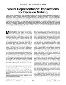
1. Introduction 1.1. Motivation One of the most common type of data visualization used is a line chart. Such a chart is normally derived from discrete two-dimensional data in which for every independent value on the x-axis there is one dependent value on the y-axis. If values on the x-axis are evenly spaced over time, the data is most often referred to as a time series. Generally, producing a line chart on a computer is a relatively easy thing to do. However, if the data contains a vast number of data points, the resulting line chart may appear quite squashed.
Figure 1.1: Time series containing 10,000 data points Such an effect is the result of rendering data containing many more points than the number of pixels for the given canvas width. A line chart entailing a data point distribution high in density proffers limited information to an observer of that chart. Short term directions and fluctuations can be hard to determine due to the fact that multiple values of the dependent variable are drawn on the same vertical pixel line. For example, if 10,000 data points are drawn on a relatively small canvas, as seen in figure 1.1, we end up with this type of squashed line chart.
1
1. Introduction Some necessary steps must be taken to avoid the problems discussed before, when visualizing a large amount of data as a line chart, if it is preferred or required to view the chart in its entirety. With some data it might be acceptable to average out some data points, creating new data points to represent a group of points in the original data. To achieve this, numerous well-known methods can be applied, e.g., regression analysis. However, the focus of this thesis is mainly to explore downsampling algorithms which return a subset of data points existing in the original data. In that regard, sometimes it might suffice to use only every other data point or maybe every tenth data point, depending on the data and canvas size. Still, such a method is only suitable if the data is “smooth” in nature and has little or no fluctuations. If the data is somewhat irregular, then using only every nth data point to draw the line chart will almost guarantee that many interesting peaks and troughs will not be included in the chart, as seen in figure 1.2. Clearly a more intelligent approach is needed and that is the motivation for this thesis.
(a) Original line chart
(b) Downsampled line chart
Figure 1.2: A line chart before and after downsampling with an every nth-point algorithm Initially the company DataMarket, inc.1 suggested that I could make the problem of downsampling data for better visualization the main topic of my masters thesis. The company has experienced this problem first hand in a very practical manner since it offers data visualization solutions to their clients.
1.2. Objectives of the Current Study Before stating the objectives it it is important to emphasize that the downsampled data is only intended to visually represent the original data for human observation and not data analysis, statistical or otherwise. Many techniques for such analysis have studied in the field of data mining and data reduction [1]. When processing information for visual representation, it is only important to retain the data which offers the most information and is actually perceived by people, the rest can be discarded. 1
2
See appendix B for more information on DataMarket.
1.2. Objectives of the Current Study The primary objective is to design and implement a few algorithms that can effectively downsample any data which can be directly drawn as line chart, with special emphasis on time series. The downsampling algorithms then need to be compared in regard to several factors. Those factors include but are not limited to efficiency, complexity and correctness. The second objective is to be able to say something about the human perception on downsampled data drawn as a line chart. That includes conducting a simple comparative survey using different downsampling algorithms. Of course, the results of such a survey will not be entirely conclusive but might still offer some insights on a few questions like: • Is there a definite underlying consensus among people what is considered to be a good representation of the original data and if so, which of the proposed algorithms are considered to produce the best results in that regard? • In the case of extreme downsampling2 , which of the proposed algorithms does the best job in retaining the visual characteristics of the line chart? Using a known algorithm to downsample large data sets for visualization can have some benefits for people, in particular researchers, who need to draw a line chart derived from large data onto a small area. It would certainly be a questionable scientific practice if everyone would just downsample their data as they saw fit in order to make their charts “look better”. Using a good deterministic algorithm to downsample data for visualization, if downsampling is required, must surely be prefered because then it can be described or cited. One other fundamental problem has to do with visualizing large data in real time, which has become a quite common practice. For example, a number of websites are now offering users to view interactive line charts. That kind of interactive solutions require the user’s computer to receive the raw data and render it. If the data is very extensive it might take some time to download and it might also take some time for the user’s computer to draw the line chart. If the data were reasonably downsampled before being sent to the user or before being drawn, the waiting time for the user would decrease without any observable effects on the line chart. That would result in a better overall user experience, saving both bandwidth and time.
2
Extreme downsampling might use less than 5% of the original points.
3
1. Introduction
1.3. Thesis Overview The remaining parts of this thesis are organized as follows: In chapter 2 three downsampling algorithms are put forth and analyzed, the original downsampling algorithm used by DataMarket and two other algorithms designed as a part of this project. Chapter 3 gives a brief introduction to cartographic generalization and polyline simplification. The chapter also describes the idea of using similar techniques as in cartography to downsample line charts. The following chapter describes three additional algorithms to downsample line charts. All those algorithms make use of a technique commonly used to simplify polylines in maps described in the preceding chapter and one of them was chosen by DataMarket to replace their method for downsampling line charts. Chapter 5 describes an online survey which was conducted as a part of this study. Next is chapter which lists comparison factors and shows a comparison matrix with all the algorithms in the thesis. The seventh and last chapter contains conclusions and future work. The thesis also includes four appendices: Appendix A contains information about the test suite of programs and line chart data, which was made to test various downsampling algorithms and used in the survey. Appendix B has some more information on DataMarket, the company which suggested the topic of the thesis. Additional figures of downsampled line charts are put forth in a structured manner in appendix C and the last appendix has the initial source code for the downsampling algorithm which was published under a free software license.
4
2. Intuitive Downsampling Algorithms In this chapter, three downsampling algorithms are described. The design of these algorithms is perhaps motivated more on intuition than on concrete theoretical foundations, hence the title of the chapter. Furthermore, it is worth mentioning that the algorithms described are only intended to explore certain concepts and are maybe not suitable for practical usage.
2.1. Mode-Median-Bucket The original downsampling algorithm designed by DataMarket employees is referred to as Mode-Median-Bucket in the current study. This undocumented algorithm was developed from experiments and visual observations in order to evaluate its effectiveness for various data. It was implemented at the early start of the company when large data sets were probably not so common and the method for downsampling was perhaps adequate in most cases observed. Now it has become more obvious that the current method needs to be analyzed further and most likely replaced. The algorithm uses primarily two methods, mode and median, to govern which data points are returned, thus the name Mode-Median-Bucket. The bucket part in the algorithm name refers to the data being split up into buckets, each containing approximately equal number of data points. The algorithm then finds one data point within each bucket as follows. If there is a single y-value which has the highest frequency (the mode) then the leftmost corresponding data point is selected. If no such data point exists a point corrosponding to the median of the y-values is selected. An exception to these rules is when a global peak or a global trough is found within the bucket. This is to ensure that those points are included in the downsampled data.
5
2. Intuitive Downsampling Algorithms Algorithm 2.1 Mode-Median-Bucket Require: data . The original data Require: threshold . Number of data points to be returned 1: Split the data into the same number of buckets as the threshold 2: for each bucket do . Select a data point to represent the bucket 3: if a global peak or trough is found in the bucket then use that data point 4: if there is a single most frequent y-value then 5: if there is only one corresponding point then 6: Use that 7: else 8: Use the one with the lowest x-value 9: else 10: if the number of data points in the bucket is odd then 11: Use the middle corresponding data point 12: else . Even number of data points in the bucket 13: Use the left data point in the the median y-value pair 14: end for 15: Finally make sure that the first and last data points in the original data are also the first and last data points in the downsampled data.
Selecting the data point from each bucket which has the highest mode or is the median for the y-values might be a good intuitive way to represent the data statistically. It is at least a very simple way and easy to understand. One of the most obvious issues with this algorithm is that it is very likely to exclude local peaks and troughs within each bucket (see figure 2.1). The reason for this is because it does not take into account what the y-value actual is, only how frequent it is within each bucket. The only exception is when the global peak or trough occur in the bucket.
6
2.1. Mode-Median-Bucket
Figure 2.1: Data downsampled with the Mode-Median-Bucket algorithm (black) skips most local peaks and troughs of the original data (gray)
Often all the y-values have the same frequency because the values within a bucket are all different. For example, a precise measurement over time might never yield the same exact measurement within each bucket, and therefore the mode rule of the algorithm seldom applies. When some y-value occurs more often than others in a bucket, the algorithm simply selects the leftmost data point with the highest frequency as in figure 2.2.
Figure 2.2: The left gray point is selected for the bucket (between the dashed lines) since the gray points have the same y-value
Another minor issue arises if the global peak and trough both occur in the same bucket. Then the peak is always used no matter what the value of the trough is. Incidentally, the absolute height of the trough might be much greater than that of the peak.
7
2. Intuitive Downsampling Algorithms
2.2. Min-Std-Error-Bucket This algorithm was designed as part of the current study. It is based on linear regression and uses the formula for the standard error of the estimate (SEE) to downsample data. The SEE is a measure of the accuracy of predictions made with a regression line when a linear least squares technique is applied. The greater the error the more discrepancy between the line and the data points. Of course one line through all data is not very useful. Thus, the original data needs to be split up into buckets and then multiple lines calculated between points in the buckets. Before setting forth a detailed description of the algorithm it is worth mentioning that it is not really a practical solution, merely an exploration of using certain concepts, e.g., the standard error. Even if the algorithm produces a statistically good line chart, it is not a very good visual representation since it smooths out many of the peaks and troughs of the line chart. First the original data is split up into approximately the same number of buckets as the downsampling threshold. The first and last buckets contain only the first and last original data points; that way the first and last original data points are always included in the downsampled data. A line is then calculated from all the points in one bucket to all the points in the next bucket as shown in figure 2.3 below.
Figure 2.3: Data with 8 points split up into 5 buckets Now each data point has the same number of outgoing lines as the number of data points in the succeeding bucket. These lines are not really regression lines since they are calculated between two real data points but are still kind of a possible estimation from one bucket to the next. Also, the only relevant segment of a line in this context is between the two points. The vertical distance from all the data points between those two points and the line can then be used to calculate the standard error of the line segment, relative to the data points that it passes by. For example in figure 2.4
8
2.2. Min-Std-Error-Bucket the line AC passes by data point B and the vertical distance between line AC and point B is e2 . Similarly the line AD passes by both point B and C. B
e1
e2
D
A
e3
C
Figure 2.4: Vertical distance between lines and other data points the lines pass by Now the standard error for each line segment can be calculated with equation 2.1 and each line segment assigned a number which represents how close it is to the data point that it passes. v uP u n 2 u eˆi t i=1 SEE = n−2
(2.1)
Standard Error of the Estimate (SEE) Since the number of buckets is the same as the target threshold, the next step is to select one point from each bucket. The aim is to have the total sum of the standard errors of lines between all the selected data points as low as possible. That can be viewed as a dynamic optimization problem and can be solved with numerous techniques. One easy way to visualize this problem is to think of it as a directed acyclic graph (DAG). All the data points are nodes and the line segments are weighted edges, the weight being the standard error for the line. All nodes have exactly one edge out and one edge in, except the first and last nodes. Also, all the edges between two nodes go over exactly one bucket boundary (dashed lines). Figure 2.5 shows an example of such a graph.
9
2. Intuitive Downsampling Algorithms
Figure 2.5: A directed acyclic graph representation of figure 2.3 By converting the problem to a DAG it is clear that any path from the first to the last point gives exactly one data point per bucket. All that remains is just a simple matter of finding the shortest path between the first and last node and it will be the total minimal sum of the standard errors. Several algorithms exist to find the shortest path in a graph but I have chosen to use the Dijkstra’s algorithm. It is very well known and an example of dynamic programming [10]. After finding the shortest path, the nodes (data points) along that path from start to finish are listed up and returned as the downsampled data.
10
2.2. Min-Std-Error-Bucket Algorithm 2.2 Min-Std-Error-Bucket Require: data . The original data Require: threshold . Number of data points to be returned 1: Split the data into equal number of buckets as the threshold but have the first bucket only containing the first data point and the last bucket containing only the last data point 2: for each bucket except the last one do 3: for every point in the current bucket do 4: for every point in the next bucket do 5: Calculate a line segment going through the two points 6: Calculate the standard error of the line segment 7: end for 8: end for 9: end for 10: Make a DAG with the edge weight as the standard error for the line segments 11: Find the shortest path from the first node to the last 12: List out the nodes in the shortest path from start to finish
A big problem with this algorithm is that it smooths out the line chart as shown in figure 2.6, missing many of the local peaks and troughs.
Figure 2.6: Downsampled data (black) and original data (gray) In downsampling, it is only normal to miss some minor fluctuation but when major fluctuations are skipped, the line chart can suffer perceptually, giving a poor representation of the original chart. In comparing the downsampled data to the original, one tends to notice when a very large spike is not present any more. The reason why large spikes are usually not included is fairly simple. The total sum of all the standard errors of the shortest path is usually lower if the large spikes are not included.
11
2. Intuitive Downsampling Algorithms C
C
e3 e1 e2
A
B
E D
(a) Large spike included
A
B
e4
E
D
(b) Large spike not included
Figure 2.7: Two line charts segments showing a spike included and excluded In figure 2.7(a) an outlier is selected to represent a bucket. Then the total vertical distance from the points B and D, to the lines is e1 +e2 . If however point B is used instead of the outlier (as shown in figure 2.7(b)), the vertical distance from the points not used to the line is e3 +e4 . In this example, e1 +e2 is larger than e3 +e4 , so the shortest path would not include the outlier point. This is often the general case as well although other factors come into account, such as how far the outlier is. Another downside to this algorithm is that it has a lot of loose ends. There are other ways to solve the dynamic optimization problem and maybe a more greedy approach is adequate. Finding the absolute minimal sum of the standard errors might not be necessary when a fairly low sum might suffice.
2.3. Longest-Line-Bucket The most common problem with the algorithms described so far is that local outliers are often not included in the downsampled line chart. That can be considered a very serious loss of visual information since the observer might want to explore the reason for a certain outlier existence. The Min-Std-Error-Bucket (MSEB) described in section 2.2, certainly falls short in that sense, smoothing out most of the fluctuation. Still this algorithm is in many ways similar to MSEB, except that it does not try to minimize the total standard error but instead tries to maximize the total line length. In principle, a downsampled line chart with a total line length close to the original line chart should at least cover many of the extreme peaks and troughs. The Longest-Line-Bucket algorithm was designed as part of the current study and
12
2.3. Longest-Line-Bucket is very similar to the MSEB algorithm but with some key differences. It starts off exactly the same, splitting the data points into buckets and calculating lines going through all the points in one bucket and all the points in the next bucket as was shown in figure 2.3 on page 8. The main difference is that instead of calculating the standard error for each line segment it simply calculates its length (Euclidean distance between the two points defining the line). Then, as with the MSEB algorithm, the points and lines segments are converted to a directed acyclic graph (DAG) and the weight of an edge is the length of the corresponding line segment as was shown in figure 2.5 on page 10. All that remains is to find the longest path through the graph. The path will contain one point per bucket which forms the longest total line length through all the buckets. Finding the longest path in a general graph is a NP-Hard problem and cannot be computed in polynomial time. However in the case of the graph being a DAG, the edge weight can simply be changed to its negation, thus changing it to a shortest path problem. This problem can then be solved with dynamic programming in exacly the same way as done in the MSEB algorithm, except that maximization rather than minimization is applied. Algorithm 2.3 Longest-Line-Bucket Require: data . The original data Require: threshold . Number of data points to be returned 1: Split the data into equal number of buckets as the threshold but have the first bucket only containing the first data point and the last bucket containing only the last data point 2: for each bucket except the last one do 3: for every point in the current bucket do 4: for every point in the next bucket do 5: Calculate a line segment going through the two points 6: Calculate the length of the line segment . Different from MSEB 7: end for 8: end for 9: end for 10: Make a DAG with the edge weight as the length of the line segments 11: Find the longest path from the first node to the last 12: List out the nodes in the longest path from start to finish
13
2. Intuitive Downsampling Algorithms This algorithm is much better at including the outliers than both the Mode-MedianBucket (MMB) in section 2.1 and the MSEB algorithms. For example, in figure 2.8 it is shown to include all the major outliers. If the MMB or the MSEB were run on the same data as in the example, most of the outliers would be excluded.
Figure 2.8: Downsampled data (black) and original data (gray) At first glance, this algorithm performs quite well in a visual sense. Maximizing the total line length of the line chart seems to be a good concept to follow when downsampling data to be displayed as a line chart. But like with the MSEB algorithm the problem with this algorithm is how complicated and inefficient the current implementation is. If this algorithm is to become a practical option in a real application, it would need to be simplified and optimized.
14
3. Cartographic Generalization All the algorithms described in the preceding chapter (Intuitive Downsampling Algorithms) seem to fall short in some way. Visual representation was not good enough or the algorithm was not efficient enough. Instead of trying to fix these shortcomings by modifying the previously described algorithms, a fundamentally new approach will be considered in this and the following chapter (see chapter 4). Extensive research has been ongoing in the domain of cartographic generalization where information, such as coastlines, is processed to be represented on a map. A line chart is different from a map but there are some similarities. For example, both may be represented by polylines connecting the data points. One property of line charts not shared by maps is that every point on the polyline has a strictly increasing x-value relative to the preceding data point.
3.1. Polyline Simplification Techniques There are several well known techniques in cartographic generalization regarding polyline simplification. The evaluation of these algorithms is still an issue of active research and there is large number of different spatial measurements which can be used as criteria [9]. Also, the factor of aesthetics plays a big part in cartographics and some might even say it borders on being art in some cases [4]. All this makes it somewhat difficult to evaluate cartographic generalization in a deterministic way and the same can be said about evaluating the correctness of line chart simplification to some extent. One of the most common line simplification method is the Douglas-Peucker algorithm [5]. It selects the point that is over a specified threshold and furthest away from an imaginary line which is initially between the first and the last point of the polyline. The algorithm then calls itself recursively with the polylines on both sides of the selected point (including the selected point) until all the points have been either selected or discarded (fall under the threshold). When the recursion is done the points which were selected define the simplified polyline.
15
3. Cartographic Generalization Another, more recent, algorithm to simplify lines is called the Visvalingam–Whyatt algorithm [11]. The basic idea behind this algorithm is to give all the points a certain rank based on their significance. The significance of a point is the area size of a triangle which it forms with its two adjacent points on each side. This is usually called the effective area of a point. For example, the effective area of point B in figure 3.1 is area b. The least significance points are then excluded in the simplified line and the effective areas of the remaining adjacent points recalculated as it has changed.
E A
C d
b c
B
D
Figure 3.1: Points on a polyline and their effective area This method of using the effective area of a point to determine its importance seems like a good idea and useful for downsampling line charts. By using the area size, both distance between points and angular measures are taken into account. It has also been suggested that the Visvalingam–Whyatt algorithm outputs aesthetically better results when faced with extreme simplifications, discarding a high proportion of the original data [11]. That is certainly a very interesting property since some large line charts might have to be downsampled and rendered as small images.
3.2. Adapting the Visvalingam–Whyatt Algorithm Polylines in line charts are more restricted than polylines used in maps. This suggests that an algorithm used to downsample line chart could be a restricted version of a known line simplification method in cartographic generalization. One obvious restriction is that the algorithm should not skip too many data points in a row. That is because that would result in long line segments over parts in the line chart with minor fluctuations. Such minor fluctuations are indeed information and their presence has a noticeable perceptual impact for a line chart. For example, a long line segment over many intervals of the independent variable in a time series
16
3.2. Adapting the Visvalingam–Whyatt Algorithm could look unusual. It would suggest a linear relationship between the x and y-values over a long period. That would surely indicate a very definite pattern which is not really present in the original data. It is safe to say that most people nowadays are quite used to viewing maps and indeed are well aware that the lines on maps are simplified. Maps are usually representations of real places so it is taken for granted that map making involves reducing the complexity of the real world. In the case of the line chart it is usually not representing a tangible thing; thus people might not expect any data point reduction when viewing line charts. The perception of line charts and other data visualization techniques has been the topic of discussion and research for a long time [3, 6]. The scope of the research is very broad and often borders on the field of psychology [2]. For now it suffices to say that when downsampling data to be displayed as line chart, it is important to retain as much visual characteristics of the line chart as possible and not suggest any false patterns because minor fluctuations are indeed a type of visual characteristic. If the x-values of the points are irregularly spaced the resulting line chart may start to look “jerky” like in figure 3.2. That might be acceptable if this was a polyline in a map but for a line chart it is a poor representation of the original line chart.
Figure 3.2: Downsampled line chart using a slightly modified Visvalingam–Whyatt algorithm (black) skips over many data points in the original data (gray) One simple way to make sure the algorithms use at least one data point for every fixed interval is to split the data points into buckets and select one point from each bucket as was done in chapter 2. Since time series have the independent variable evenly spaced it is preferable to ensure that the downsampled line chart has at least some similar properties. That is to say, the independent variables of neighboring data points are not too far apart.
17
4. Largest Triangle Algorithms Of the three intuitive downsampling algorithms described in this thesis (see chapter 2), the best by far is the Longest-Line-Bucket (LLB) shown in section 2.3, page 12. The main downside of the LLB algorithm is how inefficient it is and somewhat complicated (at least how it is implemented in the current study). What is needed is a simpler and faster technique to select or exclude data points. Fortunately many such techniques have been studied in the field of cartographic generalization (see chapter 3) and the algorithms described in this chapter all build on the idea behind the Visvalingam–Whyatt algorithm using the data points effective area1 (see section 3.2, page 16).
4.1. Largest-Triangle-One-Bucket This algorithm is very simple. First all the points are ranked by calculating their effective areas. Points with effective areas as null are excluded. The data points are then split up into approximately equal number of buckets as the specified downsample threshold. Finally, one point with the highest rank (largest effective area) is selected to represent each bucket in the downsampled data.
Figure 4.1: The gray points have the largest effective area
1
Effective area of a point is the area size of a triangle it forms with its two adjacent points.
19
4. Largest Triangle Algorithms As shown in figure 4.1, the gray points will be selected since they have the largest effective area of the points in their bucket. Algorithm 4.1 Largest-Triangle-One-Bucket Require: data . The original data Require: threshold . Number of data points to be returned 1: Rank every point in regard to its effective area 2: Split the data into the same number of buckets as the threshold 3: for each bucket do 4: Select the point with the highest rank within the bucket 5: end for 6: Finally make sure that the first and last data points in the original data are also the first and last data points in the downsampled data.
One issue with this algorithm is that the ranking (effective area) of a point only depends on its two adjacent points. It is perhaps not an apparent issue but it can lead to bad representation of the original line chart in certain cases. For example, if the data points are fluctuating rapidly, the algorithm tends to output a line chart which “travels” on top of the local peaks or troughs of the original data. An example of this effect can be seen in figure 4.2. It is still fair to mention that this is more noticeable when the downsampling threshold is very low with regard to the number of original data points.
Figure 4.2: Downsampled line chart (black) with the Largest-Triangle-One-Bucket algorithm A good analogy is to say that this algorithm is extremely short-sighted and is almost totally blind to anything beyond the nearest points. In comparison the Longest-LineBucket (LLB) algorithm (see section 2.3) is a global routine that considers all the points in the original line chart.
20
4.2. Largest-Triangle-Three-Buckets
(a) Largest-Triangle-One-Bucket
(b) Longest-Line-Bucket
Figure 4.3: Largest-Triangle-One-Bucket compared to the Longest-Line-Bucket Despite the algorithm’s short-sightedness, it nonetheless produces comparable visual results as the LLB algorithm as shown in figure 4.3; and when taking into account how simple and efficient it is, it seems like a good choice for a downsampling algorithm at first glance.
4.2. Largest-Triangle-Three-Buckets In the last section (see 4.1) the Largest-Triangle-One-Bucket (LTOB) algorithm was said to be somewhat short-sighted, only considering the two adjacent points when calculating the effective area of a point. With this in mind an obvious question is: Can the effective area of a point be larger and in a sense make the algorithm see further? As it turns out, this concept is well worth exploring. With the algorithm discussed in this section, the effective area of a point does not depend on the position of its two adjacent points but on the points in the previous and next buckets, making the possible effective area much larger. The first step is to divide all the data points into buckets of approximately equal size. The first and last buckets however contain only the first and last data points of the original data as shown in figure 2.3 on page 8. This is to ensure that those points will be included in the downsampled data. The next step is to go through all the buckets from the first to the last and select one point from each bucket. The first bucket only contains a single point so it is selected by default. The next bucket would then normally contain more than one point from which to choose. Here the algorithm differs from the LTOB since the rank of a point is calculated from the effective areas that the point can form with other points in the adjacent buckets.
21
4. Largest Triangle Algorithms The algorithm works with three buckets at a time and proceeds from left to right. The first point which forms the left corner of the triangle (the effective area) is always fixed as the point that was previously selected and one of the points in the middle bucket shall be selected now. The question is what point should the algorithm use in the last bucket to form the triangle. The obvious answer is to use a brute-force approach and simply try out all the possibilities. That is, for each point in the current bucket, form a triangle with all the points in the next bucket. It turns out that this gives a fairly good visual result but as with many brute-force approaches it is inefficient. For example, if there were 100 points per bucket, the algorithm would need to calculate the area of 10,000 triangles for every bucket. Another and more clever solution is to add a temporary point to the last bucket and keep it fixed. That way the algorithm has two fixed points; and one only needs to calculate the number of triangles equal to the number of points in the current bucket. The point in the current bucket which forms the largest triangle with these two fixed point in the adjacent buckets is then selected. In figure 4.4 it is shown how point B forms the largest triangle across the buckets with fixed point A (previously selected) and the temporary point C. B
A C
Figure 4.4: Largest triangle formed across three buckets and point C being a temporary point in the last bucket
22
4.2. Largest-Triangle-Three-Buckets There is still the matter of how this temporary point in the next bucket should be decided. A simple idea is to use the average of all the points in the bucket. In most cases this is seem to work just as well as the brute-force approach but much more efficient. In figure 4.5 it is clear that the line charts are almost identical whether the brute-force or the point average approach is used.
(a) Average point method
(b) Brute-force method
Figure 4.5: Line charts comparing the average and the brute-force method in calculating the largest triangle Algorithm 4.2 Largest-Triangle-Three-Buckets Require: data . The original data Require: threshold . Number of data points to be returned 1: Split the data into equal number of buckets as the threshold but have the first bucket only containing the first data point and the last bucket containing only the last data point 2: Select the point in the first bucket 3: for each bucket except the first and last do 4: Rank every point in the bucket by calculating the area of a triangle it forms with the selected point in the last bucket and the average point in the next bucket 5: Select the point with the highest rank within the bucket 6: end for 7: Select the point in the last bucket . There is only one
This algorithm has a lot fewer problems than all the previous algorithms described. It is both efficient and robust. Also, it is simple, portable and outputs a very good visual representation of the original line chart in most cases.
23
4. Largest Triangle Algorithms The biggest problem is not really how the points are selected within the buckets but rather how the points are divided into buckets. This algorithm uses roughly equal sized buckets (except for the first and last buckets) to make sure a point is selected for every fixed interval on the x-axis. The problem is that some line charts have somewhat irregular fluctuations. For example, some parts of the line chart might be relatively calm and other parts might fluctuate violently like is shown in figure 4.6 (downsampled line chart with the Largest-Triangle-Three-Buckets algorithm for this data is shown in figure 4.12 on page 29).
Figure 4.6: Exchange rate of the Icelandic Krona shooting up during the financial crisis of 2008 (contains 3,987 data points) The problem is that not all buckets can be visually represented fairly with just one point and some buckets might not even need to be represented at all (if the local fluctuation is very small). This is at least the case if all the buckets have approximately the same number of points and the algorithm selects only one point from each bucket. This problem also exists in all the previous algorithms which rely on this roughly equal bucket dividing concept. However, since most of those algorithms had other more serious problems, this problem was less noticeable. Perhaps one of the most apparent example of how equal sized buckets can result in a bad representation is when there is a sudden and sharp spike in the data, like a distant outlier. The algorithm would select this outlier in the bucket but it could not select the points next to the outlier since those points are most likely in the same bucket (only one point can be selected per bucket).
24
4.3. Largest-Triangle-Dynamic
Figure 4.7: Downsampling data with distant outliers The result is that even if the outlier is only a single point, the downsampled line chart indicates that the peak or trough is less sharp than in the original data. This is shown in figure 4.7 with the outliers (e.g., A and B). The more extreme the downsampling, the more visible this effect becomes, since each bucket contains more points. However, it is questionable whether such extreme downsampling can be considered practical since there will always be a big trade-off between visual characteristics, irrespective of which points are selected.
4.3. Largest-Triangle-Dynamic In contrast to the other algorithms, the name of this algorithm does not end on the word “bucket” but on the word “dynamic.” The reason is that this algorithm does not rely on equal size buckets but allows a dynamic bucket size. If a part of the line chart is fluctuating greatly, the buckets become smaller; and if another part is relatively calm, the buckets become larger. The algorithm is really an attempt to address the biggest problem with the LargestTriangle-Three-Buckets (LTTB) algorithm (see section 4.2). Having a dynamic bucket size is not a complicated idea but some interesting challenges remain as to how it can be efficiently implemented. Given that the total number of buckets should be the same as the specified downsample threshold, the only thing required is a method to determine the sizes of the buckets. For that purpose, information on the line chart has to be known in order to implement the algorithm, i.e., where the line chart is fluctuating and where is it relatively calm. There are a number of ways how this can be calculated; and some ideas were indeed implemented and tried out with some success.
25
4. Largest Triangle Algorithms Another way to examine this problem is to state that initially all the buckets are approximately the same size and then are resized in an iterative way. In other words, instead of trying to find the absolute optimal configuration of the bucket sizes, the aim is rather to address the worst cases which are most noticeable by a human observer. The first step is to assign a number to all buckets which indicates whether a bucket needs to be smaller or larger, if only one point is supposed to represent the bucket. An obvious way to calculate this number is to apply a simple linear regression for all buckets. The last point in the previous bucket and the first point in the next bucket are also included in the regression, thus the data in the buckets overlap slightly as seen in figure 4.8.
e4
e2 e1
e3
e6 e5
Figure 4.8: A regression line (gray) through a bucket After calculating a regression line for a bucket (with one extra point overlapping for each adjacent bucket) the sum of squared errors (SSE) can easily be worked out with equation 4.1. The SSE for all the buckets can then be used to rank them. SSE =
n X
e2i
(4.1)
i=1
Sum of squared errors (SSE) If the SSE for a bucket is relatively high, it means that the data points within the bucket would most likely be better represented as two buckets. If however the SSE is relatively low for a bucket, it can be merged with either one of the adjacent buckets, if one of them also has a relatively low SSE. After all the initial buckets have been ranked, the next step is to either split or merge them accordingly. Find the bucket which has the highest rank (largest SSE)
26
4.3. Largest-Triangle-Dynamic and split it up into two buckets. That will result in one extra bucket so some other two buckets (adjunct to each other) need to be merged to maintain the total bucket count. This is done by looking for the adjacent bucket pair which has the the lowest total SSE sum and merging them. In figure 4.9 the line chart has six buckets and it is quite apparent that buckets A and B have a lot less fluctuation than bucket F. Therefore the rank of bucket F is higher than both buckets A and B
A
B
C
D
E
F
Figure 4.9: A line chart divided into six equal parts If the algorithm were applied to the data in figure 4.9 and given that bucket F had the highest rank (largest SSE), the bucket sizes would be as is shown in figure 4.10 after to one iteration. Bucket F has been split up into two buckets and buckets A and B have been merged. Subsequent to each iteration, the SSE for the new buckets has to be calculated. With regard to the figure 4.10, it means that the algorithm has to calculate the SSE for buckets M, J and K.
M
C
D
E
J
K
Figure 4.10: A line chart divided into six parts After a given number of iterations the algorithm needs to halt (on some predetermined condition). The simplest condition is to have the algorithm halt after a fixed number of iterations. Even after just a few iterations, there is a noticeable visual difference since the buckets with the most SSE are split up first. However, the current implementation of the algorithm uses a simple formula to determine how many iterations are required. The original data point count is divided by the downsampled threshold times ten as shown in formula 4.2.
27
4. Largest Triangle Algorithms Original Count T hreshold × 10
(4.2)
Formula to calculate the number of iterations For example, if 1,000 points are to be downsampled down to 900 points, the algorithm runs 11 iterations. If however the 1,000 points need to be downsampled down to 50, the algorithm runs 200 iterations. When the iteration has halted, the last step is to run the LTTB algorithm on the final bucket configuration to select one data point from each bucket. In short, this algorithm can be described by saying it is just the LTTB algorithm using dynamic bucket sizes.
Figure 4.11: Line chart downsampled using Largest-Triangle-Dynamic down to 100 points, showing bucket division as vertical bands As expected, this algorithm turns out to be especially effective in the case of irregular data. In figure 4.11 the bucket division is visible, showing how the algorithm applies smaller buckets for those parts which fluctuate relatively more, at the right end of the line chart. When the LTTB algorithm is fed the same data and downsample threshold, it is apparent that the far right side of the line chart in figure 4.12 has a considerable worse visual representation in comparison with figure 4.11.
28
4.3. Largest-Triangle-Dynamic
Figure 4.12: Line chart downsampled with Largest-Triangle-Three-Buckets down to 100 points Algorithm 4.3 Largest-Triangle-Dynamic Require: data . The original data Require: threshold . Number of data points to be returned 1: Split the data into equal number of buckets as the threshold but have the first bucket only containing the first data point and the last bucket containing only the last data point . First and last buckets are then excluded in the bucket resizing 2: Calculate the SSE for the buckets accordingly . With one point in adjacent buckets overlapping 3: while halting condition is not met do . For example, using formula 4.2 4: Find the bucket F with the highest SSE 5: Find the pair of adjacent buckets A and B with the lowest SSE sum . The pair should not contain F 6: Split bucket F into roughly two equal buckets . If bucket F contains an odd number of points then one bucket will contain one more point than the other 7: Merge the buckets A and B 8: Calculate the SSE of the newly split up and merged buckets 9: end while. 10: Use the Largest-Triangle-Three-Buckets algorithm on the resulting bucket configuration to select one point per buckets
Although this algorithm can produce a good visual representation of a line chart, it is not without issues. As mentioned before, this algorithm gives the best results if the data is irregular. When the data is highly regular over the whole line chart, the algorithm appears no better than the LTTB algorithm (it might even sometimes be a little worse).
29
4. Largest Triangle Algorithms Perhaps the main problem has to do with how this algorithm could be optimized for better performance because it is currently rather slow in comparison with the LTTB algorithm. Clearly there is room for improvements, especially in the iteration step. However, in scenarios where speed is not essential, the algorithm can surely be of use, e.g., if it does not matter whether it takes a second or one tenth of a second to downsample the data Another issue is determining the halting condition. As it is implemented, the halting condition is calculated with a simple formula which takes in the data point count and downsample threshold. It does not take into account the nature of the line chart. It might be smooth, fluctuating or both. Another strategy is to consider what really happens statistically when the buckets get split up and merged accordingly. With each iteration the standard deviation of the buckets SSE should decrease, that is, the variation of the buckets SSE get closer to the bucket’s mean SSE. So after a given number of iterations the reduction of the standard deviations slows down considerably. This fact could be applied to construct a condition for the algorithm to halt. The algorithm would halt if the SSE change, from one iteration to the next, falls below a certain threshold. The downside of this approach is that this requires more calculation per iteration.
30
5. Survey In order to get a more neutral point of view on the quality of the algorithms, a survey was designed to compare the visual characteristics of an original line chart to a set of downsampled line charts. The initial idea was to have people choose which downsampled line chart they would prefer to represent the original. The downside to that approach is that even if the majority of people choose one particular downsampled line chart, it would say little about other downsampled line charts which people might have chosen. For example, some line charts might never be chosen and then it would be impossible to say anything about which of those is most or least effective. In order to collect more data the survey was designed in such a way that people were asked to order the downsampled lines charts from the best representation to the worst. Thus, the survey would yield some information about all choices of the downsampled line charts and also how good or bad a representation a downsampled line chart is relative to the other choices. In addition to the problems related to how the survey should be designed, it had some technical and human interface considerations which proved to be more difficult than expected. Because the survey was designed in a somewhat nonstandard way,1 with participants asked to order images, no typical online questionnaire tool could be used2 . Instead the survey had to be programmed from scratch to accommodate all the special requirements which emerged while designing it. Another big issue had to do with human usability. The survey had to be as user friendly as possible. The first idea was to have people enter a number for each downsampled line chart to indicate the order. That would foreseeably have frustrated some participants, requiring them to manually enter numbers. A better way was applied: to enable participants to drag and drop the downsampled line chart in whatever position they wanted. It was also a more intuitive way since dragging and dropping has become quite common on websites which enable users to customize their display. Participants could also change the order of the downsampled line charts by moving them up or down with special buttons attached to all the downsampled line charts. In addition, there was an option to pin the original line chart in place so people would not have to scroll all the way up in order to compare the 1 2
Not using Likert scale or other multiple choice question setup common in surveys. Many free online questionnaire tool exists like http://www.surveymonkey.com/
31
5. Survey original line chart to the downsampled version below. These features and more were all aimed at making the survey as easy to use as possible.
Figure 5.1: Screenshot of the first survey question (top only)
5.1. Questions In order to keep the survey short it only consisted of nine questions (not including two questions about participant’s age and education). In each question the participant was shown the original line chart and a number of downsampled line charts (displayed in a random order for each participant) using different methods and settings. The participant’s task was then to order the downsampled line charts from the best to the worst representation relative to the original line chart. It was specifically noted that the participant should just order the downsampled line charts after
32
5.1. Questions their own preference and not spend more than a minute on each question. The questions all stated the same instruction, to order the line charts from the best to the worst visual representation of the original chart. That is not without some ambiguity since a good visual representation is not really a well defined measurement. The instruction was kept a little vague on purpose, so that each participant could decide what a good representation meant. This may have caused some minor confusion since some participants might have expected a more detailed instruction. For example, order the downsampled line charts in an aesthetically pleasing order or in the order in regard to how closely the downsampled line charts resemble the original. One of the assumptions of this thesis is that both aesthetics and resemblance matter and this survey was designed to give some insight into what a good visual representation really means for people in the context of downsampled line charts.
(a) The Icelandic Krona (b) Randomly generated (c) Melbourne temperaexchange rate (3,987 data line chart (7,000 data ture over 10 years (3,650 points) points) data points) Figure 5.2: All the survey questions used one of three line charts shown in the subfigures The line charts shown in figure 5.2 were chosen because they demonstrate different visual characteristics. The line chart of the Icelandic Krona exchange rate is quite irregular with the first part relatively smooth compared to the second part. The randomly generated line chart has the typical “bold” line effect expected when multiple data points are drawn on a very small area. The line chart of the temperature in Melbourne over ten years demonstrates sharp peaks and troughs but with a regular periodic pattern (because of the seasons). Several downsampling examples for these line charts can be seen in appendix C. All the downsampling algorithms described in this thesis were included in the survey to some extent but the main emphasis was on the algorithms based on the LargestTriangle concept (see chapter 4). The reason is that those algorithms seemed more practical and thus it is important to get more information on them. The first question used the Icelandic Krona exchange rate (see figure 5.2(a)) as the original line chart and then three downsampled versions (containing 500 data points each) using the intuitive algorithms3 (see chapter 2). This question served as a kind 3
Mode-Median-Bucket, Min-Std-Error-Bucket and Longest-Line-Bucket.
33
5. Survey of a practice in order to train the participants in ordering the downsampled charts. It did also have some analytical purpose in comparing the intuitive downsampling algorithms. The next six questions all involved the Largest-Triangle algorithms4 , comparing different downsampling thresholds (300, 500 and 700 data points) on two different data sources, the Icelandic Krona exchange rate and the Randomly generated line chart (see figure 5.2(b)). The purpose was to determine if one algorithm was generally most effective or if it varied depending on the downsample threshold and the data source. For example, whether the Largest-Triangle-Three-Buckets would consistently score better than the other algorithms. The next question used the Melbourne temperature data as the original line chart (see figure 5.2(c)) and three downsampled versions using the Largest-Triangle algorithms with the downsample threshold at 500 data points. Because the Melbourne temperature is very periodic and the line chart “squashed,” it was interesting to see what algorithm people would prefer. The final question consisted of all the six algorithms, described in this thesis, downsampling the Icelandic Krona exchange rate data down to 200 data points (about 5% of the original data points). After answering eight similar questions, it was expected that the participants would be more used to the question format and could handle more than just three downsampled versions to order. It was also important that one of the questions involved all the downsampling algorithms, in order to have a comparison between them all in the same context. List of all the survey questions is shown in table 5.1.
4
Largest-Triangle-One-Bucket, Largest-Triangle-Three-Buckets and Largest-Triangle-Dynamic.
34
5.2. Participants Question number 1 2
Data source Icelandic Krona exchange rate Randomly generated line chart
Original count 3,987 7,000
3
Icelandic Krona exchange rate
3,987
4
Randomly generated line chart
7,000
5
Icelandic Krona exchange rate
3,987
6
Randomly generated line chart
7,000
7
Icelandic Krona exchange rate
3,987
8
Melbourne temperature (10 years)
3,650
9
Icelandic Krona exchange rate
3,987
Algorithms Intuitive LargestTriangle LargestTriangle LargestTriangle LargestTriangle LargestTriangle LargestTriangle LargestTriangle All
Threshold 500 700 300 500 500 300 700 500 200
Table 5.1: Order and setup of the survey questions
5.2. Participants The survey was open to everybody and 58 participants took part over the course of about two weeks. DataMarket advertised the survey on their Twitter page and the University of Iceland also sent out emails to all students in computer science and software engineering. Age range 18-24 25-30 31-40 41-50 51-60
Count 6 18 27 5 2
Table 5.2: Age distribution of participants in the survey Most participants were between 25 and 40 (see table 5.2) and the majority of the participants had a university degree (see table 5.3). It is safe to assume that most of them had some experience in viewing line charts.
35
5. Survey Education Some high school High school graduate Some college credit Bachelor’s degree Master’s degree Doctorate degree
Count 1 2 13 27 11 4
Table 5.3: Education level of participants in the survey
5.3. Survey Results Icelandic Krona Exchange Rate (500, Intuitive) Longest-LineBucket
Min-Std-ErrorBucket
Mode-MedianBucket 0.0
0.5
1.5 1.0 2.0 Average order (lower is better)
2.5
Figure 5.3: Survey results for the Icelandic Krona exchange rate down to 500 data points using the intuitive algorithms As shown in figure 5.3, most participants ordered the Min-Std-Error-Bucket algorithm in the last place and thus considered to give worst representation of the orgiginal line chart (see section 2.2). The most effective algorithm was the LongestLine-Bucket (see section 2.3) which majority of participants ordered in first place, giving the relatively best representation of the original line chart.
36
5.3. Survey Results
Randomly generated line chart (700, Largest-Triangle) Largest-TriangleDynamic
Largest-TriangleThree-Buckets
Largest-TriangleOne-Bucket 0.0
0.5
1.5 1.0 2.0 Average order (lower is better)
2.5
Figure 5.4: Survey results for the randomly generated line chart down to 700 data points using the Largest-Triangle algorithms In figure 5.4, it is clear that when the downsampling threshold is high (700 data points), the difference between the algorithms based on the Largest-Triangle concept was quite small. The Largest-Triangle-One-Bucket (see section 4.1) algorithm was only considered slightly better for the random line chart.
37
5. Survey
Icelandic Krona Exchange Rate (700, Largest-Triangle) Largest-TriangleDynamic
Largest-TriangleThree-Buckets
Largest-TriangleOne-Bucket 0.0
0.5
1.5 1.0 2.0 Average order (lower is better)
2.5
Figure 5.5: Survey results for the Icelandic Krona exchange rate down to 700 data points using the Largest-Triangle algorithms When the Icelandic Krona exchange rate was downsampled down to 700 data points, the Largest-Triangle-One-Bucket algorithm was noticeably the least effective and the result from the other two algorithms was very similar. It is important to bear in mind that the Icelandic Krona exchange rate is an example of a rather irregular line chart so the fact that the Largest-Triangle-One-Bucket did relatively bad comes as no surprise. Decreasing the downsampling threshold from 700 down to 500 produced some different results for the Largest-Triangle algorithms as the next two figures show.
38
5.3. Survey Results
Randomly generated line chart (500, Largest-Triangle) Largest-TriangleDynamic
Largest-TriangleThree-Buckets
Largest-TriangleOne-Bucket 0.0
0.5
1.5 1.0 2.0 Average order (lower is better)
2.5
Figure 5.6: Survey results for the randomly generated line chart down to 500 data points using the Largest-Triangle algorithms
Icelandic Krona Exchange Rate (500, Largest-Triangle) Largest-TriangleDynamic
Largest-TriangleThree-Buckets
Largest-TriangleOne-Bucket 0.0
0.5
1.5 1.0 2.0 Average order (lower is better)
2.5
Figure 5.7: Survey results for the Icelandic Krona exchange rate down to 500 data points using the Largest-Triangle algorithms
39
5. Survey When the downsample threshold was set to 500 data points the Largest-TriangleOne-Bucket algorithm was shown to give the worst representation of the original line chart for both data sources, the randomly generated line chart and the Icelandic Krona exchange rate. It was considerably worse for the Icelandic Krona exchange rate but only slightly worse for the randomly generated line chart. The other two algorithms, Largest-Triangle-Dynamic (see section 4.3) and Largest-Triangle-ThreeBuckets (see section 4.2), were still on par with each other. The next two figures show the same two data sources downsampled using the Largest-Triangle algorithms down to 300 data points which has to be considered substantial.
Randomly generated line chart (300, Largest-Triangle) Largest-TriangleDynamic
Largest-TriangleThree-Buckets
Largest-TriangleOne-Bucket 0.0
0.5
1.5 1.0 2.0 Average order (lower is better)
2.5
Figure 5.8: Survey results for the randomly generated line chart down to 300 data points using the Largest-Triangle algorithms
40
5.3. Survey Results
Icelandic Krona Exchange Rate (300, Largest-Triangle) Largest-TriangleDynamic
Largest-TriangleThree-Buckets
Largest-TriangleOne-Bucket 0.0
0.5
1.5 1.0 2.0 Average order (lower is better)
2.5
Figure 5.9: Survey results for the Icelandic Krona exchange rate down to 300 data points using the Largest-Triangle algorithms The Largest-Triangle-Three-Bucket algorithm emerges as the winner when downsampling down to 300 data points, although the Largest-Triangle-Dynamic algorithm is not far behind.
41
5. Survey
Melbourne temperature (500, Largest-Triangle) Largest-TriangleDynamic
Largest-TriangleThree-Buckets
Largest-TriangleOne-Bucket 0.0
0.5
1.5 1.0 2.0 Average order (lower is better)
2.5
Figure 5.10: Survey results for the Melbourne temperature down to 500 data points using the Largest-Triangle algorithms In the second last question, participants were asked to evaluate the downsampling of the Melbourne temperature line chart over 10 years (see figure 5.10). This data has some different characteristics compared to the other data sources used in the survey, containing highly periodic trends and a very dense data distribution. The result was rather conclusive, the Largest-Triangle-Three-Buckets algorithm was considered by far to give the best representation of the original line chart. Both of the other algorithms were substantially less effective but to an almost equal extent. It is worth mentioning that the Largest-Triangle-Dynamic algorithm would probably have produced a better result if it had been implemented with a different halting critera. If it would have halted sooner, the result would be more like the result of the Largest-Triangle-Three-Bucket.
42
5.3. Survey Results
Icelandic Krona Exchange Rate (200, All) Largest-TriangleDynamic Largest-TriangleThree-Buckets Largest-TriangleOne-Bucket Longest-LineBucket Min-Std-ErrorBucket Mode-MedianBucket 0
1
4 2 3 Average order (lower is better)
5
6
Figure 5.11: Survey results for the Icelandic Krona exchange rate down to 200 data points using all the algorithms The final question gave participants the task to order all the algorithms described in this thesis in a relative order from the best to the worst representation of the original line chart (Icelandic Krona exchange rate). The downsampling threshold was also set very low, so that the algorithms would produce line charts with some easily observable differences. The Largest-Triangle-Dynamic algorithm yielded the best results according to the survey. This comes as no surprise since extreme downsampling of irregular data is one of its strong points. Not far behind was the Longest-Line-Bucket algorithm. That was a bit surprising seeing as it is one of the intuitively designed algorithms, with little theoretical foundations (at least in the papers I reviewed). In retrospect, it would have been interesting to have some more survey data on it (it was only included in 2 of the 9 survey questions). The other intuitive downsampling algorithms, Min-Std-Error-Bucket and Mode-Median-Bucket (see section 2.1), were the least favorable algorithms according to the survey. Finally, consistent with the results from the other questions, the Largest-Triangle-Three-Bucket algorithm proved quite favorable among the survey participants.
43
6. Overview Comparison of the Downsampling Algorithms Six algorithms have been described in this thesis and analyzed to some extent. Also, an online survey has been conducted to give some insight into what people would prefer when given a choice between those algorithms. The next step is to assess these different types of information and merge it into a comparison matrix. The factors chosen to be represented in the comparison are listed below. Speed and scalability A downsample algorithm should be quick to process typical inputs. It is also important to have some guarantee that the algorithm will complete its task within a reasonable time frame for very large inputs. Simple time measurement in the test suite (see appendix A) with different downsampling settings and data sources are useful in this case but not conclusive as it does not reveal the scalability, i.e., how the algorithm speed depends on the number of original data points (although it certainly gives some hints). Conducting a detailed asymptotic analysis for all the algorithms is somewhat complicated, especially since some of them are implemented in part with external libraries. Also, these algorithms focus more on testing the underlying concepts (namely, how to select the data points to represent the data) rather than optimizing the implementation for each one. Still, it is relatively easy to get an intuitive sense of the scalability for each downsampling algorithm, whether it is logarithmic, linear, polynomial or something else. Complexity and portability The simpler the better, because it makes the algorithm easier to understand and less likely to contain faults. In addition, a chosen algorithm needs to be easily portable to other programming languages and environments. Dependence on complex external libraries is not ideal since those libraries would then also need to be ported (if no equivalent libraries are to be found for the target environment). There are a number of metrics which can indicate the complexity of an algorithm. The number of code lines (LOC) is one. Another way is to calculate the cyclomatic complexity [7]. However the McCabe’s cyclomatic complexity has been somewhat criticized and some say it lacks the theoretical foundations and in some cases not
45
6. Overview Comparison of the Downsampling Algorithms being any better than using the number of code lines [8]. The equally important issue of portability is related to the complexity. Simple algorithms are easier to code in other programming languages. It is important when assessing the portability of a downsampling algorithm to note what, if any, helper functions/methods are required to run the algorithm efficiently. For example, the Largest-Triangle-Dynamic algorithm (see section 4.3) would benefit greatly by using an optimized linear algebra library (which might not be available in all programming languages) while the Largest-Triangle-Three-Buckets algorithm (see section 4.2) can be implemented quite efficiently without using any optimized third party libraries, thus making it far more portable in that sense. Correctness The downsampled data should be a good visual representation of the original data and keep the “spirit” of the line chart, even if it contains just a fraction of the original data point count. This is probably the most elusive metric and even the name “correctness” is somewhat imprecise as it might imply that a result has some kind of a general quantifiable score of correctness. In actuality, it depends on many factors like what kind of data is being downsampled and even who is looking at it and what is his/her background. For example, a meteorologist and a financial analyst might notice different things about a line chart. The survey conducted (see chapter 5) was used to help determine the general correctness of each algorithm and the last question, which compared all the six downsampling algorithms, weighted the most heavily in that regard.
46
6.1. Comparison Matrix
6.1. Comparison Matrix The assessments are represented in the following comparison matrix with solid black points, three being the most effective for the corresponding factor and one being the least effective. The methodology used to determine the number of points is fairly simple. First the most effective and the least effective algorithms for each factor are identified. These two algorithms mark the top and the bottom of a scale split up into three equal parts. The number of points for the other algorithms then depend on where they are positioned on the scale relative to the most and the least effective. This is only a rough comparison which relies more on qualitative assessments rather than on precise quantifiable measurements. Speed and scalability Mode-Median-Bucket Min-Std-Error-Bucket Longest-Line-Bucket Largest-Triangle-One-Bucket Largest-Triangle-Three-Buckets Largest-Triangle-Dynamic
••• •◦◦ •◦◦ ••• ••• ••◦
Complexity and portability ••• •◦◦ ••◦ ••• ••• •◦◦
Correctness
•◦◦ •◦◦ ••• ••◦ ••• •••
Table 6.1: Comparison of the downsampling algorithms
47
7. Conclusion, Discussion and Future Work The stated primary objective of this thesis was to design and implement a few algorithms which could downsample data in order to produce a viable visual representation and, moreover, to compare those algorithms in order to determine which are the most practicable. As it turned out, the Largest-Triangle-Three-Buckets algorithm (see section 4.2) was both efficient and produced good results for most cases. Already it is being put to use by DataMarket and is reported to be a great improvement over their previous method of downsampling data (see section 2.1). It has also been published on GitHub under a free software license1 as a plugin for a popular line chart library (see appendix D). The Largest-Triangle-Dynamic algorithm (see section 4.3) also yielded some positive results, especially when extreme downsampling was applied on erratic data, containing both relatively smooth and fluctuating parts. The second objective was perhaps a bit more elusive since it involved stating something about human perception on downsampled line charts. The online survey conducted (see chapter 5) provided some good insights and certainly reinforced some general assumptions, such as the importance of retaining the outliers. The survey also indicated that even if a downsampled line chart were in fact a good statistical representation, it would not thereby count as a good visual representation. In other words, downsampling data to be applied in a statistical manner and to be put forth in a visual manner, can require two different approaches. Downsampling a line chart, using only a small fraction of the original data points, can be a challenging enterprise. One analogy to demonstrate why that is so, is to ask someone to downsample a paragraph (like this one), that is, select a fixed number of words to represent the paragraph so it can be read and understood by everyone. It would be easy if only a few words needed to be excluded but a lot harder if majority of the words need to be removed. Additionally, there had to be a general deterministic method, which could be applied on other paragraphs, to exclude any fixed number of words. It must however be admitted that downsampling line charts it not quite that hard. 1
The MIT License: http://opensource.org/licenses/MIT
49
7. Conclusion, Discussion and Future Work For future work, it might be prudent to explore other polyline simplification algorithms applied in cartographic generalization to adapt them for the purpose of simplifying line charts. Furthermore, similar to cartographic generalization, what is needed is a deeper understanding of how line charts are perceived [11], what characteristics have the most perceptual impact and to what degree. Is, for example, the absence of a peak generally more noticeable than an absence of a trough? How important is it, likewise, to retain small fluctuations? The answers to questions of this kind might appear trivial but in the case of extreme downsampling, the algorithm needs to make certain determinations as to the downsampling of a line chart resulting in trade-off between many visual characteristics. It would surely help to know which visual characteristics are more important than others.
50
Bibliography [1] Daniel Barbar’a, William DuMouchel, Christos Faloutsos, Peter J Haas, Joseph M Hellerstein, Yannis Ioannidis, HV Jagadish, Theodore Johnson, Raymond Ng, Viswanath Poosala, et al. The new jersey data reduction report. In IEEE Data Engineering Bulletin. Citeseer, 1997. [2] Patricia A Carpenter and Priti Shah. A model of the perceptual and conceptual processes in graph comprehension. Journal of Experimental Psychology: Applied, 4(2):75, 1998. [3] William S Cleveland and Robert McGill. Graphical perception: Theory, experimentation, and application to the development of graphical methods. Journal of the American Statistical Association, 79(387):531–554, 1984. [4] Denis Cosgrove. Maps, mapping, modernity: Art and cartography in the twentieth century. Imago Mundi, 57(1):35–54, 2005. [5] David H Douglas and Thomas K Peucker. Algorithms for the reduction of the number of points required to represent a digitized line or its caricature. Cartographica: The International Journal for Geographic Information and Geovisualization, 10(2):112–122, 1973. [6] Jeffrey Heer, Nicholas Kong, and Maneesh Agrawala. Sizing the horizon: the effects of chart size and layering on the graphical perception of time series visualizations. In Proceedings of the SIGCHI Conference on Human Factors in Computing Systems, pages 1303–1312. ACM, 2009. [7] Thomas J. McCabe. A complexity measure. Software Engineering, IEEE Transactions on, (4):308–320, 1976. [8] Martin Shepperd. A critique of cyclomatic complexity as a software metric. Software Engineering Journal, 3(2):30–36, 1988. [9] Wenzhong Shi and ChuiKwan Cheung. Performance evaluation of line simplification algorithms for vector generalization. Cartographic Journal, The, 43(1):27–44, 2006. [10] Moshe Sniedovich. Dijkstra’s algorithm revisited: the dynamic programming connexion. Control and cybernetics, 35(3):599, 2006.
51
BIBLIOGRAPHY [11] Maheswari Visvalingam and JD Whyatt. Line generalisation by repeated elimination of points. Cartographic Journal, The, 30(1):46–51, 1993.
52
A. Test Suite This appendix describes briefly a test suite of programs and line chart data, which played a substantial part in the overall project. The test suite provided a platform for the algorithms to be easily tested with various data sources and compared with other algorithms.
Figure A.1: Screenshot of the test suite The backend of the suite was made using the Python programming language1 and all the downsample algorithms were implemented in Python. To ease development of the front end of the programs, a high-level web framework for Python called Django2 was used. The library used by the web frontend to visualize the line charts is called Flot3 and is programmed in JavaScript. I also made some additional plugins for Flot 1
http://www.python.org/ http://www.djangoproject.com/ 3 http://www.flotcharts.org/ 2
53
A. Test Suite to help analyze the downsampled line charts in more detail. Furthermore, one of the downsample algorithms was ported to JavaScript4 and implemented as a plugin for the Flot library (see appendix D). There were not many detailed requirements regarding the test suite at the beginning of the project. Initially it was rather rudimentary with limited functionality, but as work proceeded more features were added. One of those features was the ability to visualize the line chart and interactively examine it in great detail using a web interface. Thus, other people could also easily run any of the described downsampling algorithms and view the result. Getting input from people, e.g., DataMarket5 employees and my advisors, played a crucial role in the project. The ability to easily downsample various data is also important. A given downsample algorithm might work well for some data but not so well for other. Since this project is inspired by DataMarket, it is obvious that one of the data sources should be data hosted by the company. That includes data sources from all over the world such as the U.S. Geological Survey and Eurostat (see figure A.2). To be able to search and access a wide variety of data in a well structured form is a huge time saver. Using the DataMarket API the test suite can fetch any open dataset hosted by the company and apply any defined downsampling algorithm on it.
(a) World production of lithium (1925-2010)
(b) Unemployment in the European Union (2000-2013)
Figure A.2: Data from the U.S. Geological Survey and Eurostat Another important data source is randomly generated data. An algorithm was developed to give the user the ability to input certain parameters in order to get a line chart which had some specific characteristics. Basic parameters of the algorithm include the number of total points and the axis boundaries (as seen in figure A.3(a)). More advanced parameters relate to the characteristics of the line chart. For example, they allow the independent variables to be non-uniformly spaced, with the dependent variable fluctuating violently, and also the addition of extreme outliers (as seen in figure A.3(b)).
4 5
http://en.wikipedia.org/wiki/JavaScript More on DataMarket in appendix B
54
(a) Line chart containing 10,000 data points
(b) Line chart containing extreme outliers
Figure A.3: Two random generated line charts The third data source gives the user the ability to define a mathematical formula and a list of independent variables to input into the formula in order to calculate the dependent variables (see figure A.4). The formula and list of independent variables can be defined using a subset of the Python programming language. The formula data source might not be as useful as the other two, DataMarket and randomly generated, but it is still interesting to observe how the downsampling algorithms perform.
Figure A.4: Line chart from formula y = sin(x) and x = [x*0.1 for x in range(400)] The test suite can also store data from the other sources in its own database. That is very useful because tests can then be easily replicated with exactly the same parameters and data. It is by no means guaranteed that the other data sources will remain unchanged. Some data hosted by DataMarket is updated regularly and the algorithm to generate random line charts was often revised during the course of the project.
55
B. DataMarket DataMarket is a company which was founded in Iceland in June 2008. The company specializes in hosting data from various sources and making it easily accessible, independently of the original source format is. With their web interface, data can to be searched, viewed and compared. The original data providers include corporations, government agencies and international organisations.1 In fact everybody can upload and publish their own data free of charge. As the company grew, so did the data it hosted and it became apparent that some data could not be easily visualized due to its size. Faced with this problem the company developed methods to downsample large data for visual representation. Although these methods were adequate in most cases the company was committed to find a better solution. It was simply a matter of principle to do so as stated in their own declaration of principles.2 These principles include respecting the data and ensuring both excellent performance and user experience. In 2012 I began looking for a suitable research topic for my master’s theses. I wanted to involve myself in something which would have some real world applications, so I contacted DataMarket and asked if they had some interesting topics I could work on. They proposed I could work on this problem of downsampling data and soon after I started work. During the course of the project I have had access to DataMarket employees which has been very helpful in many different ways. Also their love of data and data visualization is indeed contagious and I will always look at data differently than before.
1 2
List of largest data providers http://datamarket.com/data/ http://datamarket.files.wordpress.com/2012/01/datamarket-dop.pdf
57
C. Downsampling Examples This appendix provides some additional examples of downsampled data by the algorithms described in this thesis (along with the Nth point algorithm). Data Original count Threshold Page Icelandic Krona exchange rate 3,987 300 60 Melbourne temperature 3,650 500 61 Random generated line chart 7,000 700 62 Table C.1: List of downsampling examples
59
C. Downsampling Examples
(a) Icelandic Krona exchange rate (3,987 data points)
(b) Same (only smaller)
(c) Nth point
(d) Mode-Median-Bucket
(e) Min-Std-Error-Bucket
(f) Longest-Line-Bucket
(g) Largest-Triangle-One-Bucket
(h) Largest-Triangle-Three-Buckets
(i) Largest-Triangle-Dynamic
Figure C.1: The Icelandic Krona exchange rate 3,987 data points down to 300 with different algorithms 60
(a) Melbourne temperature (3,650 data points)
(b) Same (only smaller)
(c) Nth point
(d) Mode-Median-Bucket
(e) Min-Std-Error-Bucket
(f) Longest-Line-Bucket
(g) Largest-Triangle-One-Bucket
(h) Largest-Triangle-Three-Buckets
(i) Largest-Triangle-Dynamic
Figure C.2: The Melbourne temperature (over 10 years) 3,650 data points down to 500 with different algorithms 61
C. Downsampling Examples
(a) Random generated line (7,000 data points)
(b) Same (only smaller)
(c) Nth point
(d) Mode-Median-Bucket
(e) Min-Std-Error-Bucket
(f) Longest-Line-Bucket
(g) Largest-Triangle-One-Bucket
(h) Largest-Triangle-Three-Buckets
(i) Largest-Triangle-Dynamic
Figure C.3: Random generated line chart 7,000 data points down to 700 with different algorithms 62
D. Downsampling Plugin for Flot Flot is a free plotting library for the web written in JavaScript (http://www. flotcharts.org). A number of plugins have already been written by third party developers extending the possible functionality of the library. I have implemented the Largest-Triangle-Three-Buckets algorithm (see section 4.2) as a plugin for Flot and released it under the terms of the MIT Licence (http://opensource.org/ licenses/MIT). The source code is available on github.com (https://github. com/sveinn-steinarsson/flot-downsample) along with a link to a live demonstration. Listed below is the source code of the initial version of the downsampling plugin.
1 2
(function ($) { "use␣ strict ";
3 4 5
var floor = Math.floor, abs = Math.abs;
6 7
function largestTriangleThreeBuckets(data, threshold) {
8 9 10 11 12
var data_length = data.length; if (threshold >= data_length || threshold === 0) { return data; // Nothing to do }
13 14 15
var sampled = [], sampled_index = 0;
16 17 18
// Bucket size. Leave room for start and end data points var every = (data_length − 2) / (threshold − 2);
19 20 21 22 23 24
var a = 0, // Initially a is the first point in the triangle max_area_point, max_area, area, next_a;
63
D. Downsampling Plugin for Flot 25
sampled[ sampled_index++ ] = data[ a ]; // Always add the first point
26 27
for (var i = 0; i < threshold − 2; i++) {
28 29
// Calculate point average for next bucket (containing c) var avg_x = 0, avg_y = 0, avg_range_start = floor( ( i + 1 ) ∗ every ) + 1, avg_range_end = floor( ( i + 2 ) ∗ every ) + 1; avg_range_end = avg_range_end < data_length ? avg_range_end : data_length;
30 31 32 33 34 35
36
var avg_range_length = avg_range_end − avg_range_start;
37 38
for ( ; avg_range_start max_area ) { max_area = area; max_area_point = data[ range_offs ]; next_a = range_offs; // Next a is this b
56 57 58
59
60 61 62 63 64
64
}
65
}
66 67
sampled[ sampled_index++ ] = max_area_point; // Pick this point from the bucket a = next_a; // This a is the next a (chosen b)
68
69
}
70 71
sampled[ sampled_index++ ] = data[ data_length − 1 ]; // Always add last
72
73
return sampled;
74 75
}
76 77 78
79
function processRawData ( plot, series ) { series .data = largestTriangleThreeBuckets( series.data, series . downsample.threshold ); }
80 81 82 83 84 85 86 87
var options = { series : { downsample: { threshold: 1000 // 0 disables downsampling for this series . } } };
88 89 90 91
function init(plot) { plot .hooks.processRawData.push(processRawData); }
92 93 94 95 96 97 98
$.plot . plugins.push({ init : init , options: options, name: "downsample", version : "0.1" });
99 100
})(jQuery);
65


![Downsampling Time Series for Visual Representation - Skemman [PDF]](https://m.moam.info/img/260x300/downsampling-time-series-for-visual-representation_648f04a5098a9ebf788b4567.jpg)