Exploring the Lineage of Volunteered Geographic Information with Heat Maps Johannes Trame and Carsten Keßler Abstract—This short paper reviews and clarifies the concept of heat maps for data visualization on cartographic maps. We show how heat maps can serve as a tool for powerful data exploration by presenting a practical example taken from the context of volunteered geographic information. In particular, we demonstrate how heat maps can help to get an overview over the users’ contribution behavior of information in the OpenStreetMap community with respect to a geographic space. Index Terms—Heat maps, VGI, OpenStreetMap, editing patterns.
1
I NTRODUCTION
The term heat maps has only recently started to be used in the context of digital cartography, with the advent of map mash-ups. In this paper, we introduce an approach that uses heat maps to explore the history of OpenStreetMap (OSM). This collection of Volunteered Geographic Information (VGI) [4] has summed up to a massive dataset over the past years (∼170GB of uncompressed XML for the world dataset with its full history). In order to learn about editing, co-editing, and tagging patterns that evolve with the growing dataset (and community), visual exploration tools are required that point the user to features that stand out from its vicinity. In our visual exploration prototype outlined in this paper, we use the number of edits on each OSM feature as the attribute that determines its “heat” in the visualization. We provide further tools to explore the thematic and temporal characteristics of single features identified using the heat map. Our approach allows users and researchers interested in the interaction patterns behind the OpenStreetMap data to easily explore the dataset, without requiring detailed technical knowledge of OSM. The remainder of this paper is organized as follows: In the following section, we point to related work on heat maps and clarify the concept. Section 3 describes the visualization prototype and the technical background, followed by concluding remarks in Section 4. 2
R ELATED W ORK
Heat maps exist in various forms and are widely used across different disciplines in order to represent massive data sets graphically on a two dimensional map. Similar to tree maps [7], where the color is used to represent the importance of a variable in a specific context, heat maps can help to explore massive data sets in order to identify single instances or clusters of important data entities visually. For example, in molecular biology heat maps are used to visualize DNA microarray data of genes comparing different types of leukemia1 . In a different context, but with the same motivation, the concept of heat maps has also been adapted by usability engineers. By visualizing the location and frequency of mouse clicks (e.g., on a website), usability engineers and developers can track user interaction and behavior2 . While the data is typically mapped in a two-dimensional tiled map space, heat maps can also be applied to cartographic maps representing geographic space. Since there is no clear definition of the term and concept heat map in the context of (digital) cartography, heat maps tend to be confused • Johannes Trame is an MSc student at Institute for Geoinformatics, University of M¨unster. E-mail:
[email protected]. • Carsten Keßler is a post-doc researcher at Institute for Geoinformatics, University of M¨unster. E-mail:
[email protected].
1 http://genomebiology.com/2004/5/10/r80/figure/F2 2 http://www.labsmedia.com/clickheat/index.html
with surface maps, dot maps or even choropleth maps3 . While choropleth and heat maps have in common that the visual property color is of central importance, the underlying concepts are slightly different. Choropleth maps and dot maps are based on statistical data aggregated, classified and linked to discrete enumeration units (e.g. counties) [8]. In contrast, objects in heat maps are not associated or aggregated over predefined, discrete regions. Sometimes also the term density heat map is used, when talking about forms of continuous surface representations4 . However, a density estimation method (e.g. kernel based) is used to replace each point by its estimated density value. This is to obtain a continuous representation (a typical use case is estimation of population density) [6]. In a heat map, in contrast, each discrete point object out of a sample is portrayed as a circular color gradient with a certain radius at its assigned location. The color gradient is calculated depending on a chosen numerical attribute value, for example a frequency measure (which can nevertheless be aggregated, e.g., over time), in order to reflect the intensity or heat of the feature. However, the amount of points and graphical effects, such as varying the size or diverging the color scheme (adjusting the hue and lightness), can be suggestive of a continuous representation. The use of color can considerably facilitate fast decision making [5] and point the user to features that stand out from the large collection. In 2006, Microsoft released their research prototype “Hotmap” [1, 2] internally as a mash up on Microsoft’s Virtual Earth browser. Using the concept of heat maps, it has been designed to facilitate the visualization of access log-files on their web mapping products. It serves as a visualization of the aggregated user activity with the system by showing the frequency of requested map tiles. Therefore, it enables developers and interface designers to visually explore the users’ past interactions with the mapping system, “showing users’ attention to the map” [1, p.1]. Heat maps have recently become popular in the context of user generated content. Examples include the visualization of the frequency people have taken pictures or the occurrence of twitter post with respect to a geographic location [3, 9]. 3
V ISUAL E XPLORATION P ROTOTYPE
For our exploration interface, we used a heat map implementation5 which builds on the OpenLayers (OL) framework6 using canvas and JavaScript. The heat map is rendered in the browser as a simple layer within the OL framework and therefore supports the same map interactions as other types of layers. The user can (depending on the scale 3 http://en.wikipedia.org/w/index.php?title=Heat_ map&action=historysubmit&diff=267337825&oldid= 262742144 4 http://geog970.wordpress.com/2010/04/01/ what-i-did-to-your-data/ 5 http://www.websitedev.de/temp/ openlayers-heatmap-layer.html 6 http://openlayers.org/
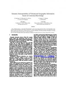
Fig. 1. OSM editing heat map, with editing history and timeline of the selected feature on the right.
and region) adjust the size of the data points. In our application, the “heat intensity” for each data value is calculated depending on the information contained in the current map bounding box. In addition to the corresponding OpenStreetMap tiles, which serve as a base map, we use the raw OSM data (obtained from the OSM API) to extract information on the current version of all features. The version of an OSM node or way is increased upon every editing action, so that features with high version numbers have been edited often, i.e., their geometry and/or tags have been changed. In order to handle outliers in the version numbers, we normalized to an interval that equals twice of the standard deviation of all version numbers in the current bounding box. An example of the corresponding heat map is shown in Figure 1, the prototype can be tested at http://giv-heatmap.uni-muenster.de. As shown in the screen shot, the heat map layer is overlaid with a vector layer containing the original raw data points retrieved from OpenStreetMap. Through this layer, a user can obtain further information about a particular “point of heat” by clicking the spot. This will open the history of the corresponding spot, as shown on the right of Figure 1: Our server component analyses the history of the element and illustrates the changes so that added, changed, and removed tags are easy to recognize through the corresponding color (green, yellow, and red, respectively). Moreover, the time line7 at the bottom gives an overview of the temporal editing patterns on the currently selected feature. 4
C ONCLUSIONS
AND
F UTURE W ORK
Heat maps provide an intuitive visual overview of the intensity of a phenomenon with respect to a spatial region. In this paper, we have shown how heat maps can be used to explore the editing history of OpenStreetMap data. By combining the map with a color-coded editing outline, we overcome the lack of explanation of the quantitative meaning of the colors inherent in heat maps. Moreover, we facilitate temporal analysis of each feature by providing a timeline. The prototype implementation introduced in this paper allows for an intuitive exploration of the history of points of interest and poly7 Based
on http://www.simile-widgets.org/timeline/.
gons in OSM. The development of this prototype was triggered by the need for an easy-to-use tool to gain insight into the editing and tagging patterns in OSM. The goal is to eventually use information about the history and stability of a feature as a proxy for data quality. In order to further facilitate the visual exploration approach, we are currently developing a classification of editing patters to highlight features on the map whose history matches those patterns. ACKNOWLEDGMENTS This research has been funded partially by the SimCat II project (DFG JA1709/2-2), see http://sim-dl.sourceforge.net. R EFERENCES [1] D. Fisher. Hotmap: Looking at geographic attention. IEEE Transactions on Visualization and Computer Graphics, 13(6):1184–1191, 2007. [2] D. Fisher. The Impact of Hotmap. Microsoft Research, available from http://research.microsoft.com/apps/pubs/default. aspx?id=81244, 2009. [3] F. Girardin and J. Blat. Place this photo on a map: A study of explicit disclosure of location information. Late Breaking Result at Ubicomp, 2007. [4] M. F. Goodchild. Citizens as voluntary sensors: Spatial data infrastructure in the World of Web 2.0. International Journal of Spatial Data Infrastructures Research, 2:24–32, 2007. [5] E. Hoadley. Investigating the effects of color. Communications of the ACM, 33(2):120–125, 1990. [6] P. Longley. Geographic information systems and science. John Wiley & Sons Inc, 2005. [7] B. Shneiderman. Tree visualization with tree-maps: 2-d space-filling approach. ACM Trans. Graph., 11(1):92–99, 1992. [8] T. Slocum. Thematic cartography and visualization. Prentice Hall, second edition, 2004. [9] J. J. D. White and R. E. Roth. Twitterhitter: Geovisual analytics for harvesting insight from volunteered geographic information, 14-17th September 2010.