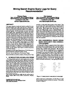
Aug 15, 2007 - Graph mining, query logs analysis, knowledge extraction. 1. INTRODUCTION ... Queries submitted to search engines convey implicit knowl- edge if we ..... there is not a strong correlation between the two measures. Table 5 ...
Research Track Paper
Extracting Semantic Relations from Query Logs Ricardo Baeza-Yates
Alessandro Tiberi∗
Yahoo! Research Barcelona, Spain & Santiago, Chile
Univ. of Rome “La Sapienza” Italy
ABSTRACT
of crowds [16]). The Web can be seen as the largest intent to store all human knowledge, either explicitly (e.g. Wikipedia) or implicitly. Social media (also called Web 2.0) has allowed more people to be able to contribute content in the Web, something that a few years ago was not true. The collaborative tagging work on sites like Flickr has created non-hierarchical categories called folksonomies. Nevertheless, still not all the people participate on social media, so a first question is: can we tap on the knowledge of more people? Below we argue that the answer is on the positive side. Queries submitted to search engines convey implicit knowledge if we assume that most of the time user actions are meaningful. Queries can be seen as tags associated to documents clicked by the people making those queries, in a similar way that link anchor text is used as surrogate text of the linked Web pages. So we can look at queries as an implicit folksonomy. However queries contain more semantic relations: some are equivalent, other are more specific, etc. In fact, those relations imply a pragmatic taxonomy, the taxonomy of the language that people use to search the Web (a kind of webslang). Hence, the challenge is how to extract interesting relations from very large query logs and find some structure for the webslang. This paper is one of the first attempts towards this ambitious goal. One natural starting point is to infer a graph from the queries. One such graph is the bipartite graph of queries and URLs, where a query and a URL are connected if a user clicked in a URL that was an answer for a query. Another possibility, more frequent in previous research, is to define a similarity (or distance) function between queries. This also implies a graph based on this function. One drawback of defining a function is that it is more difficult to understand why two queries are similar and in some degree we add artificial artifacts that can add noise to data that is already noisy. In this paper we give two different contributions. First we present a natural distance among queries that is related to previous work and we analyze large graphs that are generated by such a distance. The graphs are less sparse than in previous work, perhaps because before large data sets were usually not available. We analyze several characteristics of these graphs. This analysis provides information not only about how people query but also about how they behave after a query and the content distribution of what they look at. We then attempt to extract knowledge using the previously mentioned bipartite graph as starting point. Basically two queries are connected if there is a path between them in the bipartite graph. We also define different edge colors based on the URLs that connect two queries, which imply possi-
In this paper we study a large query log of more than twenty million queries with the goal of extracting the semantic relations that are implicitly captured in the actions of users submitting queries and clicking answers. Previous query log analyses were mostly done with just the queries and not the actions that followed after them. We first propose a novel way to represent queries in a vector space based on a graph derived from the query-click bipartite graph. We then analyze the graph produced by our query log, showing that it is less sparse than previous results suggested, and that almost all the measures of these graphs follow power laws, shedding some light on the searching user behavior as well as on the distribution of topics that people want in the Web. The representation we introduce allows to infer interesting semantic relationships between queries. Second, we provide an experimental analysis on the quality of these relations, showing that most of them are relevant. Finally we sketch an application that detects multitopical URLs.
Categories and Subject Descriptors H.2.8 [Information Systems]: Database applications— Data mining; H.3.5 [Information Systems]: Information Search and Retrieval—Query formulation
General Terms Experimentation, Measurement
Keywords Graph mining, query logs analysis, knowledge extraction.
1.
INTRODUCTION
One of the recurrent goals of mankind has been to recollect all human knowledge, as the wisdom of all the people is larger than any particular individual (e.g. the wisdom ∗
Work done while visiting Yahoo! Research Barcelona.
Permission to make digital or hard copies of all or part of this work for personal or classroom use is granted without fee provided that copies are not made or distributed for profit or commercial advantage and that copies bear this notice and the full citation on the first page. To copy otherwise, to republish, to post on servers or to redistribute to lists, requires prior specific permission and/or a fee. KDD'07, August 12–15, 2007, San Jose, California, USA. Copyright 2007 ACM 978-1-59593-609-7/07/0008 ...$5.00.
76
Research Track Paper ble semantic relations among queries. To explore our ideas we use more than twenty million queries from the Yahoo! search engine and we do a manual and automatic evaluation of the results. Moreover, we sketch an application that employs the graph to detect multitopical URLs, providing a promising approach to tackle the noise issue. In Section 2 we discuss previous work in query similarity and knowledge extraction from queries. In section 3 we describe a natural vector model to define similar queries and define semantic relations among queries. In section 4 we analyze a large graph generated from a large query log and in section 5 we evaluate our results. We end with some conclusions and future work.
2.
queries.Recently, Sahami and Heilman [15] used a query similarity based on the snippets of the answers to the queries. However, they do not consider the feedback of the users (i.e. clicked pages). Another related paper defines a query taxonomy to cluster the answers [18], but query logs are not used, while in Cid et al. [5] they use query logs to maintain a taxonomy, but not to build one. In the work by Chuang et al. [6, 7, 8, 13] query logs are used to build a query taxonomy, but no user feedback is used. This idea of building a taxonomy based on queries is extended in [9], but this is not the same as building a taxonomy of the queries, which is what we would call a query taxonomy. The closest work to ours is by Dupret and Mendoza [10] where relations among queries are defined using the rank of clicked URLS. Although with a different goal, they do generate query relations that can be associated to parts of a query taxonomy.
PREVIOUS WORK
Most of the work on query similarity is related to query expansion or query clustering. One early technique proposed by Raghavan and Sever [14] attempts to measure query similarity using the differences in the ordering of documents retrieved in the answers, which is not feasible in the current Web. Later, Fitzpatrick and Dent [11], measured query similarity using the normalized set intersection of the top 200 documents in the answers for the queries. Again, this is not meaningful in the Web as the intersection for semantically similar queries that use different synonyms can and will be very small. Wen et al [17] proposed to cluster similar queries to recommend URLs to frequently asked queries of a search engine. They used four notions of query distance based on: (1) keywords or phrases of the query; (2) string matching of keywords; (3) common clicked URL’s; and (4) the distance of the clicked documents in some pre-defined hierarchy. Befferman and Berger [4] also proposed a query clustering technique based on distance notion (3). As the average number of words in queries is small (about two) and the number of clicks in the answer pages is also small [1], notions (1) and (2) generate very sparse distance matrices. Notion (4) needs a concept taxonomy and the clicked documents to be classified into the taxonomy, which cannot be done in a large scale. Also (3)is sparse, but this sparsity can be diminished using large query logs, as in this paper. Fonseca et al [12] propose to discover related queries using association rules. The query log is viewed as a set of transactions, with each transaction representing a session in which a single user submits a sequence of related queries in a time interval. The method shows good results, but two problems arise: it is difficult to determine sessions of queries belonging to the same search process; moreover the most interesting related queries, those submitted by different users, cannot be discovered, since the support of a rule increases only if its queries appear in the same query session (i.e. they are submitted by the same user.) Baeza-Yates et al. [2, 3] used the content of clicked Web pages to define a term-weight vector model for a query. They consider terms in the URLs clicked after a query. Each term is weighted according to the number of occurrences of the query and the number of clicks of the documents in which the term appears. Then the similarity of two queries is equivalent to the similarity of their vector representations, like the cosine distance function. This notion of query similarity has several advantages. First, it is simple and easy to compute. On the other hand, it allows to relate queries that happen to be worded differently but stem from the same topic, hence capturing semantic relationships among
3. THE COVER GRAPH In this section we define a graph that naturally comes from user actions after a query. It is based on the notion (3) explained on the previous section. Before continuing, we define the main concepts used in the sequel of the paper: • Query instance: query (set of words or sentence) plus zero or more clicks related to that query. Formally: QI = (q, u∗ )
where q = {words or phrase}
being q the query, and u a clicked URL. Moreover, given a query instance QI we denote with QIq the query associated to QI and with QIc(u) the set of its clicked URLs. • URL Cover: set of all URLs clicked by a query. That is: [ U Cp = QIc(u) QIq =p
We are interested in the aggregation of equal queries (e.g. same set of words or same phrase) independently of other attributes of the query. Hence from now on, we will use query to denote the set of all equivalent queries (queries for which the set of words is the same), and we will use as URL cover the union of all covers for the equivalent queries. We now introduce a vectorial representation for the queries. Queries are represented as points in a high dimensional space, where each dimension corresponds to a unique URL u. That is, a query is based on all the different URLs in its URL cover. Given a query q, denote its representation with q¯. Each component of the vector q¯ is assigned a weight equal to the frequency with which the corresponding URL u has been clicked for that query q. We now define a graph based on this vectorial representation. Each query is a node of the graph. Two nodes (queries) are connected by an edge iff they share at least one URL u (that is, their vectorial representations have one component that is positive in both queries). Hence we obtain a nondirected graph. Edges are weighted according to the cosine similarity of the queries they connect. Hence, if e = {q, q 0 } and the URL space has D dimensions (total number of different URLs), the weight of e is given by: P 0 q¯ · q¯0 i≤D q(i) · q (i) q q = W (e) = P P 2 2 |¯ q | |¯ q0| 0 i≤D q(i) · i≤D q (i)
77
Research Track Paper Full Graph Total Queries: Total Clicks: Nodes: Isolated nodes: Edges: Unique URL:
20840741 10015280 2841520 1412208 361029245 4927978
Filtered Graph (Clicks > 10) 7501654 3229174 100057 25437 10370388 973187
Filtered Graph (Edge Weight > 0.5) 7501654 3229174 100057 74532 60945 973187
Filtered Graph (Multitopical URLs) 20840741 2841520 11M 4927578
Table 1: Some figures about the studied graphs.
3.2 Multitopical Web Pages
We define the weighted degree of a node, the sum of the weights of all its edges divided by its degree δ(q). That is, the weighted degree δW (q) of a node q is: 1 X δW (q) = W (e) δ(q) q∈e
As we already said in the introduction, the main purposes of this graph is to provide a tool for extracting semantic relations between queries. One of the factors leading to edges representing relations of poor quality is the presence of Multitopical URLs: URLs that cover either several topics or a single very general topic. URLs related to e-commerce sites are examples of the former, and portals about music or travel of the latter. Even very different queries can lead to clicks on such sites, hence a shared click on such a URL is not very informative. If we were able to detect such URLs we could filter them out thus possibly providing relations of better quality. To this end, we propose a simple but effective approach. We start by noticing that low weight edges are more likely to represent poor quality semantic relations. Hence, URLs involved in such edges are not likely to be very specific. This leads us to this heuristic: consider low weight edges as voters and let the URLs be the candidates. Each edge votes for its URLs (that is, for the URLs its queries share.) Now we can sort URLs according to the number of votes they received: the more votes a URL gets, the more multitopical it is. We can then apply a threshold (either on the number of votes or of URLs we want to get rid off) and compute a new graph without the selected URLs.
This graph can be computed relatively fast. The edges can be computed by sorting the URLs clicked by a query. The weights of the edges can be computed in linear time in the worst case, much faster on average as queries do not share many URLs. Let M be the maximal number of URLs between two queries. Hence the graph can be computed in max{M E, n log n} time, where E is the number of edges in the graph and n is the number of nodes. On average, M = O(1).
3.1 Relating Queries We now define different edge types based on the set relations among URLs that connect two query nodes. We classify the edges in three types, such that there is an edge between q1 and q2 if: • Identical cover (red edges or type I): U Cq1 = U Cq2 . This edge is undirected and should imply that both queries are in practice equivalent. We later give examples of different types of equivalences.
4. ANALYSIS OF A LARGE GRAPH
• Strict complete cover (green edges or type II): U Cq1 ⊂ U Cq2 . This is a directed edge from q1 to q2 . Semantically this should imply that q1 is more specific than q2 .
We have used several query logs containing up to fifty million queries and the results are similar for all of them, so here we present data from only one log piece of 2005 coming from the Yahoo! search engine. For building this graph we have used all the queries in the log piece with at least one click. As this graph is very large, we have filtered both its edges and its nodes. Concerning the nodes, we have filtered the queries with few clicks, while for the edges we have used a weight criterion. Intuitively, when cutting low weight edges we are also reducing the noise, since those edges represent weak relations between queries. Similarly, queries with few clicks tend to be more noisy since we have less information at disposal. The application that we have in mind for this graph (see section 5) leads us to consider also another way to filter our graph. This last technique, described in the previous subsection, essentially consists in detecting and filtering out multitopical URLs. We first describe the data for the whole graph and its versions obtained by simpler filtering techniques. Data concerning the more refined one are postponed to subsection 5.2 were also an experimental evaluation of the technique is presented. Table 1 gives the main characteristics of the different versions of the graph.For all the generated graphs we have studied different parameters. In the following each of them is discussed, and the corresponding plots are presented. Often, the observed behavior clearly follows a power law. When
• Partial cover (black edges or type III): U Cq1 ∩ U Cq2 6= ∅, but does not fulfill any of the previous two conditions. This is the most typical edge and can exist for many reasons: due to multi-topic URLs to truly related queries. For most of the analysis of the graph that is carried out in the next section we do not consider this distinction between different edges. On the other hand, for extracting knowledge from the graph, we focus on the first two types of edges. These notions of set covers can be relaxed using a parameter α. That is, we say that a query q1 is α−included in q2 if the Euclidean norm of the vector we obtain by projecting q1 on the URLs it shares with q2 is at least α. More formally, qP 2 q1 ⊆α q2 if and only if u∈U C(q1 ,q2 ) q1 (u) ≥ α where
U C(q1 , q2 ) = U Cq1 ∩ U Cq2 . We say that an edge e = {q1 , q2 } is α−red if q1 ⊆α q2 and q2 ⊆ α q1 . We say that a directed edge e = (q1 , q2 ) is α−green if q1 ⊆α q2 and q2 *α q1 . We use this relaxation as a way to filter the graph for noisy data, reducing also its size.
78
Research Track Paper
Figure 1: First row: Queries frequency and query click distribution for the whole one piece of log. Second: Clicked URL distribution and query frequency vs. clicks (the last two expressed as fractions). Third: Node Degree distribution, and Queries Frequencies vs. Node Degree.
79
Research Track Paper Power laws: A · xB Query Frequency Overall With Clicks No clicks Query Click Full Graph Filtered Node Degree Full Graph Filtered (clicks) Filtered (edge) Connected Components Full Graph Filtered (clicks) Filtered (edge)
A
B
10191819 2521970
-2.38 -3.06
10810986 5541161
-2.39 -2.53
548004 31819 31819
-1.43 -1.37 -2.05
1765795 29035 50838
-3.66 -3.94 -3.13
Table 2: Power Laws. Figure 3: Connected Components this is the case, the associated law is also plotted. Moreover, in Table 2 the interested reader can find the coefficients of all the laws. The left hand side of the first row of Figure 1 shows the frequency of the queries in the whole log. Each entry in the query log is counted as a distinct query occurrence. Three curves are shown, one counts the occurrences of all the queries, one counts the occurrences of the queries for which at least one result has been clicked, and the last one the occurrences of the queries without any click. All the curves exhibit a power law behavior. Clicked queries essentially show the same behavior (and actually they follow the same power law) of what is observed in whole log. On the other hand, queries without clicks appear to be more biased. The plot on the right hand side of the same row shows the query click distribution. Each point represents the number of queries (y axis) with a given number of clicks (x axis). Again we can see that for the full graph there is a power law at work (and this holds also for its filtered versions, not shown in the plot.) The plot on the left hand side of the second row shows the clicks distribution from the URLs point of view. Each point represents the number of URLs with a given number of clicks. Not very surprisingly, also this distribution clearly follows a power law. On the right hand side of the same row, the queries click distribution is plotted against the queries frequency. That is, each point represents the number of occurrences and the number of clicks for a given query. Both axis are normalized by dividing either by the total occurrences (x axis) or by the total number of clicks (y axis.) The bottom left part of the graph clearly shows much more variance than the rest. That is because less frequent queries have more click variance while very frequent queries tend to have a bit less than one click on average. The plots on the last row of figure 1 are probably ones of the most interesting. On the left it is shown the node degree distribution (normalized so that each point shows the number of nodes with a given degree), while on the right one each node degree is plotted against the number of occurrences of the corresponding query. As we can see from the graph, the node degree distribution follows a power law. Moreover, this is true for all the graphs we have analyzed.
Hence this property seems to remain constant even if you filter the graph, both on the nodes and on the edges. Thus, the cover graph we have generated could be seen as a kind of free-scale and autosimilar network. We also underline that the curve for the graph filtered according to the edge weight, shows even more clearly such a property. Thus, low weight edges (weak semantic relation between queries) are responsible of the outliers and probably many of them are just noise. Moreover, this kind of noise can be easily removed (by just filtering the low weight edges.) On the first row of figure 2, the nodes weight (left) and edges weight distributions are plotted. In both graphs, the y axis is normalized, showing the fraction of nodes (edges) with a given weight. The weight of a node is just its weighted degree, as previously defined. The curve for the graph that has been filtered according to the edges weight is obviously truncated at the threshold we have used. The same applies for the other graph. The last plot, Figure 3 shows the connected components distribution. Each points represent the number of components of a given size (expressed as a fraction of the total number of nodes). Also in this case we see that for all three graphs the distribution follows a power law. Interestingly enough, all graph exhibits a connected component that is a good fraction of the whole graph, resembling somehow what is observed in the web graph. Moreover, the ratio between the size of the biggest connected component and the number of nodes, varies according to which kind of filtering we apply. In particular, we can observe that this ratio increases when the click filter is used but it gets smaller when the edge weight filter is used. Tables 3 and 4 shows examples of type I (red) edges and type II (green) edges. The first table has the webslang examples at the end, detailing the type of equivalence found. The second table shows path examples on similar queries. In figure 4 we show a small part of a cover graph, that includes several separate components. Notice that edges with larger weights are darker, dashed (red) edges are identical covers and dotted (green) edges are complete covers.
80
Research Track Paper
Figure 2: First row: Node and Edge weight distribution (as fractions). Second: graph structure as edges are filtered Equivalent Edges Queries Sim Type of Equivalence ( tfcu, teachers federal credit union ) 1.0 acronym ( fhb, first hawaiian bank ) 1.0 acronym ( wtvf , news channel 5 ) 1.0 synonyms (Nashville TV channel) ( ccap, wcca ) 1.0 synonyms (Wisconsin court Internet access) ( free hispanic chat, latinopeoplemeet ) 1.0 synonym for domain name ( lj, www.livejournal.com ) 1.0 acronym for URL ( bable fish, alta vista babel fish ) 1.0 synonyms ( aj , askgeeves ) 1.0 synonyms with misspell ( yahoo for kids, yahooligains ) 0.90 synonym for misspelled domain name ( unit conversion, online conversions ) 0.85 synonym ( merriam, m-w.com ) 0.84 name for domain name ( yahoo directions, maps.yahoo.com ) 0.48 synonim for URL Table 3: Examples of equivalent queries.
81
Research Track Paper Paths on Similar Queries how to learn guitar → online guitar lessons → berklee college of music latest nokia mobiles → mobile phones toyota auto parts → wholesale car parts → used auto parts → auto parts wire window boxes → window box → decorative iron → wrought iron fence www.mysiemens.com → siemens phones Table 4: Some path examples on similar queries.
Figure 4: An example showing all possible edge types (equivalent queries are dashed edges, similar dotted)
4.1 Using edges weight as filter
provide an experimental evaluation of our heuristic for detecting multitopical URLs.
The weight associated to an edge could be interpreted as a measure of the confidence we have in the fact that queries joined by that edge are related. Hence, it is interesting to study how the graph changes as only edges of increasing weight are left. Plots on the second row of figure 2 reports our finding to this respect. In particular we let the edge weight threshold vary between 0 (all edges are kept) and 0.9 (edges with weight lesser than 0.9 are discarded), and check how the node degree distribution, the number of isolated nodes and the size of the largest connected component change. The first plot shows the node degree distribution: each point shows the degree of a node, with nodes being sorted in decreasing order with respect to their degree. Interestingly enough, as we filter more and more edges, the behaviour of the distribution does not change much. However, as the threshold increases, we can notice that long sequences of nodes with the same degree appears: these are usually clique induced by a single URL. On the second plot, we can see that the percentage of isolated nodes increases somewhat faster than linearly in the threshold value. As the threshold reach 0.9, the graph gets almost completely disconnected. On the other hand, the size of the largest connected component does not decrease very fast: this indicates that to heavily modify the structure of the graph many edges have to be removed. Also similar observations hold for the connected component distribution, which we do not show here due to lack of space.
5.
5.1 Semantic Relations Evaluating the quality of semantic relations is difficult, in particular for webslang, as there are no linguistic resources available. We mainly focus on the first kind of edges, the ones induced by identical covers. From the user perspective queries in these edges are very related, since they give rise to clicks on exactly the same set of URLs. We have done both a manual evaluation by a human expert, and automatic evaluation, on different samples of type I (red) edges. More precisely, for the evaluation we have used four different samples of the edges, each of them containing one thousand edges. The four samples differ in the number of clicks involved in their edges. Remember that an edge consists of two queries and that to each query is associated the sets of URLs users clicked after having submitted that query. Hence we can count, for each query, how many times a user did click on one of the results (notice that of course this number is usually different from the number of distinct URLs clicked for a given query.) The first sample is selected at random among edges that contain queries with just one click associated, that is, queries which, no matter of the number of times were submitted, gave rise to just one click. Our second sample was chosen by selecting (again at random) edges for which both queries have associated at least four clicks. The third sample is chosen by selecting, among all red(green) edges, those that maximize the sum of the clicks associated to the queries. The last sample is chosen by selecting those edges which maximize the minimum number of clicks involved, that is edges that maximize the number of clicks associated to the query with less clicks in the edge. The intuition behind varying the clicks in the sample is that
EXPERIMENTAL EVALUATION
In this section we report some experiments that we have carried out to assess how good in practice are the relationships represented by the edges of our graphs. Later, we
82
Research Track Paper Sample One click Max Sum Four Click Max Min
the more information (clicks) we have about a query, the better the semantic relation that we infer is going to be. For the automatic evaluation we have used data from the Open Directory Project1 . As the reader may know, when a user types a query in ODP, besides site matches, we can also find categories matches in the form of paths between directories. Moreover, these categories are ordered by relevance. For instance, the query “Spain” would provide (among others) the category “Regional/ Europe/ Spain”, while one of the results for “Barcelona” would be “Regional/ Europe/ Spain/ Autonomous Communities/ Catalonia/ Barcelona”. Hence, to measure how related two queries are, we can use a notion of similarity between the corresponding categories (as provided by ODP.) In particular, we measure the similarity between two categories D and D 0 as the length of their longest common prefix P (D, D 0 ) divided by the length of the longest path between D, D 0 . More precisely, denoting the length of a path with |D|, this similarity is defined as: Sim(D, D 0 ) = |P (D, D0 )|/max{|D| , |D 0 |}. For instance, the similarity between the two queries above is 3/7 since they share the path “Regional/Europe/Spain” and the longest one is made of seven directories. We have evaluated the similarity between two queries by measuring the similarity between the most similar categories of the two queries, among the top k answers provided by ODP, for various values of k. The first row of plots in figure 5 shows the results concerning the red edges. On the y axis the similarity is shown, while on the x axis we let the parameter k change. The results supports our intuition about using the clicks as an indicator of the reliability of the inferred relations. In fact, the samples for which we get the best results are the one that were chosen by maximizing the minimum numbers of clicks in the pairs and the one in which both queries contain at least four clicks. That is because such edges are less noisy: for both queries we have a reasonable amount of information. The fact that we obtain good performances for the latter sample is also interesting from a applicative point of view: for practical purposes this means that our technique can be applied to a large number of queries and not only to those with many clicks. On the right side we see that we can relax the graph a lot and still get good results (actually results in some cases even improve). On the other hand, we can see that by selecting edges that maximize the sum of the clicks, we do even worse than if we select edges in which there are queries with one click. Intuitively, that is because one noisy query (the one with few clicks), is enough to make the edge not very informative. Moreover, the typical edge selected in this way contains one query with many clicks and one with just one click, which makes the first query a good candidate for being a popular query and the second for being a rather obscure or not well formulated query. Hence, having poor results for such edges is not really very surprising. The same set of results concerning green edges are given in figure 6. Similarly to what happens with the red edges, here the samples that performs better are the one with at least four clicks and the one that maximizes the minimum number of clicks, for the same reasons discussed before. The sample that maximizes the sum of the clicks performs even worse than the one in which there are queries with just one click. Actually, these edges seem not to be very interesting 1
Red Edges 26% 26% 38% 42%
Green Edges 24% 35% 42% 45%
Table 5: Matches in ODP for both types of edges. since most of them contains a very specific query (with few clicks, often just one, perhaps even a mistake) and a very general one, like a search engine or a portal (with many clicks). Comparing figure 6 with figure 5, we can see that overall the similarity in the first plot is lower than in the second one. This is to be expected, since these edges express weaker semantic relations than the red ones, as they are meant to describe pairs of queries in which the first one is more specific than the second one. Hence a very high similarity is nor expected neither desired. Actually, since the most obvious application of edges of this kind is for query recommendation/expansion/reformulation, edges with perfect similarity are not very useful: for such edges you are likely to get the same set of results for both queries. Instead, we are more interested in queries which are similar, but not too much, since from such queries we can get different results. The second plot in the same figure shows for each connected component (except for the largest one) the percentace of red and green edges. We can observe that as long as the size of the component is relatively small, both components where the vast majority of edges is red (or green) and components where these kind of edges are a small percentage can be found. As the size of the component increases, the behaviour seems to somewhat stabilize. On the second row of plots in figure 5, we can compare all three types of edges (for type I and II edges a sample with four clicks was used as before). The first plot shows that the kind of edges we are considering does make the difference: red edges show a quite higher similarity than green edges, which in turn show a much higher similarity than partial cover edges. Moreover, as a sanity tester, we also evaluated random edges between queries that in the graph do not share an edge: as the plot shows, this kind of edges show a very low similarity. The second plot shows the ODP similarity (x axis) versus the click similarity (the weight) of the samples evaluated in the previous plot. As we can see, for all samples there is not a strong correlation between the two measures. Table 5 shows for each of the samples that we studied, the percentage of both type of edges that we were able to retrieve from ODP. We counted a positive match whenever both queries had at least one category listed. We can notice that the sample for which we get the best results are also the ones for which there is a better coverage in ODP. This implies that the webslang relations could be up to more than 50% of all the extracted relations, and a high percentage of them can be relevant.
5.2 Multitopical Web Pages We experimented our approach on the large graph and observed some interesting facts. Looking at the distribution of votes (plot omitted due to lack of space), which again follows a power law, we decided to cut the 400 URLs that got most votes. This brought a very drastic change in the number of edges: it decreased from 361 to only 11 million. On the other hand and rather surprisingly, such a dramatic change concerning the edges, did not alter much the struc-
http://www.dmoz.org/
83
Research Track Paper
Figure 5: Similarity of the different samples found for equivalences for different k (left) and different α (right). Sample Top Middle Bottom
Precision 0.83 0.69 0.59
Votes > 2000 300-289 117-115
precision by counting in each sample, how many URLs were actually multitopical. For the evaluation, broken URLs were removed and discarded. Table 6 shows how precision varies among the three samples. It also shows the votes range. As the table shows, we get quite good precision with the top of the list, while precision decreases as we go further down in the list. This implies that the number of votes and how multitopical a URL is, are correlated, providing experimental support to our heuristic. Moreover, we also found this approach to be, at least to some extent successful with respect to our original goal: the filtered graph provided semantic relations that gave an improvement of up to 5% on the average similarity.
Table 6: Precision against votes for all samples. ture of the graph: the connected components distribution remained almost unaltered, in particular the associated power law exhibits exactly the same coefficients. Also the number of isolated nodes remained essentially unaltered. We regard these two facts as a good hint that our approach goes in the right direction for addressing the noise issue. In fact our results seem to indicate that we are able to remove edges without changing the underlying structure of the graph. In order to evaluate the effectiveness of our classification, we have ordered the URLs by vote and selected the first 2% among the URLs that received at least one vote. Among the original (about) five million URLs, about 157K received at least one vote. We studied how the precision varies with the number of votes by manually classifying three different samples of 50 distinct URLs, taken respectively in the top, middle and bottom of the list. We manually measured the
6. CONCLUDING REMARKS Our results are really promising if we consider that the query log was actually small and over a short period of time. This implies that we can neither follow patterns over time nor consider the number of different users involved in the clicks (more users, more wisdom). So an immediate extension is to use larger logs and include information on unique users to classify the quality of results.
84
Research Track Paper
Figure 6: Similarity for different samples of green edges. of 300 million potential interesting relations! That is, we are just seeing the tip of the iceberg, because also the potential number of applications of query graphs is huge.
Also, we underline that the similarity measure used in the experimental evaluation is quite strict: often queries that are not related according to ODP, are actually equivalent. For instance, the two queries ”anchorage alaska newspaper” and ”adn com”, do not share any ODP category but they refer to the same thing: (adn.com is the site of the Anchorage Daily News.) Hence, the figures reported in the evaluation are more a lower bound on the performance we can achieve, rather than an exact measure. In fact, we did a manual evaluation of a random sample of 130 pairs from the first two sample sets and we found that the precision was 63%, which is pretty close and larger than our results. From the relevant pairs, we found that at least 40% were synonyms, 17% were site name-domain equivalences and more than 5% were webslang (e.g. typos), which cannot be found normally in ODP. Quality of results could also be improved by incorporating in the query representation information about the order of clicked URLs. Actually, it is well known that the clicks distribution is biased by the order in which the results are presented.If we were able to remove the bias, and weight each click taking into account a positional factor, then we could obtain a more faithful representation of the “information need” associated with each query. Further analysis of the structure of the graph can surface even more relations. For example, a graph clique often implies that there is at least one URL that was clicked for all the queries in the clique. One potential reason could be again multi-topical URLs, so we can also use the graph to typify web content. The graph mining techniques proposed in this paper, applied to larger query logs, can generate huge amounts of interesting relations: according to searchenginewatch.com, the number of queries of large search engines per day is of the order of hundred of millions. A one day graph would have then more than 10 billion edges. According to our results, around 6% of them will be equivalent queries and 15% of them similar queries. Considering a 50% precision for the first set and a 20% precision for the second, we have a total
7. REFERENCES
[1] R. Baeza-Yates. Applications of web query mining. ECIR’05. [2] R. Baeza-Yates, C. Hurtado, and M. Mendoza. Query clustering for boosting web page ranking. AWIC’04, [3] R. Baeza-Yates, C. Hurtado, and M. Mendoza. Query recommendation using query logs in a search engine. EDBT Workshops, 2004. [4] D. Beeferman and A. Berger. Agglomerative clustering of a search engine query log. KDD’99. Boston, MA USA. [5] A. Cid, C- Hurtado, and M- Mendoza. Automatic maintenance of Web directories using clickthrough data. WIRI’06. [6] S.-L. Chuang and L.-F. Chien. Automatic query taxonomy generation for information retrieval applications. Online Information Review 27(4), 2003. [7] S.-L. Chuang and L.-F. Chien. Enriching web taxonomies through subject categorization of query terms from search engine logs. Decision Support System 30(1), 2003. [8] S.-L. Chuang and L.-F. Chien. Towards automatic generation of query taxonomy: A hierarchical query clustering approach. ICDM’02. [9] P.-J. Cheng, C.-H. Tsai, C.-M. Hung, and L.-F. Chien. Query Taxonomy Generation for Web Search (poster). CIKM’06. [10] G. Dupret and M. Mendoza. Automatic Query Recommendation using Click-Through Data. IFIP PPAI’06. [11] L. Fitzpatrick and M. Dent. Automatic feedback using past queries: Social searching? In SIGIR’97. [12] B. M. Fonseca, P. B Golgher, E. S. De Moura, and N. Ziviani. Using association rules to discovery search engines related queries. In LA-WEB’03. [13] H.-T. Pu, S.-L. Chuang, and C. Yang. Subject categorization of query terms for exploring web users’ search interests. JASIST 53(8),2002. [14] V. V. Raghavan and H. Sever. On the reuse of past optimal queries. SIGIR’95. [15] M. Sahami and T. D. Heilman. A web-based kernel function for measuring the similarity of short text snippets. WWW’06. [16] James Surowiecki. The Wisdom of Crowds: Why the Many Are Smarter Than the Few and How Collective Wisdom Shapes Business, Economies, Societies and Nations, Little and Brown, 2004. [17] J. Wen, J. Mie, and H. Zhang. Clustering user queries of a search engine. WWW’01. [18] H. -J. Zeng, Q. -C. He, Z. Chen, W. -Y. Ma, and J. Ma. Learning To Cluster Search Results. SIGIR’04.
85