Interactive Linked Micromap Plots for the Display of Geographically Referenced Statistical Data J¨ urgen Symanzik and Daniel B. Carr Utah State University, Logan, Utah, USA,
[email protected] and George Mason University, Fairfax, Virginia, USA,
[email protected]
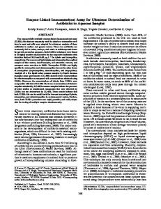
1 Introduction Over the last decade, researchers have developed many improvements to make statistical graphics more accessible to the general public. These improvements include making statistical summaries more visual and providing more information at the same time. Research in this area involved converting statistical tables into plots (Carr, 1994; Carr and Nusser, 1995), new ways of displaying geographically referenced data (Carr et al., 1992), and, in particular, the development of linked micromap (LM) plots, often simply called micromaps (Carr and Pierson, 1996; Carr et al., 1998, 2000a). LM plots, initially called map row plots as well as linked map–attribute graphics, were first presented in a poster session sponsored by the American Statistical Association (ASA) Section on Statistical Graphics at the 1996 Joint Statistical Meetings (Olsen et al., 1996). More details on the history of LM plots and their connection to other research can be found in these early references on micromaps. More recent references on LM plots (Carr et al., 2000b; Carr, 2001) focused on their use for communicating summary data from health and environmental studies. The basic idea behind LM plots is to link geographic region names and their values, as shown in quality statistical graphics such as row–labeled dot plots, with their locations, as shown in a sequence of small maps, called micromaps. This provides the opportunity to see patterns in a geospatial context as well as in the traditional statistical graphics context. Fig. 1 shows a simple example of LM plots. This figure shows the twenty–five U.S. states with the highest white female lung and bronchus cancer mortality rates for 2002. The states are sorted in descending order by the mortality rates and partitioned into groups of five to promote focused comparisons. The left hand column consists of linked micromaps with one micromap for each group of five states. The top micromap has five regions with black outlines. Within each group of five states, the shade of grey fill for a region links to the shade of grey in the dot beside the region’s name and to the shade of grey in the dot indicat-
2
J¨ urgen Symanzik and Daniel B. Carr
Lung and Bronchus Cancer: White Female Mortality 2002 Linked Micromaps With Cumulative States
U.S. States 25 Highest Rates
DC
AK
HI
Mortality Rates 2002 and 95% CI
Kentucky Nevada Oregon Arkansas West Virginia Maine New Hampshire Oklahoma Indiana Rhode Island Tennessee Ohio Louisiana Washington Massachusetts Missouri Mississippi Maryland Michigan Florida Montana Virginia Alabama New Jersey Georgia 40
45
50
55
60
Deaths per 100,000 U.S. Value
Fig. 1. LM plots, based on data from http://www.statecancerprofiles.cancer.gov/ micromaps, showing lung and bronchus cancer mortality rates for white females in 2002. The left column shows five micromaps, with five states highlighted in different colors in each of the maps. The same color information is used to link to the names of the U.S. states in the middle column and to the data in the right column. This data column displays U.S. state mortality rates estimates (the dots) and 95% confidence intervals (the lines).
ing the region’s mortality rate. The same five shades of grey or distinct hues in color plots are links within each group of five states. The linking is basically horizontal within groups of five. The right column of Fig. 1 has familiar dot plot panels showing U.S. state mortality rates estimates and 95% confidence intervals. The data is from the U.S. National Cancer Institute (NCI) Web site http://www.statecancerprofiles.cancer.gov/micromaps, further discussed in Section 4.3. Fig. 1 shows a useful variant of linked micromaps that accumulates states outlined in black. That is, states featured in previous groups of five are out-
Interactive Linked Micromap Plots
3
lined in black and shown with a white fill or with a sixth distinctive hue in color versions. The black outline brings the outlined states into the foreground and creates a contour composed of state polygons. The bottom micromap contour included states with values above 43 deaths per 100,000. The states in grey are those added to the previous contour. While the political boundaries are less than ideal for accurately communicating geospatial patterns of local mortality rates, the progression of contours and the visible clusters in the bottom micromap are much more informative geospatially than the values in a table or in a dot plot. Many statistical graphics, such as dot plots, means with confidence bounds, box plots, and scatterplots, start with a strong foundation towards quality by encoding information using position along a scale. Position along a scale encoding has a high perceptual accuracy of extraction (Cleveland and McGill, 1984). Quality statistical graphics often represent estimate uncertainty and reference values using position along a scale encodings, provide grid lines to reduce distance effect problems in judging values against a scale, and follow the guidance of Tufte (1990) and others for visually layering information. Good visual layering makes the most important information the most salient. Estimates are generally more important than confidence bounds and should be layered within the foreground. Grid lines always belong in the background. There are many factors related to statistical graphics quality, starting with content and context, and extending to additional visual considerations, such as perceptual grouping and sorting. While specific instances of LM plots may provide opportunities for improvement, the paradigm can incorporate much knowledge about quality statistical graphics design. LM plots often provide a good alternative to displaying statistical information using choropleth maps. Choropleth maps use the color or shading of regions in a map to represent region values. Choropleth maps have proved very popular but have many problems and limitations as indicated by writers such as Robinson et al. (1978), Dent (1993), and Harris (1999). Reviewing these problems helps to indicate why LM plots are a good alternative. There are two kinds of choropleth maps, called unclassed and classed. Unclassed maps use a continuous color scale to encode continuous values (statistics). This is problematic because perception of color is relative to neighboring colors and because color has poor perceptual accuracy of extraction in a continuous context. Classed choropleth maps ameliorate this problem and dominate in the literature. Classed choropleth maps use class intervals to convert continuous estimates into an ordered variable with a few values that can be represented using a few colors. When a few colors are easily discriminated and regions are sufficiently large for color perception, color identification problems are minimal. The color scheme also needs to convey the class ordering based on values. Brewer (1997) and Brewer et al. (1997) provided results evaluating different color schemes in a mapping context. The Web site http://colorbrewer.org (see Leslie, 2002, for a short description) contains guidance on ordered color schemes
4
J¨ urgen Symanzik and Daniel B. Carr
and additional issues such as suitable schemes for people with color vision deficiencies and for different media. Perfect examples on how colors should be used in choropleth maps can be found in the 1996 “Atlas of United States Mortality” (Pickle et al., 1996). Even with a good color scheme, three key problems remain for classed choropleth maps. The first problem relates to region area. As suggested above, some map regions can be too small to effectively show color. Examples include Washington, D.C., on a map of the United States (U.S.) and Luxembourg on a European map. Map caricatures, such as Monmonier’s state visibility map (Monmonier, 1993), can address this problem, by enlarging small regions in a way that maintains region identifiability and shows each region touching the actual neighboring regions. Another facet of the area problem is that large areas have a strong visual impact while in many situations, such as in the mapping of mortality rates, the interpretation should be weighted by the region population. Dorling (1995) addressed this problem by constructing cartograms that changed region shapes to make areas proportional to population. Issues related to this approach are region identifiability, and map instability over time as their shapes change with changing populations. Area related problems persist in choropleth maps. A second key problem is that converting a continuous variable into a variable with a few ordered values results in an immediate loss of information. This loss includes the relative ranks of regions whose distinct values become encoded with the same value. The task of controlling conversion loss has spawned numerous papers about proposing methods for defining class intervals. Today, guidance is available based on usability studies. Brewer and Pickle (2002) indicated that quintile classes (roughly 20% of regions in each class) tend to perform better than other class interval methods when evaluated across three different map reading tasks. Still, the best of the class interval selection approaches loses information. The third key problem is that it is difficult to show more than one variable in a choropleth map. MacEachren et al. (1995) and MacEachren et al. (1998) were able to clearly communicate values of a second binary variable (and indicator of estimate reliability) by plotting black and white stripped texture on regions with uncertain estimates. However, more general attempts such as using bivariate colors schemes have been less successful (Wainer and Francolini, 1980). Thus, choropleth maps are not suitable for showing estimate standard errors and confidence bounds that result from the application of sound statistical sampling or description. It is possible to use more than one map to show additional variables. However, Monmonier (1996, page 154) observed that when plotting choropleth maps side by side it can easily happen that “similarity among large areas can distort visual estimates of correlation by masking significant dissimilarity among small areas.” The change blindness (Palmer, 1999, page 538) that occurs as the human eyes jump from one map to another map makes it difficult to become aware of all the differences that
Interactive Linked Micromap Plots
5
exist in multiple choropleth maps and hard to mentally integrate information in a multivariate context. Carr proposed the use of micromaps and the LM plots design in response to Anthony R. Olsen’s (from the U.S. Environmental Protection Agency (EPA), Corvallis, Oregon) challenge to extend traditional statistical graphics called row–labeled plots in Carr (1994) to include geospatial context. As indicated earlier, traditional statistical graphics often use position along a scale encodings for continuous values and can readily show estimates and confidence intervals together. Olsen, Carr, Courbois, and Pierson unveiled this new design with 4 × 8 foot poster at 1996 JSM. The map regions were 78 Omernik ecoregions for the continental U.S. The various ecoregion bar plots and box plots summarized detailed elevation information and detailed land class information derived from multiple advanced high–resolution radiometer (AVHRR) remote sensing images over time. The first literature example of LM plots (Carr and Pierson, 1996) showed state values for the U.S. This example adapted the state visibility map of Monmonier to address the visibility problems for small regions. That paper presented a micromap plot of unemployment by state with two data columns (unemployment rate with 95% confidence interval and total number of unemployed persons). The LM plots paradigm supports the display of different kinds of statistical panels, such as dot plots, bar plots, box plots, binned scatterplots, time series plots, and plots with confidence bounds. In particular, Carr et al. (1998) presented three micromap plots: (i) CO2 emissions in the Organization for Economic Cooperation and Development (OECD) states with one data column (annual time series), (ii) wheat prices by state with two data columns (average price and monthly time series), and (iii) an improved version of the micromap plot from Carr and Pierson (1996). Carr et al. (2000a) presented four micromap plots based on the Omernik ecoregions: (i) three data columns with box plots, (ii) bivariate binned box plots, (iii) time series plots, and (iv) line height plots. The level 2 Omernik ecoregion micromaps involved large U.S. regions, so region visibility was not a problem. However, highly detailed boundaries lead to a slow graphics production. Faster production in the context of more numerous ecoregions and over 3000 U.S. counties as opposed to 50 U.S. states also motivated the development of generalized micromaps. Geographers traditionally use the best encoding, position along a scale, to show region boundaries. However, they also desire to show statistics more precisely and, thus, static LM plots soon appeared in the geographic literature (Fonseca and Wong, 2000) as well. In this chapter, we continue with a motivational example in Section 2 that shows the same data via choropleth maps and LM plots. In Section 3, we discuss design issues for LM plots and outline their main purposes. All of the early examples of LM plots were created as static plots to be displayed as printed pages or as large posters. In Section 4 we discuss how micromaps can be used interactively on the Web. We return to production resources for
6
J¨ urgen Symanzik and Daniel B. Carr
Fig. 2. Choropleth maps of the 1997 Census of Agriculture, showing the variables soybean yield (in bushels per acre) and acreage (in millions of acres) by state. The data represent the 31 U.S. states where soybeans were planted.
static LM plots via statistical software packages in Section 5. We finish with a discussion and comparison of LM plots with other graphical tools in Section 6.
2 A Motivational Example Fig. 2 shows two variables, the soybean yield and acreage from the 1997 Census of Agriculture for the United States, displayed in two choropleth maps. Five equal size class intervals were chosen for each of the maps. A “6–class sequential2 Greys” color scheme, obtained from http://colorbrewer.org and reprinted in Table 1, was chosen, with the lightest grey representing states where no soybeans were planted. The maps in this figure were produced with the Geographic Information System (GIS) ArcView 3.2. We obtained the data from the U.S. Department of Agriculture — National Agricultural Statistics Service (USDA–NASS) Web site http://www.nass.usda.gov/research/ apydata/soyapy.dat. Section 4.2 provides further details on this data and the USDA–NASS Web site.
Interactive Linked Micromap Plots Value 1 0 0 0 0 0 0
Value 2 0 0 0 0 0 0
7
Value 3 247 217 189 150 99 37
Table 1. Values for the “6–class sequential2 Greys” color scheme, obtained from http://colorbrewer.org, for use in ArcView 3.2. Instead of breaking down the range of possible values (0 to 255) into equally wide intervals, the chosen values represent similar perceptual differences. The first triple (0, 0, 247) represents the lightest grey, the last triple (0, 0, 37) represents the darkest grey. When represented as red, green, and blue (RGB) values, the zeros will be replaced by the non–zero value, i.e., (0, 0, 247) will become (247, 247, 247) and so on.
The two choropleth maps in Fig. 2 indicate that highest yields and highest acreages for soybeans occur in the Midwest. There seems to be some spatial trend, i.e., some steady decrease for both variables from the Midwest to the Southeast. Overall, there appears to be a positive correlation between these two variables since high yields/high acreages and low yields/low acreages seem to appear in the same geographic regions. The correlation coefficient between yield and acreage is only 0.64, suggesting departures from linearity that would be better revealed using scatterplots or LM plots. The LM plots paradigm sorts the list of regions based on their values or names and partitions the list into perceptual groups of size five or less, which is further discussed in Section 3. The micromap design assigns a distinct color to each region in a group. The same color is used for plotting the region polygon in the micromap, the dot by the region name, and the region values in one or multiple statistical panels. Fig. 3 provides a LM plots example with 31 U.S. states and shows three statistical panels with dot plots for three variables: yield, acreage, and production. This example is accessible at http://www.nass.usda.gov/research/gmsoyyap.htm. In fact, Fig. 3 shows the LM plots of the same two variables as Fig. 2, plus a third statistical panel for the variable production. Data is available for 31 of the 50 U.S. states only. An identical color links all of the descriptors for a region. Successive perceptual groups use the same set of distinct colors. In Fig. 3, the sorting is done (from largest to smallest) by soybean yield in those 31 U.S. states where soybeans were planted. Here, the points within a panel are connected to guide the viewer’s eyes and not to imply that interpolation is permitted. The connecting lines are a design option and can be omitted to avoid controversy or suit personal preferences. The list of 31 U.S. states is not evenly divisible by five. Two perceptual groups at the top and two groups at the bottom contain four states, while three perceptual groups in the middle contain five states. The middle groups require the use of a fifth linking color. Using distinct hues for linking colors works best in full color plots. For grey–level plots, colors need
8
J¨ urgen Symanzik and Daniel B. Carr
to be distinct in terms of grey–level. Fig. 3 shows different shades of green and is suitable for production as a grey–level plot. Readers new to LM plots sometimes try to compare regions with the same color across the different perceptual groups, but quickly learn the linkage is meaningful only within a perceptual group. While the micromaps in Fig. 3 are not ideally suited to show geospatial patterns, the statistical panels nevertheless are more revealing than the choropleth maps in Fig. 2. It is immediately obvious from this graphical display that there is a positive correlation between the two variables yield and acreage (high values for yield are associated with high values for acreage while low values for yield are associated with low values for acreage). However, there were some considerable spatial outliers that cannot be detected easily in the two choropleth maps in Fig. 2. Wisconsin (in a favorable geographic region for soybeans, neighboring Iowa, Illinois, and Indiana) had a high yield, but only a very small acreage was used for soybeans. On the other hand, Arkansas with a relatively low yield (similar to its neighboring states in the Central South) used a surprisingly high acreage for soybeans. Geographically, the highest yields for soybeans were obtained in the Midwest, with a spatially declining trend towards the Southeast. When visually comparing acreage and production, these two variables almost perfectly correlate. Overall, the LM plots in Fig. 3 provide a much better and simpler geographic reference to the underlying data than the two choropleth maps in Fig. 2.
3 Design Issues and Variations on Static Micromaps Fig. 3 shows one possible partitioning of 31 regions into perceptual groups of size five or less. However, for different numbers of regions there may exist more than just one meaningful partitioning. Table 2 shows different ways to partition regions into groups of size five or less. In fact, the partitioning in Fig. 3 is called partitioning 2 in Table 2. An algorithm, coded in S–Plus (Becker et al., 1988), produces symmetry about the middle panel or the pair of middle panels (Partitioning 1). It puts small counts in the middle. For complete data situations, a single region appearing in the middle panel shows the median value for the variable used in sorting. Carr et al. (1998) exploit this in a special design for the 50 U.S. states plus Washington, D.C. In other situations, it might be preferable to avoid creating groups with few regions. The right column (Partitioning 2) in Table 2 is also symmetric, but it avoids small counts where possible. The visual appeal of symmetry is lost when there are too many groups to display in one page or one screen image. In this case, it suffices to fill all panels except a single panel that contains the left–over regions modulo the grouping size. It does not seem to matter whether the partially–filled panel appears at the top, near the middle, or at the bottom of the page.
Interactive Linked Micromap Plots
9
Soybean Statistics by State, 1997 Census of Agriculture States Yield
Acreage
Production
• Iowa • • • • Wisconsin • • Illinois • • • Indiana • • • Ohio • • • Nebraska • • • Minnesota • • • Pennsylvania York •• • • •• New Michigan Virginia • • • West • • • Kansas • • • Missouri Dakota • • • South Kentucky • • • Tennessee • • • New Jersey • • • Mississippi • • • • • • Maryland Delaware • • • Oklahoma • •• •• North Dakota • Arkansas • • • • • • Louisiana • • • North Carolina • • • Texas Florida • • • • • • Alabama • • • Virginia Carolina • • • South • • • Georgia 20
25
30
35
40
Bushels per Acre
450
2
4
6
• • •
• •
• •
• • • •• • • • • • • • • • • •• • • • • • • • • • 8
Millions of Acres
100
100
300
Millions of Bushels
U.S. Average
Fig. 3. LM plots of the 1997 Census of Agriculture, showing soybean yield (in bushels per acre), acreage (in millions of acres), and production (in millions of bushels) by state. The data is sorted by yield and shows the 31 U.S. states where soybeans were planted. The “U.S. Average” represents the median, i.e., the value that splits the data in half such that one half of the states has values below the median and the other half of the states has values above the median. For example, Tennessee is the state with the median yield. This figure has been republished from http://www.nass.usda.gov/research/gmsoyyap.htm without any modifications (and ideally should contain much less white space in the lower part).
10
J¨ urgen Symanzik and Daniel B. Carr
#
Partitioning 1
1 2 3 4 5 6 7 8 9 10 11 12 13 14 15 16 17 18 19 20 21 22 23 24 25 26 27 28 29 30 31 32 33 34 35 36 37 38 39 40 41 42 43 44 45 46 47 48 49 50 51
1 2 3 4 5 3 3
3 1
4 4
5 5
1
3
5 5
4
5 5 5 5 5 5 5
5 5
5 5
5 5
5 5 5 5 5 5 5
5 5
5 5
5
5 5 5 5 5 5
5
5 5 5
5
5
5 5
5 5
5 5
5 5
4 5
5
5
5 5 5 5 5
4 5
4 4
5 4
4 4
4 5
5
4 4
5
4 3
5
4 4
5
5 4
5
4 4
5
4
4
4
5
4
4
4
5 5 5 5 5
4 5 4
4 5 5
5 4 5
5 4 5
5 4 5
4 5 5
4 5 4
5 5
5 5
5
5 5 5 5 5 5
5 5
5 4
5
5 4
5
5 5
5
5 4
5
4 4
5
4 4
5
4 4
5
4
4
4
5
5
5
4
4
4
5 5 5 5 5
4 5 4
4 5 5
5 5 5
5 4 5
5 4 5
5 4 5
5 5 5
4 5 5
4 5 4
5 5
5 5
5 5
4 4
4
5 5
5
5
4
5 5 5 5 5 5
5
4 5
5
5
5
5
4 4
4
5 5
4
4
5 5 5 5 5 5
3
5 5
5
5
5 1
4
5
5 5 5 5 5
1
4
5
4
5
3 4
3
5
3
4
5
4
5
4
1
5
4 4
4
5
5
3 3
4 3
5
5
3
1 2 3 4 5
4 4
4
5
5 5 5 5 5
1
3
5
4
5
4 5
5
3
4
5 5
5
4
1
5 5 5 5 5
3 4 4
5 1 2 3 4 5
4
5 4 5
4
3
5 5 5 5 5 5
5 5
5
5
3 4 4
3
1
3 5
5 5 5 5 5 5
5
5
5 5 5 5 5
3
5 5 5 5 5 5
5 5
5
5
5 5 5 5 5
3
5 5 5 5 5
1
4
3
4
1 2 3 4 5
4
5
3
5
3
5
4
3
1
3
2
4
5 5 5 5 5 5
3
3 1
4
5
2
5 1 2 3 4 5
3
3 4
5 5 5 5 5 5
Partitioning 2
4
5 5
5 5
4 5
4 4
4
5 4
5
5 4
5
5 5
5
5 5
5
5 5
5
5 4
5
4 4
5
4 4
5
4 4
5
4
4
4
5
5
5
5
5
4
4
4
5
4
4
5
5
5
5
5
5
5
4
4
5 5
Table 2. Full symmetry partitionings with targeting groups of size 5. The left column (#) contains the number of regions. The middle column (Partitioning 1) puts smallest counts in the middle. Full symmetry alternatives that avoid small counts appear in the right column (Partitioning 2). Abandoning full symmetry can lead to fewer panels. The table ends with 51 regions (the number of U.S. states plus Washington, D.C.), but it can be easily extended.
Interactive Linked Micromap Plots
11
The micromaps in LM plots are intended to be caricatures that generally serve three purposes. The first purpose is to provide a recognizable map. Boundary details are not important here. Boundaries only need to communicate region identity and neighbor relationships. The second purpose is to provide a visible color link. Tiny areas do not support easy color identification. As indicated above, early micromaps for states adapted the hand–drawn state visibility map of Monmonier (1993). This map simplified boundaries and increased the size of small U.S. states such as Rhode Island. The EPA Cumulative Exposure Project (CEP) Web site (Symanzik et al., 2000) made it necessary to develop an algorithm to generalize boundaries for U.S. states and U.S. counties. Most of the Web– based micromaps described in Section 4 use these generalized boundaries for U.S. states and U.S. counties. New projects may entail the production of map caricatures or generalizations when the available boundaries are not suitable. The third purpose of micromaps is to show geospatial patterns. Fig. 3 shows individual perceptual groups of states. This simple version is good as an introduction and reveals some geospatial grouping. More sophisticated variations on micromaps have also called attention to contours constructed from region polygons. One approach shows background states in light grey with white outlines. States that have been highlighted previously in a perceptual group can appear in an additional color such as light yellow and have a black outline. The non–grey black–outlined states then appear as a foreground contour. Examples with two complementary contours for regions above and below the median will be further discussed in Section 4.3 and in Section 5.1.
4 Web–based Applications of LM Plots Over the last decade, U.S. Federal Agencies and other institutions increasingly focused attention on distributing large amounts of geographically referenced statistical data, either in print or through the Web. The Web–based distribution of data is aimed at replacing printed tabular displays and at providing access to current data quickly. Several approaches have been developed that provide a user–friendly Web–based interface to tabular and graphical displays of Federal data. The user can interactively and dynamically query and sort the data, compare different geographic regions, and look at the data at different spatial resolutions, e.g., at the state or the county level. Carr and Olsen (1996) provide examples on the visual appearance of patterns in data when properly sorted. The direction of LM plots development shifted from static LM plots towards interactive micromap displays for the Web. Work done for the EPA CEP Web site (Symanzik et al., 2000) was the first in this regard. This project was soon followed by Web–based examples of micromaps produced by the USDA– NASS such as in Fig. 3.
12
J¨ urgen Symanzik and Daniel B. Carr
The Digital Government (dg.o) initiative (http://www.diggov.org) is a major research initiative funded by the National Science Foundation (NSF) and several Federal Agencies such as the EPA, the USDA–NASS, the U.S. Census Bureau, the NCI, the U.S. Bureau of Labor Statistics (BLS), etc. This initiative addresses multiple aspects related to Federal data such as visualization, access, disclosure, security, etc. One of the proposals funded under dg.o was the Digital Government Quality Graphics (DGQG) project that included the development of LM plots (http://www.geovista.psu.edu/grants/ dg-qg/index.html). In the reminder of this section, we look at four main applications of interactive Web–based LM plots, three of them on Federal Web sites. A short overview of interactive micromaps, as well as a micromap of the “Places” data (Boyer and Savageau, 1981), can be found in Symanzik (2004). However, additional details are given in this section. 4.1 Micromaps at the EPA CEP Web Site The idea of using micromaps on the Web was first considered for the EPA CEP Web site (previously accessible at http://www.epa.gov/Cumulative Exposure/). Initially, the EPA wanted to provide fast and convenient Web– based access to its hazardous air pollutant (HAP) data for 1990. In this data set, concentrations of 148 air pollutants were estimated for each of the 60,803 U.S. census tracts in the 48 contiguous U.S. states (Rosenbaum et al., 1999). The EPA Web site was designed to allow the user to easily move through the data set to find information on different air pollutants at different geographic locations and at different levels of geographic resolution (e.g., state, county, census tract) via interactive tables and micromaps. Unfortunately, no part of the interactive CEP Web site was ever published due to concerns that the 1990 data was outdated at the intended release date in 1998. Only a static version of the CEP Web site without tables and micromaps was accessible for several years. More details on the work related to the planned interactive CEP Web site can be found in Symanzik et al. (2000, 1999a,b). 4.2 Micromaps at the USDA–NASS Web Site The USDA–NASS Research and Development Division released a Web site (http://www.nass.usda.gov/research/sumpant.htm) in September 1999 that uses interactive micromaps to display data from the 1997 Census of Agriculture. The USDA–NASS Web site displays acreage, production, and yield of harvested cropland for corn, soybeans, wheat, hay, and cotton. A user of this Web site can sort the states by acreage or by yield with respect to a selected crop. Fig. 3, already discussed in more details in Section 2, shows LM plots from this Web site for soybeans, with states sorted by decreasing yield. It is possible to select another crop type and to access and download the raw data for further analysis or additional maps such as
Interactive Linked Micromap Plots
13
the choropleth maps in Fig. 2 that are based on this data. While a user who accesses this Web site gets the impression of full interactivity, this is not the case. The 10 micromaps (5 crops × 2 arrangements) plus one overview micromap were precalculated in S–Plus (see Section 5.1 for more details) and were stored as .jpg images. It is not possible to create any new micromap display “on the fly” on this Web site. Precalculating all possible micromaps is often not possible or desirable for all data sets as we will see in the next section. 4.3 Micromaps at the NCI Web Site The NCI released the State Cancer Profiles Web site in April 2003 that provides interactive access to its cancer data via micromaps. This Web site is Java–based and creates micromaps “on the fly”. Wang et al. (2002) and Carr et al. (2002) provide more details on the design of the NCI Web site that is accessible at http://www.statecancerprofiles.cancer.gov/micromaps. LM plots with interactive and dynamic features are the main content on NCI’s State Cancer Profiles Web site that combines the latest research in data visualization sponsored by the NSF DGQG initiative with features to ensure accessibility by the visually impaired. The State Cancer Profiles Web site provides a “quick stop” for cancer related statistics for planners, policymakers, and epidemiologists. It was developed by the NCI in collaboration with the Centers for Disease Control and Prevention (CDC) and is an integral component of NCI’s Cancer Control PLANET, a Web portal that links to resources for comprehensive cancer control. The Web site provides national (U.S.), state, and county views of cancer statistics collected and analyzed in support of annual Federal reports. The focus is on eight major cancer types for which there is evidence of the potential to improve outcomes either by prevention or by screening and treatment. Cancer statistics include mortality and incidence counts, rates, and trends by sex and race/ethnicity. Recent incidence data are available for cancer registries participating in CDC’s National Program of Cancer Registries (NPCR) that met selected eligibility criteria. Both historical and recent incidence data are available for cancer registries participating in NCI’s Surveillance, Epidemiology and End Results (SEER) program. Prevalence of risk factors and screening, Healthy People 2010 U.S. objectives, and demographics complete the profiles. The interactive graphic capabilities allow a user of the Web site to quickly explore patterns and potential disparities. For example, the user can easily compare graphs of national (U.S.) or state trends for Whites, Blacks, Hispanics, Asian or Pacific Islanders, and American Indian/Alaskan Natives. LM plots provide the primary graphic template for users to explore spatial relationships among the latest rates, percents, and counts for cancer statistics, demographics, risk factors, and screening. Fig. 4, a screen shot from the NCI Web site site, shows LM plots with state names, lung and bronchus cancer mortality rates, current smoking rates, and
14
J¨ urgen Symanzik and Daniel B. Carr
Fig. 4. LM plots from the NCI Web page, showing lung and bronchus cancer for the year 2002. This interactive version of micromaps is accessible at http://www.statecancerprofiles.cancer.gov/micromaps.
Interactive Linked Micromap Plots
15
micromaps. This figure illustrates some design changes (e.g., variable selection on the left and maps on the right) that are specific to the NCI micromap implementation. The major design challenge for this Web site arose from taking LM plots from a portrait print image to a landscape screen image. The change in orientation significantly affected the number of rows that could be displayed. The requirement for a standard banner and logos for branding exacerbated the problem by further reducing the vertical screen real estate. Since only a few panels could simultaneously appear in view, the revised design provides scrolling within the Java applet that keeps the variable scales and other context information in view. In the current design, there is no scrollbar for the browser window if the screen area setting is for 1024 by 768 pixels or more. Usability studies identified many health care planners using a 800 by 600 pixel resolution. A notice now suggests increasing the screen resolution to avoid this problem. The main features of the NCI micromap Web site are as follows. The scrollbar to the right of the micromaps in Fig. 4 controls a small set of statistical and geographical panels, leaving the reference information above and below the statistical and micromap displays in place. The default for the user controllable placement of micromaps puts them by the scrollbar in the right for easy scanning of contours revealed by the cumulative micromaps. Clicking a triangle above one of the columns specifies the sort order that determines how the regions accumulate. The panels often show Healthy People 2010 U.S. target intervals (the green region), estimates, and confidence intervals. Moving the mouse over an estimate shows the underlying numerical values. Moreover, moving the mouse over any of the linked items (region name, graph glyphs, and map region) causes these items to blink. Clicking on a state name invokes a drill–down to show the counties of the selected state. Due to the interest in region rankings, the statistical panels have been augmented with numbers indicating the rank order. The interpretation of “1” is explicitly labeled since usability assessment found people who interpret “1” as best. The color selection options for this Web site include one color scheme suitable for the two most common kinds of color vision deficiencies. There are additional items including popup overviews that augment the LM plots. 4.4 Micromaps at Utah State University Micromaps and other graphical displays were found to be very useful for the display and analysis of the geographic spread of the West Nile Virus (WNV) and other diseases (Symanzik et al., 2003) across the U.S. For this reason, researchers at Utah State University (USU) obtained the NCI Java micromap code and adapted it for the display of WNV data (Chapala, 2005). Similar to the NCI micromap application, a user can now select among WNV infection rates and counts, and death rates and counts, starting with the WNV data for the U.S. for the 2002 season. A drill–down into U.S. counties is possible given
16
J¨ urgen Symanzik and Daniel B. Carr
Fig. 5. LM plots from the USU WNV Web page, showing WNV death rates and death counts for the years 2002 (small dots) and 2003 (big dots). Red lines indicate an increase and green lines a decrease from 2002 to 2003. This interactive version of micromaps is accessible at http://webcat.gis.usu.edu:8080/index.html.
Interactive Linked Micromap Plots
17
that data at the county–level is available. New features of the USU Web site include the plotting of the data for two years side–by–side in one panel and additional sorting criteria such as sorting from the highest increase over no change to highest decrease in two selected years. The USU WNV micromap Web site can be accessed at http://webcat.gis.usu.edu:8080/index.html. Fig. 5 shows WNV death rates (left data panel) and death counts (right data panel) for the years 2002 and 2003. The data is sorted by highest WNV death rate in 2003. A big dot represents the year 2003, a small dot the year 2002. Red lines indicate an increase in the rates/counts from 2002 to 2003 in a state, green lines indicate a decrease in the rates/counts from 2002 to 2003. A strong geospatial pattern can be observed, with highest WNV death rates in 2003 in the Midwestern states. While death rates (and counts) considerably increased for most of the visible states from 2002 to 2003, the opposite holds for some of the Central states such as Louisiana, Ohio, Mississippi, and Kentucky.
5 Constructing LM Plots While the previous section describes major Web sites that provide access to their geographically referenced statistical data via LM plots, this section summarizes how individual micromap plots can be constructed. This can either be done using the statistical software package S–Plus, by providing appropriate data and map files to an application based on the software development kit (SDK) nViZn (Wilkinson et al., 2000), or by using recent Java code developed at the NCI. In particular, when high–resolution LM plots in postscript (.ps) format are required and a screenshot from a Web site or one of the Java applications is not sufficient, a user most likely will have to use existing S–Plus code or will have to make changes to this existing code. 5.1 Micromaps via S–Plus Individual LM plots can best be created via S–Plus. Sample S–Plus code, data files, and resulting plots can be obtained from Dan Carr’s micromaps Web site at http://www.galaxy.gmu.edu/~dcarr/micromaps. Included are files related to the early micromap articles (Carr and Pierson, 1996; Carr et al., 1998) as well as a front–end to S–Plus that allows the user to create time series micromap plots and dot plot micromap plots. In fact, the micromaps that are accessible at the USDA–NASS Web site were created by USDA–NASS personnel using these tools. S–Plus functions in the rlStateplot library, boundary files, data, and an example S–Plus script file are also available at Dan Carr’s micromaps Web site introduced above. This library supports dot plots, dot plots with confidence bounds, bar plots, arrow plots to show change, and box plots based on county values. Boundary files are available for U.S. states and U.S. counties. The data sets are cancer mortality rates from the NCI. The script file addresses
18
J¨ urgen Symanzik and Daniel B. Carr
how to obtain more mortality rates over the Web as well as examples showing different kinds of plots. More general S–Plus functions for other regions and for times series that may need panel–specific scaling are available from the second author. It seems to be possible to adapt the S–Plus micromap code for use in the statistical package R (Ihaka and Gentleman, 1996) which can be freely obtained from http://www.r-project.org/. Although no full implementation of a micromap library in R exists at this point, the basic panel functions and simple examples of LM plots have been converted from S–Plus to R by Anthony R. Olsen. Fig. 6 is based on data from the NCI micromap Web site and illustrates several variations of LM plots, implemented via the S–Plus rlStateplot library. This example uses a special layout for 51 regions that slightly differs from the two suggested partitionings in Table 2 and calls attention to the middle state after sorting the states based on one of the variables displayed. Fig. 6 bases the sorting on white male lung and bronchus cancer mortality rates during the years from 1950 to 1969. Vermont is the middle (26th ) state in the sorted order and thus has the median value. Instead of showing eleven panels with micromaps as suggested by both partitionings in Table 2, the micromap panel layout shows the middle state as a sixth highlighted state in the micromaps immediately above and below the median divider. This layout calls attention to symmetry and saves space by removing the need for an eleventh micromap. The U.S. Federal Agencies produce so many graphics and tables for the 50 U.S. states plus Washington, D.C., that it is worthwhile to develop a special layout for routine use. Other situations such as producing LM plots for the major regions of other countries may benefit from developing special layouts. Carr (2001) considered special layouts for the counties of selected states and made first use of the S–Plus functions assembled in the rlStateplot library. This library was written for students to produce LM plots such as in Fig. 6. The micromap construction in Fig. 6 introduces another useful design feature. It accumulates states when moving up from the bottom panel or down from the top panel towards the median divider. After highlighting five states in a micromap panel with foreground colors and black outlines, this design continues to show the previously highlighted states with black outlines in panels closer to the median divider. This black outline lifts the states into the foreground and the micromap progression shows a sequence of foreground contours. A cluster of states from the Northwest and much of the inland U.S. emerges when moving up from the bottom panel. The micromaps immediately above and below the median divider are duals of each other except for Vermont that is in the foreground of both of these micromaps. Human perception does not treat foreground and background equally so the logical equivalence of the two panels may not be noticed. The micromap just above the median divider calls attention to most of the U.S. border states other than those in the Northwest.
Interactive Linked Micromap Plots
19
White Male Lung Cancer Mortality Rates Order: 1950:1969 Rates
U.S.
1950:1969 − 1970:1994
1970:1994 Rates
States Are Found
States
Rates
and 95% CI
Further From The Median
DC AK
HI
20
1970:1994 Rates County Boxplots
40
60
80
40
50
60
70
80
90 0
40
60
80
40
50
60
70
80
90 0
50
100
150
50
100
150
LA MD NJ DC FL HI NY DE RI AK NV CT CA AZ NH IL MA MI VA TX OH GA SC PA ME
Median
VT MO MS IN AL WV OK WA OR TN AR MT KY NC KS IA CO NE WI WY NM MN SD ID UT ND 20
Deaths per 100,000
Deaths per 100,000
Deaths per 100,000
U.S. Value
Fig. 6. LM plots, based on data from the NCI Web page, showing summary values for the years 1950 to 1969 and for the years 1970 to 1994 in the left data panel, rates and 95% confidence intervals in the middle data panel, and box plots for each of the counties of each state in the right data panel.
20
J¨ urgen Symanzik and Daniel B. Carr
Full color LM plots typically use distinct saturated hues to highlight the selected regions in each panel. The non–highlighted black–outlined regions are shown in a desaturated hue such as light yellow while the background regions are light grey with white outlines. The grey–level representation of Fig. 6 makes it harder to distinguish between foreground (black–outlined) states with the lightest colors and the near–white states highlighted in panels further from the median divider. However, the reader can still easily look at one of the two micromaps by the median divider, note whether or not a particular state is in the foreground, based on the black outline, and know in which direction to scan to find the panel where the state is highlighted. The Fig. 6 approach of accumulating foreground regions from the ends toward the center is one of several micromap variations tried over the years. Accumulating regions from one end to the other has been popular and is easier to explain. One drawback is that micromaps look more complicated when more than half of the regions appear in the foreground. A second drawback is that the chances increase of a background region being completely surrounded by outlined states. This will cause the background region to appear in the foreground. The region color fill will clarify, but may not be noticed. Usability studies could help in ranking the various options. Fig. 6 illustrates different kinds of statistical panels. The first statistical panel shows summary values for the 20 year period 1950 to 1969 as filled dots. It shows the values for the 25 year period from 1970 to 1994 as arrow tips. Both encodings are position along a scale encodings. Arrow length encodes the difference in rates for the two time intervals. Length is a good encoding in terms of perceptual accuracy of extraction. The huge increase in mortality rates for all U.S. states is obvious. The second statistical panel in Fig. 6 shows rate estimates and 95% confidence intervals for the 25 year period from 1970 to 1994. Typically, the confidence intervals are considered secondary information and the rates are plotted on top. In Fig. 6, this totally obscures the confidence intervals except for Alaska, Hawaii, and Washington, D.C. There are various remedies, such as showing 99% confidence intervals. Our purpose in Fig. 6 is to call attention to how well the state rates are known and how little this conveys about the geospatial variation within the states. The third and right–most statistical panel in Fig. 6 shows box plots of the rate estimates for the 25 year period from 1970 to 1994 for the counties of each U.S. state. The outliers appear as open circles. The geospatial variation based on twenty–five years of data is substantial. Note that the scale has changed from the panel with state rates and confidence intervals. Using the county scale for both columns would better convey the county variability. Of course, the twenty–five year state rate estimates are also hiding variation over time. In recent years, U.S. Federal Agencies have placed increasing emphasis on confidentiality. The suppression of data is increasingly common. One approach toward making something available to the public has relied on aggregation to obscure details. This leads to aggregation over important factors such as time,
Interactive Linked Micromap Plots
21
geospatial regions, race, and sex. There is currently a serious consideration of suppressing all county–level mortality rates estimates. Suppression of data is a problem for the public concerned about human health. There are additional issues related to data that is not collected. For example, data is not collected on cigarette smoking in terms of packs per day at the county level. 5.2 Micromaps via nViZn nViZn (Wilkinson et al., 2000), read envision, is a Java–based SDK, developed and distributed by SPSS (http://www.spss.com/visualization/services/). nViZn was inspired by the idea of building on the BLS Graphics Production Library (GPL), described in Carr et al. (1996), with a formal grammar for the specification of statistical graphics (Wilkinson, 1999). nViZn was created as a distinct product whose wide range of capabilities include creating interactive tables and linked micromaps. Experiences with nViZn, its advantages and current problems, and its capabilities for the display of Federal data are described in more detail in Jones and Symanzik (2001), Symanzik and Jones (2001), Symanzik et al. (2002), and Hurst et al. (2003). While the main application of micromaps under nViZn was aimed to be a proof of concept, based on the original EPA HAP data, the implementation of this application is very flexible. When additional data files in the appropriate format are provided, these data will be immediately usable within the nViZn application. The current application uses data at the national (U.S.), state, county, and census tract level. The micromaps created under the nViZn application are dynamic. The user can sort the regions in ascending or descending order with respect to the six statistical criteria minimum, mean, maximum, first quartile, median, and third quartile of the underlying census tract level. The number of regions that are displayed per micromap can be changed “on the fly” via a slider. So, a user is not restricted to the perceptual grouping of size five or less that was introduced in Section 3 and can experiment with other group sizes. Micromaps and tables of the data can be created by selecting a HAP and U.S. state in a drill–down map. Multiple LM plots or tabular displays can be viewed simultaneously. The nViZn micromap application only works together with nViZn. The micromap application can be obtained freely from the first author upon request. A this point, SPSS no longer sells nViZn as a commercial product. However, the nViZn visualization service is a free simple service–based Java servlet application, accessible via the nViZn Web site mentioned above. Users pass GPL statements to the service via http requests and get a graph in return. 5.3 Micromaps via Java and Other Statistical Packages The NCI recently developed a Java application to make LM plots available to those who are not familiar with statistical packages. The micromap producer
22
J¨ urgen Symanzik and Daniel B. Carr
must provide region boundary files in the form of .gen (or .shp files in the near future) and data files in the form of comma delimited (.csv) files. The interactive dialogue enables the selection of plot types and the selection of columns from the data file to associate with the specific plot. For example, a dot plot with precalculated confidence bounds requires three variables. At the time of this writing, the software is still being tested in the classroom at George Mason University (GMU) and at other NCI approved sites prior to general release. The software will most likely be available to the public before this chapter is published. Most major statistical packages are flexible enough to produce LM plots. The basic issues are availability of boundary files, convenience of production, quality of appearance, and output format. For example, LM plots appeared some time ago in Wilkinson (1999), introducing the grammar of graphics. SPSS version 14.0 (http://spss.com/spss/) provides an implementation of this grammar so this should make the production of LM plots easy for those who are familiar with the grammar of graphics. The NCI LM plots applet in the State Cancer Profiles Web site, discussed in more detail in Section 4.3, provides LM plots to health planners across nations. This applet is available with Java Docs to other Federal Agencies and may be generally available for other developers as well. In fact, as already stated, the USU WNV Web–based micromap application described in Section 4.4 is based on the NCI Java code. The places in the Java code to make changes for other applications are isolated. The Graphical User Interface (GUI) prompts, options, and subsequent data base access need to be modified for boundary files if regions other than the 50 U.S. states and underlying counties are used. Similarly, the GUI prompts, options, and data base access need to be modified for different data. This is straightforward for experienced Java programmers. Two GMU students were able to make the modification to obtain EPA’s toxic release inventory data over the Web and primarily one USU student did the adaptation for the WNV micromap server. Implementations of LM plots are appearing in new settings. The Economic Research Service (ERS) of the USDA now has the capability to produce LM plots using software called Pop Charts. Micromaps recently were created for French r´egions and d´epartements and may be included in the exploratory spatial analysis package GeoXP (http://w3.univ-tlse1.fr/GREMAQ/ Statistique/geoxppage.htm).
6 Discussion In this chapter, we have demonstrated the use of interactive linked micromap plots for the display of geographically referenced statistical data. Some of the restrictions of choropleth maps do not apply for LM plots. It is possible to display multiple variables at a time in LM plots, provide summary statistics,
Interactive Linked Micromap Plots
23
and maintain the exact ranking of different subregions. The recent use of interactive LM plots on Federal (and other) Web sites and their use in geographic publications are encouraging indicators for their wide acceptance. We want to finish with a comparison of LM plots with Conditioned Choropleth Maps (CCmaps), introduced in Carr et al. (2000b) and Carr et al. (2002), and Trellis graphics, based on ideas used in Cleveland (1993) and further discussed in Section 4.5 in Venables and Ripley (2002). Carr et al. (2000b) developed conditioned choropleth maps as a way to show three variables using choropleth maps. The basic idea was to use the conditioning methodology described by Cleveland et al. (1993) to partition the regions in a map in a 3 × 3 set of panels containing partial maps. Fig. 7 provides a CCmaps example based on the data from Fig. 3. The top slider in Fig. 7 shows boundaries to convert the 1997 soybean production (in bushels) per state into three color classes for use in a choropleth map. The bottom slider in Fig. 7 shows acreage boundaries for partitioning states into the columns of the 3 × 3 set of map panels. The right slider in Fig. 7 shows the yield boundaries for partitioning states into rows of the map panels. States with high acreage and high yield appear in the top right panel, and as expected have a high number of bushels. The left column of panels highlights states with low acreage. Maryland and Pennsylvania are in the middle and high yield classes and are in the middle class in terms of bushels. All the other states in the left column are in the low class in terms of bushels. Since yield is calculated as production divided by acreage, there are no big surprises here. Carr et al. (2005) presented CCmaps in the context of hypothesis generation. Even in this simple example with just three classes per variable (low, middle, and high) one may wonder why the high–yield states in the top row are not all in the right–most panel with the four high acreage states as shown. Are less soybean acreage states smaller states in terms of total area or do they have less available fertile acreage? Is water an issue? Are there other crops that are more profitable? The comparative layout encourages thought and the mapping context often provides memory cues to what people know about the regions shown. The cautious reader may wonder how much the specific slider settings influence the visual impression and the curious reader may also wonder about all the numbers that appear in Fig. 7. Since CCmaps is dynamic software, it is trivial to adjust the two internal boundaries for each slider to see what happens. The maps change in real time and so do the numbers. The percents by the sliders indicate the percent of region weights in each class. In this example, all states involved in soybean production are weighted equally. For production, 32% of the states (10 out of 31) with the highest production are highlighted in dark green across all 9 maps. The next 32% of the states (10 out of 31) with production in the middle range are highlighted in medium green across all maps. Finally, the remaining 35% of the states (11 out of 31) with the lowest production are highlighted in light green across all maps. For acreage, 42% of the states (13 out of 31) fall into the left column, 42% (13 out
24
J¨ urgen Symanzik and Daniel B. Carr
File Variable Edit View Zoom Snapshots Cognostic Soybean Production Year: 1997 Regions: States
35%
(Help) Bushels in Millions 32%
32%
11.9 0.482
Weights: Equal Weights Contact:
[email protected]
77.8
234
5.70
446
102
326
44.8
8.71
58.2
165
35.7
35%
29.2
8.17
Yield in Bushels per Acre
35%
58.3
29%
20.1
42%
0.0131
0.870
42%
16% 4.13 Acres In Millions
83.9% R−Squared 6.17
9.94
Fig. 7. CCmaps, based on data from the USDA–NASS Web page. The same three variables production, acreage, and yield and the same data are shown as in Fig. 3, however, production is conditioned on acreage and yield here.
of 31) into the middle column, and 16% (5 out of 31) into the right column. Similarly, for yield, 35% of the states (11 out of 31) fall into the top row, 35% (11 out of 31) into the middle row, and 29% (9 out of 31) into the bottom row. Thus, the four states highlighted in dark green (i.e., Indiana, Illinois, Iowa, and Minnesota) in the top right map belong to the 32% of states with the highest production, 16% of states with the highest acreage, and 35% of states with the highest yield. Wisconsin, one of the spatial outliers identified in Section 2, is one of the states highlighted in medium green in the top central map, and, thus, belongs to the 32% of states with the medium production, 42% of states with the medium acreage, and 35% of states with the highest yield. Most of the remaining numbers by the sliders indicate the class boundaries with the units communicated in the slider label. The top and the bottom sliders have tails on the right. This reflects the presence of very large values relative to the body of the data. The lowest row of labels by the each slider gives the minimum value, the upper adjacent value from a box plot calculation (Cleveland, 1993), and the maximum value. The slider scale changes more quickly over the tail. This leaves space for more slider resolution in the body of the data. The values in the upper right corner of each map show the weighted means for production for the states highlighted in those maps. Note that no state is
Interactive Linked Micromap Plots
25
highlighted in the bottom right map and, thus, no weighted mean is available. The fitting of these means to state values for the states highlighted in the maps leads to the R–Squared value at the bottom right of Fig. 7. The CCmaps software has several other features such as enlarged views of individual maps and the possibility to obtain specific values when the mouse is moved over a particular region. The CCmaps software also provides zoom features to focus on a portion of a map, and conditioned scatterplot smoothers. The CCmaps software is freely available at http://www.galaxy.gmu.edu/ ~dcarr/ccmaps. So, finally, how do LM plots and CCmaps compare? First, the encoding of values in the Fig. 3 LM plots retains much more detail. The CCmaps encoding of three variables each into three classes loses much detail. Second, LM plots can include many additional statistics. For example, Fig. 6 shows two values for different time periods in the first statistical panel, rates with a 95% confidence interval and a reference value in the second statistical panel, and the box plots distributional summaries in the third statistical panel. CCmaps convey just three values per region. Carrying LM plots a bit further, Carr et al. (1998) illustrate sorting on one dot plot encoded variable, using this as the independent variable to obtain a smoothed fit to another variable. A second LM plots panel then shows observed and fitted values as well as the smooth in a vertical rank–repositioned smooth. This can help in seeing a functional relationship and large residuals. CCmaps does provide a separate view to show one–way dynamically conditioned smoothers. Since a similar separate view could be added to LM plots, this is not really a plus for CCmaps. The CCmaps software does have a few merits. First, CCmaps scale better to maps involving more regions. Fairly common CCmaps examples show over 3000 U.S. counties on the screen. The NCI State Cancer Profiles Web version of LM plots discussed in Section 4.3 will only show counties within a given state and then only a few counties are on the screen at one time. Texas has so many counties that the vast majority of counties are out of sight in any view. Refreshing human memory about a big visual space via a scrollbar that reveals little pieces is not very effective. Second, the partitioning sliders in CCmaps are fun to use. If a search starts to get tedious, there is a build–in option to find initial slider settings with relatively good fits with respect to the R–squared value. Third, the CCmaps software is useful as educational software as it emphasizes two–way comparisons, weighted averages, and even the sliders lead into discussions about the difficulties related to long–tailed univariate distributions. Trellis graphics in S–Plus provide another approach to the display of data. Since Trellis graphics are programmable, discussion here focuses on what is relatively easy and what is harder to do with Trellis graphics. The perceptual grouping in LM plots can easily be fed to Trellis graphics as an ordered categorical variable for the control of panel production. Showing dot plots with confidence bounds is not hard nor is showing reference values. However, Trellis graphics are primarily designed to handle a single dependent variable. They
26
J¨ urgen Symanzik and Daniel B. Carr
are poorly suited for showing multiple dependent variables in side–by–side columns such as the lung and bronchus cancer mortality and the percent of current smokers as in Fig. 4. Trellis graphics were not designed to provide a variety of options such as geographic drill–down into subregions and blinking of linked symbols that are built into the Web–based software producing Fig. 4. Though Trellis graphics can provide some alternative views that may be very useful, they are not ideal for producing LM plots.
Acknowledgements J¨ urgen Symanzik’s work was supported in part by the NSF “Digital Government” (NSF 99–103) grant #EIA–9983461 and by a New Faculty Research Grant from the Vice President for Research Office from Utah State University. Dan Carr’s work was also supported in part by NSF grant #EIA–9983461. We would like to thank our many co–authors of newsletter articles, conference papers, and journal articles underlying this work. A lot of the material presented in this current paper goes back to collaborations with colleagues in Federal and State Agencies, projects with colleagues from several universities, and, most importantly, work with our students who contributed to the development of LM plots over the last ten years. Additional thanks are due to Naomi B. Robbins for her helpful comments on an early and a late draft of this chapter and to Samson Gebreab for his help with the preparation of some of the figures. Thanks are also due to D. Andrew Carr who worked on the grouping options as part of the Visual Basic front end to LM plots at the BLS.
References Becker, R. A., Chambers, J. M., and Wilks, A. R. (1988). The New S Language — A Programming Environment for Data Analysis and Graphics. Wadsworth and Brooks/Cole, Pacific Grove, CA. Boyer, R. and Savageau, D. (1981). Places Rated Almanac. Rand McNally, Chicago, IL. Brewer, C. A. (1997). Spectral Schemes: Controversial Color Use on Maps. Cartography and Geographic Information Systems, 24(4):203–220. Brewer, C. A., MacEachren, A. M., Pickle, L. W., and Herrmann, D. (1997). Mapping Mortality: Evaluating Color Schemes for Choropleth Maps. Annals of the Association of American Geographers, 87(3):411–438. Brewer, C. A. and Pickle, L. W. (2002). Comparison of Methods for Classifying Epidemiological Data on Choropleth Maps in Series. Annals of the Association of American Geographers, 92(4):662–681. Carr, D. B. (1994). Converting Tables to Plots. Technical Report 101, Center for Computational Statistics, George Mason University, Fairfax, VA.
Interactive Linked Micromap Plots
27
Carr, D. B. (2001). Designing Linked Micromap Plots for States with Many Counties. Statistics in Medicine, 20(9–10):1331–1339. Carr, D. B., Chen, J., Bell, B. S., Pickle, L., and Zhang, Y. (2002). Interactive Linked Micromap Plots and Dynamically Conditioned Choropleth Maps. In dg.o2002 Proceedings. Digital Government Research Center (DGRC). http://www.dgrc.org/conferences/2002 proceedings.jsp. Carr, D. B. and Nusser, S. M. (1995). Converting Tables to Plots: A Challenge from Iowa State. Statistical Computing and Statistical Graphics Newsletter, 6(3):11–18. Carr, D. B. and Olsen, A. R. (1996). Simplifying Visual Appearance by Sorting: An Example using 159 AVHRR Classes. Statistical Computing and Statistical Graphics Newsletter, 7(1):10–16. Carr, D. B., Olsen, A. R., Courbois, J. P., Pierson, S. M., and Carr, D. A. (1998). Linked Micromap Plots: Named and Described. Statistical Computing and Statistical Graphics Newsletter, 9(1):24–32. Carr, D. B., Olsen, A. R., Pierson, S. M., and Courbois, J. P. (2000a). Using Linked Micromap Plots to Characterize Omernik Ecoregions. Data Mining and Knowledge Discovery, 4(1):43–67. Carr, D. B., Olsen, A. R., and White, D. (1992). Hexagon Mosaic Maps for Displays of Univariate and Bivariate Geographical Data. Cartography and Geographic Information Systems, 19(4):228–236, 271. Carr, D. B. and Pierson, S. M. (1996). Emphasizing Statistical Summaries and Showing Spatial Context with Micromaps. Statistical Computing and Statistical Graphics Newsletter, 7(3):16–23. Carr, D. B., Valliant, R., and Rope, D. J. (1996). Plot Interpretation and Information Webs: A Time–Series Example from the Bureau of Labor Statistics. Statistical Computing and Statistical Graphics Newsletter, 7(2):19–26. Carr, D. B., Wallin, J. F., and Carr, D. A. (2000b). Two New Templates for Epidemiology Applications: Linked Micromap Plots and Conditioned Choropleth Maps. Statistics in Medicine, 19(17–18):2521–2538. Carr, D. B., White, D., and MacEachren, A. M. (2005). Conditioned Choropleth Maps and Hypothesis Generation. Annals of the Association of American Geographers, 95(1):32–53. Chapala, G. K. (2005). Development of Rich Features for Web–Based Interactive Micromaps. Report, Department of Computer Science, Utah State University. Cleveland, W. S. (1993). Visualizing Data. Hobart Press, Summit, NJ. Cleveland, W. S., Grosse, E., and Shyu, W. M. (1993). Local Regression Models. In Chambers, J. M. and Hastie, T. J., editors, Statistical Models in S, pages 309–376. Chapman & Hall, New York, NY. Cleveland, W. S. and McGill, R. (1984). Graphical Perception: Theory, Experimentation, and Application to the Development of Graphical Methods. Journal of the American Statistical Association, 79:531–554. Dent, B. D. (1993). Cartography: Thematic Map Design (Third Edition). William C. Brown, Dubuque, IA.
28
J¨ urgen Symanzik and Daniel B. Carr
Dorling, D. (1995). A New Social Atlas of Great Britain. John Wiley and Sons, New York, NY. Fonseca, J. W. and Wong, D. W. (2000). Changing Patterns of Population Density in the United States. The Professional Geographer, 52(3):504–517. Harris, R. L. (1999). Information Graphics — A Comprehensive Illustrated Reference. Oxford University Press, New York, NY. Hurst, J., Symanzik, J., and Gunter, L. (2003). Interactive Federal Statistical Data on the Web using “nViZn”. Computing Science and Statistics, 35. (CD) – Forthcoming. Ihaka, R. and Gentleman, R. (1996). R: A Language for Data Analysis and Graphics. Journal of Computational and Graphical Statistics, 5(3):299–314. Jones, L. and Symanzik, J. (2001). Statistical Visualization of Environmental Data on the Web using nViZn. Computing Science and Statistics, 33. (CD). Leslie, M. (2002). Tools: A Site for Sore Eyes. Science, 296(5567):435. MacEachren, A. M., Brewer, C. A., and Pickle, L. W. (1995). Mapping Health Statistics: Representing Data Reliability. In Proceedings of the 17th International Cartographic Conference, Barcelona, Spain, September 3–9, 1995, pages 311–319, Barcelona, Spain. Institut Cartographic de Catalunya. MacEachren, A. M., Brewer, C. A., and Pickle, L. W. (1998). Visualizing Georeferenced Data: Representing Reliability of Health Statistics. Environment and Planning A, 30:1547–1561. Monmonier, M. (1993). Mapping It Out: Expository Cartography for the Humanities and Social Sciences. University of Chicago Press, Chicago, IL. Monmonier, M. (1996). How to Lie with Maps (Second Edition). University of Chicago Press, Chicago, IL. Olsen, A. R., Carr, D. B., Courbois, J. P., and Pierson, S. M. (1996). Presentation of Data in Linked Attribute and Geographic Space. In 1996 Abstracts, Joint Statistical Meetings, Chicago, Illinois, page 271, Alexandria, VA. American Statistical Association. Palmer, S. E. (1999). Vision Science, Photons to Phenomenology. The MIT Press, Cambridge, MA. Pickle, L. W., Mungiole, M., Jones, G. K., and White, A. A. (1996). Atlas of United States Mortality. U.S. Department of Health and Human Services, Centers for Disease Control and Prevention, National Center for Health Statistics, Hyattsville, MD. Robinson, A., Sale, R., and Morrison, J. (1978). Elements of Cartography (Fourth Edition). John Wiley and Sons, New York, NY. Rosenbaum, A. S., Axelrad, D. A., Woodruff, T. J., Wei, Y.-H., Ligocki, M. P., and Cohen, J. P. (1999). National Estimates of Outdoor Air Toxics Concentrations. Journal of the Air and Waste Management Association, 49:1138– 1152. Symanzik, J. (2004). Interactive and Dynamic Graphics. In Gentle, J. E., H¨ ardle, W., and Mori, Y., editors, Handbook of Computational Statistics — Concepts and Methods, pages 293–336. Springer, Berlin, Heidelberg.
Interactive Linked Micromap Plots
29
Symanzik, J., Axelrad, D. A., Carr, D. B., Wang, J., Wong, D., and Woodruff, T. J. (1999a). HAPs, Micromaps and GPL — Visualization of Geographically Referenced Statistical Summaries on the World Wide Web. In Annual Proceedings (ACSM–WFPS–PLSO–LSAW 1999 Conference CD). American Congress on Surveying and Mapping. Symanzik, J., Carr, D. B., Axelrad, D. A., Wang, J., Wong, D., and Woodruff, T. J. (1999b). Interactive Tables and Maps — A Glance at EPA’s Cumulative Exposure Project Web Page. In 1999 Proceedings of the Section on Statistical Graphics, pages 94–99, Alexandria, VA. American Statistical Association. Symanzik, J., Gebreab, S., Gillies, R., and Wilson, J. (2003). Visualizing the Spread of West Nile Virus. In 2003 Proceedings, Alexandria, VA. American Statistical Association. (CD). Symanzik, J., Hurst, J., and Gunter, L. (2002). Recent Developments for Interactive Statistical Graphics on the Web Using “nViZn”. In 2002 Proceedings, Alexandria, VA. American Statistical Association. (CD). Symanzik, J. and Jones, L. (2001). “nViZn” Federal Statistical Data on the Web. In 2001 Proceedings, Alexandria, VA. American Statistical Association. (CD). Symanzik, J., Wong, D., Wang, J., Carr, D. B., Woodruff, T. J., and Axelrad, D. A. (2000). Web–based Access and Visualization of Hazardous Air Pollutants. In Geographic Information Systems in Public Health: Proceedings of the Third National Conference August 18–20, 1998, San Diego, California. Agency for Toxic Substances and Disease Registry. http://www.atsdr.cdc.gov/GIS/conference98/. Tufte, E. R. (1990). Envisioning Information. Graphics Press, Cheshire, CT. Venables, W. N. and Ripley, B. D. (2002). Modern Applied Statistics with S (Fourth Edition). Springer, New York. Wainer, H. and Francolini, C. M. (1980). An Empirical Inquiry Concerning Human Understanding of Two–Variable Color Maps. The American Statistician, 34(2):81–93. Wang, X., Chen, J. X., Carr, D. B., Bell, B. S., and Pickle, L. W. (2002). Geographic Statistics Visualization: Web–based Linked Micromap Plots. Computing in Science & Engineering, 4(3):90–94. Wilkinson, L. (1999). The Grammar of Graphics. Springer, New York, NY. Wilkinson, L., Rope, D. J., Carr, D. B., and Rubin, M. A. (2000). The Language of Graphics. Journal of Computational and Graphical Statistics, 9(3):530–543.