Temporal Visualization of Planning Polygons for Efficient Partitioning of Geo-Spatial Data Poonam Shanbhag∗
Penny Rheingans†
Marie desJardins‡
University of Maryland, Baltimore County
University of Maryland, Baltimore County
University of Maryland, Baltimore County
A BSTRACT Partitioning of geo-spatial data for efficient allocation of resources such as schools and emergency health care services is driven by a need to provide better and more effective services. Partitioning of spatial data is a complex process that depends on numerous factors such as population, costs incurred in deploying or utilizing resources and target capacity of a resource. Moreover, complex data such as population distributions are dynamic i.e. they may change over time. Simple animation may not effectively show temporal changes in spatial data. We propose the use of three temporal visualization techniques - wedges, rings and time slices - to display the nature of change in temporal data in a single view. Along with maximizing resource utilization and minimizing utilization costs, a partition should also ensure the long-term effectiveness of the plan. We use multi-attribute visualization techniques to highlight the strengths and identify the weaknesses of a partition. Comparative visualization techniques allow multiple partitions to be viewed simultaneously. Users can make informed decisions about how to partition geo-spatial data by using a combination of our techniques for multi-attribute visualization, temporal visualization and comparative visualization.
sions in the process of partitioning by creating effective visualizations of known data and proposed plans. Spatial data and it’s temporal characteristics need to be wellunderstood in order to generate optimal partitions and to minimize the need for frequent repartitioning. Visual representations of the data and the change it undergoes provide a better insight into the characteristics of the data. The visualization tools for time-varying data that we present in this paper assist in decision-making and complement the complex process of spatial partitioning. In addition, if one could evaluate as one plans and monitor the change a particular assignment causes to the scenario, one can dynamically adapt partitioning decisions. Adaptive decisions can be facilitated by displaying information about the effects that allocation or temporal changes in data values may cause to long-term effectiveness of the partition. Resource allocation may have multiple acceptable scenarios and, more often than not, there is no best solution to the problem. Comparing multiple plans allows the users to choose a solution with the best balance of resources and utilization with evaluation criteria such as equitable allocation of resources across the county. Evaluating the long-term effectiveness of the solution before it is put into practice can minimize frequent repartitioning.
CR Categories: I.3.6 [Methodology and Techniques]: Interaction techniques I.3.8 [Applications] Keywords: Temporal visualization, time-dependent attributes, spatial data, multi-attribute visualization, resource allocation 1
I NTRODUCTION
Spatial data such as the population of a county may be distributed unevenly across neighborhoods. Resources such as schools or fire stations, on the other hand, are limited in their locations, service areas, resources and capacities. Optimally distributing such a limited set of resources across a spatial region is known as the resource allocation or partitioning problem. The location-allocation problem [6] is different from the resource allocation problem. A location-allocation problem consists of two parts—where to locate the new resources and which areas will the new resources service in order to improve resource utilization. School boundary line adjustment, political redistricting, identifying emergency response regions (e.g. deploying fire stations) and urban planning and zoning are examples of real-world resource allocation problems that may benefit from exploratory data analysis tools. In this paper, we present visualization techniques for data analaysis that will aid in spatial partitioning to solve the resource allocation problem. Our goal is not to generate solutions to the resource allocation problem but to assist a user in making intelligent and well-informed deci∗ e-mail:
[email protected]
† e-mail:
[email protected] ‡ e-mail:
[email protected]
IEEE Symposium on Information Visualization 2005 October 23-25, Minneapolis, MN, USA 0-7803-9464-X/05/$20.00 ©2005 IEEE.
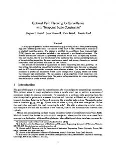
Figure 1: Neighborhoods and High School Locations in Howard County.
We present visualization techniques for multi-variate data and time-varying geo-spatial data. Orthogonal visual cues such as hue, saturation, and brightness are used to display up to three independent data variables. Additional data attributes are represented using visual cues such as density to convey numerousness. Although it is possible to display time-varying data using traditional animation, the user may often fail to notice simultaneous small and local temporal changes in data due to inattentional blindness [5] and change blindness [8]. Therefore, we aim to visualize temporal changes in a single, static and printable view. An image, being more general, can be printed out like text to be observed and analyzed. We present three techniques inspired from real-life temporal objects (tree rings,
211
the dial of a clock, and left-to-right time slices) to visualize the changing patterns of population data. Our techniques elaborate on human cognition to represent temporal changes in data. We extend our temporal visualization techniques for comparative visualization of multiple solutions.
2
R EPARTITIONING A S CHOOL D ISTRICT
We visualize real population data from the Howard County Public School System (HCPSS) in Maryland which has 38 elementary schools, 19 middle schools and 11 high schools (Figure 1). For planning purposes, the county is divided into 260 neighborhoods or planning polygons with multiple associated attributes with them such as student population by grade, number of students requiring free and reduced meals (FARM), distances from the schools, test scores, and planned housing by type. Every type of planned housing has an associated per house constant factor that indicates the average number of students each unit is expected to house. The predicted population growth is modeled as a sum of the contributions that these new developments make towards the student population. To meet the growing high school student population, the HCPSS is introducing a new high school (the twelfth school), Marriotts Ridge High School, in the academic year 2005-06 with a capacity of 1332 students. HCPSS has a tool for what-if analysis to look at the effects of reassigning neighborhoods based on capacities, FARM, and the feeder system (students moving from elementary to middle to high schools with a cohort of other students). However, this tool has no map interface and does not consider population projections. The lack of a map interface makes visual interpretation of distances difficult. Likewise, the lack of population projections requires the user to have an insight into demographic changes across the neighborhoods while reassigning them, making redistricting a mentally fatiguing process. School attendance areas are redistricted by partitioning the neighborhoods of a county into regions. Each neighborhood (planning polygon) belongs to exactly one school region at each level (elementary, middle and high school level). A school assignment (partition) can be generated in numerous ways to create multiple alternative school district plans. Partitioning of a school district is primarily influenced by the target enrollment of the schools, a need to accommodate the influx of new students, and the goal of efficient use of resources. Each polygon is assigned to a school using criteria such as proximity (shown by a map of the planning polygons), currently available seats in the school, and student population in the planning polygon (shown by multiple spreadsheets). Redistricting is especially difficult if changes in population densities are also to be considered when generating a plan. Such decisions cannot be made only by considering a static view of the population and the schools’ target capacities. A plan that may meet target school capacities this year may lead to underutilized schools in one region and overutilized schools in other regions as new housing developments are built. These changes should be anticipated when possible and taken into account during the redistricting process to minimize the need for future redistricting. The problem of partitioning the neighborhoods of a county to make school assignments when assisted with visualization techniques can be sub-divided into the tasks of analyzing multiattribute data, understanding the temporal change in them, evaluating choices, and comparing multiple solutions to choose the most optimal one. In this paper, we present multi-attribute mapping techniques for analyzing multi-attribute polygon data, temporal visualization techniques to represent change in time-varying data, and a combination of these techniques to compare different scenarios in a single view to address each of these tasks.
212
3
R ELATED W ORK
Geo-spatial datasets, while often unstructured, typically have size, distances, directions, locations and altitudes giving them an inherent positional structure and shape [4]. Maintaining the spatial boundaries of such spatial objects (neighborhoods) imposes structural and positional constraints on the choice of visualization techniques. The data associated with spatial objects can also be multivariate. Visualizing such multi-variate spatial objects is a challenging task. Time-varying geo-spatial data volumes are often so large and interactions amongst them so complex, that it is difficult for people to understand how the data changes over time when individual images are viewed in isolation. Therefore, to show both spatial and temporal aspects of data, special visual methods are required to uncover important patterns and relationships. Changes in spatiotemporal data may be existential changes (such as appearance or disappearance of characteristics), spatial changes (such as changes in shape, position and orientation) and attribute changes (such as changes in non-spatial characteristics of spatial objects) [1]. In this paper, we deal with attribute changes in spatio-temporal data. Trajectory-based techniques, proposed by Skupin et al. [10], represent change in the attribute as movement of the objects across a two-dimensional Self Organizing Map (SOM) surface. Patterns of development are visible after computational changes to the data that distort their spatial locations. Our application, by contrast, needs the spatial locations of the data to be preserved. Slocum et al. [11] suggest that spatio-temporal data associated with point locations can be displayed using animation, small multiples, or change maps as shown in their tool MapTime. However, as mentioned by Andrienko et al. [1], animation is often not effective for analyzing change in attribute values due to the effects of change blindness [8]. Skupin et al. argue that the need for temporal visualization methods for census data cannot be fulfilled by using multiple maps placed side-by-side or by using percentage change maps. Owing to the large size of census data, it is imperative to not leave the task of identifying change for visual detection solely to the human user. CommonGIS [1] offers multiple techniques for visualization where a coherent display of multiple maps, also used in MapTime by Slocum et al. [11], is used to compare several scenarios. In addition, CommonGIS also provides choropleth maps, time maps and time aggregators to visualize spatio-temporal data. However, with the exception of the choropleth maps, most of the techniques provided in CommonGIS represent data using graphs, time-series charts, histograms and scatter plots. We aim to visualize information on the map while maintaining the spatial boundaries of the planning polygons, since they aid the user in understanding the data. 4
V ISUAL MAPPING OF MULTIPLE ATTRIBUTES
Attribute data is associated with neighborhoods as well as schools. Each neighborhood can be considered as a unit of information having multiple attributes. Similarly, each school has information about its target enrollment, cost of busing students, academic performance, the percentage of students qualifying for free and reduced meals and socio-economic distribution under the current school assignments. This information can be displayed to assist the user in choosing the best possible assignment of a polygon during the redistricting process. 4.1
Visual Parameters
Visual parameters such as hue, saturation, brightness and opacity can be independently mapped to numeric data to represent the vari-
ation in data values in a visualization. In Figure 2, the saturation of the polygons is varied according to average Maryland School Assessment (MSA) test scores; brightness corresponds to high school student population. Brighter neighborhoods have a higher population of high school children than darker neighborhoods, while highly saturated neighborhoods have higher averages on the MSA tests than less saturated neighborhoods. In Figure 2, notice how larger neighborhoods on the north-western side of Howard County have fewer high school students while the smaller neighborhoods in the central region have larger high school student populations. Although hue, saturation and brightness can conceptually map up to three data parameters independently, the result of the combination of these parameters makes visual identification of individual data values difficult. Variations in saturation can be used to represent ordered data, but most people cannot accurately compare saturation levels, especially across hues [2]. Saturation and lightness are closely related where saturation scale may also contain a wide range of brightnesses, making it difficult to control the look of a color scheme in a systematic manner.
4.3
Perception of Color and It’s Effects on Visual Mappings
The three components of color—hue, saturation and brightness (or perceived lightness)—when used simultaneously in a visualization, can lead to perceptual anomalies affecting appearance. Due to the Helmholtz-Kohlrausch effect [14], certain hues with more saturation (e.g. red, blue) or those with low saturation (e.g white, yellow) when equated in brightness while being used in visual mappings, can lead to false perceptions of the data that they represent. Another aspect of hue lies in just noticeable differences, where some hues have more perceptible color gradations than others. In particular, color discriminations are much more acute for warm hues than for green hues. As a result, changes in lightness or saturation of green hues are harder to differentiate. Another phenomenon affecting the perception of hues related to changes in intensity is the Bezold-Brucke Hue Shift, where color samples will look more reddish or greenish at lower brightness levels, and more blueish or yellowish at higher brightness levels [3]. The range of colors we can see, and our judgments of color differences and similarities, depend on the color materials, color variety, contrast backgrounds and surround lighting that generate the color perceptions [12]. Due to variations in the perception of color and color appearances, a multi-dimensional mapping of three data parameters to hue, saturation and brightness may not be perceived correctly. Using the multi-dimensional nature of color symbolization, up to three data variables can be visually represented [2]. The choice of the visual parameter to which a data variable will be mapped depends on the nature of the data to be represented. Nominal data values, such as high schools that need to be individually identified, can be mapped to hue giving each high school a unique hue. Quantitative data values need to be mapped to monotonically increasing or decreasing visual parameters such as the saturation or the brightness component of color. Data parameters that represent density or those that can be aggregated into a symbol can be mapped using the dot density approach.
Figure 2: Multi-Attribute Mapping of Howard County. Saturation of the polygons is varied according to the average Maryland School Assessment (MSA) test scores while the brightness corresponds to High School population. Each of the dots on the planning polygons represents five children residing in that polygon that need free and reduced meals.
4.2
Numerousness
Visual parameters such as size and density of symbols [7] can also be used to overlay information on the visualization. Although we are unable to modify the size and shape of the planning polygons in our data set, we can use symbols to display data. For example, the number of students present in a school district can be represented by showing each student or group of students as a dot within the neighborhood. Using this representation, a densely dotted neighborhood has more students than a sparsely dotted one. Using dot density maps, where single data or a collection of data is represented as a single dot, we can overlay another numeric attribute on the planning polygons. In Figure 2, each of the dots in the planning polygons represents five children residing in that polygon who need free and reduced meals. The planning polygons in central region of Howard County (enlarged in Figure 2) are seen to have higher FARM ratios than the other planning polygons. Although the dot density display does not occlude the underlying image as long as the dot size and dot density is low, it can potentially cause cluttering in the image.
Figure 3: Wedges: The high school population is mapped to the saturation of the planning polygons. Each planning polygon is divided into three wedges, each corresponding to the years 2005, 2006 and 2007 in clockwise order. Observe how the changing levels of saturation indicate increasing or decreasing population.
5
T EMPORAL DISPLAY OF TIME - VARYING ATTRIBUTES
Temporal visualization of the changes in the student population in each grade can assist the user in planning school regions (attendance areas) according to their long-term impact on the enrollment of the school. Knowledge of temporal information at the planning stage can be used to make better plans. Animation is commonly
213
used to display temporally varying data, but this approach can introduce inattentional blindness [5]. While performing an attentiondemanding task, one can be “blind” to other features in the scene that would be salient if one were just “looking” at the scene and not trying to complete the task. Moreover, merely representing the change in the data rather than the actual data values for every year does not convey the trend, with the result that large changes in the data may go unnoticed. To display yearly data and show a changing pattern without the use of animation, we present three techniques to visualize temporal changes in the population of a planning polygon. 5.1
Wedges
The daily experience of observing the dial of a clock to perceive time has conditioned our cognitive system to visualizing clockwise (or counter-clockwise) motion as advancing (or receding) time. Drawing upon this experience, the wedges technique resembles the dial of a clock. Time starts at a vertical location that corresponds to 12 o’clock on the dial of a clock. A clockwise distribution of data corresponds to time moving forward. The planning polygon is partitioned into radial sectors equal to the number of years over which the population is projected. Each sector represents the value of the population for a particular year in the range.
chart and line graph approaches. Multi-spirals (inter-twined spiral graphs) can be used to compare and contrast multiple data sets in a single view. Using a similar concept and building on analogies of time, a tree-ring visualization is similar to the annular rings present on a tree trunk. As with tree-rings, the innermost ring corresponds to the earliest point in time; the outermost ring corresponds to the latest point in time. By arranging data as concentric objects in the shape of the planning polygon, we can represent annular data on the planning polygon. The number of rings is equal to the number of years over which the population is projected. While the notion of time is clockwise (or counter-clockwise) in the wedges technique, it is radial in the rings technique. In Figure 4, each planning polygon is divided into annular rings based on the number of projected years of population. The brightness of the rings varies according to the population of high school students in the corresponding year for that polygon. Time advances radially outwards, imparting additional attention to the outer rings, which are the latest years of the projection. If the rings have radially outward increasing brightness, the population in the planning polygon is increasing over the years, as shown by the yellow box in Figure 4. By contrast, if the brightness decreases radially, the population of the planning polygon is decreasing, as shown for the polygons highlighted by the green box in Figure 4. 5.3
Slices
On a linear axis, time is usually thought of as moving from left to right. Using this linear interpretation of time on a horizontal axis, the time slice technique divides a planning polygon into vertical slices, where the slice to the extreme left corresponds to the first year, and the one to the extreme right corresponds to the last year of the active year range. The number of time slices varies according to the number of years over which the population is projected. For each planning polygon divided into time slices, each slice corresponds to the population of students in that year for that particular polygon.
Figure 4: Rings: The high school population is mapped to the brightness of the planning polygons. Each planning polygon is divided into three rings corresponding to the years 2005, 2006 and 2007 increasing radially outwards. The changing levels of brightness indicate increasing or decreasing population.
Figure 3 illustrates the time wedges approach. Each planning polygon is divided into three wedges corresponding to the years 2005, 2006, and 2007. The saturation of each sector of each planning polygon is determined by the population of the high school students in that year. The more saturated the wedge, the higher the population in that year for that polygon. Certain planning polygons in Figure 3, such as the one marked by the yellow box, show an increase in the population; conversely, the planning polygon indicated by the green box shows a decrease in population. Those planning polygons with no changes in the population have uniform color and do not show different wedges distinctly. 5.2
Rings
Weber et al. [13] propose the use of spirals with varying attributes such as color, texture, line styles, thickness and icons to visualize trends and cycles in time-series data as opposed to the classical bar
214
Figure 5: Individual Time Slices: The high school population is mapped to the saturation of the planning polygons. Each planning polygon is divided into three vertical slices, corresponding to the years 2005, 2006, and 2007 in linear order from left to right. The changing levels of saturation indicate increasing or decreasing population.
In Figure 5, the linear representation of time is displayed across the planning polygons. Each planning polygon is divided into three time slices, representing student population in the year of 2005, 2006, and 2007 respectively. While the notion of time is circular in case of wedges (Figure 3) and radial for tree-rings (Figure 4), it is linear along the positive x-axis in time slices. Notice how the polygon marked by the yellow box shows an increase in the population, while the planning polygon marked by the green box shows
a decrease in population by the year 2007.
Figure 6: Repeating Time Slices: The high school population is mapped to the brightness of the planning polygons. The repeating sub-set of time slices has three vertical slices, each corresponding to the years 2005, 2006, and 2007 in linear order from left to right. The sub-pattern of time-slices may repeat in a single planning polygon but identification across planning polygons is easier than in Figure 5. Observe how the changing levels of brightness indicate an increasing or decreasing population.
Because the sizes of the polygons vary, the slices in one polygon may not coincide with those in its neighboring polygons. This may lead to a skew in the slices making comparisons across polygons difficult. To overcome this anomaly, we divide the whole map into slices comprising of a repeating pattern of smaller set of slices. The repeating pattern has a number of slices equal to the number of years over which the population is projected. As the slices traverse different planning polygons, the visual characteristics are varied according to the year and the population of the planning polygon they correspond to. To facilitate the identification of repeating subpatterns of time slices, a marker stripe is introduced between two repeating sub-patterns. The changes in population across planning polygons are easily identified using the marker to identify the start of a sub-pattern and looking down the length of the stripes. Figure 6 illustrates the repeating time slices technique. As one glances along the length of a time slice, one observes the change in the population between the neighboring planning polygons for the particular year. Within a planning polygon, one notices a repeating sub-set of time slices demarcated by the marker slice, that correspond to the different years over which the population is projected. 5.4
are most suitable since they provide a linear representation of time. As opposed to identifying an individual data value for a year or understanding trends, annular rings provide emphasis on more recent years as compared to earlier years in the visualization. When the recent years are to be observed in greater detail, the tree-rings technique appears to provide a more convenient representation as compared to wedges or slices. Thus, depending on the nature of the task, the perception of time differs and the three kinds of temporal visualization techniques provide various visualization possibilities. Since the boundaries of the planning polygons need to be maintained, consolidating the appearance of wedges or time slices to view the planning polygon may sometimes be difficult. In such cases, the rings technique fares better than the other two techniques since it does a better job in maintaining the boundary lines of the planning polygons. Wedges, tree rings and time slices have a limitation on the number of time periods they can effectively display. Since the planning polygons may differ in size and extent, temporal displays in smaller planning polygons may be difficult to view. A basic zooming and panning functionality can provide a better view into difficult to see temporal displays on smaller planning polygons. 6
S CENARIOS
Target areas to be partitioned can be divided into a map of discretized cells. Data contained in each cell provides additional information that can be used to create better partitions and to evaluate the proposed partitions. We refer to the map cells that contain a resource as centroidal cells. Spatial partitioning involves assigning each non-centroidal map cell to one of the centroidal cells. School redistricting involves creating boundary lines that determine which school each student in a school system will attend. To partition the region, each student in the school district must be assigned to a home school in a way that optimizes facility usage, transportation costs, and school diversity, while causing as little disruption to the current boundary lines as possible.
Discussion of Temporal Techniques
Each of the three techniques presented in this paper partitions the planning polygon differently using different interpretations of advancing time. Each technique has its own advantages depending on the nature of the task at hand. If the population for every year is to be perceived, the planning polygons can be divided into equal sectors similar to a pie-chart as represented in the wedges technique. Each sector has equal emphasis and the visual appearance of each sector conveys the population of the corresponding year. The wedges technique provides a structured clockwise representation of change in data values. A monotonic increase or decrease in data values can be easily identified when the data is represented as a linear sequence. To perceive the pattern of change in population by year, time slices
Figure 7: Making a high school assignment plan
The application that implements the visualizations described in this paper has been implemented in Java using Java Bindings for OpenGL (JOGL). The user interface is designed using Java Swing. Support for reading .shp, .shx and .dbf files is provided by the Geotools library. As seen in Figure 7, the user interface provides interactive tools to select a school using the drop-down list of schools in the left bar. Using the “Add to plan” and “Remove from plan” button, the user can click on a planning polygon and
215
Outlined school icons redundantly indicate schools that have exceeded their target capacity. In Figure 9, observe that the average scores seem to be uniform in most attendance areas except Centennial HS, which seems to have a high average test score and that the attendance area for Wilde Lake HS has a higher FARM ratio than the other schools. Centennial HS (1650 students), Hammond HS (1439 students), Mt. Hebron HS (1544 students) and Wilde Lake HS (1567 students) have exceeded their target capacity of 1332 students shown by the larger, outlined school icons. A combination of multi-attribute mapping techniques brings out the various features of a plan. 6.2
Figure 8: High School Assignments: The planning polygons are assigned to the geographically closest high school. The hue of the planning polygons is matched with the schools that they are assigned to, while the occupied percent capacity is mapped to the pie chart icons that represent the schools. The black sectors indicate vacant capacity as a percentage. The outlined schools have exceeded their target capacity proportional to the size of their glyphs.
assign the active school to the specified planning polygon. In Figure 7, the brightness of the planning polygons is varied according to the high school student population and the number of children requiring FARM assistance is displayed as a dot density texture on the planning polygons. The school icons have a unique hue and are represented as pie charts that indicate their percent utilization. Figure 7 is zoomed to show Glenelg HS, River Hill HS, Wilde Lake HS and Centennial HS. Along with differences in brightness, some planning polygons use concentric rings with varying brightness to show the temporal variation in high school student population over the years 2005, 2006 and 2007 to assist in planning. The tool also provides the ability to probe, retrieve and display the numeric data in each polygon, region or school on the information window for further analysis. 6.1
Evaluating a solution
An intuitive solution is to send the students of a neighborhood to the school which is closest to them (Figure 8). Assigning the closest school to a planning polygon can cause under-utilization of some schools and over-utilization of others. Each school region is identified by a hue that corresponds to the hue of the school. Schools, represented as pie chart icons, indicate their percentage utilization. Schools that exceed their target capacity are redundantly shown with thick outlines and their sizes are proportionally larger than those that are within capacity. In Figure 8, Hammond HS (2314 students), Long Reach HS (1790 students) and Mt. Hebron HS (1777 students) have exceeded their target capacity while Marriotts Ridge is using less than half of its target capacity. It is clear that geographical proximity to the school is not an ideal and only criterion to choose a school for a neighborhood. Criteria for evaluation include transportation costs, percentage of the target capacity reached, average test scores, and average FARM ratios that can be visually represented on the planning polygons to assist the evaluation process. The plan for the academic year 200405 is shown in Figure 9. The average test scores of the attendance areas are mapped to the brightness, saturation varies according to the percent capacity and total FARM ratio is represented by dot density on the attendance area. Varying size and slices of the pie charts, as school icons, show maximum occupancy and percent utilization.
216
Comparing multiple solutions
Multiple solutions to the partitioning problem must be compared and contrasted to identify the best solution from the available set. One way to compare plans is to look at images of different plans in different windows and let the human visual system pick out the differences in them. An alternative approach is to display multiple plans in the same view. Viewing multiple solutions next to each other makes it difficult to remember details outside the focus of attention, especially when one reorients one’s gaze on a new scene or looks away and back again at the same scene [9]. If there are visual mappings of the plan attributes, or if there are more than two plans to compare, the process of comparison becomes tedious for the human visual system. Hence, comparative visualizations in a single view help in identifying the differences in the views at a glance. We extend our temporal visualization techniques to represent non-temporal data, such as multiple solutions of a resource allocation problem, by partitioning the spatial extent of planning polygons by the solution they represent instead of time. The partitions are created in the order in which the solutions are added to the display frame. During the planning for the year 2005-06, with the introduction of the new high school (Marriotts Ridge HS), two plans under consideration were the Green Plan (Figure 11(a)) and the Red plan (Figure 11(b)). 6.2.1
Current School Plan vs. Closest School Plan vs. Green Plan
Figure 10 compares three plans against each other. The innermost ring corresponds to the plan for academic year 2004-05 (Figure 9), the ring in the middle corresponds to the closest high school plan (Figure 8), and the outermost ring corresponds to the Green plan (Figure 11(a)). The average MSA test scores for each attendance area is mapped to the brightness of the planning polygons, the percent utilization of the schools is mapped to the saturation. Brighter rings have higher average test scores, while highly saturated rings have more students enrolled in the school. Observe the attendance area of Mt. Hebron HS in Figure 10. Mt. Hebron HS currently has exceeded its target capacity by 16%. In the closest school plan, the utilization of Mt. Hebron HS increases further to reach 133% of the target capacity. The Green plan, however, reduces the utilization to 80% of the expected target capacity. Similarly, Long Reach HS, which has just 97% of its target capacity utilized in the current academic year, exceeds its target capacity by 34% in the closest school plan. On the other hand, Wilde Lake HS shows a decrease in its utilization in the closest school plan to 89% while both the Green plan and the Current plan have 17% in excess of their target capacity. Of the three plans, the Green plan appears to have better utilization statistics and emerges as the best of the three plans. 6.2.2
Current Plan vs. Green Plan vs. Red Plan
Figure 12 evaluates how the current plan fares against the two plans currently under consideration by the HCPSS. Each planning polygon is divided into three vertical slices, corresponding to each of
Figure 9: Evaluation of Current Plan for Academic Year 2004-05: High School assignments are indicated by matching the hue of the polygons to the schools they are assigned to. The average test scores of each school region is mapped to the brightness of the region, saturation is varied according to the percent capacity while the total FARM ratio is indicated by the dot density in the region. Schools are represented as color-mapped pie charts where the black sectors indicate vacant seats. Schools exceeding their capacities are marked by thicker outlines.
Figure 10: Comparing three plans—Current (innermost ring) vs. Closest (middle ring) vs. Green plan (outermost ring): School assignments are shown by matching the hue to the school icons. Average MSA test scores are represented by varying the brightness of the school attendance region. The percentage utilization of each school is mapped to the saturation of its attendance area.
217
the three plans from left to right. The hue of the planning polygons is matched to that of their assigned school. In Figure 12, the transportation costs is mapped to the saturation of each slice and the percent utilization are mapped to its brightness. In the attendance area for Mt. Hebron HS, the left, middle and right slices represent the Current plan, the Green plan and the Red plan respectively. The brightness of the slice corresponding to the Current plan is highest among the three slices, indicating that Mt. Hebron was over-utilized (115%). Both the Green and the Red plan reduce its utilization to 80% and 84% respectively indicated by their dimmer slices. In the attendance area for Howard HS, both the Green and Red plans fare equally well at reducing utilization and increasing test scores compared to the Current plan. Each of the three available solutions to the redistricting of the Howard County Public School System has its own pros and cons. Comparative visualization of the three plans can identify the minute differences in them, helping in their evaluation and analysis. With some minor modifications, HCPSS decided to put the Green plan into practice for the school year 2005-2006.
8
F UTURE W ORK
In addition to representing the temporal change in spatial data, temporal characteristics of the plan could also be evaluated. Aggregating the attendance areas of each school into an attendance region and applying temporal visualization techniques on these regions could help in extrapolating the behavior of a plan over time. Integration of learning techniques and optimization methods to partition the data and visualization methods to evaluate such partitions could provide an interesting solution for resource allocation problem. 9
ACKNOWLEDGEMENTS
We would like to thank David Drown and Larry Weaver from the Howard County Public School System and Ryan Carr for providing us with the data required for our research. This work was supported, in part, by the National Science Foundation (ITR 012128). R EFERENCES
(a) Green Plan
(b) Red Plan
Figure 11: Comparing plans in separate views
7
C ONCLUSION
The techniques presented in our paper - wedges, rings and slices help in visualizing temporal changes in spatial data while maintaining the spatial boundaries of the map. Using a combination of such temporal techniques with multi-attribute visual mappings, comparative visualizations help in evaluating different solutions in a single view, allowing for easy comparison.
Figure 12: Original (leftmost slice) vs. Green (middle slice) vs. Red (rightmost slice) : Individual Time Slices. Transportation costs are mapped to saturation and percent utilization is mapped to brightness.
218
[1] Natalia Andrienko, Gennady Andrienko, and Peter Gatalsky. Tools for visual comparison of spatial development scenarios. In Proceedings of the Seventh International Conference on Information Visualization, page 237. IEEE Computer Society, 2003. [2] Cynthia A Brewer. Color use guidelines for data representation. In Proceedings of the Section on Statistical Graphics, American Statistical Association, pages 55–60. American Statistical Association, 1999. [3] Dan Carr. Color perception, the importance of gray and residuals, on a choropleth map. Statistical Computing and Statistical Graphics Newsletter, pages 16–20, April 1994. [4] Menno-Jan Kraak and Alan MacEachren. Research challenges in geovisualization. Cartography and Geographic Information Science, 28(1):3–12, 2001. [5] A. Mack and I. Rock. Inattentional Blindness. MIT Press, Menlo Park, California, 1998. [6] Lasse Moller-Jensen and Richard Y. Kofie. Exploiting available data sources: location/allocation modeling for health service planning in rural ghana. Geografisk Tidsskrift: Danish Journal of Geography, 101:145–154, 2001. [7] Elisabeth Nelson. The impact of bivariate symbol design on task performance in a map setting. Cartographica, 37(4):61–77, 2000. [8] Lucy Nowell, Elizabeth Hetzler, and Ted Tanasse. Change blindness in information visualization: A case study. In Proceedings of the IEEE Symposium on Information Visualization 2001 (INFOVIS ’01), page 15. IEEE Computer Society, 2001. [9] Daniel J. Simons. Current approaches to change blindness. Visual Cognition, 7(1/2/3):1–15, 2000. [10] Andr´e Skupin and Ron Hagelman. Attribute space visualization of demographic change. In Proceedings of the Eleventh ACM International Symposium on Advances in Geographic Information Systems, pages 56–62. ACM Press, 2003. [11] Terry A. Slocum, Stephen C. Yoder, Fritz C. Kessler, and Robert S. Sluter. Maptime: software for exploring spatio-temporal data associated with point locations. Cartographica, 37(1):14–32, 2000. [12] Colin Ware. Information visualization: Perception for Design. Morgan Kaufmann Publishers Inc., 2000. [13] Marc Weber, Marc Alexa, and Wolfgang Mller. Visualizing timeseries on spirals. In Proceedings of the IEEE Symposium on Information Visualization 2001, page 7. IEEE Computer Society, 2001. [14] Hirohisa Yaguchi, Atsuo Kawada, Satoshi Shioiri, and Yoichi Miyake. Individual differences of the contribution of chromatic channels to brightness. Journal of Optical Society of America, 10(6):1373–1379, June 1993.