The relation between visualization size, grouping, and user performance Connor C. Gramazio,Student Member, IEEE, Karen B. Schloss, and David H. Laidlaw, Fellow, IEEE 64 marks
100 marks
196 marks
484 marks
0.254 degrees
0.508 degrees
0.152 degrees
0.254 degrees
36 marks
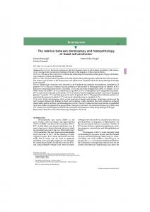
Fig. 1. Examples of experimental displays. Participants were asked to find a target (purple square) in visualizations with varying mark sizes, set sizes, and color configurations. Figures not drawn to scale. Abstract— In this paper we make the following contributions: (1) we describe how the grouping, quantity, and size of visual marks affects search time based on the results from two experiments; (2) we report how search performance relates to self-reported difficulty in finding the target for different display types; and (3) we present design guidelines based on our findings to facilitate the design of effective visualizations. Both Experiment 1 and 2 asked participants to search for a unique target in colored visualizations to test how the grouping, quantity, and size of marks affects user performance. In Experiment 1, the target square was embedded in a grid of squares and in Experiment 2 the target was a point in a scatterplot. Search performance was faster when colors were spatially grouped than when they were randomly arranged. The quantity of marks had little effect on search time for grouped displays (“popout”), but increasing the quantity of marks slowed reaction time for random displays. Regardless of color layout (grouped vs. random), response times were slowest for the smallest mark size and decreased as mark size increased to a point, after which response times plateaued. In addition to these two experiments we also include potential application areas, as well as results from a small case study where we report preliminary findings that size may affect how users infer how visualizations should be used. We conclude with a list of design guidelines that focus on how to best create visualizations based on grouping, quantity, and size of visual marks. Index Terms—information visualization, graphical perception, size, layout
1
I NTRODUCTION
A common goal when creating visualizations is to improve user performance by optimizing visual design given the limitations of the visual system. A central issue in designing effective visualizations concerns how to present as much information as possible while maintaining legibility. Here we report the results of two experiments that test how the ability to find a target data point is influenced by the size of the marks encoding data, the quantity of these marks, and the color grouping in the visualization. We tested user performance when the data were pre• Connor Gramazio and David H. Laidlaw are with the Department of Computer Science at Brown University. E-mail: {connor, dhl}@cs.brown.edu. • Karen B. Schloss is with the Department of Cognitive, Linguistic, and Psychological Sciences at Brown University. E-mail: karen
[email protected]. Manuscript received 31 Mar. 2014; accepted 1 Aug. 2014; date of publication xx xxx 2014; date of current version xx xxx 2014. For information on obtaining reprints of this article, please send e-mail to:
[email protected].
sented as squares in a grid (Experiment 1) and as marks in a scatterplot (Experiment 2). Based on the results, we provide guidelines on how to optimize data density while maintaining usability. This paper is part of a broader effort to quantify how visual encoding (how data is represented in visual features) can improve or detract from user performance [2, 5, 18, 24, 25, 33, 44, 46, 51]. Previous studies have looked at topics as diverse as adjusting chart height to improve slope comparison [43] and adjusting aspect ratios of treemap components to facilitate area comparison [30]. By understanding the effect of specific visual encodings on user performance, researchers can help programmers improve default design options in visualization software. This approach can also help designers make more effective, informed decisions. Professional designers are able to produce simple, elegant visualizations based on their intuitions on how features like size, color, and mark density effectively encode data. Now more than ever, novices who lack these intuitions can easily generate complex visualizations with a few lines of code or button presses. This ease of use is problematic if novices rely on the default parameters provided by visualization software, which can lead to hard-to-read or misleading visualizations (e.g., rainbow color maps [3]). Novices can further obfuscate their data
when customizing visualizations by manipulating the myriad parameters available without understanding how those settings affect user performance. Seemingly small decisions (e.g., the selection of a color gradient) can profoundly impact legibility [38]. A central goal of this paper is to understand how to improve visualization tools that are used for rapid serial viewing, in which search speed is especially important. For example, cancer genomics researchers and medical professionals who have started to use personalized genomics may search through charts showing where various mutations fall on transcripts as quickly as possible when forming research hypotheses. Improving target detection speed may help these researchers and medical professionals spend less time weeding through data and more time on advancing our understanding of cancer and on finding the best methods for patient care. In this paper, we make the following primary contributions: • We describe how the grouping, quantity, and size of visual marks affects search time based on the results from two experiments • We report how search performance relates to self-reported difficulty in finding the target for different display types • We present design guidelines based on our findings to facilitate the design of effective visualizations In addition, we report the results of a multiple linear regression model constructed from stimulus parameters, which explains 89% of the variance in response times from searching though grids (Experiment 1). This model generalizes to response times from searching through scatterplots in Experiment 2 (86% of the variance explained). We also provide several potential application areas for our research and results from a small case study where we found mark size may influence what type of analysis task (e.g., global pattern or target search) is associated with a visualization. 2 R ELATED W ORK The experiments described in this paper contribute to the study of graphical perception– how visualization usability is affected by visual attributes like grouping by color similarity, shape, and size [9]. This section surveys the prior literature on graphical perception that forms the basis for our research on size and grouping. According to Eick and Karr, seven categories of scalability issues arise in data visualization: human perception, monitor resolution, visual metaphors, interactivity, data structures and algorithms, and computational infrastructure [11]. Our work lies in their human perception and monitor resolution categories. Within the category of size perception, we define three subcategories: 1) scale, the physical size of elements (i.e., zoom level); 2) quantity, the number of elements; and 3) aspect ratio, scaling one dimension to shrink or expand elements. Each of these subcategories pertains both to individual marks and whole visualizations. The size of marks in visualizations has substantial effects on performance [42]. Studies of how visual scale (i.e., zooming) influences user performance often focus on tasks involving navigational maps. Work in this area dates back to cartographic research, predating information visualization. For instance, Enoch found that visual search performance had steeper performance declines based on visual angle when map size was 9 or less, compared to a shallower performance difference when map size was greater than 9 [12]. More recently, Jakobsen and Hornbæk compared user navigation performance when maps were displayed on monitors of varying sizes, causing the maps’ visual angle to vary across displays [39]. Participants were asked to complete map-based navigation tasks across various zoom levels. Performance was similar for users with medium-sized and large monitors, but was better for those with larger monitors than with small monitors. This was true even after controlling the quantity of information displayed [28]. They report dissimilar findings from Yost and North, who varied the number of elements relative to the monitor size and found no effect on normalized performance time [51]. Jakobsen and Hornbæk suggest that the difference might be due to variance in task difficulty.
A large body of literature in the psychology of attention reports how the quantity of elements in visual displays influences people’s ability to find targets. Treisman and Gelade found that the quantity of distractor elements had differential effects on search time, depending on the relation between the visual features of the targets and distractors [48]. If a target (e.g., blue circle) differs from a homogeneous set of distractor elements (e.g., red circles) on a single feature (e.g., color), the number of elements has little to no effect on search performance. Visual search under such conditions is considered to be preattentive, where all the elements are surveyed in parallel and the target “pops out” (i.e., parallel visual search). If the target differs from a heterogeneous distractor set on multiple features (e.g., a blue circle target among red circle and blue square distractors), visual search is serial – people must exhaustively search all elements until they find a target. Parallel search is marked by reaction time functions that have little to no slope as distractor set increases, whereas serial search is marked by reaction times that follow robust positive slopes over set size. This distinction is useful in evaluating users ability to “automatically” find target information in visualizations, given the display parameters. Further, visual search is more difficult when: 1) distractors more closely resemble possible targets and 2) distractors have higher variability in visual appearance [10]. This difficulty due to increased distractor variability is consistent with the claim that decreased coherence or order in a visualization impairs performance [20, 31]. Additional evidence from studies using node-link diagrams and adjacency matrices also indicate that response time increases as the set size and data density increases [14]. Our study builds on these results by: 1) looking at a greater range and total number of set sizes, and 2) investigating how set size could interact with grouping by color similarity [49] and the size of marks. Relating to this work, Haroz and Whitney provide visualization design guidelines based on how color variability (i.e., the number of colors) and grouping affected the ability to find a target in a grid of colored squares [18]. They found that participants were faster at finding targets in displays where marks were grouped by color rather than randomly distributed. Adding additional color variability to displays had little affect for grouped displays. However, the affect of adding color variability for random displays depended on whether the target type was known before the start of each trial. If the target was unknown (“odd ball” task), performance slowed substantially as color variability increased, whereas the performance decay was minor if the target was known. Unlike Haroz and Whitney who focus on color variety and grouping, we investigated how effects of grouped vs. random layouts influence performance as the size and quantity of marks increased. We predicted that the minor difference in search time for grouped and random layouts found by Haroz and Whitney for grids of 64 elements would increase dramatically as the number of elements increased. Wolfe provides a survey on many other important visual search considerations when detailing his “Guided Search 2.0” model [50]. Perhaps most relevant to this work, Wolfe discusses how the density of marks influences search performance. For instance, greater density facilitates search performance when the target type is unknown, but has little effect when the target type is known [6]. Related to density, Palmer notes that set size can have a varying effect on performance due to numerous other related factors such as eccentricity [36]. Our first experiment varies total display size with mark size as spacing between marks was kept fixed across all conditions, however we have provided a view of our results that highlights the relation between total display size and response time (Figure 4). Our second experiment has a fixed display size for all trials. The present study adds to our knowledge of how search factors such as set size can affect task performance; however, as Wolfe and Palmer have shown, there are many remaining factors that information visualization researchers can use to study performance. Further research has examined how constraints in the visual system affect how observers interpret scatterplots. Gleicher et al. show that users can effectively compare average values in multiclass scatterplots even with dissimilar number of points between classes, additional distractor classes, and with conflicting cues [15]. Fink et al. take a
derstanding and optimizing tasks where users need to look through many series of visualizations and find a target as quickly as possible. We acknowledge that other measures (e.g., long-term memory) are important in improving our knowledge of visualization usability, and that the goal of a given study is paramount in choosing a dependent measure. We hypothesized the following:
Fig. 2. Three example grids that were presented in Experiment 1. The left shows the single-colored layout, the middle shows the group-colored layout, and the right shows the random-colored layout.
complementary approach to improving scatterplot efficacy [13]. They found that their method for selecting scatterplot aspect ratio, based on Delaunay triangulation, improved the accuracy of correlation and cluster detection within scatterplots. Where Gleicher et al. examined value comparison in scatterplots and Fink et al. examined aspect ratios, our study examines how the number and size of marks influences visual search performance. Studies have also revealed that the aspect ratio of graphical elements affects user performance. Looking at individual rectangles, Heer and Bostock found that people were more accurate at comparing the area of two rectangles when they departed from a 1:1 aspect ratio [24], although Kong et al. found that performance was also poor for extreme aspect ratios [30]. Looking at whole graphs, Talbot et al. found that the aspect ratio of line charts influenced people’s ability to compare slopes of lines [43]. Participants had more difficulty comparing two large slopes than two shallow slopes; however, reducing chart height to reduce the physical angle of the two lines improved accuracy. In contrast, Heer et al. found that people are better at comparing values in horizon graphs – a type of time series visualization – with taller graphs rather than shorter ones [25]. Heer and Bostock found similar results when looking at bar chart height, and further found that benefits of increasing height plateaued with successively greater height increments [24]. Taken together, these studies suggest that when the goal is to compare angles, visualizations should be shorter, and when the goal is to compare area, visualizations should be taller. An often challenging part of graphical perception research is designing experiments that capture the complexity of real-world information visualizations. In an effort to improve the ability to capture and account for such complexity in full, Rosenholtz et al. show how they were able to use computational approaches to assess grouping in design and demonstrate how their computational results relate to traditional design rules [41]. We believe work such as this can provide the foundation for creating computational techniques that give designers indicators when it would be useful to apply certain guidelines discovered from graphical perception research. 3
E XPERIMENT 1: S EARCHING
THROUGH GRIDS
In this experiment, we studied how visual mark size, the number of visual marks (set size), and the color layout (grouping) influence the time taken to find a known target in a grid of squares. In the experiment, participants were presented with colored grids (Figure 2) and were asked to indicate which quadrant contained the purple target. This task is similar to Haroz and Whitney’s “Find a Known Target” task, except they varied the target color across trials and their participants indicated whether a known target was present/absent (without reporting its location) [18]. We fixed the target color and used the quadrant localization task because the types of everyday search tasks we are interested in optimizing involve localizing a single target type. For instance, cancer genomics researchers routinely try to localize specific mutations in many types of visualizations such as transcript charts and various distribution plots. We note that although the use of response time as a dependent measure in visualization research is controversial [27], it is an appropriate measure for our present objectives. We are most concerned with un-
H1 Participants take longer to find targets in random-colored grids than in grouped- and single-colored grids H2 Set size and mark size influence responses to random-colored grids to a larger degree than to grouped- and single-colored grids H3 Responses are slowest when grids have large quantities of visual marks of very small or very large mark sizes (e.g., a 14⇥14, 50 px condition) We derive H1 and H2 from our prediction that visual search response time trends, due to pop-out, will be uniform and parallel for single and grouped colored grids independent of changes to visual mark size and set size. Related, we believe that random grids – which we predict do not afford pop-out effects – will be influenced by changes in visual mark size and set size. We derive H3 from our belief that processing many small marks requires effort to differentiate and parse and that processing many large marks requires effort from gaze shifting during search. 3.1 Methods 3.1.1 Participants There were 15 participants (mean age 24.2 years, range 19-30 years) recruited from on-campus fliers and university mailing lists. All had normal color vision (assessed with H.R.R. Pseudoisochromatic Plates [17]). All gave informed consent and were compensated for their participation. The Brown University Institutional Review Board approved the experiment protocol. 3.1.2 Design and Displays Experiment 1 included two size factors: visual mark size (length of one edge of the square marks) and mark set size (the total number of visual marks). The levels for mark sizes and set size were: Mark size: {.254 (10px), .508 (40px), 1.271 (50px)}
(20px), .762
(30px), 1.016
Set size: {6 ⇥ 6, 8 ⇥ 8, 10 ⇥ 10, 12 ⇥ 12, 14 ⇥ 14} Mark size is given in terms of visual angle, where 1 is roughly equivalent to 1.064cm. We limited the maximum set size to 14 ⇥ 14 due to the resolution constraints of the testing environment’s monitor while trying to maintain a diversity of set size and mark size conditions. We also tested three color layout variations (Figure 2): 1) single-color, 2) 4-color grouped, and 3) 4-color random layouts. In the single-color layout (Figure 1, left), the distractor marks were all the same color (see below for color details). In the 4-color grouped layout, the distractor marks were spatially grouped by color into four quadrants (Figure 1, center). In the 4-color random layout (Figure 1, right), the distractor marks were randomly colored (equal numbers of each color except one color in which one square became the target). The three color layouts crossed with the 25 combinations of set size and mark size created the 75 main conditions. Henceforth, the 4-color grouped condition is referred to as “grouped” and the 4-color random condition is referred to as “random.” Within each color layout there were four variants. In the singlecolor layout condition the variants were four distractor colors (red, yellow, green or blue). In the grouped layout the variants were four different permutations of color group placement (e.g., in one condition red was in the top-left quadrant but in another it was in the topright). In the random layout the variants were for random assignment of color positions. These variants were treated as replications because
they were not central to the aims of this study. We had an equal number of colored squares in the grouped and random conditions (e.g., 10⇥10 grids had 25 squares of each color). This constraint guaranteed that each quadrant in the grouped condition corresponded to a unique color. We placed the same constraint on the random condition for comparability. Each display type described above was presented four times so the target would appear an equal number of times in each quadrant for each display type. The four target locations were treated as replications. The full experiment design included 1200 displays (5 mark sizes ⇥ 5 set sizes ⇥ 3 color layouts ⇥ 4 color variants ⇥ 4 target locations). There was one replication of the full design (total of 2400 trials) to ensure that there were enough data to analyze participant reaction times. When averaging all replications, there were 32 trials for each of the 75 main conditions for each participant. 3.1.3
Grid creation
The grids were generated individually for each participant using a Python script to create grid data, which were rendered with a D3/Node.js script [4, 45]. The rendered squares were always separated by a .127 (5px) gap, regardless of the other size conditions. The target location within each quadrant was randomly assigned for each trial. However, we added a constraint that targets could not exist on any of the four edges of the quadrant because targets falling on a border elicit different results from those one or more marks away [47]. 3.1.4
Color selection
Many researchers have shown how color selection is an important consideration when designing visualizations. For instance, Healey et al. found that encoding search targets with a differing hue can lead to more accurate responsnes [23]. Because of the relation between performance and color selection, many have suggested color selection techniques to improve the usability of visualizations [20, 26, 33, 35]. Healey suggests a method to pick colors using the Munsell color model [22], which closely resembles our color selection process. The colors we selected were: red, yellow, green (Healey used green-yellow in his method), blue, and purple. We arrived at our similar colors independently. We achieved this by choosing a purple that had the most intermediate luminance, chroma, and hue arc values of the chosen palette. In Experiment 1, the target color was always purple and the distractors were blue, green, yellow, and red (see Table 1 for CIE xyY and LCH coordinates). The reason for using only one target color was described above (Section 3), and the choice to make the target hue purple was arbitrary. All of the colors were nameable and categorically different. The colors were all assigned different luminance values, given that incorporating luminance contrast between elements facilitates legibility [42]. The purple target was set to have a mid-level luminance (30 cd/m2 ) with respect to the distractor colors. The Michelson contrasts between the purple target and the blue and red distractors was +/-16.5%, and the contrast between the purple targets and the yellow and green distractors was +/- 33% (see Table 1 for luminance values). The purple had a mid-level chroma, situated halfway between the higher chroma red and yellow and the lower chroma blue and green (see Table 1). The CIE L*u*v* coordinates were translated into CIE 1931 xyY space using an Illuminant D65 white point (x = .3127, y = .3290, Y = 100). These device-independent coordinates were translated to monitor-specific RGB values so they could be accurately rendered on our calibrated monitor. Each grid was displayed on a black background. Dark gray lines delineated the borders between the four quadrants (CIE x=.3021, y=.3121, Y=12.43). 3.1.5
Procedure
The monitor was warmed up for 30 minutes before each test session to prevent color shifting during the experiment. Participants first gave consent, completed the H.R.R. Pseudoisochromatic Plates [17] color
Color
x
y
Y
Lightness
Chroma
Hue
Yellow Red Purple Blue Green
.4393 .4335 .2899 .1768 .1903
.4769 .2982 .1933 .2373 .4681
60.0 42.0 30.0 21.5 15.0
81.838 70.871 61.654 53.492 45.634
95 95 83 71 71
75 5 295 225 155
Table 1. Colors used in the study expressed in xyY color space and each color’s corresponding lightness, hue angle, and chroma (LCH)
vision test, and filled out demographic information. The lights were then turned off in the testing booth. The participants were told that they would be presented with a series of grids, each containing a purple target, and their task was to indicate which quadrant contained the target (i.e., top-left, top-right, bottom-left, bottom-right). To respond they used four labeled keys on the keyboard numpad (one for each quadrant). The experimenter remained in the room while participants completed 10 practice trials to answer questions, after which the experimenter left the room. During the experiment participants were shown each of the 2400 grids one at a time in a random order. Each grid remained on the screen until participants made their response. Each trial was separated by a 500ms intertrial interval during which the screen was black except for a fixation cross of the same color as quadrant grid lines. Short breaks were given after every set of 15 displays and long breaks were given 25%, 50%, and 75% of the way through the study. Participants were seated approximately 60 cm away from the screen and were asked to reduce any movement towards or away from the screen; this was reinforced throughout the practice trials. 3.1.6
Equipment
We used an ASUS ProArt Series PA246Q Black 24.1” monitor (1920 ⇥ 1200 pixel resolution). The monitor was characterized with a Konica Minolta CS-200 Luminance and Color Meter. The experiment was conducted through a locally hosted instance of Experimentr [19]. 3.2
Results and Discussion
Before analyzing results we filtered the data using standard procedures for reaction-time datasets [37]. We first removed all trials where participants made incorrect responses because we were interested in participants’ reaction times when they were successful in finding the target. The mean accuracy across participants was 92% (range: 90%93%). Upon inspection, the errors appeared evenly divided across conditions, but there were too few errors for systematic statistical analysis. We next removed outlier trials for each participant, defined as response times more than two standard deviations away from the mean of all trials for that participant. The mean number of outlier trials across participants was 89 trials (range 32-103 trials). Given that participants completed 32 trials for each critical condition, ample data remained after outliers and incorrect responses were removed. Across all subjects and conditions 28 out of 34 trials were considered on average (range: 9-32). 3.2.1
Interaction between mark-set size and color layout
Figure 3 (left) shows the effect of set size on response time for each color layout condition, averaged over mark size. For each color layout condition, we tested whether set size influenced performance by first calculating the best-fit line for each subject and then using ttests to compare the mean slope of the best fit lines with zero. There was a robust effect of set size for the random color condition (t(14) = 7.17, p < .001): participants took longer to find the target as the set size increased. The positive slope indicates that participants used serial search until they found the target. In contrast, the slope for the grouped- and single-color conditions did not differ from zero (t(14) = 1.49, 1.76, ps > .05, respectively), indicating that participants used parallel search and the target “popped out,” regardless of the number of distractors.
Average Response Time (ms)
Exp 1: Grids
Exp 2: Scatterplots
750 Color Layouts 700
4000
Random Grouped Single
Random
3000
650
Grouped
600
2000
550 500
36 64
100 144 Set Size
196
1000 196
484 Set Size
Fig. 3. Averaged response times (RT) for all color layouts for each set size. Bars show standard error.
We next compared the random and grouped conditions to look at effects of grouping and set size when the number of distractor colors was held constant at four. There was a robust effect of color layout: response times were significantly faster in the grouped than in the random condition (F(1, 14) = 403.96, p < .001). The magnitude of this difference varied with set size, as indicated by a layout ⇥ set size interaction (F(4, 56) = 98.75, p < .001). The extent to which the random layout slowed performance increased as the number of elements increased. Recall Haroz and Whitney’s report that grouping had a minor effect in their known-target condition (difference of roughly 100 ms) for their displays of 64 elements. We found a comparable difference for our displays containing 64 elements (91.2ms averaged over mark size), but the difference increased to 180.4ms for our largest set size of 196 elements. Thus, color layout has a larger impact on displays with more data, complementing Haroz and Whitney’s finding that layout has a larger impact on displays with higher color variety. This difference between the random and grouped conditions can be understood by considering how the “number of distractors” is defined by the visual system. In the grouped condition, the same-colored elements are grouped by color similarity and by common region (due to grid lines), causing them to form four global “objects.” In this interpretation, the small squares can be considered texture elements that comprise the four global objects [29]. Adding more texture elements (which we have been describing as increasing set size) does not change the perceived number of distractors, which is still four – one for each color group. If the number of global objects remains constant, previous work on texture predicts little to no increase in response time with the addition of more elements. Consistent with this interpretation, the average response time in the single-color layout condition was faster than in the 4-color grouped condition (F(1, 14) = 6.09, p < .05). 3.2.2
Effects of mark size and its interaction with set size
Figures 4A,D, and G show the data from Figure 3 separated by mark size, with an individual chart for each color layout condition. We see two main patterns in these data. The first is that the lines within each color layout condition are roughly parallel, indicating that the effect of set size is similar for the different mark sizes. We tested this observation by first calculating the best-fit line of each participants response time as a function of set size for each square length in each color layout condition (the 15 lines in Figure 4A,D,G). We then conducted a oneway repeated-measures ANOVA for the five slopes within each colorlayout condition. The slopes for the different mark sizes did not differ significantly within the single, grouped, or random color layout conditions (F(4, 56) = 2.10, 1.64, .74, ps > .05, respectively). This analysis suggests that the effects of mark size are independent of the effects of set size within each color-layout condition. The second pattern is that response times for the smallest mark size were the greatest for all color layout conditions, and that the effect of mark size on response time plateaus as mark size in-
creases. This pattern is clearer in Figure 4B,E,H where the rate of decline between adjacent mark sizes decreases as mark size increases. For all color layouts we see the sharpest decline in response time between .254 and .508 mark sizes, with subsequent slopes between other neighboring mark sizes about half or less. This observation is supported by robust linear and quadratic contrasts in the mark size factor for all three color layout conditions: random-linear F(1, 14) = 76.87, p < .001; random-quadratic F(1, 14) = 56.10, p < .001); grouped-linear F(1, 14) = 11.54, p < .001; grouped quadratic F(1, 14) = 83.71, p < .001; single-linear F(1, 14) = 95.21, p < .001; single-quadratic F(1, 14) = 86.06, p < .001. The finding that performance is worst when marks are small and that performance improvement plateaus as mark size increases is consistent with prior results. Heer and Bostock found that comparing bar-chart values had similar plateauing advantages when increasing chart height [24], and Jakobsen et al. found similar plateaus when increasing physical displays for map navigation tasks [39, 28]. These findings only partially fulfill H3, as .254 lengths do have the highest response time; however, 1.271 mark sizes have roughly the same response time as 1.016 mark sizes for all conditions. It is possible that H3 may still be supported by examining larger set sizes. We also plotted response time as a function of total grid length to examine the impact of adding more data points given a fixed frame (Figures 4C,F,I). If a designer is working with a small amount of screen real estate and with ungrouped data, our results show that while you can fit 196, .254 elements in a slightly greater space as 36, .508 elements, doing so instills a large penalty to performance. The difference in search type (parallel vs. serial) shows that increasing set size is a barrier to efficiency in noisily colored visualizations but a negligible influence in ordered or simply colored visualizations. There is also a significant interaction between mark size and color layout (F(8, 112) = 17.773, p < .001), where participants perform significantly worse in the random condition. These two results taken together support H2, as increasing set size and mark size will slow response time for randomly colored grids at a faster rate in comparison to grouped and single colored grids. As seen in Figure 4, random layouts as a whole elicit slower response times in comparison to grouped and single colored grids thus supporting H1. It is possible that the response time trend in our results could be in part due to interactions that Stone notes between color discriminability and size [42], however further testing is required to determine such an interaction. The results of this experiment indicate that if data can be grouped (e.g., by color) then search performance is not affected by the quantity of data marks. However, it is not always possible to group data, such as in scatterplots where ordering cannot be altered. We will will investigate the effects of mark and set size in less ordered displays in Experiment 2. 3.2.3
Predicting Search Time: Experiment 1
We used multiple linear regression analysis to better understand the relative importance of the main factors in our study. The factors we used were grouping (1 or 0), set size (total number of marks), log of mark size, and the number of colors (1 or 4). We chose to take the log of mark size for our model because of the decreasing response time trend seen in Figure 4. The model accounted for 89% of the variance in the data from Experiment 1. Grouping accounted for the most variance (75%), log mark size accounted for an additional 7%, set size an additional 6%, and the number of colors did not account for additional variance. From this model we obtained a regression equation, where RT is response time, g is grouping, l is the log mark size, and s is set size: RT = 62.31 127.36g 83.17l + .30s. 3.2.4
Results in context
Haroz and Whitney showed that grouping counteracts large increases in response time for increasing color and motion complexity; we corroborated this and add that grouping negates large changes in performance for mark size and set size variation. Our results show that random grids are affected by mark size and set size manipulation whereas
single and grouped grids are not. We disagree with Haroz and Whitney’s statement that the variety of visual features has a weak effect on response time when people know what they are looking for. We think it more appropriate to say that prior knowledge can reduce the magnitude of the difference created by pop-out, rather than that prior knowledge eliminates pop-out and thus eliminates the differences between random and grouped layouts. 3.3
Post-Experiment-1 Survey Results
We were also interested if participants’ perception of search difficulty mirrored their response times. In particular we asked if, after completing the experiment, participants could intuit which grid configurations were easier to use. To investigate this question, we gave participants a post-test survey asking them to rate how difficult it was to search for the target in each grid. We tested the orthogonal combination of all color layouts, mark sizes, and set sizes (3 ⇥ 5 ⇥ 5 = 75 trials). Grids were rated from 1 (very easy) to 7 (very difficult). Grids were presented in a random order and had randomized target location. Results show that participants thought that grouped- and singlecolored grids were always easier than random-colored grids (group vs. random: t(14) = 54.93, p < .001; single vs. random: t(14) = 73.93, p < .001). The most difficult grids were those with small marks or with large set sizes. We evaluated how accurately participants could gauge visualization difficulty by correlating each participant’s mean response time for the 75 grid types with their ratings of perceived difficulty. The average correlation was .80 (range: .42-.92). We then tested whether the mean correlation was different from zero by first calculating the arc-hyperbolic tangent transformation on each participant’s correlation coefficients to unconstrain their limits and then conducting a onesample t-test. The participants’ correlations were significantly greater than zero (t(14) = 12.17, p < .001), indicating that visualization users can provide accurate feedback on difficulty relating to scale even if they are not necessarily visualization designers. We believe that this means that asking novice visualization creators – even those without design expertise – about usability issues relating to size can provide accurate design suggestions. For instance, even if cancer genomicists might have difficulty designing visualizations from scratch, if they are familiar with using the visualizations their assessment of what is too small to use will be accurate. Researchers, such as Levin [34], have shown that people are often poor at self-assessment. It is possible that this discrepancy could be due to the perception of visual clutter (e.g., Rosenholtz et al. [40]) or graph complexity (e.g., Carpenter and Shah [7]). However more research is required to deduce any such relations. 4
E XPERIMENT 2: S EARCHING
THROUGH SCATTERPLOTS
In Experiment 2 we studied how search for a target data point in scatter plots is affected by variations in the same factors from Experiment 1: 1) visual mark size, 2) the number of visual marks (set size), and 3) color grouping. We designed this experiment to investigate smaller mark size and larger set size combinations we thought might have greater performance differences based on our findings from Experiment 1. While most of the set and mark size combinations in Experiment 2 are distinct from those in Experiment 1, we included one overlapping condition to serve as a reference point. To test a greater number of set size and mark size combinations, we omitted the single color condition tested in Experiment 1 because the results from the single and grouped conditions were similar. We also changed the grouped condition tested in Experiment 1 to a “semi-grouped” condition where there is partial overlap between groups to make the data look more like natural scatterplots (rather than distinct clusters). The colors in Experiment 2 are the same used in Experiment 1. Examples of the scatterplots used are shown in Figure 5. Our hypotheses for Experiment 2, based on the results of Experiment 1, include: H1 Random conditions will yield slower response times compared to semi-grouped conditions H2 Response time will increase as set size increases
H3 Response time will decay as mark size shrinks Although finding unique targets might be only a subset of analysis tasks in scatterplot use (e.g., brushing and linking), using scatterplots as stimuli has several advantages. The scatterplots we created have high visual similarity to the grids used in Experiment 1. Ignoring the data that fuels each type of visualization, if you eliminate row and column alignment of a grid and then vary mark spacing, you get a scatterplot. This similarity is beneficial as it gives us a glimpse into how the spatial ordering of marks might affect performance. 4.1 4.1.1
Methods Participants
There were 16 participants (mean age 25, range 20-31 years) recruited from on-campus fliers and a university mailing list. All participants had normal color vision as assessed using H.R.R. Pseudoisochromatic Plates [17]. All gave informed consent and were compensated for participation. The experimental protocol was approved by the Brown University Institutional Review Board. One participant was excluded from analysis because he/she took over two hours to complete the experiment whereas other participants needed only 30-50 minutes. 4.1.2
Design
As in Experiment 1, we varied mark size and set size, but the values were different: Length: {.102 (4px), .152 (6px), .203 (8px), .254 (10px)} Set Size: {14 ⇥ 14, 22 ⇥ 22} There were two color layouts, one in which the colors were semigrouped and one in which they were random. In the semi-grouped condition, the distractors that were the same color were clustered together (see Plot Creation, Section 4.1.3, below and Figure 5) but were not perfectly grouped and separate from one another as in the grouped condition of Experiment 1 (see Figure 2). As in Experiment 1, there were equal amounts of marks assigned to each color. The orthogonal combination of these three factors created the 16 main conditions of interest. Other factors included slope (positive, negative) and, as in Experiment 1, target quadrant location. Those factors were included to provide additional control but were treated as replications because they were not of central interest. The full design included 128 conditions (4 mark sizes ⇥ 2 set sizes ⇥ 2 color layouts ⇥ 2 slopes ⇥ 4 target locations). We included a 4x replication of the full design so that each of the main conditions in Experiment 2 had 32 trials – the same number as for the main conditions in Experiment 1. With replications the experiment had 512 trials. We chose a reduced number of trials after discovering that a 1000-trial pilot study took prohibitively long. The 512 trial variant took participants up to an hour to complete. 4.1.3
Plot Creation
The plots described above were generated individually for each participant using the same Python and D3/Node.js pipeline as in Experiment 1. All data were generated from sampling a multivariate normal distribution with four clusters. The data were then rotated to have a slope of y = x or y = x. After rotation we also imposed the constraint that no data point may overlap or touch. This constraint ensured that each square corresponded to a distinct perceived object and that set size remained constant within a given condition. Any points violating the constraint were removed and new marks were generated until the desired condition for the grid was met. The target location within each plot was randomized, and target placement was less restricted than in Experiment 1 for greater ecological applicability. In Experiment 1 targets could only be placed in non-quadrant-edge locations, whereas in Experiment 2 a target could be placed at any location. Color assignment for grouped conditions was randomly decided for each groupcolored plot. Frame size was fixed for all plots at 20.612 .
Avg. RT (ms.)
Random Layout
800
A
800 750
750
700
700
700
650
650
650
600
Mark size 0.254° 0.508° 0.762° 1.016° 1.271°
Avg. RT (ms.) Avg. RT (ms.)
Grouped Layout
500
600
36
64
100
114
196
D
6x6 8x8 10x10 12x12 14x14
.25
.50
36
64
100
114
196
G
500
600
550
.76
1.02
1.27
E
64
100 Set size
114
196
500
6x6 8x8 10x10 12x12 14x14
500
0
5
10
15
20
5
10
15
20
F
600 550
.25
.50
.76
1.02
1.27
H
500
0
I
600
550
36
Set Size
550
550
500
500
500
600
Set Size
550
600
550
600
600
C
800
750
550
Single Layout
B
550
.25
.50 .76 1.02 Mark size (visual angle)
1.27
500
0
5 10 15 Total grid length (visual angle)
20
Fig. 4. Charts showing response times (RT) for each color layout in relation to set size (column 1), mark length (column 2), and total grid length (column 3). The first row is random-, the second row is grouped-, and the last is single-colored grids. Bars show standard error.
4.1.4
Color Selection & Equipment
The same colors and equipment were used as in Experiment 1. 4.1.5
Procedure
The procedure was identical to that in Experiment 1 except short breaks were given after every set of 10 displays. We reduced the number of trials between breaks from Experiment 1 to account for longer task completion time. 4.2
Results and Discussion
Before analyzing results we applied the same data filtering procedure as in Experiment 1. Accuracy was lower in Experiment 2 (mean: 86%, range: 84%-87%), but still acceptable. The average number of outlier trials across participants was 17 trials, with a range 10-26 trials. As in Experiment 1, ample data remained after removing outliers and incorrect responses. 4.2.1
Interaction between set size and color layout
Figure 6A,C shows the effect of set size on response time for each mark size separately for the random (A) and grouped (C) layouts. Like in Experiment 1, we tested whether set size influenced performance by first calculating the best-fit line for each subject and then using t-tests to compare the mean slope of the best fit lines with zero. Results match those from Experiment 1: there was an effect for grouped color layouts (t(14) = 4.842, p < .001) and also for random color layouts (t(14) = 3.813, p = .002). We also found a difference between the two color layouts (t(14) = 2.630, p = .020), where random color layouts took longer. This supports H1. We next compared random and grouped conditions to look at effects of grouping and set size. As in Experiment 1 there was a robust effect of color layout, where response times were significantly lower in the grouped than in the random condition (F(1, 14) = 19.803, p = .001). There was a layout ⇥ set size interaction (F(1, 14) = 6.917, p = .02),
in which the difference in response time as set size increased was greater for the random condition than for the semi-grouped condition (see Figure 6A,C). These findings support H2. 4.2.2
Effects of mark size and its interaction with set size
Figure 6B,D shows the effect of mark size on response time for each set size separately for the random (B) and grouped (D) layouts. In Figure 6, we see the same main patterns in Experiment 1. First, lines within each color layout are roughly parallel. Second, the response times for the smallest mark sizes were the longest in both color layout conditions, and the effect of mark size plateaus as mark size increases. To test our first observation we calculated the best-fit line for each participant’s response times as a function of set size for each square length in each color layout condition. We then conducted a oneway repeated-measures ANOVA for the four slopes within each colorlayout condition. The slopes for different mark sizes did not differ significantly within either layout condition (F(3, 42) < 1, p > .05, for both layouts). As in Experiment 1, this analysis suggests that the effects of mark size are independent of the effects of set size within each color-layout condition. To examine our second observation we tested for linear and quadratic contrasts as a function of mark size for each color layout condition. There were robust linear contrasts for both layouts (grouped:F(1, 14) = 22.224, p < .001; random:F(1, 14) = 23.796, p < .001). There was also a quadratic contrast for the random layout (F(1, 14) = 7.423, p = .016), and a marginal effect for the grouped layout (F(1, 14) = 4.348, p = .056). These two observations support H3. 4.2.3
Self-Reported Experiment 2 Feedback
Many participants said that it was harder to find the purple dot when: (1) it was close to the axis, (2) it was surrounded by various different colors (as opposed to within a cluster), and (3) it was not an outlier.
5
P OTENTIAL A PPLICATION A REAS
Random Layout
Avg. RT (ms.)
Grouped Layout
Avg. RT (ms.)
Although the present study involved the evaluation of simple visualizations in a lab setting, we believe our results can be applied to various tools currently used by analysts. One application area of our results is in complex analysis environments such as those provided in Bloomberg Professional. In Bloomberg Professional analysts often perform tasks involving multiple displays, multiple types of charts and data, and must make decisions with time sensitive data.We hypothesize that in complex analysis environments, fast search time can improve the analysis process by reducing the time analysts spend weeding through data in favor of time spent on using located information to generate hypotheses. It is possible that other financial software packages that do not rely on as complex monitor configurations (e.g., Palantir Metropolis) can still benefit equally as much from our findFig. 5. Two example scatterplots that were presented in Experiment 2. ings. Other application areas include, but are not limited to, network The left shows group-colored layout and the right shows the randomsecurity applications (e.g., Traffic Circle [1]), financial security monicolored layout. toring (e.g., WireVis [8]), and intelligence analysis environments (e.g., Palantir Gotham). Another relevant domain is cancer genomics analysis. To under6000 B 6000 A Set Size stand the role of mark size in this domain we conducted a small case Mark Size 196 0.102° study with two pairs of cancer genomic researchers. In our case study 5000 5000 484 0.152° we observed the researchers using an analysis tool that presented a 0.203° 0.254° 4000 4000 frequently used genomics visualization (a categorical heatmap called a mutation matrix). We tested two cell sizes in the visualization (.102 3000 3000 and .254 ) and counterbalanced the order across the two pairs of researchers. We used NASA’s TLX evaluation, which estimates task dif2000 2000 ficulty by asking participants to rate workload for a given task using six different factors [21]. We also asked participants to rate the diffi1000 1000 196 484 0.102 0.152 0.203 0.254 culty of each condition using the same 7-point Likert difficulty rating scale from Experiment 1, where 1 was “very easy”, 4 was “neutral,” and 7 was “very difficult.” Based on the results from Experiments 1 3000 D 3000 C and 2, we hypothesized that participants would report that the condition with smaller marks was more difficult. Instead both pairs of re2000 2000 searchers said that each size (small vs. large) was useful for different tasks. When searching for a single target (as in Experiments 1 and 2), 1000 1000 196 484 0.102 0.152 0.203 0.254 larger marks were better, but when looking for global trends, smaller marks were better. As such, participants reported task switching deSet Size Mark size (visual angle) pending on the mark size. This left the TLX evaluations unsuitable for use because TLX relies on comparing difficulty of the same task Fig. 6. Results from Experiment 2 showing response times (RT) for across different conditions. The Likert scales were similarly inconclurandom (top) and grouped layouts (bottom). Bars show standard error. sive. Although the evaluation was left inconclusive, we believe that the association of task type with visualization size is an interesting finding that has potential for assisting visualization design. Furthermore the The comment that some found it easier to find a target when it was sur- association between task and size may be a factor that should be conrounded by different colors was surprising given the results in Haroz sidered when designing visualizations, however additional research is and Whitney [18]; however, the other feedback supports existing vi- required before further claims can be made. sual search knowledge proposed by Treisman [47]. 6 D ESIGN G UIDELINES 4.2.4 Predicting search time: Experiment 2
6.1
We applied the equation generated from the regression model in Experiment 1 (Section 3.2.3) to test whether it generalized to predict response times in Experiment 2. We did not include the number of colors as a factor because color was not varied in Experiment 2. The Experiment 1 model fit the Experiment 2 data well, accounting for 86% of the variance. Despite changing the type of visualization, the set sizes, and mark sizes, both datasets reveal similar patters, in that both show higher relative response times for random visualizations compared to grouped visualizations. Although the exact equation generated from Experiment 1 might not be applicable to more complex visualizations, we believe that the relative ordering of the factors (grouping, mark size, and set size) suggested by our analysis will generalize. In future work, it would be beneficial to determine how our findings might be incorporated into more robust predictive modeling, such as Rosenholtz et al.’s model that detects groups in visualizations [41]. Other interesting directions related to a more robust measure of grouping are to look at color surround of targets and to investigate how semantic ramifications of groupings may influence target search in information visualizaitons.
People are faster at search through visualizations in which similar marks are grouped together (e.g., grouping by color similarity) compared to visualizations with little grouping. In some types of visualizations it is impossible to group similar marks (e.g., one cannot decide where data are placed in scatterplots). However, if the ordering does not matter in the visualization, such as in cancer mutation matrices, treemaps, and even bar graphs, it is beneficial to group marks by similarity. Designers should, however, be careful when applying this guideline that the ordering does not cause other detrimental effects. For example, given a set of colors that encode data in a categorical heatmap, the ordering of color may give the illusion of a continuous gradient even though the data is categorical. It would be interesting to study if the benefits of ordering outweigh such illusions. Another effect of ordering can be seen in our comparison of Experiments 1 and 2. The scatterplot stimuli we tested in Experiment 2 were very similar to the grid stimuli from Experiment 1, with the main difference being spatial location: rather than being arrayed in a tight grid, our scatter plots had squares with varying distances and alignments to one another. Our preliminary comparisons between types of visualiza-
Group similar marks
tions suggest that spatial ordering of marks magnifies usability issues related to the number and size of visual marks. 6.2
Avoid large mark quantities when data cannot be grouped When marks are strongly grouped (e.g., by color similarity), search time is not affected by the quantity of data. However, as visualizations become less ordered, the quantity of data marks becomes scalar for search response time. Visualization summarization is often used to compensate for the impossibility of showing all data in a visualization at once. Such scenarios can occur when there is more data than pixels or when node-link diagrams become “hairballs” from a large number of nodes and high connectivity. Our results suggest that even if all data can be shown at once, such data reduction methods can be beneficial if the marks cannot be grouped. While summarizing data might not make sense in every scenario – as summarizing the data could limit tasks other than visual search that require a fuller representation of data – this guideline nonetheless gives designers another tool. 6.3 Use large (enough) mark sizes In tasks that involve finding a target, avoid using small mark sizes (i.e., .508 visual angle) because of the slow performance. The range of mark sizes most susceptible to slowing performance happen to be the range of mark sizes used in typical scatterplots and marked line graphs. The importance of choosing size is even greater when considering Stone’s findings that perceived color can differ based on mark size [42]. However, the usefulness of increasing mark size plateaus with increasingly larger mark sizes (Figure 4). Performance was roughly equivalent for marks whose visual angle ranged from .762 to 1.271 . It is unclear what the effect of increasing mark size is beyond that tested in Experiment 1. One possibility is that as sizes become larger there is a point at which response time increases due to the need for users to move their head to view different parts of the display. This can become an issue for large format visualizations, such as those that can be found in virtual reality. We note that this design recommendation pertains to finding a single target within a visualization. User reports from our case study suggest that if the goal for the visualization is to discern a global pattern, then smaller marks can be better. 7 L IMITATIONS Although our study examines the relation between grouping, mark size, and set size in depth, there are numerous other factors that are involved in visual search performance for information visualization. For instance, Stone has claimed that color can interact with size to affect legibility [42], and it is unclear from the present results to what degree size was a problem due to its affect on discriminability. One way to test this potential interaction is to control for color discriminability at different sizes and see if the response times are similar to those found in Experiments 1 and 2. There is also the question of target saliency in search. If the target in a grid were encoded with a bright white, another salient color (e.g., pink [32]), or were blinking, then it is possible that current effects of set size, mark size, and grouping would be diminished. Other potentially relevant factors include density [6] or the amount of marks assigned to each color category. Another concern is that we tested only a subset of sizes given our monitor, and it is unclear how our results extend to larger visualizations (e.g., virtual reality). It could be that the observed performance plateau extends into larger display configurations. If the curve is only due to color discriminability then the plateau should remain. However, it is possible that for sufficiently large sizes there could be another factor that causes a dip in performance (e.g., head movement in virtual reality). The slight upturn in the data for large set sizes in random displays (Figure 4B,C) hint to this phenomena. Related, although we tested both fixed and varied spacing of marks (Experiment 1 and 2, respectively) the effects of spacing warrants further investigation. We also note that the guidelines here apply directly to target search tasks, and further study is necessary to determine whether they generalize to other types of tasks (e.g., average comparison tasks [15]
and correlation and cluster detection [13]). For tasks that consider global pattern understanding, it is possible that ideas from the ensemble statistics literature may prove useful (e.g., Haberman and Whitney [16]), as it is possible that ensemble parameters could influence global pattern task type performance. Finally, how might our results transfer to continuous, not categorical, data? We believe all of these points provide interesting future lines of research. 8
C ONCLUSION
We explored how the color layout, quantity, and size of marks in a visualization can impact visual search time based on the results of two experiments. Each experiment asked participants to search for a unique target in colored visualization, where the first experiment tested various colored grids and the second tested various scatterplots. We found that search performance was faster when colors were spatially grouped. We also found that the number of marks had little effect on search time when colors were grouped, but had a robust effect when colors were laid out randomly. Finally, we found that the smallest mark size was always slower and that increasing mark size led to plateauing response times. We assessed the difficulty associated with mark size beyond our quantitative experiments through a post-experiment survey, finding that participants were accurate in rating how difficult visualizations were. We also conducted a small case study with cancer researchers and found that even small changes in size can have notable effects on usability by changing what task associations users have with a visualization. These results led to several design guidelines for improving visualization performance. We believe that these results can help tool makers give their users more intuitive visualizations through data-aware visualization stylization. ACKNOWLEDGMENTS This material is based upon work supported by a National Science Foundation Graduate Research Fellowship under Grant No. DGE1058262. We would also like thank Lane Harrison, Bill Prinzmetal, Ani Flevaris, and our reviewers for their helpful input on this research. R EFERENCES [1] D. M. Best, S. Bohn, D. Love, A. Wynne, and W. A. Pike. Real-time visualization of network behaviors for situational awareness. In Proceedings of the Seventh International Symposium on Visualization for Cyber Security, VizSec, pages 79–90, New York, NY, USA, 2010. ACM. [2] M. A. Borkin, A. A. Vo, Z. Bylinskii, P. Isola, S. Sunkavalli, A. Oliva, and H. Pfister. What makes a visualization memorable? IEEE Transactions on Visualization and Computer Graphics, 19(12):2306–2315, 2013. [3] D. Borland and R. Taylor. Rainbow color map (still) considered harmful. IEEE Computer Graphics and Applications, 27(2):14–17, March 2007. [4] M. Bostock, V. Ogievetsky, and J. Heer. D3 data-driven documents. IEEE Transactions on Visualization and Computer Graphics, 17(12):2301– 2309, Dec. 2011. [5] N. Boukhelifa, A. Bezerianos, T. Isenberg, and J. Fekete. Evaluating sketchiness as a visual variable for the depiction of qualitative uncertainty. IEEE Transactions on Visualization and Computer Graphics, 18(12):2769–2778, Dec 2012. [6] M. J. Bravo and K. Nakayama. The role of attention in different visualsearch tasks. Perception Psychophysics, 51(5):465–472, 1992. [7] P. A. Carpenter and P. Shah. A model of the perceptual and conceptual processes in graph comprehension. Journal of Experimental Psychology: Applied, 4(2):75–100, 1998. [8] R. Chang, M. Ghoniem, R. Kosara, W. Ribarsky, J. Yang, E. Suma, C. Ziemkiewicz, D. Kern, and A. Sudjianto. Wirevis: Visualization of categorical, time-varying data from financial transactions. In IEEE Symposium on Visual Analytics Science and Technology., pages 155–162, Oct 2007. [9] W. S. Cleveland and R. McGill. Graphical perception: Theory, experimentation, and application to the development of graphical methods. Journal of the American Statistical Association, 79(387):531–554, 1984. [10] J. Duncan and G. W. Humphreys. Visual search and stimulus similarity. Psychological review, 96(3):433–458, 1989. [11] S. G. Eick and A. F. Karr. Visual scalability. Journal of Computational and Graphical Statistics, 11(1):22–43, 2002.
[12] J. M. Enoch. Effect of the size of a complex display upon visual search. Journal of the Optical Society of America, 49(3):280–285, Mar 1959. [13] M. Fink, J.-H. Haunert, J. Spoerhase, and A. Wolff. Selecting the aspect ratio of a scatter plot based on its delaunay triangulation. IEEE Transactions on Visualization and Computer Graphics, 19(12):2326–2335, 2013. [14] M. Ghoniem, J.-D. Fekete, and P. Castagliola. On the readability of graphs using node-link and matrix-based representations: a controlled experiment and statistical analysis. Information Visualization, 4(2):114– 135, July 2005. [15] M. Gleicher, M. Correll, C. Nothelfer, and S. Franconeri. Perception of average value in multiclass scatterplots. IEEE Transactions on Visualization and Computer Graphics, 19(12):2316–2325, Dec 2013. [16] J. Haberman and D. Whitney. Ensemble perception: summarizing the scene and broadening the limits of visual processing. In J. Wolfe and L. Robertson, editors, From Perception to Consciousness: Searching with Anne Treisman, pages 339–349. Oxford University Press, 2012. [17] L. H. Hardy, G. Rand, M. C. Rittler, J. Neitz, and J. Bailey. HRR pseudoisochromatic plates. Richmond Products, 2002. [18] S. Haroz and D. Whitney. How capacity limits of attention influence information visualization effectiveness. IEEE Transactions on Visualization and Computer Graphics, 18(12):2402–2410, Dec 2012. [19] L. Harrison. Experimentr. https://github.com/codementum/ experimentr, 2014. [20] M. Harrower and C. A. Brewer. Colorbrewer.org: An online tool for selecting colour schemes for maps. The Cartographic Journal, 40(1):27– 37, 2003. [21] S. G. Hart and L. E. Staveland. Development of nasa-tlx (task load index): Results of empirical and theoretical research. In P. A. Hancock and N. Meshkati, editors, Human Mental Workload, volume 52 of Advances in Psychology, pages 139 – 183. North-Holland, 1988. [22] C. Healey. Choosing effective colours for data visualization. In Proceedings of Visualization, pages 263–270, Oct 1996. [23] C. G. Healey, K. S. Booth, and J. T. Enns. High-speed visual estimation using preattentive processing. ACM Transactions on Computer-Human Interaction, 3(2):107–135, June 1996. [24] J. Heer and M. Bostock. Crowdsourcing graphical perception: Using mechanical turk to assess visualization design. In Proceedings of the SIGCHI Conference on Human Factors in Computing Systems, pages 203–212, New York, NY, USA, 2010. ACM. [25] J. Heer, N. Kong, and M. Agrawala. Sizing the horizon: The effects of chart size and layering on the graphical perception of time series visualizations. In Proceedings of the SIGCHI Conference on Human Factors in Computing Systems, pages 1303–1312, New York, NY, USA, 2009. ACM. [26] J. Heer and M. Stone. Color naming models for color selection, image editing and palette design. In Proceedings of the SIGCHI Conference on Human Factors in Computing Systems, pages 1007–1016, New York, NY, USA, 2012. ACM. [27] J. Hullman, E. Adar, and P. Shah. Benefitting infovis with visual difficulties. IEEE Transactions on Visualization and Computer Graphics, 17(12):2213–2222, Dec 2011. [28] M. Jakobsen and K. Hornbaek. Interactive visualizations on large and small displays: The interrelation of display size, information space, and scale. IEEE Transactions on Visualization and Computer Graphics, 19(12):2336–2345, Dec 2013. [29] R. Kimchi and S. E. Palmer. Form and texture in hierarchically constructed patterns. Journal of Experimental Psychology: Human Perception and Performance, 8(4):521–535, 1982. [30] N. Kong, J. Heer, and M. Agrawala. Perceptual guidelines for creating rectangular treemaps. IEEE Transactions on Visualization and Computer
Graphics, 16(6):990–998, Nov 2010. [31] S. M. Kosslyn. Graph design for the eye and mind. Oxford University Press, 2006. [32] Y. Kuzmova, J. Wolfe, A. Rich, A. Brown, D. Lindsey, and E. Reijnen. Pink: the most colorful mystery in visual search. Journal of Vision, 8(6):382, 2008. [33] S. Lee, M. Sips, and H.-P. Seidel. Perceptually driven visibility optimization for categorical data visualization. IEEE Transactions on Visualization and Computer Graphics, 19(10):1746–1757, Oct 2013. [34] D. T. Levin, N. Momen, S. B. Drivdahl, and D. J. Simons. Change blindness blindness: The metacognitive error of overestimating changedetection ability. Visual Cognition, 7(1-3):397–412, 2000. [35] S. Lin, J. Fortuna, C. Kulkarni, M. Stone, and J. Heer. Selecting semantically-resonant colors for data visualization. volume 32, pages 401–410. Blackwell Publishing Ltd, 2013. [36] J. Palmer. Attention in visual search: Distinguishing four causes of a setsize effect. Current Directions in Psychological Science, 4(4):118–123, 1995. [37] R. Ratcliff. Methods for dealing with reaction time outliers. Psychological bulletin, 114(3):510–532, 1993. [38] B. E. Rogowitz, L. A. Treinish, and S. Bryson. How not to lie with visualization. Computers in Physics, 10(3):268–273, 1996. [39] M. Rønne Jakobsen and K. Hornbæk. Sizing up visualizations: Effects of display size in focus+context, overview+detail, and zooming interfaces. In Proceedings of the SIGCHI Conference on Human Factors in Computing Systems, pages 1451–1460, New York, NY, USA, 2011. ACM. [40] R. Rosenholtz, Y. Li, and L. Nakano. Measuring visual clutter. Journal of Vision, 7(2), 2007. [41] R. Rosenholtz, N. R. Twarog, N. Schinkel-Bielefeld, and M. Wattenberg. An intuitive model of perceptual grouping for hci design. In Proceedings of the SIGCHI Conference on Human Factors in Computing Systems, pages 1331–1340, New York, NY, USA, 2009. ACM. [42] M. Stone. In color perception, size matters. IEEE Computer Graphics and Applications, 32(2):8–13, 2012. [43] J. Talbot, J. Gerth, and P. Hanrahan. An empirical model of slope ratio comparisons. IEEE Transactions on Visualization and Computer Graphics, 18(12):2613–2620, Dec 2012. [44] A. Tatu, P. Bak, E. Bertini, D. Keim, and J. Schneidewind. Visual quality metrics and human perception: An initial study on 2d projections of large multidimensional data. In Proceedings of the International Conference on Advanced Visual Interfaces, AVI ’10, pages 49–56, New York, NY, USA, 2010. ACM. [45] S. Tilkov and S. Vinoski. Node.js: Using javascript to build highperformance network programs. IEEE Internet Computing, 14(6):80–83, 2010. [46] C. Tominski, G. Fuchs, and H. Schumann. Task-driven color coding. In Information Visualisation, 2008. IV ’08. 12th International Conference, pages 373–380, July 2008. [47] A. Treisman. Features and objects in visual processing. Scientific American, 255(5):114–125, 1986. [48] A. M. Treisman and G. Gelade. A feature-integration theory of attention. Cognitive psychology, 12(1):97–136, 1980. [49] M. Wertheimer. Laws of organization in perceptual forms. A source book of Gestalt psychology, pages 71–88, 1938. [50] J. M. Wolfe. Guided search 2.0 a revised model of visual search. Psychonomic Bulletin Review, 1(2):202–238, 1994. [51] B. Yost and C. North. The perceptual scalability of visualization. IEEE Transactions on Visualization and Computer Graphics, 12(5):837–844, Sept 2006.