Visualizing Program Similarity in the AC Plagiarism Detection System Manuel Freire
EPS-Universidad Autonoma de Madrid ´ Av. Tomas ´ y Valiente 11, ES-28049 Madrid, Spain
[email protected] ABSTRACT Programming assignments are easy to plagiarize in such a way as to foil casual reading by graders. Graders can resort to automatic plagiarism detection systems, which can generate a “distance” matrix that covers all possible pairings. Most plagiarism detection programs then present this information as a simple ranked list, losing valuable information in the process. The Ac system uses the whole distance matrix to provide graders with multiple linked visualizations. The graph representation can be used to explore clusters of highly related submissions at different filtering levels. The histogram representation presents compact “individual” histograms for each submission, complementing the graph representation in aiding graders during analysis. Although Ac’s visualizations were developed with plagiarism detection in mind, they should also prove effective to visualize distance matrices from other domains, as demonstrated by preliminary experiments.
Categories and Subject Descriptors H.5.2 [User Interfaces]: [GUI, interaction styles]; K.3.2 [Computer and Information Science Education]: [Computer science education]; G.2.2 [Graph Theory]: [Graph algorithms]
General Terms Algorithms, Design
Keywords Software plagiarism, Visualization
1.
INTRODUCTION
Many courses include programming assignments. Depending on the time constraints, honesty, and other factors, some students of these courses may decide to plagiarize from their
Permission to make digital or hard copies of all or part of this work for personal or classroom use is granted without fee provided that copies are not made or distributed for profit or commercial advantage and that copies bear this notice and the full citation on the first page. To copy otherwise, to republish, to post on servers or to redistribute to lists, requires prior specific permission and/or a fee. AVI ’08, 28-30 May , 2008, Napoli, Italy. Copyright 2008 ACM 1-978-60558-141-5 ...$5.00.
colleagues instead of coding their own submissions. Cheating students are usually liable to heavy penalties – if discovered. However, students are well aware that manual discovery is only feasible in small groups. To reliably detect plagiarism, a grader would have to compare all possible pairings of student submissions to each other. Given N students, this scales as O(N 2 ); manual detection is not feasible. Revealing the use of automated plagiarism-detection systems to the students prior to completion of an assignment proves to be a remarkably strong (though still not absolutely perfect) deterrent [3], because it alters the cost-benefit analysis of potentially dishonest students. However, since computer programs lack the context to make moral judgements on academic dishonesty, the role of these systems should be limited to helping graders to discard the vast majority of non-plagiarized submissions and concentrate on the few were students may have yielded to temptation. Software plagiarism detection systems such as Moss [1], Sherlock [8] and Sim [7] use different similarity algorithms to fill a distance matrix, which must then be presented to the user. The default presentation mode for all of them is a ranked list, achieving roughly comparable results for precision and recall (see [11]). Ranked lists discard a huge amount of data from the distance matrix. A ranked list will not allow a grader to determine whether an analysis is truly informative or too noisy to be trusted. Additionally, a single numerical score does not provide any further clues regarding the confidence that the system has in the similarity being due to plagiarism instead of coincidence, even though the distance matrix, taken as whole, may contain the necessary information. Graders faced with a ranked list are expected to perform manual checks in order of decreasing plagiarism-probability score until they locate a series of non-plagiarized pairs. However, a crafty plagiarizing student may introduce enough “noise” (modifications to the source that do not change program semantics) into a plagiarized submission to make it slip under the radar. Additionally, lists cannot display or help to identify closely-related groups of submissions; similarity need not be restricted to pairs. The graph and histogram representations described by this paper seek to address the above problems through a better visualization. The following section describes visualization in Ac, starting with an overview of the Ac system, presenting the graph and histogram visualizations, and ending with a brief subsection on the use of Ac’s visualizations outside the domain of programming assignments. Section 3 summarizes the main results and describes future work.
2.
VISUALIZATION IN AC
The Ac system1 , described in [6], has been developed in the Escuela Polit´ecnica Superior of the Universidad Aut´ onoma de Madrid, where it is currently being used in several courses. Since its introduction, (detected) plagiarism rates in these courses have dropped dramatically. These results support the observation quoted from [3]: it is enforcement of penalties, not the penalties themselves, which dissuades would-be trespassers. Ac currently supports three visualizations: table, graph and histogram. Once an analysis has generated a distance matrix, users can switch between the different visualizations (using the tabs shown at the top of, for instance, Fig. 1). The table visualization is the simplest of the three; similarity for each submission pair is displayed in a sortable table. The table is therefore equivalent to the ranked lists described in the previous section, and presents the same drawbacks.
2.1
Graph Visualization
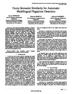
The graph visualization provides an overview of the values in the distance matrix, displaying a graph that includes submissions with distances below a threshold. The primary goal of this visualization is to identify group relationships. For instance, if an analysis reports low distances between submissions A and B, and B and C, it may be interesting to know whether A and C are also closely related. The lower part of the visualization (see Fig. 1) contains a (color-coded) histogram that indicates the relative frequency of each distance in the matrix. In an ideal scenario, the analysis will generate a roughly bell-shaped distribution. In other cases, such as when different course instructors have suggested different approaches, the distribution may look more like a superposition of distinct bell-like curves. In a pathological case, such as a choice of submission files which does not capture enough variability or includes too much noise, the distribution will be highly skewed towards low or high values. The global distance histogram can be therefore used to quickly gauge the relevance of the results provided by an analysis. Since the left-most edge of the histogram represents lower distances, spikes to the left of the main distribution are suspect of plagiarism. By adjusting the position of the horizontal slider placed on top of the histogram, a grader can select the threshold to be used for graph representation: the area under the slider becomes shaded, and all submission pairs with distances below this threshold will be displayed in the main graph. The graph is redrawn automatically every time the threshold slider is move. The slider+histogram can be seen as an implementation of the scented widget concept [15]. Graph vertices are labeled with the corresponding submission IDs, and edges are color-coded and width-coded to indicate distance: edges representing very low distances are colored red and are several pixels wide, while those that represent larger distances become thinner as they progress through orange, yellow and green. Connected components are rendered inside separate grey boxes. The general graph only renders a subset of all edges which fall below the threshold. Given a box that encloses a subgraph G’, any edge that does not belong to the minimum spanning tree (MST) of this subgraph and is not within 1 Ac stands for “AntiCopias”, and is available from http://tangow.ii.uam.es/ac
Figure 1: Graph visualization and distance histogram, using a low threshold. Above, without a center. Below, centered around submission p1b05. the shortest |G’| edges is elided. This is a refinement over the edge-removal approach suggested by Whale in [14]; the result is low edge clutter, while low-distance edges corresponding to strong cliques are preserved. Individual similarity graphs, centered on a particular submission, can also be generated. The “center submission” is selected by using the combo box located near the lowerright corner of the graph window. The center submission is highlighted using a large font, and the global histogram is substituted with the individual distance histogram for the center submission (these histograms will be introduced in the next subsection). Finally, a different criterion is used to select which edges and vertices to display: the goal is to display only those submissions that are highly related to the center one. Individual graphs allow graders to check on a particular submission in a graphical way. The distance threshold is preserved when the center is changed. Graph drawing in Ac relies on the Clover [5] library2 . This library provides automatic layout, zoom and pan functionality, and allows users to manually displace vertices. The use of a force-directed layout (FDL, also termed ’organic’ or ’spring’) algorithm does not impose significant slowdowns on the interface, as long as the number of vertices displayed is kept below a few hundred. Besides the expected zoom and pan behavior, hovering the mouse pointer over any graph edge displays the associated numerical distance as a tooltip, and double-clicking an edge displays a side-by-side comparison dialog for the connected submissions. Double-clicking on a single submission displays a small pop-up window with the individual histogram for the corresponding submission. Similarity graphs are also available for the Sherlock system[13]. However, a circular graph layout is used, which is less informative than Ac’s organic layout. Additionally, there is no individual submission graph mode, and the horizontal slider used to set the edge inclusion threshold does not provide any clues on the actual distance distribution, 2
Available from http://tangow.ii.uam.es/clover
making threshold selection a blind process.
2.2
Histogram Visualization
The histogram visualization displays a series of “individual histograms” stacked vertically. Each histogram displays the distribution of distances from a specific submission to all others; the submission ID for this specific submission is displayed in the left-most edge of the histogram (see Fig. 2). Individual histograms are usually presented in collapsed form. Selecting any row, however, will display it in the traditional, expanded form. The mapping from traditional histogram representation to the compact, color-coded representation is straightforward: the higher the frequency of a certain distance, the “redder” the color. Very frequent distances will be red, and progressively rarer distances will be colored orange, yellow, green and finally blue. The compact representation is also referred to as a “hue histogram”, inspired on Kincaid and Lam’s Line Graph Explorer [10]. Both expanded and compact representations can be found in Fig. 2.
Figure 2: Individual histogram visualization. Each row corresponds to a single submission, and plots the histogram of distances to all other submissions. Selected rows are expanded and shown in traditional form. The lower histogram visualization has been generated after refining matrix values using the leftoutlier heuristic. Constructing histograms for floating-point values, such as similarity distances, involves choosing a number of buckets into which these distances can be aggregated; it is rare to find more than one distinct pair of submissions with exactly the same distance between them. To capture “distance sameness” in the compact histogram representation, two types of coloring are used. Buckets themselves are colored in unsaturated hues. Within each bucket, exact distances are colored in a completely saturated color matching the bucket’s hue, at the horizontal position nearest to their actual value. Hovering the mouse pointer over any point of a histogram displays the IDs of the submissions with distances closest to the current hovered-over value, together with their actual numerical values. Double-clicking on a histogram position will display a comparison screen featuring the two submis-
sions that correspond to those IDs. This behavior is also available in the global histogram that can be found in the graph visualization (see Fig. 1).
2.3
Interpreting Individual Histograms
By default, individual histograms are sorted according to their lowest distances; this is equivalent to the ranked lists found in other systems. Individual histograms, however, prove to be much more informative than simple numerical values. For instance, in Fig. 2, large gaps can be observed between the first leftmost spike in the histograms for p1c04 and p1c09 and the rest of their distance distributions. Not only is the distance between p1c04 and p1c09 low - it is also much lower than any distance from p1c04 or p1c09 to other submissions. After manual inspection, these two submissions can be seen to share a substantial amount of source code, and p1c09 ’s authors recognized having plagiarized from p1c04. These observations can lead to the following interpretation rule: a leftmost-outlier within an individual distance distribution is likely to be due to plagiarism. The rationale is that, if Bob copies from Alice, his submission would be expected to be much more similar to Alice’s than to all other, independently developed submissions. An interesting corollary is that the low distance between Bob and Alice’s submissions may not be as important as its position within the histogram. If Bob’s submission is much more similar to Alice’s than to all other submissions, then it probably deserves a manual comparison by the grader - even if the distance itself, as reported by the current analysis, is not particularly low. Indeed, if Bob wished to avoid detection after plagiarizing Alice, his best bet would be to introduce noise (random cosmetic changes) in the source code. Although this would increment the distance between both submissions, it would also increment the distances to other, unrelated submissions, leading to a right-shifted individual similarity histogram such as the one found in the rows for p1c04 and p1c09 of Fig. 2. In a traditional ranked-list representation (such as the upper part of Fig. 2), this would be row 22 – far outside the area where a grader would have looked. Using the histogram visualization it is easy to scan for this pattern, and manually examine each case. A refinement heuristic has been developed to increase the visibility of such cases. When this heuristic is in use, each distance DAB within the matrix is adjusted to factor in the “degree of outlierness” within the corresponding individual distance distribution (see [6]). In the lower part of Fig. 2, p1c04 occupies row number 9, and is much more visible.
2.4
Application to Other Domains
Although developed for use in plagiarism detection, Ac’s visualizations can be applied to any distance matrix. In a recent experiment, a normalized compression distance similarity analysis was used to generate a distance matrix for a corpus of news headlines3 . Most highly-related headlines were indeed semantically significant, even though the approach had not been optimized at all for natural language processing. Two other experiments in non-plagiarism domains are currently under way. In the first one, Ac is used to locate similar classes within a single large java program; the results 3 Thanks to Jae-Wook Ahn, from the PAWS group at Pittsburgh University, for providing the corpus.
can be used in refactoring and testing efforts. In the second, Ac is used to analyze amino acid sequences, and the goal is to locate similarities at the sequence level that may prove significant at higher levels.
3.
CONCLUSIONS AND FUTURE WORK
Ac’s graph and histogram visualization represent improvements in the visualization of distance matrices, specially when compared to simple distance-ranking approaches. The graph visualization couples the histogram of the distance population and the edge threshold slider, allowing intuitive selection of relevant thresholds. Additionally, the heuristic used to elide edges from connected components preserves the most important parts of the component structure, while simplifying the graph for later layout. The addition of an individual graph mode allows graders to quickly examine the position of a single submission. The histogram visualization is based on individual histograms. To reduce space requirements, hue-histograms are used instead of bar histograms; greater compactness could be achieved by dropping submission labels, and generally adopting the interface of Card’s Table Lens [12]. The interpretation of this visualization provides a wealth of information, and has prompted the development of a novel heuristic to detect cases of plagiarism in the presence of added noise. Feedback from graders indicates that the tool is effective at detecting and, even better, deterring plagiarism. Performance on artificial benchmarks is very high (see [4]), although experiments in which students are asked to cheat have not been performed. Beyond the graph and histogram visualizations, graders have repeatedly requested support for incremental comparisons, and for the ability to avoid comparing old submissions among themselves.
3.1
[4]
[5]
[6]
[7]
[8]
[9]
Future Work
Although Ac is useful (and used) as-is, the interpretation of histograms and, to a lesser extent, graphs, is certainly not intuitive, and requires a degree of training and familiarity. Work is under way to simplify this task, by using statistical outlier detection to aid graders to quickly locate suspect submission pairs. An over-simplification of the interface, however, would be dangerous, since graders may decide to “let the system do the work” instead of making informed decisions based on the actual submissions. Reviewers have provided insightful comments and pointers; color-coding could benefit from the ideas contained in [9], and histogram rows could be sorted as described in [2]. Additionally, the experiments described in section 2.4 have prompted the development of a new “dendrogram+graph” visualization, similar to the current “histogram+graph” visualization.
4.
[3]
[10]
[11]
[12]
[13]
ACKNOWLEDGMENTS
This work has been sponsored by the Spanish Ministry of Science with project code TIN2004-03140.
5.
REFERENCES
[1] A. Aiken et al. Moss: A system for detecting software plagiarism. University of California–Berkeley. See www. cs. berkeley. edu/aiken/moss. html, 2005. [2] M. Ankerst, S. Berchtold, and D. A. K. Mihael. Similarity clustering of dimensions for an enhanced
[14]
[15]
visualization of multidimensional data. In Proceedings IEEE Symposium on Information Visualization 1998, pages 52–60. IEEE, 1998. B. Braumoeller and B. Gaines. Actions do speak louder than words: Deterring plagiarism with the use of plagiarism-detection software. PS: Political Science and Politics, 34(04):835–839, 2002. M. Cebri´ an, M. Alfonseca, and A. Ortega. Automatic Generation of Benchmarks for Plagiarism Detection Tools using Grammatical Evolution. In Proceedings of the 9th annual conference on Genetic and Evolutionary Computation. ACM Press New York, NY, USA, 2007. M. Freire. An Approach to the Visualization of Adaptive Hypermedia Structures and other Small-World Networks based on Hierarchically Clustered Graphs. PhD thesis, Universidad Aut´ onoma de Madrid, 2007. M. Freire, M. Cebrian, and E. del Rosal. Ac: An integrated source code plagiarism detection environment. Pre-print manuscript, available at http://www.citebase.org/abstract?id=oai: arXiv.org:cs/0703136, May 2007. D. Gitchell and N. Tran. Sim: a utility for detecting similarity in computer programs. In Proceedings of 13th SIGSCI Technical Symposium on Computer Science Education, pages 266–270. ACM Press New York, NY, USA, 1999. M. Joy and M. Luck. Plagiarism in Programming Assignments. IEEE TRANSACTIONS ON EDUCATION, 42(2):129, 1999. D. A. Keim. Designing pixel-oriented visualization techniques: Theory and applications. IEEE Transactions on Visualization and Computer Graphics, 6(1):59–78, Jan./Mar. 2000. R. Kincaid and H. Lam. Line graph explorer: scalable display of line graphs using focus+context. In Proceedings of AVI 2004, pages 404–411. ACM Press, 2006. C. Liu, C. Chen, J. Han, and P. S. Yu. Gplag: detection of software plagiarism by program dependence graph analysis. In KDD ’06: Proceedings of the 12th ACM SIGKDD international conference on Knowledge discovery and data mining, pages 872–881, New York, NY, USA, 2006. ACM. R. Rao and S. K. Card. The table lens: merging graphical and symbolic representations in an interactive focus + context visualization for tabular information. In Proceedings of CHI ’94, pages 318–322, New York, NY, USA, 1994. ACM Press. University of Aberdeen, CS Department. Student handbook: on plagiarism. http://www.csd.abdn.ac.uk/teaching/handbook/ both/info.php?filename=cheating.txt. Last visited, Dec. 2007. G. Whale. Identification of Program Similarity in Large Populations. The Computer Journal, 33(2):140, 1990. W. Willett, J. Heer, and M. Agrawala. Scented widgets: Improving navigation cues with embedded visualizations. IEEE Trans. Vis. Comput. Graph, 13(6):1129–1136, 2007.