which presented email messages based on a dateline together with other email information. The usability .... a standard email client (i.e., Outlook Express). This.
Journal of Computer Science 5 (10): 690-703, 2009 ISSN 1549-3636 © 2009 Science Publications
Graphical Browsing of Email Data: A Usability Based Comparative Study Dimitrios Rigas and Saad Alharbi Department of Computing, University of Bradford, BD7 1DP, Bradford, UK Abstract: Problem statement: With the rapid growth of the number of email messages and the diverse use of email, people have become overwhelmed by the large volumes of email archives. As a result, email tools that facilitate the browsing of email messages are highly required. This study described an empirical study that aimed to investigate whether the usability of email client can be improved by incorporating graphical visualization techniques to browse email data. Approach: Two email visualization approaches, called LinearVis and MatrixVis, were developed for this empirical study which presented email messages based on a dateline together with other email information. The usability of each approach was compared to atypical email tool in terms of locating messages. Results: The results demonstrated that LinearVis was the most usable email approach in terms of browsing email messages whereas MatrixVis was found to be the least usable email condition. Conclusion: The results showed that usability of email clients can be significantly improved by presenting graphically email messages with only a small volume of hidden email data. Results also indicated that usability of the graphical representations, that hide large volume of email data, can be negatively affected. Key words: Design, evaluation, interaction, visualization need for more usable email clients that help users to browse email messages efficiently and effectively becomes important. This study describes an empirical study that was performed to investigate how the various ways of browsing email messages graphically affect the usability of email clients. An experimental email client platform was developed to be used as a basis for this empirical study. The platform provided two types of graphical representation of email messages, both of them present email messages based on a dateline together with other email information. The effectiveness, efficiency and users’ satisfaction of the experimental platform were compared to a standard email client (i.e., Outlook Express). This study concludes with the results of this comparative study and some directions of the future research.
INTRODUCTION Email is one of the most widely used applications and Duchenaut and Bellotti called it habitat[1]. Sometimes, email applications are also used to serve users for task and time management as well as for personal archiving[2]. Whittaker and Sidner called this as email overload[3]. The number of email messages and accounts often grows rapidly. For example, it has been estimated that about 31 billion email messages have been sent in 2002[4]. It has also been shown that the average user gets around 49 email messages a day while high volume users can get more than one hundred[5]. Email inboxes have become cluttered and difficult to browse as users usually keep their email messages in the inbox for different purposes[6]. The use of folders and filing has been proposed to organize email messages in the inbox. Becker and Ferreira developed an email tool that automatically classifies email messages using virtual folders[7]. According to Duchenaut and Bellotti, the use of folders demonstrated problems such as long nesting and lack of use over time[1]. Yiu et al stated that filing is time consuming and it could be cognitively intensive[8]. Thus, folders are not always useful especially for high volume email users and some users may also have difficulties generating appropriate folder labels[9]. Therefore, the
Email visualization: Several studies have employed information visualization to represent email messages for different purposes and they can broadly be classified into three categories. These are users’ relationship, messages relationship and tasks management. For example, FaMailiar uses visualization techniques to present personal relationships[10] by allowing users to categories their contacts into five intimacy categories as well as an automated intimacy weight based on the
Corresponding Author: Saad Alharbi, Department of Computing, University of Bradford, BD7 1DP, Bradford, UK
690
J. Computer Sci., 5 (10): 690-703, 2009 content of the e-mail messages. Messages in faMailiar are presented in calendar-like manner[10]. Perer, Shneiderman and Oard developed an approach that helps to understand the individuals and communities from the email archive[11]. Rhythms of relationships were visualized in this project and have shown they could provide context that is necessary for a social scientist[11]. Perer and Smith developed three email visualizations that capture the hierarchal, temporal and correlation patterns[12]. One of the goals of theses visualization was to improve the understanding of the variation in email users’ practice such as the intensity and the duration of relationships with people. Viegas, Golder and Donath developed an email visualization tool called “Themail”, which visualized email archives based on the content of email messages, in order to presents relationships between individuals[13]. It presented a series of keywords in columns arranged along a timeline, where each keyword was shown in a different color. The size of keywords depended on their frequency and distinctiveness. The main goal of these studies was only to show the relationships amongst email users where the usability of email has not been considered. Message threads, which is the reply relationship for a group of email messages[14], have been used by many studies to visualizing email messages. Rohall et al.[5,15] developed three visualization techniques and combined them in order to enhance the email inbox. These visualization techniques depend on message threads, time and content of the email messages. In the thread visualization, all the messages that are related by the reply function are shown as connected tree. The relationship between email senders can also be seen in this visualization by displaying the related email messages using different colors. For example, an email message colored purple is from someone outside the recipient’s work. Venolia and Neustaedter pointed out that email clients would be more useful if conversation threads were used as the main display for email clients[16]. They presented a mixed-model visualization that shows the sequence of email messages and reply relationships among the messages of conversation. The users’ understanding of message threads was tested and the results showed they were able to understand them. The results of this study showed that users could understand the message threads but the usability of the approach was not considered. Kerr developed a visualization technique called ThreadArcs that shows the reply relationships in messages[17]. Related messages are connected with arcs and displayed chronologically. It was compared with the existing thread visualizations such as tree diagram and tree
table visualizations and demonstrated to have an advantage over them[17]. ThreadArcs was used in the reinventing email “Remail” project[14]. “EzMail” is an email visualization that displayed messages as components of threads in order to provide contextual information[18]. The thread visualization in this tool was compared with a traditional textual thread and it has been found more usable and preferred[18]. Perer and Shneiderman stated that threading messages by subject lines and reply relationships does not reflect users behavior[19]. Therefore, they developed a thread visualization that portrayed users participation in a conversation in addition to the time of sending messages[19]. Email can be used to perform the management of pending tasks[20]. Gwizdka focused on how to support this function in email and divided this problem space into two levels (message and inbox)[20]. Gwizdka developed two email user interface prototypes. The first prototype explored the automatic placement of pending tasks and the second explored the manual arrangement of pending tasks[20]. Yiu et al.[8] developed an alternative approach of using folders, called TimeStore, to organize email messages in the inbox and to support task management. This approach used the time of receiving the email messages as the determining factor to display email messages. Email messages were organized on X, Y axes where time was presented along the X-axis and the senders on the y-axis. Email messages were displayed as dots and they were interactive (e.g., a user can click on an email message in order to read it). The result showed that the majority of the users thought it was useful[8]. The task management has been employed in “Remail” project where the received messages can be marked into different categories such as to-do, reminder and appointment[14]. Some of these marks can be applied automatically where other should be applied manually. Sudarsky and Hjelsvold developed a tool that visualized the email inbox depending on a hierarchal nature of domain names in email addresses such as COM and EDU[9]. This approach had two hierarchal views. These were a tree generated from the domain names and a temporal view which presented the email messages. In a brief and informal study, significantly improved performance as well as improved overall preferences were demonstrated[9]. The main goal of most of the previous studies was to visualize email data without fully taking into account whether the usability of email clients was enhanced. Therefore, this study described a comparative usability study aimed to investigate how the various ways of browsing email messages graphically affect the 691
J. Computer Sci., 5 (10): 690-703, 2009 usability of email clients. This was conducted by comparing the effectiveness, efficiency and users’ satisfaction of two experimental email visualizations to a standard email client (i.e., Outlook Express). This study concludes with the results of this evaluation and some directions of the future research. Experimental platform: LinearVis and MatrixVis: An experimental email visualization platform was developed using Microsoft Visual Basic 2005 under a Windows XP platform and supported by a database that was designed by Microsoft SQL Server 2005. The platform simulated an email client with a reduced set of functionality but sufficient to serve the empirical study. The platform provided two email visualizations which were called LinearVis and MatrixVis. Both of these approaches presented email messages based on a dateline together with other email information (e.g., senders’ email address, time). Table 1 shows the email data that was hidden in both email visualizations in order to reduce the graphical complexity in the email inbox and to avoid the visual overload.
LinearVis: The LinearVis approach presented email messages based on the date and senders’ email addresses. Figure 1a shows that the inbox is divided into three parts: dateline, main view and temporal view. The dateline was located at the top part of the inbox which presented all the dates that contained email messages in chronological order where the first date on the far left side was the most recent date that email messages were received and the last date on the far right side was the oldest date. A drop down menu with previous dates (not displayed in the current view) allows the users to view earlier dates. This approach minimized the number of presented dates in order to produce a clear and readable display and to reduce the scrolling operations that would have been required by the users if all dates were presented. The main view presented email messages from the inbox as square boxes which were grouped based on the alphabetically ordered list of email senders on the left side of the inbox. The size of the presented squares decreased according to the number of email messages sent by the email sender (i.e., the larger number of email messages received, the smaller the square).
Table 1: Presented and hidden information in the experimental visualization and the standard email Email data -----------------------------------------------------------------------------------------------------------------------------------------------Conditions Date Email address Subject Status Attachment Priority Recipients (TO,CC) Standard email √ √ √ √ √ √ × LinearVis √ √ × √ × × √ √ × × √ × × × MatrixVis
(a)
(b)
Fig. 1: The inbox of LinearVis with all email messages presented (a) and after selecting a date (b) (A denotes the dateline, B the main view and C the temporal view) 692
J. Computer Sci., 5 (10): 690-703, 2009
(a)
(b)
Fig. 2: The inbox of MatrixVis with all email messages presented (a) and after selecting a date (b) (A denotes the dateline, B the main view and C the temporal view) same approach as the LinearVis. The main view of the MatrixVis inbox was divided into six timeslots that presented a full day. Each timeslot represented a 4-hour period. Email messages were also presented as square boxes and sorted into timeslots according to the time they were received. In this case, the size of the presented squares was fixed as the size of timeslots could vary according to the number of email messages received within that particular timeslot. Therefore, email messages in each of the timeslots were presented chronologically in rows with up to eleven per row (Fig. 2a). Colors were also used to present the status of the email messages in the same way as in the LinearVis approach. The size of the timeslots and the number of email messages displayed in the main view can be minimized by selecting a date from the dateline at the top of the inbox (Fig. 2b). The content of email messages and the hidden information (e.g., subject and the recipients (To, CC)) can be seen by clicking on the required email message in the main view. Senders’ email addresses were not presented directly in this approach. Therefore, by moving the mouse over an email message, all the email messages sent by the same sender of this message were presented chronologically in the temporal view. The content of email messages presented in the temporal view can be seen by clicking on the required email messages, too.
The filled color of the square communicated to users whether the email message was unread (displayed in yellow), read (displayed in white), replied (displayed in green), or forwarded (displayed in grey). Subject, attachment and priority were hidden in order to reduce the graphical complexity in the main view and to avoid visually overloading the users. This information can be seen by users when the content of the email message is viewed by clicking on the email message in the main view. The number of displayed messages and addresses in the main view can be reduced by selecting the required date from the dateline (Fig. 1b). The recipients of an email message can be shown in the temporal view by moving the mouse cursor over its icon in the main view. Rather than using the traditional textual way of displaying the recipients (TO, CC) of an email message they are presented using colors. All email addresses connected by green lines are those email messages who have been received as Carbon Copies (CC) and email addresses connected by red lines are those received as normal messages (TO). In order to reduce the amount of presented information on the screen, the email addresses that appear in both TO and CC fields are displayed once and connected by blue lines rather than displaying them twice. MatrixVis: The MatrixVis approach displayed email messages according to the date and time. Figure 2a shows the way in which the inbox was similarly divided into three main parts: Dateline, main view and temporal view. The dateline section presents the dates using the
MATERIALS AND METHODS Subjects: Thirty users (all were postgraduate computing students) participated in the experiment. All 693
J. Computer Sci., 5 (10): 690-703, 2009 of them were email users but were not familiar with the experimental visualizations.
operations to find an email message. In order to find out if the hidden email information in both experimental conditions (i.e., LinearVis, MatrixVis) would affect the usability, medium tasks were designed based on increasing the number of required information in email message, especially the hidden ones. For example, in one of the medium tasks users were asked to find an email message by the attachment name with the date. In the difficult tasks, users were mainly asked to find email messages by asking them about the recipients (TO, CC) of the email message beside other information such as the sender’s email address.
Experimental design and tasks: An experiment was designed in order to find out whether the usability of email clients can be improved by visualizing email data. This experiment is a comparative usability evaluation between one of the well-known email clients, outlook express and the proposed experimental graphical email approaches. It was three-conditions, within-subjects design and therefore each subject was asked to perform the experimental tasks in each condition. The email messages were the same under each condition. In order to avoid the learning effect, the order of the conditions was varied between subjects (counter-balanced)[21]. Table 2 shows the structure of the experiment. Users were required to perform all experimental tasks in a condition and then move to the next one. As shown in Table 2 users were required to fill a satisfaction questionnaire after performing each experimental condition. They were free to use any of the functions that are offered by Outlook Express such as sorting email messages and searching for an email message but they were not able to use these functions in the experimental tool. At the end of the experiment users were also required to choose their most preferred email version. A five minutes demonstration was given for all users prior performing each condition. Users were required to perform 10 tasks in each experimental condition in each task they had to locate an email message with the provided relevant information such as the date of receiving, the sender’s email address and subject. In order to test the control email and the experimental email approaches (i.e., LinearVis, MatrixVis) under various situations, all the data of email messages were taken into account when designing the experimental tasks. In addition, they were designed to be in three complexity levels: easy tasks (3 tasks), medium tasks (4 tasks) and difficult tasks (3 tasks). The location of email messages in the inbox were considered when designing the easy tasks. Therefore, the required email messages in the easy tasks were located at the top of the standard email inbox so users do not need to perform scrolling and searching
Hypotheses and measures: The experiment aimed to investigate the effect of the graphical browsing of email messages on the usability of email clients. Therefore, the hypothesis of this experiment was that the LinearVis approach should be more usable than the standard email (i.e., Outlook Express). A similar hypothesis was also formulated for MatrixVis. The usability of a user interface can be measured by taken into account the effectiveness, efficiency and users’ satisfaction[22]. These usability metrics were considered as the dependant variables in this experiment. A detailed analysis based on the tasks complexity levels was also performed on each experimental condition to find out whether the hidden email information in both experimental conditions would affect the usability of email clients. As the effectiveness of user interfaces can be measured by finding out whether certain tasks can be accomplished successfully[23], tasks completion rate were considered to measure the effectiveness in this experiment. The efficiency of user interfaces can be measured by finding out the amount of effort required to accomplish certain tasks[22,23]. Therefore, the efficiency was measured by the time taken by users to perform tasks and the number of actions carried out during the performance of those tasks. For example, one of the actions that can be carried out whilst performing a task in this experiment is clicking on a date in LinearVis or using the search function in the standard email client.
Table 2: Experimental structure and the order in which the conditions were attempted by the users Order of the presentations of conditions --------------------------------------------------------------------------------------------------------------------Users Users’ satisfaction Users’ satisfaction Users’ satisfaction 1, 2, 3, 4, 5 Outlook Express LinearVis MatrixVis 6, 7, 8, 9, 10 Outlook Express MatrixVis LinearVis 11, 12, 13, 14, 15 LinearVis Outlook Express MatrixVis 16, 17, 18, 19, 20 LinearVis MatrixVis Outlook Express 21, 22, 23, 24, 25 MatrixVis Outlook Express LinearVis 26, 27, 28, 29, 30 MatrixVis LinearVis Outlook Express
694
J. Computer Sci., 5 (10): 690-703, 2009 Table 3: Usability metrics and dependant variables Usability metric Dependant variables Effectiveness Tasks successfully completed Efficiency Tasks accomplishment time Number of actions performed to accomplish tasks Users’ satisfaction Overall users’ satisfaction Users’ preference
Users’ satisfaction is usually measured by knowing the level of users’ comfort when using an interface[23]. Therefore, satisfaction was measured qualitatively by asking users to rate their satisfaction over each email version and asking them about the most preferred email client. Table 3 summarizes the dependant variables used in this experiment.
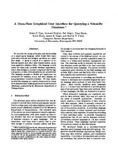
Fig. 3: The percentage of users (a) who successfully completed the ten tasks, (b) all tasks and (c) the tasks completed by all users
RESULTS
suggested that both email visualizations are significantly better than the standard email in terms of number of users who completed all tasks, but 67% of the users who did not complete all tasks in LinearVis because they could not complete Task 4. In this task users were required to find an email message by subject where it is hidden in both experimental conditions. Also, 50% of the users who did not complete all tasks in MatrixVis because they could not complete the same task and the other 50% could not complete the tasks that users wherein required to find email messages by sender’s email address where it is hidden in this visualization approach. The number of tasks completed by all users in the three conditions was also calculated to produce an overall percentage. Figure 3 shows both email visualizations produced higher percentage of tasks completed by all users. Chi-square was also used to test the significance in the number of tasks completed by all users. It showed a significant difference in the number of completed tasks by all users in LinearVis (X2 = 5.05, df = 1, cv = 3.84, p0.05). Figure 3 shows that the completion rate in both experimental visualizations decreases when the required information of the email messages was hidden. For example, most of the experimental tasks have been successfully completed by all users in LinearVis except Task 4 where the subject of email message was hidden. Also, most of the experimental tasks were successfully completed by all users in MatrixVis except those tasks where users required finding email messages by subject or email address (i.e., Tasks 4, 6 and 7). Therefore, the large scale of hidden information in MatrixVis affected users’ performance in terms of number of completed tasks. On the other hand, the percentage of users who completed last three tasks (8-10) using the experimental conditions
The performance of each user in each condition was observed and noted in an evaluation form which included the accomplishment time of each task, the number of actions carried out when performing each task and whether each task was successfully completed. The obtained data was analyzed independently according to the usability metrics of efficiency, effectiveness and satisfaction of users. Each graphical email approaches was compared independently to the standard email client. Effectiveness: In order to find out whether a task was completed successfully, a critical time for task completion was derived. It was computed as follows: CT (Ti ) = M (Ti ) + 30s CT T i 30s
= = = =
The critical time An experimental task The experimental task number 30 sec
Users who took longer than this critical time to complete a task, were considered as not to have completed the task. Figure 3 shows the overall percentage of users who successfully completed all tasks and the overall percentage of tasks completed by all users. Also, it shows the percentage of users who successfully completed each tasks in each of the three experimental conditions. The users who completed all tasks using the experimental conditions (i.e., LinearVis and MatrixVis) are higher than the control condition (i.e., standard email client). Chi-square[24] results showed a significant difference in the number of users who completed all tasks in LinearVis (X2 = 15.8, df = 1, cv = 3.84, p