Knowledge Visualization: A Comparative Study between Project Tube Maps and Gantt Charts Remo Aslak Burkhard (University of St.Gallen,
[email protected])
Michael Meier (vasp datatecture GmbH,
[email protected])
Peter Rodgers (University of Kent,
[email protected]) Matthias Thomas Jelle Smis (University of St. Gallen,
[email protected])
Jonathan Stott (University of Kent,
[email protected])
Abstract: This paper compares the effectiveness of the Project Tube Map and the Gantt Chart for interfunctional communication in large projects where different stakeholders are involved. Today, Gantt Charts are well known in project management. However, the use of Gantt Charts has limitations: It fails in motivational aspects, it has difficulties to illustrate who is collaborating with whom, and it supports badly recall. The Project Tube Map has been introduced earlier as an approach to overcome these limitations. This paper compares the effectiveness of both visualization methods. Our findings from the evaluation of 44 interviews indicate that the Project Tube Map is more effective for (1) drawing attention and keeping interest, (2) presenting overview and detail, (3) visualizing who is collaborating with whom, (4) motivating people to participate in the project, and (5) increasing recall. The findings indicate that both formats complement each other. We further present an algorithm that allows the automatic creation of Project Tube Maps. The results presented in this paper are important for researchers and practitioners in the fields of Knowledge Visualization, Project Management, Visual Communication Sciences, and Information Visualization. Keywords: Knowledge Visualization in Projects, Visual Metaphor, Project Tube Map Algorithm Categories: H.5.2, H.5.3
1
Introduction: The Power of Visual Metaphors in Projects
In long-term projects where different individuals are involved effective communication becomes an important success factor. It can result in higher motivation, in better co-operation, and in higher productivity. Today’s project
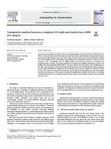
communication occurs mainly by verbal formats. However, the Gantt Chart [Fig. 1] is a well known visualization method in today’s Project Management.
Fig. 1: A Gantt Chart (68x38cm) illustrates tasks and task duration with bars that are aligned to a timeline and followed by the involved groups per task. The tasks are listed on the left hand side. For the planning and controlling of projects Gantt Charts are effective. But, to address various individuals Gantt Charts are not the best means; especially if the individuals have different cultural, educational, or functional backgrounds. We believe that Gantt Charts (1) are not effective at attracting, fascinating, or motivating project members, and accordingly they do not initiate discussion, (2) they lack in illustrating interrelationships among the involved project members and therefore do not present the 'big picture' which is often essential, and (3) they hardly support recall and are difficult to remember. Based on research in various fields e.g., Knowledge Visualization [Burkhard 2004; Burkhard 2005; Eppler and Burkhard 2005], Information Visualization [Bertin 1974; Card et al. 1999], Information Design [Bertin 1974; Tufte 1997], Cognitive Art [Horn 1998], Learning Psychology [Mandl and Levin 1989], [Weidenmann 1989] the Project Tube Map [Burkhard and Meier 2004; Burkhard and Meier 2005] has been developed to overcome the limitations of the Gantt Chart. The Project Tube Map [Fig. 2] uses the metaphor of a tube system for knowledge communication, where the tube lines represent project groups and the tube stations project tasks. The task stations are further tagged with detailed descriptions like dates and instructions. The whole map is aligned to a timeline that runs from the left to the right and is illustrated through bars at the bottom of the visualization.
Fig. 2: Full screenshot and zoom-in of the Project Tube Map (1.2x2.4m)
A previous evaluation [Burkhard and Meier 2004] indicates that the Project Tube Map has several advantages: It attracts and motivates individuals, illustrates overview and detail (because it integrates detailed descriptions of the milestones as stations), establishes a mutual story, and leads to discussion. These promising results motivated us to investigate the differences between the Gantt Chart and the Project Tube Map in an additional study, which is the focus of this publication. The results from the comparative study indicate, that the Project Tube Map overcomes the weaknesses of the Gantt Chart. Therefore, we also present a software algorithm that allows to create Project Tube Maps automatically.
2 2.1
Comparative Study: Project Tube Map versus Gantt Chart Hypotheses
In this comparative study five assumptions are tested: • Attraction: People think the Project Tube Map is more attractive and catches more attention than the Gantt Chart. • Overview+Detail: The Project Tube Map is more effective in illustrating the 'big picture' of the project. • Discussion: The Project Tube Map initiates more discussion on the project than the Gantt Chart. • Motivation: The Project Tube Map motivates individuals more to participate in the project than the Gantt Chart. • Recall: The Project Tube Map sticks better in the recipient's memory than the Gantt Chart. 2.2
Target Group
The target group of this study consisted of 44 individuals with different backgrounds. To do so, we have chosen three similar groups: Project managers, students, and employees from large organizations that worked in long-term projects. But we want to stress that not this distinction but the mixed group as one population is important to us. 34 percent were female, 66 percent male. The average age was 31 years. 68 percent of the test persons have a university degree. 2.3
Procedure
With the software Adobe Illustrator we designed two posters [Fig. 1 and 2], which contain the same information content with one exception: The Project Tube Map has additional graphic symbols. Both posters are printed in the size of 68cm by 38cm. The population has been divided in two equal groups. One group started the procedure with the Project Tube Map, and the other with the Gantt Chart. In this procedure we first asked each participant to explore the visualization as long as he is interested in it. During this process, we asked to think aloud and point with the finger to items that catch the attention. We measured the time for this first part. Then, the recipient was asked to complete the first part of a paper based questionnaire. Next, the other format (Project Tube Map or Gantt Chart) was presented to the participant. We again asked
to brainstorm aloud while exploring and comparing the two formats. We noted down the comments and again measured time. Finally the participants were asked to fill in the second part of the paper based questionnaire. Roughly half of the participants were contacted two weeks later either by a short telephone call or interviewed briefly for measuring recall. We stress that the two authors who developed and discussed the Tube Map Visualization in previous publications have not interviewed the particpants, because they might have influenced the participants. The participants have been interviewed by one person, which has not been involved in previous work or the development of the approach. 2.4
Evaluation of the Data
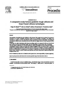
In this section we present some insights we found when we analyzed the collected data (observations, brainstorms, and questionnairs). The questions and results of the evaluated questionaires can be seen in [ Fig. 3]. We present the findings according to the five hypotheses for the global group. We are aware that we should discuss the data for each group. However, we have chosen this approach, because, first, we did not find significant and clear patterns in the three groups and, secondly, we do not have enough data to analyze each group separately yet. In the next section we compare the Tube Map and Gantt Chart by comparing groups for rather do agree and do agree according to the hypotheses Attraction: According to statement 1 in [ Fig. 3] the Project Tube Map (TM) catches more attention (TM 82% versus GC 48%, both for rather do agree and do agree) than the Gantt Chart (GC). According to statement 2 it interests the recipients more (TM 95% versus GC 52%). Statement 3 states that the Tube Map is more appealing (TM 83% versus GC 35%). Comparing the measured times for studying the formats indicates that the Project Tube Map has been viewed 1.41 times (mean) or 1.53 times (median) longer than the Gantt Chart. Observations of the participants and comments underlined that the particpants from all groups were clearly more attracted and fascinated by the Tube Map. However, this might change, as soon as Tube Maps are used more regularly. Concluding, it showed clearly that the Project Tube Map catched more attention than the Gantt Chart. Overview+Detail: According to statement 4 the Project Tube Map presents a better overview (TM 87% versus GC 71%). If we only compare the values for very true then the Gantt Chart scores better. However, statement 5 (TM 13% versus GC 43%) indicates that the Gantt Chart rather focuses too much on detail. The participant stressed that the Project Tube Map displays better how tasks and groups relate to each other, but does not illustrate task durations as the Gantt Chart does. Secondly the particpants liked the task list in the Gantt Chart. One third stated that the Gantt Chart is well known and thus a better means than the Tube Map. Half of the population (equally in all three groups) consider the Gantt Chart as boring and bureaucratic and predictable. In the Project Tube Map, some persons considered the graphic symbols as not being well associated with the content and thus confusing. This point is true. Concluding, this data indicates that the Project Tube Map is more effective in illustrate the 'big picture'.
Fig. 3: The results of the 44 questionnairs. The triangle represent the mean. Discussion: According to statement 6, the Project Tube Map initiates more discussions on the project than the Gantt Chart (TM 61% versus GC 24%). The visual metaphor helps to build a mental model, which helps to discuss on the project. According to statement 7, participants that started with the Tube Map but also participants that started with the Gantt Chart think that such a display should be used in every complex project (TM 65%, GC 48%). Concluding, it shows that the Project Tube Map seems to initate more discussion on the project than the Gantt Chart. Motivation: According to statement 8 (TM 44% versus GC 24%) the Project Tube Map is motivating more to participate in the project. This result is similar to our finding in the previous study [Burkhard and Meier 2004], where the Project Tube Map motivated the participants measurably to engage in the project.
Concluding, this data indicates that the Project Tube Map motivates individuals to greater participation in the project than the Gantt Chart. Recall: We did not specifically compare the maps in regards to recall tasks. But several meetings with some of the participants two weeks after they participated in the study made clear that they remembered well the general structure and the main groups and tasks of the Project Tube Map, whereas they could not remember details about the Gantt Chart. The participants could reconstruct the Project Tube Map much easily and recall different groups. Whereas initially some persons have been confused by the symbols, the interviews showed that the persons remembered the symbols precisely. Concluding, several comments indicate that the Project Tube Map sticks better in the recipient's memory than the Gantt Chart and the various visual elements of the Project Tube Map help to re-construct the Project Tube Map content. 2.5
Conclusion and Guidelines
Our study indicates that the Project Tube Map is more effective than the Gantt Chart for the communication of long-term projects where individuals from different backgrounds are involved. A first finding is that the participants explored the Project Tube Map around 50 percent longer than the Gantt Chart. A second finding is that the Project Tube Map motivates people more to participate in the project than the Gantt Chart. Generally, it helps in catching the attention and illustrating the 'big picture', in initiating discussion, and motivating employees to participate in the project. In contrast, the Gantt Chart is more effective in a clear-structured approach and for the display of the task duration. Thus the formats complement each other. Feedback allowed to derive general guidelines for creating Project Tube Maps: (1) Carefully use symbols as cognitive aides for recall. (2) Use a clear title, legend and verbal project summary for the overall understanding. (3) Use a clearly visible scaled time axis (4) Print the Project Tube Map on large posters and place them at lively places (e.g., next to the elevator) (5) Add a small Gantt Chart to the Project Tube Map to illustrate task durations. Next we present a tool that allows to create Project Tube Maps from a simple mouse click as a basis for the design of your Project Tube Map.
3
Tool: The Project Tube Map Algorithm
Creating Project Tube Maps manually is time consuming. Hence, we have developed a software prototype that converts a standard planning format (MS Project™) into a Project Tube Map and assists designers in generating comprehensible layouts. Various attempts have been made to automatically draw Project Tube Maps [Christensen et al. 1995; Stott and Rodgers 2004] and other more general schematic diagrams [Cabello et al. 2001; Cabello and van Kreveld 2002].
Fig. 4: The result of our software generated Project Tube Map. Our approach [Fig. 4] is based on a multicriteria optimization approach taken in [Stott and Rodgers 2004] and has been adapted for this particular application area by introducing a horizontal time axis. It also allows us to represent the available time for each task by the difference in x-coordinates between two task stations. The algorithm and tool are discussed in [Stott et al. 2005].
4
Conclusion
We presented a study that indicates that the Project Tube Map is more effective than the Gantt Chart for the communication of long-term projects where individuals from different backgrounds are involved. In order to obtain effective project communication the advantages of both formats should be available. We further presented a software algorithm which eases the creation of Project Tube Maps. In our future work we will improve the algorithm and investigate on other metaphors for knowledge communication in long-term projects.
References [Bertin 1974] Bertin, J.: "Graphische Semiologie. Diagramme, Netze, Karten"; Walter de Gruyter, Berlin (1974) [Burkhard 2004] Burkhard, R.: "Learning from Architects: The Difference between Knowledge Visualization and Information Visualization"; Proc. Eigth International Conference on Information Visualization (IV04), London, July, (2004). [Burkhard 2005] Burkhard, R.: "Towards a Framework and a Model for Knowledge Visualization: Synergies between Information and Knowledge Visualization"; Knowledge and Information Visualization: Searching for Synergies. Tergan, S.-O. and Keller, T. Springer Lecture Notes in Computer Science, Heidelberg / New York (2005): [to appear]. [Burkhard and Meier 2004] Burkhard, R. and Meier, M.: "Tube Map: Evaluation of a Visual Metaphor for Interfunctional Communication of Complex Projects"; Proc. Proceedings of IKNOW '04, Graz, Austria, June 30 - July 2, (2004), 449-456. [Burkhard and Meier 2005] Burkhard, R. and Meier, M.: "Tube Map Visualization: Evaluation of a Novel Knowledge Visualization Application for the Transfer of Knowledge in Long-Term
Projects"; Journal of Universal Computer Science, Special Issue Business Process Oriented Knowledge Infrastructures (2005), [to appear]. [Cabello et al. 2001] Cabello, S., de Berg, M., van Dijk, S., van Kreveld, M. and Strijk, T.: "Schematization of Road Networks"; Proc., (2001), 33-39. [Cabello and van Kreveld 2002] Cabello, S. and van Kreveld, M.: "Schematic Networks: An Algorithm and Its Implementation"; Springer (2002) [Card et al. 1999] Card, S. K., Mackinlay, J. D. and Shneiderman, B.: "Readings in Information Visualization: Using Vision to Think", Morgan Kaufmann Publishers Inc., San Francisco (CA).(1999) [Christensen et al. 1995] Christensen, J., Marks, J. and Shieber, S.: "An Empirical Study of Algorithms for Point-Feature Label Placement"; ACM Trans. Graphics, 14, 3 (1995), 203-232. [Eppler and Burkhard 2005] Eppler, M. and Burkhard, R.: "Knowledge Visualization"; Encyclopedia of Knowledge Management. Idea Group (2005): [to appear]. [Horn 1998] Horn, R. E.: "Visual Language: Global Communication for the 21st Century"; MacroVU Press, Bainbridge Island (WA) (1998) [Mandl and Levin 1989] Mandl, H. and Levin, J. R.: "Knowledge Acquisition from Text and Pictures", Advances in Psychology, North-Holland, Amsterdam, 58: 329.(1989) [Stott and Rodgers, 2004] Stott, J. M. and Rodgers, P.: "Metro Map Layout Using Multicriteria Optimization"; Proc. Proc. 8th International Conference on Information Visualisation (IV04), IEEE, London, (2004). [Stott et al. 2005] Stott, J. M., Rodgers, P., Burkhard, R., Meier, M. and Smis, M. T. J.: "Automatic Layout of Project Plans Using a Metro Map Metaphor"; Proc. Ninth International Conference on Information Visualization (IV05), London, July, (2005). [Tufte 1997] Tufte, E. R.: "Visual Explanations: Images and Quantities, Evidence and Narrative"; Graphics Press, Cheshire (CT) (1997) [Weidenmann 1989] Weidenmann, B.: "When Good Pictures Fail: An Information Processing Approach to the Effect of Illustration"; Knowledge Acquisition from Text and Pictures. Mandl, H. and Levin, J. R. Elsevier, Amsterdam (1989): 161-171.