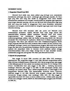
Microsoft Excel Creating a Pie Chart on a Picture 1. In order to ...
Recommend Documents
1. In order to create a pie chart on a picture, you need to first find the picture you
want to use. Click on the Internet Explorer icon. 2. When the browser launches, ...
Making a Pie Chart in Excel. 1. Enter Your Data. Put the categories in one column
and the frequency that each category occurs in the adjacent column.
tutorial with the exception of keyboard shortcuts will work in Excel for Mac. 1)
Introductory Excel: Entering Formulas. In Excel, formulas allow a user to make
new ...
Creating a Simple Chart in Excel. Lesson Plan. 1. Goals: The learner will gain an
understanding of basic editing of an Excel chart. enter data and create a chart.
INTRODUCTION TO MICROSOFT EXCEL 2010. Creating a ..... Prior versions of
Microsoft Office displayed a set number of the most recent documents accessed.
Vincent J. Yanusauskas. Computer Training Coordinator ..... Release the mouse button to access the "Auto Fill Options" m
The different slices of the pie represent different values of a ... filter data by time
period: http://www.cdc.gov/nhsn/PS-Analysis-resources/PDF/FilterTimePeriod.pdf
.
A flow chart is a visual means of portraying steps in a process. A flow ...
appropriate in the construction of charts representing the flow of objects or
materials.
Spreadsheet Concepts: Creating Charts in Microsoft Excel lab. 6. 125. Objectives
: ... Comfortable editing an Excel worksheet or another electronic spreadsheet ...
Introduction to Microsoft Excel 2003. A sample workbook referred to in ... A bold
font is used to indicate named keys on the keyboard, for example,. Esc and Enter
...
Jun 10, 2015 - Automotive, 10% ... CSX has a vast network of Products & Programs to better serve the AG ... customer
types and weight of clothes) to the pictures just by hanging the clothes on a hook. In this paper, we describe the concepts and implementation of the system. 1.
Using Excel™ formulas in cells to enter equations and manipulate data ... first
one. • Select Edit→Fill→Series... to fill the column with sequentially increasing.
Fill in Columns for Time (sec.) A. Enter in the initial time (in this example 0.0 sec.)
in the first cell in the time column. B. Fill in the time column using Equation 1.
Available online 19 August 2011. Keywords: Mass balance ... interactive Microsoft Excel spreadsheet program that can be run on the Mac and Windows ...
The code in this paper was tested using SAS® 9.3 and Microsoft Excel 2010
software. ... To find the SAS code that generates sample output for the ODS styles
available on .... 5. To see a listing of the supported options, submit the following
SAS c
dengan pengenalan Microsoft Excel 2010, pembuatan Macro,variabel, tipe data,
konstanta, array, percabangan, perulangan, prosedur sub, fungsi,antarmuka ...
To make a circle graph (pie graph) in Excel 2010. 1. Enter the data into Excel in
rows, with the data labels followed by the numerical data. 2. Select all cells that ...
Now, you can close Excel and go to ArcCatalog to build the connection. 1. In
ArcCatalog, open the Database Connections folder and double-click the “Add.
Advanced Tips- Excel 2010 Charts... Notes from previous slide: It's great when
someone gets excited about pie charts and bar graphs. Especially when it's in a ...
Loading⦠Page 1. Whoops! There was a problem loading more pages. Retrying... Pie Chart Flyer.pdf. Pie Chart Flyer.pdf.
There was a problem previewing this document. Retrying... Download. Connect more apps... Try one of the apps below to op
To create a chart in Excel, you start by entering the numeric data for the chart on
a ... However, you can fine-tune a layout or style as needed by making manual ...
Microsoft Excel Creating a Pie Chart on a Picture 1. In order to ...
1. In order to create a pie chart on a picture, you need to first find the picture you
want to use. Click on the Internet Explorer icon. 2. When the browser launches, ...
Microsoft Excel Creating a Pie Chart on a Picture
Name _________________________
Date ________________________
1. In order to create a pie chart on a picture, you need to first find the picture you want to use. Click on the Internet Explorer icon.
2. When the browser launches, type http://www.google.com/images into the address bar. Press enter. 3. You are going to use a picture of a globe for this activity. When the screen loads, type “globe” into the search box.
Then choose “Search Images.”
4. Choose the first picture of the globe. 5. Right click on the globe and choose copy from the drop down menu.
6. Open Microsoft Excel by clicking on your start menu on the bottom left of your screen. 7. Choose “All Programs” from the menu. Now choose the Microsoft Office folder and open Microsoft Office Excel 2007.
8. Since you have already copied your picture of the globe, right click on any empty cell and choose paste.
Congratulations! You have successfully copied your picture of the globe off of the internet and into Microsoft Excel! 9. The next step is to create the pie chart. For your convenience, click on the picture of the globe and drag it over to the right hand side of your screen so that it is not in the way of the pie chart you will make.
10.
The pie chart you will create represents the number of
people in millions who speak certain languages throughout the world. Copy the following information into the corresponding cells: A
B
1
Language
Population in Millions
2
Chinese, Mandarin
1120
3
English
480
4
Spanish
332
5
Arabic
235
6
Bengali
189
7
Hindi
182
8
Russian
180
9
Portuguese
170
10
Japanese
125
11
German
98
Your spreadsheet should look like this:
11.
Highlight rows 2 through 11 for both columns.
12.
Choose the Insert tab at the top of the screen and choose
Pie. From that drop down menu, choose the first option under 2-D Pie.
Congratulations! You have just made a pie chart for the information you entered!
13.
Click on the pie chart and press CTRL + 1. This will bring up
the Format Data Series box. 14.
From the menu on the left hand side, choose Fill. Select No
Fill from the checklist on the right hand side. This will make the pie graph transparent.
15.
Choose the Border Color tab from the left hand side and
choose Solid Line. Change the color to Black.
16.
Choose the Border Styles tab from the left hand side and
change the width of the line to 2.25 pt. Click close at the bottom of the box.
17.
Click on the white space outside of the pie chart. Use the
CTRL + 1 feature again to change to No Fill. This will make the background transparent too. 18.
Now you will make the labels appear by their pie slice
instead of them all listed on the right hand side. To do this, click on the labels. Click on the Layout tab from the tool bar at the top of the page. Choose Legend, then None.
19.
Still in the Layout tab, choose Data Labels, then More Data
Label Options.
20.
Under the Label Options Tab on the left hand side, check the
boxes for Category Name, Percentage, and Show Leader Lines. Click close at the bottom of the box.
21.
Take the picture of the globe that you pasted into this
spreadsheet and make it larger or smaller to fit inside of your pie
chart. Drag the picture of the globe into the pie chart and resize the picture so that the sections of the pie chart are dividing up the globe. 22.
If the labels of the pie chart are on top of the picture and
you can’t read them, drag the label off of the picture. It will make a line to that piece instead. Congratulations! You have just made your pie chart on a picture! 23.
Now you have the completed graph and can answer the
following questions: a. What percentage of people in the world speaks English?
b. What percentage speaks Hindi?
c. What percentage speaks Japanese?
d. What language do most people speak?
e. What language does the least amount of people speak?
f. Draw your pie chart below:
Try it yourself! Make a pie chart on a picture just like above. Larry Bird was a famous basketball player. He played from 1979 to 1992 for the Boston Celtics. Use the following information to create a pie chart on a picture of a basketball.