Enabling End-Users and Designers
#chi4good, CHI 2016, San Jose, CA, USA
Using and Exploring Hierarchical Data in Spreadsheets Kerry Shih-Ping Chang and Brad A. Myers Human-Computer Interaction Institute Carnegie Mellon University Pittsburgh, PA 15232 USA {kerrychang, bam}@cs.cmu.edu ABSTRACT
More and more data nowadays exist in hierarchical formats such as JSON due to the increasing popularity of web applications and web services. While many end-user systems support getting hierarchical data from databases without programming, they provide very little support for using hierarchical data beyond turning the data into a flat string or table. In this paper, we present a spreadsheet tool for using and exploring hierarchical datasets. We introduce novel interaction techniques and algorithms to manipulate and visualize hierarchical data in a spreadsheet using the data’s relative hierarchical relationships with the data in its adjacent columns. Our tool leverages the data’s structural information to support selecting, grouping, joining, sorting and filtering hierarchical data in spreadsheets. Our lab study showed that our tool helped spreadsheet users complete data exploration tasks nearly two times faster than using Excel and even outperform programmers in most tasks.
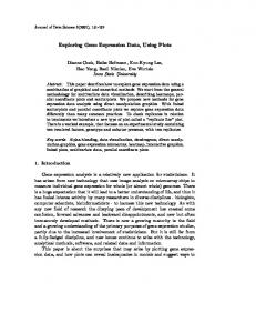
Figure 1. Screenshots of our tool showing a list of restaurants and their categories retrieved from Yelp’s web service (1). Our tool shows the hierarchical structure in data using nested tables. By dragging column B to the front (2), the user reshapes the data and views the restaurants grouped by category (3).
web data sources has become a daily task for many professional data analysts, and they often use programming languages such as R and Python. We believe that soon many end-users may also have to work with JSON or XML data instead of comma-separated values (CSV) or Excel data as they do now. Currently, there are a variety of systems that let end-users get data from web services without writing conventional code. For example, Microsoft Excel has a WEBSERVICE function that lets users pull data from a web service given a URL. Excel also provides libraries that let developers write custom functions to retrieve data from specific data sources. However, current end-user tools provide very little support for manipulating the retrieved hierarchical data. Current spreadsheets do not recognize hierarchies in data and do not have an efficient way to show data that have nested structure. Instead, they often flatten a hierarchical document into a long string which is then put into a single cell, and require users to write additional1query languages (such as XPath) to extract desired fields in the data. There are also data converters online that can convert an XML or JSON file into a spreadsheet file. However, the data’s nested structure will inevitably require creating a lot of repetitive rows and empty cells, making further use and analysis of the converted data difficult. Some spreadsheets support using SQL queries to select desired data (such as Google Sheets’ QUERY function). However, users then have to learn SQL’s different syntax and semantics.
Author Keywords
Spreadsheets; hierarchical data; end-user programming ACM Classification Keywords
H.4.1. Information system applications: Spreadsheets INTRODUCTION
Hierarchical data formats such as JSON and XML are becoming pervasive online. MongoDB, a JSON database popular among web developers, has been one of the fastest growing database systems in recent years1. JSON and XML are also the two dominant data formats for web services where the user can download various kinds of data such as music (e.g., Discogs), movies (e.g., RottenTomatoes), social networks (e.g., Facebook, Twitter), and finance (e.g., Yahoo, Bloomberg). In fact, programmableweb.com lists over 14,489 web services, most of which return data in JSON or XML formats. Exploring and analyzing hierarchical data retrieved from Permission to make digital or hard copies of all or part of this work for personal or classroom use is granted without fee provided that copies are not made or distributed for profit or commercial advantage and that copies bear this notice and the full citation on the first page. Copyrights for components of this work owned by others than ACM must be honored. Abstracting with credit is permitted. To copy otherwise, or republish, to post on servers or to redistribute to lists, requires prior specific permission and/or a fee. Request permissions from
[email protected]. CHI'16, May 07-12, 2016, San Jose, CA, USA © 2016 ACM. ISBN 978-1-4503-3362-7/16/05 $15.00 DOI: http://dx.doi.org/10.1145/2858036.2858430
In this paper, we present a spreadsheet tool with novel features for using and exploring hierarchical data. Our tool 1
2497
See http://db-engines.com/en/ranking
Enabling End-Users and Designers
#chi4good, CHI 2016, San Jose, CA, USA
Figure 2. Six tables showing how the user can compute summaries of a JSON file of conference papers. (1) The data initially is indexed by paper titles. Each paper has multiple authors. Each author has an institution. The user regroups the data by institutions by dragging the institutions to the beginning of the table (2), right-clicks column A and chooses “Group Column B-C by Column A” (3) to merge rows that have the same value in column A (4). Column B now has many repeated values as a paper can have many authors from the same institution. (5) The user groups the data again by column B to merge repetitive paper titles within an institution. Lastly, (6) the user inserts a new column at column B, enters =COUNT(C1)in B1 to get the paper count for the first institution, and autofills the value for the rest of the institutions. She sorts the data by column B to bring the institution that has the most papers to the top.
makes several contributions. First, it contributes a new method to visualize hierarchical data in a spreadsheet by taking into account both the source document’s hierarchical structure and the order of the data in spreadsheet columns as organized by the user at runtime. The user can dynamically decide to visualize the data as nested cells (Figure 1 at 1) or to reshape it into a flat table (Figure 1 at 3) by moving spreadsheet columns using drag-and-drop. This feature enables the user to easily experiment with different groupings of data using any JSON fields. It also allows the user to calculate various kinds of summaries of data using the familiar spreadsheet functions without having to learn new concepts such as pivot tables or SQL queries (see Figure 2).
conventional methods (such as in [7]), our method joins hierarchical objects without flattening them, resulting in a new combined hierarchical object that can be used the same way as any other hierarchical object, and can even be used to create hierarchical visualizations such as treemaps. We conducted a lab study where we recruited intermediate spreadsheet users to use our tool or Microsoft Excel to complete five data exploration tasks using two hierarchical JSON documents. We also recruited a separate set of people who were professional programmers familiar with JSON data to use JavaScript or Python to complete the same tasks. In summary, we found that our tool helped spreadsheet users complete the tasks nearly two times faster than using Excel. Our tool even helped spreadsheet users complete four of the five tasks faster than professional programmers. Participants also rated our study tasks highly realistic and similar to what they do in their own work in real life. Based on participants’ feedback and our observation on how they completed the tasks, we discuss the strengths and limitations of our tool and some directions for future work.
Our tool makes a second contribution by extending the familiar spreadsheet mechanisms for manipulating table data, namely spreadsheet languages, sorting, filtering, and autofilling (select-and-drag), to support hierarchical data as well. We introduce a new syntax that enables selecting data by the hierarchy such as selecting the first author of the first papers in Figure 2 at 1 using the formula =B1.1. Data can also be sorted and filtered by the hierarchy to enable actions such as in Figure 6 at 1 to bring the sector within each country that received the most funding to the top of the nested table. Autofilling can be also used to create new data in a hierarchical document.
BACKGROUND
This work extends our prior system called Gneiss2. Previous publications about Gneiss introduced ways to use spreadsheets to exchange data with web services [5], pro-
Third, our tool contributes a new method to join hierarchical data from multiple sources. While hierarchical documents could be turned into flat tables and joined using
2
Gneiss is a type of rock. Here it stands for Gathering Novel End-user Internet Services using Spreadsheets. Gneiss is at http://www.cs.cmu.edu/ ~NatProg/gneiss.
2498
Enabling End-Users and Designers
#chi4good, CHI 2016, San Jose, CA, USA
gram interactive web applications that use backend data sources [4], and manipulate live streaming data [6]. This paper focuses on supporting hierarchical data. We redesigned how hierarchical objects are turned into nested tables from our previous version [5] and introduce a new way to show hierarchical data in spreadsheets that allows users to reshape and regroup data dynamically using interaction techniques. The old method in [5] was static and did not support reshaping and regrouping data. This work also adds sorting, filtering and joining nested data that were not supported in the previous versions of Gneiss. Finally, this paper presents a lab study that evaluates the new contributions in this work and validates the usability of some designs presented in previous Gneiss papers, such as the left pane that shows raw JSON data to end-users, and the drag-anddrop gesture to extract desired fields from a JSON document to the spreadsheet.
filtering or calculating new data with functions like in our tool. The nested cells serve only for viewing purposes. There are spreadsheet tools that use nested cells or linked spreadsheets to represent hierarchies in other programming activities, such as defining new spreadsheet functions and parameters in functions [12], creating spreadsheet templates [1], and programming graphical interfaces and object inheritance [3]. However, those systems do not support exploring and manipulating hierarchical datasets as our tool does. Some other research tools focus on extracting hierarchical relationships in conventional spreadsheets created implicitly by users. For example, Hermans et al. used content layout and cell dependencies to extract hierarchical information in spreadsheets and visualize it as diagrams to improve spreadsheet readability [10,11]. Chen et al. used fonts and alignments to extract hierarchical information in a spreadsheet to generate relational tables which can be used in relational databases [7,8]. Different from those tools, our work targets hierarchical data formats such as JSON and XML that are not designed for relational databases, and the hierarchies in the data are explicitly defined. Our tool directly operates on hierarchical objects (instead of flattening them into tables) and focuses on leveraging those objects’ structural information to facilitate data manipulations such as to support hierarchical grouping, sorting and filtering.
RELATED WORK
Lotus Improv (1991) introduced the concept of “categories” that contain related attributes of the spreadsheet data. The user can create custom categories, such as a “season” category that has “spring”, “summer”, “fall” and “winter, and a “year” category that has a list of years. The user can then use these categories as row and column labels to reshape the data, such as to create a plot using years as column labels and seasons as row labels. This feature was eventually replaced by pivot tables in today’s spreadsheets, where the user can preform different groupings on data and calculate summaries such as counting the items in each group. Although the pivot table allows users to create nested groups, it assumes the underlying data are flat and do not contain multiple nested structures, which in hierarchical data are very common. For example, a movie database could return a list of movies where each movie has a list of actors, a list of reviews, and a list of awards. Turning such data into a flat table will either create lots of repetitive rows or lots of columns with many empty cells (depending on how the lists are expanded), as each movie can have different numbers of actors, reviews and awards. Some tools support transforming table data into long and wide format [9,13,16]. However, our user study showed that transforming a hierarchical document into either format would still require users to do additional data manipulation before using the pivot tables. There are data cleaning tools that let users quickly edit string formats, such as Excel’s Flash Fill and [13]. Those tools also do not help much when using hierarchical files, as the problem is the data structures rather than the formats.
Many prior systems allow users to get data from web services without programming. Some systems use a data-flow approach (such as [17,18]), some use spreadsheets (such as our prior work on Gneiss [5]), and some just provide a list of built-in web services (such as [14]). However, none of these allows users to freely manipulate hierarchical data such as sorting, filtering, grouping and joining data by arbitrary fields from any user-selected data sources as we do. USAGE SCENARIO
Here we present a usage scenario to give an overview of our tool. In this scenario, Ally, a graduate student, gets two JSON documents from a database about the CHI’15 conference. The first file, paper.json, stores all accepted papers. Each paper is an object and has 7 fields: ID, paper_title, abstract, keywords (an array), type (“long” or “short” meaning a long or short paper), award (“none”, “bp” for a best paper, “hm” for a honorable mention paper) and authors (an array with each author being an object and having a name, institution, city and country field). The second file, session.json, stores all the paper sessions in the conference. Each session is an object and has 6 fields: session_title, day, time, room, chair and submissions. The submissions field is an array that contains a list of paper IDs that are presented in the session. Ally is interested to know which institution has the most accepted papers and also wants to determine which paper sessions she should attend during the conference. She uses our tool to explore the data.
Some research tools have experimented with the use of nested cells to represent hierarchies. Bakke et al.’s Related Worksheets [2] lets users create inner cells in a row to show one-to-many relationships in data. A cell can be set to reference values from another worksheet and thus may create additional nested cells. Their study showed that users could understand the nested cells and could use them to find information. However, the Related Worksheets do not support further manipulating the nested data, such as sorting,
Ally loads the two files into the left pane of the tool (Figure 3 at the left). She first tries to answer the question of which institution has the most papers. To do so, she first extracts 2499
Enabling End-Users and Designers
#chi4good, CHI 2016, San Jose, CA, USA
Figure 3. A screenshot of our tool showing the result spreadsheet of the second task in the usage scenario. The left pane is where the user loads and views a JSON file. The spreadsheet is a custom conference schedule created by the user. The spreadsheet shows for each time slot, the session that has the most number of award papers plus papers that have “crowdsourcing” in its keywords. The data is grouped by day (column A) and time (column B). Column C shows the title of the session that the user should go to. The number of award plus crowdsourcing papers of that session is in column D, with the details of the papers in the rest of the columns.
the paper titles to the spreadsheet by selecting the title of the first paper and dragging it to column A. The system fills in column A with all paper titles. Ally then extracts the name and institution of each author in the paper to column B and C using the same method (Figure 2 at 1). The system recognizes that column B (author names) came from a child field of column A (paper titles). Therefore, it puts author names in nested tables in column B so they are in the same row as their corresponding paper in column A. As for column C (author institutions), the system recognizes that the data are in the same hierarchy level in the document as column B, so it creates the same nested tables as column B and puts an author’s name and institution in the same row.
Figure 4. The user joins two tables by selecting a common column in each table and clicking the “Join” option from the right-click menu. The common columns (here, column D and E) are combined into one column after the tables are joined.
This view lets Ally easily see how many authors and institutions each paper has, but Ally wants to know which institution has the most papers. She needs to regroup the data using the institution field. To do so, she drags the institution data from column C to A. In our tool, data that are used for grouping must be at the beginning of the table. The system replots the data (Figure 2 at 2): column A now shows a flattened list of all of the institutions fields. Data in column B (paper titles) now come from a parent field of the data in column A (author institutions) and thus the system repeats the parent values to let the child and parent again be in the same row. Finally, the system recognizes that data in column C (author names) come from a child field of column B so it shows the data in nested cells. Column C is also constrained by column A: only the author name in the same object with the author institution in the same row is shown.
Figure 5. The user can insert a new blank column that has the same structure as a selected column.
institution, all papers of the institution, and all authors who wrote the paper and are from the institution (Figure 2 at 5). With this table, Ally can easily see the number of papers of each institution. She inserts a new column next to column A and names it “paperCount”. Column B is now a blank column and the paper titles and author names are pushed to columns C and D. Ally enters =COUNT(C1) in B1 to count the number of papers of the first institution, and uses dragdown autofill to fill in the paper count for the rest of the institutions. She sorts all the data by column B to bring the institution that has the most papers to the top (Figure 2 at 6). With a few mouse clicks and a spreadsheet function, Ally gets the answer she wants from a messy JSON file.
Ally then selects column A, right clicks and chooses “Group Column B-C by Column A” (Figure 2 at 3). The system merges rows that have the same values in column A, and column B becomes nested (Figure 2 at 4). She can see that many papers are repeated multiple times. As column C shows, this is clearly because a paper could have multiple authors from the same institution. To get rid of duplicate values in column B, Ally groups the data by column B using similar methods. Now each spreadsheet row shows an
Ally’s next task is to come up with a schedule that tells her what sessions to attend at the conference. She is interested in papers about crowdsourcing and also all the award pa2500
Enabling End-Users and Designers
#chi4good, CHI 2016, San Jose, CA, USA
pers. She decides that for each time slot, she wants to go to the session that has the highest number of award papers plus papers that have “crowdsourcing” as one of the keywords. Since session and paper information are in two different files, she needs to join the two documents together. Ally opens a blank spreadsheet and first extracts the fields she needs from the session file, which are the day, time, title, and paper submissions (listing their IDs) for each session, from the left pane into spreadsheet columns A-D. She then switches to the paper file and extracts the paper ID, title, award and keywords fields into columns E-H. She then selects column D and E that are the paper IDs from the session and paper files, right-clicks and chooses “Join The Two Tables on Column D=E” (Figure 4 at the top).
ing the entire document to the spreadsheet. This allows our algorithm to run on a smaller set of data (thus generating cleaner tables) and also ensures that the extracted fields are somewhat related (as judged by the user). Our tool targets JSON data, which is organized into objects which contain named fields and arrays, each of which can contain objects and/or arrays. In our current implementation, we treat each JSON array as a hierarchical tree. Each item in an array creates a branch in the tree. Fields in the same array item are considered being in the same level of the tree. If an array item has a field that is also an array, that field creates a subtree in a branch, thus the tree grows a new level. Our current implementation expects each array item to have a similar structure. This hypothesis is true for most of the database and web service data we have seen because the data usually follows a predefined schema. If there is a missing field in an array item, that field is shown as a blank cell in the spreadsheet. While different types of data could specify hierarchies differently, we believe that our method could be extended to support those data as well. We discuss this further in the limitations section below.
The system connects the two tables by joining the two ID columns. It creates a combined hierarchical table containing three levels of hierarchies (Figure 4 at the bottom). The user can manipulate this table such as reshaping it by moving columns or sorting and filtering values the same way as if the data had come from a single source. Here, Ally wants to know the total number of award and crowdsourcing papers in a session. She inserts a new column next to the paper title in column F (Figure 5), naming it “isAwardOrCs”. The award and keyword column are pushed to column G and H. Ally then enters this formula in cell F1.1:
We use the term hierarchical table in the rest of the paper to refer to a set of adjacent columns that have fields extracted from the same tree in a source document (note that our tool allows multiple hierarchical tables in the same spreadsheet). In a hierarchical table, the leftmost column is always a flat column. For each of the rest of the columns, the system starts by examining its immediate left column.
=IF(OR(OR(G1.1=”bp”,G1.1=”hm”), COUNTIF(H1.1,“crowdsourcing”)>0),“Yes”,“No”)
The formula returns “Yes” if a paper has an award (best paper (bp) or honorable mention (hm)) or has at least one keyword being “crowdsourcing”. Ally then computes this value for all papers using autofill, and filters the data to show only the papers that have “Yes” in this column.
1) If the column immediately to the left comes from an ancestor field, the systems puts data in this column in inner cells in the same row with the ancestor value. Those inner cells form a nested table. Each cell in a nested table creates a nested row that has a row label parentLabel.thisIndex. For example, in Figure 2 at 1, a paper title field is an ancestor field of the author name field. Thus when displaying cell B1, the system puts the author names that belong to the paper title in A1 into inner cells in row 1. The author names thus form a nested table inside cell B1. Each cell becomes a nested row and has a row label 1.1 – 1.7 as there are seven items in the first paper’s authors array. The order of the values is the same as their order in the array in the source document unless sorted by the user.
Ally inserts a new column next to the session title column (Figure 3 at column D), uses the COUNT function to compute the number of “Yes” papers for the first session, and autofills the rest of the sessions. Finally, Ally groups the data by the day and time to make it more readable. Within each time slot, Ally uses sorting and filtering to show the session that has the highest count number. Now she gets her custom schedule! The final result is in Figure 3. GNEISS
Our tool is implemented as a web application. We used ConstraintJS [15] to manage the constraints among the data and the spreadsheet cells. Here we describe the key features for using hierarchical data in Gneiss.
A nested row can further contain other nested tables. For example, in Figure 3, due to the user’s joining and grouping operations, each paper is already in a nested row. Thus each paper’s keywords (column I) are put in a nested table inside each nested row with the paper.
A Method for Visualizing Hierarchical Data
Our system introduces a new method for visualizing arbitrary fields from a hierarchical document in a spreadsheet. This method takes into account both the field’s hierarchical location in the source document and the field’s relative hierarchical relationships to the data to its left in the spreadsheet. We designed our interface to let the user first extract the specific fields that she thinks are relevant to her task (through drag-and-drop) to the spreadsheet instead of load-
To decide what values to put in a nested table, the system will keep checking until it reaches the leftmost column to see if there is a column whose data is from a descendent field of the immediate left column and is also in the same branch with the current column. If the system finds one, it stops looking and puts only the values that are in the same hierarchical branch with that descendant field into the nest2501
Enabling End-Users and Designers
#chi4good, CHI 2016, San Jose, CA, USA
ed table. If the system does not find a column that fits the criteria, all the descendant values of the immediate left column are put into the nested table.
clicking and choosing the “group by” option from the menu. The text for the “group by” menu item is generated dynamically based on what the user selects (see Figure 2 at 3 for an example). When the user hovers the mouse over the “group by” menu item, the system highlights the columns used for grouping in purple and the columns being grouped by in green to help the user identify the range. The system combines rows that have the same values in the grouping columns. Columns that are to the right of the grouping columns are merged into nested tables. A column used for grouping will have a green column label. The user can cancel a grouping anytime by clicking on an icon at the top left of the grouping columns (Figure 2 at 4). The visualization algorithm and the grouping feature enable users to easily experiment with different ways to view and group data through simple interaction techniques.
Using Figure 2 at 2 for example, when visualizing cell C1 (author name), the system first looks at B1’s value, which is the title of the first paper. The system knows that paper title is an ancestor of author names, thus it generates a nested table in C1. To decide which author names from the first paper should be put in the nested table in C1, the system moves to the next left column and checks A1’s value. A1 is the institution of the first author of the first paper. Therefore, C1’s value is constrained by A1: the system puts only the name of the first author of the first paper in C1. If A1 is an empty column, the system will put all authors’ names of the first paper into the nested table in C1. 2) If the immediate left column comes from a sibling field, the system copies the structure of the immediate left column and puts the values in the same row with its siblings. For example, in Figure 2 at 1, column B (author name) and column C (author institution) are siblings. Therefore the system copies column B’s structure to C, and puts the institution that is in the same object in the source document with the author name in cell B1.1 into cell C1.1, and so on.
Language Syntax for Selecting Nested Data
Our tool introduces an extended spreadsheet language for selecting values in the nested cells. A nested cell can be referenced as a regular cell using its column and row label. For example, in Figure 6 at 1, B1.1 selects the value “Primary education“ which is the first major sector of the first country. Our language also supports selecting multiple values. Conventional spreadsheet’s “:“ operator for specifying the start and end cell of a range selection still works in our tool. For example, C1.2:C2.1 in Figure 6 at 1 selects 4 values (26, 16, 12, 70). The user can also use the parent row label to select all cells in a nested table. For example, B1 selects all sectors of the first country in Figure 6 at 1. Finally, our language also includes a wildcard character (*) that can be used in any nested row index to further assist hierarchical selection. For example, B*.1 in Figure 6 at 1 selects the first primary sector of all the countries. Selections that return multiple values can be used in functions that take a list of values as inputs, such as the familiar COUNT and SUM. This language enables our tool to go beyond a read-only tool and allows the user to compute new values using the hierarchical data, as shown in the scenarios.
3) If the immediate left column comes from a descendant field, the system copies the structure of the immediate left column and for each row puts the ancestor value that is in the same branch in the hierarchical tree with the descendant. For example, in Figure 2 at 2, when visualizing column B (paper title), the system checks column A (author name) and finds that it comes from a descendant field. Therefore it copies column A’s structure (which is just a flat column) to column B and fills in B1 with the ancestor paper title of the author name in A1, and so on. As Figure 2 at 2 shows, an ancestor value could be repeated multiple times, as multiple descendants could have the same ancestor. 4) If the immediate left column does not have any hierarchical relationship with the current column, the system checks the next leftmost column for the same relationships as described above, and so on. If a relationship is found in a column that is not the immediate neighbor, the system displays a gray line between this column and its immediate left column to show that the two are not connected hierarchically. If the system could not find any columns in the hierarchical table that relate to this column, it treats this column as the start of a new independent hierarchical table which is shown by separating the column with a small space.
Inserting new data into the hierarchical table
There are many situations where the user may want to add new data to a hierarchical table. For example, in the first example scenario, Ally adds a flat column to compute the number of papers for each institution. She may also want to add a nested column next to the author names and manually enter an author’s email address. Our tool lets users insert different structures of columns by first selecting a column in the table that has the desired structure, and then rightclicking and choosing “Insert a new column that has the same structure” (Figure 5 at the left). A new column will be inserted to the right of the selected column. If the selected column is a regular flat column, the inserted column is also flat; if the selected column is a column containing nested tables, the inserted column will have the same tables but with empty cells (Figure 5 at the right). The newly created column can be moved and used for grouping, sorting, filtering and joining just like any other column.
Using this method, the nesting level of a hierarchical table always increases from left to right. The system stores each hierarchical table as a JSON object and manipulates its structure dynamically as the user moves the columns. Regrouping the data by arbitrary fields
The user can regroup a hierarchical table in the spreadsheet using any columns by moving those columns to the beginning (left) of the table, selecting those columns, right2502
Enabling End-Users and Designers
#chi4good, CHI 2016, San Jose, CA, USA
Figure 7. An example of joining two hierarchical objects. The two trees are joined by the yellow nodes. (Left) The blue tree has the yellow nodes in a deeper hierarchy level than the red tree. (Right) The join operation preserves the blue tree’s structure and connects red tree to blue tree through the matched yellow nodes (shown as the yellow nodes that have two rings).
structure as its source JSON document but contains only the visible fields in the spreadsheet. The system then checks the hierarchical level of the selected joining fields in the two duplicate objects. The object that has the joining fields closer to the top level will be connected to the object that has the joining fields in a deeper level through the matched fields (see Figure 7 for an example). This rule ensures that the combined object remains a single-root tree. The joined table now uses this newly combined single JSON object as its source for the visualization algorithm and thus can be manipulated just as other tables in the spreadsheet.
Figure 6. (1) shows countries funded by the World Bank. Each country has a list of major sectors and the percentage of funding the sectors received. The user can sort and filter the data by any column using a dialog box (2). When sorting and filtering on a nested column, the operation is executed within each nested table, marked in the spreadsheet with blue borders (3). The system highlights the affected columns using a purple background when the dialog box is open. Sorting and Filtering Nested Data
The user can choose to sort and filter a hierarchical table using any column by clicking on the arrow icon at the top of the column to open a dialog box (see Figure 6). We defined that sorting and filtering by a nested column are executed within each nested table in that column. The operation will affect columns that have the same or deeper nested level, but will not affect columns that are in the upper levels of the hierarchy. To help the user identify the nested tables and the affected columns, when sorting and filtering dialog box is open, the system highlights the affected columns in purple and highlights each nested table in the column using a blue border. For example, in Figure 6, sorting on column B will affect columns B and C but will not change the data in column A, as column A is an ancestor of column B. If columns A and B had the same nesting level, then they would both be sorted. Each nested table in column B, outlined using a blue rectangle, is sorted internally. The same rule applies for filtering. Filtering to see the first X items will show the first X items in each nested tables. Duplicated values are also calculated within each nested table.
LIMITATIONS
Our prototype system has a number of limitations. First, for better performance Gneiss only displays the first 50 rows of data. All the data operations such as sorting, filtering, grouping and joining are executed on the entire dataset. Similarly, for autofill, as long as the user drags it to the last displayed row, the system will apply the operation to the entire dataset including the hidden rows. To view the hidden data, the user can use sorting and filtering to bring the data she wants to the top as in the scenarios, or open the entire data in a read-only spreadsheet using a menu command. Many conventional tools have similar design. For example, Google Fusion Tables show 100 rows at a time and have a “next” button to let the user view the next 100 rows of data. We could also add a “next” button to our system to enable more fluid browsing. Second, as we described earlier, our system supports JSON data that use arrays to represent hierarchies. Different data formats may have different ways to specify hierarchies. For example, XML does not have arrays and the hierarchies are specified using nested tags. While our system currently does not support other hierarchical formats, we believe that our techniques can be adapted to handle those data as well. Finally, our system lacks some expected usability features (such as undo) and only supports a small number of functions for formulas. Adding those features is future work.
Hierarchical sorting and filtering can be useful in many situations. For example, in the usage scenario, Ally uses hierarchical filtering to get rid of papers within a session that she is not interested in, and uses both hierarchical sorting and filtering so that each time slot shows only the session that has the most award and crowdsourcing papers. Our user study showed that our design of hierarchical sorting and filtering was understandable by the participants and was critical in helping them complete the tasks.
USER STUDY
We conducted a lab study to evaluate our tool. The study examined whether the various new features introduced by our tool could be understood and used by spreadsheet users, and whether these new elements could help users use hierarchical data more efficiently compared with current tools.
Joining Hierarchical Tables
Our tool supports joining hierarchical tables based on the columns with common values selected by the user in each table. To implement this, the system first creates a duplicate JSON object for each table that has the same hierarchical 2503
Enabling End-Users and Designers
#chi4good, CHI 2016, San Jose, CA, USA
Study Design
We evaluated our tool by comparing it to how end-users and professional programmers currently work with hierarchical data. We designed a set of data exploration tasks for the study and measured the success rate and the time participants spent completing each task. Our study uses a between-subject design and has three groups. The experiment group used our tool (Gneiss). For the end-user comparison group, we picked Microsoft Excel, the most popular conventional spreadsheet tool. For the programmer comparison group, we picked JavaScript and Python, as our informal poll showed that those were the most popular languages for using JSON data. Participants picked either one of the languages to use in the study. They used Sublime Text as the editor, and printed out the answer in Sublime’s Python console (Python) or Chrome’s developer console (JavaScript).
JSON file, put in the same Excel workbook for the ease of use). The main difference between a wide and long table is that in a wide table, a list of values within an item is expanded horizontally as multiple columns. Each item (a paper or a session in our data) is a row in the spreadsheet. However, a row could have many empty cells as the lists for different items could have different lengths (such as different papers may have different numbers of authors). In contrast, in a long table, a list of values is expanded vertically. While the long table has no empty cells and fewer columns, it has a lot of duplicated values as an item could be repeated multiple times depending on the length of the lists in each item. For example, a paper with 2 authors and 3 keywords would become 6 rows as each author and keyword was paired once. Participants in the Excel group were told they could use any of the tables to complete the tasks.
Participants
Tasks
We recruited 12 spreadsheet users and 6 programmers for the study (ages 21-39). All but 2 participants were university students. The other 2 were alumni. Participants rated their proficiency with Excel, programming in general, and using JSON data on a five-point scale from “none” to “superior”. Among the 12 spreadsheet users, four rated their Excel proficiency as “3: Intermediate - know how to use basic functions such as SUM and IF”, and eight rated as “4: Advanced - know how to use pivot tables and advanced function such as LOOKUP”. None of the spreadsheet users considered themselves as programmers, although some of them had prior experience programming using languages like R or MATLAB. Their average rating on programming proficiency was 2.17. A few of them had used JSON data (average rating 1.42). Thus, we consider them to be intermediate to experienced spreadsheet users who are not experienced programmers. The 12 spreadsheet users were randomly assigned into the Gneiss or Excel group (6 in each group). There were no significant differences in the demographic measures between the two groups. All 6 programmers were in the programming group. 4 people chose to use JavaScript and 2 chose Python. Their average self-rating for proficiency was 4.17 on programming in general and 3.67 on the language they used in the study. All of them were familiar with JSON data (average rating 3.83). Thus, we consider them to be experienced programmers.
We designed 5 tasks for the study. The first task is to find the number of papers that have “social” in their keywords. This is the easiest task. The second task is to find the top three institutions that have the most papers (same as the first task in the scenario). For the first two tasks, participants only need to use the papers file. They had at most 10 minutes to finish each task. The third through fifth tasks involve using both the papers and sessions files. The third task was to come up with a schedule that could let a person go to the session that has the most award papers in a time slot (similar to the second task in the scenario). The fourth task is to find all the papers that were presented on Tuesday that are from Carnegie Mellon University. The fifth task is to find all the authors who had multiple papers scheduled to be presented in the same session (a similar task to finding if anyone had conflicting presentations). For the third to fifth tasks, participants had at most 15 minutes to complete each task. Participants in all three groups received the same five tasks and did the tasks in the same order. Procedure
The study took about 75 minutes per participant. After signing the consent form, participants in all groups received tutorials on the given tool. The Gneiss group received a 20minute tutorial on all the features described above in this paper. The Excel group received a short introduction to Excel’s interface (including sorting, filtering, the pivot table and the remove duplicates widget) and a tutorial on the long and wide table format. The programming group received a short introduction to the Sublime editor. Participants in the Excel and programming group were given up to 10 minutes to get familiar with the editor they used and to install any libraries or plugins they wanted to use. Two programmers used jQuery, one programmer used D3.js and lodash. None of the Excel participants installed any plugins.
Data
We used the same CHI’15 conference data described in the usage scenario (papers.json and sessions.json). There were 484 papers and 119 sessions in our datasets. Participants in the Gneiss and programming group received the data as two JSON files. For the Excel group, we converted the JSON files into CSV files. To our knowledge, there is no standard on how to convert a JSON file into a spreadsheet. Based on our informal interview and pilot test with several expert Excel users, we decided to provide each JSON file in both a wide table and a long table spreadsheet out of fairness as both formats were suggested by the expert users. Thus the Excel group was given four sheets (two sheets for each
After introducing the tool, the experimenter showed and explained the study data to the participants. Then they began to do the tasks. Participants in the Excel and programming group could look up anything online. Participants
2504
Enabling End-Users and Designers
#chi4good, CHI 2016, San Jose, CA, USA
using Gneiss were given an A4 paper with a list of spreadsheet functions supported in the system. In all conditions, when participants thought they were done with a task, the experimenter checked the answer and requested the participant to continue if their answer was incorrect. This checking time was not counted as part of the participants’ time. After doing the tasks, participants filled out a short survey on their demographics and feedback. They were paid $15. Results
For each task we measured the task completion time. If the participant did not complete a task within the time limit, we used the time limit as the task completion time. We analyzed each task using a one-way ANOVA and post hoc analysis. The results are reported below and in Figure 8. All time numbers are in seconds.
Figure 8. The average task completion time for the Gneiss, Excel and programming groups. Shorter bars are better.
plete the task within the time limit. ANOVA showed that there was no significant difference in the task completion time among all three groups.
Task 1: All participants completed this task. There was a significant effect of the average task completion time for the three groups (F(2, 15) = 6.339, p = .010). Post hoc comparisons showed that the Gneiss group spent significantly less time (M = 142.83, SD = 119.84) on the task than both the Excel group (M = 370, SD = 142.23; p = .013) and the programming group (M = 336.17, SD = 36.66; p = .033).
Subjective Results
We asked participants in a post study survey about their feedback on the tasks and the tool they used. Using a 7point scale, participants rated the tasks highly realistic (average rating Gneiss = 7, Excel = 6.16, programming = 6.5) and close to what they do in real life (average rating Gneiss = 4.67, Excel = 4.33, programming = 5). Gneiss participants rated the tool easy to learn (M = 5.67) and could see themselves using it in their own work (M = 5.83).
Task 2: All participants using Gneiss completed the task. Three participants in the Excel group and one participant in the programming group did not complete the task within the time limit. There was a significant effect of the average task completion time for the three groups (F(2, 15) = 19.974, p < .001). Post hoc comparisons showed that the Gneiss group spent significantly less time (M = 183.5, SD = 50.35) on the task than both the Excel group (M = 517.17, SD = 135.58; p = .003) and the programming group (M = 506.5, SD = 107.20; p = .001).
DISCUSSION Learning and Using Gneiss
All six participants using Gneiss successfully used all novel features described above to complete the tasks after receiving a 20-minute tutorial. It took some participants a longer time to understand the meaning of the nested tables. Although we explained that the nested tables are a way to show hierarchies in data, some participants viewed it more as a way to show one-to-many relationships and were a little confused at first if they saw a nested table having only one row. This, however, did not affect the participants in solving the tasks. We found that even when the participants did not fully master the visualization rules, they could still successfully move the columns into the correct places eventually by trying out different combinations by dragging a column to different locations. This low-cost method of reshaping the data facilitated opportunistic data explorations in the Gneiss group and often led the participants to the correct answer. As the study went on, all participants gradually became more familiar with the visualization rules, and they seemed to act more quickly and needed fewer trials.
Task 3: All participants using Gneiss completed the task. One participant in the Excel group and one participant in the programming group did not complete the task within the time limit. There was a significant effect of the average task completion time for the three groups (F(2, 15) = 8.657, p = .003). Although on average participants using Gneiss completed the task almost twice as fast (M = 332.67, SD = 62.5) as participants using Excel (M = 566.33, SD = 240.26), the difference is not significant in the post hoc test. We may need more participants to confirm any differences. The Gneiss group spent significantly less time on this task than the programming group (M= 743.33, SD= 176.47; p= .003). Task 4: All participants completed the task. Again, there was a significant effect of the average task completion time for the three groups (F(2, 15) = 10.037, p = .002). Post hoc comparisons showed that the Gneiss group spent significantly less time (M = 165.67, SD = 62.42) on the task than both the Excel (M = 357, SD = 123.67; p = .025) and the programming group (M = 414.17, SD = 107.53; p = .003).
Strengths of Having Hierarchies in Spreadsheets
As we expected, participants using Excel were constantly troubled by the repetitive data in the spreadsheet caused by flattening a hierarchical document into a table. The Excel participants chose to use the long table format in most tasks as the wide table contains too many columns and thus is difficult to read. The key to using a long table is to remove unneeded duplicate values. Many of our tasks required the user to remove duplicate rows using multiple columns. For example, in the second task, the participants had to get a list
Task 5: Task 5 is the most difficult task. Five participants in the Excel group, two participants in the Gneiss group and two participants in the programming group did not com2505
Enabling End-Users and Designers
#chi4good, CHI 2016, San Jose, CA, USA
of unique paper title and institution pairs before using pivot tables to calculate summaries. We found that while removing duplicated values in a single column was intuitive to the participants, the concept of removing duplicates using multiple columns (or in other words, to create unique keys using multiple attribute values) was difficult for the spreadsheet users to figure out how to do.
functions return different values. This approach, while obvious to a programmer, is not straightforward to spreadsheet users who do not have much programming background. The two Gneiss users who failed this task both had organized and grouped the data into the right form but could not think of a way to describe this relationship. Another interesting observation was that while programmers on average spent longer solving the tasks than Gneiss users, they rated the tasks easier than either the Gneiss and Excel users. While statistically the differences are not significant, this result makes sense, as although it took longer for programmers to write a working program, the logic for solving these tasks was pretty straightforward. This result suggests that while our tool extends spreadsheets to support many new ways to manipulate hierarchical data, whether users could successfully use our tool to solve a task in real life still may be limited by their programing skills.
Gneiss successfully avoided this problem by supporting hierarchical grouping and filtering. For example, in Figure 2, Gneiss users could interactively merge data first by a column then by another column to get rid of duplicate rows using multiple columns. There was visual feedback at each step that led the users naturally to the next operation (e.g., in Figure 2 at 4, it was intuitive to group the data again by column B after seeing the repetitive papers within an institution). However, in Excel, since there were no hierarchical representations in the spreadsheet, removing duplicate rows by multiple columns cannot be done in sequence. Excel does provide a “remove duplicates” widget, but to remove duplicate rows by multiple columns using that widget, the user either had to make a new column that uses values from both of these columns (to create a key) and remove duplicates using that column, or had to know to have multiple columns checked at the same time in the remove duplicates widget. Neither of these strategies was straightforward for the participants based on our observations.
Possible Forms of Outputs
We also observed advantages in using Gneiss’ grouping and spreadsheet functions to compute summaries of data instead of using pivot tables. The biggest advantage is that participants with Gneiss could see the data while calculating the summaries and thus were more likely to spot problems in the data, such as duplicated values. In contrast, in Excel, as the pivot table interface took people away from the original data, it was more difficult for participants to spot errors.
We showed Gneiss to participants from all groups after the study was over. Participants expressed interest in using it in real life. Besides using it as a data exploration tool, they also suggested some possible forms of outputs that could be useful to them. One programmer suggested that Gneiss should export a hierarchical table into a new JSON file that he could then feed into his programs. Another programmer wanted to use Gneiss as a programming-by-demonstration tool to generate data reshaping scripts, such as a snippet of JavaScript code for him to paste to his program. Another programmer wanted Gneiss to become a database console that can generate queries to databases using spreadsheet interactions like sorting, filtering, grouping and joining. Several programmers and spreadsheet users wanted Gneiss to support creating many types of hierarchical visualizations, such as treemaps or sunburst graphs. These could all be interesting directions for future work.
Strengths of Having a Visual Tool to Work with Data
CONCLUSIONS
We observed that all participants in the programming group constantly printed out data in the console to check if their code manipulated the data in the way they wanted. Participants in the programming group also gave more incorrect answers before having the right answers than participants using Gneiss and Excel, since they did not have a visual way to examine the manipulated data and thus were more likely to miss errors like repetitive values. This result suggests to us that even professional programmers might benefit from having a visual tool (such as spreadsheets) to work with data, especially when doing data exploration tasks.
We presented a spreadsheet tool for using hierarchical data. With our tool, the user can reshape, regroup and join hierarchical data in spreadsheets through simple interaction techniques. Conventional spreadsheet mechanisms including spreadsheet languages, sorting, filtering and autofilling are extended to further support manipulating data using hierarchical structures. Our lab study showed that our tool helped spreadsheet users with little programming experience complete realistic data exploration tasks significantly faster than Excel and even outperform professional programmers writing code, showing that hierarchical representations can be successfully integrated into spreadsheet-like tools.
Lack of Computational Thinking
The fifth task was the most difficult task for spreadsheet users as to solve the task requires computational thinking. Instead of getting rid of duplicated values, in this task the user needs to discover a way to keep authors that have papers with duplicated session ids and get rid of the ones that do not. One strategy is to create another column that computes whether there were duplicated values. In Gneiss, this can be done by checking if the COUNT and COUNTUNIQUE
ACKNOWLEDGEMENTS
We thank the reviewers for their feedback and all our participants for their help with the study. This research was funded by the NSF under grant IIS-1314356. Any opinions, findings and conclusions or recommendations expressed in this material are those of the authors and do not necessarily reflect those of the NSF.
2506
Enabling End-Users and Designers
#chi4good, CHI 2016, San Jose, CA, USA
REFERENCES
European Conference on Object-oriented Programming, Springer-Verlag, 52–75. Retrieved from http://dl.acm.org/citation.cfm?id=1883978.1883984
1. Robin Abraham, Martin Erwig, Steve Kollmansberger, and Ethan Seifert. 2005. Visual specifications of correct spreadsheets. Visual Languages and Human-Centric Computing, 2005 IEEE Symposium on, 189–196. http://doi.org/10.1109/VLHCC.2005.70
11. Felienne Hermans, Martin Pinzger, and Arie van Deursen. 2011. Supporting Professional Spreadsheet Users by Generating Leveled Dataflow Diagrams. Proceedings of the 33rd International Conference on Software Engineering, ACM, 451–460. http://doi.org/10.1145/1985793.1985855
2. Eirik Bakke, David Karger, and Rob Miller. 2011. A Spreadsheet-based User Interface for Managing Plural Relationships in Structured Data. Proceedings of the SIGCHI Conference on Human Factors in Computing Systems, ACM, 2541–2550. http://doi.org/10.1145/1978942.1979313
12. Simon Peyton Jones, Alan Blackwell, and Margaret Burnett. 2003. A User-centred Approach to Functions in Excel. Proceedings of the Eighth ACM SIGPLAN International Conference on Functional Programming, ACM, 165–176. http://doi.org/10.1145/944705.944721
3. Margaret Burnett, John Atwood, Rebecca Walpole Djang, James Reichwein, Herkimer Gottfried, and Sherry Yang. 2001. Forms/3: A First-order Visual Language to Explore the Boundaries of the Spreadsheet Paradigm. J. Funct. Program. 11, 2: 155–206. Retrieved from http://dl.acm.org/citation.cfm?id=968486.968487
13. Sean Kandel, Andreas Paepcke, Joseph Hellerstein, and Jeffrey Heer. 2011. Wrangler: Interactive Visual Specification of Data Transformation Scripts. Proceedings of the SIGCHI Conference on Human Factors in Computing Systems, ACM, 3363–3372. http://doi.org/10.1145/1978942.1979444
4. Kerry Shih-Ping Chang and Brad A Myers. 2014. Creating Interactive Web Data Applications with Spreadsheets. Proceedings of the 27th Annual ACM Symposium on User Interface Software and Technology, ACM, 87–96. http://doi.org/10.1145/2642918.2647371
14. Max Van Kleek, Daniel A Smith, Heather S Packer, Jim Skinner, and Nigel R Shadbolt. 2013. Carpe Data: Supporting Serendipitous Data Integration in Personal Information Management. Proceedings of the SIGCHI Conference on Human Factors in Computing Systems, ACM, 2339–2348. http://doi.org/10.1145/2470654.2481324
5. Kerry Shih-Ping Chang and Brad A Myers. 2014. A spreadsheet model for using web service data. Visual Languages and Human-Centric Computing (VL/HCC), 2014 IEEE Symposium on, 169–176. http://doi.org/10.1109/VLHCC.2014.6883042
15. Stephen Oney, Brad Myers, and Joel Brandt. 2012. ConstraintJS: Programming Interactive Behaviors for the Web by Integrating Constraints and States. Proceedings of the 25th Annual ACM Symposium on User Interface Software and Technology, ACM, 229– 238. http://doi.org/10.1145/2380116.2380146
6. Kerry Shih-Ping Chang and Brad A Myers. 2015. A Spreadsheet Model for Handling Streaming Data. Proceedings of the 33rd Annual ACM Conference on Human Factors in Computing Systems, ACM, 3399– 3402. http://doi.org/10.1145/2702123.2702587
16. Vijayshankar Raman and Joseph M Hellerstein. 2001. Potter’s Wheel: An Interactive Data Cleaning System. Proceedings of the 27th International Conference on Very Large Data Bases, Morgan Kaufmann Publishers Inc., 381–390. Retrieved from http://dl.acm.org/citation.cfm?id=645927.672045
7. Zhe Chen, Michael Cafarella, Jun Chen, Daniel Prevo, and Junfeng Zhuang. 2013. Senbazuru: A Prototype Spreadsheet Database Management System. Proc. VLDB Endow. 6, 12: 1202–1205. http://doi.org/10.14778/2536274.2536276 8. Zhe Chen and Michael Cafarella. 2014. Integrating Spreadsheet Data via Accurate and Low-effort Extraction. Proceedings of the 20th ACM SIGKDD International Conference on Knowledge Discovery and Data Mining, ACM, 1126–1135. http://doi.org/10.1145/2623330.2623617
17. Jeffrey Wong and Jason I Hong. 2007. Making mashups with marmite: towards end-user programming for the web. Proceedings of the SIGCHI Conference on Human Factors in Computing Systems, ACM, 1435–1444. http://doi.org/10.1145/1240624.1240842 18. Yahoo Pipes. Retrieved from http://pipes.yahoo.com/
9. William R Harris and Sumit Gulwani. 2011. Spreadsheet Table Transformations from Examples. Proceedings of the 32Nd ACM SIGPLAN Conference on Programming Language Design and Implementation, ACM, 317–328. http://doi.org/10.1145/1993498.1993536 10. Felienne Hermans, Martin Pinzger, and Arie van Deursen. 2010. Automatically Extracting Class Diagrams from Spreadsheets. Proceedings of the 24th 2507