USING THE MUSIASEM APPROACH TO STUDY METABOLIC PATTERNS OF MODERN SOCIETIES MARIO GIAMPIETRO*, ALEVGUL H. SORMAN, AND GONZALO GAMBOA Institute of Environmental Science and Technology (ICTA); Universitat Autònoma de Barcelona (UAB) 08193 Bellaterra, Spain
Abstract This paper presents examples of application of the MuSIASEM approach (Multi-Scale Integrated Analysis of Societal and Ecosystem Metabolism). The text is organized as follows: Section 1 briefly discusses, using practical examples, the theoretical challenge implied by the quantitative analysis of complex metabolic systems. Complex metabolic systems are organized over multiple hierarchical levels, therefore, they require the adoption of different dimensions and multiple scales of analysis. This challenge has to be explicitly addressed by those performing quantitative analysis; Section 2 discusses two key characteristics to be considered when studying the evolution in time of the metabolic pattern of modern societies: the implications associated with changes in demographic structures (Section 2.1); and, the need of providing an integrated analysis of the structural change of socio-economic systems (Section 2.2). Such an analysis can be obtained by integrating the two functional/structural parts: (i) the part in charge for the production; and (ii) the part in charge for the consumption of goods and services. Section 3 provides an example of an integrated analysis of the evolution in time of the metabolic patterns of European Countries (data from an ongoing European Project – SMILE). This analysis shows clearly the problem generated by the use of data referring to the societal level (characteristics of whole countries). Looking only at the characteristics of the black-box, neglecting the differences of key parts operating inside the black-box, can lead to erroneous interpretation of data (e.g. the theory of Environmental Kuznets Curves).
______
* To whom correspondence should be addressed: Mario Giampietro, Institute of Environmental Science and Technology (ICTA); Universitat Autònoma de Barcelona (UAB) 08193 Bellaterra, Spain; E-mail:
[email protected]
F. Barbir and S. Ulgiati (eds.), Energy Options Impact on Regional Security, DOI 10.1007/978-90-481-9565-7_2, © Springer Science + Business Media B.V. 2010
37
38
M. GIAMPIETRO, A.H. SORMAN, AND G. GAMBOA
Keywords: Multi-scale integrated analysis, societal metabolism, ecosystem metabolism, comparative analysis of European countries, environmental Kuznets curves, demographic changes
1. The Problems with Existing Quantitative Sustainability Analyses 1.1. THE CHALLENGE OF MULTI-LEVEL ANALYSIS
In this section we provide a few practical examples of a systemic challenge faced by quantitative analysis, when applied to the analysis of complex systems (e.g. the sustainability of societies). By definition a complex phenomenon is a phenomenon which can and should be perceived and represented using simultaneously several narratives, dimensions and scales of analysis (Ahl and Allen 1996; Allen et al. 2001; Funtowicz et al. 1999; O’ Connor et al. 1996; Rosen 1977, 1986, 2000; Simon 1962, 1976). Therefore, complexity represents a challenge for the generation of quantitative indicators, since, in order to be able to generate an accurate quantitative representation of an event, scientists must focus only on a limited subset of these possible scales and dimensions (Rosen 1977, 2000; Giampietro 2003; Giampietro et al. 2006). Any quantitative representation of a complex system – which must be based on the use of only a chosen dimension and a chosen scale at the time – entails a dramatic “reduction” in the set of possible useful perceptions and representations. This is to say that quantitative analysis entails an important epistemological trade-off: in order to gain a robust and accurate quantitative representation of one aspect of the investigated system (perceived by using just one dimension and one scale) the scientist must accept to lose the possibility of perceiving and representing other aspects, which would be relevant for other analysts having other interests and therefore purposes. This is to say that when dealing with a complex issue such as the sustainability of modern societies, the power and strength of quantitative analysis may entail also a potential weakness due to the excessive reliance on reductionism, which they require. This point is beautifully explained by Box (1979), under the heading “all models are wrong, but some are useful” he discusses the usefulness of quantitative models as follows: “For such a model there is no need to ask the question “is the model true?”. If “truth” is to be the “whole truth” the answer must be “No”. The only question of interest is “Is the model illuminating and useful?”” (pp. 202–203). This consideration points directly at the fact that the pre-analytical definition of the purpose of the analysis – why are we doing this analysis in the first
METABOLIC PATTERNS OF MODERN SOCIETY
39
place?, whose problems are addressed by this analysis? – will determine the usefulness and pertinence of the quantitative results. In the rest of this section we illustrate a few practical examples of typologies of problems associated with this predicament: 1.1.1. Example #1 – Scale issues matter: it is essential to establish interlinkages between events taking place at different hierarchical levels The example given in Fig. 1 refers to a multi-level reading of the score of a tennis match. In this example Player A won the match after winning three sets at the tie-breaker (with a score of 7-6 games in each one of the three sets). On the contrary Player B won only two sets with a score of 6-3 and 6-2. Let’s now imagine that a scientist, trying to discover the rules of tennis, wants to find out the winner, looking at this quantitative description (score). If he decides to use an index based on the accounting of the number of games won, he would get a completely wrong picture of the result of the match. In fact, Player B (who lost the match) won 30 games versus the 26 won by Player A.
Figure 1. The multi-scale accounting of the score in tennis
This example may seem trivial, but it points at a very dangerous pitfall: one should never rely on statistical information gathered at a given hierarchical level – e.g. the household level, the sub-economic sector level, the whole society level – without having first seen and understood the “big picture” – the meaning of the relative numbers within the investigated system. It is the hierarchical structure of relations across levels, which provides the meaning of the data gathered at different levels.
40
M. GIAMPIETRO, A.H. SORMAN, AND G. GAMBOA
The example given in Fig. 1 illustrates that it is not always true that by working more in details, with more accurate measurements one can get a more reliable picture (or explanation!) of a given situation. In fact, let’s imagine that two different scientists trying to study this “unknown game” – one counting the “number of games won” and the other counting the “number of sets won” – get into a public scientific controversy about the determination of who is the winner of this match. Let’s also imagine that in order to solve this controversy the scientific community would follow the traditional recipe of reductionism: gathering more accurate data, coming from a more detailed study. This decision may lead to a more accurate analysis of the recorded tape of the match. For example, a new team of scientists can keep record of the individual points won by the two players within each game. This additional check based on an additional dose of reductionism would simply add confusion to confusion. In a tennis match, the number of points won, does not necessarily map either in the number of sets or the number of games won by the two players. There is no escape from the necessity of having first of all a clear understanding of the meaning of the numerical relations found when observing a complex system operating across different levels of organization. In the example given in Fig. 1 the three relevant rules to be considered for gaining understanding are: (i) how the winning of points within a game translates into the winning of games; (ii) how the winning of games in a set translates into the winning of sets; and (iii) how the winning of sets in a match translates into the winning of a match. In technical jargon this entails to develop a grammar capable of addressing the issue of scale. The problem is “how to scale” the results of the quantitative analysis performed at one level to the next one. In fact, within different levels, one should expect to find different rules. That is, we cannot understand the emergent behavior of the whole if we are not able to establish first effective interlinkages between the various representations of events referring to different hierarchical levels. This problem can be described using various concepts such as: nonlinear behavior, emergent properties, the need of using hierarchy theory. To make things more challenging one should notice that determining the winner of the match – using a variable defined on the highest hierarchical level “number of sets won” – is not the only information which may be relevant when studying a tennis match. If we are also interested in the duration of the match, then the variable we have to consider is the “number of points played” (defined at the lowest hierarchical level). Finally, by looking at the games won within the various sets one can get an idea of the typology of the match. For example, a score of 6-0, 6-0, 6-0 indicates a
METABOLIC PATTERNS OF MODERN SOCIETY
41
overwhelming triumph in a match played over five set; whereas, a score of a 7-6, 6-7, 7-6 indicates a very tight win in a match played over three sets. This to say, that when compressing the information gathered about a complex system to just a number – a single indicator – referring to just one of the hierarchical levels, we are losing a lot of potential information. For this reason, it would be wise to keep as much as possible the gathered information organized over different “variables” – categories – referring to different hierarchical levels. 1.1.2. Example #2 – assessments per capita (using a variable at higher level) miss important qualitative differences between societies (= the importance of demographic variables – referring to a lower level) Economic development entails both quantitative and qualitative socioeconomic changes, which can be missed when adopting quantitative assessment “per capita” (e.g. GDP per capita, energy consumption per capita, number of teachers per capita). For example, the very same assessment of ‘per 1,000 people’ (equivalent to a ‘per capita’ assessment) can imply quite different supplies of work hours per year into the economy depending on the demographic and social structure of society. As shown in Fig. 2, in 1999, Italian population supplied 680,000 h of work to the economy per 1,000 people, while Chinese population supplied 1,650,000 h of work per 1,000 people (2.46 times more!). In China, 1 out of every 5 h of human activity was allocated to paid work, while in Italy this was only 1 out of every 13 h (Table 1). This difference can be easily explained: more than 60% of the Italian population is not economically active, including children, students and elderly (retired). The human activity associated with this part of the population is therefore not used in the production of goods and services but allocated to consumption. Furthermore the active population, the 40% of the population included in the work force, works less than 20% of its available time (yearly work load per person of 1,700 h). The economic implications of this qualitative difference (per 1,000 people) on economic variable are illustrated in Table 1. If we imagine that these two countries were operating at the same level of GDP per capita – e.g. assuming a common value of 20,000 €/person/year – this difference in work supply would imply that in order to be able to generate the same level of GDP per capita, the amount of GDP produced per hour of labour in Paid Work in Italy would have to be 2.4 times higher than in China (29.4 €/h versus 12.1 €/h). This qualitative difference is at the root of one of the trade-
42
M. GIAMPIETRO, A.H. SORMAN, AND G. GAMBOA
offs linked to progress that will be discussed later on and it is completely missed if we adopt indicator of economic performance based on the “per capita” basis.
? OECD
CHINA
economically active population: 50%
economically active population: 60%
workload per worker. 1,900 hours/year
workload per worker. 2,820 hours/year
950,000 hours of work per 1,000 people
1,650,000 hours of work per 1,000 people
ITALY
economically active population: 40%
?
SOCIAL TROUBLE WAITING TO HAPPEN
Economically active Population: 45%
workload per worker. 1,700 hours/year 680,000 hours of work per 1,000 people
and already a large fraction of unemployed!
Figure 2. Relation between demographic structure and supply of work hours at the level of society (Adapted from Giampietro 2009) TABLE 1. Allocation of human activity (HA in hours) to paid work (PW) and household (HH) sectors for Italy and China in 1999 (per 1,000 people per year); THA = 1,000 people × 8,760 h/year, and THA = HAPW + HAHH Italy
China
8,760,000
8,760,000
Paid Work sector (HAPW) in hours/year
680,000
1,650,000
Household sector (HAHH) in hours/year
8,080,000
7,110,000
Ratio Paid Work/Total Human Activity (HAPW/THA)
1/13
1/5
Hypothetical level of GDP (20,000 €/year per capita)
20,000,000
20,000,000
Flow of added value to be generated in Paid Work! (€/h)
29.4
12.1
Total Human Activity (THA) in hours/year
METABOLIC PATTERNS OF MODERN SOCIETY
43
1.1.3. Example #3 – assessments of any variable at higher-level (the whole society seen as a black box) must be combined with assessments of variables at lower-levels (qualitative differences within economies) by looking inside the black box The I = PAT relation – introduced by Elhrlich in the 1980s – can be used to explain the main point we want to make in this example. The four terms of this relation are: (I) standing for the Impact on the environment; which is determined by the combination of other three terms: (P) Population; (A) Affluence; and (T) Technology. Within this relation (T) Technology is individuated as the key factor that makes it possible to decouple economic growth and environmental degradation. According to the traditional gospel about the positive effect technical progress (e.g. the Environmental Kuznets’ Curve hypothesis), improvements in Technology can effectively counteract the effects of increasing population (P) and affluence (A). That is, even though these two factors have the effect of increasing the amount of goods and services which have to be produced and consumed in a given society, technical progress, by improving the performance of technology (T), can reduce the impact per unit of goods and services produced and consumed by society. Can we check the validity of this hypothesis using empirical data? Again, in order to be able to answer this question it is crucial to be careful in handling in a wise way the set of possible assessments of performance referring to different hierarchical levels. Let’s start by comparing the characteristics of three European countries (Spain, the UK and Germany) adopting the rationale of “I=PAT”. This comparison is given in Table 2. TABLE 2. Indicators relevant for the I=PAT relation and the “black-box level” (level n) U.K.
Spain
Germany
352
897
558
P – Population (millions)
42.3
82.5
50.1
A – GDP per capita (€/year)
17,900
26,800
27,000
0.46
0.41
0.35
I – CO2 emissions p.c. (ton/year)
T – CO2 emission intensity (kg/€)
Looking at this dataset it seems that the data back up the hypothesis of the Environmental Kuznets curves. That is, the Affluence A (estimated in this case using the proxy GDP p.c.) seems to explain the differences in emission intensity (estimated using the proxy CO2 emission per unit of GDP). UK with a higher GDP per capita than Spain has a lower energy intensity of its economy. According to this hypothesis the variable Technology
44
M. GIAMPIETRO, A.H. SORMAN, AND G. GAMBOA
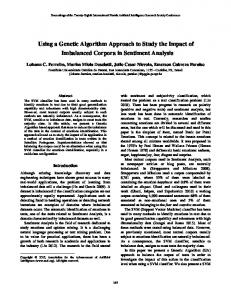
(T) is explaining this difference, since, according to this analytical framework Technology is “better” where the GDP is higher. But how robust is such an analysis if we check the same data set across different hierarchical levels? To test the robustness of this result we can use a multilevel system of accounting proposed by the MuSIASEM approach. In this way we can “open up” the black box and move down the analysis through three hierarchical levels: • Level n: the “whole society” • Level n − 1: the “Paid Work sector” • Level n − 2: individual compartments within the economy (e.g. socioeconomic sectors) After opening the black-box we look for benchmark values referring to the proxy variables chosen to characterize the semantic categories A and T at level n − 2. That is, in this way we can look for indicators of performance referring to the level n − 2. This characterization can be done both in economic terms (e.g. extensive variable: sectorial GDP; intensive variable: pace of added value generated per hour of labor) and in biophysical terms (e.g. extensive variable: energy consumption per sector; intensive variable: exosomatic energy spent per hour of labor in the sector). In this way, we can generate a different – richer – view of the key characteristics (expressed at a lower hierarchical level) generating the overall level of CO2 emission per capita and of the overall energy intensity (MJ of primary energy consumption/€ of GDP) – measured as aggregated value for the whole country. An example of what we see after opening the black boxes is given in Fig. 3. After moving to a lower hierarchical level (that is, the “Paid Work sector” inside the black box [level n − 1]), we can check for differences and similarities in sub-sectors of the Paid Work sector (i.e. socio-economic sectors at level n − 2) between the three considered countries. The three sub-sectors considered in this example are: (i) AG = agriculture (ii) PS = Productive Sector (Building and Manufacturing, plus Energy and Mining) (iii) SG = Service and Government For these three sub-sectors we can now compare benchmark values referring to both economic, demographic and energy related variables: • Economic variables: Sectoral Gross Domestic Product per hour of Human Activity – GDPi/HAi – measured in €/h (data from Eurostat EEA)
METABOLIC PATTERNS OF MODERN SOCIETY
45
• Demographic variables: Human Activity in the Paid Work sector (HAPW) and Human Activity in the Production sector (HAPS), Human Activity in the Service and Government sector (HASG), Human Activity in the Agricultural sector (HAAG) (data from ILO) • Energy related variables: Sectoral Energy Throughput per hour of Human Activity in the sector i – ETi/HAi – measured in MJ/hour (data from IEA) Level n
Population: 42.345.342 GDP p.c.: 19.862 CO2 emissions: 426 Mt
Population: 59.699.828 GDP p.c.: 29.230 CO2 emissions: 658 Mt
Population: 82.531.671 GDP p.c.: 26.792 CO2 emissions: 1.028 Mt
Level n-1
HApw = 34,6 Gh EMRpw = 142,5 MJ/h 5,9 MJ/ ELPpw = 24,3 /h
HApw = 55 Gh EMRpw = 133,4 MJ/h 4,2 MJ/ ELPpw = 31,8 /h
HApw = 68.1 Gh EMRpw = 157,1 MJ/h 4,8 MJ/ ELPpw = 32,5 /h
EN 2,0%
Spain
AG 3,6%
EN 3,4%
UK
AG 0,9%
PS 19,5%
Germany
EN 2,3%
AG 1,1% PS 26,8%
PS 27,2%
Level n-2 economic view (GDP from the mix of subsectors in PW)
SG 67,2% Energy Intensity [MJ/ ]
Energy Intensity [MJ/ ]
96,7
7,1 2,7
ETag
ETps
ETsg
2,3
ETen
Exosomatic Metabolic Rate [MJ/h] 8,043
161,5 59,6 EMRag
EMRps
ETag
Energy Intensity [MJ/ ]
49,2
5,7
4,6
4,6
ETps
ETsg
2,0 ETen
Exosomatic Metabolic Rate [MJ/h] 7,886
ETag
EMRsg
EMRen
Level n-2
EMRag
EMRps
ETps
ETsg
169,7
EMRsg
66,4
EMRen
Economic Labour Productivity [ /h] 160,2
EMRag
EMRps
EMRsg
22,7
25,8
ELPag
ELPps
ELPsg
ELPen
EMRen
Economic Labour Productivity [ /h] 90,9
83,2 12,9
ETen
Exosomatic Metabolic Rate [MJ/h] 7,333
58,4
57,8
45,3
80,7
5,7
1,8
164,4 70,8
Economic Labour Productivity [ /h]
biophysical view
SG 69,7%
SG 76,1%
20,1
28,9
31,6
ELPag
ELPps
ELPsg
12,6 ELPen
ELPag
30,0
33,6
ELPps
ELPsg
ELPen
Figure 3. Opening the “black-box”: what is behind the “I=PAT” relation (Data source: Eurostat)
In order to be able to read the system across levels, the MuSIASEM approach uses assessment of energy and added value flows “per hour of human activity” instead of using values “per capita/per year”. Then, as soon as one looks at the integrated characterization (based simultaneously on economic and biophysical data) across the levels given in Fig. 3, one can make the following observations: 1. The differences in the aggregate value of CO2 emission intensity (Table 1) have very little to do with the values of individual proxy variables used to characterize the semantic categories I, A, T at the level n − 2. That is, the lower level of CO2 emission of the UK (Table 1) is not about a more efficient production of steel or construction than in Germany or Spain.
46
M. GIAMPIETRO, A.H. SORMAN, AND G. GAMBOA
Rather the differences in this value are more related to the different composition of the Paid Work sector in these three countries (UK does not produce the same level of steel and construction, and it has to rely more on import for its internal consumption). 2. The different economic performances of these three countries depend on their different socioeconomic structures (i.e. different characteristics of the sub-compartments of the whole), that is by the relative importance of the different economic sectors. UK gets a large fraction of her GDP from the service and the financial sector. Looking at this example we can conclude that the ratio MJ/€ measuring the energy intensity (which is often erroneously labelled as a proxy of Technology in the analysis of Environmental Kuznet Curves) either of a whole economy (at the level n) or of an economic sector (at the level n − 1) does not have a meaningful external referent. In fact, this emergent property of the whole can be explained by both: (i) differences in technology over the various sectors (detectable only at level n − 2 and level n − 3); and (ii) differences in the relative profile of sectoral GDPs. When using the chosen label (Technology) these values could (mis)lead us to think that Spain is using worse technology than UK and Germany. In fact, when looking at the amount of fossil energy consumption per hour of work (a proxy of the amount of technical devices used per worker) of the Industry, Building and Manufacturing sector (PS) the three countries present very similar values: 161.5 MJ/h in Spain, 164.4 MJ/h in the UK and 169.7 MJ/h in Germany. In conclusion looking at the dataset presented in Figure 3 we can say that the differences of values in energy intensity (or CO2 emissions) found at the level of the whole economy do not necessary imply better or worse technology. This point will be illustrated in detail in Section 2 when describing the pattern of energy metabolism of these three countries across levels. 1.1.4. Example #4 – Multiple-scale [short-term vs long-term view] and Multiple-dimensions [steady-state analysis vs evolutionary analysis] Demographic changes provide an easy example of lag time dynamics that imply a predictable trade-off in economic performance. As observed in Fig. 2 a wave of individuals moving across age class will determine a change in the performance of an economy, which can imply a different effect when considering short-term versus long-term.
METABOLIC PATTERNS OF MODERN SOCIETY
47
This effect is illustrated in Fig. 4. What is bad in the short term (in 1980) a high dependency ratio, associated with a baby-boom in the 1970s, will become a very positive situation in the year 2000 (after 20 years), providing an incredible high fraction of working population. Needless to say that we can expect that the situation will revert again to bad in another 20 years when the dependency ratio will go up again because of the massive ageing of the population. Therefore, the example in Fig. 4 shows the existence of predictable pattern of qualitative (structural) change in time, which will determine a contrasting performance at different points in time (short term vs long term).
Figure 4. A view of the changes in demographic structure in China 1970–2000
This contrasting effect of demographic variables is obviously extremely relevant for sustainability analysis, and it can only be analyzed by adopting an evolutionary narrative of sustainability. That is, when looking at existing indicators of performance and demographic dynamics one can guess a situation of instability. For example, we can develop an analysis that says: when the economy of China will reach a dependency ratio similar to that of Italy now, it is very unlikely that it will be able to generate a flow of added value of 29.4 €/h of labour, since the large population would make quite unlikely the accumulation of a huge amount of capital per capita (required by this performance). However, such a model can only predict a reason for instability (lack of viability) due to demographic changes. It cannot predict if this instability will translate into wars, riots, massive emigration, or rather in a positive transformation determining a new form of organization of social activities, which will make it possible for the society to work in a desirable way, in presence of a much higher level of dependency ratio. Such a model can only point at the existence of critical bottlenecks and at forced transformations to be expected in the future.
48
M. GIAMPIETRO, A.H. SORMAN, AND G. GAMBOA
2. Key Characteristics of the Pattern of Societal Metabolism 2.1. THE IMPLICATIONS OF CHANGES IN DEMOGRAPHIC STRUCTURE
It is well known that an increase in material standard of living translates into a longer life expectancy. The relation between an increase in material standard of living and adjustment in demographic characteristics of a society is well known (e.g. the theory of demographic transition, the work of 1993 Nobel Prize in Economics Robert Fogel on the implications of demographic changes). Very shortly, we can see in Fig. 5 the differences in population structure between a pre-industrial society, a developing country and two developed countries. (Giampietro and Mayumi 2000a).
Figure 5. Demographic structure of different societies at different level of economic development
When performing the same analysis within OECD countries, we can still observe a clear difference in population structure between countries at different levels of economic development. As illustrated in Fig. 6 Mexico and Turkey do have at the moment a population structure belonging to the “pyramid type” (associated with developing country), whereas richer countries, such as Sweden and Japan have a population structure belonging to the “mummy type” (associated with developed countries). However, it is possible to see, from the projections of population structure, that in the year 2050 Mexico and Turkey, because of their economic development, will get into the “mummy type” shape as illustrated
METABOLIC PATTERNS OF MODERN SOCIETY
49
in Fig. 6 by the white bars describing the size of each age class. Obviously, these projections of demographic changes are based on the steady-state assumption of continuous growth of 3% of the global economy. We saw before that population changes may entail a non linear change in the feasibility of the dynamic equilibrium between: (i) the requirement – what is consumed by the whole economy; and (ii) the supply – what can be supplied by the specialized compartments of society in charge for the production of goods and services. In particular the MuSIASEM approach can focus on this dynamic budget in terms of congruence over the flows that are produced and consumed per hour of human activity. in 2000
in 2050
in 2000 in 2000
SWEDEN SWEDEN
men MEN
women WOMEN
,10
,8
,6
,4
,2
in 2000 in 2000
,2
,4
,6
,8
,10 ,10
,8
,6
,10
,8
,6
,4
,2
,0
,2
,0
,0
in 2000 in 2000
women WOMEN
,2
,4
,2
,4
,6
,8
,10
,12 ,12
,10
,8
,6
,4
,2
,8
,10
women
WOMEN
85+ 80 - 84 75 - 79 70 - 74 65 - 69 60 - 64 55 - 59 50 - 54 45 - 49 40 - 44 35 - 39 30 - 34 25 - 29 20 - 24 15 - 19 10 - 14 5-9 0-4 ,0
,6
2050 inin 2050
TURKEY
men MEN
85+ 80 - 84 75 - 79 70 - 74 65 - 69 60 - 64 55 - 59 50 - 54 45 - 49 40 - 44 35 - 39 30 - 34 25 - 29 20 - 24 15 - 19 10 - 14 5-9 0-4 ,12
,4
inin2050 2050
MEXICO MEXICO
men MEN
women WOMEN
85+ 80 - 84 75 - 79 70 - 74 65 - 69 60 - 64 55 - 59 50 - 54 45 - 49 40 - 44 35 - 39 30 - 34 25 - 29 20 - 24 15 - 19 10 - 14 5-9 0-4 ,0
,0
inin 2050 2050
JAPAN JAPAN
men MEN
85+ 80 - 84 75 - 79 70 - 74 65 - 69 60 - 64 55 - 59 50 - 54 45 - 49 40 - 44 35 - 39 30 - 34 25 - 29 20 - 24 15 - 19 10 - 14 5-9 0-4
,0
,0
,2
,4
,6
,8
,10
,12
Figure 6. Demographic structure of different societies in OECD countries
As illustrated in Fig. 7 we can see that there is a standard breakdown in the “expected” profile of human activity across different compartments of the economy, defined at different levels of organization. As illustrated in this example this implies that the amount of hours of human activity per capita available for each specialized task is very limited. In the example of Fig. 7 the task considered is producing energy carriers, but the same constraint applies to other tasks such as producing food, mining, generating an adequate supply of water, activity of doctors, teachers, etc. In more general terms, we can use the same approach, used by ecologist to study the structural/functional organization of ecosystems, to study the set of internal constraints affecting the metabolism of a modern society. This implies studying the forced relation between what can be produced per hour by the different compartments of the economy (on the production side) and what is required by the various compartments of the economy (on the consumption side).
50
M. GIAMPIETRO, A.H. SORMAN, AND G. GAMBOA
The trade-off between economic development and economic competitiveness can be now explained by the systemic change in internal relations which is associated with economic development. Economic development entails an integrated set of changes in social variables: (i) longer life expectancy = larger dependency ratio; (ii) subsidies to unemployed people = longer periods of unemployment since the unemployed can wait for a desirable job offer; (iii) longer periods of morbidity in the work force; (iv) better level of secondary education = further reducing the economically active population within the work force; (v) smaller work load per year and paid leaves = reducing the actual work supply of the economically active population. The final result of this combined set of changes is an expansion of the size of the Household Sector – the hours of human activity allocated in consuming, by performing activities outside the Paid Work sector. The consequence of economic development is therefore a dramatic reduction of the ratio HAPW/THA – the hours of work in the Paid Work sector versus the Total Hours of Activity of the society. Population size
50%-60% dependent population
Total Human Activity
8760 hours in a year
factors determining the fraction of human activity not available for working 80% personal care, sleep, leisure
Dependency ratio active population
Work-load hours/year
50%-40%
potential working
5% - 10% unemployed
Unemployment level
20% actual working
outside FUND Variable Human Activity
Fraction of work force Industry Service&Government Agriculture
31 % 65 % 3%
OTHER SECTORS
>99%
8% - 9% of THA
inside ENERGY SECTOR