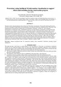
VISUALISATION OF ENGINEERING PROGRESS TO SUPPORT MONITORING AND CONTROL OF DESIGN PROCESSES Tjamme Wiegers Willem G. Knoop Faculty of Industrial Design Engineering Delft University of Technology Jaffalaan 9, 2628 BX Delft, The Netherlands
[email protected]
ABSTRACT A method was developed to visualise the progress of an engineering design process. With the method, both the activities together with the information handling are captured and recorded in computer files. A computer tool was developed, which generates a visual representation of the captured design process. The generated diagrams are an integrated visualisation of process activities and information handling, depicted along a time axis. We use the diagrams to locate blockades and bottlenecks in the conceptual phase of design processes.
generates the diagrams. We conclude with applications and possible enhancements.
1.1.
Existing visualisation methods
Various presentation techniques exists to analyse processes (Blank and Krijger, 1983). A widely known technique is IDEF-0, from the IDEF method for the specification of complex systems. Within the IDEF method, IDEF-0 is the part which is concerned with the recording of information needs. IDEF-0 is derived from SADT, Structured control
KEYWORDS Monitoring of concurrent processes, Automated diagram generation, Visualisation of time aspects, Information flow, Design activities, Quantitative analysis.
1. INTRODUCTION This paper presents an automated visualisation tool to present an integrated overview of information usage in design processes. It was developed as part of a research project aimed at an understanding of the use of information in design to develop more effective computer support tools (Knoop, et al., 1995). In fact the tool provides us the “information landscape” we were looking for. The direction of the research was also based on a state-of-the-art study which shows that detailed research on information structures in design related to the development of computer tools was hardly done (Knoop, 1994). In this introduction we mention some existing visualisation methods and describe what our diagrams add to them. Section 2 explains how we captured the data of the design projects while Section 3 describes the computer tool that
input
activity
output
mechanism activity
Figure 1. An IDEF-0 diagram. The process is shown as a series of activity boxes, and the related information as arrows. There is no time scale.
Analyses and Design Technique (Marca and McGowan, 1988). The method is applied in cases were insight is required in the complexity of processes and their information handling. IDEF-0 diagrams visualise process characteristics and related information. The process is depicted as a series of activity boxes, and the related information is represented by arrows that go in or come out from the boxes. Arrows in the horizontal plane depict inputs and outputs, while arrows in the vertical plane are used for control and
mechanisms. An example diagram is drawn in Figure 1. In IDEF-0 diagrams, activities and information types are identified as items that play a role in the process. But they are not represented as events that occur in the time domain. Iterations are not explicitly presented. In the research on the improvement of design processes, the time element plays an important role. For example, a shorter time-to-market can be achieved if tools or methods can help the designer to solve specific problems in shorter time, or if the designer needs less retries to come to a reasonable concept. Other influences are the time a designer has to wait for information, and the time he needs to interpret information materials, and to interrelate them. We find chronological representations of the design process by researchers like Dorst (1997), Frankenberger and Auer (1997), Dörner et al. (1995), Bakker (1995), Fricke (1993), Christiaans (1992), and
1. 2. 3. 4.
activities; requests for information from a designer; answers to the requests, or information inputs; results produced by the designer, or information outputs.
In this way we limited ourselves to tangible information because it is the kind of information which is manageable with information technology tools. We wanted to visualise the recorded design process showing these events, and insuring the preservation of their time of occurrence and their 1
1
1 1
2
calculate
2
draw
2
1
4 2
3
3
time
sketch read time
Figure 2. A chronological diagram of a design process: process characteristics are plotted in time. Information events can be plotted in a similar diagram.
Dylla (1991). However, they all use separate diagrams for process characteristics and for information handling. An example of a typical chronological diagram as used in these studies is shown in Figure 2.
1.2.
4
request input activity output
Towards an integrated visualisation method
Before we started to observe design processes, we investigated which data had to be captured and visualised. Based on a study of van Breemen (1995) we decided to capture data about four types of events:
Figure 3. Information handling and process characteristics along a time axis. The process is shown as a chronological sequence of activity boxes. The information handling is depicted by lines and arrows.
mutual relations. For this purpose, we propose an information diagram as presented in Figure 3. The x-axis of the diagram represents the time, the yaxis is used to indicate the different activities in the design process. An activity is depicted as a box. The start time of the activity is indicated by the left side of the box, and the right side of the box denotes the end of the activity. Figure 3 shows activity 1 as the first started activity. If a new activity is started, its activity box is plotted below the existing ones, like it is seen for activity 2. An activity can stop for a certain time, and be resumed at a later moment. In this case the total activity will be depicted by two or more activity boxes. We call the separate activity boxes subactivities. The subactivities that belong to the same activity are plotted on the same line. In our example activity 1 is such an activity which consists of more than one subactivity. After activity 2 stops, activity 1 is continued to be plotted on the same level which
was used for the first occurrence of activity 1. Figure 3 also shows that the information events are depicted as vertical lines and arrows. An information request is represented by a vertical line on top of an activity box like the requests 1 to 4. The x-position of the line indicates the moment the request is done. An arrow inside the box indicates the answer. The arrow is directed inwards, because it concerns an information input. The number of the answer corresponds to the question. So here we see that all four requests were answered, almost immediately after they were put. An outward arrow denotes an information output (a generated result). The output arrows are located at the bottom of the activity box. In this way the separate information events are located at different heights within an activity box. This is convenient both for the generation and the interpretation of the diagrams. Each information event is located at the activity box of the activity that is current when the event occurs. The example therefore shows that results 1 and 2 are both a result of activity 1. The diagrams are generated by a computer tool. This tool derives its data from a structured data file which lists all the events of the design process to be visualised. Each event is characterised by: • • • •
… 13:35:30 13:38:30 13:38:45 13:40:00 13:40:30
activity request answer result activity
13:44:00 13:44:15 13:45:15 13:46:00 13:47:00 13:47:15 13:47:30
request answer request answer activity request answer
13:49:00 result …
a[1] ri[1] ii[1] io[1] a[2]
(selecting batteries) (what is their voltage?) (1.2 Volt) (then I need 5 batteries) (determining dimensions) ri[2] (how thick is this tube?) ii[2] (its diameter is 15 mm) ri[3] (and the hub diameter?) ii[3] (110 mm) a[1] (selecting batteries) ri[4] (what is this capacity?) ii[4] (the current a battery can deliver a certain time) io[2] (3 minutes => 25mAh)
An additional diagram element is the information link. An information link, or link for short, occurs when a result generated during a certain activity is used as an input in a later activity. This use of information is indicated in the structured data file as an information input, with a reference to the used result. To distinguish this type from an ordinary information input, it is identified with the keyword use. A typical example of an information 14
12
the time of its occurrence, the event type, a unique identifier, the description of the event.
More about the structured data file can be found in Knoop and Wiegers (1995a, 1995b), which describes the data capturing and visualisation method in detail. A (slightly simplified) fragment of the structured data file which corresponds with the information diagram of Figure 3 looks like this:
15
85
time
Figure 4. An information link. Information input 85 in activity 15 uses information output 12 from activity 14.
link in a structured data file is noted below, and its visual representation is shown in Figure 4. Here we see that the result 12 of activity 14 was re-used later in activity 15. There it was labelled as information input 85. … 14:02:00 14:05:30 14:06:00 14:08:10 …
activity result activity use
a[14] io[12] a[15] ii[85]
(calculating the current) (I = 0.5 A) (determining efficiency) (io[12]; I = 0.5 A)
2. DATA ACQUISITION To apply and evaluate the observation method we set up an experiment. This experiment was conducted as an exploratory study in our research to acquire knowledge about the information handling by designers. In the experiment, which is outlined in Figure 5, we gave a designer a conceptual design task. The assignment, which reflected an industrial problem, addressed a mixture of generating a concept together with its technical specifications in both the mechanical and electrical domain. The designer D performing the design process P, was located in a laboratory, where he was assisted by an experimenter E1, whose role was to serve as an expert information provider and to observe the subject. D and E1 were sitting at the same table in a room with audio and video equipment. In a
separate room a second experimenter E2 was controlling the equipment and observing the subject. Both experimenters E1 and E2 observed the requests, answers and results, and also noted the activities of D. D had to provide documentation of the design concept at the end of the session. In this way we observed 10 sessions with individual designers, all working at the same task. A comprehensive overview of the experiments can be found in van Breemen (1996).
2.1. Observation method Our observation method is based on the considerations discussed in the previous section. The data collection and processing procedure which we have worked out is limited to a situation with one designer, but an extension towards design teams seems possible in the future. The procedure consists of the following steps:
time (minutes) 0
10
20
Figure 6. An example of a diagram.
30
result
D P
request answer
E1 observation 2
E2 observation 1
Figure 5. Structure of the experiment.
1. Observation of the design process and information handling of the designer, resulting in hand written observation lists. 2. Translation of the observation lists into transcription files. 3. Data structuring of the transcriptions towards structured data files. 4. Visualisation of the design process and information handling in information diagrams. The observations are written on a series of observation forms. Both experimenters filled out the forms, which were merged into one transcription file afterwards. Immediately after the observation the hand written observation lists are translated into one transcription file. The file is initiated by E2, who had the most time available to fill in the observation list, after which it is supplemented by E1. He can add specific details, like the numbers of the pre-numbered sheets the subject was writing on, which could not be seen by E2. Furthermore, the transcription is completed by replaying the video for those moments that both experimenters missed to fill in the observation form. In the case that the video data is not sufficient as well, the subject will be consulted to fill in the gaps. During the next step, the data from the transcription files is structured to determine the relationship between activities, information input and information output. Information links are added to represent the (re)use of previously generated information, i.e. previous results are used as input information for activities. Data structuring introduces some subjectivity, because the analyst decides which activities are grouped together and which information links are added. The main difference between the structured data
file and the transcription file, is the occurrence of the identification labels of the events. The structured data file served as an input file for the automatic visualisation tool. An example of an information diagram, taken from one of our observations, is given in Figure 6. For ease of reading we left out the event labels.
3. DESCRIPTION OF VISUALISATION TOOL The visualisation tool to translate the structured data files into diagrams consists of two programs. The first program is called DAD (Design Analysis Diagrams). It is an X-windows based program that generates diagrams from structured data files. The diagrams are displayed and can also be output as postscript files. The second program is called Dadcheck. It is a command line based program that verifies the syntax of structured data files. The user manuals of the programs describe their features, their use, and what syntax checks are performed (van Geest, 1997). The manuals contain also information about the format of the structured data files. Both programs are developed on Silicon Graphic machines in the C++ programming language. The programs are object -oriented, except for some standard functions. The DAD program uses the Motif library for the X-windows interface. The Dadcheck program uses a Cfunction created by Lex (a lexical analysis program) to parse files.
Dad v2.00 (d1s008.g) Load 82
83
Print 82 83
13
Options
11
Exit 84
Mode: Scroll
Zoom
14
84
12
Zoom: 0.500
Full Screen
15
85
Previous Zoom
Figure 7: The DAD visualisation program.
Once the DAD program is started, you can load a structured data file, zoom and scroll, and print out the diagram or a part of it. A window like that in Figure 7 will appear on the screen. The options
button makes it possible to specify which sorts of diagram elements must be visible. Activities, requests, inputs and outputs can separately be selected to be displayed or hidden, just as their indices and the information links. This option is included because generally the diagrams are large and contain dense spots. For the same reason a convenient zooming mechanism is included. Zooming can be done by means of a rubber box, but also by setting a zoom factor. For this purpose a zoom bar is available. Scrolling is done in two ways: by a rubber box, and by the scroll bars. With the Full Screen button the complete diagram is fitted to the window sizes. Print outs of the diagrams can be made in the sizes specified by the user. A print window asks for the dimensions of the print out. The user can set the dimensions by defining the length and the width, or by specifying one of those together with the length/width ratio. The print window will show how many pages in length and in width will be required, depending on the selected paper size. A print-preview can be ordered from the print window, if a postscript previewer is available.
An interesting application is the measurement of the impact of support tools and methods. This can be achieved if a design process is monitored in which a new tool or method is used, and also a similar design process in which the novelty is not available. The progress of both processes can be compared and conclusions can be drawn about the impact of the new tool or method. These conclusions can be founded with quantitative data from the structured data files. We have already worked on a first comparative study where we applied a paper based tool trying to improve the design task.
4.2. Industrial applications
4. APPLICATIONS
The method can be used to monitor an industrial design progress in order to keep track of its progress, and to interfere when its progress is not optimal. The visualisation of the process will make bottlenecks more obvious and better to identify. Proper identification of bottlenecks is the first step to release them and to speed up the process. Furthermore, the insights gained by the visualisation and analysis of the progress can be used to prevent pitfalls, blocks and dead ends in future design projects.
4.1. Scientific applications
4.3. Educational applications
We have used the visualisation tool in the experiments we were referring to in Section 2. The diagrams made it very easy to visually observe the trends in the different sessions. Visually we couldn’t find a common structure for all 10 sessions. Nevertheless this scattering in structure was not reflected in the design concepts that were produced by the subjects. Every subject did come up with a more or less valid product concept although they differ in satisfying the initial product requirements. We also found that relatively few information links were laid, which in our terms means that the subjects tangible re-use of previous generated results was limited.
An educational application is the recording of the performance of a designer, individual or in a team. Analysis of a designer’s performance can learn the designer his or her strengths and weaknesses. This can help the designer to make the right choices for further studying and optimise his learning curve.
The visualisation of the progress of design processes can also be used as a means to analyse them and to identify their bottlenecks, in order to set requirements for computer support tools or methodological improvements. We applied the method for this purpose (Wiegers and Knoop, 1997). The method can be used when design tasks are observed, but it can also serve the analysis of cases that are already available on video tapes (Ettema and van Breemen, 1995).
5. POSSIBLE ENHANCEMENTS Though we started with the observation of individual designers, we developed our method with the observation of teams in mind. The diagrams can visualise concurrent processes and information exchange between team members. The
12 p1
14 p1
15 p2
85 p2
Figure 8. In a team diagram a subindex identifies the originator of the event. In this example, person 12 generates output 12 which is used by person 2 as input 85.
Link ii[85] diameter 20 mm a[15] p[2] calculating speed In From a[4] p[1] determining dimensions
14
REFERENCES Bakker, C., 1995, “Environmental Information for Industrial Designers”, Thesis Delft University of Technology, Delft, The Netherlands. Blank, J. and Krijger, M.J., 1983, “Software engineering: methods and techniques” Academic Service and Wiley-Interscience Publication.
12
15
85
Figure 9. A possible enhancement: Click an event to read its details.
identifier of the events can be extended with a subindex to identify the originator of the event, see Figure 8. The visualisation tool maintains an internal object oriented database to manage the event data of the events to be displayed. Because these event data is already available, it is easy to enhance the tool with facilities that support the analysis of the visualised design process. A possible enhancement is to support the search for a specific event. The user might for example request a visualisation of the activity in which a specific information output occurs. Or, when a user zoomed in on an activity in which an information link ends, he might ask for the activity from which that information link is originated. Other possibilities are to click an event and get detailed information about it, including a textual description of the event (Figure 9). Currently, the program does not display the textual descriptions of events, but these descriptions are available in the internal database. Furthermore, features could be added to categorise events and to write output files to be able to use the analysis data in spreadsheets and word processors.
ACKNOWLEDGEMENTS Our special thank goes to Sander van Geest. He participated in the definition of the user requirements, designed the data structure and built the tool. This research work reported in this paper relates to the ICA research project of the SubFaculty of Industrial Design Engineering of the Delft University of Technology.
Breemen, E.J.J. van, 1995, "Characterisation of information in product development processes", K-memo K311, Delft University of Technology, faculty of Industrial Design Engineering, Engineering Department, Delft, The Netherlands, revised edition. Breemen, E.J.J. van, 1996, "The Desys D1 experiment - Empirical results of observing product development processes", K-memo K329, Delft University of Technology, faculty of Industrial Design Engineering, Engineering Department, Delft, The Netherlands. Christiaans, H.H.C.M., 1992, “Creativity in design, the role of domain knowledge in designing”, Lemma, Utrecht. Dörner, D., Ehrlenspiel, K., Eisentraut, R., and Günther, J., 1995, “Empirical investigation of representations in conceptual and embodiment design”, In: Proceedings of the ICED’95, V.Hubka (ed.), Heurista, Zürich. Dorst, K., 1997, “Describing Design - A comparison of paradigms”, PhD-thesis, Delft University of Technology, Delft, The Netherlands. Dylla, N., 1991, “Denkund Handlungsabläufe beim Konstruieren”, (in German), Konstruktionstechnik, München, Bd.5, Carl Hanser Verlag, München, Germany. Ettema, S.A., and Breemen, E.J.J. van, 1995, "The Desys Research Method: Observing a Designer", K-memo K309, Delft University of Technology, faculty of Industrial Design Engineering, Engineering Department, Delft, The Netherlands. Frankenberger, E., and Auer, P., 1997, “Standardized Observation of Team-work in Design”, Research in Engineering Design, Vol. 9, pp. 1-9. Fricke, G., 1993, “Kostruieren als flexibeler Problemlöseprozess” (in German), VDI
Fortschrittberichte, Reihe 1, Nr.227, VDI-Verlag, Düsseldorf, Germany. Geest, S. van, 1997, “DAD tools documentation”, http://dutoki.io.tudelft.nl/~sander, Delft University of Technology, faculty of Industrial Design Engineering, Engineering Department, Delft, The Netherlands. Knoop, W.G., 1994, "Empirical research in design: A literature survey of the state-of-the-art", K-memo K310, Delft University of Technology, faculty of Industrial Design Engineering, Engineering Department, Delft, The Netherlands. Knoop, W.G., et.al., 1995, "Design Research in the Netherlands", Bouwstenen no.37, Faculty of Architecture Planning and Building Science, Eindhoven University of Technology, Eindhoven, The Netherlands. Knoop, W.G., and Wiegers, T., 1995a, “The DESYS D1-experimental procedure: A method to observe information handling in actual product development processes", K-memo K328, Delft University of Technology, faculty of Industrial Design Engineering, Engineering Department, Delft, The Netherlands. Knoop, W.G., and Wiegers, T., 1995b, "The DESYS D1-experimental procedure: Appendices”, K-memo K340, Delft University of Technology, faculty of Industrial Design Engineering, Engineering Department, Delft, The Netherlands. Marca, D.A. and McGowan, C.L., 1988, “SADT: Structured Analysis and Design Technique”, McGraw-Hill, New York. Wiegers, T., and Knoop, W.G., 1997, “Discovering information patterns during conceptual design” In: Proceedings of the 11th International Conference on Engineering Design (ICED’97), Riitahuhta, A. (ed) Tampere University of Technology, Tampere, Finland, II:433-436.