WHAT DOES CODE RED MEAN? BY CHRISTOPHER
B. MAYHORN,
MICHAEL
S. WOGALTER,
The
17\ HOM[
LA,.."0 .l\OVI~"rJJ.lY
\.J
H M
Sf. CURl
,..•• S' •.'iTC •.·•
ATTR 113 TES A 'T THREATE
F. SHAVER
attacks" with "High risk of terrorist attacks" (13.3%).Together. these categories of error accounted for 40% of the errors during phrase sorting. The error-laden results of the three sorting tasks provide converging evidence that HSASmay not be an effective hazard communication tool. These results are not surprising when considered In the context of previous work within the human factors/ergonomics warnings literature (laughery. Wogalter. & Young,I994;Wogalter,Young,& Laughery,200 I). For instance, the results of the color-sorting task are consistent with previous research: Although the color red consistently connotes the presence of a hazard, orange and yellow are not readily differentiated on the hazard continuum (Chapanls, 1994).Colors such as red and yellow suggest greater levels of hazard than other common colors, such as green and blue, but research indicates that people do not perceive blue to be mori! hazardous than green (Braun & Silver. 1995;Rashid & Wogalter, 1997).Thus, participants' poor performance on the color-sorting task was predictable. Had human factors/ergonomics professionals been consulted on the design of HSAS.the misunderstandings associated with color coding of threat levels might have been avoided, resulting In a more effective hazard communication tool. Similarconfusions in the word- and phrase-sorting tasks might also have been avoided in light of extensive research demonstrating that people frequently have difficultydistinguishing one signalword from another, such as "danger," "warning:' and "caution" (Braun.Kline,& Silver,1995;leonard. I999).The designers of HSASmight have avoided the use of this attribute entirely. At the very least, HSASshould have been tested prior to deployment to determine whether the public could distinguish among the five threat levels.Had this testing occurred and the findings refleCted the confusion revealed in the present results, alternative attributes such as numbers (I.e.. 1-5) or percentages (e.g.,80%) might have been explored as a means to disambiguate the threat levels.
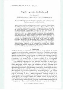
The U.S.Department of Homeland Security developed the Homeland Security Advisory System (HSAS)as a means to disseminate information regarding the risk of terrorist acts. HSAS communicates a series of warnings in the form of five graduated threat conditions that utilize three distinct attributes: colors, words, and phrases. As the table below illustrates. each of these attributes is composed of five components that are ordered to communicate five distinct threat levels.The purpose of this additional study was to determine the effectiveness of HSASas a means of public hazard communication by empirically assessing people's understanding of the system. Our 57 participants (see page 7 in the accompanying article) were given a set of index card labels and asked to rank the colors, words. and phrases from most threatening to least threatening. During color label sorting. 57.9% of them erred by deviating from the correct order illustrated in the table below. When examining the specific errors made we found that the most frequent errors occurred when participants thought the blue threat condition was less threatening than the green condition (78%). Another source of error resulted from participants confusing the orange with the yellow threat condition (12.1%).Together. these twO categories of confusion account for more than 90% of the color-sorting errors. The word-sorting task revealed somewhat better results: only 33.3% of the sample deviated from the correct order. Participants most frequendy confused the guarded condition with the low condition (42.1%) and less frequendy confused the elevated with the guarded condition (21.1%).Together. these two categories of confusion account for more than 63% of the errors during word sorting. Participants were the most accurate when asked to order the descriptive phrases. compared with the other sorting tasks. In the phrase-sorting task. 26.3% deviated from the correct order. Participants most frequendy confused "Significant risk of terrorist attacks" with "High risk of terrorist attacks" (26.7%) and less frequently confused "Severe risk of terrorist
HOllie/mId
& ERIC
I
I
J)
IZATI
(T
L
OF
NIP
THREAT
eellrit)'
dl'isory 'ystem
~
Colors
Words
Phrases
Red
Severe
Severe risk of terronst attack
Orange
High
High risk of terronst attack
Yellow
Elevated
Significant nsk of terronst attack
Blue
Guarded
General nsk of terrorist attack
Green
Low
Low risk of terronst attack
~ ~ ~
r---I GUARDED ~
12
ERGONOMICS
IN
DESIGN·
FALL
2004
slowly. Representative comments included "show open slowly" and "use arrow differently to indicate slow." Of the 24 design suggestions for the symbol meant to illustrate not yelling when trapped under debris, representative comments included "Nothing to indicate that yelling is the last resort" and "Number the action steps." Because each of these symbols is meant to communicate a set of actions (i.e., multiple propositions) that should be initiated in sequence, the complexity of the message content exceeds what is acceptable for a single symbol (Dewar & Arthur, 1999). Moreover, message content is dependent on the abstract concept of time, which is not readily visualized; thus, the utility of using a pictorial symbol in these two instances is not recommended (Leonard et aI., 1999). The participants' design recommendations, though insightful and accurate, would be very difficult to execute and may not result in better DHS symbols. Had DHS conducted some form of preliminary testing before these safety symbols were deployed for use by the public, they might have discovered that these are two instances in which pictorial symbols are not amenable for the job intended.
developing an effective pictorial symbol was low. Not only would DHS have avoided wasting valuable time and money on the development of incomprehensible symbols meant to convey abstract message content, the agency also might have identified more concrete concepts to enable it to concentrate efforts on designing useful safety symbols.
One source of concern with the current DHS education framework is that it is available only on the Internet.
Training via an awareness campaign. Although we have focused on the comprehension of pictorial warnings in this article, it is important to realize that the development of pictorial symbols is only one component of the DHS warning system. For the DHS public education framework to be successful, the public must first be aware of it. Of the 57 participants tested in our study, only one had previously encountered the DHS safety pictorials, but not on the official Web site. If people are to recognize and activate preexisting safety information when they encounter a pictorial symbol, initial training in the form of exposure to the material may be necessary to ensure that people first learn specific safety information. When they encounter pictorial symbols during real-world tasks, the symbols could then serve to cue access to previous knowledge, thereby guiding their behavior (Leonard et aI., 1999). Clearly, recognition and use of the DHS pictorial symbols requires that the public be informed that this information is available. This dependency on previous knowledge suggests that DHS should initiate a public awareness campaign that will inform the public where to access and become familiar with this information. One source of concern with the current DHS education framework is that it is available only on the Internet. Although Internet access is growing, not everyone has direct access to DHS safety information. It might be useful if this information were made available through other media, such as paper copies at the local post office or television advertisements.
As Hancock and Hart (2002) recently illustrated, human factors/ergonomics professionals possess skills and expertise that can be applied in a number of technical areas, such as airport security and emergency response to advance counterterrorism efforts. Given the low comprehension rates and high percentage of critical confusions associated with the current DHS safety symbols, HF/E professionals might be of service in pictorial warning design and evaluation. They have at their disposal well-established, psychometrically validated methods that produce more effective hazard communication (see Wogalter, DeJoy, & Laughery, 1999, for a review). Here we describe how these methods might be used to improve the DHS pictorial safety symbols.
Selection of concepts through precursor testing. The
process for developing effective pictorial warnings is often expensive, inefficient, and time-consuming (Wolff & Wogalter, 1993). Research shows that concept concreteness is positively correlated with how well people comprehend the meaning of pictorials (McDougall & Curry, 2000). Recent work by Hicks et aI. (2003) indicated that precursor tests of concept concreteness and ease of visualization can be used to predict the likelihood of designing a successful pictorial warning symbol. Thus, preliminary testing of concepts should allow designers to identify instances in which abstract, nonconcrete concepts would result in incomprehensible symbols. Because many of the DHS symbols were designed to convey information concerning abstract concepts, precursor testing might have identified cases when the likelihood of
Iterative comprehension testing and rapid proto typing. Once concrete concepts have been identified, prototype symbols should be developed and tested for comprehension with a sample of the at-risk population (as described in the current study). Symbols that do not meet acceptable levels of comprehension should be redesigned based on feedback from the earlier test participants and retested for comprehension in an iterative process (design, test, redesign, test, etc.) until a satisfactory level of comprehension is reached. Rapid prototyping is one method used to conduct iterative testing, whereby prototype warnings are continually redesigned and improved based on the evaluations of test participants (Wogalter, Vigilante, & Conzola, 1999).
ARE WE READY? The Department of Homeland Security is faced with the Herculean task of preparing the public for future terrorist incidents. The DHS Web site asks, "Are we ready?" Based on the results of the symbol comprehension study described in this article, it appears that the answer is "Not yet." Pictorial symbols cannot address every concept, and sometimes text FALL
2004
•
ERGONOMICS
IN
DESIGN
13
warnings are more appropriate. Knowledge of these limitations might have informed the design of the current symbols and resulted in the development of a more effective hazard communication system. For something as important and serious as safety in times of national emergencies, unambiguous warnings are essential for safety promotion and injury prevention. With the active assistance of human factors/ergonomics professionals, DHS should come closer to accomplishing the strategic goals of fostering public education and preparedness, thereby depriving the terrorists of their most effective tools: disorder and fear. REFERENCES Braun, C. c., Kline, P. B.• & Silver. N. C. (1995). The influence of color on warning label perceptions. International Journal of Industrial Ergonomics.1S, 179-187. Braun, C. c., & Silver, N. C. (1995). Interaction of signal word and colour on warning labels: Differences in perceived hazard and behavioural compliance. Ergonomics, 38, 2207-2220. Chapanis. A. (1994). Hazards associated with three signal words and four colours on warning signs. Ergonomics, 37, 265-275. Dewar, R. E. (1999). Design and evaluation of public information symbols. In H. J. G. Zwaga. T. Boersma, & H. C. M. Hoonhout (Eds.), Visual information for everyday use: Design and research perspectives (pp. 285-303). London: Taylor & Francis. Dewar, R. E.• & Arthur, P. (1999). Warning of water safety hazards with sequential pictographs. In H. J. G. Zwaga, T. Boersma, & H. C. M. Hoonhout (Eds.), Visual information for everyday use: Design and research perspectives (pp. 111-117). London: Taylor & Francis.
Rashid. R., & Wogalter, M. S. (1997). Effects of warning border color. width. and design of perceived effectiveness. In B. Das & W. Karwowski (Eds.). Advances in occupational ergonomics and safety, 1997 (pp. 455-458). Amsterdam: lOS Press. Schroeder. D. G., Hancock. H. E., Rogers, W. A., & Fisk. A. D. (2001). Phrase generation and symbol comprehension for 40 safety symbols. In
Proceedings of the Human Factors and Ergonomics Society 4Sth Annual Meeting (pp. 1479-1480). Santa Monica. CA: Human Factors and Ergonomics Society. Sojourner. R. J., & Wogalter. M. S. (1998). The influence of pictorials on the comprehension of and recall of pharmaceutical safety and warning information. International Journal of Cognitive Ergonomics, 2. 93-106. U.S. Department of Homeland Security. (2003). Preparing makes sense. Get ready now. (Available at http://ready.gov) Wogalter. M. S.•Young, S. 1.. & Laughery. K. R. (2001). Human factors perspectives on warnings, Volume 2: Selectionsfrom Human Factorsand Ergonomics Society Proceedings, 1994-2000. Santa Monica, CA: Human Factors and Ergonomics Society. Wogalter, M. S.• Dejoy. D. M., & Laughery, K. R. (1999). Warnings and risk communication. London: Taylor & Francis. Wogalter, M. S.•Vigilante. W. J.• & Conzola. V. C. (1999). Applying usability engineering principles to the design and testing of warning messages. In
Proceedings of the Human Factors and Ergonomics Society 43rd Annual Meeting (pp. 921-925). Santa Monica. CA: Human Factors and Ergonomics Society. Wolff. J. S.• & Wogalter. M. S. (1998). Comprehension of pictorial symbols: Effects of context and test method. Human Factors. 40,173-186. Wolff, J. S., & Wogalter. M. S. (1993). Test and development of pharmaceutical pictorials. Interface '93: Humanizing Technology, Proceedings of the Eighth Symposium on Human Factors and Industrial Design in Consumer Products (pp.187-192). Society.
Santa Monica.
CA: Human
Factors and Ergonomics
Edworthy. J.• & Adams. A. (1996). Warning design: A research prospective.
London: Taylor & Francis. Hancock, P. A., & Hart, S.G. (2002). Defeating terrorism: What can human factors/ergonomics
offer? Ergonomics in Design.ID(ll,
6-16.
Hicks. K. E.• Bell. J. 1.. & Wogalter, M. S. (2003). On the prediction of pictoIn Proceedings of the Human Factors and Ergonomics Society 47th Annual Meeting (pp. 1735-1739). Santa Monica. CA: Human rial comprehension.
Factors and Ergonomics Society. International Standards Organization. (ISO). (1984). International standard for safety colours and safety signs (ISO 3864). Geneva, Switzerland: Author. Jackson, W. (2003). On Ready.gov. HSD reaches out to the public. Government
Computer News, 22(5). (Available at http://www.gcn.com/22_5/news) Kalsher, M. J.•Wogalter. M. S., & Racicot, B. M. (1996). Pharmaceutical container labels and warnings: Preference and perceived readability of alternative designs and pictorials. International Journal of Industrial Ergonomics, 18, 83-90. Laughery. K. R., Wogalter, M. S., & Young. S. 1. (1994). Human factors per-
spectives on warnings: Selection from Human Factors and Ergonomics Society Proceedings, 1980-1993. Santa Monica. CA: Human Factors and Ergonomics Society. Leonard, S. D. (1999). Does color of warnings
affect risk perception?
International Journal of Industrial Ergonomics, 23, 499-504. Leonard, S. D., Otani. H., & Wogalter, M. S. (1999). Comprehension
and
memory. In M. S. Wogalter. D. M. Dejoy. & K. R. Laughery (Eds.), Warnings and risk communication (pp.149-187). London: Taylor & Francis. McDougall. S. J. P., & Curry. M. B. (2000). Exploring the effects of icon characteristics on user performance: The role of icon concreteness. complexity,
and distinctiveness.
Journal of Experimental Psychology:
Applied, 6, 291-306. Murray, L.A .• Magurno, A. B.• Glover. B. 1.. & Wogalter. M. S. (1998). Prohibitive pictorials: Evaluations of different circle-slash negation symbols. International Journal of Industrial Ergonomics, 22. 473-482. National
Electrical Manufacturers National
symbols (American
Association. (2002). Criteria for safety Standards Institute Z535.3-Revised).
Rosslyn. VA: Author.
14
ERGONOMICS
IN
DESIGN·
FALL
2004
Christopher B. Mayhorn is an assistant professor of psychology in the ergonomics/experimental psychology program in the Department of Psychology at North Carolina State University, 640 Poe Hall, Campus Box 7801, Raleigh, NC 27695-7801, 919/513-4856,
[email protected]. He recently completed a postdoctoral fellowship at the Georgia Institute of Technology and earned a Ph.D. and M.S. from the University of Georgia. Michael S. Wogalter is a professor of psychology and coordinator of the ergonomics/experimental psychology program in the Department of Psychology at North Carolina State University. He received a Ph.D. from Rice University and has held previous faculty appointments at the University of Richmond and Rensselaer Polytechnic Institution. Jennifer 1. Bell is a graduate student in the Department of Curriculum and Instruction at North Carolina State University. She earned a B.A. in psychology from the University of Dayton. Eric F. Shaver (coauthor of "What Does Code Red Mean?") is a recent graduate of the ergonomics/experimental psychology program at North Carolina State University. He is employed at Applied Safety and Ergonomics, Inc. The authors thank an anonymous HFES member for bringing this important, timely topic area to our attention. We also thank Melody Carswell, Jeff Kelley, and an Ergonomics in Design associate editor for their insightful comments on earlier drafts during the review process. We wish to recognize Adam Fuller, Jeff Hardee, Erin Newman, and Kinsey Metts for their assistance in stimulus development, data collection, and data entry. mil