for years it has been known, that there is no âbestâ solu- tion [13]. ... tion available, the basic idea of INSYDER is a software plus content approach. The software is a PC-based local .... searching the Web with different keywords for 12 topics.
Evaluation of Different Visualizations of Web Search Results Thomas M. Mann, Harald Reiterer Computer and Information Science, University of Konstanz, D-78457 Konstanz, Germany {Thomas.Mann, Harald.Reiterer}@uni-konstanz.de Abstract This paper discusses the evaluation of a visual information seeking system for the Web called INSYDER. The aim of INSYDER is to find business information on the Web. The evaluation compares different visualizations including HTML-List, ResultTable, ScatterPlot, BarGraph and SegmentViews. These visualizations support the interpretation of the search result phase of the information seeking process. First results of the evaluation with forty users are presented and an outlook on future work is given.
1. Introduction In the Information Visualization literature a lot of ideas can be found how to visualize data helping users to reach their goals. There are a considerable number of guidelines when to use which visualization and some findings based on experiments and investigations. Despite the fact that the tradition of evaluations is quite long, there are a lot more ideas and theoretical thoughts about the value of visualization ideas than really evaluated results. A number of factors influence the success of visualization for certain data in certain situations and for certain users, but for years it has been known, that there is no “best” solution [13]. In this paper we present first results from the evaluation of different visualizations for web search results used in a system called INSYDER. The project was funded by a grant from the European Union, ESPRIT project # 29232. Chapter 2 introduces the INSYDER system. Chapter 3 describes the different visual structures used. Chapter 4 explains the evaluation setting. Chapter 5 presents first results of the evaluation. Chapter 6 summarizes the main results of this paper and gives an outlook on future work.
2. The INSYDER system The main goal of the INSYDER project was to create a solution to supply small and medium size enterprises with business information from the web. To make the information available, the basic idea of INSYDER is a software plus content approach. The software is a PC-based local meta-search engine, with functions for searching and crawling HTML- and TXT-based information, monitoring
changes of found documents, handling bookmarks and last but not least managing all this in a topic oriented way in Spheres Of Interest (SOIs). Content means in the case of INSYDER, country- and industry-branch-specific predefined SOIs, with selected bookmarks, collections of starting points like search engines and URL-lists, specific thesauri to improve the relevance ranking done by the semantic analysis module or rule files to classify hits by user definable host-types. Altogether a country- and industry-branch-specific adaptable system to find, evaluate, filter, manage and monitor relevant business information from the web. More information about the project can be found in [10] and [5]. In the following we concentrate on the evaluation of the visualizations.
3. Visual structures of INSYDER A lot of factors influence the value of certain visualization in a certain situation. Summarizing the literature they can be grouped into four [4] or five main groups, here called the 5T-environment: Target user group, Type and number of data, Task to be done, Technical environment and Training. After a number of design decisions explained in [4], [5] and [9], the following visualizations had been implemented in the INSYDER system to present search results: HTML-List, ResultTable, ScatterPlot, BarChart and SegmentViews. HTML INSYDER has an option to show search results in a traditional HTML-format with 30 hits per page and common HTML-navigation elements. This offers the user a familiar visualization and allows comparisons with usual presentations in common search engines. JAVA The second visualization is a ResultTable implemented in JAVA. Information about the documents, like relevance, title, or an abstract, is presented in columns. Each row shows one document. The user has the possibility to sort or customize the table (e.g. show only selected variables). Also part of the table is a static RelevanceCurve for each document. This is a simplified version of the StackedColumn from the SegmentViews and was contributed by Arisem S.A. Paris [2]. In the ResultTable of the INSYDER system it has been used to allow a fast recognition of doublets, because the crawling module eliminated doublets just by URLs. Having the Rele-
vanceCurves of two identical documents with different URLs, which usually appear close to each other, because of the same attributes, allowed fast detection of this type of doublets. Besides considerations about using businessgraphic-like visual structures, because business users are the target user group of INSYDER, the use of the ScatterPlot was inspired by visual information seeking systems like Envision [7] or Spotfire [1]. Each document is represented by a blue dot. The X and Y dimension encode two variables. There are three predefined ScatterPlots available: date/relevance, server type/number of documents, and relevance/server type. The user has also the possibility of choosing his own combinations from the available variables. A square-box labeled with the number of documents represents a document group having the same X/Y-values. A tool tip when crossing the square shows the titles of the first ten documents in the group. In contrast to this, the tool tip for a single document shows important attributes, like title, size, date, category, or abstract. Tool tips are available in all visual structures. Further possibilities of the visualizations are described in [9]. The use of the BarChart was mainly inspired by the work of [12]. The original idea of BarCharts, showing overall and single keyword relevance using the length of bars, had been adapted in several ways. The BarChart is rotated by 90 degrees: top down instead of right to left, to have the same vertical orientation displaying the documents like in the other views where document details are given. The impression of a document as an entity is emphasized using Gestalt principles, without disturbing the keyword orientation too much. Whereas the above described visualization focus on showing the complete document set as far as allowed by screen space, the SegmentViews are dedicated to focus on single documents. Documents are broken down into segments by the semantic analysis module for ranking purposes. One segment is usually one sentence. For screen space and performance reasons during the analysis, we limited the maximum number of segments to 100. If a document contains more than 100 sentences, they are automatically grouped in a way that all text is shown but 100 displayed segments are not exceeded. The segmentation is used to show the document in two different versions as TileBar or StackedColumn view. Both use the same data, but the display is slightly different. The use of TileBars was mainly inspired by the work of [3]. In contrast to the original TileBars we didn’t use gray levels to show the keyword relevance for a segment. Instead, each keyword is represented with a different color (same colors as used for the BarGraph): The relevance of the keyword is coded by the darkness of the color or the size of the colored area (continuous or in steps). The darker the color or the greater the colored area, the higher is the relevance of the keyword for this segment.
The use of StackedColums was inspired by the RelevanceCurve from Arisem. Each segment is represented as a vertical column. The height of each column corresponds to the relevance of the keywords for that segment. The contribution of the different keywords is shown using the same color map as for BarGraph and TileBars. We made some enhancements of the original idea for our purposes. First, the number of columns shown corresponds to the number of segments, the original has a fixed number of columns. Second, the original shows only the relevance for the whole query per segment; we added the indication of the single keyword contributions. Third, a showsegment-text-as-tooltip feature was implemented, being displayed when crossing a segment with the cursor. Fourth, a jump-to-segment feature was added, showing the document text in a separate window, scrolled to and highlighting the current segments text. Show-segmenttext and jump-to-segment are also implemented for the TileBars. Like before, we experimented with different versions of the StackedColumn. The first version shows the segments in the same width as the TileBar. This affords vertical scrolling for longer documents. In the second version we use the same text segment size, but the display is narrowed. So usually all segments of a document can be viewed without scrolling. The StackedColumn view is very similar to the TileBar view. One of the goals of the development was to find out what kind of visual structure is more effective and satisfying from the user’s point of view.
4. Evaluation of the Visualization Views During the EU project (September 1998 – February 2000) a number of interviews with potential users and three usability tests (formative evaluations) with users from small and medium size enterprises in Great Britain, France and Italy were conducted to discuss ideas and test especially the user interface and visualization ideas. The tests followed the GUIDE-method, as being proposed in [8]. The results are mainly qualitative, but did influence a number of design decisions and gave us a lot of helpful hints to improve the system. In addition to these formative evaluations, the University of Konstanz continued the evaluation after the end of the project in Feb. 2000. These summative evaluations are described afterwards. The primary goal was to measure the added value of the visualizations for reviewing Web search results in terms of effectiveness, efficiency, and subjective satisfaction as explained below. Knowing advantages of the multiple view approaches documented in user studies like [6], we didn’t intend to measure the effects of having ScatterPlot, BarGraph and SegmentViews instead of the HTML-List and ResultTable. We wanted to see the added value of having these visualizations in addition to the ResultTable.
Group 1
Group 2
30
1
HTML
JAVA
2
Extended 500
3
JAVA
3
Specific
30
8
4
Extended 500
1
5
Specific
30
3
6
Extended 500
8
HTML
7
Specific
500
1
JAVA
8
Extended
30
3
9
Specific
500
8
10 Extended
30
1
11
Specific
500
3
HTML
12 Extended
30
8
JAVA
JAVA
JAVA
Group 5
Keyword
Specific
Group 4
Docs
1
Group 3
Fact finding
User Interface: The following configurations have been tested: • HTML HTML-List only • JAVA ResultTable only • + JAVA ScatterPlot + ResultTable • + JAVA BarGraph + ResultTable • + JAVA SegmentViews + ResultTable. Of the five factors influencing the success of using visual structures we decided to vary target user group, type and number of data, and the task to be done. The remaining factors technical environment and training had been identical for all tests by having identical training sessions and technical equipment. Target user group: 40 male and female users for the test had been recruited from students or staff of our department of information and computer science, and a number of non IT-related disciplines. To see possible influences of the target user group, they had been chosen and divided into two groups of 20 users each. The members of first group called “beginners“ knew the Web and had some limited understanding of search engines, but no deeper knowledge about information retrieval techniques. The members of the second group called “experts”, had extensive Web search experience and at least participated in one course on information retrieval. Type and number of data: To see possible influences caused by the type and number of data, we used queries with three different numbers of keywords (1, 3, 8) and two different sizes of result sets (30 or 500 hits). An additional influence may come from the quite heterogeneous content of the result sets, which had been prepared by searching the Web with different keywords for 12 topics. Task: To see possible influences caused by the task to be done, we decided to use two of the four different types of information seeking tasks described in [11]. Half of the tasks were “specific fact finding”, the other half “extended fact finding”. The main difference between these two types is that in the first case, there is a clear stop criterion, when the user finds a document to answer the question. In the second case there is no such clear abort criterion to stop the examination of the result set, and therefore the investigation process will be much broader and possibly of longer duration. We decided to eliminate all documents from the result sets, which would allow completing the extended fact finding tasks using a single document. So we conserved the extended fact finding condition. This did not influence the size of the result sets, because when eliminating a document from the set presented to the users, it was substituted by the first document not included so far. Example for the tasks with combinations of type/ number of data and task to be done in the field of specific fact finding is the 1 keyword / 30 hits query “danube” and the indented information seeking task to find out: “How long is the Danube river?”. Example for a extended fact-finding task is the 3 keyword / 30
hits query “john irving book” and the indented information seeking task “Which books had been written by the author John Irving?”. The test setting covered all combinations of these variables: 5 visualizations, 2 information seeking tasks, 2 sizes of result sets, and 3 numbers of keywords. Overall 60 combinations (5*2*2*3) had been tested with 2 groups of users, divided into 5 subgroups (Table 1). Each cell of the test table was done by 8 users (4 beginners, 4 experts). Question
Independent Variables
JAVA HTML
JAVA
JAVA
JAVA HTML
JAVA
JAVA
JAVA
JAVA
JAVA
HTML
HTML
JAVA
JAVA
JAVA JAVA
JAVA
JAVA
JAVA
JAVA JAVA
JAVA
JAVA HTML
JAVA
JAVA
JAVA HTML
JAVA
JAVA
JAVA
JAVA
HTML
HTML
JAVA
JAVA JAVA JAVA JAVA
JAVA
JAVA
JAVA
JAVA JAVA
JAVA
JAVA HTML
JAVA
JAVA
JAVA
Table 1: Combination of test tasks Dependent Variables Task completeness (effectiveness): Accuracy and completeness by which users achieved the goals of the test tasks. The effectiveness was calculated by relating the answers to the number of possible correct answers in the concrete result set (e.g. if 12 books by John Irving could be found in the result set and the user did find 7, his effectiveness was recorded as 58%) Task performance time (efficiency): Time to complete each test task, not including reading the task question. In order not to exceed the overall test time per user much more than two hours, the time to answer specific factfinding questions was limited to 5 minutes per question, for extended fact finding tasks to 10 minutes per question. User subjective acceptance (satisfaction): Positive attitudes toward the use of the visualizations. Test users rate their satisfaction in the following categories: ease of use, self-descriptiveness, suitability for learning, layout, suitability for the tasks, and conformity with expectations.
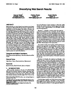
Procedure The evaluation was focused on the activities done in the reviewing of the results phase of the four-phase framework of information seeking [11]. To avoid side effects caused by the activities in the formulation and action phase, the evaluation was done with already prepared searches. For each predefined query the users had to answer a question representing the intended information-seeking task. To avoid side effects caused by the refinement step, the INSYDER system had been modified in a way that all functions, which allow refinement steps other than view transformations, had been suppressed. So the users had functions like zoom or mark/unmark documents, but they didn’t see functions like generating new queries using relevance feedback or re-ranking result sets. The users were told to answer the questions as quickly as possible. All users processed the same 12 questions, with the same keywords and number of hits in the same order. The difference between the five groups was the visualizations the user could use to answer the question. For example, a user of group one started to answer question 1 by using the HTML-List, then proceeded with question 2 / ResultTable etc. (Table 1). A user of group two started answering question 1 / ResultTable, then proceeded with question 2 / ScatterPlot etc. Example screenshots for question 11 are shown in Figure 1. The system ensured that for every task a user had to fulfill he could only see the result set and visualization he needs. The setting for this controlled experiment assured that the five combinations of visualizations had been distributed in an equal manner to all variables. After fulfilling an entry questionnaire with six questions (e.g. age, computer experience), the users got a short
introduction to the INSYDER system with the help of a ScreenCamTM movie demonstrating the main concepts and visualizations of the system. Then each user had a learning period with a test result set and all five visualizations. After finishing this introduction phase the users had to accomplish the 12 test tasks. During the tasks the users were requested to "think aloud" to allow the evaluation team to understand and record their current actions. Two persons taking written records did the recording of data. An experimenter moderated the test session. After accomplishing the tasks the users answered a questionnaire of 30 questions regarding their subjective satisfaction.
5. First Evaluation Results The following results are based on an interim report prepared after finishing the 40 test-sessions and should only give a first impression, because the main statistical analysis and validation still has to be done. Added values of the visualizations. The majority of the users expressed a high satisfaction about the visualizations. Especially the SegmentViews got high positive ratings. This subjective impression seems not to be fully supported by the hard facts. Looking on the overall results for task completeness (effectiveness) and task performance time (efficiency) we got the following results: Considering the average efficiency and effectiveness for all factors (independent variables), the HTML-List performed slightly best (see Figure 2). This may be an effect of experience. People are used to this visualization of search results, and our evaluation setting did not allow examining the effect of training. For specific fact-finding tasks the SegmentViews setting was the best configuration after the HTML-List. For extended fact finding the
Figure 1a-f: Question 11 Upper Row: a) Group 1: b) Group 2: c) Group 3: Lower Row: e) Group 4: f) Group 5:
HTML JAVA
HTML-View ResultTable ScatterPlot
BarGraph SegmentViews
SegmentViews configuration was the worst one. The HTML-List was clearly the “best” visualization, both in terms of average efficiency and average effectiveness. For the others this picture is not so clear, because ranking positions are sometimes different for efficiency and effectiveness. When we are talking about results e.g. for Scatterplot”, we correctly should speak of “ScatterPlot + ResultTable setting”. For Scatterplot, BarGraph and SegmentViews users had also the ResultTable available as additional view. Some of the test users had been really visualization-resistant. One expert and one beginner never used anything else but the HTML-List or ResultTable. So to get trends it’s not enough to see how much time the users needed and what level of completeness they reached, but also to see which possibilities they used. 5:38
5:26
5:15
5:12
4:59
100%
minutes
5:00 4:00
65,8%
65,4%
62,3%
60,1%
63,4%
80% 60%
3:00 40% 2:00
effectiveness
6:00
The users had been free to use ScatterPlot, BarGraph and SegmentViews or not. Maybe results would have been different if we had forced the users to use them. Another interesting evaluation will be a comparison of the different variants of the SegmentViews we created: three TileBar versions and two StackedColumns versions, all showing the document data on segment level. Not to blow up the evaluation setting, we didn’t compare the different versions. The users had been free to choose which versions they use. All five had been available in the SegmentViews configuration and mostly people just used the default one. Will there be differences between them? In terms of effectiveness, efficiency or satisfaction? Besides these open questions from our own work, there are a lot of ideas from the literature, we couldn’t consider so far. E.g. influenced by [6] we are discussing a redesign of some parts of the INSYDER system to have a stronger integration of the different visual structures.
7. References
20%
1:00 0:00
0% HTML-List
ResultTable
BarGraph
SegmentViews ScatterPlot
Figure 2: Average efficiency / effectiveness Other trends we detected so far: Average efficiency was better and effectiveness was higher for 30 hits presented than for 500 hits. For the number of keywords used to find and rank the results average efficiency was best and effectiveness was highest for 3 keywords condition, compared to 1 or 8 keywords. Average efficiency was better and effectiveness was higher for specific fact finding tasks than for extended fact finding tasks. But: effectiveness for some extended fact finding tasks was better than for certain specific fact finding tasks. So the concrete result set plus question may have a high influence.
6. Conclusion and Outlook The first results of the summative evaluation of our visual information seeking system for the Web have motivated us to go ahead. The idea to use the principles for visual information seeking for searching the Web has been successful, at least in a way that users are more satisfied when working with the system. The results in terms of effectiveness and efficiency have to be interpreted in more depth to find out the determinant factors. But a lot of questions will still be open, even when the interpretation of the already available data will be finished. In our evaluation overall the HTML-List performed best. As stated above, this may be an effect of experience, because people are used to this presentation of web search results. It will be an interesting test to see if the performance of the other visualizations will improve, when the factor training is modified by having people use the system over a longer period of time or offering a distinctable greater amount of training to a certain group of users.
[1] Ahlberg, C; Wistrand, E: IVEE: An information visualization and exploration environment. In: Proc. IEEE Information Visualization 95, pp. 66-73. [2] Arisem S.A., Paris, http://www.arisem.com [1999-06-20] [3] Hearst, M.A.: TileBars: Visualization of Term Distribution Information in Full Text Information Access. In: Proc. ACM CHI'95, pp. 59-66. [4] Mann, T.M.: Visualization of WWW-Search Results. In: Proc. DEXA’99 Workshops, [5] Mann, T. M.; Reiterer, H.: Case Study: A Combined Visualization Approach for WWW-Search Results. In supplement Late Breaking Hot Topics Proceedings In: Proc. IEEE Information Visualization 99, pp. 59-62. [6] North, C.; Shneiderman, B.: Snap-Together Visualization: Coordinating Multiple Views to Explore. University of Maryland, technical report CS-TR-4020 June 1999 [7] Nowell, L.; France, R.; Hix, D.; Heath, L.; Fox, E.: Visualizing Search Results: Some Alternatives To Query-Document Similarity. In: Proc. ACM SIGIR ´96. pp. 67-75 [8] Redmond-Pyle, D.; Moore, A.: Graphical User Interface Design and Evaluation (GUIDE). Prentice Hall (London). 1995. [9] Reiterer, H.; Mann, T.M., Mußler, G., Handschuh S.: INSYDER - A Visual Information Seeking System for the Web. Submitted to InfoVis’00 http://kniebach.fmi.uni-konstanz.de/ pub/german.cgi/d340648/insyderWebAuftritt.html [2000-05-10] [10] Reiterer, H.; Mußler, G., Mann, T.M., Handschuh S.: INSYDER - An Information Assistant for Business Intelligence. Accepted for and to appear in SIGIR 2000. [11] Shneiderman, B.: Designing the User Interface. Strategies for Effective Human-Computer Interaction. Addison-Wesley, Reading, Massachusetts, 1998. [12] Veerasamy, A.; Navathe, S.B.: Querying, Navigating and Visualizing a Digital Library Catalog. In: Proc. DL'95. http://www.csdl.tamu.edu/DL95/papers/veerasamy/veerasamy.h tml [1999-03-24] [13] Washburne, J.N.: An Experimental Study of Various Graphic, Tabular and Textual Methods of Presenting Quantitative Material. In: The Journal of Educational Psychology, Vol. 18 Num. 6, 1927, pp. 361-376.