Making the invisible visible: early data display in the geological sciences
Richard J. Howarth (Department of Geological Sciences, University College London, Gower Street, London WC1E 6BT.
[email protected]) Abstract
The representation of numerical results in the form of a graph or thematic map rather than in tabular form is today commonplace, in the earth sciences as elsewhere, so it is hard to conceive that until about 1860 numerical results in geological publications were presented almost exclusively in tabular form, even by the leading scientists of the day. With the apparent exception of isoline (‘contour’) and point-symbol maps, frequency polygons, and the multivariate graphic symbols introduced by geochemists in 1897–1900, most graphical display methods now used in the earth sciences came from outside the field. Leading proponents of ‘the graphic method’ are briefly described and the origins of the stereographic projection, line graphs, time series plots, rosediagrams, the ternary diagram and multivariate symbols are discussed. Following the introduction of computers into universities (initially in the USA) after 1945, the time taken before earth scientists adopted new graphical methods was reduced abruptly.
A
Introduction: the rise of the graphical method
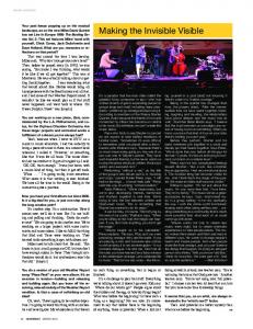
Figure 1 Edmond Halley’s graph (1686; 1809, pl. IX fig. 7 — curve RIHFDGC) relating air pressure (inches of mercury; ordinate) to altitude (feet; abscissa).
look of a modern graph, with coordinates marked off along the axes (Fig. 2; Lambert 1765, pl. V fig. IV). It was the observational science of meteorology that increasingly led to graphical innovation. One of the earliest such graphs was described by the English naturalist and physician Martin Lister (c. 1638–1712), who may have been the originator of a ‘Diary of the Weather’: a graph of daily temperature and/or air pressure, perhaps with written observations on the wind, etc. In 1684, the members of the Philosophical Society of Oxford were shown:
graph is a pictorial data display, which today we take for granted; traditionally, it was something that was either handdrawn or printed in ink in a journal or book in order to display numerical information in a way that enabled it to be assimilated easily and rapidly, and thereby effectively interpreted. Today graphs of all kinds are found in newspapers, and on the television news (often embellished by what the American student of graph“His way of keeping the Account of the Barometer which is ics, Edward Tufte (1983, 107–23), has described as ‘chart junk’), the most easy and exact that wee ever saw. From a plate he as well as in scientific journals. It is perhaps surprising to realise takes his paper, which is to be a months reckoning. It consists that although a very small number of scientists and mathematiof oblong squares, one side of the paper is marqued the days cians used the graphical method in the 17th century, even at the of the month to 31, an other side the inches of the quicksilbeginning of the 19th century such techniques were only rarely ver between 28 and 31, each divided into 10 parts; there used, and most observational data was still being presented for needs no more than draw a red line where the heighth is such interpretation in tabular form. Curiously, it took a long time a day, this makes in a month one red line the length of the before people realised that if you make pictorial displays of data paper bending as the quicksilver has risen or fallen, by seevalues, then it makes their relationships more obvious, and hence ing this line he says he can tell what weather has been.” their interpretation much easier. (quoted in Gunther 1939, 41). The foundations were laid by the introduction of the Cartesian co-ordinate system by the influential French philosopher and mathematician, René Descartes (1596–1650), also known by the latinised form of his name, Renatus Cartesius, in his philosophical treatise on the natural sciences (Descartes 1637), in which he laid down the principles of analytical geometry. One of the earliest graphs in the physical sciences, drawn by the English polymath Edmond Halley (1656–1742) to show hypothetical air pressure as a function of altitude (Halley 1686; 1809, pl. IX fig. 7), clearly reflects this geometric legacy in the way it is presented (Fig. 1). However, by 1765, a graph of change in magnetic declination as a function of time, by the German physicist Johann Figure 2 Johann Lambert’s graph (1765, pl. V fig. IV- curve DECF) of mean annual magnetic decliLambert (1728–1777) has very much the nation (degrees) as a function of time over the years 1550–1760. OUGS Journal 29 (2) Symposium Edition 2008, 70–80 © OUGS ISSN 0143-9472
OUGS Journal 29 (2) Symposium Edition 2008
Lister’s method was so ‘mightily approved of’, that printed graph paper for the purpose was soon being commercially produced and sold by the mathematical instrument maker John Warner (fl. 1682–1700), from his shop in Lincoln’s Inn Fields, London (Gunther 1939, 139, 304). Just over 100 years later, the German astronomer and topographer Ulrich Schiegg (1752–1810), published a slightly more sophisticated graph, which compared daily temperatures at Salzburg, Innsbruck, Stuttgart and Göttingen over the winter of 1798/99. Its data points were individually delineated and different line styles were used to denote the four time series (Schiegg 1799, pl. II). In 1845, the French civil engineer Léon-Louis Chretien Lalanne (1811–1892) demonstrated the use of contoured (isoline) surfaces, which he called ‘topographical tables’, to show the variation of mean temperature as a function of both the hour of the day and the month of the year; his work also made use of histograms, together with wind roses and pie diagrams to depict directional (wind) frequency data. The Scottish engineer and political-economist William Playfair (1759–1823), younger brother of the mathematician, John Playfair (1748–1819), best known to geologists as the interpreter of James Hutton’s Theory of the Earth (Hutton 1795; J. Playfair 1802), had been introduced as a child to the art of keeping a weather diary (in the form of a ‘register of the thermometer’) by his brother (W. Playfair 1805, xvi f.n.). Some years later, in about 1785, the younger Playfair “thought of applying lines to the subject of finance” (W. Playfair 1798, 5), and the econometric time series was born (see Klein 1997 for a very readable account of the evolution of time series analysis from mere graphical display to a sophisticated statistical specialisation). However, W. Playfair also introduced the proportional-length bar chart (1786) and, in 1801, proportional-area circles and the pie diagram. All of these techniques came to be staple elements of the palette of graphical methods. In the earth sciences, examples of essentially econometric data displayed in this tradition include time series of mineral production, which largely appeared in literature concerned with mining (economic) geology from the 1840s onwards (early examples include: Hunt 1846; Herder and Gätzschmann 1849). The use of proportional squares and pie diagrams to illustrate mineral production data had a brief popularity around the end of the 19th century (Keppen 1894, pl. VII, VIII; Anonymous 1907, figs. 88–94). Another person whose work influenced the growth of graphical displays was the Belgian social scientist and statistician, Adolphe Quetelet (1796–1874). He was one of the very first people to begin to think about ‘statistics’ (a term that initially just meant the collection of numbers about things), and he demonstrated the importance of the mean as a measure of the centrality of a frequency distribution. In 1827 and 1838, he published graphs that show curves of the annual variation by month of the numbers of births and deaths in Brussels, together with the corresponding mean monthly temperature, all plotted as a function of the months of the year. The obvious inverse relationship between these two sets of data (maximum mortality occurred in January to March; minimum in July) caused interest all over Europe, because people were so struck by the fact that one could actually illustrate the relationship between two measurable attributes in this sort of way. Quetelet also discussed the use of empirical frequency distributions. Later, two highly influential textbooks on the graphic method were published. The first (Minard 1862) was by the French civil
engineer Charles Joseph Minard (1781–1870), who devised a number of innovative cartographic displays and in particular used proportional-width lines to denote the increasing/decreasing quantity of something (the amount of wine, number of passengers, etc.) as a function of transportation distance. The second (Marey 1878) was by his countryman Étienne-Jules Marey (1830–1904), who described examples mainly taken from physiology and medicine.
Early use of graphs in the earth sciences
When the Scottish physicist David Brewster (1781–1868) deduced the law named after him in the course of studies of the polarisation of light reflected from transparent crystals (Brewster 1815) — i.e., the index of refraction is the tangent of the angle of polarization — he accomplished it solely using data presented in tabular form. Today, one would naturally begin by plotting the data graphically to see the actual form of the relationship between the two variables (it could, after all, turn out to be non-linear) but, at that time, it was simply not an obvious way to proceed, even to someone of Brewster’s intellect. Quetelet’s ideas and, indeed, his graphic style, were adopted in 1843 by the French mathematician and astronomer Alexis Perrey (1807–1882) for use in his pioneering earthquake catalogues. Figure 3 shows one of Perrey’s courbes seismiques [seismic curves] (Perrey 1844, 97 and pl. I), one of several illustrations of the monthly frequency of earthquakes occurring in various parts of Europe during 1843, together with roses seismiques [seismic roses] (Perrey 1844, 107 and pl. II) showing the frequency distribution of the directions from which the earthquake shocks were supposed to have propagated, based on observations of damage to buildings, etc.
a
b
Figure 3 Examples of Alexis Perry’s synopses of earthquake data: (a) Courbe sismique: the relative frequency of earthquake shocks per month for France (line ab shows the overall mean; Perry 1845, pl. I fig. 1); (b) Rose sismique: comparative plot of the relative frequency of the direction from which the shocks were estimated to have come in France (F), Italy (I) and the rest of Europe (E) (line ab shows the overall mean; Perry 1845, pl. II, fig. 11).
71
Data display / Howarth
The methods of Marey and Minard were later reflected in maps related to economic geology, such as that made by the French Inspector General of Mines and geophysicist Charles Lallemand (1857–1938), showing the amounts of lignite coal transported by water and railway to the cities and towns of northern Germany (Lallemand 1881, pl. IX). However, the concern here is with graphs rather than thematic maps. Arthur Robinson (1982) gives an excellent, and well-illustrated, history of the latter, although his examples fall outside the geological sciences. The British geologist James Forbes (1809–1868) was also a keen Alpinist and he became interested in the behaviour of glaciers. In 1844 and 1845, with the help of a number of assistants, he measured glacier movement at the Mer de Glace, near Chamonix, in the French Alps, over a total period of about a year. Two stations were established on the ice and, with the aid of a theodolite, he measured the downstream movement of the glacier at intervals throughout the year, together with the mean temperature over the same time period. In a similar manner to Quetelet’s analysis of mortality data, Forbes deduced from a comparison of time series graphs for each property that there was a systematic relationship between the speed of glacier movement and temperature (Forbes 1846, pl. X; Fig. 4). Today, one would have displayed such data as a scatter-plot with temperature plotted along the horizontal axis (abscissa) and amount of movement on the vertical (ordinate), as it is the dependent variable, but it just did not occur to Forbes to do it in this way. It was probably not until the English statistician Karl Pearson (1857–1936), who introduced the use of so many of the statistical parameters (reviewed in Stigler 1986), devised the correlation coefficient (later named after him) in 1895 (Pearson 1896), that people began to think about using the information provided by a scatter-plot to assess the strength of a statistical relationship between two measured attributes. Although a few early examples have already been mentioned, I will now review the types of graph that have been most com-
monly used in the earth sciences, broadly in the order in which they were taken up.
Stereographic projection The oldest graphical method by far is the stereographic projection (which is generally used by crystallographers to project the positions of a set of points on the upper surface of a sphere onto a horizontal plane passing through its equator, and in structural geology to project points from the lower surface). The projection was originally devised by the Greek astronomer and mathematician Hipparchos (fl. 180–125 BC), inventor of both plane and spherical trigonometry; it provided the basis of the instrument known as the astrolabe (Anonymous 1976), which enabled one to find one’s position on Earth from sightings of the stars. The earliest extant example is a combined stereographic net and star map in the Libros del Saber de Astronomia [Book of Astronomical Knowledge] compiled for King Alfonso X of Spain in 1252 (reproduced in Howarth 1996a, fig. 4), but thought to be based on an illustration in an earlier manuscript (c. 1070), based on the work of the Spanish-Moorish astronomer al-Zarquâlâ or Arzachel of Toledo (1029–1087). Stereographic nets were constructed on the basis of trigonometric relationships, initially simply using a ruler and compass. The radii of the latitudes and longitudes of the net are proportional to the secant and tangent of the corresponding angles (Fig. 5, opposite), but special geometrical instruments, such as ‘the instrument of three streight rules’ (Blagrave 1585, 65) had to be devised in order to accurately draw the large radius arcs required in constructing larger nets. By the 17th century, the projection had become established as a basis for the construction of both celestial and geographical atlases, e.g. the 292mm diameter 1° net (reproduced in Howarth 1996a, fig. 5) engraved by the renowned Dutch cartographer Willem Blaeu (1571–1638) for a textbook on the astrolabe (Metius 1633) by the Dutch physician and mathematician Adrian Metius (1571–1635).
Figure 4 James Forbe’s (1846, pl. XI) comparison of temperatures at Geneva (upper stepped line) and St Bernard (lower) with daily movement on the Mer de Glace, near Chamionix, French Alps in 1844–5. The two sets of stepped lines in each of the hachured plots of Mean daily motion correspond to two stations on each glacier.
72
OUGS Journal 29 (2) Symposium Edition 2008
use of the stereographic projection as a tool for the interpretation of macroscopic structural data has proved invaluable (Phillips 1954; Ramsay 1967). More detailed discussion will be found in Howarth (1996a, 1999) and in Howarth and Leake (2002).
Figure 5 The constuction of an equatorial stereographic net; the centres of the first few circles for which arcs are drawn are shown by the lines of vertical and horizontal dots (Howarth 1996, fig. 3).
Once mineralogists began to measure interfacial angles in crystals, the projection became of great utility, first in mineralogy and much later in structural geology. Franz Neumann (1798–1895), Professor of Mineralogy and Physics at Königsberg [Kaliningrad] was the first to use it in his textbook on mineralogy (Neumann 1823, pl. IV, fig. 20, reproduced in Howarth 1996a, fig. 6); and its use was further popularised by the French mineralogist and petrologist, Ernest-François Mallard (1833–1894) when he published his book on geometrical and physical crystallography in 1879. Following the invention, in the 1880s, of the so-called ‘universal’ microscope stage — which allowed a thinsection to be inclined or rotated about any axis — the projection was widely used for the portrayal of the optical properties of minerals in thin-section, such as feldspars (Federov 1892; MichelLévy 1894), for diagnostic purposes. The adoption of the stereographic net as a basis on which to plot and manipulate threedimensional orientation data in structural geology followed considerably later. Although first devised by the Swiss mathematician and physicist Johann Heinrich Lambert (1728–1777), the equal-area stereographic net (Lambert 1772, reproduced in Howarth 1996a, fig. 8) did not come in to use in geology until the principle was adopted by the Austrian mineralogist Walter Schmidt (1885–1945) for plotting and analysing the spatial distribution of the orientations of the principal optical axis of quartz or calcite crystals contained, at microscopic scale, in the fabric of metamorphic rocks (Schmidt 1925). As a result of the pioneering work of his colleague, the Austrian geologist Bruno Sander (1884–1879) and the subsequent promotion of his methods in North America by Eleanora Frances Knopf (1883–1974) and by Harold Williams Fairbairn (1906–1994), and in England by Frank Coles Phillips (1902–1982) (Sander 1930, 1948; Knopf 1933; Fairbairn 1949; Phillips 1945), what came to be called petrofabric analysis subsequently gained wide usage as a means to interpret the tectonic origin of such rock fabrics. However, the controversial nature of many of the results led to its falling out of favour in the 1960s. In very recent years it has become successfully utilised through improved understanding of the origin of such fabrics and the introduction of X-ray goniometry as a tool to obtain the crystallographic orientation data (Howarth and Leake 2002). Nevertheless,
The line chart This is a graph in which the data points are simply joined up by lines and the original points are not shown. Perhaps the earliest example of these in the earth sciences is that drawn by John Playfair to illustrate a theoretical model relating to the behaviour of gravity over the upper surface of a cylinder (J. Playfair 1809, pl. V, fig. 27). It seems extraordinary that, when one thinks of the graphic innovation by his younger brother, the graphs in J. Playfair’s own work still retained the style of geometric figures. More commonly, early line graphs were used to illustrate such things as topographic profiles (Héron de Villefosse, 1808, pl. I; reproduced in Howarth 2002, fig. 4), and time series. The earliest examples of the latter in earth science literature were probably those drawn by Perry (mentioned above) in his many reports on earthquake occurrence for various parts of the world but, until the late 20th century, time series charts were almost exclusively confined to the depiction of econometric aspects of metallic mineral or coal production (Hunt 1846, pl. 9; reproduced in Howarth 2002, fig. 6; Herder and Gätzschmann 1849, pl. I). In fact, it was quite unusual to explicitly show the individual data points on the basis of which the line graph was drawn. An early example by the French mineralogist Julien Thoulet (fl. 1843–1922) shows the results of a series of sedimentation experiments, and includes both the data points as well as lines and curves fitted to them (by eye) (Thoulet 1891, pl. 1; reproduced in Howarth 2002, fig. 7); a contemporary, mineralogical, example occurs in a study of the optical properties of crystals by the Russian mineralogist Georgii Yuri Viktorovich Wulff (1863–1925) (Wulff 1890, fig. 4). By the late 1800s, the rapidly growing study of igneous geochemistry gave rise to what came to be known as the variation diagram, in which the varying proportions of the major element oxides, typically, weight percentages of Al2O3, Fe2O3, TiO2, FeO, MnO, CaO, MgO, K2O, Na2O and P2O5, were shown by multiple lines with a common ordinate, as a function of increasing SiO2 along the abscissa. In early examples, such as that of the Austrian petrologist Eduard Reyer (1849–1914) values of SiO2 were included in the graph, as well as being implicit in the ordering of the specimens along the abscissa (Reyer 1877, fig. I). Not many years after, the American geologist and igneous petrologist Joseph Paxton Iddings (1857–1920) promoted the use of explicit coordinate values for the molecular proportion (‘variation’) of silica in his graphs (Fig. 6, overleaf; Iddings, 1892, fig. 80). The same type of diagram, plotted in terms of weight percentages rather than by molecular proportions, was subsequently popularised by the English igneous petrologist Alfred Harker (1859–1939) as the ‘variation diagram’, following publication of his influential textbook, the Natural History of Igneous Rocks (Harker 1909, 119, fig. 26). A contemporary described the diagram as “specially designed to draw attention to the relations between the compositions of rocks belonging to the same centre or region of igneous activity … in its simplicity and fertility of suggestion it is unrivalled” (Holmes 1921, 441–2).
73
Data display / Howarth
Figure 6 Joseph Idding’s (1892, fig. 80) diagram of ‘Molecular variation of the rocks at Electric Peak’; molecular proportions of Al2O3, CaO, Fe2O3, FeO, H2O, K2O, MgO and Na2O plotted as a function of SiO2 (abscissa).
Frequency distributions and rose diagrams Quetelet’s popularisation of the frequency distribution curve and its adoption by Perrey to illustrate his earthquake catalogues has already been mentioned. Rather surprisingly, the wider usage of frequency distributions in geology seems not to have become common until the beginning of the 20th century and, even then, it was largely confined to palaeontology and igneous geochemistry. An early morphometric example is by the American geologist Edgar Roscoe Cumings (1847–1967) and his student [?Ada Virginia] Mauck [?b. 1877] (Cumings and Mauck 1902, fig. 1). In geochemistry, Harker (1909, 148, fig. 42) illustrated the abundance of SiO2 in igneous rocks, but, as time went by and more data was accumulated, it became apparent that this composite distribution was in fact strongly bimodal, as was illustrated by the American petrologist Henry Hollister Robinson (1873–1925) (Robinson 1913, 202, fig. 34). He also demonstrated (Robinson 1916, fig. 1) that the frequency distribution of error in the ‘total’ oxide percentages of 3,391 complete chemical analyses of igneous rocks was well fitted by the normal distribution model. Subsequently, the English civil engineer and petrologist William Richardson (1887–1965) showed that, by using a statistical technique introduced by Pearson (1894), this bimodal curve could be decomposed into a mixture of two normal distributions (Richardson 1923, fig. 1) with modes at 52% SiO2 (basalt) and 73% SiO2 (granite).
Figure 7 One of William Alkins’ (1920, fig. 2) models of bivariate frequency distributions of shell length versus depth in 945 specimens of Reticularia lineata from the Carboniferous Limestone of Castleton, Derbyshire, UK.
74
Bivariate frequency distributions also made a rare appearance. The English chemist and malacologist William Ernest Alkins (1896–1969) published photographs of his models of bivariate frequency distributions of shell length versus width and depth (Fig. 7) for 945 specimens of the brachiopod Reticularia lineata from the Carboniferous Limestone of Castleton, Derbyshire (Alkins 1920, figs. 1 and 2). Surprisingly, the portrayal of frequency distributions of spatially directional data came into general use rather earlier. Perrey’s work in 1844 has already been mentioned. His adoption of the term roses seismiques presumably followed the introduction of Wind-Rosen [wind-rose] by Baron Christian Leopold von Buch (1774–1853), after the 14th-century compass rose (referring to the supposed resemblance between a 32-sector compass card and the petals of a rose). However, whereas von Buch simply used oriented direction lines within a compass-circle (1821, pl. VIII, figs. 12–14), it was Lalanne who showed how circular frequency plots could be used as an alternative to the conventional histogram-like representation (cf. Fig. 3b) to illustrate predominant wind directions (Lalanne 1845, pl. 1, fig. 4-ter.; pl. 2, fig. 17; pl. 4, fig. 31-bis.). In an early geological attempt to portray geological orientation data, the French palaeontologist and prehistorian Jules de Christol (1802–1861), in a letter to his fellow countryman the structural geologist Jean-Baptiste Élie de Beaumont (1798–1874), illustrated the orientation of dykes and predominant schistosity in the Cevennes region of France by simply writing the occurrence of the attribute along the appropriate sector of a 32-sector compass rose (Christol 1835, pl. I). Shortly after this, the French geomorphologist Auguste Viquesnel (1800–1867) adopted the style of the rose de directions used by Élie de Beaumont and his fellow countryman, the geologist Ours Pierre Armand Petit Dufrénoy (1792–1857) (Élie de Beaumont and Dufrénoy1841, I, 466) by filling 5º sectors about each mean strike direction with a number of radial lines proportional to the number of observations falling in that direction (Viquesnel 1842, pl. XX). Some thirty years later, the French mining engineers Auguste Michel-Lévy (1844–1911) and Jules-Emile Choulette (1844–1871) were still using essentially the same method to show the orientation of various types of veins in the Freiberg region of the Erzgebirge mining district, Czechoslovakia (Michel-Lévy and Choulette1870, pls. VII, IX, X; part of pl. VII is reproduced in Howarth 1999, fig. 7). In fact, similar depictions of the orientations of mineralised faults and fissures, using ungrouped radii, went on being used in studies of ore deposits into the 1930s (e.g. Burbank and Henderson 1932, pl. 8). The American economic geologist John Mason Boutwell (1874–1968) drew a particularly striking example (Fig. 8, opposite; Boutwell et al. 1905, pl. XXIII) distinguishing between the orientations of barren, lean and pay lodes in the Bingham mining district, Utah. Orientation diagrams in which radius length was proportional to frequency of the number of observations within a sector also began to be used by the middle of the 19th century. The frequency of joint directions in Co. Donegal, Ireland, was so illustrated by the Irish physician and petrologist, the Rev. Samuel Haughton (1823–1837) in 1864 (reproduced in Howarth 1999, fig. 9); and the English mathematician and seismologist Charles Davison (1858–1940) drew a polygonal rose diagram (Fig. 9, opposite), in what is essentially the modern style, showing the directions of fall of 140 stone lamps overturned in the Japanese earthquake of
OUGS Journal 29 (2) Symposium Edition 2008
Figure 10 Compositions of 928 American igneous rocks in which Na2O/K2O >2; plotted on the basis of SiO2 wt. % (abscissa) and (K2O + Na2O)/SiO2 wt. % (ordinate) (Iddings 1898, fig. 2).
Figure 8 Trends of barren fissures (innermost circle), and of lean (central ring) and pay (outer ring) veins and lodes, in the Bingham mining district, Utah, USA (Boutwell et al. 1905, pl. XXIII).
20 June 1894 (Davison 1905, fig. 8, 19), based on observations originally recorded by the Japanese seismologist Fusakichi Omori (1868–1923).
Scatter plots Surprisingly, in view of their ubiquity today, the scatter diagram, a term introduced (Krumbein1938, 199) by the American sedimentologist and mathematical geologist William Christian Krumbein (1902–1979) for figures that simply consist of data points plotted on the basis of their Cartesian coordinates (today, also referred to as a scatter plot, dot plot or cross plot), was very unusual in early work. The use of such graphs essentially began with the rise of crystallography, mineralogy and igneous petrology in the 1890s (e.g. Iddings 1898, figs. 1–6; Boeke 1914, figs. 7–9). An impressive early example is by Iddings who studied the compositions of a large number of igneous and plutonic rocks selected from the ‘best’ analyses to have been made in the U. S. Geological Survey’s laboratory up to that time. Figure 10 shows all analyses for which Na2O/K2O >2, plotted on the basis of SiO2 wt. % (abscissa) and (K2O + Na2O)/SiO2 wt. % (ordinate). The use of scatter plots became more frequent following publication of textbooks such as Holmes (1921) and Krumbein and Pettijohn (1938), which included chapters devoted to the graphic method, and with a growing interest in morphometrics in
Figure 9 ‘Plan of directions of fall of overturned stone-lamps at Tokyo during the earthquake of 1894’ (Davison 1905, fig. 8).
palaeontology (e.g. Davies and Trueman 1927, fig. 4). The latter was prompted by the publication of the textbook On Growth and Form (1917) by the English biologist and mathematician D’Arcy Wentworth Thompson (1860–1948); and an article on the use of graphs in palaeontology by the English zoologist and invertebrate palaeontologist, Henry Hurd Swinnerton (1875–1967) (Swinnerton 1921).
Ternary diagram The ternary, or triangular diagram (Bancroft 1897, 404), is one in which a point is plotted using its centered coordinate system, the coordinates mutually inclined at 60º; it represents the relative proportions (a, b, c) of three end-members {A, B, C}, generally expressed as percentages, so that a + b + c = 100. Its first application was probably that of the German physicist Tobias Mayer (1723–1762) in c. 1752, in which he illustrated colour-mixing using such a diagram, with the pigments red lead, yellow ochre and Berlin blue as end-members. It was originally drawn in black-and-white (reproduced in Howarth 1996b, fig. 1) but showed the proportions one should mix together to get particular types of colour (Georg Lichtenberg, the editor of Mayer’s posthumously-collected works, succeeded in making a 7-step colour triangle based on his scheme; Mayer 1775, pl. III). However, the mathematical properties of such a barycentric coordinate system (i.e. one in which the coordinates are defined by reference to the vertices of a simplex), its geometry and a calculus based upon it, were first described (although solely in the contest of analytical geometry) by the German mathematician and astronomer August Möbius (1790–1868) in 1827. Although subsequently adopted by physicists engaged in studies of colour and photoelasticity, it was only after the formulation of the phase rule by the American physicist and engineer Josiah Willard Gibbs (1839–1903) in 1875, that the English physicist Sir George Gabriel Stokes (1819–1903) drew the first ternary diagram to show how the concept could be usefully applied to the study of three-component alloys (Stokes 1891, fig. 1; reproduced in Howarth 1996b, fig. 6). Curiously, the first such diagram to appear in the geochemical literature, drawn by the Czechoslovakian mineralogist, crystallographer and petrologist Friedrich Becke (1855–1931) in 1896 (Becke 1896, reproduced in Howarth 1998, fig. 2) was constructed on a different basis: having been inspired by the {h, k, l} crystallographic indices for the hexagonal system, introduced by the English mineralogist and crystallographer William Hallowes
75
Data display / Howarth
The increasing interest in igneous petrology and geochemistry, and the publication of many textbooks on petrographic methods, led to the publication of numerous ternary diagrams from the early 1920s onwards, particularly in the field of igneous petrology. By the late 1940s, their use had also spread to sedimentary petrology and sedimentology. The American sedimentologist and marine geologist Francis Parker Shepard (1897–1985) reviewed in 1954 various classification schemes, based on sand-silt-clay ratios, which had recently been proposed. Krumbein (1952, 1955) established quantitative sedimentary facies mapping, in which ternary classification schemes based on lithological attributes (such as the sandstoneshale-limestone or sandstone-shale-non-clastics thickness ratios) in stratigraphic sections, or wells, passing through a particular formation could be usefully overlaid on isopach maps of the formation thickness. The use of this approach was popularised following publication, with his colleague Laurence Louis Sloss (1913–1996), of their textbook Stratigraphy and Sedimentation (Krumbein and Sloss 1959, ch. 6). See Howarth (1996b) and Sabine and Howarth (1998) for further discussion.
Figure 11 Examples of the granite family plotted in Alfred Osann’s ‘ACF’ scheme for the classification of igneous rocks (see text for explanation; redrawn from Osann (1900, pl. IV fig. 2)). In the original the ratio lines are in red, the whole over a very faint blue grid.
Miller (1801–1880) in 1839. Becke used two coordinates inclined at 120º, with their origin at the centre of the triangle. By the turn of the century, there was great interest in both the chemical composition and classification of igneous rocks, and a lot of experimental petrology was also being undertaken in order to understand the behaviour of silicate systems. It became considerably easier to plot such data following the introduction of ‘triangular’ graph paper by the American physical chemist Wilder Dwight Bancroft (1867–1953), ruled with a 60º net consisting of 1% and bolder 10% gridlines (Bancroft 1897, fig. 1; reproduced in Howarth 1996b, fig. 7). Even so, its commercial availability must have proceeded surprisingly slowly, as in 1922 the petrologist Albert Johannsen (1871–1962) published a method to facilitate the hand-drawn graphical construction of a plot of data points within a quartzorthoclase-plagioclase triangle. The German geochemist Alfred Osann (1859–1923) used the ternary diagram in 1900 as the basis for one of the first chemical classification schemes for igneous rocks, based on the conversion of the weight percentages of the various major oxides to molecular proportions (by dividing them by the molecular weights of the oxides). He then plotted these on a triangular ‘ACF’ diagram (Fig. 11): A, the sum of the molecular proportions of the alkalis; C, the sum of the molecular proportions of CaO plus MgO and FeO equivalent to any Al2O3 left over after its allotment to the alkalis and lime; and F, the sum of the molecular proportions of FeO and MgO plus any excess CaO. The percentages of the quantities A, C and F were then calculated in order to plot them on the diagram (Osann 1900, pls. IV–VII). Results obtained using his classification scheme were published in a series of papers between 1900 and 1903. Similar classification schemes have continued to be used in igneous and metamorphic petrology (see examples in Rollinson 1993).
76
Multivariate frequency polygons It is easy to forget that, until the recent years of computer graphics, all statistical illustrations were drawn by hand; and that a standard chemical analysis of a rock was, until the advent of Xray fluoresence analysis in the 1960s, still being performed by the classic methods of wet chemistry (e.g. Washington 1919). Typically, most or all of the major oxides (SiO2, Al2O3, Fe2O3, TiO2, FeO, MnO, CaO, MgO, K2O, Na2O, P2O5 wt. pct.) would be reported and, for some applications, these would be recalculated as normative values etc. under one of a number of possible schemes. It was realised that, in order to best compare compositions of different individual rocks (as opposed to the overall trends shown by a variation diagram), a graphical display embracing the essential features of the entire composition of each might be helpful. Perhaps inspired by the use of multiple curves, or divided bars, to represent the proportions of the oxides in each rock type plotted in variation diagrams (see above), this encouraged graphic innovation in the form of multivariate symbols. Figure 12 (opposite) shows six of these by the French mineralogists Michel-Lévy in France and Otto Mügge (1858–1932) in Germany; and by petrologists Waldemar Christopher Brøgger (1851–1940) in Norway, Franz Loewinson-Lessing (1861–1939) in Russia, and Iddings in America (Michel-Lévy 1897a, 1897b; Brøgger 1898; Loewinson-Lessing 1899; Mügge 1900; Iddings 1903). The most interesting graphical display produced using multivariate symbols is that by Iddings, which he developed as an extension of his 1898 work, mentioned above. He adapted his symbol from that of Brøgger (1898) and plotted the centre of each in the diagram using SiO2 and (K2O + Na2O)/SiO2 wt % coordinates, as before. For additional clarity, he coloured the four triangular sub-regions of each symbol: lower right (MgO, CaO) blue; upper right (NaO, Al2O3), yellow; upper left (Al2O3, K2O), green; and lower left (2Fe2O3+FeO, CaO) red. If TiO2 were present in ‘appreciable’ amount it was plotted to the left of the zero point, parallel to the abscissa. He concluded that the overall figure (Iddings 1903, pl. I), which consisted of several hundred individually coloured symbols for igneous rocks containing more than 27% SiO2, convincingly demonstrated:
OUGS Journal 29 (2) Symposium Edition 2008
Figure 13 Usage of different types of graph in igneous petrology, 1800–1935 (adapted from Howarth 1998, fig. 1). Figure 12 Examples of types of multivariate graphics used to represent the chemical composition of an igneous rock: 1, Michel-Lévy 1897a, pl. VII; 2, Michel-Lévy 1897b, fig 2 and pls X–XV; 3, Brøgger 1898, pl. I; 4, Loewinson-Lessing 1899, pl. IV; 5, Mügge 1900, pls V–VI; and 6, Iddings 1903, pl. I (Howarth 1998, fig. 5).
“that there are gradual transitions in the chemical composition of igneous rocks from one extreme to another, that there are no recognizable groupings of rocks or noticeable subdivisions of the chemical series, and that chemically similar rocks occur in genetically different families, it follows that the subdivision of all igneous rocks into groupings for purposes of classification must be along arbitrarily chosen lines. And the intricate character of the chemical variations, apparent in the diagrams, prevents a simple quantitative statement of any possible limits which may be selected for subdivisions of the series, however arbitrarily chosen.” (Iddings 1903, 69)
Unfortunately, probably because they were so tedious to draw by hand, the use of multivariate symbols fell out of use around 1910 and was not taken up again until their construction was facilitated by the arrival of computer graphics in the late 1960s. Nevertheless, igneous petrology was one of the areas where the use of graphs was most rapidly taken up (Fig. 13). A few other types of graph were also occasionally used in other fields, e.g. polar diagrams in studies of crystal optics, such as those by the French physicist Jean Baptiste Biot (1774–1862) using Iceland spar (e.g. Biot 1817, pl. IV, fig. 14); and divided-bar charts were
occasionally used to compare rock compositions (Brammall and Harwood 1925, fig. 1).
The computer age
As time went by, the time lag before earth scientists adopted a graphical technique that had originally been developed outside their field gradually became shorter and shorter, and a major decrease followed the introduction of computers into universities after the Second World War, first in America and later in Europe (Fig. 14, overleaf) as the computer enabled graphs of all kinds to be far more easily produced than drawing them by hand. The situation was further eased with the gradual introduction of software packages. While these developments led to much innovation in statistical methods, including methods for graphical data display, only a small number of the new, purely graphical, innovations have been taken up in the earth sciences. These include: 1. The boxplot (which can be thought of as a ‘top-down’ view of a histogram) for univariate comparison of the distribution of the same variable across a number of classes, introduced by the American statistician John Wilder Tukey (1915–2000) in 1977 and now a standard component of most statistical software packages. 2. Kleiner-Hartigan trees, a method introduced by the American statisticians Beat Kleiner and John Hartigan (1981) to aid comparison of multivariate abundance (the problem discussed in the previous section). The data for each sample to be compared was plotted using the same tree-like topology of the graphic symbol (based on a prior hierarchical cluster analysis of the correlation
77
Data display / Howarth Brewster, D. 1815 ‘On the laws which regulate the polarisation of light by reflexion from transparent bodies’. Philosoph Trans Royal Soc London 105, 125–30 Brøgger, W. C. 1898 ‘Die Eruptivgesteine des Kristianiagebietes. III. Das des Laurdalits’. Ganggefolge Videnskabsselskabets Skrifter. I. Mathematisk-naturvidenskabelig Klasse 6, 1–377 Buch, L. von 1821 ‘Über barometriche Wind-Rosen’. Annal Physik 1, 437–44 Burbank, W. S. and Henderson, C. W. 1932. ‘Geology and ore deposits of the Figure 14 Time lag before a statistical graphic method was taken up and used in the earth sciences, Bonanza mining district, Colorado’. USGS based on first-appearances of a given technique in the earth science literature and outside the field Professional Pap 169 (modified from Howarth 2002, fig. 11). Christol, J. de 1835 ‘Lettre à M. Élie de Beaumont’. Bull Soc géol France ser. 1, 7, 253–9 matrix for all the variables used) with branch-lengths in each tree Cumings, E. R. and Mauck, A. V. 1902 ‘A quantitative study of variation proportional to relative abundance. Early geological examples of in the fossil brachiopod Platystrophia lynx’. Amer J Sci ser. 4, 14, the application of both these methods are given by Howarth 9–16 (1984, figs. 2 and 3). Regrettably, the extremely effective Davies, J. H. and Trueman, A. E. 1927 ‘A revision of the non-marine Kleiner-Hartigan trees eventually fell out of use in the late 1980s Lamellibrancs of the Coal Measures and a discussion of their zonal as a result of insufficient portability of the software. sequence’. Quart J Geol Soc London 83, 210–59 3. The radial or Galbraith plot, for the comparison of a number Davison, C. 1905 A Study of Recent Earthquakes. London and of point-estimates of differing precision, introduced by the Newcastle on Tyne: Walter Scott British statistician Rex Galbraith, and now widely adopted for the Descartes, R. 1637 Discours de la Méthode pour bien Conduire sa display of comparison of fission track age estimates (Galbraith Raison, et chercher la verité dans les sciences. Plus la dioptrique. 1988, 1990, 2005). Les meteores. Et la géometrie. Qui sont les essais de cette Methode. Leyden: Ian Maire Readers interested in finding out more about the early history of Élie de Beaumont, L. and Dufrénoy, A. 1841 Explication de la Carte graphical methods should investigate: Shields (1937), Géologique de France. Paris: Imprimerie Royale Funkhouser (1938), Royston (1956), Tilling (1975), Beniger and Fairbairn, H. W. 1949 Structural Petrology of Deformed Rocks. Robyn (1978), Fienberg (1979), Tufte (1983), Hankins (1999) Cambridge, MA: Addison-Wesley and Spence (2005); and geological applications have been disFederov, E. S. 1892 ‘Universal-(Theodolith-) Methode in der cussed by Howarth (1984, 1996a, 1996b, 1998, 1999, 2002). Mineralogie und Petrographie. I. Universalgeometrische Unterschungen’. Zeitschr Kristallograph und Mineral 21, 574–678 References Fienberg, S. E. 1979 ‘Graphical methods in statistics’. Amer Statistician Alkins, W. E. 1920 ‘Morphogenesis of Brachiopoda. I. Reticularia lin33, 165–78 eata (Martin), Carboniferous Limestone’. Mem Proc Manchester Lit Forbes, J. D. 1846 ‘Illustrations of the Viscous Theory of Glacier Philosoph Soc 64, 1–11 motion. III’. Philosoph Trans Royal Soc London 136, 177–210 Anonymous 1907 ‘Eisen und Kohle’. Zeitschr praktische Geol 15, 334–7 Funkhouser, H. G. 1938 ‘Historical development of the graphical repreAnonymous 1976 The Planispheric Astrolabe. Greenwich: National sentation of statistical data’. Osiris 3, 269–404 Maritime Museum Galbraith, R. F. 1988 ‘Graphical Display of Estimates Having Differing Bancroft, W. D. 1897 ‘A triangular diagram’. J Phys Chem 1, 403–10 Standard Errors’. Technometrics 30, 271–281 Becke, F. 1896 ‘Gesteine der Colombretes’. Tschermak’s Mineralog und Galbraith, R. F. 1990 ‘The radial plot: graphical assessment of spread in petrograph Mitteil 16, 308–36 ages’. Nuclear Track and Radiation Measurements 17, 207–14 Beniger, J. R. and Robyn, D. L. 1978 ‘Quantitative graphics in statistics: Galbraith, R. F. 2005 Statistics for Fission Track Analysis. London: a brief history’. Amer Statistician 32, 1–11 Biot [J. B.] 1817 ‘Mémoire sur les rotations que certaines substances Chapman and Hall/CRC Press impriment aux axes de polarisation des rayons lumineux’. Mém Gibbs, J. W. 1875 ‘On the equilibrium of heterogeneous substances. I’. l’Acad royale Sci l’Inst France 2, 41–136 Trans Connecticut Acad 3, 108–248 Blagrave, J. 1585 The Mathematical Jewel. London: Walter Venge Gunther, R. T. 1939 Early Science in Oxford. Vol. XII. Dr. Plot and the Boeke, H. E. 1914 ‘Zur chemischen Zusammensetzung der tonerdehaltiCorrespondence of the Philosophical Society of Oxford. Oxford: prigen Augite, eine Anwendung quarternärer graphische Darstellungen vately printed auf mineralogie Fragen’. Zeitschr Kristallograph Mineralog 53, Halley, E. 1686 ‘On the height of the mercury in the barometer at dif445–62 ferent elevations above the surface of the Earth; and on the rising and Boutwell, J. M., Keith, A., and Emmons, S. F. 1905 ‘Economic geology falling of the mercury on the change of weather’. Philosoph Trans of the Bingham mining district, Utah’. USGS Professional Pap 38 Royal Soc London 16, 104–16; abridged version [1809] 3, 300–7 Brammall, A. and Harwood, H. F. 1925 ‘The occurrence of a gold-bearHankins, T. L. 1999 ‘Blood, dirt, and nomograms. A particular history of ing pegmatite on Dartmoor’. Mineral Mag 20, 201–11 graphs’. Isis 90, 50–80
78
OUGS Journal 29 (2) Symposium Edition 2008 Harker, A. 1909 The Natural History of Igneous Rocks. London: Methuen Haughton, S. 1864 ‘On the joint-systems of Ireland and Cornwall and their mechanical origin’. Philosoph Trans Royal Soc London 154, 393–411 Herder, [S. A. W.] von, and Gätzschmann, M. F. 1849 ‘Das Silberausbringen des Freiberger Reviers vom Jahre 1524 an bis mit dem Jahre 1847. In graphischer Uebersicht zusammengestellt ... mit erläuternden Bemertungen’. Jahrb Berg- und Hütten-Mann 5, 1–19. Freiburg Héron de Villefosse, A. M. 1808 ‘Nivellement des Harzgebirges mit dem barometer’. Gilbert’s Annal Physik 1, 49–111 Holmes, A. 1921 Petrographic Methods and Calculations with Some Examples of Results Achieved. London: Murby Howarth, R. J. 1984 ‘Statistical applications in geochemical prospecting: a survey of recent developments’. J Geochem Explor 21, 41–61 Howarth, R. J. 1996a ‘History of the stereographic projection and its early use in geology’. Terra Nova 8, 499–513 Howarth, R. J. 1996b ‘Sources for a history of the ternary diagram’. British J Hist Sci 29, 337–56 Howarth, R. J. 1998 ‘Graphical methods in mineralogy and petrology (1800–1935)’, in B. Fritscher and F. Henderson (eds), Toward a History of Mineralogy, Petrology and Geochemistry. Proceedings of the International Symposium on the History of Mineralogy, Petrology, and Geochemistry, Munich, March 8–9, 1996. Munich: Institut für Geschichte der Naturwissenschaften, 281–307 Howarth, R. J. 1999 ‘Measurement, portrayal and analysis of orientation data and the origins of early modern structural geology (1670–1967)’. Proc Geol Assoc 110, 273–309 Howarth, R. J. 2002 ‘From graphical display to dynamic model: mathematical geology in the Earth sciences in the nineteenth and twentieth centuries’, in D. R. Oldroyd (ed.), The Earth Inside and Out: Some Major Contributions to geology in the Twentieth Century. Geol Soc London Special Publ 192, 59–97 Howarth, R. J. and Leake, B. E. 2002 The Life of Frank Coles Phillips (1902–1982) and the Structural Geology of the Moine Petrofabric Controversy. London: Geol Soc Hunt, R. 1846 ‘A notice of the copper and tin raised in Cornwall’. Mem Geol Survey Great Britain 1, 510–19 Hutton, J. 1795 Theory of the Earth with Proofs and Illustrations. I and II. London: Cadell and Davies; Edinburgh: Creech Iddings, J. P. 1892 The Eruptive Rocks of Electric Peak and Sepulchre Mountain, Yellowlstone National Park. Twelfth Annual Report of the Director, U. S. Geological Survey. Government Printing Office, Washington, 577–664 Iddings, J. P. 1898 ‘On rock classification’. J Geol 6, 92–111 Iddings, J. P. 1903 ‘Chemical composition of igneous rocks expressed by means of diagrams with reference to rock classification on a quantitative chemico-mineralogical basis’. USGS Professional Pap 18, 1–92 Johannsen, A. 1922 ‘On the representation of igneous rocks in triangular diagrams’. J Geol 30, 167–9 Keppen, A. de 1894 ‘Aperçu général sur l’industrie minérale de la Russie’. Annal Mines, ser. 9, 5, 180–273, 279–368 Klein, J. L. 1997 Statistical Visions in Time: a History of Time Series Analysis 1662–1938. Cambridge: Cambridge U. P. Kleiner, B. and Hartigan, J. A. 1981 ‘Representing points in many dimensions by trees and castles’. Amer Statist 76, 260–76 Knopf, E. B. 1933 ‘Petrotectonics’. Amer J Sci ser. 5, 25, 433–70 Krumbein, W. C. 1938 ‘Sampling, preparation for analysis, mechanical analysis, and statistical analysis’, in W. C. Krumbein and F. J. Pettijohn Manual of Sedimentary Petrography. New York and London: D. Appleton-Century, 1–274
Krumbein, W. C. 1952 ‘Principles of facies map interpretation’. J Sediment Petrol 22, 200–11 Krumbein, W. C. 1955 ‘Composite end members in facies mapping’. J Sediment Petrol 25, 115–22 Krumbein, W. C. and Pettijohn, F. J. 1938 Manual of Sedimentary Petrography. New York and London: D. Appleton-Century Krumbein, W. C. and Sloss, L. L. 1959 Stratigraphy and Sedimentation. San Francisco: W. H. Freeman Lalanne, L. 1845 ‘Appendix on the graphical representation of meteorological tables, and of natural laws in general’, in L. F. Kaemtz (trans C.V. Walker) A Complete Course in Meteorology, with Notes by Ch. Martins and an Appendix, Containing the Graphic Representation of the Numerical Tables. London: Baillière, 505–37 Lallemand, C. 1881 ‘Les lignites dans la nord de la Bohême’. Annal Mines, ser. 7, 19, 350–493 Lambert, J. L. 1765 Beyträge zum Gebrauche der Mathematik und deren Anwendung. Theil I. Berlin: Verlage des Buchladens der Realschule Lambert, J. H. 1772 ‘Anmerkungen und Zusätze zur Entwerfung der Land- und Himmelscharten’, in J. H. Lambert Beiträge zum Gebrauch der Mathematik und deren Anwendung. III. Berlin: Buchhandlung der Realschule, 105–99 Loewinson-Lessing, F. 1899 ‘Studien über die Eruptivgesteine’. Congrès géologique Internationale. Comptes Rendus de la VIIeme Session, St. Petersbourg, 1897, 193–464 Mallard, E. 1879 Traité de Cristallographie géométrique et physique. Paris: Dunod Marey, E. J. 1878 La Méthode graphique dans les Sciences Expérimentales et Principalement en Physiologie et en Médecine. Paris: G. Masson Mayer, T. 1775 (ed. G. C. Lichtenberg) Opera Inedita Tobiae Mayeri. Göttingae [English trans E. G. Forbes 1971, Tobias Mayer’s Opera Inedita: the first translation of the Lichtenberg edition of 1775. London: Macmillan] Metius, A. 1633 Primum Mobile, Astromomice, Sciographice, Geometrice & Hydrographics, nova methodo explicatum in I. Sphaera, II Planisphaero sive Astrolobio, III Triangularis Sphaericus, IV Tab. Astronomicus Loxodromis, V lineamentis Geometricis, Opus absolatum, VI Tomis distinctum. Amsterdam: [W.] Blaeu Michel-Lévy, A. 1894 Étude sur la Détermination des feldspaths dans les Plaques Minces au point de vue de la Classification des Roches. Paris: Baudry Michel-Lévy, A. 1897a. ‘Mémoire sur le Porphyre Bleu de L’Esterel’. Bull Services Carte géol France et topograph souterraines 9, 1–47 Michel-Lévy, A. 1897b ‘Mémoire sur le Porphyre Bleu de L’Esterel’. Bull Services Carte géol France et topograph souterraines 25, 326–77 Michel-Lévy, [A.] and Choulette [E.-J.]. 1870 ‘Mémoire sur les principaux champs de filons de la Saxe et de la Bohême septentrionale’. Annal Mines ser. 6, 18, 117–316 Miller, W. H. 1839 A Treatise on Crystallography. Cambridge: Deighton Minard, C. J. 1862 Des tableaux graphiques et des cartes figuratives. Paris: Thunot Möbius, A. F. 1827 Der barycentrische Calcul ein neues Hüsmittel zur analytischen Behandlung der Geometrie dargestellt und insbesondere auf die Bildung neuer Classen von Aufgaben und die Entwickelung mehrerer Eiegnschaften der Kegelschnitte. Leipzig: J. A. Barth Mügge, O. 1900 ‘Zur graphischen Darstellung der Zusammensetzung der Gesteine’. Neues Jahrb Mineralog, Geol Palaeontol 18, 100–2 Neumann, F.E. 1823 Beiträge zur Krystallonomie. Berlin: Mittler
79
Data display / Howarth Osann, A. 1900 ‘Versuch einer chemischer Classification der Eruptivgesteine’. Tschermak’s Mineralog und Petrograph Mitteil 19, 351–469 Pearson, K. 1894 ‘Contributions to the Mathematical Theory of Evolution’. Philosoph Trans Royal Soc London ser. A, 185, 71–110 Pearson, K. 1896 ‘Contributions to the mathematical theory of evolution. III. Regression, Heredity and Panmixia’. Philosoph Trans Royal Soc London ser. A, 187, 253–318 Perrey, A.1844 ‘Mémoire sur les tremblements de terre ressentis en France, en Belgique et en Hollande, depuis le quatrième siècle de l’ère Chrétienne jusqu’a nos jours (1843 inclusiv)’. Mém couronnes et Mém des Savants Etrangers. Acad royale Sci et Belles-Lettres Bruxelles ser. 1, 18, 1–110 Phillips, F. C. 1945 ‘The micro-fabric of the Moine schists’. Geol Mag 82, 205–20 Phillips, F. C. 1954 The Use of the Stereographic Projection in Structural Geology. London: Edward Arnold Playfair, J. 1802 ‘Illustrations of the Huttonian Theory’, in J. G. Playfair (ed.) 1822 The Works of John Playfair Esq. Edinburgh: Constable, 1, 1–514 Playfair, J. 1809 ‘On the solids of greatest attraction’, in J. G. Playfair (ed., 1822) The Works of John Playfair Esq. Edinburgh: Constable, 3, 315–77 Playfair, W. 1786 The Commercial and Political Atlas; representing by means of stained copper-plate charts, the exports, imports and general trade of England ... with observations ... To which are added, charts of the revenues and debts of Ireland ... by James Correy, Esq. London: printed for the author Playfair, W. 1798 Lineal Arithmetick; applied to shew the progress of the Commerce and Revenue of England during the present century; which is represented and illustrated by thirty-three copper-plate charts. Being an useful companion for the Cabinet and countinghouse. London: printed for the author; sold by A. Paris Playfair, W. 1801 The Statistical Breviary; Shewing on a Principle Entirely New, the Resources of Every State and Kingdom in Europe. Illustrated with Stained Copper-plate Charts, Representing the Physical Powers of Each Distinct Nation with Ease and Perspicuity. London: T. Bensley Playfair, W. 1805 An Inquiry into the Permanent Causes of the Decline and Fall of Powerful and Wealthy Nations, illustrated by four engraved charts. Designed to shew how the Prosperity of the British Empire may be prolonged. London: Greenland and Norris Quetelet, A. 1827 ‘Recherches sur la population, les naissances, les décès, les prisons, les dépôts de mendicité, etc., dans le royaume des Pays-Bas’. Nouveaux Mém l’Acad Royale Sci Belles-Lettres Bruxelles ser. 1, 4, 117–92 Quetelet, A. 1838 ‘De l’influence des saisons sur la mortalité aux différens ages dans la Belgique’. Nouveaux Mém l’Acad Royale Sci Belles-Lettres Bruxelles 11, 1–32 Ramsay, J. G. 1967 Folding and Fracturing of Rocks. New York and London: McGraw-Hill Reyer, E. 1877 Beitrage zur Fysik der Eruptionen und der Eruptivgesteine. Vienna: Hölder
80
Richardson, W. A. 1923 ‘The frequency-distribution of igneous rocks. Part II. The laws of distribution in relation to petrogenic theories’. Mineralog Mag 20, 1–19 Robinson, A. H. 1982 Early Thematic Mapping in the History of Cartography. Chicago and London: U. Chicago P. Robinson, H. H. 1913 ‘The San Franciscan volcanic field Arizona’. USGS Professional Pap 76. Robinson, H. H. 1916. ‘The summation of chemical analyses of igneous rocks’. Amer J Sci ser. 4, 41, 257–75 Rollinson, H. R. 1993 Using Geochemical Data: Evaluation, Presentation, Interpretation. Harlow: Longman Royston, E. 1956 ‘A note on the history of the graphical presentation of data’. Biometrika 43, 241–7 Sabine, P. A. and Howarth, R. J. 1998 ‘The role of ternary projections in colour displays for geochemical maps and in economic mineralogy and petrology’. J Geochem Explor 63, 123–44 Sander, B. 1930 Gefügekunder der Gesteinemit besonderer Berücksichtigung der Tektonite. Vienna: Springer Sander, B. 1948 Einführung in die Gefügekunde der geologischen Körper. I. Allgemeine Gefügekunde und Arbeiten im Bereich Handstück bis Profil. Vienna: Springer Schiegg, U. 1799 ‘Lufttemperatur in Salzburg, Innsbruk, Stutgard und Göttingen’. Jahrb Berg- und Hüttenkunde 4, 211–16. Salzburg Schmidt, W. 1925 ‘Gefügestatistik’. Tschermak’s Mineralog und Petrograph Mitteil 38, 392–423 Shepard, F. P. 1954 ‘Nomenclature based on sand-silt-clay ratios’. J Sedimentary Petrol 24, 151–8 Shields, M. C. 1937 ‘The early history of graphs in physical literature’. Amer Physics Teacher 5, 68–71 Spence, I. 2005 ‘No humble pie: the origins and usage of a statistical chart’. J Educ Behav Stat 30, 353–68 Stigler, S. M. 1986 The History of Statistics: the measurement of Uncertainty before 1900. Cambridge, MS and London: The Belknap Press of Harvard U. P. Stokes, G. G. 1891 ‘On a graphical representation of the results of Dr Alder Wright’s experiments on ternary alloys’. Proc Royal Soc London 49, 174–8 Swinnerton, H. H. 1921 ‘The use of graphs in palaeontology’. Geol Mag 58, 357–64 Thompson, D. W. 1917 On Growth and Form. Cambridge: Cambridge U. P. Thoulet, J. 1891 ‘Expériences sur la sédimentation’. Annal Mines ser. 8, 19, 5–35 Tilling, L. 1975. ‘Early experimental graphs’. British J Hist Sci 8, 193–213 Tufte, E. R. 1983 The Visual Display of Quantitative Information. Cheshire, CT: Graphics Press Viquesnel, A. 1842 ‘Journal d’un Voyage dans la Turquie d’Europe’. Mém Soc Géol France 5, 35–127 Washington, H. S. 1919 Manual of the Chemical Analysis of Rocks (3 edn). New York: Wiley; London: Chapman and Hall Wulff, G. 1890 ‘Optische Studien an pseudosymmetrischen Krystallen’. Zeitschr Kristallograph und Mineralog 17, 592–603