Visual Support for the Understanding of Simulation Processes Andrea Unger∗
Heidrun Schumann†
University of Rostock
A BSTRACT Current visualization systems are typically based on the concept of interactive post-processing. This decoupling of data visualization from the process of data generation offers a flexible application of visualization tools. It can also lead, however, to information loss in the visualization. Therefore, a combination of the visualization of the data generating process with the visualization of the produced data offers significant support for the understanding of the abstract data sets as well as the underlying process. Due to the application-specific characteristics of data generating processes, the task requires tailored visualization concepts. In this work, we focus on the application field of simulating biochemical reaction networks as discrete-event systems. These stochastic processes generate multi-run and multivariate timeseries, which are analyzed and compared on three different process levels: model, experiment, and the level of multi-run simulation data, each associated with a broad range of analysis goals. To meet these challenging characteristics, we present visualization concepts specifically tailored to all three process levels. The fundament of all three visualization concepts is a compact view that relates the multirun simulation data to the characteristics of the model structure and the experiment. The view provides the visualization at the experiment level. The visualization at the model level coordinates multiple instances of this view for the comparison of experiments. At the level of multi-run simulation data, the views gives an overview on the data, which can be analyzed in detail in time-series views suited for the analysis goals. Although we derive our visualization concepts for one concrete simulation process, our general concept of tailoring the visualization concepts to process levels is generally applicable for the visualization of simulation processes. Keywords: Information Visualization, Process Visualization, Simulation Data, Time-Series Data. Index Terms: I.3.8 [Computing Methodologies]: Computer Graphics—Applications; 1
I NTRODUCTION
Today’s techniques in information visualization support the interactive analysis of large and complex data sets. Usually, these techniques are uncoupled from the process in which the data was derived. Visualization techniques thus perform an interactive postprocessing of the data, a back-coupling with the process of data generation is not provided. One main advantage of this approach is that visualization techniques can be developed solely based on data characteristics and analysis tasks, independent from the process of data generation. Hence, they provide the flexibility to analyze data from very different application fields. However, the uncoupling of the data generation process from the data visualization may result in an information loss. To derive conclusions from the data, analysts have to bring together their intrinsic ∗ e-mail:
[email protected]
† e-mail:
[email protected]
knowledge about the process and the visual information shown on the screen. For complex data sets, it is very difficult to be aware of all necessary information while analyzing the data. We believe that integrating the visualization of process information and the visualization of the data can support the analysis significantly. Thereby, the analysts’ efforts for gathering all the necessary information for decision making are reduced. Further, data analysts, who have not been involved in the process of data generation, get an easier access to the data. As the visualization of process information is applicationdependent, the same holds true for the coupling of process visualization and data visualization. Integrating process information into a visualization requires to suit the visualization concepts to the application domain. One example of such an application-specific visualization concept for the combination of the data generating process and simulation data was introduced by Matkovic et al. [6]. In this paper, we introduce concepts for a combined visualization of process information and data in the application field of simulating biochemical reaction networks as discrete-event systems. For biochemical reaction networks, research has been carried out to derive appropriate visualizations of the model structure [9]. Currently, the system biology community defines standards for the drawing of reaction networks [7]. In addition to these approaches for small reaction networks, visualization methods for very large reaction networks have also been introduced recently [10]. While all these methods focus on the visualization of the model structure, a combined visualization of model and simulation data from biochemical reaction networks has been addressed in [3] and [8]. However, the approaches are suited for the presentation of a simulated model, where the most important findings are communicated. They do not meet the requirements for the analysis of simulations with various analysis goals, as it is our intention. Our approach is to systematically analyze the underlying process and the simulation data to visually support the understanding of both. Generally, three different process levels can be discerned in stochastic simulation: the Model, Experiment and the Multi-Run Simulation Data. Their characteristics will be discussed in detail in Section 2 as well as the broad range of analysis goals associated with them. The conclusion from this discussion is that one visualization concept cannot provide a comprehensive solution for all analysis goals. In this work, we introduce visualization concepts tailored to the three process levels, which have been developed in cooperation with application experts from biology and simulation. As the basis of our visualization concepts, we introduce the Experiment View in Section 3. This compact view integrates model structure, experiment description, and multi-run simulation data. Within the view, the components of the system are positioned in 2D according to the model structure. Icons shown for each model component carry the information about the experiment description and the aggregated simulation data. To globally compare the local value ranges of model components, we introduce a global color scale based on the value ranges of the data. The compact view allows to get an overview of one experiment, and therefore covers the Experiment level. The visual concepts for the other two process levels, which are the subject of Section 4, use the Experiment View as a basis. At the Model level, multiple Experiment Views are coordinated to provide a comparison of the experiments of a model.
At the level of Multi-Run Simulation Data, the Experiment View is used as an overview of the data. The detailed analysis of the data is supported by appropriate time-series views. Using the Experiment View at all process levels has the advantage of providing a visual connection among them. To demonstrate the applicability of our visualization concepts, we have implemented a prototypic tool that integrates all three process levels. The main contribution of our work is summarized in Section 5. 2
C HARACTERISTICS IZATION TASKS
OF
P ROCESS , DATA ,
AND
V ISUAL -
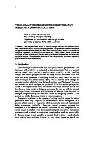
As the intended visual combination of the data generating process and the resulting data is application-specific, we examine in this section the characteristics of the simulation of biochemical reaction networks as discrete-event systems. More precisely, the simulation process used throughout this paper is an implementation of the Gillespie algorithm [5], a stochastic algorithm frequently used to simulate biochemical processes. In stochastic simulation, three process levels can be generally distinguished: the Model level, the Experiment level and the level of Multi-Run Simulation Data. An overview on the process levels and their interrelations is given in Figure 1.
Figure 1: Overview on process levels in stochastic simulation.
In the following, the process levels are described with respect to the characteristics of our application and the analysis goals related to them. This provides the foundation for the design of visualization concepts related to the process levels in later sections. 2.1
Model
In general, a simulation model consists of important components and their interrelations, which are application-dependent. We shortly discuss our application field of simulating biological reaction networks as discrete-event systems in order to identify the model components and their interrelations relevant for our work. Biochemical reaction networks describe the biological processes as reactions of chemical compounds. Regarding a network as a model, the model components are the chemical compounds, the reactions describe their interrelations. Each reaction can have several reactants and reaction products. One important feature of reaction networks are reverse reactions. The reactants of one reaction are the reaction products of the oppose reaction and vice versa. Discrete-event systems [1, 15] allow to model and simulate these biological reaction networks. In general, discrete-event systems consist of state variables, whose values define the system state. This system state is altered at discrete time steps by the occurrence of events, which happen randomly based on a stochastic distribution. The system states over time specify the system behavior. Describing a biochemical reaction network as a discrete-event system, the quantities of the chemical compounds are modeled as state variables, the reactions are modeled as events. The reaction
rates are mapped onto stochastic distributions to model the occurrence of events. Each event changes the values of the related state variables in the system according to the related reaction. Table 1 gives a short overview on the mapping of components and interrelations of biochemical reaction networks to discrete-event systems.
Reaction networks Discrete-event systems
Model components
Relations
Chemical compounds State variables
Reactions Event types
Table 1: Mapping of components and interrelations of biochemical reaction networks to discrete-event systems.
An analysis of a simulation system at the model level requires the presentation of the model structure, which includes the model components and their interrelations. This is very useful for the debugging process. The analyst can review whether the implemented model structure is correct or deviations between the intended and implemented model structure exist. However, presenting the model structure is not sufficient to analyze a simulation system at the model level. Additionally, the simulation data has to be linked to the model structure. This simulation data needs to be distinguished for experiments. Hence, the analysis at the model level does not only include the presentation of the model structure, but also its linking to the simulation data distinguished for the different experiments. 2.2 Experiment An experiment describes the specific settings of a model for which the simulation is performed. Hence, an experiment can be regarded as an instance of the model under certain conditions. In this work, we refer to these conditions as the experiment description. For our application, the description of an experiment is related to both the components and the interrelations of the model structure. Related to the model components, experiments of biochemical reaction networks are carried out for different initial concentrations of the chemical compound, which is equivalent to the initial states of the state variables. The experiment description for the interrelations of the model components is related to the reactions. Each reaction is characterized by a reaction rate. In the discrete-event system, the reaction rate is expressed as a stochastic distribution for the occurrence of events. The duration of the simulation, or the simulation time, completes the experiment description. The most important analysis goal related to the experiment level is to analyze the dependency between the experiment description and the multi-run simulation data of the experiment. In the debugging process, it has to be examined whether the simulation shows the behavior that is expected from the results of real-world experiments. Also, it is important to make statements about the behavior of the system, which can be transformed into predictions about the behavior of the real system. To analyze an experiment, the visual linking of experiment description and multi-run simulation data is very important. An additional linking with the model structure can provide further support for understanding the simulation process at the experiment level. 2.3 Multi-Run Simulation Data The simulation data is given by the system state over time, described by the values of state variables over time. In addition, the occurrences of events over time are of interest during debugging to examine whether the correct functionality has been implemented. As already shortly described, the simulation data of an experiment is not deterministic in our application field. Due to the stochastic distributions used to generate events, the simulation data is different every time the simulation is performed – although the
simulation data is derived from the same model and the same experiment description. To analyze the system behavior for an experiment, it is performed multiple times in order to analyze the possible simulation outputs. Only from the multitude of runs, conclusions about the likeliness of different outcomes can be made. Exactly these deviations in the simulation data among the runs of one experiment are the analysis subject on the level of multi-run simulation data. Hence, the simulation data from different runs has to be compared. This requires the analysis of temporal developments of state variables and the occurrences of events for different runs and the dependencies among them. 3
V ISUAL I NTEGRATION OF M ODEL , E XPERIMENT, M ULTI -R UN S IMULATION DATA
AND
Considering the three process levels of stochastic simulation as discussed in Section 2, we now focus on the second level, the visualization of one experiment. The important goals of a visualization are the correlation of the multi-run simulation data of one experiment to both the model structure and the experiment description. Therefore, we introduce in this section a compact view called Experiment View that integrates model structure, experiment description, and the multi-run simulation data of one experiment. The reason for starting with the visualization concept at the Experiment level is that it serves as a basic component on all three process levels and provides a connection between them. The visual concepts for the other two process levels are subject of Section 4. 3.1
General Visual Concept
The goal of the Experiment View is the visual integration of model structure and experiment description with the resulting multi-run simulation data. The model structure is a graph whose nodes are the model components. The edges are the interrelations of components. In our application, the state variables are the nodes and the event types are the edges of the graph. As the reaction networks executed in simulation are usually small and planar, a node-linklayout is a good choice for visualizing the model structure. It allows to represent the model structure in a very intuitive way. The experiment description and the multi-run simulation data of an experiment are linked to the nodes and edges of the model structure. The experiment description is given by the initial states of the state variables, which are the nodes in the model structure, and the reaction rates of event types, which are represented as edges. The multi-run simulation data consists of the temporal development of state variables and the occurrences of events over time for the different event types. To visualize the time-dependent data within the model structure, iconic representations are integrated in the model structure. The icons are placed at the positions of the corresponding nodes and edges. The node icons provide an overview of the state variable’s temporal development aggregated from multiple runs, including the initial state of the variables, by a time-value-plot. The edge icons are designed as stylized arrows to maintain the characteristic of directed edges. They show the reaction rate and the average number of events occurring in the experiments. The visualization concept of the Experiment View is shown in Figure 2. The three main components are the 2D-Layout, the icon nodes and the edge icons. They are now discussed in detail. 3.2
2D-Layout of Model Structure
Given the relatively small reaction networks, we make use of the standard force-directed algorithm [2] to generate the layout. The node-link layout of the model structure has to follow several characteristics of the model structure. One edge (reaction) can link multiple input nodes (reactants) and output nodes (reaction products). The direction of the edge is given by the reaction. But in addition, special reactions exist that do not fulfill the constraints of edges.
Figure 2: Experiment View. The multi-run simulation data and the experiment description are shown in icons that are positioned according to the 2D-layout of the model structure. The color scale for icons is shown left, the color scale for edges is shown at the bottom.
They are only linked to either input or output nodes. This aspect has to be considered in the design. To handle it, one additional node is added for every edge to compute the layout. The layout provides positions for the nodes and the edges of the model structure. Thus, the forces in the algorithm need to be chosen so that distances between nodes ensure enough space to place the node and edge icons. In addition, we allow to manually adjust the positions of the nodes and to store and load layouts with fixed positions of the components. 3.3
Node Icons
The data to be visualized by the node icon is the initial state of the associate variable and its temporal development in multiple runs. As the initial state is part of the time-series data, it will not be explicitly highlighted, but included in the multi-run data. The time-series data from multiple runs is too complex to be shown in the limited space of the icon. Hence, the data is downsampled to the most important information: the general development of the state variable over time. To this end, the runs are aggregated into one time series, which is then aggregated into fewer temporal intervals. Possible aggregation measures include mean and standard deviation, median, or the range of values. To avoid that data values get lost by the reduction of the temporal dimension and the aggregation of runs, the range of values is visualized by the icon. It communicates well the extent of deviation among the runs and provides a general impression whether the variable shows a consistent increase or decrease, or a rather inconsistent behavior throughout the runs. Our visualization concept for the node icons shows the multi-run data in a time-value-plot. Time is plotted on the x-axis, data minimum and maximum over time as positions on the y-axis. That way,
the analyst can easily identify whether the attribute values decrease or increase over time. This approach allows the analysis of the local values in every icon. However, the data cannot be compared among icons. To this end, the icon has to communicate the local value range in a global context. As this problem is a general challenge in visualization, we will discuss the subject in Section 3.5. Our solution is a segmented global color scale that is based on the local value ranges in the data. To make the data range in an icon visible at a first glance, the panel is colored according to the corresponding subrange of the global color scale. The area between minimum and maximum is filled with a color that can be clearly distinguished from the background. The design of the node icon is shown in Figure 3.
reverse reactions often are very heterogeneous. As the arrows of reactions with small reaction rates are mapped onto a very small length, the direction of the reaction rate, and also the reaction itself, can become invisible. Therefore, we exclude the arrowhead of a reaction from the mapping of the reaction rate. From the multi-run simulation data, the related data are the occurrences of the event over time in every run. To avoid an overload of information in the Experiment View, the occurrences of events are not visualized over time, although this information can reveal inconsistencies in the data. As a general overview on the eventrelated data, the edge icons encode the average number of events occurring in the runs of one experiment. Therefore, a segmented global color scale is used. The color of the class representing the number of occurrences is encoded in the arrow representing the event. To visually distinguish between the data ranges of nodes and edges, separate color scales are used. 3.5
Figure 3: Design of the node icon. The label allows to identify the model component. An overview on the multi-run simulation data is given by the value range over time. From the background color, the subrange of the global color scale can be identified (see Figure 2).
3.4 Edge Icons An edge icon is designed as a stylized arrow to indicate the direction of the edge. An important characteristic of reaction networks, which needs to be considered, are reactions that affect the same chemical compounds, but in opposite directions. Showing these reverse reactions as separate nodes in the structure will not instantly communicate the existence of reverse reactions in the model. Hence, an edge icon either includes a single reaction or two reverse reactions. The icon design as a stylized arrow allows an easy adaption to reverse reactions. Icons representing single-sided reactions have an arrow in one direction, icons representing reverse reactions have arrows in both directions. The links to nodes that represent the reactants and reaction products emanate from the ends of the arrows as shown in Figure 4. In addition, the orientation of the icon is adapted according to the average positions of input and output nodes.
(a) single-sided reaction
(b) two-sided reaction Figure 4: General design for the icons of event types. The size of the arrows excluding the arrowhead encodes the reaction rate, the color encodes the average number of event occurrences for multiple runs.
Beyond this model-related information, the icons should include the experiment description and the multi-run simulation data. From the experiment description, the reaction rates are linked to the events. To give an instant impression of the reaction rates included in an experiment, the reaction rate is encoded in the length of the arrow. The reaction rates within an experiment and even of two
Visual concept for the global comparison of value ranges
The global comparison of very heterogeneous local value ranges is a known challenge in visualization. We face this challenge when we want to globally compare the temporal developments of state variables. In this section, we motivate and explain the design concept of our global color scale, which is used to compare values in the node icons as described in Section 3.3. We use the approach by Tominski et al. [12] as a starting point for the design of the color scale. They propose to use a segmented color scale for the comparison of value ranges. For the unambiguous mapping of data to color segments, the possibly overlapping data ranges are transformed into non-overlapping, sequential intervals (compare to Figure 5, Step 1 and 2). Thus, data intervals are subdivided that share values with other data intervals. The basic idea of the approach is to map every sequential interval to one segment of the color scale. The global color scale is derived from sequentially combining partial color scales with distinct hues. Brightness and saturation are used to distinguish the intervals within one partial color scale. For the transition between two partial color scales, equal brightness and saturation are chosen for both intervals at the shared boundary. This encoding allows to map the value ranges onto the segments of the color scale, the value range is exactly matched to the attribute values. However, the approach has two main disadvantages for our application: • The subdivision of the global range to a very fine granularity means that every value range covers a unique range of color segments. Thereby, similar value ranges cannot be directly compared because they are not mapped to the same color segments. • The number of color segments is equal to the number of data intervals. This can result in a high number of color segments. The problem arises to derive a color scale with an equally high number of colors that are visually distinguishable. This problem is not solved by the authors of [12]. Therefore, we introduce a different approach to derive the color scale. The basic idea is to merge sequential data intervals into a predefined number of intervals. On the one hand, the aggregation of similar value ranges into one data interval results in a better comparison of similar values. On the other hand, the resulting intervals can be mapped to the segments of a predetermined, well-designed color scale. In our application, a sequential color scale is designed that shows the segments with similar brightness to avoid unintended accentuations in the data.
Figure 5 illustrates the steps of our approach: the gathering of sequential intervals from the value ranges, the merging of these intervals, and the mapping of the merged intervals to the segments of the color scale.
In addition to these considerations, the concept can be extended to account for empty parts of the global value range that do not contain data values. The idea is to maintain large empty intervals during the merging of intervals. It has the advantage that no segment from the color scale has to be mapped to an empty data interval. Hence, more and smaller segments are available for those parts of the global value range that actually include data. To consider empty intervals, an additional condition is introduced that applies if the first pair of intervals (Ii , Ii+1 ) in the list is empty: • (Ii , Ii+1 ) are merged if the enclosed value range is smaller than the value range of the next pair of non-empty intervals (I j , I j+1 ) in the list • (I j , I j+1 ) are merged otherwise The condition provides a compromise to maintain large empty intervals, but to merge small empty intervals with data intervals.
Figure 5: Steps to create the segmented color scale from the value ranges of the data. The possibly overlapping value ranges in the data (1) are split into sequential intervals (2). These intervals are merged until a predefined number of intervals remains (3), which can be mapped to the segments of the predefined color scale (4).
However, the suitability of this approach strongly depends on the appropriate merging of the data intervals (Step 3 in Figure 5). A solution for this problem is sketched in the following. The approach requires the desired number of intervals, which can be mapped to the segments of a color scale, and the sequential, non-overlapping data intervals. By sorting all border values of the value ranges in one list, the data intervals are given by two subsequent extrema in the list (compare to Step 2 in Figure 5). The goal of the approach is to distribute the amount of information included within one interval as uniformly as possible among the intervals. Characteristics for this amount of information are, on the one hand, the number of intervals that are mapped to one interval and, on the other hand, the value range enclosed by the interval. We use a step-wise bottom-up approach to merge the intervals until the number of intervals remains that matches the number of color segments in the predefined color scale. In every step, two neighboring data intervals Ii and Ii+1 are merged into a new interval, based on the number of intervals aggregated into Ii and Ii+1 in preceding steps and the value range enclosed by Ii and Ii+1 . To select the pair of neighboring intervals Ii and Ii+1 that are merged in one step, a list of the interval pairs is used. In every step, the interval pairs are sorted in the list by the preferred order to merge the intervals. Then, the first pair of the list is merged. The list is sorted according to the following rules. 1. sort all interval pairs (Ii , Ii+1 ) by the enclosed value range if the value range is smaller than a given threshold sizemin 2. sort all other pairs of intervals (Ii , Ii+1 ) by the number of aggregated intervals and, as the second criterion, by the enclosed value range All sorting operations are performed in ascending order. The constant value sizemin serves as a threshold to aggregate very small value ranges regardless of the number of merged intervals. Although the algorithm also works without considering the first rule, its usage allows a better adaptation of the resulting intervals to the visualization. In our visualization concept for node icons, the exact data values within a data interval are encoded by position. Thus, the value sizemin can be chosen so that a minimum difference between data values (in our case 1, because only integer values are present) corresponds to one pixel in the display. Using this approach avoids to apply an unnecessarily large amount of display space for a very small value range.
4
C OORDINATED MENT V IEW
V ISUALIZATION BASED
ON THE
E XPERI -
In this section, we discuss how the Experiment View can be used to analyze the simulation data at the two other process levels, namely the analysis of one model and the analysis of the multi-run simulation data of one experiment. For the analysis of data at the model level, the numerous experiments from one model need to be compared. Therefore, we present an image-based comparison of experiments by coordinating multiple Experiment Views in Section 4.1. Besides the visual coordination, the exploration of experiments is supported by a coordinated fish eye and an automated selection based on the similarity of experiment descriptions. Second, the Experiment View serves as a starting point for a detailed analysis of the multi-run data, consisting of multivariate time-series. To this end, we coordinate appropriate information visualization techniques with the Experiment View, which is the focus of Section 4.2. 4.1 Comparison of Experiments This section focuses on the visualization for the analysis at the model level, which was described in Section 2.1. From the analysis goals, the visualization has to include the model structure as well as the multiple experiments performed for one model. To compare the experiments, deviations among them have to be explored. These deviations arise from the experiment descriptions and the multi-run simulation data of one experiment, which depend on each other. The Experiment View introduced in Section 3 has been designed to support the analysis of one experiment. We extend the concept to the comparison of multiple experiments. Due to the complexity of the experiment description and multi-run simulation data, we propose an image-level comparison. The concept basically includes one Experiment View for every experiment. Reusing the Experiment View designed for the experiment level on the next higher process level has a main advantage: the visual connection between the two process levels is provided. The Experiment Views are visually coordinated with each other. As the model structure is identical for all experiments, the node and edge icons are placed at identical positions in the Experiment Views. Deviations among the views indicate deviations in the experiment description and the simulation data (see Figure 6). However, the visualization of multiple Experiment Views results in a limited screen space available for each Experiment View. Very small sizes for node and edge icons hamper the analysis of the experiment description and multi-run simulation data. Thus, a global comparison of the experiments cannot be performed with this design. Additional concepts are required for the comparison of multiple experiments. Therefore, we follow the idea of local comparisons of nodes and edges among the experiments. The general concept has the following steps:
Figure 6: Visualization design for the comparison of experiments. For every experiment, one Experiment View is shown. The screen shot includes the object-based distortion based on a region of interest.
1. The user interactively selects a point of interest (a node or an edge) from the model structure of one experiment 2. For the comparison, a region of interest is defined, which is based on the point of interest and the analysis goal. The region of interest can consist of multiple edges and nodes from different experiments. 3. The visualization is adapted to provide the comparison of the selected components. In the remainder of the section, we describe how the step of defining the region of interest as well as the adaptation of the visualization can be performed automatically for the main analysis goals. First, the general comparison of a node or an edge among the experiments is supported, including its dependencies on related nodes and edges in the model structure. To this end, the structural proximity is considered to derive the region of interest. The visual concepts to achieve this analysis goal are discussed in Section 4.1.1. Second, to support the exploration of dependencies among experiment descriptions and multi-run simulation data, concepts to compare experiment descriptions are the subject of Section 4.1.2. To avoid that additional views have to be displayed within the already limited screen space, the visualization concepts described in the following are integrated within the Experiment Views. 4.1.1
Local Comparison Based on Structural Proximity
For the comparison of nodes and edges among experiments, it is important to communicate the structural dependencies of the selected point of interest. To this end, the region of interest is defined by two relations: For a selected node or edge as the point of interest, all equal nodes or edges from the other experiments are included in the region of interest. In addition, components of the model structure that are linked to the point of interest are also added to the region of interest. These relations can be considered as the structural proximity of model components.
The automated selection of the region of interest can be performed for a point of interest and a structural distance, which can be user-defined. The measure is defined at a granularity that allows to distinguish between nodes and edges. For the minimum structural distance 0, only the point of interest and equal components in other Experiments Views are selected. Given a node as the point of interest, a structural distance of 1 adds all edges linked with the node to the region of interest. A greater structural distance would also add nodes that are linked to the point of interest by edges. However, the structural distance should be kept small. Otherwise, a large part of the model structure would be included in the region of interest. The goal of the visualization is to provide a magnification of the selected nodes and edges, in order to enable the comparison of the information carried by the icons. Due to the limited screen space available, the magnification is included within the Experiment View. As the 2D-layout of the model structure (Section 3.2) arranges the model structure based on the structural proximity of model components, a fish eye distortion [4] can be applied to magnify the regions of interest. It allows to magnify the selected components by reducing the visualization space for non-selected components. At the same time, context information is maintained as the non-selected parts are still shown in the visualization. The same fish eye distortion is applied to all Experiment Views. Hence, we use a coordinated fish eye, which highlights the same parts of the model structure in all experiments. This is consistent with our general approach to provide the same layout in all experiments. The implementation of the fish eye is driven by the characteristics of the visualized data. As the information to be analyzed is carried by the icons, it is important to magnify them without distorting them. Also, the structural dependencies among the magnified icons have to be maintained. To comply with these requirements related to the objects in the display, we make use of an object-based approach described in [11]. The region of interest is uniformly magnified, while the remaining parts of the display are reduced in size and distorted. In Figure 6, an example of the local distortion applied to all experiments can be seen. The changes in the layout induced by the interactive selection are communicated by animations. This enables the analyst to maintain the overview on structural relations in the data when comparing the experiments. 4.1.2
Local Comparison Based on Similarity
To support the exploration of dependencies among the experiment descriptions and the multi-run simulation data, this section introduces methods to support the comparison of experiments based on the similarity of experiment descriptions. To this end, the region of interest includes similar experiment descriptions in other experiments. Following the approach of a local comparison, the comparison of experiment descriptions is based on the individual nodes and edges. The experiment description associated to a node includes the initial states of the variable, edges include the reaction rate. Thus, each node and each edge contain a single value of the experiment description. The similarity measure to compare the experiment descriptions is thus based on a single value, given by the point of interest. All experiments are considered as similar whose corresponding part of the experiment description lies within a certain range around the basic value. The range can be interactively set by the user as the deviation from the basic value in both directions. The similarities are visually communicated by highlighting the region of interest, which includes the point of interest and the equal model components in other experiments with similar experiment descriptions. To enable the comparison of experiments for more than one part of the experiment description, the option of a permanent highlighting is provided. The components of the experiment
description can be consecutively compared, as previously found dependencies of interest are retained. Thus, the analyst has the ability to compare experiments based on similarities in the experiment descriptions, which are derived from a combination of different parts of the experiment description. 4.2 Detailed Exploration of one Simulation Experiment To perform a deeper analysis of the multi-run simulation data from one experiment, visualization concepts are needed that provide a detailed visualization of this data. This corresponds to the third process level, which aims at analyzing the multi-run simulation data in detail (see Section 2.3). The multi-run simulation data consists of time-series data for multiple runs, for each state variable and each event type. Due to this complexity, the whole data cannot be adequately visualized at once. The selection of parts of the data is necessary, which are then visualized in detail. For the required combination of overview and detail, we make use of a multiple-view concept. Similar to the visualization concept at the model level, the Experiment View provides an overview on the experiment and the visual linkage between the consecutive process levels. It is further used to select model components whose data can be examined in detail in other views. The analysis goals from Section 2.3 include the evaluation of single runs. From the aggregated multi-run data in the Experiment View, runs cannot be selected. Thus, the functionality for the selection of runs has to be integrated in a separate view. To analyze the data of one run, data connected to nodes and edges has to be distinguished. Therefore, we design three detail views that complement the overview with the following general analysis goals: • Multi-Run View Selection of one run of the experiment. • Node View For the selected run, analysis of the time-dependent simulation data related to nodes • Edge View For the selected run, analysis of the time-dependent simulation data related to edges In all views, the analysis of data over time is important. Hence, we use a time-value-plot as the basic component [14]. One plot is shown for every time-series in the view. The Multi-Run View provides the functionality to select one run for detailed analysis. The selection is based on the comparison of all runs. To this end, we include the time-series of every run for one node or edge, which is selected in the Experiment View. The visual design of the time-value-plots follows the design of the plots in the Node View and Edge View. The Node View visualizes the temporal development of the single-run data related to one or multiple nodes. The run is selected in the Multi-Run View, the nodes in the Experiment View. To provide a visual linking of the time-series data with the nodes in the Experiment View, the global color scale of node icons in the Experiment View is used. The Edge View generally visualizes the number of event occurrences over time for a single run. Analog to the Node View, the run is given from the Multi-Run View and the edges from the Experiment View. The color scale of the edge icons in the Experiment View is reused to visualize the data in the Edge View. To visually link the views, selected components are highlighted in the Experiment View and the Multi-Run View. In the Experiment View, these are the nodes and edges analyzed in detail in the Node View and the Edge View. In Figure 7, the selected components in the Experiment View are highlighted by adding a shadow to the
icons. Additionally, the icon shown in the Multi-Run View needs to be highlighted differently. Therefore, the borders of the selected icon are drawn in a different color. The selection of an icon for the Multiple-Run View and the selection of icons for the Icon and Node Views is performed with different mouse buttons. Further interaction methods include the interactive adjustment of the time scale, which is global for all views related to one experiment, and the data range, which is specific for each of the three detail views. For these detail views, several arrangements of the time-value-plots are provided, which can be interactively chosen. The plots can be overlaid or placed beside each other, either horizontally or vertically. Also, the plots can be placed behind each other with an offset among the views to extend the visualization to 3D. 5
C ONCLUSION
AND
F UTURE W ORK
This work aimed at providing visual support for the understanding of simulation processes. The central requirement is the visual combination of the data generating process and the generated data. In close cooperation with application experts, the visualization was designed based on the underlying process and data characteristics as well as the needs of the users. The presented visualization concepts are tailored to the three process levels in stochastic simulation: model, experiment, and multirun simulation data. Using the process-level approach, a broad range of analysis goals is covered by our visualization, ranging from the comparison of experiments at the model level to detailed analysis of single time-series. The visual linking of the process levels is achieved by using a basic view at all process levels. This basic view provides a compact combination of model structure, experiment description, and multi-run simulation data from one experiment. While the view covers the experiment level, the visualization concepts at the two other process levels integrate this view into multiple-view concepts. At the model level, an image-based comparison of experiments is proposed in combination with interaction techniques to explore deviations among experiments locally. For the detailed exploration of one experiment, which is the main analysis goal at the level of multi-run simulation data, the visualization is based on the combination of overview and detail. The basic experiment view gives an overview, which is coordinated with detail views based on time-plots. The introduced visual concepts at the three process levels have been implemented in a prototypic tool. First applications of our tool to the field of simulation indicate that our visual concepts provide significant support for the analysis of the addressed processes. As future work, we will extend our approach especially at the third process level of detailed analysis of multi-run simulation data. To support the comparison of deviations among multiple runs, functionality will be added to analyze subsets of runs, which are derived by similarities in the data. In this regard, methods to interactively derive and compare subsets of interest have already been addressed in previous work [13]. Also, we have carried out first investigations to perform an automated derivation of subsets. The most important matter here is the thorough choice of appropriate similarity measures, which depends on the application context and the current analysis goal. Our future research will steer in this direction in order to include appropriate functionality for multi-run analysis into our visualization. In addition, we will extend the applicability of our concepts to other simulation processes. Although the proposed visualization concepts have been tailored to one specific simulation process, the generic approach of subdividing the simulation processes into separate levels is suitable for deriving visualizations for other simulation processes as well. Considering our visualization concepts, mainly the compact view of an experiment needs to be adapted. To this
Figure 7: Visualization design for the detailed exploration of one experiment. The Experiment View (top left) is coordinated with the Multi-Run View (top right) for the selection of one run from all runs, the Node View (bottom left) for the detailed analysis of single-run data linked to nodes, and the Edge View (bottom right) that shows the single-run data connected to edges. The data of the icons highlighted by a shadow are shown in the Node and Edge Views. The icon highlighted by green borders is the node shown in the Multi-Run View.
end, a suitable layout of the underlying simulation model needs to be found that allows to visually attach the experiment description and the simulation data to the corresponding parts of the model. Given this adaptation, our concepts for comparing multiple experiments or analyzing a single experiment in detail can be generally reused for other applications. ACKNOWLEDGEMENTS The authors wish to thank Steffen Hadlak for his implementation work. This work is supported by the DFG graduate school dIEM oSiRiS. R EFERENCES [1] J. Banks, I. John S. Carson, B. L. Nelson, and D. M. Nichol. DiscreteEvent system simulation. Prentice Hall, 2001. [2] G. D. Battista, P. Eades, R. Tamassia, and I. G. Tollis. Graph Drawing - Algorithms for the Visualization of Graphs. Prentice Hall, 1999. [3] F. T. Bergmann and H. M. Sauro. SBW - a modular framework for systems biology. In WSC ’06: Proceedings of the 37th conference on Winter simulation, pages 1637–1645. Winter Simulation Conference, 2006. Keck Graduate Institute, Claremont. [4] G. W. Furnas. Generalized fisheye views. In CHI ’86: Proceedings of the SIGCHI conference on Human factors in computing systems, pages 16–23, New York, NY, USA, 1986. ACM. [5] D. T. Gillespie. Exact stochastic simulation of coupled chemical reactions. The Journal of Physical Chemistry, 81(25):2340–2361, 1977.
[6] K. Matkovic, M. Jelovic, J. Juric, Z. Konyha, and D. Gracanin. Interactive visual analysis and exploration of injection systems simulations. Visualization, 2005. VIS 05. IEEE, pages 391–398, Oct. 2005. [7] N. L. Novre, S. Moodie, A. Sorokin, M. Hucka, F. Schreiber, E. Demir, H. Mi, Y. Matsuoka, K. Wegner, and H. Kitano. Systems biology graphical notation: Process diagram level 1. available at sbgn.org, 2008. [8] U. Rost and U. Kummer. Visualisation of biochemical network simulations with SimWiz. Systems Biology, IEE Proceedings, 1(1):184– 189, June 2004. [9] P. Saraiya, C. North, and K. Duca. Visualizing biological pathways: requirements analysis, systems evaluation and research agenda. volume 4, pages 191–205. Palgrave Macmillan, 2005. [10] H.-J. Schulz, M. John, A. Unger, and H. Schumann. Visual analysis of bipartite biological networks. In Proceedings of the Eurographics Workshop on Visual Computing for Biomedicine, 2008. [11] T. Strothotte and S. Schlechtweg. Non-Photorealistic Computer Graphics. Margan Kaufman, 2002. [12] C. Tominski, G. Fuchs, and H. Schumann. Task-driven color coding. Information Visualisation, 2008. IV ’08. 12th International Conference, pages 373–380, July 2008. [13] A. Unger, P. Muigg, H. Doleisch, and H. Schumann. Visualizing statistical properties of smoothly brushed data subsets. IEEE Information Visualisation, 2008. IV ’08. 12th International Conference, pages 233–239, July 2008. [14] L. Wilkinson. The Grammar of Graphics. Springer, 2005. [15] A. Zimmermann. Stochastic Discrete Event Systems - Modeling, Evaluation, Applications. Springer, 2008.