Visualization of Geographic Query Results for Small Screen Devices Maria Beatriz Carmo, Ana Paula Afonso, Paulo Pombinho de Matos Faculdade de Ciências da Universidade de Lisboa, Departamento de Informática Campo Grande 1749-016 LISBOA, Portugal
{bc, apa}@di.fc.ul.pt,
[email protected] ABSTRACT The visualization of geo-referenced information on a map has become an essential method to help the users to get the intended information. The adaptation of visualization techniques for mobile devices, such as, PDA and mobile phones make this type of applications ubiquitous. However, the context of mobility and the limitations of mobile devices, such as, the small screen, suggest that some visualization techniques may not be appropriate for those devices. In this work we intend to integrate filtering mechanisms, based on semantic criteria, and to use multiple representations with different levels of detail to generate intelligible representations as a result of geographic queries in mobile environments. Categories and Subject Descriptors H.3.3 [Information Storage and Retrieval]: Information Search and Retrieval – Information filtering, query formulation. H.5.2 [Information Interfaces and Interfaces – graphical user interfaces.
Presentation]:
User
General Terms Design, Experimentation. Keywords Information visualization, geo-referenced data, filtering mechanisms.
Therefore, it is fundamental to employ efficient visualization mechanisms that guarantee a straightforward and understandable access to relevant information. An approach to successfully visualize spatial information and the related non-visual information is, thus, an important research topic [1]. There are already several geo-referenced visualization tools for mobile devices, such as TomTom Navigator System [11] and Google Maps Mobile [5]. However, these systems present some limitations. Systems like TomTom are excessively focused on the navigation task and, consequently, do not usually offer the best graphic quality, presenting maps with an excess of information and difficult to read. The last problem also occurs with Google Maps Mobile as it may produce cluttered images when a lot of results are displayed. The objective of this work is to analyse the problems of georeferenced information visualization through mobile devices and to present some proposals and solutions focused on filtering mechanisms, extending our previous work on geo-referenced visualization for desktop computers [2]. This paper is organized as follows: section 2 describes ongoing work; section 3 outlines the defined prototype and finally, section 4 presents some conclusions and future work.
2. VISUALIZATION ISSUES
Even if the display technology can deliver high resolutions, the available screen space will remain unchanged given that the device itself has the requirement of being small. Consequently, the device limitations and the mobility context impose severe usability and visualization problems.
Our goal is to visualize, with icons superimposed on a map, georeferenced information organized in several categories with several attributes (e.g., category hotel can have various attributes like stars of the hotel, parking conditions and room information). To achieve intelligible images we have to take into account filtering mechanisms that reduce the amount of displayed objects and adequate representations for the objects. A degree of interest function [4] is used to quantify the relevance of each object. If a threshold is defined, only the objects with degree of interest value over that threshold are displayed. This means that less relevant objects can be omitted. However, if the objects are not uniformly distributed over the screen, we can still have a cluttered image. This can be reduced using aggregation (this technique is referred in cartographic literature as a generalization operator [3]). Multiple representations must be defined with different levels of detail either to reflect aggregation or user’s degree of interest. Several approaches have been used to express objects’ relevance: a vertical bar attached to the symbol whose height represents how much that object satisfies the user’s query [1], symbols with different opacity levels [10] or with different complexity levels [2].
Copyright is held by the author/owner(s). GIR’07, November 9, 2007, Lisbon, Portugal. ACM 978-1-59593-828-2/07/0011.
Some authors have studied icons layout over a map avoiding the overlapping of cartographical objects [7], [3]. Our concern is with icons overlapping, when a large number of objects are retrieved.
1. INTRODUCTION Information visualization is a well-established discipline that proposes graphical approaches to help users to better understand and make sense of large collections of information. These mechanisms have been applied to the fields of geographical information retrieval in an attempt to solve search and access of information problems in large screen displays. The adaptation of theses techniques to small screen devices offers new prospects in domains where geographic data have an important role, such as cartography, tourism, natural resources management and emergency management. These devices allow the user to access geo-referenced information in real time, anywhere and anytime, in a dynamic and flexible way [1].
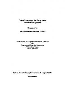
MetaCarta system [8] solves this problem with aggregation. An aggregation symbol is used when several objects are associated with the same coordinates. We intend to extend this concept using several aggregation symbols. Choosing the adequate symbols to convey the available information to the user is a major challenge. For instance, in [9] symbols are adapted according to user’s current activity, language, age group and time of year/day. To design adequate symbols to be adopted in small displays we have to take into account both their dimension and their semantic. With respect to the dimension of the symbols, they must be large enough to allow interactive selection to get details on demand, but not so big that they hide the underlying map. In the semantic point of view, we have to consider different levels of detail conveying different meanings: to identify a category, to express the object’s degree of interest and to represent aggregations either with all objects of the same category or with objects of different categories. The aggregation symbol must also express if it includes at least one object with the higher level of interest. For instance, adding a marker, such as ‘+’, to the aggregation symbol. Some examples of symbols are shown in Figure 1. To represent an aggregation with objects of different categories we intend to design a symbol consisting of small symbols. That is, the square area of the symbol is tiled with four reduced symbols. If the aggregation includes objects from more than four categories, only the small symbols corresponding to the four categories with more objects will be displayed. To decide whether to aggregate objects, it is not enough to count the total number of objects to display, because they may not be evenly distributed on the visualization area. A wiser approach is to superimpose a regular grid on the visualization area as it is proposed in [12]. However, the grid is attached to screen coordinates leading to visual discontinuity in pan operations. This occurs because the number of objects in each cell of the grid varies as the displayed area is changing. To avoid this problem in each zoom operation we associate the regular grid with the visible area in user’s coordinates. So when a pan operation is executed, the grid moves together with the visualized area.
obtained through an embedded GPS device. The client application will use this information and will communicate with the Google Maps [6] web server to retrieve the map images for the desired locations and magnification levels. The client application will additionally retrieve data about the points of interest for the given location from an SQL Server. The coordinates of each of these points of interest will then be used to process the image to be displayed to the user. The architecture of the prototype was rather limited due to the difficulties that exist when developing for a mobile device. For example, the use of JavaScript map servers was not possible, since we did not find browsers fully supporting this scripting language.
4. CONCLUSIONS AND FUTURE WORK This paper presents an ongoing work that aims to visualize georeferenced information organised by categories for small mobile devices. The main goal is to create intelligible representations controlling the number of objects displayed using filtering mechanisms, like the degree of interest function, and aggregations. This function will be extended to express more complex queries based on several categories and attributes. Moreover, an interface must be developed to enable the user to personalize his preferences. Usability tests should be done to evaluate visualization effectiveness.
5. REFERENCES [1] S. Burigat, L. Chittaro. Geographic Data Visualization on Mobile Devices for User’s Navigation and Decision Support Activities. Spatial Data on the Web – Modelling and Management, Springer, 2007. (in press) [2] M. B. Carmo, S. Freitas, A. P. Afonso and A. P. Cláudio. Filtering Mechanisms for the Visualization of GeoReferenced Information. GIR’05, pp. 1-4, 2005. [3] A. Edwardes, D. Burghardt et al. Portrayal and Generalisation of Point Maps for Mobile Information Services. Mapbased Mobile Services – Theories, Methods and Implementations. Springer-Verlag, pp 11-30, 2005. [4] G. Furnas. Generalized Fisheye Views. ACM CHI’86, pp.1623, 1986. [5] < http://www.google.com/gmm > [6] < http://maps.google.com > [7] L. Harrie, H. Stigmar et al. An Algorithm for Icon Labelling on a Real-Time Map. Developments in Spatial Data Handling, Proceedings 11th International Symposium on Spatial Data Handling. Springer, pp. 493-507, 2004. [8] < http://www.metacarta.com >
(a) (b) (c) Figure 1 – Visualization of points of interest with: (a) aggregation symbol (b) individual symbols after zooming in (c) symbols with higher level of detail
3. PROTOTYPE A prototype is being developed for the Pocket PC, with the Windows Mobile 5.0 operating system and using the .Net Compact Framework 2.0. Zoom and pan operations are already implemented. The current position of the user is automatically
[9] Nivala, A.-M. and L.T. Sarjakoski. User Aspects of Adaptive Visualisation for Mobile Maps. Cartography and Geographic Information Science, Special Issue on Ubiquitous Mapping, 2007. (in press) [10] T. Reichenbacher. Mobile Cartography – Adaptative Visualization of Geographic Information on Mobile Devices.PhD Thesis, In Verlag Dr. Hut, München, 2004. [11] < http://www.tomtom.com > [12] A. Woodruff, J. Landay, M. Stonebraker. Constant density visualizations of non-uniform distributions of data. ACM UIST´98, pp. 19-28, 1998.