Facebook, MySpace, Twitter, Flickr, mailing lists, and Usenet (to name only a ... Although each automated graph layout algorithm attempts to produce an ...
Improving Graph Drawing Readability by Incorporating Readability Metrics: A Software Tool for Network Analysts Cody Dunne and Ben Shneiderman
A BSTRACT Designing graph drawings that effectively communicate the underlying network is challenging as for every network there are many potential unintelligible or even misleading drawings. Automated graph layout algorithms have helped, but frequently generate ineffective drawings. In order to build awareness of effective graph drawing strategies, we detail readability metrics on a [0,1] continuous scale for node occlusion, edge crossing, edge crossing angle, and edge tunneling and summarize many more. Additionally, we define new node & edge readability metrics to provide more localized identification of where improvement is needed. These are implemented in SocialAction, a tool for social network analysis, in order to direct users towards poor areas of the drawing and provide real-time readability metric feedback as users manipulate it. These contributions are aimed at heightening the awareness of network analysts that the images they share or publish could be of higher quality, so that readers could extract relevant information. Keywords: Readability metrics, aesthetic, graph drawing, social network analysis, information visualization. 1 I NTRODUCTION Graphs have long been common data structures in Computer Science, but have only recently exploded into popular culture with publishers like the New York Times now frequently including elaborate and interesting graphs with their articles. Online communities like Facebook, MySpace, Twitter, Flickr, mailing lists, and Usenet (to name only a handful) enjoyed enormous growth over the last few years and provide incredibly rich datasets of interpersonal relationships, which social scientists are now fervently exploring. Conventional visualization tools like bar and pie charts are often inadequate when faced with these varied and oftentimes immense datasets. www.visualcomplexity.com provides many beautiful alternative visualizations for these data, but one enduring visualization in particular models relationships using a node-edge diagram, where nodes in the graph represent actors in a community and the edges indicate relationships between individual actors [7]. This graph is called a social network and the resulting graph drawing is called a sociogram [34]. Sociograms have only recently been established as tools for network analysis, but have already been put to great effect. [13, 54] successfully used sociograms to detect common social roles in online discussion newsgroups such as answer person and discussion person, and [1] applied sociograms to the study of relationships between political blogs during the 2004 U.S. Presidential Election, showing the division between liberal and conservative communities as well as their internal interactions. There is a huge array of possible sociograms for any given social network, many of which can be misleading or incomprehensible. Drawings of relational structures like social networks are only useful to the degree they “effectively convey information to the people that use them” [6]. What’s more, there is no “best” layout for a social network as different layouts can highlight different features of
the network being studied [7]. In fact, the spatial layout of nodes in the sociogram can have a profound impact on the detection of communities in the network and the perceived importance of individual actors [32]. Hence, significant thought must be given to properly drawing graphs so that network analysts will be able to understand and effectively communicate data like clusters in the network, the bridges between them, and the importance of individual actors. As manual layout of nodes in the sociogram is incredibly time consuming to do well, a lot of effort has been put into developing automated graph layout algorithms. There are many that can be used for sociograms, including variants of the spring embedder [11] such as the popular Fruchterman-Reingold force-directed algorithm [15] and more scalable gravitational N-Body approaches such as [2]. The results of applying these algorithms can vary greatly depending on the size and topology of the network, and the layouts they generate are dependent on the algorithm used. Each attempts to find an optimal layout of the graph, often according to a set of readability metrics, which are measures of how understandable the graph drawing is, such as the number of edge crossings or occluded nodes in the drawing. While optimizing readability metrics, or RMs, does not guarantee the resulting drawing is understandable, it has been shown to promote many common analysis tasks. Traditionally these RMs have been called aesthetic criteria. We choose to call them readability metrics instead because of the ambiguity implied by the word “aesthetic”. We are not concerned as much with how visually pleasing a particular graph drawing is; instead we are interested in how well it communicates the underlying data. However, many graph drawing algorithms create visually appealing visualizations, and some of the most informative visualizations are also the most beautiful. Although each automated graph layout algorithm attempts to produce an understandable graph, the particular RMs it optimizes intentionally or indirectly may not be the correct ones for what the users are trying to demonstrate. Additionally, as the optimization of many RMs is NP-hard [6], these techniques often produce suboptimal graph drawings. The International Symposium on Graph Drawing has met annually for 16 years working to improve automated graph layout algorithms and RMs, among other things, but we believe that state of the art automated layout algorithms alone are insufficient to consistently produce understandable graph drawings. Instead of focusing on a purely automated graph layout, we propose raising user awareness of the importance of RMs for their graph drawings and providing users with computer-assisted layout manipulation tools. Taking up where the automated layout leaves off, these tools would give users real-time feedback as to how their movement of nodes affect the RMs and potentially even provide local placement suggestions for the RMs users wish to optimize. This functionality could take a form similar to the “snap-to-grid” feature of many modern graphics applications, optionally pulling the dragged nodes to local maxima. We believe that this approach will provide users, and network analysts in particular, tools and guidelines that will allow them to create more understandable graph drawings that more accurately highlight features like communities within social networks. We do not yet have a complete set of requirements for highly readable graph drawings, but we believe that many currently pub-
lished graphs could be substantially improved with a few modest refinements. While no set of requirements can fully capture all effective graph drawings, we believe that applying RMs will improve most graph authors’ output. A simple interim set of guidelines for editors and network analysts might be to aspire to these four principles that we playfully call NetViz Nirvana: 1. Every node is visible 2. For every node you can count its degree 3. For every edge you can follow it from source to destination 4. Clusters and outliers are identifiable This name NetViz Nirvana is meant to be in harmony with and complement the widely cited principles in the InformationVisualization Mantra: overview first, zoom and filter, then detailson-demand [46]. These principles will need refinement to deal with large graphs where node aggregation, edge bundles, and cluster markers may be necessary to allow users to make scalable comparisons. The remainder of this paper delves into the creation of RMs for graph drawings and a software tool for network analysts that incorporate the idea of communication-minded visualization: “visualization designed to support communication and collaborative analysis” [51]. Four RMs are outlined in detail in §2, along with an overview of additional ones. We then in §3 describe the integration of our RM framework into SocialAction, a tool that allows ranking by the attributes of nodes and edges and provides multiple coordinated views to help users systematically explore various statistical measures for social network analysis [36, 38, 37]. We leave the implementation of the “snap-to-grid” feature as future work (§4). 2
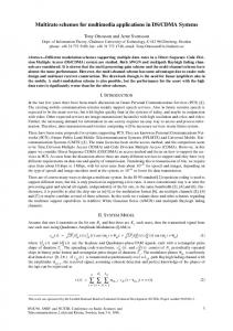
(a) Tight layout
(b) Relaxed layout
Figure 1: We can eliminate the node occlusion that makes the center cluster in 1a so hard to understand by zooming out and reducing the the spring lengths of our layout algorithm 1b.
(a) Random layout
(b) After reducing edge(c) After eliminating crossings edge crossings
R EADABILITY M ETRICS
There is a substantial body of work aimed at developing and, more recently, empirically verifying the correctness of a wide variety of RMs. Excellent overviews of RMs for general graphs can be found in [48, 6, 52, 5, 4], and RMs specific for trees and UML diagrams are in [55] and [12], respectively. The first standard and numerical definitions of many specific RMs were given in [45] and were elaborated on by [41], which presents seven specific RM formulae. These will form the basis for many of our RMs. Previous work in this area primarily deals with RMs for the entire graph drawing, giving, for example, a count of the total number of edge crossings. We will call such RMs global readability metrics, or global RMs. These serve as excellent measures for how understandable the whole graph drawing is, but do not provide the level of specificity we need to direct users to problem areas. Moreover, the computational requirements of some global RMs limit their usefulness for providing real-time feedback. Additionally, we would like to integrate our RM framework into SocialAction’s attribute ranking system, so users can intuitively move between rankings of statistical measures and those for RMs (§3). To do so, we can provide additional attributes for both nodes and edges in the network that describe how these individual components affect the global understanding. We will call these node readability metrics and edge readability metrics, or node RMs and edge RMs for short. This is an extension of the idea of individual node and edge metrics espoused in [16]. Defining RMs for individual clusters or regions would also be helpful, especially for examining large graphs, but we leave this as future work. As per [41], each of our RMs are scaled appropriately to a continuous scale from [0,1] where 1 indicates the positive maximum of the RM. This allows us to assign graph readability requirements to particular drawings based on the content and information we want the impart. For example, a journal may recommend 0% node occlusion,