Making a Case for HCI: Exploring Benefits of Visualization for Case Studies ... textbooks in teaching HCIâ Rosson and Carroll created a website to present ...
Making a Case for HCI: Exploring Benefits of Visualization for Case Studies
Brandon Berry, Laurian Hobby, D. Scott McCrickard, Chris North, and Manuel A. Pérez-Quiñones Center for Human Computer Interaction and Department of Computer Science Virginia Polytechnic Institute and State University (Virginia Tech) Blacksburg, VA 24061-0106 1-540-231-7409 {brberry,lhobby,mccricks,north,perez}@cs.vt.edu
Abstract: While the use of case-based methods for computer science and human-computer interaction instruction have shown great promise in encouraging active learning of real-world topics, questions remain as to the best way to encourage exploration by students of the breadth of knowledge that cases can provide. This paper investigates the benefits that are gained from using cases in an active learning situation, exploiting the benefits in a visualization tool to enable reliable and in-depth understanding of the case. An experiment comparing performance using a standard case browser and using our augmented visual browser demonstrates the promise of visual techniques in completing complex comparative tasks.
Introduction The discipline of human-computer interaction (HCI) drives the development of usable software systems by encouraging a humans-first approach to design. However, teaching students to understand and appreciate the many complexities of the design process is difficult. Case studies capture the intricacies of design in a complete package, detailing all decisions made throughout the design process for the benefit of future developers (and students!). However, modern constructivist views of education suggest that case studies on their own do not help students to learn—by themselves they are just collections of information, difficult for students to assimilate without some meaningful activity associated with them. It is the activities that students undertake with the cases that facilitate learning, and it is the interface through which they access the cases that assists them with their activities. It is the nature of this interface that is the focus of our work. This paper compares and contrasts two visualizations of case studies to investigate visualization principles in terms learnability. Specifically, this work examines other ways in which teaching with case studies has been effective, taking into consideration the types of activities they undertake with the cases. We examine an existing repository of cases for HCI, the Usability Case Studies (UCS) library (available at http://uc.ist.psu.edu/), to see how effectively it supports learning tasks. We describe our own augmentation of the UCS library, based on established visualization principles to enable reliable and in-depth understanding of the case, and we present an experiment that compares performance at typical case-related tasks for the two systems. Based on our analysis, we make suggestions for how a case tool should be designed and used for classroom instruction. Teaching with Cases Cases in general are “evocative narrative descriptions of a specific real-world activity, event or problem.” (Carroll & Rosson 2005). As examples of real-world events and activities, they are suitable for students learning about related processes. In other words, “they provide models of practice to students and other novice practitioners.” (Carroll & Rosson 2005). Harvard Business School (Harvard Business School 2005) classes are based around their own model of case studies, which provides a narrative description of a real-life business situation. Students study over 500 cases, analyzing what happened and focusing on what effects alternative decisions would have. Broadly, there are five different types of Case Studies that can be explored: Identification, Problem-solving, Practice, Application, and Serial (Barbazette 2004). Similarly, cases are used in many other domains, including medical and law schools.
Cases have a history of use in computer science, notably in interface design. Wixon (Wixon 2003) proposes that cases be used to establish a collection of design knowledge to extract real and valid design rationale that reflects the decisions that designers made. Such cases could allow students to explore the resources used and decisions made during the described process, leading to informed decisions regarding their own designs. Some learning activities that case studies have been shown to help for learning how to design interfaces are modeling, perturbation, analysis, tracing, compare and contrast, and classification (Carroll & Rosson 2005b). Our previous work confirmed that active employment in classroom settings of case methods supports the connection of abstract concepts and methods from HCI with actual design artifacts (Somervell et al. 2004). Although professionally prepared cases resulted in increased preparation time, there did not always seem to be a corresponding increase in performance—suggesting that the students perceived benefits from exploring the cases, but perhaps did so in a somewhat undirected way. It is our hypothesis that better online tools, accompanied by appropriate activities, can help students use their time more productively. As a starting point, we investigate the UCS library in more depth.
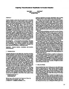
The UCS Library As a supplement to their textbook on scenario-based design (Rosson et al. 2004)—one of the most widely used textbooks in teaching HCI— Rosson and Carroll created a website to present some case studies: the Usability Case Study (UCS) Library. Each case study is organized according to a structured interface design approach (mirroring the approach in the textbook), cycling through requirements analysis, activity design, information design, interaction design, and usability testing. Each of the design phases contains subsections on exploration, envisionment, and rationale, organized in a hierarchical structure accessed through a menu on the website. Within each of those
Figure 1. UCS screenshot, displaying an artifact within requirements analysis from the Garden.com case study.
subsections resides related artifacts—for example, the interaction design section contains scenarios that describe how users will interact with the system, interaction artifacts like light pens or gesture recognition cameras, and claims about the artifacts and other system features. The tree-structured layout allows the user to traverse the hierarchy using familiar point-and-click web techniques to find desired items. Cases are not limited to the business side of system development, but can be based off of any computer system development such as notification systems and instant messaging systems. Garden.com, the case shown in Figure 1, is a case study that is based off of the development of an online store for purchasing garden equipment and greenery. The case study of the Virtual Science Fair follows the development of a system for students to use to display and present their science fair projects. In integrating these cases into classroom activities, Carroll and Rosson emphasize that cases unfold in time and that any presentation should reflect their temporal nature (Carroll & Rosson 2005). They suggest that large cases, presented improperly, can hinder the user’s thinking about the case. The authors acknowledge that key design objects—such as scenarios, claims, artifacts, and so on—should be drawn out. As Carroll and Rosson state, “Just what and how case information is presented can have a significant impact on its effectiveness as a resource for active learning” (Carroll & Rosson 2005). Methods for integrating the UCS library into the learning process include homeworks, in-class activities, and groupwork [McCrickard et al. 2004; Rosson et al. 2004, Somervell et al. 2004]. For example, students might be asked to review the requirements analysis of a certain case study and write an additional problem scenario, or to contrast information prototypes and interaction prototypes. In this type of constructivist learning, teaching is not just about lecturing, but asking students to explore, compare, and discuss through the case studies in UCS. However, the textual tree-based structure of the UCS library may not be the most effective way to assist students in gaining an understanding of the multiple layered structure of a case, or to support comparison of different parts of a case. With only the highest levels of a tree visible, or at most a single branch of the case tree, comparisons can be difficult. The remainder of this paper addresses this issue through a common technique for supporting information exploration—visualization.
Visualizing Cases Visualization has long been effective in presenting raw data in a manner supporting rapid understanding. Even structured information can be visualized effectively. Less clear are benefits in visualizing information with minimal structure (like cases) in a manner that will assist non-experts like students, who may be overwhelmed by large volumes of information. We explored the creation of a case visualization based on a widely-accepted mantra and two information visualization principles. As a central principle to designing an information visualization tool, Shneiderman proposes a visual-informationseeking mantra: overview first, zoom and filter, details on demand (Shneiderman 1998b). An overview represents the entire collection of data. From that overview, the user can zoom to gain more information about a specific portion of the data, filtering out less relevant data. An important final step is seamlessly providing details about selected items of interest. One example of an effective visualization is the LifeLines (Plaisant et al. 1996) system developed by Shneiderman and his colleagues. LifeLines focuses on personal histories of troubled teens, similar to how this project examines the temporal evolution of cases. LifeLines starts with an overview, where the information about an individual or individuals is arranged on a timeline, with horizontal lines placed at different heights. Rows correspond to categories, with each line in a row representing personal status (location, employment status, etc.) Lines vary as to color or thickness to represent additional information, and icons can also be used to represent one-time events. Zooming allows the user to expand sections within the overview to see particular time spans, and clicking on visual artifacts provides textual details. Another inspirational technique from information visualization is the Elastic Windows concept (Kandogan & Shneiderman 1997). This concept explored how tiled windowing compared to independent, overlapping windowing (as in pop-up windows). Instead of dealing with multiple windows that need to be moved and overlapped, Elastic Windows placed all windows into one area with no overlapping. Resizing or removing one window resulted in the
automatic adjustment of all other windows to fill up the space. The idea was this windowing system would be more efficient for environment setup, window switching, and when execution than compared to using multiple, independent, overlapping windows. Empirical studies demonstrated that elastic windows effectively helps to balance attention between multiple sources—important in comparing different parts of cases. To apply principles of information visualization to the exploration of case studies, we created a tool called Visualizing a Development Record (VaDeR). A development record is the trail of information that others can follow to trace the creation of an interface—a development record along with context and commentary is a case study. For comparison purposes, we built VaDeR as an extension to the UCS library, enabling VaDeR to visualize the same cases as can be found in the UCS library. Since it has already been determined that time-based artifact ordering is central to understanding the structure of a case, for the main layout we adapted the LifeLines approach. To enable comparison of multiple parts of a case, hiding or showing elements of the timeline, we adopted the Elastic Windows technique. Within problem-based learning, this information layout should support the efficient identification of data. And more broadly, the temporal overview will present a more realistic representation of how the design occurred—with multiple iterations and constant cycling between the phases of design—so the student does not obtain a false sense of the case structure by assuming every design was perfectly sequential through every step of the design process. The remainder of this section describes in detail the features of VaDeR, pictured in Figure 2. A complete description of the interface and design process is found in (Berry 1994). Timeline To provide an overview of a case, a timeline running down the left side of the interface shows representations for the case artifacts, falling into three main categories: analysis, design, and evaluation. You can see these in Figure two as the three columns on the left hand side. You can also see how the artifacts tend to be clustered by time due to the inherent nature of design. On top of that timeline are category titles linked to help files with detailed explanations. These can be seen in Figure 2 in the top left hand corner. Timeline artifacts, ordered top to bottom from earliest to latest, represents each artifact with an icon placed in the appropriate temporal ordering. Because time is the most important ordering for the tasks, the best visual mapping is position (Mackinlay 1986). Icon coloring was also used and corresponds to design phase (since color is the second
Figure 2. VaDeR screenshot, displaying a scenario and a claim from the Virtual Science Fair case study.
best mapping technique for categorical data (Mackinlay 1986)), allowing students to compare and contrast among phases two different ways. Menus and filters As in the UCS library, menu titles correspond to stages of design: Requirements Analysis, Activity Design, Information Design, Interaction Design, Documentation, and Usability Testing. These can be seen at the very top of the screen as links with icons and check-boxes underneath. Each title of the design stage links to the menu contents displayed in the elastic detail area. Instead of hiding the submenu contents nested inside levels as in UCS, all levels are graphically shown simultaneously, with submenu titles providing the separation, reducing the navigation necessary to explore the contents. For more refined filter control with a design phase, separate menus are provided—Exploration, Scenarios, Claims, and Prototypes—representing the artifact types found in the design phases. Elastic display area Below the menu titles and to the right of the timeline is the elastic display area, where artifact detail is shown. When icons are selected, this area shows the text, pictures, and/or links associated with that artifact. All windows can be resized but not overlapped, preventing details from covering any portion of the timeline while enabling comparison or artifacts. This area takes up about the same space as UCS has for detail, since the overview and menu titles do not require significant space. Following the design visualization principles effectively laid out by previous research, VaDeR should support easier and faster navigation, retrieval, and understanding of artifacts within the case study.
Experimental Design In a constructivist learning sense, the goal in using tools like UCS and VaDeR is to help students undertake activities that enable them to better understand the design effort contributing to a case. As such, the null hypothesis is that both systems provide the randomly selected user with equal task support and that the user has no preference for one over the other in terms of learning and usability. To examine the validity of this hypothesis, two sets of four tasks were created for the users to complete. Two scenarios were created and four tasks defined for each scenario; these tasks were designed as typical activities that would be present in a perfect-use case study system. With tasks and questions as the independent variables, the dependent variables were participant responses. The first system used by participants was alternated to ensure a random assignment and to reduce confounding variables. After completing each task, participants answered a series of questions about their ease in understanding and working with the particular system, UCS or VaDeR. This series of questions was guided by Shneiderman’s information visualization principles (Overview First, Zoom and Filter, and Details on Demand) (Shneiderman 1998b). By abstracting the systems with these design principles, and the tasks completed in them, a general measurement of how well the participants were able to learn could be established. A seven-point Likert Scale (from completely agree to completely disagree) was used with positively worded statements as the questions. The study was completed by twenty-seven undergraduate students. The students received class credit for participating in the experiment. The participants completed three more sets of statement agreement questions after completing a set of tasks. One set was dedicated towards the participant gauging his/her overall usability experience with UCS or VadeR. This included statements such as, “The system kept me informed.” The second set of questions gauged the participants’ overall comprehension of design and the key concepts within it. This included statements such as “I was able to gain a clear understanding of the phases of design.” The last set of questions asked the participants to directly compare the VaDeR and UCS systems with both statement agreement questions and qualitative answers about why one system was better than the other. A seven-point Likert Scale was again used to gauge agreement.
Results This section presents results for task correctness and tool preference. For each data set (unless otherwise noted) we performed two-tailed t-tests. Results are reported as significant for p-values less than 0.05, and marginally significant for p-values less than 0.10. Data without these descriptors should be considered not significant.
Task correctness The initial set of results parsed the data dependent on the participant’s ability to complete tasks correctly, to determine the effectiveness of each tool in helping participants find information. The tasks were graded as either Pass (successful task completion), Semi-complete (partial credit), or Fail (not completed or not correct). Table 1 summarizes task completion rates. Note that for the easier initial set of four tasks (shown in the left columns of Table 1), users of UCS outperformed users of VaDeR, but for the more conceptually difficult second set of tasks (right), VaDeR users outperformed UCS users (both statistically significant). In Table 2, the ability of participants to correctly complete tasks is broken down and grouped by task and system. This table further shows that UCS helped users to perform better on the initial easier tasks (UCS: M = 2.79, SD = 0.98; VaDeR: M = 1.69, SD = 1.38), p=0.02, but VaDeR helped users perform better on the final harder tasks (UCS: M = 1.08, SD = 0.86; VaDeR: M = 1.93, SD = 1.27), p = 0.05. Task Completion Percentages System 1 = VaDeR System 2 = UCS Pass 44.23% Pass 26.92% Semi 23.08% Semi 23.08% Fail 32.70% Fail 50.00% System 1 = UCS System 2 = VaDeR Pass 66.07% Pass 48.21% Semi 8.93% Semi 12.50% Fail 1.57% Fail 39.29% Table 1. The percentage of participants by ability to complete tasks and organized by which system was used first.
Task Completion by System SYS. USED 1st
UCS
VaDeR
SYS. USED 2nd
T1
T2
T3
T4
T5
T6
T7
T8
P
13
9
7
8
3
3
3
5
S
1
4
0
0
2
7
3
0
F
0
1
7
6
8
3
7
8
P
6
6
5
5
9
6
4
9
S
4
6
1
1
1
6
0
0
F
3
1
7
7
4
2
10
5
Table 2. The totals for task completion (T1 – T8) versus which system was used first by the participants P = Pass, S = Semi-complete, F = Fail
Tool preferences Out of the twenty-seven participants, fourteen (52%) preferred UCS and thirteen (48%) preferred VaDeR—a virtually even split. Comparison questions at the end of the experiment yielded non-significant results for preference. To contrast differences between user preferences after each round, we then looked at preference questions after each round, where preference was the dependent variable and system type was the independent variable. This t-test, used to determine if the means of the preferred system chosen had a large effect upon the participant’s preference, yielded marginally significant results for one question: the UCS (M = 5.46, SD = 1.88) was better at clearly marking exits which allowed for leaving unwanted windows than VaDeR (M = 4.50, SD = 2.03), p=0.06. This result highlights a caution point for the integration of visualizations—that the added complexity can make window management more difficult. In the Zoom and Filter question “I was able to easily manage the window(s) used for this task,” UCS (M = 5.89, SD = 1.32) obtained a marginally higher result than VaDeR (M = 5.42, SD = 1.61), p = 0.06. On the Overview question and Details on Demand question, no significant or marginally significant results were found.
Discussion The experiment data suggest that a standard web-based interface like UCS may be best for answering simpler questions about a case, but a case visualization like that provided in VaDeR may be easier for users to navigate, understand, and to learn from. However, the marginally significant preference results and the user comments
suggest that many users felt overwhelmed by the mass of choices presented in VaDeR. For example, one participant said “…there were icons everywhere, and things just thrown around. After about 15-20 min[utes] I finally somewhat figured out where things were.... You always feel lost and you have no idea where everything is.” Yet it is important to remember that cases are indeed complex, and by visually alerting users of this complexity, perhaps participants spent more time studying the cases and gain a more thorough understanding of them—leading to more carefully constructed results on the more complex questions. In terms of system look-and-feel noted by participants in ratings and qualitative feedback, UCS system has a much more traditional navigation scheme that users felt more comfortable with. VaDeR on the other hand had a navigation visualization that allowed users to focus on the big picture with all pieces of information and artifacts. One participant said that he preferred UCS because interfacing with it was simpler for initially understanding the system; however, he then went on to say, “I can see that an advanced user, someone who looks at a lot of case studies, might like System 1 [VaDeR].” Perhaps even a bit of experience is helpful in preparing people to use VaDeR—as can be seen from Tables 1 and 2, VaDeR was indeed more successful as a secondary system. Important in furthering integrating visualization tools and techniques into the teaching and learning experience is exploring the types of visualizations that work best for educating users, and how best to integrate visualization into classes. While this does not absolutely indicate that one system performed better than the other, it shows that different visualization principles should possibly be used depending on the level of background knowledge the user has: use a more traditional navigation system like a tree structure for novice users, and use a timeline driven structure for more advanced users. Using a more traditional navigation scheme can reduce the complexity to novice users; however, this data suggests training whells should be removed soon in order for the complete magnitude and size of a case to make an impact on a user. Lastly, information that was not statistically significant contains suggestions about types of tasks to pursue in future research investigations. Tasks related to understanding the location of key concepts suggested UCS was better for compare and contrast tasks but VaDeR was better for relationship tasks. Perhaps the volume of information in VaDeR made it easy to see relationships, but difficult to identify positions—not unexpected given the tree structure of UCS. Similarly, VaDeR was better in determining elements of the stages of design, while UCS was better in finding artifacts within a stage of design. Again, with the chronological ordering apparent in VaDeR, a user will be able to quickly determine the major parts within a design stage; whereas, UCS makes obvious the location of objects in the tree hierarchy. While the tree structure is certainly visible within VaDeR, the additional visual information may obscure it. Although these are just speculations based on non-significant data, they point out areas and tasks that are better suited to different visualizations for learning systems—worthy of future investigation.
Future Work & Conclusions For VaDeR, in summary, we supported the following proven methods of visualization: •
An overview of all artifacts within the case to support better context when viewing individual pieces of the case. This is done in a timeline fashion to best support the natural flow of system development. The data suggests that showing all the artifacts can drastically overwhelm the user, but that as users became more familiar with the system they actually preferred it due to the decreased navigation time.
•
Filters that allow users to specify one piece of a case study to focus upon – supports quick depth searching. The results show that users ignored this feature because it was unfamiliar. However, some subjects did use it for search tasks even if they did not return completely correct answers.
•
Multiple display areas for compare and contrast and other activities between artifacts. Students did not use this tool for their work. Future exploration into how to make this a usable tool should be done.
Continuing to explore how the UCS Library and VaDeR were used and why one of them was successful and one of them was not stresses that visualization principles are not some grand blanket on how to employ a design idea. Instead, application, and even a case study of how to apply a visualization rule could be used. This is one major area that should be explored in the future. This work has many areas to be explored in the future. Apart from working on the visualization aspects of how to develop a case study, the next area to continue exploring is what information should be included within a case study. In either current implementation of the case study library above, students were only shown polished artifacts that were generated along the way. However, how do we know that these are the right artifacts to display? For example,
what about versions of scenarios or versions of prototypes that were initially developed? A scenario was not written perfectly the first time. Having these artifacts that show development is one area that could help novice designers understand that in essence, developing a scenario or claim is in a way doing a small amount of initial prototyping of the eventual system. A second area is to attempt the integration of using a case study library into the development cycle of scenario-based design. Currently the case study library is used only as a tool for in-class activities. Moving the Case Study Library into the process of development will hopefully raise questions as to what parts of the Case Study Library are important and which ones should be developed further. Also, how case studies are gathered should be explored. Finding a way to elicit case study material can be a cumbersome process and trying to deduce how to capture that information without being invasive to the design process raises many more questions. There are many areas to explore with case studies because cases are a tool that has been proven to be effective across almost every domain. Finding a way to use them in order to show the art behind design is a delicate process. Displaying a case study that only ends up overwhelming the user can produce only frustration and exhaustion. However, enabling a tool that can provide the ability to learn quickly and effectively has limitless potential. In conclusion, this paper has highlighted the promise visualization holds in helping students understand cases. Our case visualization tool encouraged more in-depth exploration by students of cases—resulting in better performance on difficult case-related questions. User preference for more traditional tools highlights the importance of future work to investigate the proper way to introduce and utilize visualization techniques when teaching with case studies.
References Barbazette, J. (2004). Instant case studies: How to design, adapt, and use case studies in training. Pfeiffer, An Imprint of
Wiley. Berry, B. (June 2004). VaDeR: Visualizing a Development Record—A Study of Claims-Centric Scenario-Based Design. MS Thesis, Department of Computer Science, Virginia Tech. Carroll, J. M. and Rosson, M. B. (January 2005). Cases as minimalist information. In Proceedings of the 2005 Hawaii International Conference on System Sciences (HICSS 2005). Carroll, J.M. and M.B. Rosson. (2005). A case library for teaching usability engineering: Design rationale, development, and classroom experience. In J. Educ. Resour. Comput., 2005. 5(1): p. 1-22. Harvard Business School. The case method. http://www.hbs.edu/case/index.html. Kandogan, E. and Shneiderman, B. (1997) Elastic Windows: Evaluation of Multi-Window Operations. In Proceedings of the ACM Conference on Human Factors in Computing Systems (CHI ’97), pp. 250–257. Mackinlay, J. (1986). Automating the design of graphical presentations of relational information. ACM Transactions on Graphics, 5(2), pp. 110–141. McCrickard, D. S., Chewar, C. M., and Somervell, J. (March 2004). “Design, Science, and Engineering Topics—Teaching HCI with a Unified Method.” In Proceedings of the 2004 ACM Technical Symposium on Computer Science Education (SIGCSE '04), Norfolk VA, pp 31-35. Plaisant, C., Milash, B., Rose, A., Widoff, S., and Shneiderman, B. Lifelines: Visualizing Personal Histories. (1996).In Proceedings of the ACM Conference on Human Factors in Computing Systems (CHI ’96), pp. 221–227. ACM Press. Rosson, M. B. and Carroll, J. M. (2002). Usability Engineering: Scenario-Based Development of Human-Computer Interaction. Morgan Kaufmann. Rosson, M. B., Carroll, J. M., and Rodi, C. M. (March 2004). Case Studies for Teaching Usability Engineering. In Proceedings of the ACM Technical Symposium on Computer Science Education (SIGCSE ’04), Norfolk VA, pp. 36–40. Shneiderman, B. (1998). Designing the User Interface: Strategies for Effective Human-Computer Interaction. Addison-Wesley, Reading, MA. Somervell, J., Chewar, C. M., and McCrickard, D. S. (October 2004). “Making a Case for HCI: Comparing Materials for CaseBased Teaching.” In Proceedings of the 2004 Conference on Frontiers in Education (FIE ’04), Savannah GA, pp. T3H-4-T3H9. Wixon, D. (2003). Evaluating Usability Methods: Why the Current Literature Fails the Practitioner. Interactions, 10(4):28–34.


![Making the Case for BPM: A Benefits Checklist - BPTrends [PDF]](https://m.moam.info/img/260x300/making-the-case-for-bpm-a-benefits-checklist-bptre_647c2890098a9e37568b45d6.jpg)